Category Archives: GIS

Safest Driving Routes from UBC to Greater Vancouver

Click here for a direct link to the project website.

Abstract

The commute to the University of British Columbia can be thought of as a daily hassle. This project aims to provide insights towards the fastest and safest driving routes to and from UBC during peak traffic hours. In doing so, the map will help to inform the public of any areas to avoid in order to minimize their commute times and avoid accident prone areas.

The project used a kernel density analysis approach using ICBC accident data and ESRI’s ArcGIS software. Through analyzing crash severity and frequency, a ‘cost’ surface path was made. This enabled the production four respective paths leading from UBC to arbitrarily chosen points in Burnaby, Richmond, Surrey and Vancouver (which are different municipalities in the GVRD).

The intended audience of these results are faculty, staff and students of UBC. Further collaboration with ICBC,  UBC and the municipalities would increase the accuracy of this project for its users. This project was conducted by Lucia Bawagan, Chelsey Cu, Tovi Sanhedrai and Lakshmi Soundarapandian as the final project of an Advanced GIS course (GEOB370) at UBC.

Introduction

In British Columbia, driving is regulated by the Insurance Corporation of British Columbia (ICBC), which was established in 1973 as a provincial Crown corporation. Since all vehicles are must be registered to legally be parked or driven on public streets in British Columbia, ICBC handles motorist insurance, vehicle licensing and registration, driver licensing, and produces annual traffic reports, statistics and crash maps.

The project, Safest Driving Routes from UBC to Areas Around the Greater Vancouver Regional District, was derived from our interest in finding the safest route from the University of British Columbia (UBC) to residential areas in the Greater Vancouver Regional District (GVRD). As driving is an important skill for most students and faculty members commuting to and from the campus, we take a special interest in road safety. The routes to each residential area are defined as the “least cost” paths that pass through areas classified under varying risk levels within an overall cost surface marked by car accidents that occurred in the previous year. These paths are created using ArcMap, and data from ICBC’s data catalogue.

The residential areas we have chosen are Vancouver, Burnaby, Richmond, and Surrey. These cities were chosen based on their variability in crash types and our assumptions that many people would commute from there to UBC. The least cost paths were created after a kernel density analysis to create a cost surface.

The goal of our project is to create a map of various least cost routes from UBC to residential areas in the GVRD. This map will hopefully bring awareness to young drivers, students and faculty about safe driving practices, frequency of car accidents and areas which have a high frequency of accidents.

Methedology

Initially, the task was to select four different cities within a Euclidean distance of 10 to 20 kilometers from the UBC campus. Settling on Vancouver, Burnaby, Richmond and Surrey, we used car crash data from ICBC along with lower mainland shapefiles, road networks and land use data to showcase the safest driving routes from these cities to UBC and vice versa. The method of analysis involved, first, data clean up prior to creating a cost surface, then selecting points in each city as a destination, before doing a kernel density analysis and creating a cost distance surface which is used to form the shortest, safest path from each city to UBC.

I.  Data Clean Up:

The first step was to ensure that all the layers had the same spatial referencing. So, the projections were all changed to BC Albers and the datum to NAD 1983 UTM Zone 10. The layers were then added to the car crash data shapefiles creating the output layer. This was made into the main geodatabase. Then, the excel car crash data was imported into ArcMap and converted into a points layer in the geodatabase, using the command make xy event layer. Since this spatial referencing did not match, so the projection needed to be defined. We inputted the spatial referencing as WGS 1984 because the longitude and the latitude was measured in decimal degrees and we needed to convert it to meters in ArcMap for the car crash data shapefiles. At this point, other municipalities, that we did not intend to look at, also had data. So, those data points needed to be deleted while in the layer editing mode. The same was done for the roads that were outside of the Lower Mainland area prior to intersecting the layer to the main project layer.

II.  Creating a Cost Surface:

Now, with the data organized, spatial analysis can begin. The cost factors were then defined, by assigning frictional values depending on frequency of car accidents in a location.

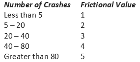
Table 1. Frequency of car crashes

Another set of frictional values were also added in for the severity of the car crashes.

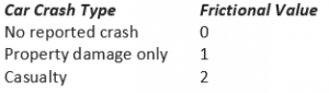
Table 2. Type of car crashes

Also, the roads layer was converted into to a raster file and cost values were assigned based on if the pixel was part of a road (value of 1) or not a road (value of 0). During the processing, it was important to ensure that the calculations are restricted to roads (and do not incorporate waterways).

III.  Selecting Source and Destination Features for the Route:

Since we did not have data on which specific neighbourhoods most people commuted from, an arbitrary point in each city was selected as a destination feature to avoid biases. This was done by doing a definition query, choosing points in layer editing mode, and deleting all other points that were not used. Once this was done, all the points in the different municipalities were merged into one layer.

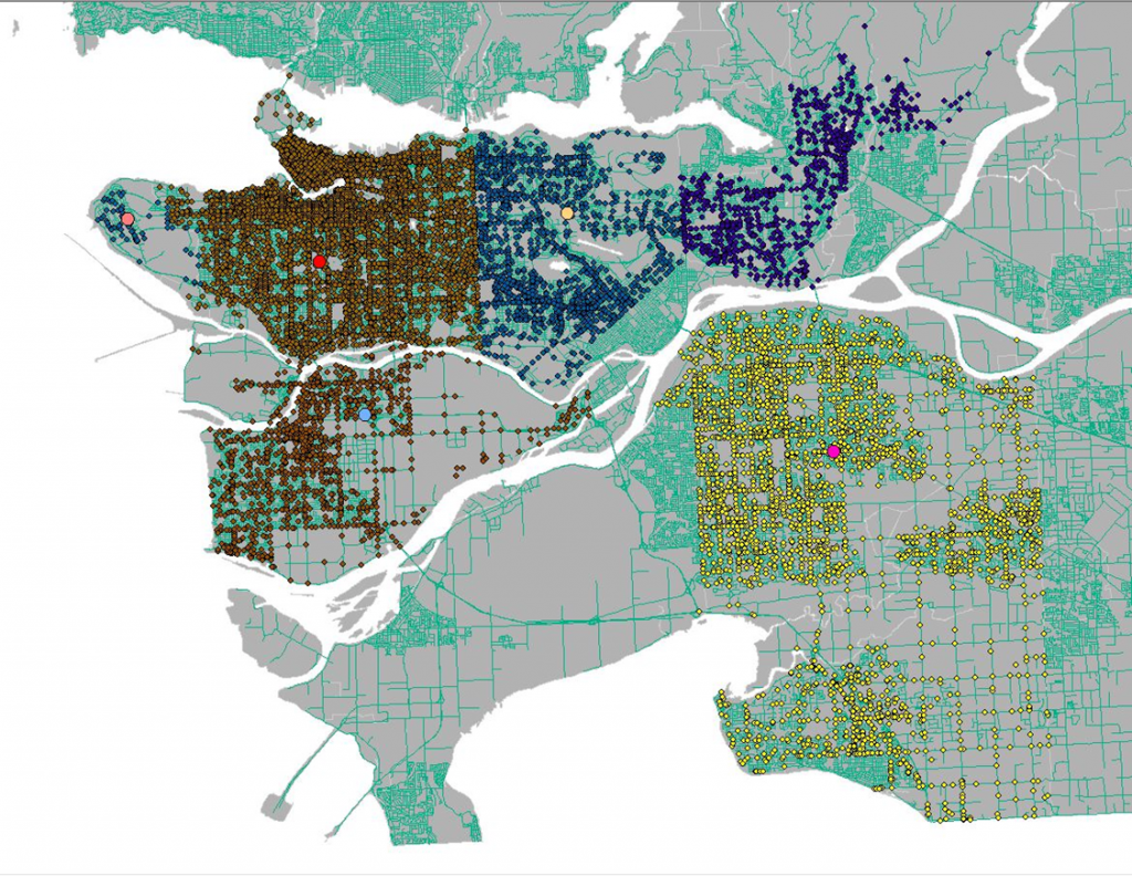
Figure 1. Accident points in municipalities and selected start points for safest routes (larger dots)

IV.  Creating Cost Attribute:

The next step was to create a cost attribute by creating a new column in the attribute table that considers both the weight assigned to the number of crashes and the crash type. This was represented by seven classes in a gradient.

After this, a kernel density analysis was performed.

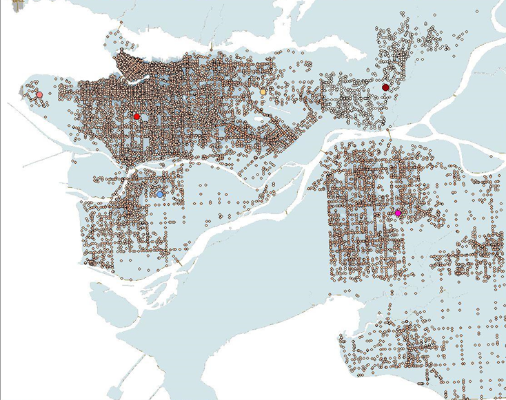
Figure 2. Combined attributes in preparation for the kernel density analysis

V.  Creating Cost Distance Surface:

Next, we needed to create a cost distance analysis based on the new combined attribute that was made in the previous step. We created, not only a cost distance raster layer, but also the backlink raster layer as well.

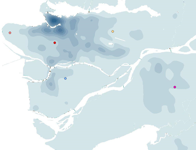
Figure 3. A raster layer of the cost surface

VI.  Creating Shortest/Cost Path:

Finally, with the cost distance surface layer, we were now able to make a path that outlined the shortest distance from our arbitrarily selected point in each of the four cities (Richmond, Vancouver, Surrey and Burnaby) to the UBC campus. Taking into account the ICBC data on car crash severity and frequency around the Lower Mainland, these four paths are the safest driving routes for commuters going to UBC.

Results and Discussion

The results of the project are shown below in figure 4. Or, the map can be downloaded as a pdf by clicking here

Based on the kernel density mapping of the ICBC crash data, all of the routes to the four residential areas head south and then east due to the high density of accidents northward of UBC. From looking at the routes, it can be estimated that there is a correlation between high density traffic areas and accidents. The routes tend to avoid major roadways in the municipalities whenever possible and veer towards less dense networks. Thus, it could be possible that main roads are more prone to accidents because of the higher volume of drivers using them. The routes outlined by the analysis is potentially a longer route from UBC to the destination in either Burnaby, Richmond, Surrey or Vancouver. This is because the analysis uses the ‘least cost’ path (which was designated by the car crash severity and frequency in a specific area) and there is a much higher density of crashes north of campus around Downtown Vancouver/ Kitsilano area.

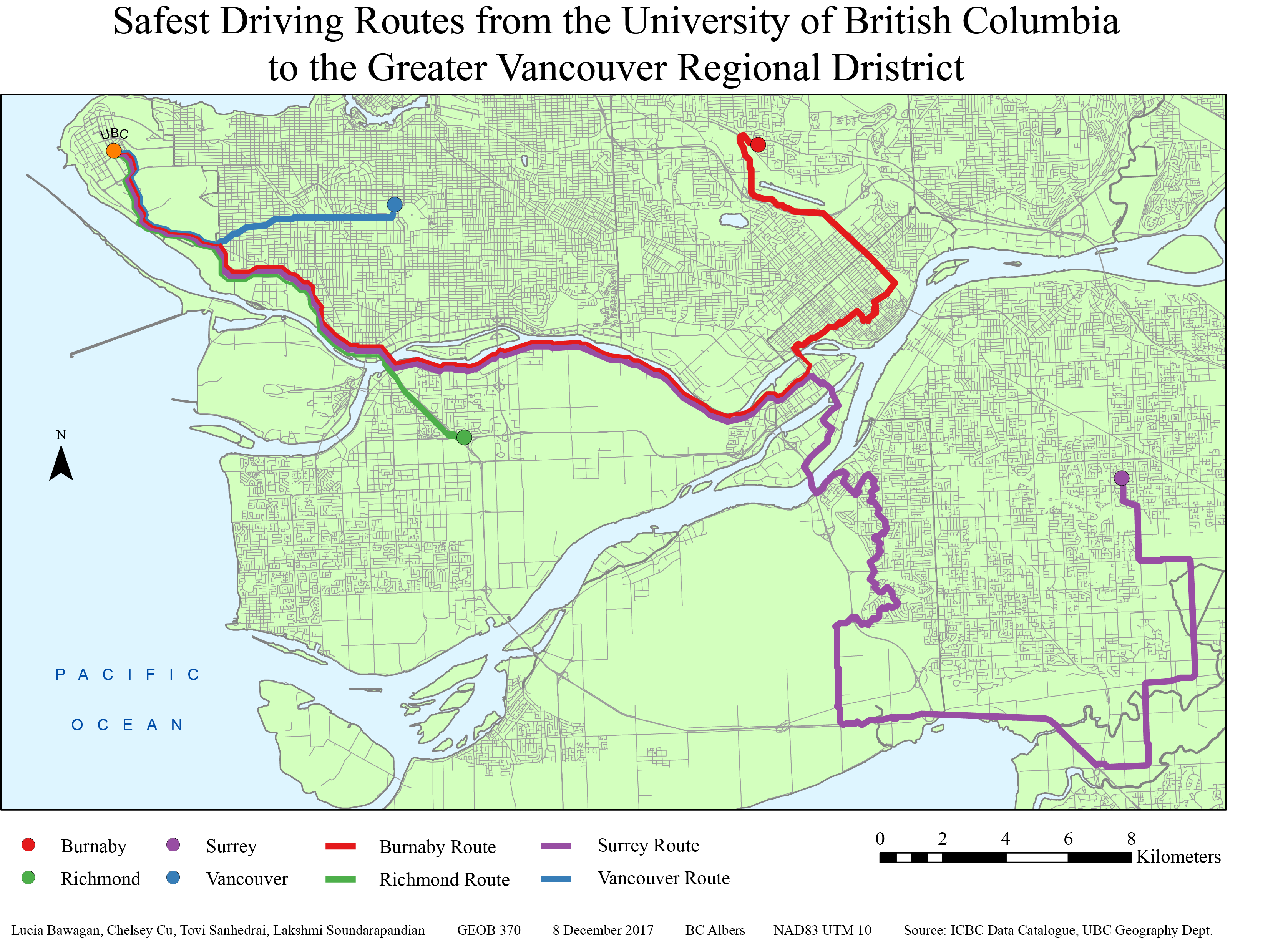
Figure 4. Final map after analysis with the four routes leading from UBC to Burnaby (red), Richmond (green), Surrey (purple) and Vancouver (blue)

Our analysis can be applied to commuter everyday life in multiple ways. It can increase the awareness of the safest driving routes between the UBC campus and the different cities in the Lower Mainland. For instance, given this information, drivers can be proactively be more alert and cautious when passing by the areas that are prone to accidents. This will encourage overall safer driving practices within the GVRD. Drivers can also avoid these areas whenever possible in order to minimize their commute times.

We would like to acknowledge that there are also points where our analysis falls short. For one, the point destinations were arbitrarily chosen rather than based on statistical analysis of which neighbourhoods most commuters are from. Furthermore, the classification of crash counts and risk levels were also arbitrarily chosen. In addition to this, there are also infinite combinations of cost by type and count when creating the ‘sum of the cost’ attribute. These errors and uncertainties could create uncertainties in our analysis and leave room for future improvements.

Further Studies

This research has been limited in scope due to the constraints in the data that we obtained. For future work, researchers could partner with the University of British Columbia to try and obtain data of where most of the university staff and students live and their mode of transportation. From there, the ones that drive to school can be singled out and an analysis can be performed based on the approximate areas which people commute to campus from. Then the analysis of the least cost path can be improved by using those areas rather areas rather than arbitrarily selecting city points. 

Another step to change our analysis process would have been to normalize the ICBC data that was obtained. In our analysis we only added together the number of car crashes and the type of car crash, but it would be interesting to map out the more serious car crashes in an area over the total car crash number in the area. This would, for instance, show intersections with multiple small crashes being less dangerous than an intersection with less crashes that are more severe, informing users to avoid the latter.

Furthermore, the monitoring of accident-prone areas can help to determine how this will increase and/or shift traffic and accidents to other parts of the Greater Vancouver area. Research can also be done on whether the knowledge of the suggested routes might possibly shift the accident locations from their original locations to along the routes suggested as more and more people use these paths.

The research can also be combined with other fields such as environmental impact assessments. Investigations could occur as to whether  avoiding these routes impact other areas long term. For instance, if taking these routes cause people to be caught more often in stand-still traffic due to car accidents and this, in turn, affects the amount gasoline consumed and the amount of fuel emitted into the atmosphere.

REFERENCES

ICBC Data Catalogue: http://www.icbc.com/about-icbc/newsroom/Documents/quick-statistics.pdf

  • Average annual car crash data published January 2017 for the past year
  • Metadata includes: crash statistics charts and accident reports

UBC Geography Department: G Drive

  • Basemap: Lower Mainland Shapefile
  • Road Networks: Intersection density, All roads in GVRD
  • Vancouver DEM: Differentiate between road features (degree of steepness, shape of the road)

All projected in BC Albers, NAD83 UTM 10

Acknowledgments: Brian Klinkenberg and Alexander Mitchell

GEOB 270: Introduction to GIS

Over the course of this term taking introductory geographic information science (GIS), I have learned that I learn best when I am doing things hands on. I like, not only understanding how things work, and trying to see if I can yield the same results, but also taking the time to figure things out on my own through trial and error. I am proud to have been able to slowly improve on my maps as I built up my repertoire of understanding the software. I learned about the vast array of open source data that is available for analysis, but also the danger of feeding junk data into the analysis and the poor results it may produce. I hope that I will continue to improve and be able to compare my future work with my current ones and see the progress.

Potential Orienteering Map Sites in Greater Vancouver

Orienteering is a sport in which participants are required to navigate from check point to check point in diverse terrain using a map and a compass. There are a number of requirements (such as the size of the plot of land, the percent of elevation of the terrain, easy access for commuters, and so forth) that must be met before an area can be deemed fit for the sport. From there, a cartographer is brought in to map the selected location. The goal of this project was to find locations that are suitable for a cartographer to map.

Our team worked together on the mapping portion of the project then divvied up the accompanying discussion sections. This worked best for us because it ensured that everyone knew what was happening in terms of mapping and had a say in the results. This also eliminated the issue of analysis steps being done twice or missed if each of us had worked on the map separately.

Some issues that we faced when acquiring data was that a lot of material we found was older. For example, the shapefile of Greater Vancouver was from 1999. Other data that we were looking for, such as tree density, was proprietary. This hindered our analysis and left room for error in our final product. I found that while open source data is convenient, it may not always be the most reliable. On the other hand, proprietary data may be more accurate, but, like in our case, may go unused because it is harder to access.

Below are the different components of this analysis.

  1. The flowchart of analysis done.
  2. The map that resulted from this analysis.
  3. The discussion of analysis and results.

As a result of this project, I discovered a sport that I would have otherwise never known about. I think that it is interesting that the specifications for mapping set forth by this sport requires not only maps to be made of the terrain but also maps that pinpoint where maps should be made.

In working on this project, I learned how use new tools that I had previously not been familiar with such as adding X,Y data to excel spreadsheets in order to use that information in ArcMap. For the most part, there was a lot of trial and error when using tools that were unfamiliar. This made the end result more satisfying because it was something that we had spent a lot of time and effort in figuring out. The map aesthetics was something that I spent a lot of time on. Trying to get the halo effect on the words and drawing in the leader lines to try to make the map clearer and more user friendly.

Environmental Assessment of Garibaldi Ski Resort

The purpose of this analysis was to look at the proposed project area for the Garibaldi at Squamish ski resort a year-round destination on Brohm Ridge, and determine whether it was a good fit based on the impact that this project will have on the environment. In this analysis, I looked at the habitats of ungulate, fish and endangered species as well as the parks and protected areas already in place and the old growth forests. These areas should be preserved to allow the respective species to continue thriving in their environment. Furthermore, I looked at the road networks already in place which would help to reduce the time and cost of future construction.

The following steps were taken in the assessment:

  1. Gather data from various sources (such as DataBC).
  2. Organize the gathered data.
  3. Focused into looking at solely the proposed project area and removed all the data that was associated with other areas. This lessened the amount of data that I had to deal with and reduced the clutter of information.
  4. Created a 555m snowline, and separated the areas that are potentially above or below this with a line. Those areas below this line potentially do not have enough snow for ski runs.
  5. Separated areas that are potentially old growth forests. These protected areas are not allowed to be cut down during construction.
  6. Separated the ungulate winter habitat. This shows the range of Mule Deer and Mountain Goats in the winter. If a resort were to be built, these animals’ natural habitats would be disturbed since the ski resort would most likely be busiest at the same time.
  7. Separated the red-listed ecosystems. These areas house endangered species and should remain undisturbed to allow the species time to repopulate. It was discovered that six species are endangered in the proposed project area: Falsebox, Salal, Cladina, Kinnikinnick, Flat Moss and Cat’s-tail Moss.
  8. Looked at the waterways in the proposed areas and created a buffer zone around them. Buffering an area creates a border of a certain distance in all directions around a specific area. Some of the streams may be fish-bearing and to preserve this natural habitat, the streams and the area around the streams should remain untouched. Streams that are above 555 meters in elevation are less likely to bear fish, so they only require 50 meters of buffer around the waterway. Streams that are below 555 meters may house more fish and are given a buffer of 100 meters to preserve their habitat.
  9. Combining all the areas that should be protected (old growth forests, fish habitat riparian management zones, ungulate habitats, and red-listed species areas). This helps in calculating areas that should be protected. It also prevents overlaps such as calculating an area twice.
  10. Creating a map using a 3D elevation model as the base then highlighting the previously gathered protected areas. Included are roadways, elevation contour lines and the 555 meter snowline.
  11. Add a legend, scale and compass to help user interpretation.

In the results, I discovered that 29.93% of the proposed project area is below 555 meters. Meaning that, these areas will most likely not have enough snow for the ski runs. 6.78% of the proposed area is old growth forests, 7.89% is ungulate habitat, 24.84% are habitats to endangered species, and 28.07% will fall on fish bearing streams. This equates to 54.68% of the project disrupting protected areas. It is important to note, however, that further research is needed to look at the impact in regards to social, economic, heritage, and health effects.

The two greatest environmental concerns to project development would have to be red-listed species and fish bearing streams as those take up the most of the project area. Seeing as most of these red-listed areas and fish bearing streams fall below the 555 meter line, impacts to these areas can be minimized by restricting construction to higher elevations. This would also be beneficial for the resort owners since there is a chance of insufficient snow below the 555 meter line. In this way, impact to these protected areas can remain minimal, while profit for the resort can be maximized.

Personally, I do not think that this project should be allowed to continue. While the memo notes that limits to construction below the 555 meter snowline can minimize impacts to red listed species and fish bearing streams, these areas will be disturbed regardless. The increased human traffic in these areas will significantly impact and alter the original ecological balance of these areas. Species that are endangered, if unable to adapt to these conditions will become extinct and loss of species in an ecosystem leads to wider scale impacts to the ecological balance in the long run.

Recap of learning: I gained skills in acquiring and parsing data to filter out the information that I needed based on my analytical objectives.  I was able to clip, buffer, and layer different sets of data together to determine whether or not the location for the ski resort has major environmental impacts.

Housing Affordability

Affordability measures the cost of housing compared the annual income that inhabitants earn. This is a better indication of whether or not housing is affordable as opposed to solely looking at housing cost because it looks at how accessible housing is given that people are making a certain amount of income. If one were to look at housing costs alone, they would be neglecting the other factors that affect people’s purchasing power. For example, if housing were on average $2 million in Vancouver but $5 million in London. Taking into account only the housing cost would mean that Vancouver is far more affordable than London. But if one were to look at the additional factor of income, London might have a median income of $150,000 per year while Vancouver inhabitants only have a median income of $50,000 per year. This would mean that with the income that the population is getting, it would be more affordable to live in London than Vancouver. (Please note that all these numbers are inaccurate)

The housing affordability rating categories are: Affordable, Moderately Unaffordable, Seriously Unaffordable, and Severely Unaffordable. They were created by the Demographia International Housing Affordability Survey. They take census data and use the Median Multiple (median house price divided by gross annual median household income) to determine housing affordability.  I think the point of this is to show that housing is no longer affordable for middle income, working class people. As such, this data may be skewed to prove a point. When using manual breaks, one can determine the amount of housing that falls in each category because they are arbitrarily set breaks that suit the purpose of the cartographer.

Housing affordability might not be a good indicator of a cities livability because there are many other factors that could come to play. For instance, food costs might also come into play. Some areas that might have low housing costs and high incomes, such as mining towns in northern BC, have high wages and low housing because there are a surplus of available housing. But the cost of importing food there means that the population of those areas pay a lot more for their food than the population of Metro Vancouver.

Recap of learning: From open source census data, I was able to normalize the data and create a map showing the inequities of housing affordability in two cities.

A Different Point of View

If I were a journalist, I would use the natural breaks method because it shows more contrast between the housing costs more accurately since each colouring depends on a natural grouping of number values. So wherever there is a gap in numbering would be where one category stops and another begins. This would make it easier for the audience to visualize and group housing costs into set numerical categories.

If I were a real estate agent, I would use the equal interval map because it divides the data in a way that shows the area around UBC as an average cost. This would mean that people who were not familiar with the housing prices in the rest of Metro Vancouver would assume that the prices were reasonable and would be more likely to invest in the property. This inaccuracy in mapping makes it unethical because the audience is getting misinterpreted and skewed information.

This data given would not be accurate because it is from 2011 census tract. This tract was made optional by the government meaning that there was a smaller sample size which was also biased because those who answered the National Household survey were in large part middle class Canadians. Furthermore, since the housing market continues to inflate in Vancouver, many of the areas may be more expensive than they were during the 2011 census tract.

Recap of learning: I was able to showcase the differences between various methods of quantitative data classification. This is useful to note in order to produce maps that are ethically sound.

Planning for a Tsunami

Health care facilities in danger zone:

  • False Creek Residence
  • Broadway Pentecostal Lodge
  • Yaletown House Society
  • Villa Cathay Care Home

Education facilities in danger zone:

  • Anthony of Padua
  • Ecole Rose Des Vents
  • False Creek Elementary School
  • Emily Carr Institute of Art and Design
  • Henry Hudson Elementary

I got these results by first intersecting the land use layer data with the danger zone layer data.  Then I intersected the new resulting layer with the healthcare facilities location data and the educational facilities location data respectively. This gave me the remaining points of which healthcare and educational facilities are currently located in the danger zone and are at risk of flooding should a tsunami hit Vancouver.

The new site for St. Paul’s Hospital is located in the danger zone. This means that if there were to be a tsunami and subsequent flooding, the hospital would have to be evacuated or it would not be accessible if the surrounding roads were flooded. Since it will be a major healthcare facility for the east end, this might lead to problems in the event of an emergency.

Recap of learning: Working with both spatial and tabular data, I was able to identify and create a map of areas that are prone to flooding in the event of a tsunami. I was then able to locate the areas that will require warning signage as well as determine whether the proposed location of the new hospital will be affected.

Advantages to Using Remotely Sensed Landsat Data for Geographic Analysis

Remotely sensed Landsat imaging data provides space taken images of the Earth’s surface at 16 day intervals. Initially launched in 1972, this tool is a source of raster data that can be crucial to geographic analysis. Its ability to provide repetitive and synoptic observations of the Earth, makes it useful in giving data on how land use changes over a span of time (which can be a long or short interval). This data is used in a variety of ways by allowing users to determine the rate and distribution of surface processes.

An example of when Landsat data would be useful is the when looking at the disappearing swamp in the Apalachicola delta in Florida. The Landsat data allowed researchers to “distinguish between hardwood swamp, the typical forest in the Apalachiocola River floodplain, and the bottomland hardwood forest, the encroaching forest that thrives on drier soils.1” These changes are important because they can negatively impact the biodiversity in the area. Landsat images in this case can not only distinguish between forest types, but also water levels in the river to help determine changing rate of the forest and its possible relation to water levels.

Recap of learning: I have discovered the usefulness in constant areal photographic monitoring of the Earth. This up to date data helps with making the most accurate interpretations when doing spatial analysis.

1 http://landsat.gsfc.nasa.gov/apalachicolas-disappearing-swamp/

Misaligned and Improper Spatial Data

Fig 1. Coordinate System: Canada Lambert Conformal Conic. Projected layers: Canadian national parks and rivers. Cities: Vancouver and Halifax

ArcMaps does this nifty thing called Projection-on-the-Fly, which allows users to combine layers set to different coordinate systems and still have them align with each other. It is useful in some cases, but it does not always work. Sometimes, you my find that your map layers do not line up. Not to worry, the solution may be as simple as incorrect coordinate systems. Maps that are used in layering may be set in different coordinate systems (also known as spacial referencing) which results in a mismatch of layers.

To fix improperly referenced spatial data, right click on the lowest layer of your map (this is the last on your list in the Table of Contents) and look at the properties > source > spatial referencing. Check what coordinate system (spatial referencing) this layer is on. Then, right click on Layers (this this is the first item on your Table of Content list) go to properties > coordinate system > layers > (pick the one that matches the coordinate system you previously checked for). Now that your map is all on the same coordinate system, everything should hopefully line up nicely.

Discrepancies in location and scale lead to misaligned layers. To fix this, launch the properties of the layer in the Catalog tab. Find XY coordinate system > geographic coordinate systems. Now, make sure to select the the coordinate system that fits the original information.

Let’s go one step further. Say you want to project a layer for spatial analysis. Projecting a layer modifies the coordinate data and creates a new version of the data layer with a different coordinate system. This means that you must use a special tool in ArcCatalog to perform the transformation. Dock ArcToolbox on the right side panel. In ArcToolbox, find Data Management Tools > Projections and Transformations > Project. Make a new layer, which will appear in your ArcCatalog. Drag this to your Table of Contents and add it as a new layer to your map.

Ensuring that all the data lines up is crucial for accuracy in mapping. This may not be a bid deal in small scale mapping, but for large scale maps, inaccuracy can lead to major issues. Imagine trying to go hiking with a map that is 400 km off!

Recap of learning: I learned not only how to change the coordinate system of a map but also the misinterpretation that wrong projections can cause. I’ve begun to figure out which projections work best for which maps and in doing this, learned how to determine if map projections are skewing data.