Network Assignment Using Golden Record Curation Quiz Data
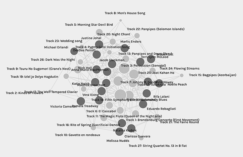
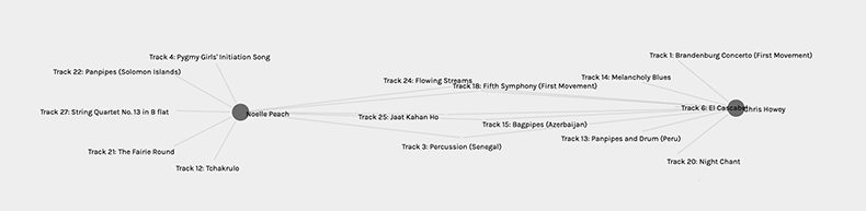
When the email with the data arrived I was at work and being curious about the results I loaded the data in my browser. At first glance, the visualization of the data was a bit overwhelming. As it was early in the week and I was at work I didn’t have the Canvas explanation of the Palladio site in front of me. There were obvious sets of nodes ranging in size and shade that clearly represented the participants and the song choices. I noticed that my peers and I had equal size nodes but the nodes of the song choices varied in size. It was obvious that the larger the song node the more popular the choice. I could see my name and I was almost in the center but to the right, I was unsure if this had any significance. What was also not clear at first was communities and the corresponding numbers in the facet area. What did the numbers actually mean in the absence of labels and how were these communities chosen beyond similar tastes in music was not clear to me. As such, I closed the tab and returned to work.
Over the week as I loaded and reloaded the data I noticed that the initial presentation of the data is never the same (although the scale is fairly consistent). My node’s position in the visualization has been different every single time. Obviously, the data and the connections between the nodes are the same and in the most self-centred way, I always started with my node. Because of this, I noticed that where I was located had an impact on how I started to view and feel about the data. The relational distance and placement of my node to my colleagues’ node was perceived differently by me simply by the rotation of the visualization although the data from which the visualization was produced remained constant. At times the people that I am most strongly connected to seem to be at equal distance from me covering the circumference of the data (we surround them). Other times the people with the most connections to me are close to me. I was unable to find a consistent pattern in spatial representation because of these inconsistencies.
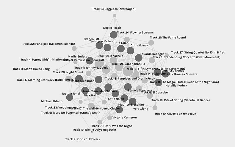
A possible outcome of the generalization of the data and how I perceived it may be that I have common preferences in musical styles to my peers whose nodes I have the greatest number of links (lines) to. It might also be that our musical preferences are not what actually bonded us but perhaps the political and social filters we applied when making our selections were similar. In reality, we might not actually share the same taste in music beyond the available choices or have the same political/social values. Our similarities may only be shared and determined by the parameters of this assignment.
I am certain compromises were made as I am sure the vast majority of us were made to adapt our musical preferences and/or politics to the available selections. If we were asked to input our ten favourite songs without parameters I predict there would be so few common/popular selections the data would likely be unusable. However, any connections made are likely to be a truer representation of our authentic music tastes rather than the connections made from the Golden Record selection pool. But I also wonder if our song choices would shift if our answers were anonymous. If our names were not attached to nodes but rather we appeared as numbers would people feel freer, to be honest? Music is highly personal and there may be some music we like but frankly do not want to admit publicly. This becomes especially true when coupled with the rationale of our choices being published on our blogs. The visibility of the space (our blogs) could influence choices based on what is expected given the public and reasonably permanent platform as well as the awareness of the institution attached to the assignment itself. The visualization could potentially capture what is expected rather than what is truthful.
The visualization is not able to capture the reasons beyond our choices because there is no rationale attached to the data. Contributors are positioned as all equal and our selections are all of equal value. If we wanted more information on personal choice parameters we could in theory go into our peer’s web spaces and read their rationalizations and see if there is indeed shared logic in our selections. This is where the communities within the Facet section could come in handy as it would narrow down the people who made choices similar to mine and focus my initial search. I could also search out those who have the least links to me and see if any criteria in their rationale matched mine. Another variable would be that we were asked to rationalize our choices in 3-5 thoughtful sentences which was extremely challenging to do. Because not every person chose to follow this instruction or was perhaps not aware of it and as such the comparative data is not equal.
Another complication may have been that perhaps someone could have clicked the wrong box or did not click all the boxes and this may change the accuracy of the intended truthful selections. It would also change the size of the contributor’s node. As my largest shared connection is five songs with any other person (if I am reading the data right) one misselection could connect me with a group I may actually share less in common with.
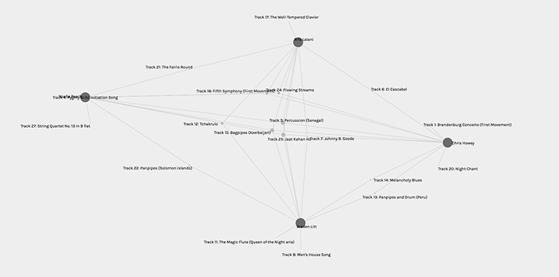
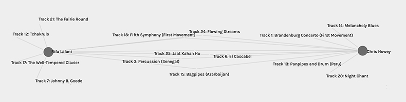
I found adding further facets and dimensions helped me to understand and see the data more clearly. Within community 1 I am with three other people but even when I pull the nodes out to see the lines more clearly it can still be a bit muddled. By using additional facets and dimensions I can select individual people and see clearly our connections (choices). The further I can spread the contributor’s nodes apart the clearer the visualization becomes. But this only works with a few peers’ data. As the more data (song titles and contributors) that is included in the visualization the more important it becomes to highlight selections that are popular so that the visualization can convey a clearer message. But, in saying important I politicize the popularity of the common selections and discard the unpopular choices which can be argued right or wrong. Do the common selections of the majority then overwrite the choices of the others and by virtue of the visualization process make these songs superior? We do not in this case know whose voices we have erased and whose voices we have privileged because everyone’s selections are treated as equal regardless of positionality factors (race, gender etc.).
A direct parallel can be made here to the video The Internet: How Search Works, which informed us that algorithms rank search results based on the idea “that if lots of websites think that a web page is interesting, then it’s probably the one you’re looking for” (Code.org, 2017). Through this assumption, the information you view has already been vetted by popularity and other information that may have been helpful to you has been excluded. We know nothing of the people who click the links to increase the popularity of the website other than they have enough financial resources to access the website. The reality then becomes the strength of the popular selections keeps gaining strength and other information becomes even more obscure as more users engage with and strengthen the popularity of the popular websites. The visualization of our song choices privileges the popular (through larger nodes) and shrinks the less popular choices that you at times literally have to zoom in to see when data is presented on a large scale. We don’t get the full story just the highlights.
Works Cited
Code.org. (2017, June 13). The Internet: How Search Work. Retrieved from https://youtu.be/LVV_93mBfSU
Some really interesting analysis. I found the data overwhelming and difficult to interpret too, but you found some thought-provoking ways to decipher and discuss it.