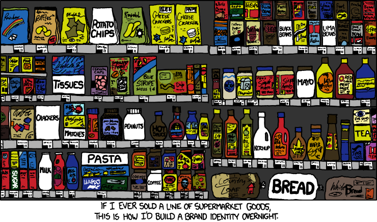
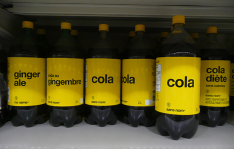
This Internet comic challenges a few assumptions that many people make about branding. First, popular convention is to put brightly colored labels on grocery products to make them aesthetically pleasing. However, it is very possible that in a crowded isle of different colors a plain white label would stand out. Second, it proposes a sort of brand paradox; the products are branded by their uniqueness in the fact that they have no brand. I then did research to see how well this actually worked; The No Name brand of household products uses a similar tactic.
This brand, introduced by Loblaw Companies Limited in the 1970s, aimed to provide similar, if slightly less quality, items for a bargain price. Price was its point of difference, which they emphasized using unique marketing strategies such as this:
Overall, this approach was very successful. No name became the best-selling food brand in the mid-1980s, and had a certain status for customers who wanted to be seen as savvy shoppers. This reminds us that a company’s brand identity is not simply its name, its label, or its colors, but the feelings or attributes associated with the company. It is how the company or the product is viewed by the public. The company chose the commercials, the name and the plain packaging all to get the customers to view the product as plain, simple, and cost-effective.
References
. “brandchannel.com | Loblaw Companies Ltd. | No Name Brand | No Name | Discount Brands | Recession Brands | Generic Brands | Canadian Brands | print version.” brandchannel.com | always branding. always on.. N.p., n.d. Web. 9 Oct. 2012. <http://www.brandchannel.com/print_page.asp?ar_id=433§ion=profile>.
“Super market man”, Maclean’s, November 3, 1986
“Retailers fight slump by pushing generics – thestar.com.” News, Toronto, GTA, Sports, Business, Entertainment, Canada, World, Breaking – thestar.com. N.p., n.d. Web. 9 Oct. 2012. <http://www.thestar.com/article/571945>.


