Brand Positioning
Brands should aim to have a clear and distinct position in consumers’ minds in order to be more desirable than competitors, and sometimes, these marketing strategies can even influence our lifestyle and language.
Success
Effective advertising attracts customers, but good brand positioning makes them feel privileged. From Starbucks cups to Louis Vuitton purses, people are willing to pay higher prices for these luxurious products. Even though I find this quite crazy, I understand their intentions.
Such appreciation could change the brand name into a daily term too; “Google it” and “Kleenex” have been embedded into our vocabulary and now defines the product category. I sometimes forget that Kleenexes are actually tissues, and that other search engines are available. This subconscious loyalty is built from brand image.
Fail
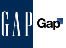
But this customer loyalty can be negatively impacted if the company makes the wrong moves, such as the case with Gap’s new logo. Their attempts to reposition by implementing a “more contemporary and current” logo was beat down. Customers (me included) preferred the old logo, which was the icon for Gap for over 20 years. After much criticism, Gap reverted to the old logo.
Despite the importance of evolving the brand after its initial creation, protecting it is crucial as well. Gap’s is an example of a bad and costly strategy that seeked change without maintaining its grounds. So, while brands should be shy of being obsolete, any repositioning should be of the brand must only improve its place in the consumer’s mind.
References:
–The Gap’s New Logo
–Bloomberg: Gap Scraps New Logo After Backlash, Revives Blue Box


