Elements of Design
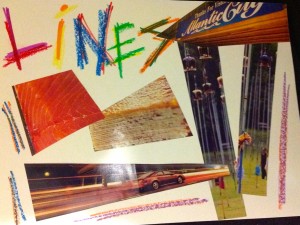
Line
Line is the path of moving dot, where a dot is extended in some manner to determine a line. Line is used to symbolize direction, imply movement, outline forms, suggest mood and determine boundaries of shapes. The quality of line can vary according to the tool and method used, the amount of pressure used and they way a line related to other elements. Some examples of words to use to describe line are jagged/smooth, think/thin, weak/strong, curved, straight, wavy and diagonal.
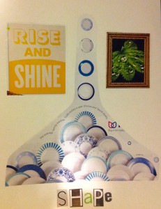
Shape
Shape described two-dimensional area that is defined in some way. Shapes may be open or closed, positive or negative and free form or geometric. Some examples of words to use to describe shape are solid, organic, repeated, symbolic and proportional.
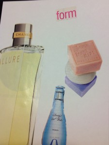
Form
Form occurs when a three-dimensional quality has been achieved in a shape. Form may be implied by the use of tone and/or shadow or form may be actually three-dimensional. Some examples of words to use to describe form are routined, squared, angular, textual, volume and mass.
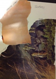
Texture
Texture refers to surface quality. Texture can be real or simulated. Actually texture can be both seen and touched. Simulated texture cannot be interpreted by touching; it must be seen. Some exampled of words to use to describe texture are shiny, smooth, rough, coarse, gritty and granular.
Colour
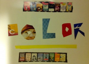
Colour (another name for hue) refers to the naming words we use to identify specific wave lengths of light such as red, yellow, orange and so forth. A colour wheel can explain the origins and relationships that hues possess (specific descriptions of colour vocabulary may be found in the glossary). Colour may be descriptive, decorative and symbolic. Colour has both tone and intensity. Some words to us to described colour are bright, pastel, warm, cool, in harmony and discordant.
Principles of Design
Balance
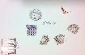
Balance refers to the equilibrium of various elements and involves a sense of order. Order may be achieved in a variety of ways. Order may be symmetrical or asymmetrical, formal or informal or rigid or random. Imbalance can create a feeling of awkwardness or discomfort. it can be used to create an exciting visual response.
Contrast
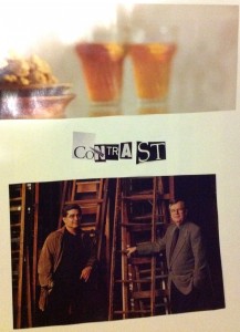
Contrast involves opposition and results from the juxtaposition of qualities that are unlike one anther. High contrast can be used to emphasize, dramatize add variety and surprise. Low contrast can be used to soothe, settle harmonize and comfort.
Emphasis
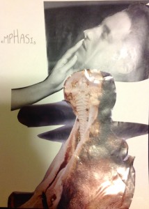
Emphasis refers to the focal point or centre of interest in am image. Emphasis implies both dominance and subordination and can be used to call attention to specific areas within a work.
Movement
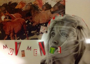
Movement is achieved by manipulating the elements to imply motion, to move the viewer’s eye in a decided direction as he or she looks at an image. Movement may be implied through recognizable images in action and may also be implied through abstract, non-representational marks such as diagonal lines, broker edges and gradation of tones.
Pattern
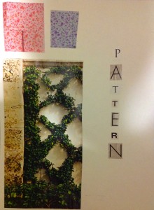
Pattern involves the repetition of similar motifs on a surface, which creates rhythm. Pattern can be used to organize or unify an object and/or to create visual enrichment. Pattern can be created in an organized way or be created in random fashion.
Source:
Decosson, Alexander. (2015). Feb. 2 Arts Method Course. EDCP 301, University of British Columbia.
What if we tell you we have made it easy for you by picking out the Best Sexologist in delhi