The following video summarizes the design process used in the video.
https://youtu.be/Rof0U_VqJOs
We also created a mockup of how we imagine a more polished version of the interface could look:
Developing a better platform for educational video
The following video summarizes the design process used in the video.
https://youtu.be/Rof0U_VqJOs
We also created a mockup of how we imagine a more polished version of the interface could look:
After completing Milestones I to IV, we reflected on our design process and had several points to consider:
We were unable to find a statistically significant difference in overall task completion time or comment/annotation search time between System Blue (our developed system) and System Red (YouTube). However, 6 out of 8 participants agreed that it was easier to complete tasks on System Blue than on System Red, and that they would be more likely to use System Blue over System Red for watching educational video. 6 out of 8 participants also indicated that they liked the feature of having the video divided into smaller segments for navigation. Although no statistically significant timing differences were found, a majority of participants preferred System Blue’s annotation and video segmentation system.
From the results of our experiment, we can recommend that the overall approach of our system was valid. However, there are various recommendations that can be made to further improve both the design of our system and experiment. Firstly, we could modify segments by integrating them into the video playback bar by adding markers, instead of only having hyperlinks under the video. This would make our segment design more visually salient and possibly affect the way that users interact with it. Secondly, we could focus more on learning about the types of interactions users would have with annotations to enlighten our interface design. It could also be useful to determine which types of annotations people post, as well as what they find useful for their video completion goals. Thirdly, since our experiment only examined one type of video (tutorials) it could be useful to include a wider range of video types, such as informational videos. Lastly, we would recommend that the experiment be conducted again, with some minor changes. The videos being used in the experiment should be changed. The current videos proved to be too challenging for some users and resulted in many users not completing the prescribed tasks in time.
We added a script so that our studies could be conducted in a consistent manner.
Minor changes were made to the consent form to fit the context of our study, such as adjusting the time the experiment should take and what the participant should expect to do.
We made separate questionnaires for each one of our interfaces and also a post study one. Questions were also reworded for clarity.
We compiled a list of all the comments on both videos for the participants to use during the search for the comments.
For our study, we compared two interfaces, System Red (Youtube) and System Blue (our interface), to observe how users completed tutorial videos and searched for comments or annotations in each setting. We recruited 8 participants for our study and had each person complete a tutorial video on both interfaces, as well as follow-up questionnaire questions. We wanted to determine which interface helped users finish an entire task, and find comments or annotations faster.
After running our study we found that over half of the participants failed to complete at least one of two tutorials. Our results can’t support that finding annotations is faster on System Blue compared to System Red, but there is a trend in the data to System Blue being faster. Despite this, our qualitative data results showed that the majority of participants prefer to System Blue to watch educational videos (6/8 participants).
As a result of our pilot test, we noted following issues that needed to be changed in our experiment protocol:
The following video details our medium fidelity prototype. For more details regarding the rationale of the design, see Update 5a.
https://www.youtube.com/watch?v=AV7z517uYQg
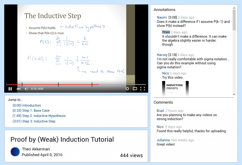
Our prototype was built using HTML and Javascript. Originally, our group decided to use Axure as our main prototyping tool, but changed our decision when we realized there would be too many limitations using Axure alone, especially regarding video function. When interacting with the prototype, users can add and scroll through both comments and timestamped annotations, watch an embedded video with standard YouTube player controls and select hyperlinked video segments to traverse different portions of the tutorial.
We learned from our field study that these functions were often used by participants while watching an educational video. Therefore, they would be important to include to thoroughly test Task 1 (completing an entire task in a video). The prototype also contains all the functionality we plan to test for Tasks 2 and 3 (finding specific annotations).
There are both vertical and horizontal aspects of our design. Comments and timestamped annotations can be made with the prototype. However, if a user were to add a timestamped annotation, it does not actually give the current playing time of the video, making this functionality horizontal. We decided that this is acceptable for our design, since testing users on their ability to add comments and annotations is no longer being tested as one of the tasks in our experiment (although we initially planned to test the process of adding comments/annotations, we decided to no longer pursue this due to time constraints and experiment complexity). Furthermore, video segments have been decided in advance by our team. They are not generated based on users access patterns of the video and videos queues (i.e. screen transitions, long pauses), as they would be ideally in a fully-functioning design. We decided that it was also important for video annotations to update automatically when a new segment is reached. We wanted users to see that annotations are specific to each segment and observe if their interaction with these segments affected their ability to complete the tasks in the experiment.
It was also important that our prototype had a somewhat professional appearance. Since users will be tested using both our interface and YouTube, we did not want them to feel that our design was less serious or professional, and judge it based on this fact alone.
This is the questionnaire that will be given to participants after they have completed all tasks in the experiment on both interfaces:
The following is the consent form the participants will be asked to review and sign before participating in the study:
Participants:
We are planning to have have our participants composed of the general population. The inclusion criteria are as follows:
We plan to recruit participants using word of mouth (convenience sampling) and a call for participants at UBC. We expect to recruit and perform the experiment on 8 participants due to our 4 combination counterbalancing.
Conditions:
In this experiment, we will compare a user’s performance on our prototype versus the user’s performance using YouTube. We will examine how quickly users can perform tasks on both interfaces. This includes how quickly users can find annotations (a timestamped user remark) as well as complete an entire task described in a video tutorial. In addition, we will be looking at a user’s willingness to use each system and their preference.
Tasks:
On each video and interface, participants will be asked to perform the following tasks in the given order:
Design:
To test the speed of finding annotations, we will use a 2×2 (annotation visibility x interface type) within-subjects factorial design. We will have 2 levels of annotation visibility: high and low. We will also have 2 levels of interface type: YouTube (System Red to participants) and our interface (System Blue). Regarding annotation visibility, high means that the placement of the annotation is in an immediately visible position in the list of annotations without scrolling on our system. A low visibility means that the annotation may only be found after scrolling through the list of annotations on our system. To test the time taken to complete an entire task described in a video, we will use a t-test to compare both interface types.
We will use a counterbalancing method to eliminate order effects. Participants will interact with both interfaces with two different videos. For example, a user might be assigned to the first video on our system followed by the second video on YouTube. There are four possible possible combinations displayed in the table below:
Table 1: Counterbalancing method for our experiment
| Combination | First Scenario | Second Scenario |
| 1 | YouTube, Video 1 | Our System, Video 2 |
| 2 | YouTube, Video 2 | Our System, Video 1 |
| 3 | Our System, Video 1 | YouTube, Video 2 |
| 4 | Our System, Video 2 | YouTube, Video 1 |
We plan to counterbalance this way because a user cannot watch the same video twice, due to learning effects. After completing a tutorial, a user would become familiar with the steps and anticipate what should be done next, biasing our results. Thus, we are using two different videos regarding knot tying, choosing the videos based on:
The videos chosen are as follows:
(Video 1) How to Tie the Celtic Tree of Life Knot by TIAT: https://www.youtube.com/watch?v=scU4wbNrDHg
(Video 2) How to Tie a Big Celtic Heart Knot by TIAT: https://www.youtube.com/watch?v=tfPTJdCKzVw
For the Youtube interface, the participant will be directed to the corresponding video hosted on Youtube. For our developed interface, the participant will interact with the interface on a local machine. The comments (non-timestamped remark) and annotations for our developed system will be imported from the Youtube video hosting the same video. These will be randomly assigned in our system to be either a comment or an annotation, with a 50% chance of each. We decided on 50% since there is no precedent for a system like this to provide more accurate data on how comments and annotations should be distributed. Similarly, we assume that annotations’ timestamps are uniformly distributed across time. To make a fair comparison between both interfaces, all comments will be sorted based on most recent to least recent. For our developed interface, the video will be segmented manually beforehand based on places where the video either visually or audially pauses for more than one second or where the video transitions in some way (e.g. a screen transition).
Procedure:
Apparatus:
Hypotheses:
Speed:
H1. Finding a specified annotation is faster using our system compared to Youtube for high visibility annotations.
H2. Finding a specified annotation is no slower using our system compared to Youtube for low visibility annotations.
H3. Completing an entire task prescribed in a video is no slower on our system compared to Youtube.
User Preference:
H4. Users will prefer our system’s comment and annotation system over Youtube’s.
H5. Users will not have a preference towards either system overall.
Priority of Hypotheses:
Planned Analysis:
For our statistical analysis, we will be using a 2 factor ANOVA (2 interface types x 2 annotation visibilities) for the time it takes for the participant to find specific annotations in our system compared to Youtube’s interface. A two-tailed paired t-test will also be used to compare the completion time of an entire task between the two interfaces. In order to measure the user’s preference of interface type, descriptive statistics of Likert scale data will be collected from each participant’s questionnaire.
Expected Limitations:
There are various issues that we expect to be limitations in our experiment, including: