Design Alternative 1:
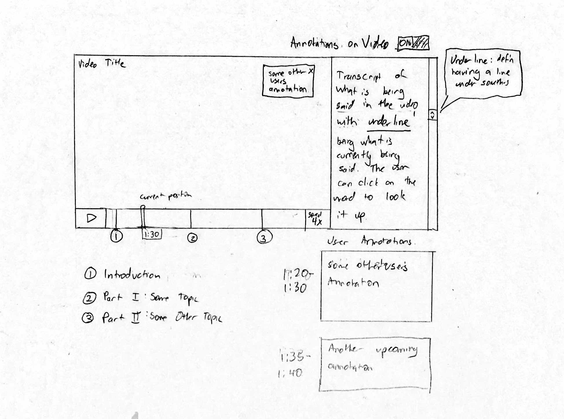 This design was made with task example 3 in mind, specifically reviewing educational content from an expert perspective. The user is presented a video with the ability to move their position and pace at will. Individual subsections are also labelled below and indicated on the playback bar for quick navigation. The user is presented with annotations supplied by other users in the bottom right, which change dynamically based on their position in the video. The user has the option of presenting these in the video as well. In addition to this, a transcript is presented to the right where the user can look up any terms that they are not familiar with. This design was meant for academic purposes- content related specifically for this reason are more likely to be uploaded with transcripts and with more preparation. However, with more casual content, transcripts may not be a focus of the uploader and may be omitted. Additionally, one weakness of this design is the potential for annotations on the video, while potentially helpful, may be too intrusive.
Design Alternative 2:
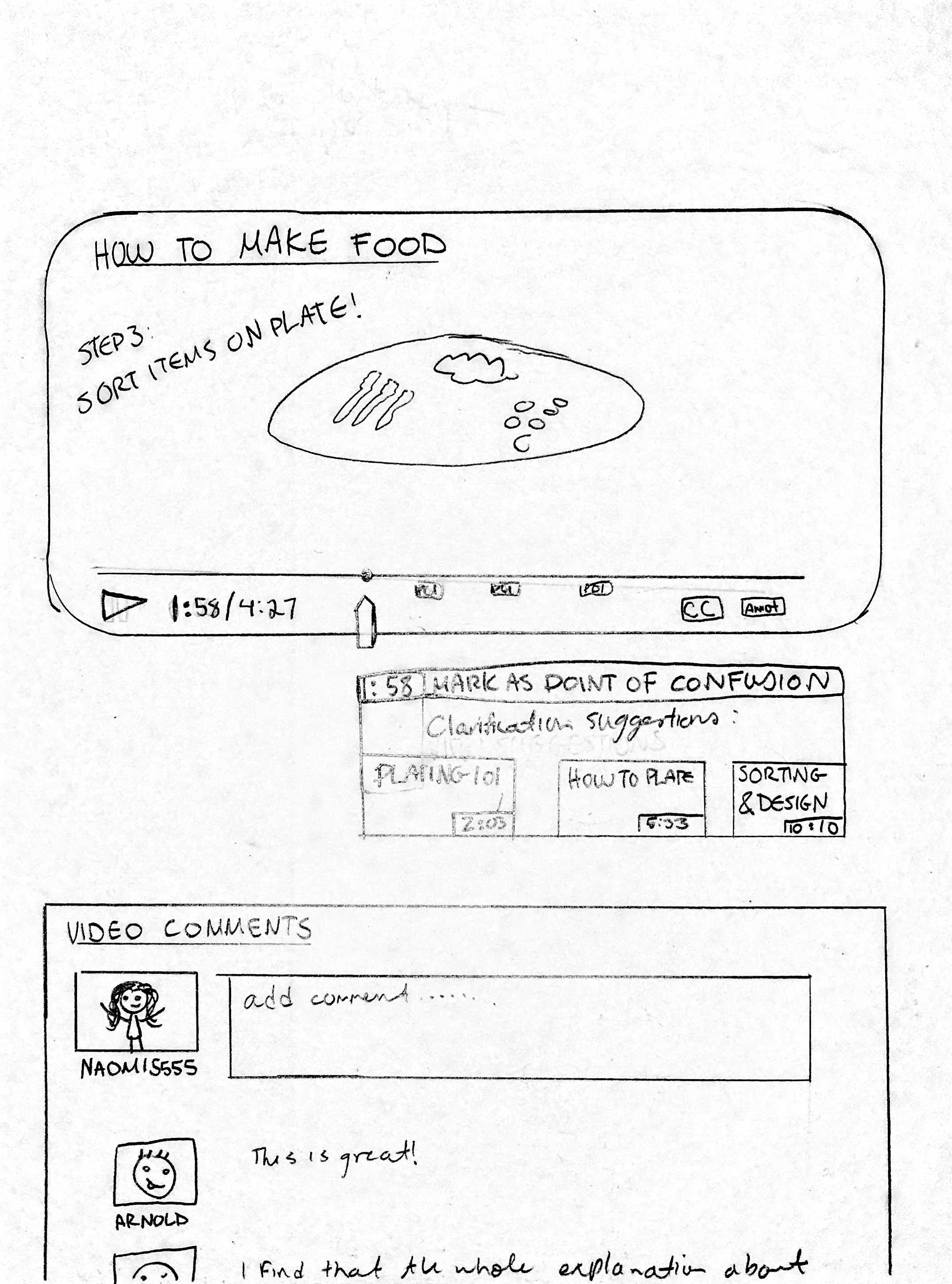
This design was tailored for task example 1. Since Naomi ultimately ends up making her “best guess” when confused about a step in a tutorial, we thought it would be important to include a possible solution for this. In the diagram, she has paused the video she is watching at 1:58. Here, she can mark it as a point of confusion, so that other users can see that someone needs a detailed explanation. However, since this part of the video has been previously marked as a point of confusion, Naiomi can see video suggestions that may explain better ways to approach her current step in the video. Besides this feature, there are other functions included that are discussed in blog update 2c as important requirements for design: rewind/forward function, pause/play feature, ability to add and view captions/visual cues on the bottom right side of the screen.
Cons of this approach are that, it does not completely cover the third task example, a teacher that wants to add content to an already existing video. It also does not take into account any of the “should include” or “could include” design requirements. There is still room for this design approach to be improved.
Design Alternative 3:
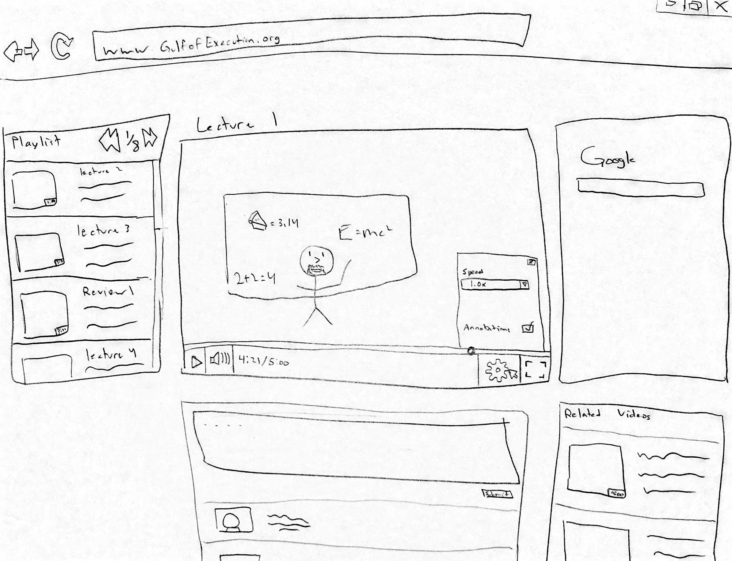
This design is tailored for the infrequent users of our system. It is designed so that it is very intuitive so that new users to our system will have a minimal learning curve and be able to easily navigate through our site. The system includes all the basic video features as well as an integrated search system and easy navigation for videos in the same playlist. Also, there are sections for users to comment and discuss the video, as well as a section for related videos if the user wants to watch another video on the same topic to supplement the current video.
Design Alternative 4:
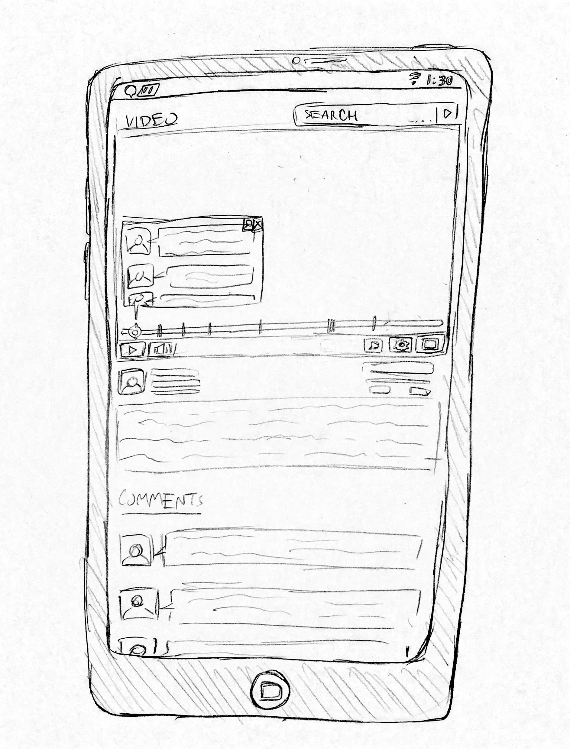
This design is for users who have experience and familiarity using video applications on mobile devices. The design contains the basic features of most video applications ie. pause, full screen, play and volume button. Since we found that users would use Google as a search function, this design has implemented a search bar at the top allowing for users to conveniently search up problems that may arise when watching the video. There are also tabs within the play bar of the video. These tabs indicate specific sections of the videos where other users have misunderstandings in the video. When the video crosses one of these tabs, a notification box pops up, revealing a list of comments by other users who had trouble with the video. A problem with this design is that the notification box blocks off part of the video, obstructing the view of the user. This can be improved upon by having the notification box be moved elsewhere on the interface.