The following video summarizes the design process used in the video.
https://youtu.be/Rof0U_VqJOs
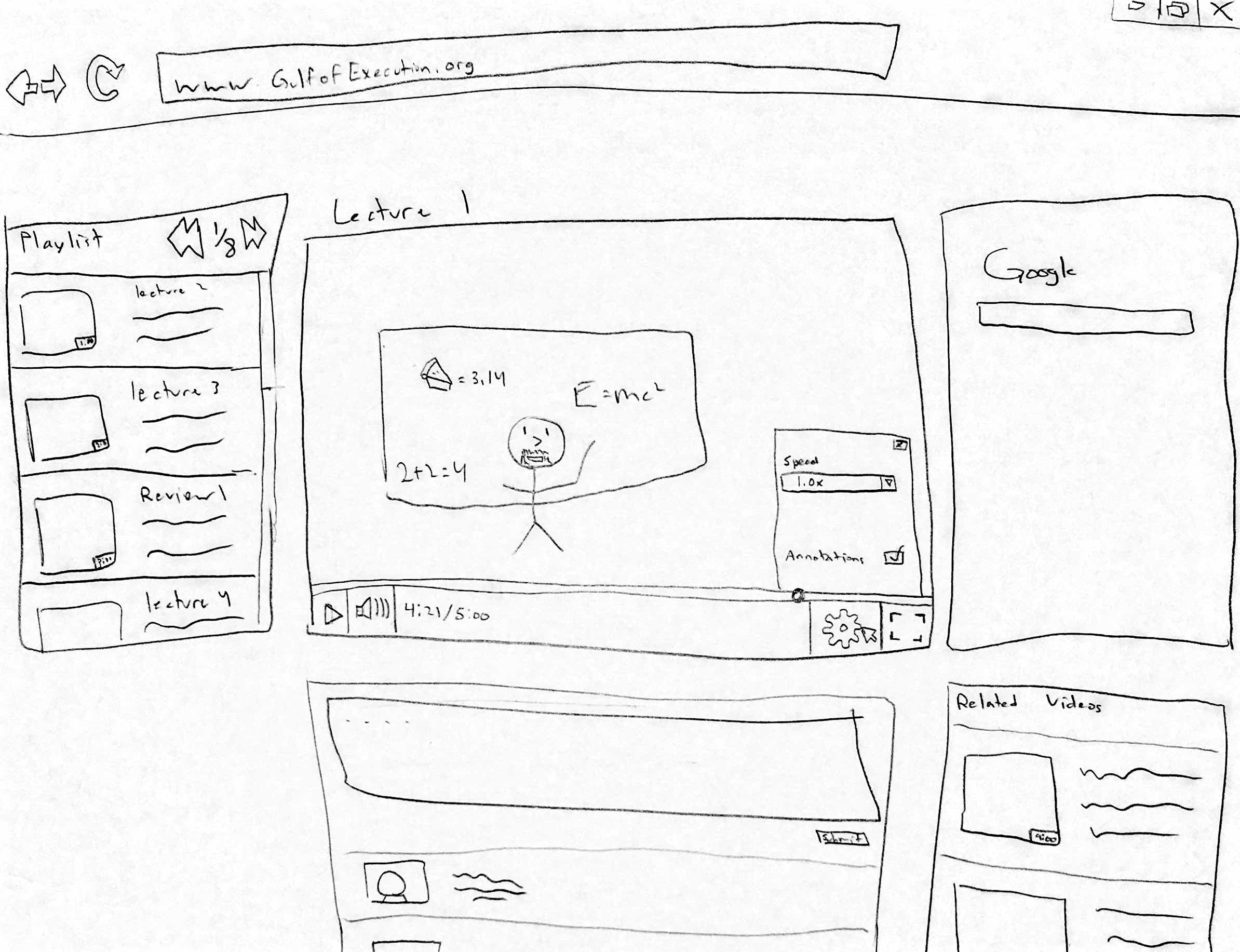
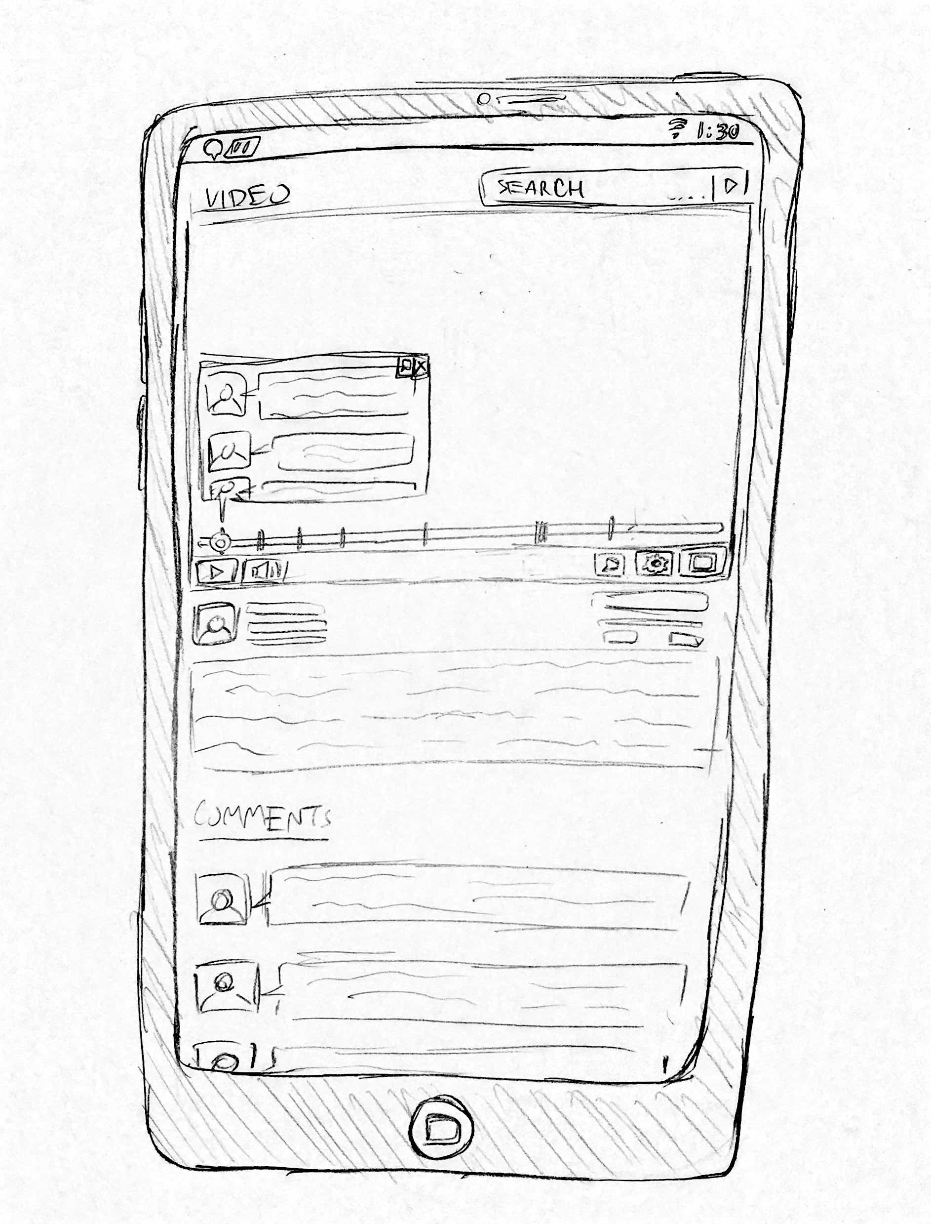
We also created a mockup of how we imagine a more polished version of the interface could look:
The Collaborative Video Project
Developing a better platform for educational video
The following video summarizes the design process used in the video.
https://youtu.be/Rof0U_VqJOs
We also created a mockup of how we imagine a more polished version of the interface could look:
We were unable to find a statistically significant difference in overall task completion time or comment/annotation search time between System Blue (our developed system) and System Red (YouTube). However, 6 out of 8 participants agreed that it was easier to complete tasks on System Blue than on System Red, and that they would be more likely to use System Blue over System Red for watching educational video. 6 out of 8 participants also indicated that they liked the feature of having the video divided into smaller segments for navigation. Although no statistically significant timing differences were found, a majority of participants preferred System Blue’s annotation and video segmentation system.
From the results of our experiment, we can recommend that the overall approach of our system was valid. However, there are various recommendations that can be made to further improve both the design of our system and experiment. Firstly, we could modify segments by integrating them into the video playback bar by adding markers, instead of only having hyperlinks under the video. This would make our segment design more visually salient and possibly affect the way that users interact with it. Secondly, we could focus more on learning about the types of interactions users would have with annotations to enlighten our interface design. It could also be useful to determine which types of annotations people post, as well as what they find useful for their video completion goals. Thirdly, since our experiment only examined one type of video (tutorials) it could be useful to include a wider range of video types, such as informational videos. Lastly, we would recommend that the experiment be conducted again, with some minor changes. The videos being used in the experiment should be changed. The current videos proved to be too challenging for some users and resulted in many users not completing the prescribed tasks in time.
As a result of our pilot test, we noted following issues that needed to be changed in our experiment protocol:
The purpose of our paper prototype and cognitive walkthrough was to develop a high-level understanding of the interactions between important individual functions derived from our field study. After determining these functions from our field study, we wanted to explore how users would interact with these functions and how these functions would interact with each other when integrated into a single design. An illustration of the prototype can be seen in Update 3a.
We have chosen to support all of our task examples, which can be found in our previous blog post, Update 2b. Our task examples were supported in the design by allowing users to add annotations at specific parts of a video, or to leave a general comment. For task example 1, a user might add a link to a video aid in their annotation, to help other users clarify a specific idea in a tutorial. For task examples 2 and 3, a user can personally make an annotation for a certain timestamp on the video to note errors or suggest alternatives, applicable to both tutorial or informational videos.
There were several key design decisions we made that influenced the design of our paper prototype. Firstly, we wanted to use a familiar video website interface to create a positive transfer effect, to make the interface intuitive for new users. For this, we used the YouTube interface as a basis due to its popularity. Another important design decision was to make the interface simple, without overwhelming the user with too much information at once. Related to this, we wanted to make the interface consistent across different contexts, whether it be a more casual tutorial context as in task example 1, or a more formal educational context as in task example 3. Consequently, we did not include video transcripts in the design, because it was not completely necessary for a casual educational video. Instead, we focused on the commonality across these different contexts for this prototype. Additionally, we incorporated the concept of segmenting the video into sections automatically based on user behaviour (e.g. where they stop, where they rewind) and video content (e.g. transition points, audio pauses) which would help with the process of following along with a video. Since this is a low-fidelity prototype, deciding how to do this was not in the scope of our design, but will be an important consideration in the future.
The following video illustrates how the low-fidelity paper prototype we developed was developed. For more details regarding the design of the paper prototype, see Update 3b.
https://youtu.be/0s-CAOaPMt8
Design Alternative 1:
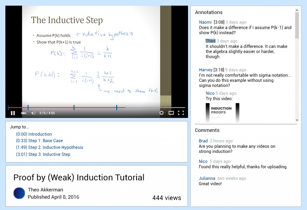
 This design was made with task example 3 in mind, specifically reviewing educational content from an expert perspective. The user is presented a video with the ability to move their position and pace at will. Individual subsections are also labelled below and indicated on the playback bar for quick navigation. The user is presented with annotations supplied by other users in the bottom right, which change dynamically based on their position in the video. The user has the option of presenting these in the video as well. In addition to this, a transcript is presented to the right where the user can look up any terms that they are not familiar with. This design was meant for academic purposes- content related specifically for this reason are more likely to be uploaded with transcripts and with more preparation. However, with more casual content, transcripts may not be a focus of the uploader and may be omitted. Additionally, one weakness of this design is the potential for annotations on the video, while potentially helpful, may be too intrusive.
Design Alternative 2:
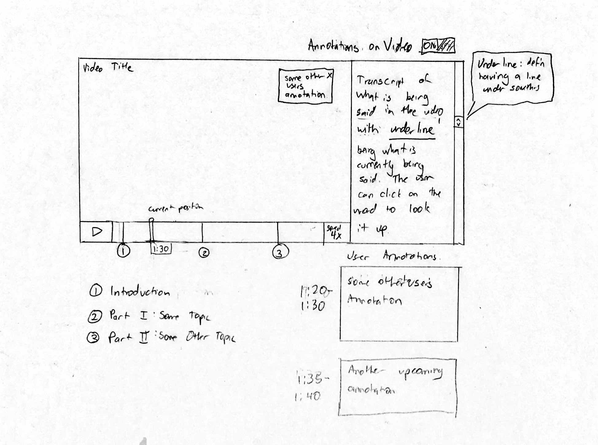
This design was tailored for task example 1. Since Naomi ultimately ends up making her “best guess” when confused about a step in a tutorial, we thought it would be important to include a possible solution for this. In the diagram, she has paused the video she is watching at 1:58. Here, she can mark it as a point of confusion, so that other users can see that someone needs a detailed explanation. However, since this part of the video has been previously marked as a point of confusion, Naiomi can see video suggestions that may explain better ways to approach her current step in the video. Besides this feature, there are other functions included that are discussed in blog update 2c as important requirements for design: rewind/forward function, pause/play feature, ability to add and view captions/visual cues on the bottom right side of the screen.
Cons of this approach are that, it does not completely cover the third task example, a teacher that wants to add content to an already existing video. It also does not take into account any of the “should include” or “could include” design requirements. There is still room for this design approach to be improved.
Design Alternative 3:
This design is tailored for the infrequent users of our system. It is designed so that it is very intuitive so that new users to our system will have a minimal learning curve and be able to easily navigate through our site. The system includes all the basic video features as well as an integrated search system and easy navigation for videos in the same playlist. Also, there are sections for users to comment and discuss the video, as well as a section for related videos if the user wants to watch another video on the same topic to supplement the current video.
Design Alternative 4:
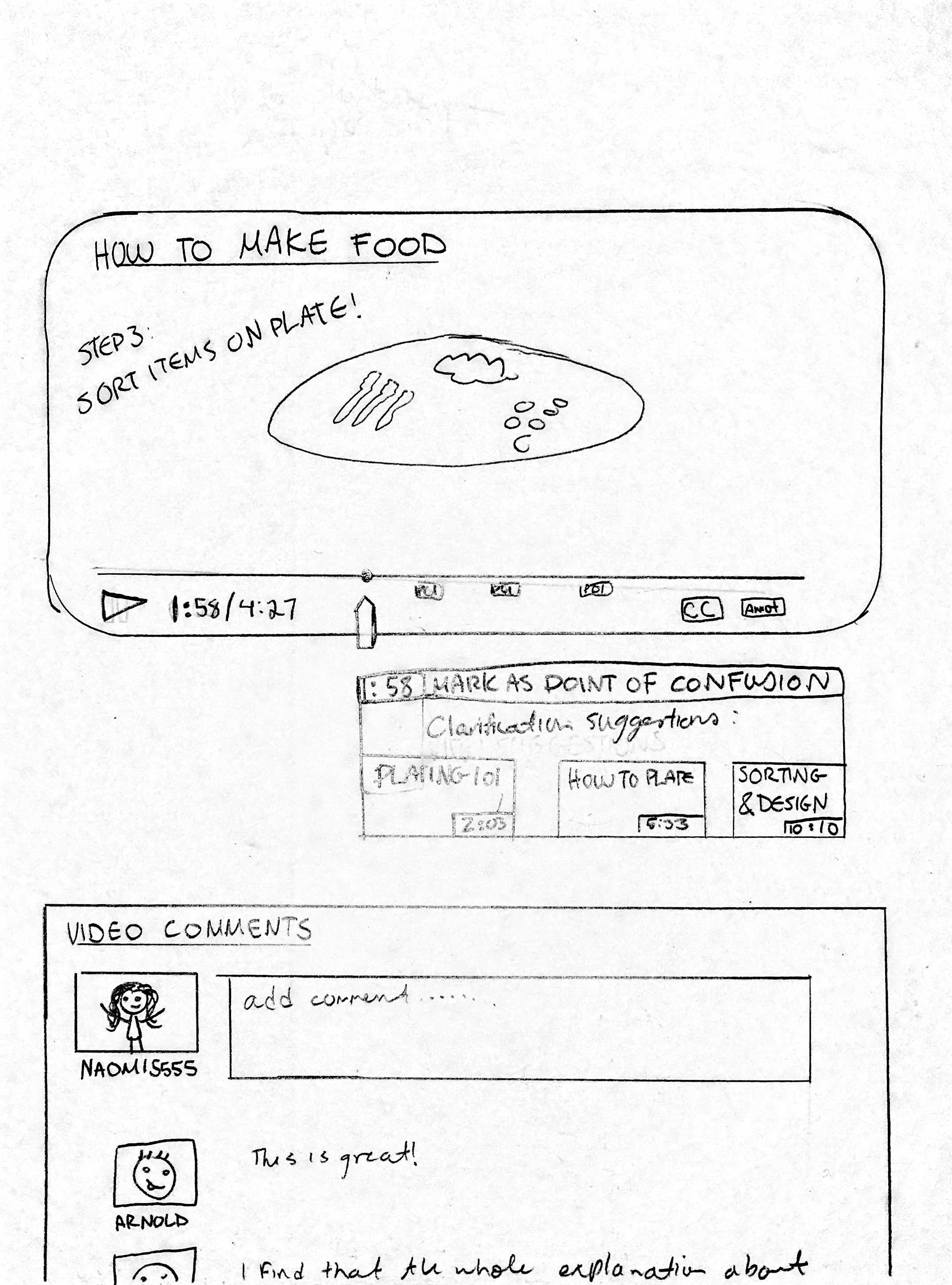
This design is for users who have experience and familiarity using video applications on mobile devices. The design contains the basic features of most video applications ie. pause, full screen, play and volume button. Since we found that users would use Google as a search function, this design has implemented a search bar at the top allowing for users to conveniently search up problems that may arise when watching the video. There are also tabs within the play bar of the video. These tabs indicate specific sections of the videos where other users have misunderstandings in the video. When the video crosses one of these tabs, a notification box pops up, revealing a list of comments by other users who had trouble with the video. A problem with this design is that the notification box blocks off part of the video, obstructing the view of the user. This can be improved upon by having the notification box be moved elsewhere on the interface.
Requirements
Absolutely must include:
-rewind/forward function
-pause feature
– ability to add and view captions/visual cues
These are functions that every participant in our study used to complete their task and are minimum requirements to be able to watch an educational video. In addition, we included the requirement of being able to add and view annotations due to its central role in our project topic.
Should include:
-have some sort of integrated external search feature into the platform
-function to speed up/slow down video speed
-ability to navigate to videos on related topics
These requirements were prevalent across all subjects that participated in our field study. Almost every participant interacted with all of these functions, either using them repeatedly during the observation or noting them as useful.
Could include:
-videos change depending on user’s level of knowledge
-videos are engaging for users to help users maintain focus
-navigation outside of the video should be intuitive
These requirements were only mentioned to be important by one or two participants. Therefore, we decided that these requirements should be useful to have in our system, but would not make our design dramatically weaker if excluded.
Could exclude:
-follow-along type of videos (eg. tutorials) have pauses between steps to allow users to keep up easily
Although these requirements are useful, they could be excluded from the system because they only apply to specific types of videos, rather than the majority of them. We are also unsure if the majority of users will find this function useful.
Users
Absolutely must include:
-infrequent users with minimal knowledge of our platform
-people who are looking for help on general topics (e.g. cooking)
We want to test people who are generally looking for tutorial videos since these demographics reflect our task examples and target users.
Should include:
-users seeking videos on very specific, not well known topics
These users could be helpful for our study, but the data we collect from them may not be as vital since they are seeking uncommon video topics.
Could include:
-students seeking educational videos
Students are an important participant choice because they are a large and easily accessible for our study, and frequent users of educational videos.
Could exclude:
-users who have trouble using technology
These users could be excluded from our study because their limited knowledge and interaction with technology would make it artificially difficult for them to use our system.
From the results of our field study, we determined that our task examples adequately reflected tasks that users presently perform. Thus, we did not change our task examples after the study. They are given below:
TE1: Naomi is an avid social media user. While on these sites, she frequently notices videos of how to make different types of food that catch her interest, and tries to make them once in awhile. Sometimes she takes notes on the steps involved, pausing and replaying the video frequently. She also sometimes has questions about one of the steps, but feels that there is no good way of getting those questions answered on the video. Instead, she will try to look for a similar recipe to resolve her confusion. Sometimes, if she has a mobile device, she will follow along with the video while she is cooking and she will pause and replay parts of the video while she is making the food. If she is confused about a step while following along, she usually ends up making her best guess.
TE2: Moritz frequents video sharing websites and often uses them to look up tutorial videos. He tries to follow these videos in real time, but finds himself pausing and backtracking while going through the video. Sometimes, when following these videos, he notices that some part of the tutorial does not work for him, but finds an alternative way to progress with the tutorial. He would like to share his method in the hope of potentially helping somebody with the same problem, but does not want to go through the effort of creating a new video. Currently, when this happens, he leaves a text comment on the video describing his method and suggestions. Sometimes the original uploader notices his comment and makes changes to the video.
TE3: Tom is a math teacher. Every now and then, he likes to suggest videos to his class that he finds online to show them an explanation of a problem and supplement their learning. He looks through several videos first, frequently on popular educational sites, and chooses one that he feels will best explain the concept. Sometimes, he will like most of the video, but will have some ideas to add. He usually ends up accepting the video’s content as is, but sometime sends the video with some his own extra notes to the students if he finds it necessary. Occasionally, he will also find some videos where he does not agree with the content, or finds an error. In this case, he will move on and choose not to share the video. When he has selected a video, he will send the video to his students.
Given our conclusions from the field study, we have brainstormed some recommendations for the next steps of our project. For our paper prototype design, it will be important to incorporate elements that users found useful. These include functions such as: rewinding, skipping, pausing, video captions, speed adjustments and visual annotations, which were all functioned noted by our study participants to be useful.
A current idea for our cognitive walkthrough is to add heuristics that account for different base levels of a user’s knowledge as well as the type of video being followed. This is because we noted different styles of interaction based on the type of video being watched. Specifically, informational videos were watched more linearly while tutorial videos had users follow along step-by-step and were watched in a non predictable order.
Our evaluation will address a user’s level of focus while interacting with a video and determine which level of video chunking is useful for allowing a user to remain engaged. This was because study participants often became disengaged when videos contained too much information or pieces of information that they felt were unrelated to their learning goals. Besides this, the foci described for our cognitive walkthrough will also be relevant to our evaluation.
The original scope of the project was to better support the process of both creating and modifying annotated educational or tutorial videos. However, based on feedback from the course staff, we ultimately decided that the initial scope was too broad for the time that we have for the project. Therefore, we have decided to narrow down the scope to focus on the modification of these videos, specifically the process of annotating these videos by multiple users. Also, due to the potential constraints surrounding recruitment of video creators, we have decided to shift our study focus more towards the consumers of these educational videos, instead of having the focus on the creators of the videos.