The following video summarizes the design process used in the video.
https://youtu.be/Rof0U_VqJOs
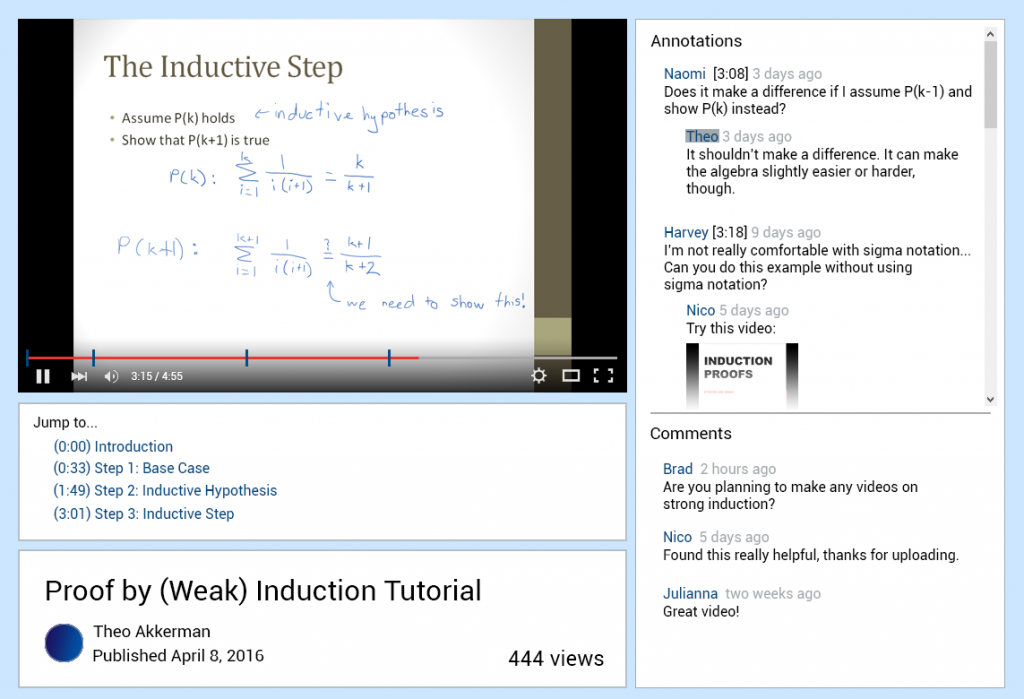
We also created a mockup of how we imagine a more polished version of the interface could look:
The Collaborative Video Project
Developing a better platform for educational video
The following video summarizes the design process used in the video.
https://youtu.be/Rof0U_VqJOs
We also created a mockup of how we imagine a more polished version of the interface could look:
After completing Milestones I to IV, we reflected on our design process and had several points to consider:
We were unable to find a statistically significant difference in overall task completion time or comment/annotation search time between System Blue (our developed system) and System Red (YouTube). However, 6 out of 8 participants agreed that it was easier to complete tasks on System Blue than on System Red, and that they would be more likely to use System Blue over System Red for watching educational video. 6 out of 8 participants also indicated that they liked the feature of having the video divided into smaller segments for navigation. Although no statistically significant timing differences were found, a majority of participants preferred System Blue’s annotation and video segmentation system.
From the results of our experiment, we can recommend that the overall approach of our system was valid. However, there are various recommendations that can be made to further improve both the design of our system and experiment. Firstly, we could modify segments by integrating them into the video playback bar by adding markers, instead of only having hyperlinks under the video. This would make our segment design more visually salient and possibly affect the way that users interact with it. Secondly, we could focus more on learning about the types of interactions users would have with annotations to enlighten our interface design. It could also be useful to determine which types of annotations people post, as well as what they find useful for their video completion goals. Thirdly, since our experiment only examined one type of video (tutorials) it could be useful to include a wider range of video types, such as informational videos. Lastly, we would recommend that the experiment be conducted again, with some minor changes. The videos being used in the experiment should be changed. The current videos proved to be too challenging for some users and resulted in many users not completing the prescribed tasks in time.
We added a script so that our studies could be conducted in a consistent manner.
Minor changes were made to the consent form to fit the context of our study, such as adjusting the time the experiment should take and what the participant should expect to do.
We made separate questionnaires for each one of our interfaces and also a post study one. Questions were also reworded for clarity.
We compiled a list of all the comments on both videos for the participants to use during the search for the comments.
For our study, we compared two interfaces, System Red (Youtube) and System Blue (our interface), to observe how users completed tutorial videos and searched for comments or annotations in each setting. We recruited 8 participants for our study and had each person complete a tutorial video on both interfaces, as well as follow-up questionnaire questions. We wanted to determine which interface helped users finish an entire task, and find comments or annotations faster.
After running our study we found that over half of the participants failed to complete at least one of two tutorials. Our results can’t support that finding annotations is faster on System Blue compared to System Red, but there is a trend in the data to System Blue being faster. Despite this, our qualitative data results showed that the majority of participants prefer to System Blue to watch educational videos (6/8 participants).
As a result of our pilot test, we noted following issues that needed to be changed in our experiment protocol: