Requirements
Absolutely must include:
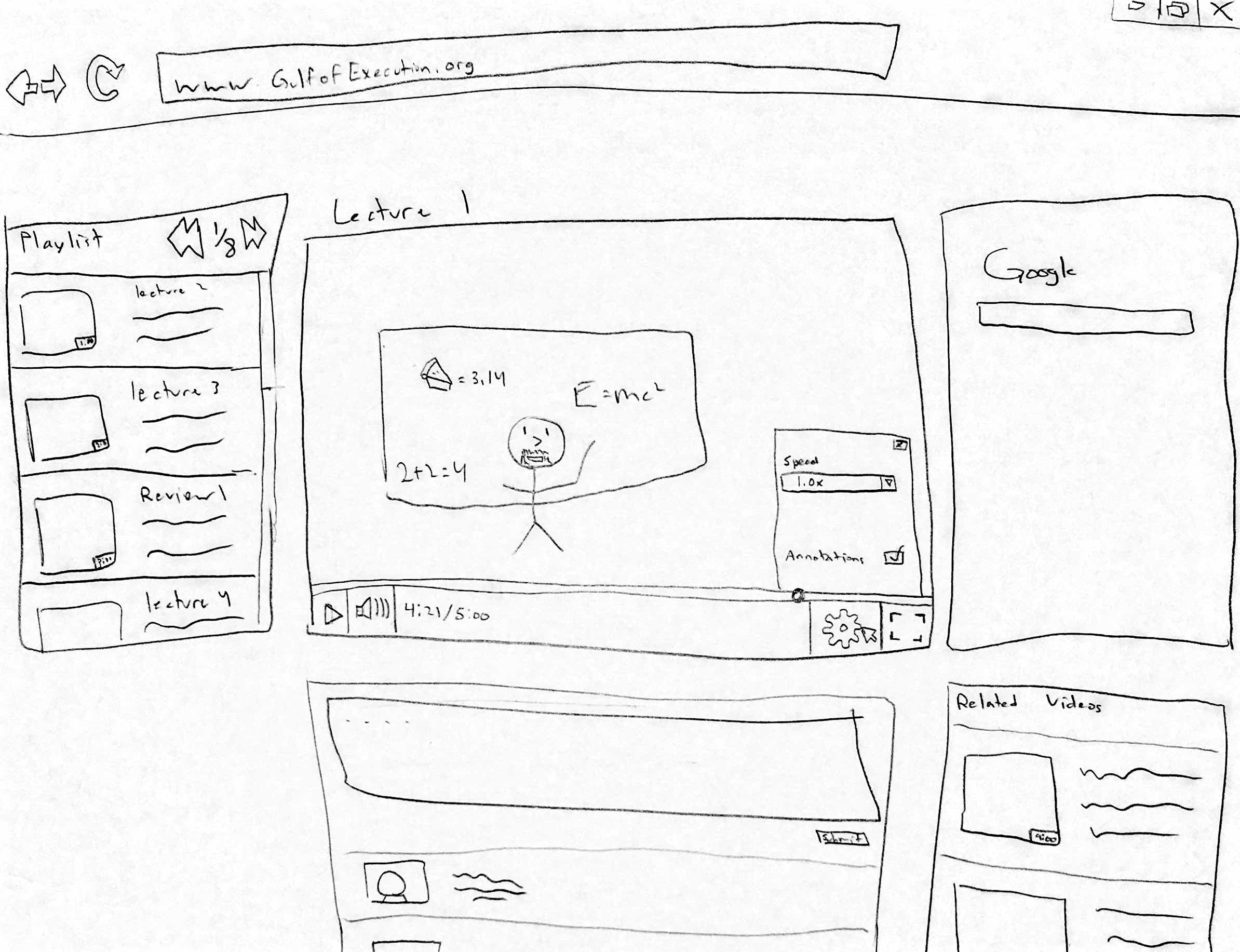
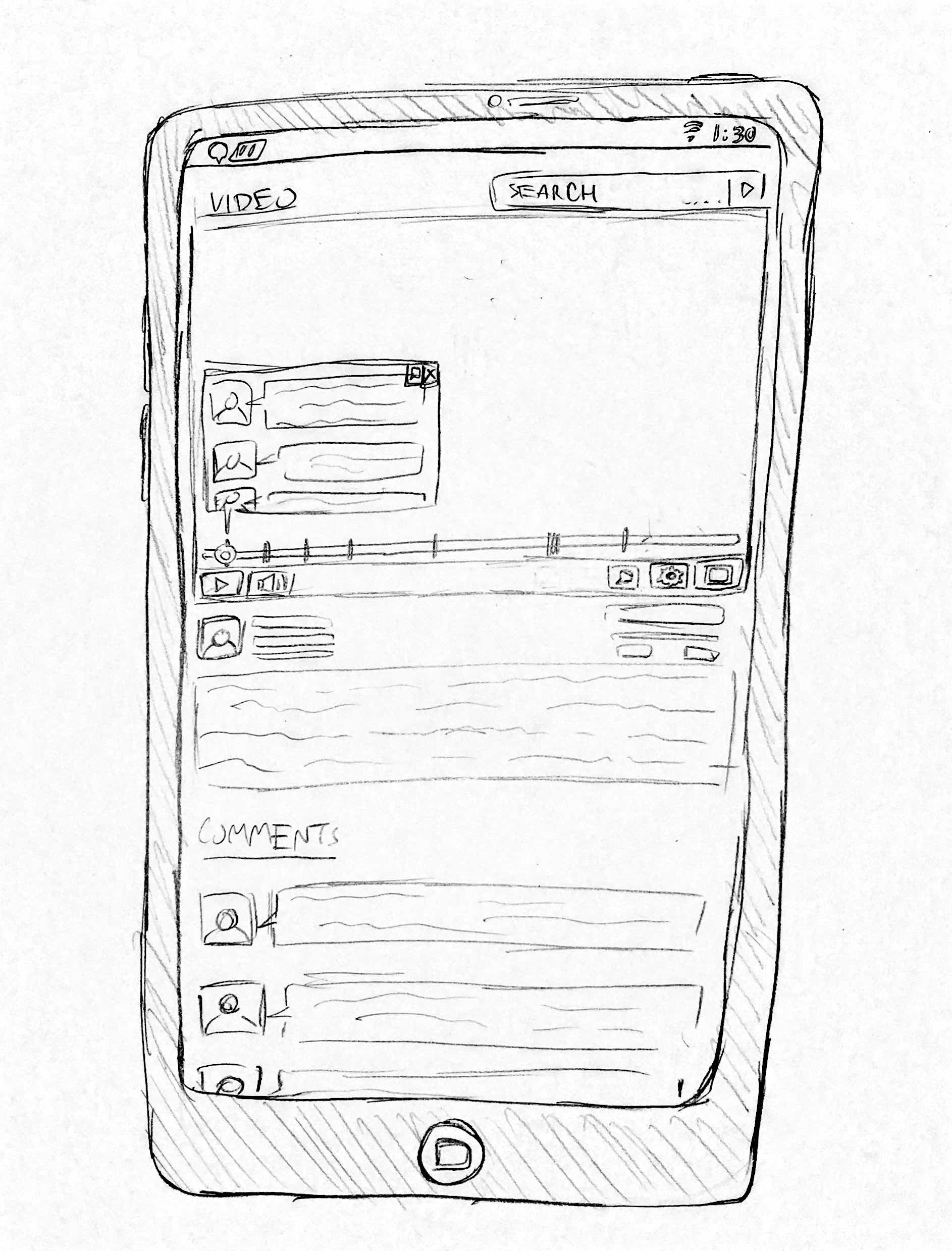
-rewind/forward function
-pause feature
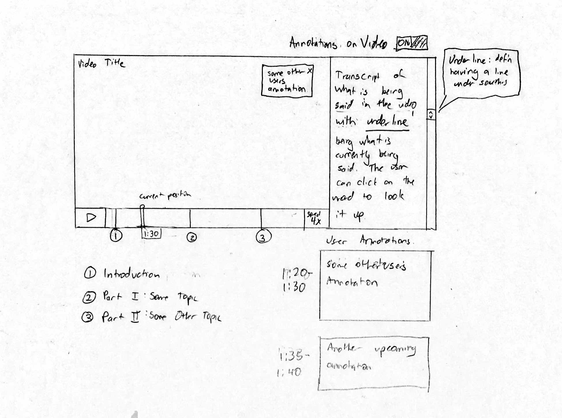
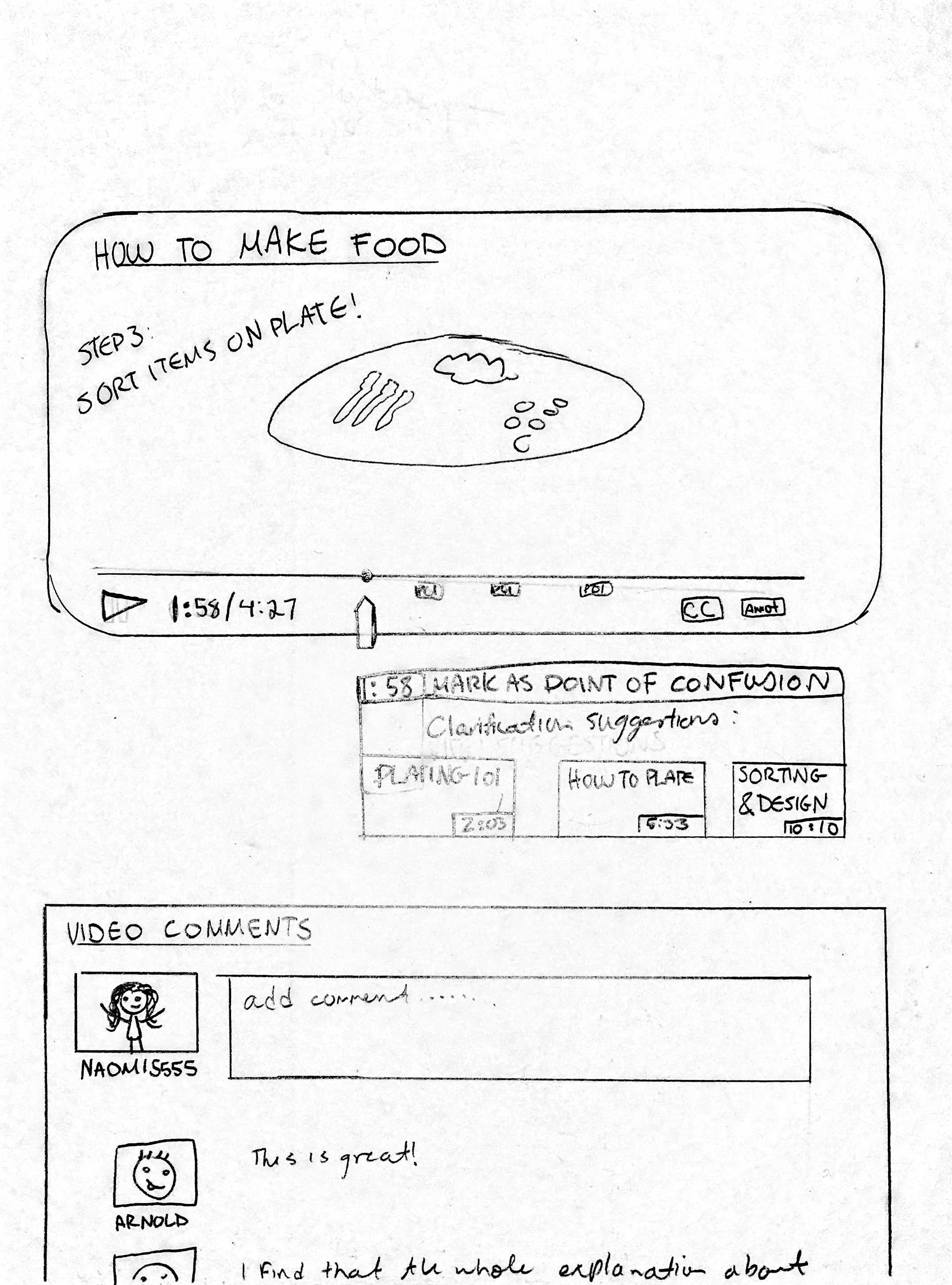
– ability to add and view captions/visual cues
These are functions that every participant in our study used to complete their task and are minimum requirements to be able to watch an educational video. In addition, we included the requirement of being able to add and view annotations due to its central role in our project topic.
Should include:
-have some sort of integrated external search feature into the platform
-function to speed up/slow down video speed
-ability to navigate to videos on related topics
These requirements were prevalent across all subjects that participated in our field study. Almost every participant interacted with all of these functions, either using them repeatedly during the observation or noting them as useful.
Could include:
-videos change depending on user’s level of knowledge
-videos are engaging for users to help users maintain focus
-navigation outside of the video should be intuitive
These requirements were only mentioned to be important by one or two participants. Therefore, we decided that these requirements should be useful to have in our system, but would not make our design dramatically weaker if excluded.
Could exclude:
-follow-along type of videos (eg. tutorials) have pauses between steps to allow users to keep up easily
Although these requirements are useful, they could be excluded from the system because they only apply to specific types of videos, rather than the majority of them. We are also unsure if the majority of users will find this function useful.
Users
Absolutely must include:
-infrequent users with minimal knowledge of our platform
-people who are looking for help on general topics (e.g. cooking)
We want to test people who are generally looking for tutorial videos since these demographics reflect our task examples and target users.
Should include:
-users seeking videos on very specific, not well known topics
These users could be helpful for our study, but the data we collect from them may not be as vital since they are seeking uncommon video topics.
Could include:
-students seeking educational videos
Students are an important participant choice because they are a large and easily accessible for our study, and frequent users of educational videos.
Could exclude:
-users who have trouble using technology
These users could be excluded from our study because their limited knowledge and interaction with technology would make it artificially difficult for them to use our system.