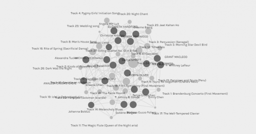
The data set that has been imported into Palladio is represented in the form of data visualization. Data visualization is a helpful tool in data analytics as it can be used to shed light on massive accumulations of data. It makes summarizing data easier and more digestible for a researcher. As Hoppe explains, data analytics “exemplify[s] challenges and potential benefits of using advanced computational methods that combine different methodological approaches”(Hoppe, 2017) to building knowledgeable communities. The use of a web-formatted graph that is able to be stretched and be pulled is marvellous as it provides a researcher with the ability to draw information for the data set in real-time. The benefits of a plug-and-play graph like the one in Palladio also has it’s own drawbacks. With the qualitative data presented, it is challenging to grasp the relevance of the songs my peers had chosen as their Golden Record Task from week eight. Variables such as musical taste, age, understanding of music theory, or even cultural backgrounds may have influenced their choices. Due to a lack of quantitative data, I felt aligned with Lexie Tucker’s goal to narrow the twenty-seven songs down to just ten. My goal was to choose ten songs that represented earth’s vast creativeness rather than a song’s popularity. Tucker’s goal was to “include songs that were representative of our world as a whole and not simply the winners.” (Tucker, 2021). With this in mind and what I felt were similar goals, the ten songs we had selected from the original twenty-seven were far from the same. Tucker and I shared just five choices out of ten.
Morning Star and Devil Bird- Australia
Fairie Round – cond David Munroe
Tchenhoukoumen, percussion Senegal
Fairie Round – cond David Munroe
The odds of us choosing the same five songs is 1/125. Even more staggering, the chances of choosing the same ten songs is 1/225. These odds are not as vast as, let say, if we had to pick the same ten songs in the same order, which would come out to 1/30,613,591,008,000. Regardless of the odds, attempting to draw assumptions without further understanding and qualitative data or discussion is merely futile. Our own personal and life experiences are part of why collecting and observing data can be skewed depending on what form of data is presented and analyzed.
I am leaving this task with gratitude that with the development of the internet, a learning tool such as Palladio has made data analytics accessible for a thought experiment that I can only imagine would have taken months to complete otherwise.
References
Hoppe, H. U. (2017). Computational Methods for the Analysis of Learning and Knowledge Building Communities. In Handbook of Learning Analytics (p. pp. 23-33). Solar, Society For Learning Analytics And Research. https://www.solaresearch.org/publications/hla-17/hla17-chapter2/
Tucker, L. (2021, November 14). Task 10 – Attention Economy. Exploring Text Technologies with Ms Tucker. https://blogs.ubc.ca/etec540withmstucker/2021/10/31/task-8-golden-record/