Final project: Describing communication technologies
Please find my video project below. Feel free to pause the video at any time to review the notes.
Please find my video project below. Feel free to pause the video at any time to review the notes.
Please wait 1-2 minutes for the videos to load. After you have watched them, the rationales behind the two very different distant future scenarios are explained below. Please be advised some images may be found offensive and/or provoking.
Speculative design is described by Dunne and Raby (2013) as “…to use design as a means of speculating how things could be—”(p. 2) This was the basis of this week’s task to create our visions of what a utopian and dystopian vision for the future of education, technology, media and text could be. Dunne and Raby (2013) discuss the purpose of speculative futures is, “the idea of possible futures and using them as tools to better understand the present and to discuss the kind of future people want, and, of course, ones people do not want”(pp. 2-3).
Dunne and Raby (2013) mention that speculative design should involve critical thinking, “Designers start by identifying shortcomings in the thing they are redesigning and offer a better version” (p. 35). This is exactly what I used to help identify the problems in current technology, its use and the potential effects on the future. For example, in the utopian video I draw attention to some of the technologies that currently exist but are being underused which, with further acknowledgment and training in their use can benefit the people who need them such as: assistive technologies, satellite internet in remote communities and affordable devices (tablets, mobiles) for those with lower socioeconomic status. In the dystopian video for example, I point out the importance of including the teaching of soft skills in future curriculums and education as these skills will be needed for future employment opportunities because technology does not possess them. A lot of the ideas of how technology, specifically AI, can help us in the future such as virtual personal assistants, improving diagnoses and overall health through analysing data were borrowed from the Vallor (2018) video, Lessons from the AI Mirror. Vallor (2018) mentions how we can use the AI mirror, “to construct a better world.” This notion was a further inspiration behind both the utopian and dystopian videos created for this task.
Dunne and Raby (2013) explain how critical thought is integrated into the material design and by doing so, “It is an expression or manifestation of our skeptical fascination with technology, a way of unpicking the different hopes, fears, promises, delusions, and nightmares of technological development and change” (p. 35). I hoped to achieve just that with the presentations displaying hopes by giving examples of how companies could use the data collected on people to improve lives by helping design programs to discover our passions, create life plans and connect us more to the people and nature around us as mentioned in the Harris (2017) talk. I also wanted to point out the dark side and fears associated with the other side of the spectrum in the dystopian video which alludes to data collection being used increasingly in social media for mind control, time wasting and manipulating people (especially those with mental illnesses) as described in the Tufekci (2017) video, for example.
“To find inspiration for speculating through design we need to look beyond design to the methodological playgrounds of cinema, literature, science, ethics, politics, and art; to explore,hybridize, borrow, and embrace the many tools available for crafting not only things but also ideas— fictional worlds, cautionary tales, what-if scenarios, thought experiments, counterfactuals, reductio ad absurdum experiments, prefigurative futures, and so on” (Dunne & Raby, 2013, p.3). This was the inspiration for my dystopian video as I had been to an art exhibit by the artist Héctor Hernández Rodríguez in Spain last year that really inspired me as it seemed to convey the fears people may have with technology and the future. I decided to use this as the main visual component of the dystopian video as the powerful visuals could create a cautionary tale invoking fear and anxiety and most importantly thought about peoples’ relationships to technology and its use in the different aspects of our lives.
Dunne and Raby (2013) mention the use of conceptual design as a form of critique of our existing world more specifically how it can be used to, “question, critique, and challenge the way technologies enter our lives and the limitations they place on people through their narrow definition of what it means to be human” (p. 34). This was another part of the discourse that fuelled my design for both the utopian and dystopian future videos. In my utopian video, I focussed on exaggeration in my design to stress how technology is helpful for all purposes and made it seem as though without it we would be far more deprived. I did this throughout the video but ended the video with a strong ode to technology making the world better as a sort of overly exaggerated nod to its benefits whilst blinding myself to its faults. In the dystopian video, I again critiqued the way technology is limiting people such as the way in which education is focussed on repackaging the old-fashioned learning intentions rather than re-defining or innovating it more to fit with 21st century skills needed for the future workforce as well as critiquing how the media influence our decisions and judgements through constant exposure to ideas and fake news, making the assumption that we can no longer decipher the truth or make decisions in its absence.
Both of these videos portray unlikely and extreme scenarios but, the ideas contained within them could be applied to current and future technologies to help improve our society as a whole.
References
Dunne, A. & Raby, F. (2013). Speculative everything: Design, fiction, and social dreaming
[eBook edition]. The MIT Press. https://muse-jhu-edu.eu1.proxy.openathens.net/book/28148/
Freeland, A., & Klangkarussell. (2015). We want your soul [Song].Virgin Records
Harris, T. (2017). How a handful of tech companies control billions of minds every day [Video].
TED Conferences.
https://www.ted.com/talks/tristan_harris_the_manipulative_tricks_tech_companies_use_to_capture_your_
attention?language=en
Hernández, H. (2018). Originales digitales. Héctor Hernández. Retrieved July 28, 2022, from
https://hectorhernan.wixsite.com/originalesdigitales/2
Tufekci, Z. (2017). We’re building a dystopia just to make people click on ads [Video]. TED
Conferences. https://www.ted.com/talks/zeynep_tufekci_we_re_building_a_dystopia_just_to_ma
ke_people_click_on_ads?language=en
Vallor, S. (2018, November 6). Lessons from the AI mirror [Video]. YouTube.
https://www.youtube.com/watch?v=40UbpSoYN4k
This week we learned about how the end-goal of a lot of social media companies and businesses is to try to garner our attention and commodify it for profits, manipulation and even mind-control (Harris, 2017)(Tufekci, 2017). The game-play in this week’s task helped to demonstrate how exactly this can be done on a daily basis without people even realizing it as described below.
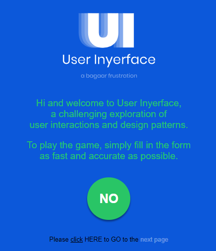
Upon starting the game, the first screen encountered was a blue screen with tiny print and a huge green button in the centre encouraging me to pay attention to it (through the bright colour and large size) whilst adhering to my natural impulse to ‘push it’ with my mouse. However, as we read this week, advertising on the web can be misleading and can lead to manipulation and control of our time and interests (Tufekci, 2017). Therefore having knowledge of this, I read the small print which was actually encouraging the user NOT to press the big green button to start the game and the even tinier black print at the bottom encouraged me to press there instead to actually start the game. This was a sort of clever play on this advertising tactics often used on us in our daily encounters with using social media and the web. Harris (2017) mentioned that knowing these manipulation tactics used on us can help us to protect our interests and minds.

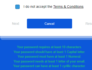
Another feature of the game was a big red banner at the top saying, “this game uses cookies, is that a problem for you?” with two button next to it saying “yes” or “no” with the “yes” button highlighted in white. This was another clever tactic to highlight how we are often manipulated through websites to press the already highlighted box which is often “yes” in response to the familiar question, “this site uses cookies, would you like to continue?” We do this so automatically in our everyday lives without even reading the fine print that may sign us up to some mailing list or trick us into signing away our personal data in the form of email addresses, location data or gathering data on our interests to then give/sell to businesses (Brignull, n.d.). By allowing these cookies and other tracking mechanisms and data collections to occur, we are giving too much power to the businesses that collect and resell this data to other businesses which can then target us with similar ads and internet stimulus catered to our demographics in order to occupy more of our time and spend more of our money (Harris, 2017). Tufekci (2017) discussed the dangers of giving away our information so easily further citing that in doing so we are also giving up our own power and control of our minds governing what we are interested in and how we spend our time. Another feature similar to this was the “I do not accept the terms and conditions” checkbox which also demonstrates how often the choice to not accept or choose alternate options for our data isn’t given. In allowing these options in an upfront way as some sites are now doing, we can allow for a much more ethical standpoint from which these businesses can operate from perhaps in the future.
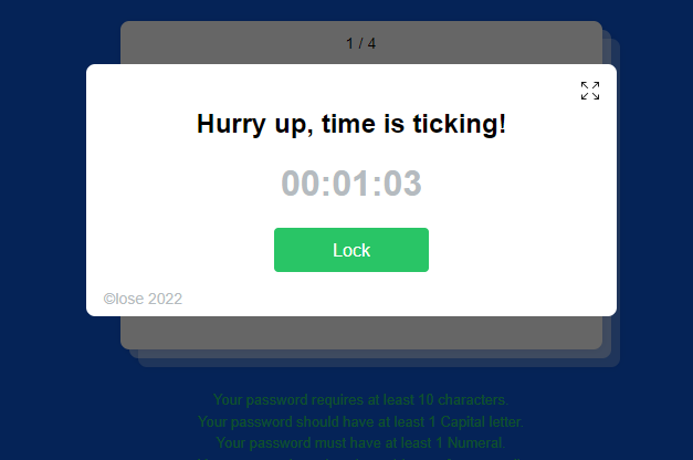
Getting back to the game, another feature within the game was a pop-up that kept recurring throughout it saying, “Hurry up, time is ticking!” This pop-up seen above had a big green button in the middle remniscent of the ‘download’ pop-up ads frequently encountered on websites also known as ‘disguised ads’ (Brignull, n.d.). Upon clicking on these ads, you are then redirected to advertising sites rather what your original intention was (in this game’s case it was to close the window rather than lock it) as described by Brignull (n.d.). This particular pop-up had a timer and the terms ‘hurry up’ which was also creating time pressure to distract users from leaving the site and encouraging them to continue to enter their information otherwise facing the consequences of ‘time’s up’ or ‘game over’ which psychologically is tricking users into thinking they will need to start a lengthy process over again or lose what they were aiming to do in the first place, all the while manipulating their time and responses.
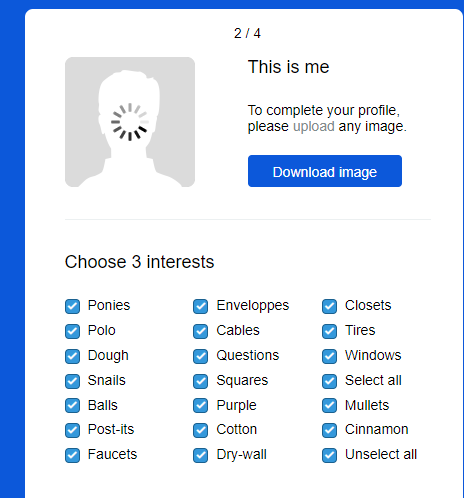
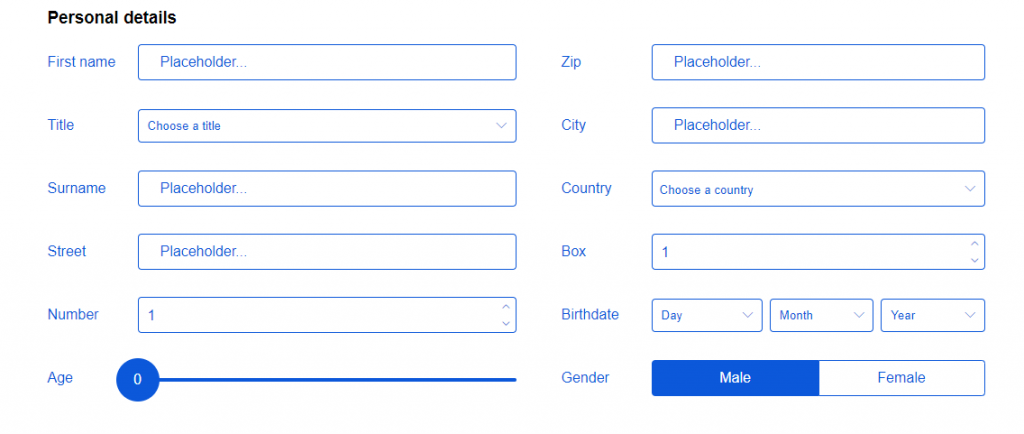
This game seemed to use the ‘privacy zuckering’ tactic as well to force me into providing a photo of myself and giving out a lot of personal information such as my age, home address and personal interests/preferences (Brignull, n.d.). It also wouldn’t allow me to proceed further without entering this information which is another manipulation tactic described by Brignull (n.d) as one, “[being] tricked into publicly sharing more information about yourself than you really intended to.” This type of forced wavering of demographic information could again lead to business’ re-selling this data to third parties for targeting subgroups based on the particular demographic they are aiming at or contributing information to build algorithms of my personal preferences, profiling me for targeted ads and preying on my weaknesses (Harris, 2017)(Tufekci, 2017). All of this in turn leads to more time spent on the internet using these sites that have targeted me (Tufekci, 2017) and could potentially lead to personal harm in the future as Brignull (n.d.) describes that giving away this personal information can even sometimes lead to, “being refused services such as insurance or loans”.


Another tactic seemingly highlighted in this game was how advertisers often use ‘misdirection’ to mislead people (Brignull, n.d.). The screenshots above tend to showcase how some businesses use the ‘default’ options to mislead consumers leading people to choose one thing when they are in a rush by highlighting it in a bright, attention grabbing colour as in the example above so they focus on that particular option to choose rather than the dull blue option that blends into the background of the rest of the screen.
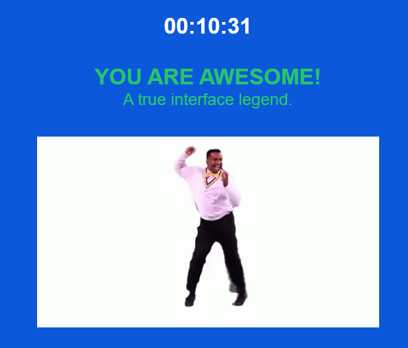
Finally, the end of the game presented me with a time or a score and a gif celebrating my completion. The game is therefore rewarding me and inciting instant gratification in doing so. Similar to gambling this tactic almost encourages me to try or play again to achieve a better score next time, for example. The is just another tactic to maintain my attention and waste another 10 minutes of my time on this game and therefore allow myself to relinquish control to the manipulation tactics being used upon me throughout this game.
References
Brignull, H. (n.d.) Types of deceptive design. Deceptive Design. https://www.deceptive.design/types
Harris, T. (2017). How a handful of tech companies control billions of minds every day [Video].
TED Conferences.
https://www.ted.com/talks/tristan_harris_the_manipulative_tricks_tech_companies_use_to_capture_your_at
tention?language=en
Tufekci, Z. (2017). We’re building a dystopia just to make people click on ads [Video]. TED
Conferences.https://www.ted.com/talks/zeynep_tufekci_we_re_building_a_dystopia_just_to_make_people_
click_on_ads?language=en
This week we were privy to knowledge distributed to us in a visual manner with the subject being our 10 choices for the musical tracks curated on our own versions of The Golden Record as displayed on a network graph using Palladio. The information represented in this way allowed me to instantly see who shared commonalities with me for last week’s task by seeing whose choices of songs were most similar to my own. I was able to do this by following the edges from my node with my name on it to song nodes (the edges representing the connection to my song choices) and then following the subsequent edges connecting these song nodes which are also connected to nodes representing the other students’. For example, my node was connected to my song choice Track 23, which showed a high level of connectedness because there were 10 edges attached to Track 23’s node therefore indicating 10 other students also chose that song to include on their curation. The graph also showed which other students in the course shared similarities in terms of connections to each other’s song choices and those that didn’t display as many connections to my own choices or to others.
I decided to check-out the number of connections (edges) shared for each song node as the Systems Innovation (2015) video described a higher number of edges for each node means that it is more connected to the other nodes, in this case representing other students. I was able to find the most popular song choices and least popular easily by looking at both the size of the nodes and then looking at the specific degree of connectedness (or number of edges) by using the metrics calculator and its table. The higher degree of connectivity to each other’s answers was represented by larger nodes and less connectivity to smaller nodes. Systems Innovation (2015) video described this concept’s importance in the following, “how connected an individual node is becomes a key metric of its significance within the network.”
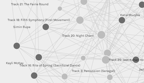
The results showed that Track 20, Navajo peoples’ Night Chant along with Track 3, Percussion from Senegal had the largest nodes and when looking at the metrics table they also had the highest degree of connectedness at 14 connections each. I thought this was interesting as this course is run in Canada and most of the participants are Canadian. I wondered if having such a high number of connections to the Navajo Night Chant song showcased Canadians’ recognition of the aboriginal people who lived in Canada originally and perhaps through our education of this, we chose this song because we feel it represents our homeland and therefore perceive it be more important in relation to other song choices and their representation on The Golden Record.
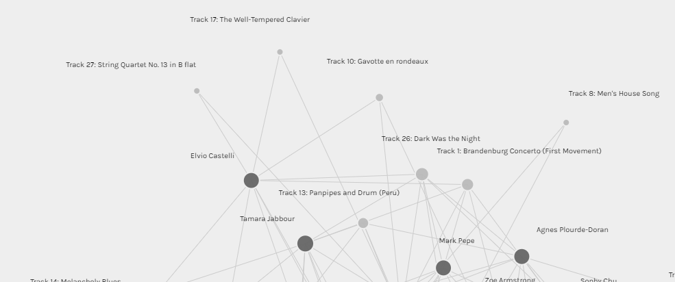
To contrast that, Track 17: The Well-Tempered Clavier- Bach, Track 27: String Quartet No. 13 in B flat- Beethovan and Track 9: Men’s House Song, had the smallest nodes and therefore lowest degree of connectivity at just 2 edges/connections for each. I can only guess as to the reasons for this as each person had their own criteria for selecting their 10 song choices. One possible explanation for not choosing these songs could be because there were 2 Beethoven and 2 Bach songs on the original album and a few artists from Germany itself listed on the record, therefore forcing people to choose one, (or none) rather than the other. I also believe since the alternate Bach song, Brandenburg Concerto No. 2 and its mathematical significance was mentioned in the Twenty-Thousand Hertz podcast, most people may have opted for including this song as it appealed to beings that may not hear in the same way as humans rather than The Well-Tempered Clavier (Taylor, 2019, 8:45).


By seeing many people grouped together through connections to the same answers on our song choice quiz, this could imply or lead to assumptions that these answers are indeed the ‘correct’ answers as they showcase the majority. This could then invoke a sort of power as majority holders similar to that in political parties and vice-versa for those that did not seem to group with many others who may be seen as ‘outliers’ or having ‘wrong’ answers because they are not those of the majority. These interpretations would of course be wrong as it was an opinion assignment and therefore the map is merely a reflection of our own individual considerations as to what we think a diversity of earthly sounds would sound like.
When it comes to null choices, I think they cannot be reflected in this particular data set because the data is only grouped on ‘choice of songs included’ and not the reasoning behind the unchosen songs. Any conclusions drawn can only be from those of the question asked and the visual representation of that which was, ‘which students chose the same song choices’. If there were to be another quiz asking, ‘which songs did you not feel were reflective of The Golden Record’s intent to create a diversity of Earthly sounds to ET’s’, then perhaps the graphs or other visual representations based on these answers/data could provide a more accurate representation of the null choices.
References
Stanford. (n.d.). Golden Record A [Graph]. Palladio-app. hdlab.stanford.edu/palladio-app/#/visualization
Systems Innovation (2015, April 19). Network connections [Video]. YouTube.
https://www.youtube.com/watch?v=2iViaEAytxw&t=63s
Taylor, D. (Host). (2019). Voyager golden record [Audio podcast episode]. In Twenty thousand hertz.
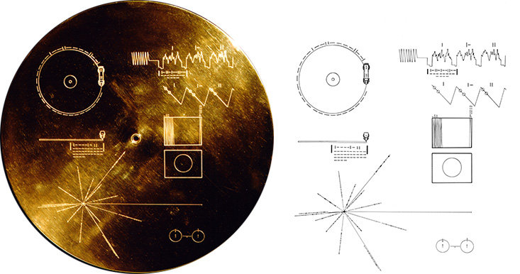
The Golden Record is described as a time capsule used to introduce and send greetings from humanity to extra-terrestrial life forms. “…the earth’s greatest hits, a gift across the cosmic ocean from one island of civilization to another ” (Carl Sagen as cited in Taylor, 2019, 2:28). Seeing as the record is meant to “contain[ing] sounds and images selected to portray the diversity of life and culture on Earth” (NASA, n.d), I would include the tracks listed below as they represent most of the continents (excluding Antarctica) and therefore a geographical and cultural diversity of sound, instruments, tradition and some languages. I added on more tracks for the largest of the continents being Asia and Africa seeing as their size means they may contain a larger amount of cultural diversity, history and languages/instruments. I’ve chosen one track representing the far East Asia (Kinds of Flowers- Indonesia) and another for the west part of Asia (Azerbaijan) and a third track, Bhairavi: Jaat Kahan Ho representing India and central Asia as it also has the second largest population in the world. For Africa, I chose Pygmy girls’ Initiation Song from the former area of Zaire in central Africa (now known as The Democratic Republic of the Congo) and Percussion from Senegal located in the west of Africa. That brings the total to 9 tracks so far. The final track I would choose to include would be another artist from Europe being track 5, Brandenburg Concerto No.2 in F Major by Bach, because it includes strong mathematical foundations and therefore could appeal to beings without the same hearing capacity and allow for diversity in that sense as discussed in the Taylor (2019, 8:45) podcast.
Africa:
The Voyager Interstellar Record – 8/31 Pygmy Girls Initiation Song- Zaire
Voyager’s Golden Record: Senegal percussion by Charles Duvelle- Senegal
Asia:
Voyager’s Golden Record: Kinds of flowers by Robert Brown- Indonesia
Voyager’s Golden Record: Azerbaijan bagpipes- Azerbaijan
Voyager’s Golden Record: Jaat Kahan Ho by Surshri Kesar Bai Kerkar- India
North America:
Voyager’s Golden Record: Navajo Indians_Night Chant- Canada and USA
South America:
Peru, wedding song, recorded by John Cohen- Peru
Europe:
Voyager’s Golden Record:The Fairie Round performed by David Munrow- U.K.
Voyager’s Golden Record: Bach_Brandenburg Concerto No. 2 in F major- Germany
Australia/Oceania:
Voyager’s Golden Record: Morning Star and Devil Bird_ Australia
References
NASA. (n.d.). What are the contents of the Golden Record?. Voyager. https://voyager.jpl.nasa.gov/golden-
record/whats-on-the-record/
Taylor, D. (Host). (2019). Voyager golden record [Audio podcast episode]. In Twenty thousand hertz.
Defacto Sound. https://www.20k.org/episodes/voyagergoldenrecord
If you are having trouble viewing this, follow the link here: https://app.milanote.com/1O68jb1WkCis1W?p=ry4DhXucTjs
This week I decided to completely embrace the notion of multiliteracies as discussed in the Cazden et al. (1996) article. In doing so, I explored multimodal ways of presenting my original content to help convey these literacies and therefore help create deeper meaning for the audience in this digital environment (Cazden et al., 1996). By diversifying my content presentations, I was aiming for a wider audience and I felt I was able to adhere to the movement of using digital literacies to create further inclusion in education as Kolbitssch and Maurer describe this can then begin to create:
…opportunities for interaction, or more generally with increased access and participation in
the literate, informed and knowledgeable quality of our lives through the open access movement
and the self-publishing technologies of blogs and wikis. (2006, as cited in Dobson & Willinsky, 2009, p.2)
The Cazden et al. (1996) article describes that due to the exclusionary nature of current literacy teaching pedagogies we must, “rethink what we are teaching, and, in particular, what new learning needs literacy pedagogy may now address” (p.61). Remixing my original content allowed me to help create more inclusivity. I was able to do this by researching and employing tools to allow for my words to be translated into sign language for a deaf or hard of hearing audience who may find reading signs easier/faster, to allow for dual audio and visual representations of my text to those that may benefit more from visual learning or auditory learning and finally, to include interactive components to allow for those that learn better in a more kinaesthetic way. I also tried to use different coloured backgrounds and dyslexic favoured fonts where I could.
Cazden et al. (1996) explain how multiliteracy skills are helping students to fulfill many goals including those to help design their social futures and achieve future employment on account of these. I found while embarking on my remix/remake of my original work that I too was helping to develop my 21st century skills such as video editing, software experience and authoring in multiple spaces through creating multimodal presentations of my original information. In doing so, I developed skills which may add to my current skillset and that I may then potentially use for future employment opportunities that demand these 21st century skills.
During my remix construction I was aware that I wanted to allow for opportunities of interaction and collaboration as these are important affordances that digital technologies allow for in literacy and education and are described from early on as providing benefits as described by Bruce et al. (1985, as cited in Dobson & Willinsky, 2009) in the following, “research showed that the ability of students to readily see and comment on each others’ work led to improvements in the quality of writing” (p.2). I therefore included opportunies in the remixed content to comment, contribute and co-author and ‘like’ comments or material that the audience could relate to or saw as relevant to them.
One of the challenges on the other hand during this task was trying to find the best tools to help diversify my content presentation to help adhere to as many groups and styles of learners as I could. This is marked by Mabrito & Medley (2008) as an important aspect to filling the current gap in current educational settings due to the discrepancies in some teachers’ digital literacy and learners’ digital literacy knowledge and skills (p.3). Although I tried my best to include as many people as possible by trying to cater to differing learning styles and needs, it was tricky to find ways to cater to all groups and cultures. I wanted to add in a translator for example to allow for other language learners to view my content but couldn’t find one that would translate the entire page automatically except for downloading a plugin that some may not want to do. I had to then settle on directing the viewers of my content to a translating app via a link to another website. Another challenge of course in finding new tools and research is that it takes time and it is quite time consuming to embark on multiple remixes or multimodal presentations of content. That being said, however, it was time well invested in skill development that will lead to future opportunities to those who view, interact and learn from this content as Cazden et al. (1996) describe:
we should get back to the broad question of the social outcomes of language learning , and that
we should, on the basis, rethink the fundamental premises of literacy pedagogy in order to
influence practices that will give students the skills and knowledge they need to achieve their
aspirations (p. 63).
References
Cazden, C., Cope, B., Kalantzis, M., Luke, A., Luke, C., Nakata, M., & New London Group. (1996). A
pedagogy of multiliteracies: Designing social futures. Harvard Educational Review, 66(1), 60-92.
https://doi.org/10.17763/haer.66.1.17370n67v22j160u
Dobson, T., & Willinsky, J. (2009). Digital Literacy. In D. Olson & N. Torrance (Eds.), The Cambridge
Handbook of Literacy (Cambridge Handbooks in Psychology, pp. 286-312). Cambridge: Cambridge
University Press.
Mabrito, M. & Medley, R. (2008). Why professor johnny can’t read: Understanding the net generation’s
texts. Innovate: Journal of Online Education: Vol. 4:6, 1-8
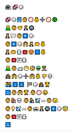
According to Bolter (2001), the power once held in writing alone has been declining and due to the prevalence of digital media in our modern society, images now replace the meaning once held sacred in written words (p.56). This task sought to trial this notion in a sense by asking fellow pupils to interpret familiar images (in the form of emojis) as we would words to describe the plot of a television show or film.
To begin this task, I tried to simplify the plot of the TV show as much as possible by turning only the important parts (beginning, characters, middle and end) into short emoji sentences. I then placed these emoji sentences in a sequential order so that they could be followed from left to right in the fashion of ‘reading’ them similar to words on a page of a book or website. The order of the emojis was important to understanding the plot as Kress (2005) expresses that, “Hearers (and readers to a somewhat lesser extent) depend on the “unfolding”, the revealing of elements one after the other to be able to make sense of the whole.”(p.13)
The emojis themselves represented words rather than syllables which I hadn’t considered using. I started with the title just because that was part of the initial instructions given, but personally this was such a popular show that I think the clues held in these emoji sentences can quickly become quite transparent to the reader.
Some of the challenges I encountered within this task were trying to figure out which symbols best represented the words or phrases about the show I was describing to then translate meaning to a vast audience. Kress (2005) described how words act as interpretable symbols and I believe emojis in this task act in the same way described by Kress (2005) below,
Words are (relatively) empty entities—in a semiotic account they are signifiers to be filled with
meaning rather than signs full of meaning, and the task of the reader is to fill these relatively vacant
entities with her or his meaning. This is the task we call interpretation, namely interpreting what sign
the writer may have intended to make with this signifier. (p.7)
Therefore, I wanted to choose emojis that I saw used often in text messages and from popular social media sites to help translate the meaning to the masses in the most effective fashion. Bolter (2001) explains below that different people may interpret pictures/emojis in different ways, however emojis seem to be present cross-culturally due to the popularity of social media and therefore may lead to a wider shared understanding, “Although the writer and reader may use words to describe and interpret the pictorial message, two readers could explain the same message in different words, and speakers of different languages could share the same system of picture writing.”(p.59)
Another challenge I faced during this task was trying to find symbols (emojis) that accurately reflected the real-life look of certain aspects of the show while still conveying an easy to interpret story. For example, it was difficult to differentiate the characters in my description of the TV show I was writing about as there was a limited amount of male emojis available and I had three separate male characters I wanted to introduce to help explain the plot. The only other male emojis were of those in uniforms other than the standard ‘male’ emoji which I had already used for the main character (which also didn’t represent the cultural background of the character accurately). I therefore had to use the innocent/angel emoji to represent one man and a man in a suit emoji to represent another one of the male secondary characters. I chose the angel to represent the personality characteristic of an innocent/naïve person (who didn’t know what was going to happen) and the suit because the character in the show actually wears a suit and little is known about his personality. Another word I found hard to represent was the word, ‘people’. In the end, I decided to use a family to represent this, hoping for the best (although I initially considered using more than one person emoji side by side as well). Finally, since a van was used in the real show, I wanted to get a van emoji and people wearing balaclavas as well to help visualize the plot more accurately but found these were difficult to come across by searching ‘van emoji’ or ‘balaclava emoji’. So, I settled on a minibus to represent the van and a person wearing a medical mask as a balaclava alternative.
As in some of the previous tasks, another problem I faced during this particular task was that I didn’t know what to do with punctuation and whether or not to include it at all. So, I settled on using the plus sign to mean ‘and’ and some periods and commas to help people to read/interpret everything a bit more clearly. However, for conjunctions like ‘if’, ‘because’ or ‘but’, I really couldn’t think of how to represent these in an emoji form, therefore some confusion may still be present in their absence at points in my plot description. To display the text, I decided to break up each sentence and paste them one under the other to allow for a more simplified reading approach as having all the symbols side-by-side seemed a bit overwhelming to take in.
I hope my final pictorial representations are helpful to allow others to derive meaning from them and therefore unravel the plot of this particular television series.
References
Bolter, J. D. (2001). The breakout of the visual. Writing space: Computers, hypertext, and the
remediation of print (pp. 47-76). Lawrence Erlbaum Associates. doi:10.4324/9781410600110
Kress, G. (2005). Gains and losses: New forms of texts, knowledge, and learning. Computers and
Composition, 22(1), 5-22.
https://doi.org/https://doi-org.ezproxy.library.ubc.ca/10.1016/j.compcom.2004.12.004
Please feel free to view or read my handwritten script it in its original codex form below (click the three dots to view in full-screen on the bottom right of the image for best results) or, you can view the PDF below it in scroll form. Choose whichever is more comfortable for you.
Excerpts from the Camino de Santiago by Alexis R
Writing by hand versus typing on a computer
This task was a fun task for me because I actually prefer to write by hand when writing creatively or in a journal. Although I find it a lot easier to type and “fix” mistakes when using my laptop for example with the help of a few buttons, I also enjoy seeing the mistakes when writing by hand and contemplating my changes as I revise my writing before proceeding further. I also don’t feel the pressure to correct my mistakes instantly when writing by hand, which allows my creativity and ideas to flow in a freer fashion on the page. I usually pause when I run out of ideas and then go back to revise, rather than having the pressure of having to correct as I go along as indicated by the very prevalent red underlined words my automatic word processor indicates (ever so subtly). When I do make a mistake when writing by hand as in this activity, I tend to cross out the word and write the new word or corrected spelling/grammar above it or even on top of it at times. I also generally type in printed mechanized fonts whereas I write by hand using cursive writing so as to alleviate the pressure from having to write super neatly and accurately and to encourage the free flow of the pen forming letters and words more easily. It may look quite messy by the end but, when I read through the completed text I can make the final call if I would like to keep certain words previously changed, replace them with new ones or take them out completely. On the other side, I find punctuation a lot easier when typing rather than writing by hand perhaps due to the blue reminders my word processor gives me when I forget a comma or other punctuation mark.
The process of writing by hand is definitely felt a lot more physically in my hand and wrist and I sometimes have to pause and shake it out as I am used to typing now and only occasionally practice this “exercise”. I also tend to get ink or lead all over one side of my hand being a left-handed writer, occasionally smudging my work as I go, which is never pleasant.
I personally think the most significant difference in terms of writing by hand and typing on my computer is that I am able to review all my pages at one time rather than having to scroll up and down on my computer to see the whole text when revising it in its entirety. Of course, I can choose the option on my computer to view all of the pages at once, but this leaves me with my pages shrunken down into indiscernible type and therefore not the best option for revision. Writing by hand I am also able to move all the pages physically side by side, write on the back of the paper causing me to flip it forwards and backwards easily or if I want compile the pages into a little book (if they are free sheets of paper for example).
All of the reasons mentioned above combined alongside the personal desire to preserve the tradition of handwriting from a cultural perspective are reasons (although it may take longer and look messier), I prefer writing by hand.

The other day I was minding my own business watching TV in my living room when all the sudden I heard the sound it’s horrible horrible sound of some sort of thing I looked around and then I saw it big brown hairy moth yes that’s right I’m off in my living room I was absolutely terrified I didn’t know what to do I’ve never even seen him off here before nevermind in my living room so I decided to go into my lock myself into my bedroom and think of what to do next well in my bedroom I decided I need to be brave it’s not going to go anywhere on its own and I needed to get back out and think of a plan so I decided to pick up my broom and just started waving it around to keep the airflow so that perhaps The Moth wouldn’t get close to me while I thought it what to do so while I was doing that I thought I need to get to the other side of the room to open the window more so the moth can get out but it was very scary moment because I do not like insects and especially moss and especially don’t like them in my house so I needed to act fast to get rid of it so what I did was I kept waving the broom around and it was keeping them all the way from me I played around a bit with the lights to perhaps scare it away or let it see the window more clearly so after that as I was going to get closer to the windows open it I suddenly didn’t hear them all flopping around anymore I thought could this be it could be gone but I was a bit skeptical so so I decided to stop dropping the broom around and just listen and look around check the corners of the room and I went over to the window and I closed it shut and then I waited after about a few minutes I realized it was finally gone and I could breathe a little sign of relief because then my head I was still sure it was coming back somehow after about an hour of trying to relax and finally realizing it wasn’t coming back I vowed to never leave my window open again at night cuz all sorts of creatures sneaking any given moment and I was not here for it I kind of laughed a little bit to myself after though as I was wondering if my neighbors had heard my shrill screams and my banging around with the with the 3 month at the ceiling in the wall trying to make sure it wasn’t there all in all I was glad it was over with and have learned from my mistakes and again I am never ever leaving my window open at night again who knows what type of creatures are lurking out there in the darkness you know play jazz you and everybody else does the same Beware of the night creatures they could come in any given moment you’ve been warned
The Analysis
When initially looking at the text produced from my speech to text app, the first thing I noticed was that the text appeared to lack proper punctuation. I wasn’t sure if I was supposed to add it in by dictation and simply assumed the voice to text app would pick up on this via pauses and perhaps intonation and the tempo of my speech. When I read the text back, I realized it didn’t do so. As a teacher I know that the meaning of a text can be vastly different in the absence of proper punctuation. For example, the following sentence was transcribed using the app, “I decided to stop dropping the broom”. This would imply I was dropping the broom continuously throughout the story. However, what I said in reality would read more like this, “I decided to stop, dropping the broom.” This sentence on the other hand conveys that I was in the process of doing something at least one time with the broom and I stopped the action by putting/dropping the broom down. This was how I had intended the story to sound, rather than what was transcribed. The speech to text app also chose to capitalize ‘the moth’ in my story almost as if to make it a main character or a villain’s name as demonstrated in the following, “so that perhaps The Moth wouldn’t get close to me”. The app also capitalized some improper nouns without a period beforehand such as in this example, “same Beware of”, perhaps due to a glitch in the system. The app did, on the other hand, correctly capitalize ‘I’ and ‘TV’. These mistakes in transcribing punctuation mentioned above showcase the importance of punctuation in the process of meaning making in written text and confusion that could arise in its absence or misinterpretations.
Most of the words were spelled correctly in the transcribed text however, a mistake I found really interesting was that the voice to text app wrote ‘cuz’ instead of ‘because’. Although I do write ‘because’ in the abbreviated spelling, ‘cuz’ when sending text messages for example, I didn’t think I have ever actually said it orally. This was fascinating because I started to wonder if perhaps I have started saying these types of abbreviations that I normally text now in an oral fashion without consciously doing so. This notion of language changing or being influenced in the presence of computer technology is echoed by Schmandt-Besserat (2009) as described, “The future of writing will also be determined by communications technologies.” (p. 23)
Some of the text became distorted when the words weren’t transcribed correctly according to what was actually spoken as seen in the following sentence, “I’ve never even seen him off here before”. In reality when I spoke I said, “I’d never even seen them here before.” This and other small mistakes in transcribing were made by the app such as transcribing ‘moss’ instead of ‘moth’ or ‘windows’ instead of ‘window’ for example. Some more common mistakes found in the text were amongst the smaller words and pronouns recorded incorrectly such as “it” instead of “if” and “him” instead of “them”. I consider these mistakes as they change the meaning of the text from that which I originally intended. For example, when the app recorded the following, “I’ve never even seen him off here before” having ‘him’ replace ‘them’ implies that I knew the moth was a male moth and therefore it also implies that I was either really well-researched on moths or it could also imply that the moth was my pet and therefore I knew its gender. In reality it was neither of those things and that is where the mistake aspect comes in as the meaning and the implications of the text have changed through this improper transcription.
These mistakes made me reflect on discrepancies between oral and written texts. I thought about how history was originally passed down by word of mouth and similar to a game of telephone, small mistakes such as these could change the meaning drastically and therefore the story itself. I further reflected on how many stories had been altered throughout history before writing was invented and how it was impossible to figure out the exact origins of many things in history before writing took place.
In the end, the app captured my general story idea more or less correctly, about a moth invading my living room. The details and most of the punctuation however were incorrect leading to some confusion laced throughout. The fear and the mood I expressed orally however were not really aptly conveyed through the writing. It seems the app did not pick up on my intonation and tempo at times to add in exclamation marks to convey the fear and excitement felt at different points in the story, therefore creating a loss of emotion and tone throughout. These notions of differences in the transference from oral storytelling into written text are echoed in the following,
although writing represents information about how words are pronounced, it does not record the
identifying details of any individual utterance of those words. It records language, but not actual
speech. Even in cases of dictation or courtroom stenography, much information about the actual
speech is lost, such as intonation and emotional content. (Gnanadesikan, 2011, p. 9)
Oral storytelling becomes distorted and changes as it is passed on with details lost or swapped along the way. Therefore although oral storytelling coveys more emotion, it can be a bit more interpretative and less ordered or factual than written storytelling where the details can be revisited in the exact same fashion as they were originally conveyed over time as long as the paper or medium (web page) in which they were written is still intact and someone can read the symbols correctly. If it is a story of historical significance for example this attention to detail maintained through writing can attribute more value to the story as its meaning is more thoroughly maintained from its original intent. As described by Gnanadesikan (2011),
Writing is generally done more deliberately than speaking, so finished written pieces are much more
carefully crafted than a typical spoken sentence. Written texts can thus convey their message more
precisely, adding to the sense that writing is worth more than speech. (p. 5)
Finally, if I’d have scripted the story, perhaps it would sound more like a monologue as I would be the only character speaking throughout the play.
References
Gnanadesikan, A. E. (2011).“The First IT Revolution.” In The writing revolution: Cuneiform to the
internet (Vol. 25). John Wiley & Sons (pp. 1-10).
Schmandt-Besserat, D. (2009). “Origins and Forms of Writing.” In Bazerman, C. (Ed.). Handbook of research
on writing: History, society, school, individual, text. New York, NY: Routledge.
What is your daily need for the items in your bag?
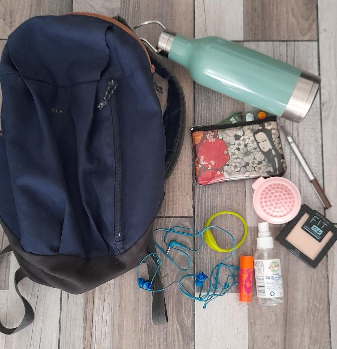
I usually head to the gym 3-4 times a week and have gotten used to carrying both my gym bracelet for access to the gym, my headphones for when I run and my water bottle. My change purse acts as my wallet and houses my bank cards and ID card (incase I head out before or after to a shop or cafe). I have also gotten used to bringing hand sanitizer everywhere since the pandemic began and therefore this is also a staple in my bag. My eyebrow pencil, lip gloss and brush are also viewed as “necessities” for my bag as I like to stay groomed after the gym or going somewhere for a long period of time and of course my mobile phone (which I cannot show as it’s taking the photo) as I like to listen to music at the gym and stay connected via the internet and text messaging capabilities housed on it.
How might these items be considered “texts” and what do they say about you, the places you inhabit, the cultures with which you engage, and/or the activities you take up?
These might be considered “texts” as they are visual representations of my lifestyle and daily habits. They tell a story of how I live my life and what I like/dislike through this photograph of them. For example they show I like to go to the gym, purchase on the go, I enjoy listening to music and I dislike the spread of germs/harming others. They also reflect aspects of my own personality as well such as my need to appear polished, my preparedness, my introverted nature at the gym via my headphones and the avoidance of conversations with strangers, my determinedness via my gym bracelet and my water bottle and large enough bag to tote various items incase of adventure or a spontaneous outing.
Thinking about the title of the course, what are the “text technologies” in your bag, if any? What do these items say about how you engage with language and communication?
The text technologies would be my phone as it houses my digital communication tools for communicating with others via text messages, emails, etc. It also shows I don’t have time to write things down with a pen and paper as I am too busy for this and therefore I utilise my phone for any note taking in a digital form (for convenience sake). This shows that I am both busy, connected to the modern forms of communication and perhaps that I am partial to using abbreviations in my language and communication practices through text messaging tools. This item also reflects the rapid pace at which we can communicate with others in these modern times due to affordable and portable internet and text messaging tools housed on our phones, for example.
What do the items in your bag say about the literacies you have?
The items may show that I have digital literacies and am familiar with modern forms of digital representations of text on my mobile phone for example. They may also show that I have health literacies (hand sanitizer, a gym bracelet and a water bottle) demonstrated by this activity. They may say I have financial literacy through my bank cards that show I know how to move and make money to store on these cards. They may also demonstrate civic or social literacy through my desire to ensure a safe society and protect one another from the spread of germs and COVID in particular.
How does the narrative of the (private) contents of your bag compare with the narrative produced by image you have of yourself or the image you outwardly project?
The narrative of the private contents of my bag reflect a more insecure, slightly antisocial person than the image I have of myself on a regular basis due to the avoidance of social interactions by use of headphones and the use of makeup to cover visible insecurities.
What would this same bag have looked like, say, 15 or 25 years ago?
15 years ago the bag would have housed more makeup items as I was more interested and had more time to take better care of myself back then and enjoyed doing so. It would have had an iPod rather than a phone to house my music options and perhaps some body spray for after the gym as I cared more about the image I projected to others when I was younger. I would also have a plastic gym card membership rather than a computerized wristband to gain entry to the gym.
How do you imagine an archaeologist aiming to understand this temporal period might view the contents of your bag many years in the future?
In the future an archaeologist would probably find it intriguing that people toted around antiseptic spray and would perhaps think we were very clean individuals or suspect a plague (which would be more apt). I think they would be impressed with our reusable water jugs and think them to be quite clever. I think they would find the headphones to be of an archaic design and poor quality and I don’t think they would be surprised by the use of grooming products in women as they’ve been used countless times in differing forms throughout history.