This week we were privy to knowledge distributed to us in a visual manner with the subject being our 10 choices for the musical tracks curated on our own versions of The Golden Record as displayed on a network graph using Palladio. The information represented in this way allowed me to instantly see who shared commonalities with me for last week’s task by seeing whose choices of songs were most similar to my own. I was able to do this by following the edges from my node with my name on it to song nodes (the edges representing the connection to my song choices) and then following the subsequent edges connecting these song nodes which are also connected to nodes representing the other students’. For example, my node was connected to my song choice Track 23, which showed a high level of connectedness because there were 10 edges attached to Track 23’s node therefore indicating 10 other students also chose that song to include on their curation. The graph also showed which other students in the course shared similarities in terms of connections to each other’s song choices and those that didn’t display as many connections to my own choices or to others.
I decided to check-out the number of connections (edges) shared for each song node as the Systems Innovation (2015) video described a higher number of edges for each node means that it is more connected to the other nodes, in this case representing other students. I was able to find the most popular song choices and least popular easily by looking at both the size of the nodes and then looking at the specific degree of connectedness (or number of edges) by using the metrics calculator and its table. The higher degree of connectivity to each other’s answers was represented by larger nodes and less connectivity to smaller nodes. Systems Innovation (2015) video described this concept’s importance in the following, “how connected an individual node is becomes a key metric of its significance within the network.”
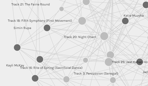
The results showed that Track 20, Navajo peoples’ Night Chant along with Track 3, Percussion from Senegal had the largest nodes and when looking at the metrics table they also had the highest degree of connectedness at 14 connections each. I thought this was interesting as this course is run in Canada and most of the participants are Canadian. I wondered if having such a high number of connections to the Navajo Night Chant song showcased Canadians’ recognition of the aboriginal people who lived in Canada originally and perhaps through our education of this, we chose this song because we feel it represents our homeland and therefore perceive it be more important in relation to other song choices and their representation on The Golden Record.
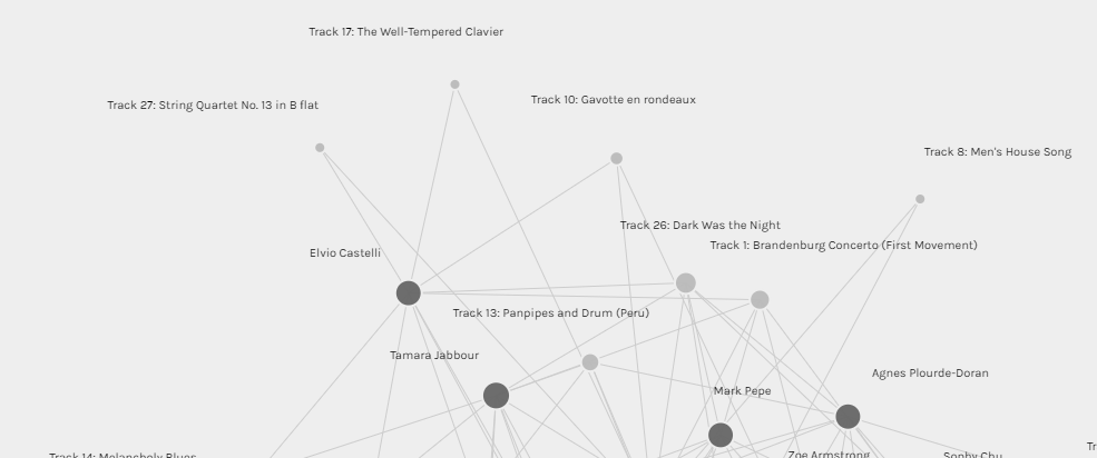
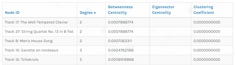
To contrast that, Track 17: The Well-Tempered Clavier- Bach, Track 27: String Quartet No. 13 in B flat- Beethovan and Track 9: Men’s House Song, had the smallest nodes and therefore lowest degree of connectivity at just 2 edges/connections for each. I can only guess as to the reasons for this as each person had their own criteria for selecting their 10 song choices. One possible explanation for not choosing these songs could be because there were 2 Beethoven and 2 Bach songs on the original album and a few artists from Germany itself listed on the record, therefore forcing people to choose one, (or none) rather than the other. I also believe since the alternate Bach song, Brandenburg Concerto No. 2 and its mathematical significance was mentioned in the Twenty-Thousand Hertz podcast, most people may have opted for including this song as it appealed to beings that may not hear in the same way as humans rather than The Well-Tempered Clavier (Taylor, 2019, 8:45).
By seeing many people grouped together through connections to the same answers on our song choice quiz, this could imply or lead to assumptions that these answers are indeed the ‘correct’ answers as they showcase the majority. This could then invoke a sort of power as majority holders similar to that in political parties and vice-versa for those that did not seem to group with many others who may be seen as ‘outliers’ or having ‘wrong’ answers because they are not those of the majority. These interpretations would of course be wrong as it was an opinion assignment and therefore the map is merely a reflection of our own individual considerations as to what we think a diversity of earthly sounds would sound like.
When it comes to null choices, I think they cannot be reflected in this particular data set because the data is only grouped on ‘choice of songs included’ and not the reasoning behind the unchosen songs. Any conclusions drawn can only be from those of the question asked and the visual representation of that which was, ‘which students chose the same song choices’. If there were to be another quiz asking, ‘which songs did you not feel were reflective of The Golden Record’s intent to create a diversity of Earthly sounds to ET’s’, then perhaps the graphs or other visual representations based on these answers/data could provide a more accurate representation of the null choices.
References
Stanford. (n.d.). Golden Record A [Graph]. Palladio-app. hdlab.stanford.edu/palladio-app/#/visualization
Systems Innovation (2015, April 19). Network connections [Video]. YouTube.
https://www.youtube.com/watch?v=2iViaEAytxw&t=63s
Taylor, D. (Host). (2019). Voyager golden record [Audio podcast episode]. In Twenty thousand hertz.
Hello!
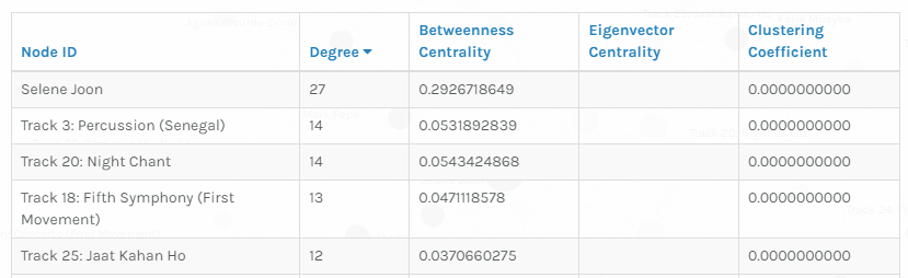
I found it interesting that when you parsed the nodes by the top 5 largest nodes measured by connections, the top result is Selene Joon, a name, whereas the rest were the names of the songs. Why do you think that happened? I didn’t parse my information in this way, so I am curious to see how you would interpret the data!
Hey Tzu Hsu, I honestly thought it was a mistake on Selene’s part or perhaps the input of the data at first so I I didn’t focus on it too much until I did my linking assignment for this week. I looked more deeply at the breakdown of connections and it seemed that she picked all 27 of the songs when I looked at the nodes connected to her node. I guess that’s why she had the largest node and the highest degree of connections.