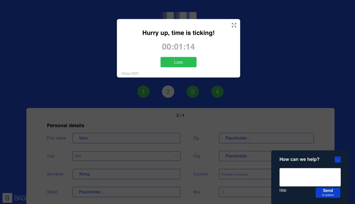
I have to confess that step 2 is the furthest I can reach. I tried at least 10 times but I can only reach this far. Even though I can type 50 words per minute, I failed to finish step 2. So glad it is not a website I visit for online shopping or virtual exams. Otherwise, the User Interface (UI) and User Experience (EX) designers would probably receive only a handful of data but so many complaints.
The design is not user-friendly
Each column needs to be manually cleared before typing the responses. Other than that, the count down is annoying. Very few websites would dare to create a site with a tight time limit because they want users to stay as long as possible. Perhaps only TV shopping and online shopping sites would do that to create an urgency for customers to make a purchase. In contrast, good designs are user-friendly, it’s easy to
The design is confusing
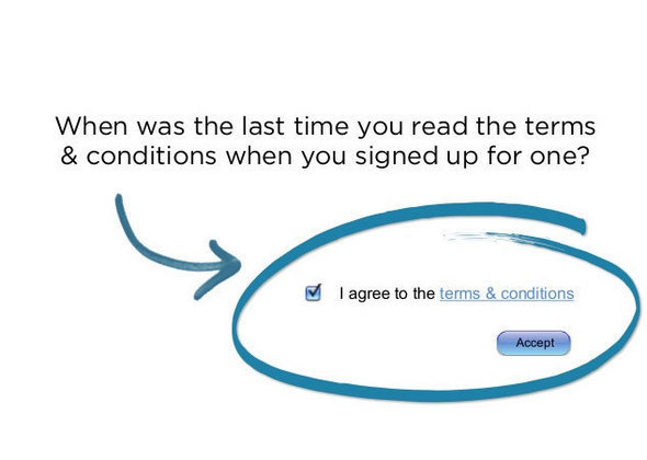
Step 1 when being asked “I do not accept the terms and conditions”, isn’t this odd to ask for negative feedback? It would make more sense to ask “accept terms and conditions” tagged along with the tick-off box. Meanwhile, provide a separate page that contains the actual terms and conditions users can read. Good designs often aid rapid comprehension, for instance, key information is in headings or subheadings, or presented in a strong visual hierarchy which allows users to instantly gather key information. A good example is shown below:

Watch out for deceptive design and online fraud
I didn’t get to step 3 or step 4 which is unfortunate. But we learned about deceptive design in this module, I would like to highlight this as well. Give you an example, I almost become a victim of online fraud yesterday. I was browsing Facebook Marketplace looking for a Breville coffee machine, this page came up and instantly caught my attention. The retail price of this coffee machine is $850 but now only $99. Obviously, the price is very tempting. This site comes with everything else you can find on a legit website (see the screenshot below), except when it says in partnership with Costco but actually doesn’t require Costco membership card at the check-out. Red flag! And plus there is no customer feedback page, which is very suspicious. And the website link is not affiliated with Costco at all. Glad that I didn’t fall for it in the end. We need to watch out for deceptive design, online fraud, and biased information in digital life.

Personally, I have been intrigued by the subject of digital marketing, and even considered the program offered at BCIT, UI, and EX design certificate. The program description says “You’ll acquire tools to help you generate creative, user-friendly digital solutions that support human behaviour within an interactive, computer-based environment (BCIT, n.d.).” It all sounded different to me after knowing the dark patterns, persuasive techniques, machine learning, and etc.
Tristan Harris and Zeynep Tufekci both spoke at TED Talks in 2017 to unveil the dark patterns in UI design. That was when I realize technologies are serving as a double-edged sword. In the digital world, the information we receive may shape our thoughts subtlely. Earlier in this course, we learned from Dr. Lera Boroditsky (2011) how language can affect one’s cognitive thinking and behaviour patterns. This extends naturally to how the overwhelming information we receive can impact our thinking and behaviour.
It’s outrageous to think there are evil web designers out there, utilizing persuasive techniques to bump up the conversion rate of a customer paying for a product or service. Think about how Instagram ads fill up your screen. Also think about how news threads, app notifications, and automatic feeds affect your emotions or your perceptions of certain things. I love what Harris said about building Artificial Intelligence that supports us in our human goals, empowers us to focus and create, instead of distractions.
When it comes to AI, we also need to consider morality and ethics. How to set healthy boundaries to balance real life and virtual life? For instance, with AI we could be able to see the loved ones who have passed away, but how can we make sure we won’t be addicted to it? This music video Mercury Records is a story about a woman who cannot accept the fact that her husband has died, so she relies on artificial intelligence and visual reality to see her late husband every day. Similar story, if you have watched Inception, you should know the story of how the character suffered from not being able to tell what is real and what is a dream.
Now that Facebook is renamed as Meta, the company is now even more radical about building virtual communities. In the near future, we will see how this is going to affect how we interact in the online community.
References
British Columbia Institute of Technology. (n.d.). User Interface and User Experience Design Overview. Retrieved from here.
Brignull, H. (2011). Dark Patterns: Deception vs. Honesty in UI Design. Interaction Design, Usability, 338.
Boroditsky, L. (2011). How language shapes thought. Scientific American, 304(2), 62-65.
Harris, T. (2017). How a handful of tech companies control billions of minds every day. Retrieved fromhttps://www.ted.com/talks/tristan_harris_the_manipulative_tricks_tech_companies_use_to_capture_your_attention?language=en
Tufekci, Z. (2017). We’re building a dystopia just to make people click on ads. Retrieved from (Links to an external site.)https://www.ted.com/talks/zeynep_tufekci_we_re_building_a_dystopia_just_to_make_people_click_on_ads?language=en (Links to an external site.)