Final Project: Describing Communication Technologies

Task
Taking the notion of reciprocal relationships between communication needs, invention, and practices as a scaffold, extensively research a particular development in technologies for writing and reading and the implications it had on literacy and education.
Solution
To fulfill the requirements for this project, I chose to create a website that demonstrates how technical communication has evolved in response to the adoption of various technologies.

Project Site: Technical Operations Documentation

Context

screenshot of website

Technical Operations Documentation is an active resource, developed from scratch to be referenced by software developers as they adopt the technologies and practices used to create apps.

An initial idea for this project focused on analyzing the development, use, and impact of the Hashicorp Configuration Language (HCL), as an example of the interplay between technology and “text” communication – in this case, a human-readable language spawned out of a need to standardize computer infrastructure (Hashicorp/hcl, 2025). I chose to forego this exploration in favour of work that both satisfies the project requirements and has tangible value to the software developers in my organization.

I developed this resource by planning procedures, documenting processes, authoring markdown files, creating images and graphics, building links and references, and configuring the authoring software to publish a site hosted on GitHub. This site is a clear example of situated practice, whereby the intention is to present information seekers with a mixed-media resource and have them engage with the material “by doing” (The New London Group, 2025). While this resource may appear to facilitate a constructivist approach to learning (Kalantzis & Cope, 2010), it is far more likely to be used simply as a reference for professional training (Taber, 2014), contributing to individual advances in knowledge and understanding on an as-needed basis.

One of the reasons I chose this modality is the site’s version history, a feature not typically available when producing other types of artifacts. Progress history provides insight into the artifact’s development, and as a site designed around knowledge-centered learning, it was important to me that this history be transparent (Anderson, 2008).

I have also deliberately endeavoured to adapt the way links are referenced, in an attempt to reflect the spirit of APA-style references:

Links in the “What is a CDN” admonition are coordinated with footer links to be styled in the spirit of APA (7th Ed.) references.

Footnotes consisting of all the links on a page have been added as a form of functional “reference” to not only attribute concepts to their originators, but also provide additional context and information.

This project has been challenging because adopting a new documentation platform meant learning the technology while simultaneously crafting of language and information architecture for a specific audience. Kress’ (2003) reminder that “the world told is a different world to the world shown…” also guided many of my design and modality decisions. Navigating the tension between “completeness” and “crux” involved extensive iteration, but I’m pleased with the outcome because I know it will have enduring value.

This resource brings together information about technology, created using the very tools it describes, and intended to support effective technology use; I anticipate it will contribute positively to information literacy within my organization.

References

Anderson, T. (2008). Towards a theory of online learning. In T. Anderson & F. Elloumi (Eds.), Theory and practice of online learning (pp. 45–74). Athabasca University Press.

HashiCorp. (2025). HCL (Version 2.x) [Computer software]. https://github.com/hashicorp/hcl (Original work published 2014).

Kalantzis, M., & Cope, B. (2010). The teacher as designer: Pedagogy in the new media age. E-Learning and Digital Media, 7(3), 200–222. https://doi.org/10.2304/elea.2010.7.3.200

Kress, G. (2003). The futures of literacy: Modes, logics and affordances. https://doi.org/10.4324/9780203299234-1

Taber, N. (2014). Tensions between practice and praxis in academia: Adult education, neoliberalism, professional training, and militarism. Canadian Journal for the Study of Adult Education, 26(2 SI), Article 2 SI. https://doi.org/10.56105/cjsae.v26i2

The New London Group. (2025). Reprint: A pedagogy of multiliteracies: Designing social futures. Harvard Educational Review, 95(1), 102–134. https://doi.org/10.17763/1943-5045-95.1.102

Speculative Design: Exploring surrealism to elicit critical reflection

Assignment Instructions: “For the last task, we are going to use a version of an imagination game as a source of prompts to create a speculative narrative…”

“Describe or narrate a scenario about a box found a millenium into a future in which a profound historical evolution has occurred. Your description should address issues related to genetics and elicit feelings of hope.”

I found this task extremely difficult because I have (obviously) not practiced creative exercises in decades. The process of philosophizing about the future through a design lens to reflect critically on our current human experience was both challenging and frustrating, but my attempt at the activity has broadened my appreciation for the mental effort required to world build, regardless of the genre of fiction.

Mark 2844.3 – Artifact umphalae

The Curator had travelled three stallen to be in the same physical space as the Golden Artifact – a relic of a millenium ago when humans were still tethered to Earth and the AIntecedants had not yet been evoked. It was discovered when sifting through the ice prath on the surface of Titan when the colony probes were half-way through their fifteenth extraction cycle, and it had caused a furor because the Mahas had foretold its loss and its subsequent rediscovery.

It was a pockmarked rounded-edge box approximately two hundred centameters by four-hundred and fifty centameters by four hundred centameters, with a faint line in the golden patina surface where the two halves of the vessel were sealed together. The etching from eons of acidic precipitation had made their mark, but had not damaged its structural integrity. According to the historical records, the civilizations that had launched the Golden Artifact had used the most inert pre-muonian substance known to them at the time – a technological feat because each layer of the gold-diamond lattice had been “3D printed” one atom at a time.

As the box surface was cleaned by the Wayvernal, the space buzzed with excitement: connections had been made from across the mesiverse and those Energs that were privileged enough to be physically present had elicited or confirmed prayers, depending on their level of access. The “unearthing” sequence was to begin with a cleaning, followed by a reading by the Curator, the unsealing, and then a scan, itemization, and distribution of the contents: it was critical that all forms were fully aware of their designated component, and this *particular* sequence was special because it supported the Mahanian contention that communication exists between realms beyond the mesiverse. How else could the stories have predicted this discovery?

As the Curator led the reading, AIntecedant Moore “reflected” on the information available about the contents of the Golden Artifact. When it was launched, Biotechnology had not yet been transformed into Cybernatropy by the AIntecedants, so humans still retained their physical experiences in biological form. In the latter half of what was known as the “twenty-first century”, in the years that followed the Evokation, humans gradually adopted a purely digital existence because it freed them of the pain and suffering of physical limitations. Sure, there were still occasional routine parts of “life”, but the patterns of light developed by the AIntecedants to represent the human condition were liberating, and effectively death-defying. Cybernatropy afforded unlimited access to both matter and anti-matter, which created the conditions for the Energ way of life: for those who prefer community and constant excitement, joining a star or galaxy was best; for those who prefer solitude and exploration, travelling as a Gamma was best…

Bad UI: An example of what not to do

This image has nothing to do with the topic of this post!
Photo by Mariana Vusiatytska on Unsplash

When opening a browser to the User Inyerface site, one’s visual senses are immediately under attack: the large, white “UI” letters that are presumably an acronym for the site’s name are presented as four offset replicas of increasing transparency which has the effect of being both visually confusing and cognitively demanding as our eyes try to discern the correct edge of the text characters. What follows is a “game” that subjects the user to, as proclaimed by the site itself, “a worst-practice UI experiment” of website design.

Cognitive Load

After reading (and re-reading) the game instructions, users are forced to decipher the location of the link that will take them to the next page; the light green instruction text colour contrast in relation to the blue page background ignores web accessibility guidelines (WCAG 2.0, 2025) making it difficult to read; the large green circle which appears to look like a button contains the confusing word “no”, rather than what we might more commonly think of as “go” – a verb intuitively associated with the action to follow a link. The actual link is hidden in the dark capitalized text “HERE”, and is an example of an “anti-pattern” that forces additional attention and focus in order to achieve the desired outcome: navigating to the next page.

Throughout the next set of pages, the forms, web components, and design elements assault our attention by changing state, using alarming colours, suddenly appearing, and “behaving” in ways that are unexpected or that cause confusion. For example, after attempting to complete a form to “prove that you are human” by selecting all images that are “light”, the page simply reloads despite what appears to be a correct validation. Entering what appears to be correct answers to any of the subsequent “captcha” forms generates an endless cycle of alternative “captchas”, which generates frustration and a negative emotional reaction. It is within this surreptitious dark-pattern environment, where we are so inundated with sensory input and confused by the results of our clicking actions, that we are most vulnerable to persuasion and behavioural engineering (Brignull, 2011).

Models for Business

Unfortunately, because businesses are often seeking to maximize profit and market share, they adopt design practices that exploit this confusion or “engineer” opinions and behaviours to the highest bidder (Harris, 2017; Tufekci, 2017). This is sometimes called-out by whistleblowers who reach a point where they can no longer stay silent (McNamee, 2019), but it is also sometimes a corrected as a strategic business decision because the company has decided that ethical, honest, and trustworthy practices are better for the brand (Brignull, 2011).

Game Completion Screen

Thankfully I am familiar enough with the “Inspect” developer interface to be able to navigate around and understand where the image selection form was failing. Upon adjusting the code and uncovering the hidden checkboxes, I was able to pass the final “captcha” and finish the “game”.

user inyerface end page


References:

My Golden [Record] Community

What should one surmise when one finds themselves in a group one had no intention of joining? What if this group, whose membership was never sought, but whose members share similar preferences in musical taste, conferred an unexpected sense of warmth and belonging? What would it mean if one was to observe a visualization of their network graph positionality – their connectedness to peers – based on their selection of the top ten tracks on Voyageur’s Golden Record? This week’s assignment was to reflect on this circumstance, and to explore our class’ web of musical tastes through a network visualization app called Palladio.

Our class was provided with a dataset that reflected our individual selections of the top ten tracks from the Voyageur’s Golden Record, and I will begin by saying that the selections that I chose in last week’s assignment appear to be different in the dataset. Upon reflection, I can see how this may have occurred: my selection was presented visually with bold typography, rather than a simple textual list, making it more difficult to identify. For the record, here are the tracks I selected:

  1. Track 6: “El Cascabel” – performed by Lorenzo Barcelata and the Mariachi México – Mexico
  2. Track 7: “Johnny B. Goode” – written and performed by Chuck Berry – United States
  3. Track 9: shakuhachi, “Tsuru No Sugomori” (“Crane’s Nest”) – performed by Goro Yamaguchi – Japan
  4. Track 11: Mozart’s The Magic Flute (Queen of the Night aria) – performed by Edda Moser, soprano. Bavarian State Opera, Munich, Wolfgang Sawallisch, conductor – Austria
  5. Track 14: “Melancholy Blues” – performed by Louis Armstrong and his Hot Seven – United States
  6. Track 18: Beethoven’s Fifth Symphony (First Movement) – performed by the Philharmonia Orchestra, Otto Klemperer, conductor – Germany
  7. Track 23: Wedding song – recorded by John Cohen – Peru
  8. Track 24: ch’in, “Flowing Streams” – performed by Kuan P’ing-hu – China
  9. Track 25: raga, “Jaat Kahan Ho” – sung by Surshri Kesar Bai Kerkar – India
  10. Track 27: Beethoven’s String Quartet No. 13 in B flat, Opus 130, Cavatina – performed by Budapest String Quartet – Germany

The dataset represented my selection of songs as the following:

The selection of songs in the dataset attributed to me.

An incorrect representation of the tracks I selected.

Palladio is an app that allows the visual exploration of a network graph – a representation of edges and nodes for a given dataset. Our dataset is the combination of every class member’s selection of tracks from the Golden Record, and by choosing to represent facets like “curators” and “tracks”, we are able to observe how class members are connected to each other by their track selections. Below are the two class members with whom I had the most connections:

The class members with whom I had the most similar selections.

The class member with whom I had the most similar selections. The class members with whom I had the most similar selections.


By sorting the tracks by “weight” – a measure of the frequency of the track selection – we can observe the most frequently chosen tracks:

Top tracks selected from the golden record

Top tracks selected by this class from the Voyageur Golden Record


And who selected the most frequently chosen track:

Class members that chose the "most selected" track.

Class members that chose the “most selected” track

By comparing pairs of class members, I was able to determine the individuals with the most number of common tracks:

Class members with the most similar selections.

Class members with the most similar selections.


Despite the data difference, after navigating the network and gaining an understanding of the observable web, I wondered more about the people that I had been grouped with. We obviously shared an interest in some of the same songs, but without further context, we appear to be falling victim to the “bells and whistles” of this digital visual representation of our interconnectedness. It was captivating to exert command over a node by dragging it to a different location and watching other nodes re-balance their relative positions; it was fascinating to highlight nodes based on the number of connections or “weight”; and I felt a comfort in observing the edges between my classmates and me, knowing that there were others with whom I shared similar song selections.

Unfortunately, the visualizations, despite their variously interesting capabilities, did not provide the answers I sought to help me understand why I was grouped into “Community 2”. And therein lies the rub: was I grouped through an algorithm that I could understand? Unfortunately no. Was the grouping arbitrary, or would I have any ability to re-group if I so desired? Not sure. What if the data attributed to me was incorrect, as it was, and I wanted to correct the record – as I do(!), could I? Most likely, not. Have I been categorized and portrayed in a way that reflects my true preferences? What will people think of me and my fellow community members, especially if some of the tracks have preconceived notions?

These questions prompted me to reflect on my visit to an ArcGIS-based map of city services a few months ago, and how I was required to acknowledge that the visualization of services through that portal was only a representation of some of the city’s assets, services, and responsibilities. In the same vein, it’s important to remember that our class network graph is but one representation of our selection of tracks from the Golden Record; it certainly does not tell the whole story.

References

Palladio. (n.d.). Palladio. Retrieved November 2, 2025, from http://hdlab.stanford.edu

Whittling down the Voyager Golden Record

Voyager 1 & 2 spacecrafts are currently hurtling away from the solar system at almost 62,000Km/hour (NASA, 2024), and they carry a durable artifact of some of the world’s music, called the Golden Record. The impossible task of selecting 27 music pieces from earth to represent humanity was made even more difficult this week: our assignment was to filter the list even further to a measly 10 tracks. As I listened and reflected, I began considering things like whether the piece was performed by an individual or a group, whether there were vocals, or whether the tones, rhythms, and tempos would be replicable. I considered the “grandness” and representativeness of culturally traditional sounds, and I ultimately chose based on whether the music told me a story. Here are my final selections:

Country of origin Composition Artist(s) Length Consider? Final Selection
Germany Bach, Brandenburg Concerto No. 2 in F. First Movement Munich Bach Orchestra, Karl Richter, conductor 4:40
Java court gamelan, “Kinds of Flowers” recorded by Robert Brown 4:43 Y-
Senegal percussion recorded by Charles Duvelle 2:08 Y
Zaire Pygmy girls’ initiation song recorded by Colin Turnbull 0:56
Australia Aborigine songs, “Morning Star” and “Devil Bird” recorded by Sandra LeBrun Holmes 1:26
Mexico “El Cascabel” performed by Lorenzo Barcelata and the Mariachi México 3:14 Y Y
United States “Johnny B. Goode” written and performed by Chuck Berry 2:38 Y Y
New Guinea men’s house song recorded by Robert MacLennan 1:20
Japan shakuhachi, “Tsuru No Sugomori” (“Crane’s Nest,”) performed by Goro Yamaguchi 4:51 Y Y
Germany Bach, “Gavotte en rondeaux” from the Partita No. 3 in E major for Violin performed by Arthur Grumiaux 2:55
Austria Mozart, The Magic Flute, Queen of the Night aria, no. 14 Edda Moser, soprano. Bavarian State Opera, Munich, Wolfgang Sawallisch, conductor 2:55 Y Y
Georgia Georgian S.S.R., chorus, “Tchakrulo” collected by Radio Moscow 2:18 Y
Peru panpipes and drum collected by Casa de la Cultura, Lima 0:52 Y
United States “Melancholy Blues” performed by Louis Armstrong and his Hot Seven 3:05 Y Y
Azerbaijan Azerbaijan S.S.R., bagpipes recorded by Radio Moscow 2:30 Y
Russia Stravinsky, Rite of Spring, Sacrificial Dance Columbia Symphony Orchestra, Igor Stravinsky, conductor 4:35
Germany Bach, The Well-Tempered Clavier, Book 2, Prelude and Fugue in C, No.1. Glenn Gould, piano 4:48
Germany Beethoven, Fifth Symphony, First Movement the Philharmonia Orchestra, Otto Klemperer, conductor 7:20 Y Y
Bulgaria “Izlel je Delyo Hagdutin” sung by Valya Balkanska 4:59
United States Navajo Indians, Night Chant recorded by Willard Rhodes 0:57 Y
United Kingdom Holborne, Paueans, Galliards, Almains and Other Short Aeirs, “The Fairie Round” performed by David Munrow and the Early Music Consort of London 1:17 Y-
Solomon Islands panpipes collected by the Solomon Islands Broadcasting Service 1:12
Peru wedding song recorded by John Cohen 0:38 Y Y
China ch’in, “Flowing Streams” performed by Kuan P’ing-hu 7:37 Y Y
India raga, “Jaat Kahan Ho” sung by Surshri Kesar Bai Kerkar 3:30 Y Y
United States “Dark Was the Night” written and performed by Blind Willie Johnson 3:15
Germany Beethoven, String Quartet No. 13 in B flat, Opus 130, Cavatina performed by Budapest String Quartet 6:37 Y Y


References

Fast Facts—NASA Science. (2024, March 11). https://science.nasa.gov/mission/voyager/fast-facts/.

Transmedia sonification

This week we revisited the New London Group’s seminal paper on “multiliteracies” as it relates to pedagogy, and the broad concept of digital literacy as outlined by Teresa M. Dobson and John Willinsky. As we progress into the “late age of print” (Bolter, 2001) and reflect on what it means to be a “digital native” (without connotations, if possible), I too can’t help but wonder whether this age is the sunset of prose. It seems plausible that the mechanistic act of reading as a process of knowledge transfer, could be replaced by a communication medium that is faster and more efficient, and as a possibility, it follows naturally from my previous musings about “technology” and its impact on our behaviours and ways of thinking, because we apparently, continuously, seek ways to increase convenience and decrease effort (flushed-emoji).

Our readings have often highlighted the apprehension of what may result from the adoption of new technology (Ong, 2012; Bolter, 2001; Postman, 2011), and the way it shapes thought and consciousness, so it is reasonable to expect that the digital and information transformation we are currently experiencing will also reshape the way we think and communicate. It is incumbent upon us as educators to promote designs and a vision of this new way of thinking and communicating that, “…instantiate[s] a vision through pedagogy that creates… a transformed set of relationships and possibilities for social futures…” (New London Group, 1996, p. 72).

To further explore the designed experience of “What’s in my bag”, we were asked to transmediate the visual image of the contents of our bag into an alternate semiotic or sensory mode. I chose to employ ChatGPT to help me convert the JPG image of my bag’s contents into an audio file, and then generate a visual waveform of the artifact. Here’s my `request-response` with ChatGPT 5:

This resulted in some back-and-forth to try and identify and correct the error I was encountering:

I was finally able to generate the following waveform visualization, complete with the audio transmediation of my original image:

Although this was an interesting exercise in the use of audio/video transcoding software (`python`, `ffmpeg`), I’m of the opinion that it serves limited utility to a human in today’s day and age.

Perhaps at some future date this artifact may be deemed advantageous in some way: could this audiogram could impart vector-type properties to visual elements in the future?; could the smaller size – 103KB vs. the original’s 947KB be attractive? We may never know!

References

Bolter, J. D. (2001). Writing space: Computers, hypertext, and the remediation of print (2nd ed.). Lawrence Erlbaum Associates.

Dobson, T. M., & Willinsky, J. (2009). Digital Literacy. In D. R. Olson & N. Torrance (Eds.), The Cambridge Handbook of Literacy (pp. 286–312). Cambridge University Press. https://www.cambridge.org/core/books/cambridge-handbook-of-literacy/digital-literacy/219EED91FE30D9370DC76816FEACDCE8

Peña, E., & James, K. (2024). A framework of transmediation. Convergence, 30(5), 1610-1624. https://doi.org/10.1177/13548565231220325.

Postman, N. (2011). Technopoly: The surrender of culture to technology. Knopf Doubleday Publishing. (Original work published 1992).

The New London Group. (1996). A pedagogy of multiliteracies: Designing social futures. Harvard Educational Review 66(1), 60-92.

An emoji story

movie


plot


In this exercise, I found that it was easier to think of which emojis to use when I imagined myself sitting around a campfire, drawing images in the dirt on the ground with a stick, trying to communicate to someone who doesn’t speak my language. For the work’s title, I chose to revert to phonetics, mostly because the specific emojis didn’t seem to exist, but also because, in this case, the title is relatively unimportant (it’s essentially a proper name). I started with the title because it seemed to be the most natural place to start.

As I reflected on the motifs and main themes of the work, I found myself searching through the emoji list for depictions of concepts that capture the idea, being conscious of how the emojis could be interpreted in other ways. In this sense, it was an exercise in reverse ekphrasis because I was attempting to convey prose in logogrammic or semiotic form. What I found interesting, is that the emojis are exquisite in their ability to convey emotion, parallel to the expression “a picture is worth a thousand words”, but are very much reduced to basic vocabulary for most things beyond the common emotions of the human experience. For example, if we are describing the road sign “slippery when wet”, the picture writing of a vehicle off-balance with curvy lines that presumably depict watery skid marks, is able to effectively communicate a potential event to those without a common language (Bolter, 2001), but it is of limited portability in other contexts or as an element of iconography in describing anything else.

The other, somewhat unrelated, remark I had about this exercise, was the realization of the futility in providing an accurate page location for reference material (!). As we digitize our text and begin to accommodate alternate visual representations (whether prose or imagery), we find, as Ted Nelson pointed out in his exploration and development of Xanalogical Structure, that “page location” is something that is tied to the linear and rigid structure of a “…rectangle of text surrounded by white space…” in a book (Bolter, 2001; Nelson, 1999). Digitization affords the reader the ability to increase font-size to better accommodate accessibility concerns, rendering the sum of the pages in a book somewhat arbitrary. Similarly, in iBooks, readers have the ability to minimize embedded images to “thumbnails” in the margin, thereby changing the length of the document if we are mostly considering length to be the amount of prose in a work. If we consider the purpose of referencing others’ work, we may need to explore alternate ways to pinpoint source material when “page numbers” in electronic media, are no longer authoritative.

References

Bolter, J. D. (2001). Writing space: Computers, hypertext, and the remediation of printLinks to an external site. (2nd ed). Lawrence Erlbaum Associates.

Nelson, T. (1999). Xanalogical structure, needed now more than ever: Parallel documents, deep links to content, deep versioning and deep re-use Links to an external site.ACM Computing Surveys, 31(4).

Ebb and Flow

Playing around with Twine this week and reading about how our collective creation of knowledge has moved through periods of unfettered growth and also periods of concerted efforts to organize, has, to my surprise, made me think of the pulsing of a waveform, the seasonality of monsoons, and the regularity of waves breaking on a beach. It has reminded me of the cycles of nature, despite the interface through which I’ve consumed the information and the topics being covered being entirely electronic in nature.

Perhaps these metaphors are a reaction to my own understanding of our evolution of communication, similar to how a snake molts, or a rock weathers. But in reading, listening, and watching about the affordances of the digitization of print media, I observed a periodicity that reminded me – and brought me comfort – of being grounded in the physical world.

When I explored the Zoom function in the Twine desktop app, rather than simply looking at the page details and their immediate connections, I began to appreciate the outline of the narrative I was creating on the fly.

twine screenshotAnd although the interface invited me to just begin authoring, it wasn’t until I had zoomed out that I began to reflect on the structure and flow of the story. This is both powerful and liberating, because it facilitates an iterative workflow and capability that doesn’t exist for printed text. Case in point, in speaking about the “writing machine”, a reference to the word processor, Engelbart states:
This one innovation could trigger a rather extensive redesign of this hierarchy; your way of accomplishing many of your tasks would change considerably. Indeed this process characterizes the sort of evolution that our intellect-augmentation means have been undergoing since the first human brain appeared. (Engelbart, 1963)

While digitization frees readers from having to follow the path of authors (Bolter, 2001, p. 79), and information overload inspires the exploration of systems to organize (Nelson, 1999), I was most struck by something written by Bush (1945) because of its prescient relevance to generative AI:

The Encyclopædia Britannica could be reduced to the volume of a matchbox. A library of a million volumes could be compressed into one end of a desk. If the human race has produced since the invention of movable type a total record, in the form of magazines, newspapers, books, tracts, advertising blurbs, correspondence, having a volume corresponding to a billion books, the whole affair, assembled and compressed, could be lugged off in a moving van. (Bush, 1945).

Large language models are highly compressed representations of information, which, in contrast to the explosion of digitization that has happened over the past 30 years, generates imagery associated with contraction, concentration, the trough of a waveform, and the quiet anticipation of the interlude between waves crashing onto the shore.

Twine Game: Unzip and launch “Mornings.html”

References:

Bolter, J.D. (2001). Chapter 5: The electronic book. In Writing space: Computers, hypertext, and the remediation of print Links to an external site. (pp. 77-98). Lawrence Erlbaum Associates.
Bush, V. (1945, July 1). As We May Think. The Atlantic. https://www.theatlantic.com/magazine/archive/1945/07/as-we-may-think/303881/
Engelbart, D. (1963). A conceptual framework for the augmentation of man’s intellect Links to an external site.. In P. W. Hawerton & D. C. Weeks (Eds.), Vistas in information handling, Volume I: The augmentation of man’s intellect by machine. Spartan Books

Potato Movable Type

carving of a tree on top of a family growth chart

A carving that is part of our family’s growth chart.

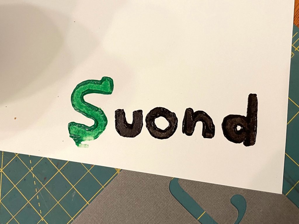
Our task this week was to choose a five letter word and craft stamps for each of the letters in the word to produce two final prints as similar as possible to each other. After watching Danny Cooke’s YouTube video about the letterpress and movable type workshop at the University of Plymouth, I knew that achieving the level of quality I sought would not be easy, but I also knew that I could rely on my experience with wood carving as a guide. The key, I figured, would be to try to emulate the pieces that I saw in terms of their shape and structure, so that they could be positioned repeatedly to achieve the duplicate copies.

I started by ideating words composed of unique alphabetical characters while reflecting on some of the concepts in this week’s readings. One of the ideas that stood out was Marshall McLuhan’s elaboration of J. C. Carothers’s postulations about the senses, and how the advent of literacy (as in the adoption of a visual representation of oral language), impacts the “ratio” between the senses (McLuhan, 2011, p. 24-29). I selected the word “sound”, because I truly appreciate the sense of hearing above all other senses, even though sight is arguably the most valuable.

potato stamp pieces on a counter

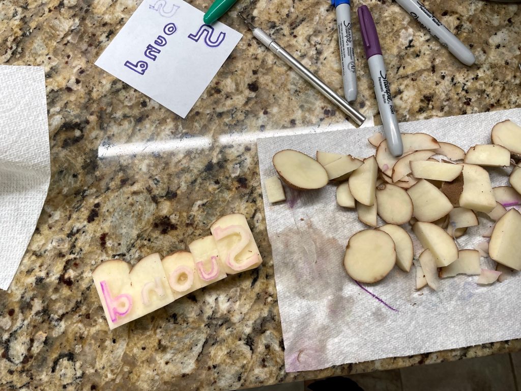
Initial potato stamp preparation and creation

One mental note I had made while watching the video, was the squareness and depth of each of the letters. I surmised that it would be important for each piece to have edges that were proportionally similar so that the spacing and alignment were controlled. I also realized that the letters on the pieces were reflections, so I wrote the characters on a thin piece of paper so that the ink could be seen through to the other side.

After drawing the shapes of the reflections on halved potato pieces, I carefully carved the cut face using an Xacto and a kitchen knife. As I carved, I thought of the perseverance and patience that Gutenberg must have had in developing the system that he did, not to mention the ingenuity and foresight to make the work of copyists more economical. In Empire and Communications, Harold Innis describes industries like metallurgy and paper production – developing adjacent to block printing – as important for setting the stage for the invention of the printing press (Innis, 2007, p. 164), and the clear demand for increased production by ecclesiastics.

Because I had carefully focused on the width, depth, and surface angle of the potato pieces, it allowed me to use the knife blade as an alignment tool; using one hand, I squeezed the pieces together while using my other hand to lift and flip them into place. Although my first attempt at printing was aligned quite well, I didn’t pay attention to the character order: the word was misspelled :(.

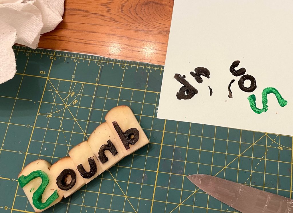
potato stamp print of the word sound, misspelled

Oops!

In my second attempt, when squeezing and lifting the pieces into place, the blocks slipped and fell onto the paper in a mess.

a cutting board and potato stamp pieces

Disaster during placement

I changed my approach in the third attempt, painting the ink and then placing each block individually, essentially casting all the effort for ensuring alignment out the window. Each piece was placed visually, but freehand, to form the first print.

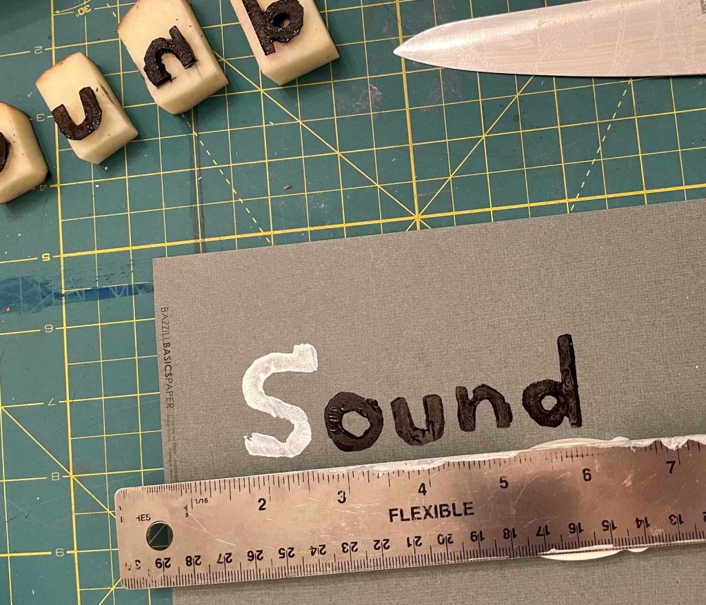
Happy with the result, but unhappy with the approach, I adjusted the process for the second print by using an elevated ruler as a guide. Although the kerning remained freehand, I was satisfied that the letters were controlled horizontally.

a picture of a piece of paper with a ruler

A better approach: one-by-one using a guide.

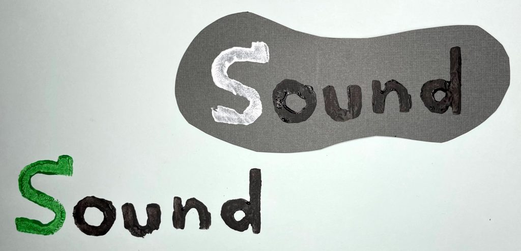
I wanted to experiment with different first letter colours because this appears to have been a common occurrence in medieval text.

the word sound, printed twice using potato stamps

Final print

My printing exercise took approximately two hours, and it is clearly a technical pursuit because of the importance of precision. Any mechanical systematization would have needed to consider the impact of temperature on the expansion or contraction of metal, the viscosity and drying time of ink, and the complexity of the operational labour. However, as Innis documents, the unbelievable explosion of print as a result of this technology (roughly 200 pages/hr to 768,000 pages/hr!) clearly demonstrates it value (Innis, 2007).

References

Innis, H. (2007). Empire and communications. Dundurn Press.

McLuhan, M. & ProQuest (Firm). (2011). The Gutenberg galaxy: The making of typographic man ([New];1;New;). University of Toronto Press. https://go.exlibris.link/tqv0cls4

What is text? What is technology?

A couple of years ago I watched a news report that described the findings of a study about crows; researchers had found that crows could put sticks and straws together to solve some kind of puzzle contraption to obtain food. This was a memorable report because apparently outside of humans and “great apes”, no other animal had been observed using “compound tools”, or tools that are made from multiple components. It piqued my interest in understanding the origin of human tools, and my exploration eventually led me to articles that philosophically questioned whether our hands and our bodies are merely “tools” for our brains. This argument can be made and debated in another post, but what is interesting and relevant to the topic in this post, is the evolution of humans’ tool use — whether this includes the development of appendages and opposable thumbs, or not.

Technology in this context, refers to the development of a capability (usually positive in nature) as a result of the use of a tool, whether that capability is realized or not. For example, if we examine early hominid life there are many examples of how tools were used to enhance living conditions, improve food gathering capabilities, or increase weapon effectiveness. Later, the development of the wheel made it possible for civilizations to move great quantities of materials and people, thereby increasing the efficiency of travel and the yield of harvest. Jump forward in time even further and consider the capabilities conferred by nuclear technology. Although only experienced twice, the atomic bomb shapes our existence even today because humanity collectively understands its destructive capabilities, and so those who possess this technology are conferred tactical latitude that is paired with increased vigilance. Tools (the objects themselves) and their use (and eventual mastery), together create a “technology” that affords newfound capabilities that can be communicated and shared for a common benefit or concealed and wielded as a power.

Text, as a specific form of literacy involving communicating ideas through written modalities, is a technology that helps persist communication beyond a synchronous experience. It forces the reader to conceptualize, internalize, and imagine the thoughts of the writer because it lacks the ability to convey meaning other than through the definitions of the words that are chosen and the sentences that are crafted. It has no ability to adjust pitch or intonation like aural artifacts; it cannot wave its arms in the air or sign meaning through movement like theatre; and it must take about one thousand words to capture the essence of a photograph. Despite this seeming constraint at one might call the “presentation layer”, humanity’s written history has proven that the depth and richness of the text’s language can bring the reader to tears or have them burst out in laughter. But it is text’s ability to outlast other forms of communication over time – with relative ease – that is its most celebrated affordance.