The Premier League Payout

By Nyah Gray and Miriam Celebiler

A link to our website can be found here.

Objectives

The English Premier League is the most-watched football league in the world, garnering an international audience of around 1.4 billion people annually. Its players are some of the highest-paid in the world, but there isn’t a standard salary or easily determinable, consistent reason for disparities. Our goal with our visualizations was to analyze players’ salaries in relation to their attributes and markers of success, and try to see if there were any significant correlations. We hoped that these statistics would reveal surprising patterns or even more surprising outliers, possibly providing insights into how Premier League success is measured, and what contributes to a player’s value. The intended audience for our visualizations is Premier League fans, ones who are familiar with the teams by logo and with the players by name, and would be interested in the sport from not only an entertainment perspective, but from a cultural and business-minded perspective as well. The information is still understandable and accessible to a wide audience, however, and could potentially be of even greater interest to a non-Premier League fan who isn’t aware of the economics around the sport.

We aimed at presenting our visualizations on a simple, easy-to-follow website, which guides viewers through our findings and analyses with text and images. Where necessary, certain visualizations are interactive, allowing for the viewer to isolate relevant data points and become engaged with the data.

Data we used

For this project, we created a data set composed of the top 22 players in each of the 2021-2022 English Premier League teams. Each data point consists of the player’s name, their team, their nationality, the total amount of minutes they played during the season, their Instagram followers as of November 2022, and their gross salary for the entire season. We sourced the basic details of each player from the official Premier League Stats Centre website, and we sourced their salaries from Capology.com, a website that covers football finance. To find each player’s Instagram follower count, we had to search them up by name and manually check that they were the correct, verified account before inputting the data.

The Tools

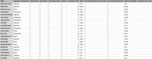
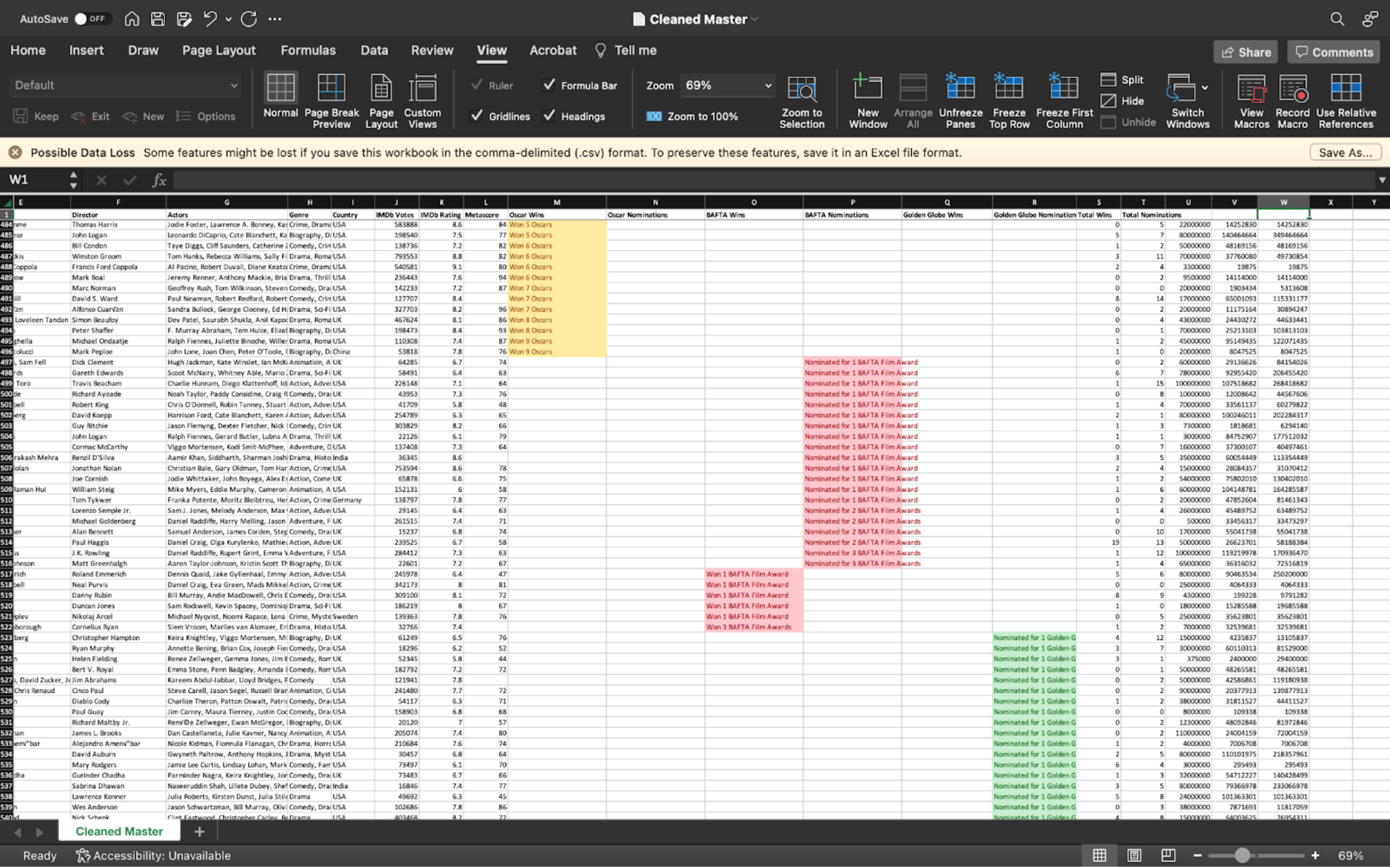
In the data collection step, we used google sheets to compile our data set. Sourcing information from the internet, we manually inputted data into our spread sheet. 
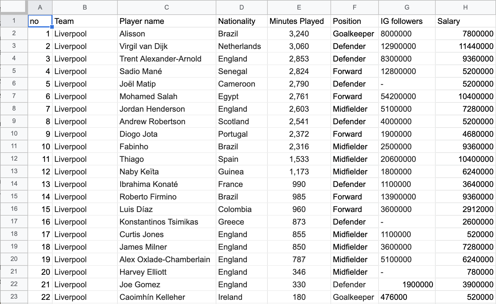
Figure 1: Our dataset on Excel.

Once completed, we brainstormed ideas for how we wanted to represent our data using a pen and paper.
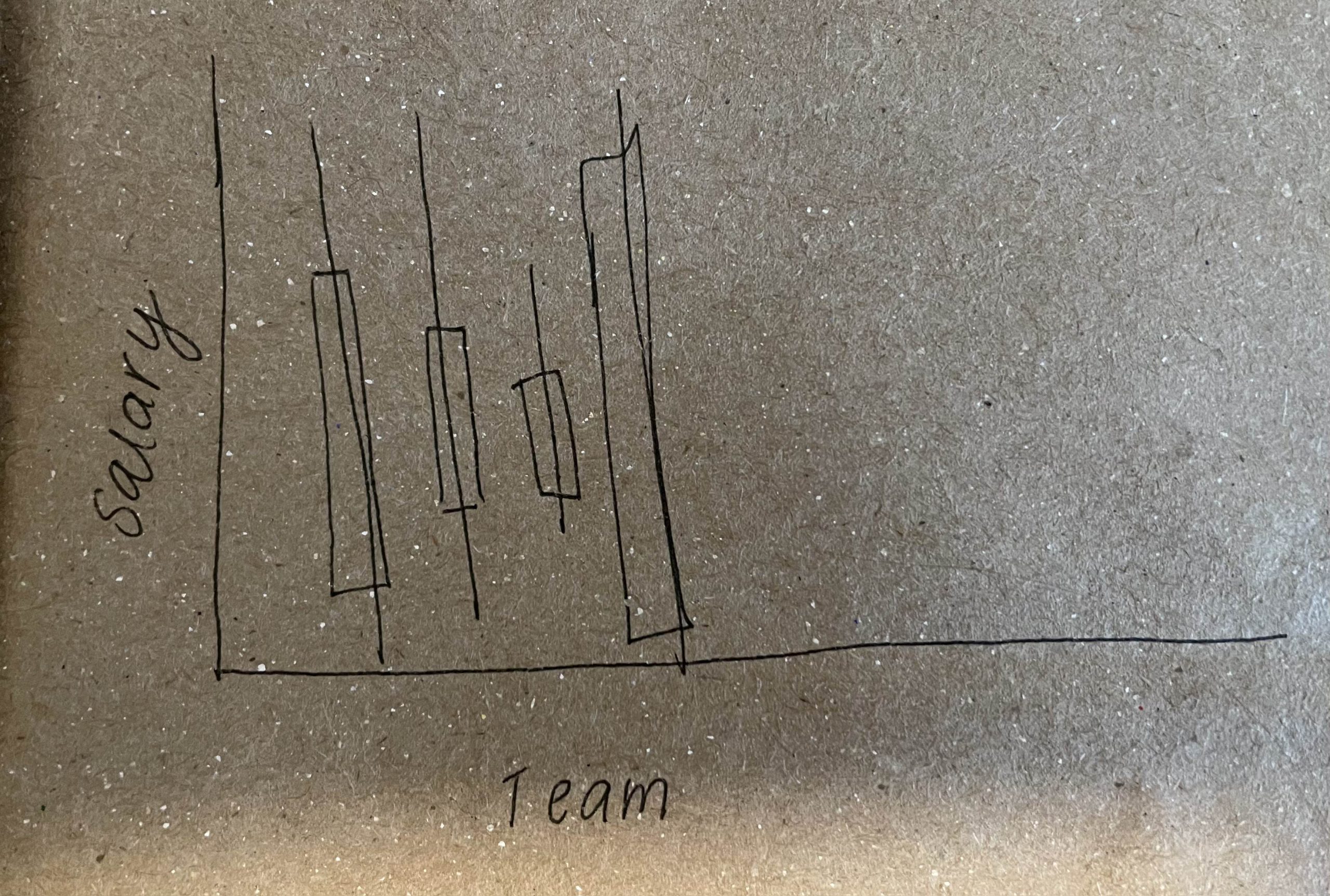
Figure 2: An initial draft of our box plot on pen and a paper bag.

We then ingested the data into Tableau desktop, and used the software to assign the correct attribute type to our attributes, fixing Instagram followers from a sting to a whole decimal and nationality from a string to a geographical region. With our dataset, we created our visualizations in Tableau, using online resources to learn new functions on the software. One of these new functions was figuring out how to use the team logos as marks and another was about changing the coloring of the visualizations. Tableau was the ideal choice for us since it is a strong visualization making software that we already learned how to use. Tableau fit our needs perfectly, though we did have some trouble with publishing to Tableau Public.

After we completed our visualizations in Tableau, we prepared a website on Wix as our final product. The website embeds our Tableau visualizations to maintain interactivity and also allows for text that can guide the viewer through our visual story. We chose Wix because it is easy to use, but some of the negatives that came with using it was that it was hard to work on it collaboratively and it was hard to customize.

Analytic Steps

A lot of our analysis of the data, and therefore the types of visualizations that we would include, had to be done through playing around on Tableau Desktop, and seeing what results we could garner from different iterations of scatterplots and bar graphs. We knew that we wanted to analyze the correlation between salary and total minutes of playing time, as well as between salary and Instagram followers, so we made scatterplots pertaining to those attributes. They somewhat revealed the results that we hypothesized, but not explicitly and didn’t reveal any consistent positive correlations. We included these graphs in our final visualization as they are still interesting and a crucial part of the story we are telling. The analysis of Instagram followers especially was a tricky one, since Cristiano Ronaldo’s extremely high follower count makes him an anomaly that makes the rest of the data appear skewed and minuscule. We thought that this phenomenon was very telling about the “success” disparity between players in the EPL, so we included this as part of our story in the final visualization.
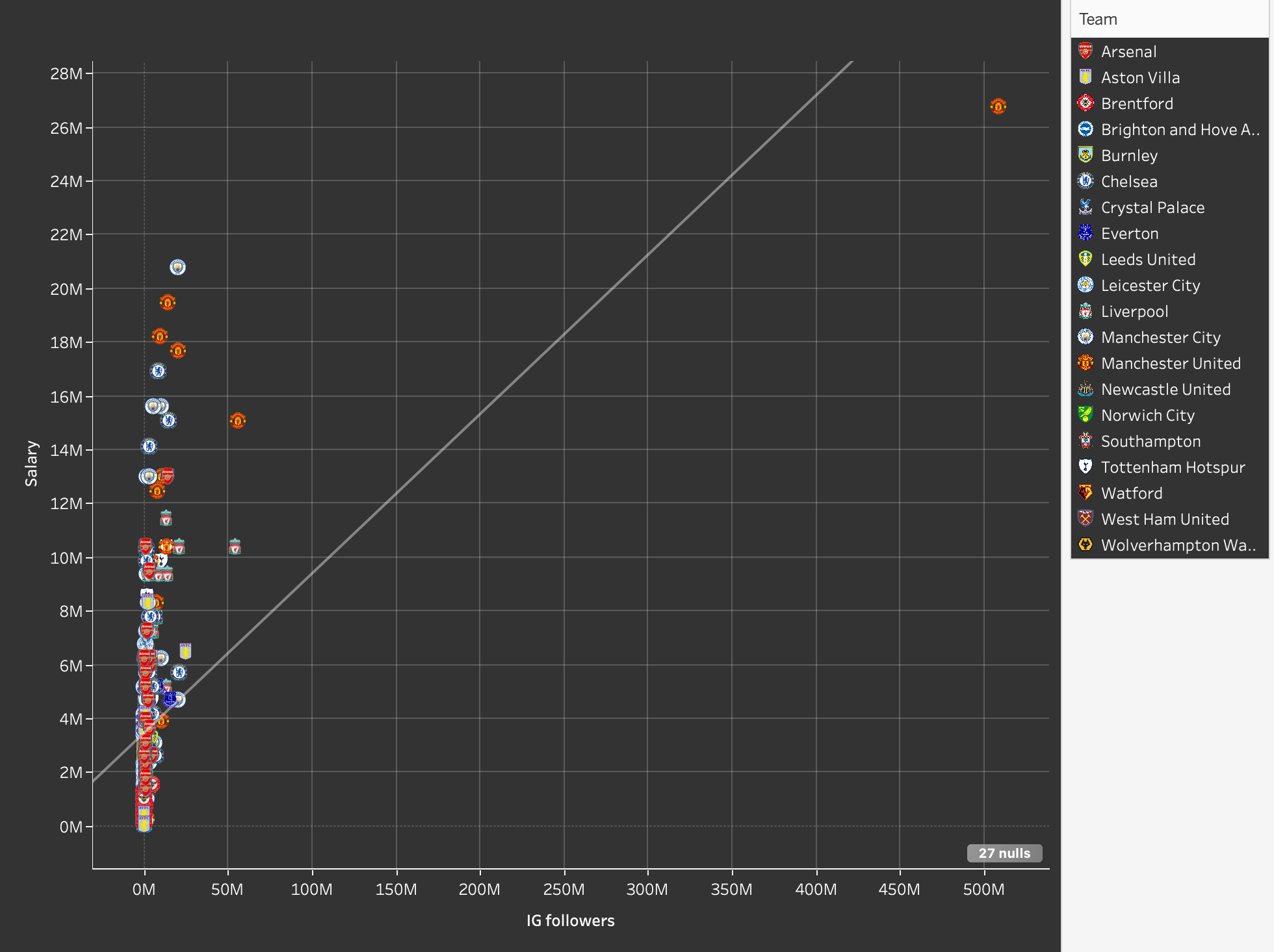
Figure 3: Ronaldo’s Instagram followers as an outlier point.

We found that the inclusion of each player as a separate data point wasn’t as easily readable or informative as we had hoped, so we created a more comprehensive scatterplot which took the average salary of each team. Initially, they were ordered alphabetically, but then we had the idea to add another attribute to compare this data to, which is the final standings of the teams, which we placed them in manually. 
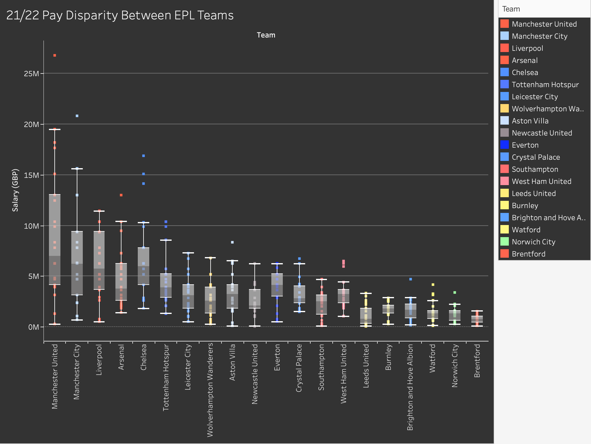
Figure 4: Final box plot showing pay disparity between EPL teams.

We found that the most interesting aspect of our data had to do with salary disparities within teams, or the difference in salary between the highest and lowest players, in other words. To analyze this, we created a box and whisker plot which measured the range of salaries within the teams, and we ordered them from largest disparity to smallest disparity.

Design Process

Once we had all of our data collected, we revisited our proposal and set goals for what we wanted to achieve with our visualizations. Our goals were to see if there were any correlations between player salaries and their time played, as well as how their salaries compared to their Instagram follower count.

As mentioned above, we chose to represent this data using scatterplots. Once we began putting our visualizations for these points together we wanted to be able to visually represent the teams of players to see if that had any impact on the results. At first we used color hue to code circle shaped marks, but since we were working with 20 teams the visualization wasn’t that effective. Instead we chose to use the team logos as the marks, as well as a key for which logo matched which team to the right.
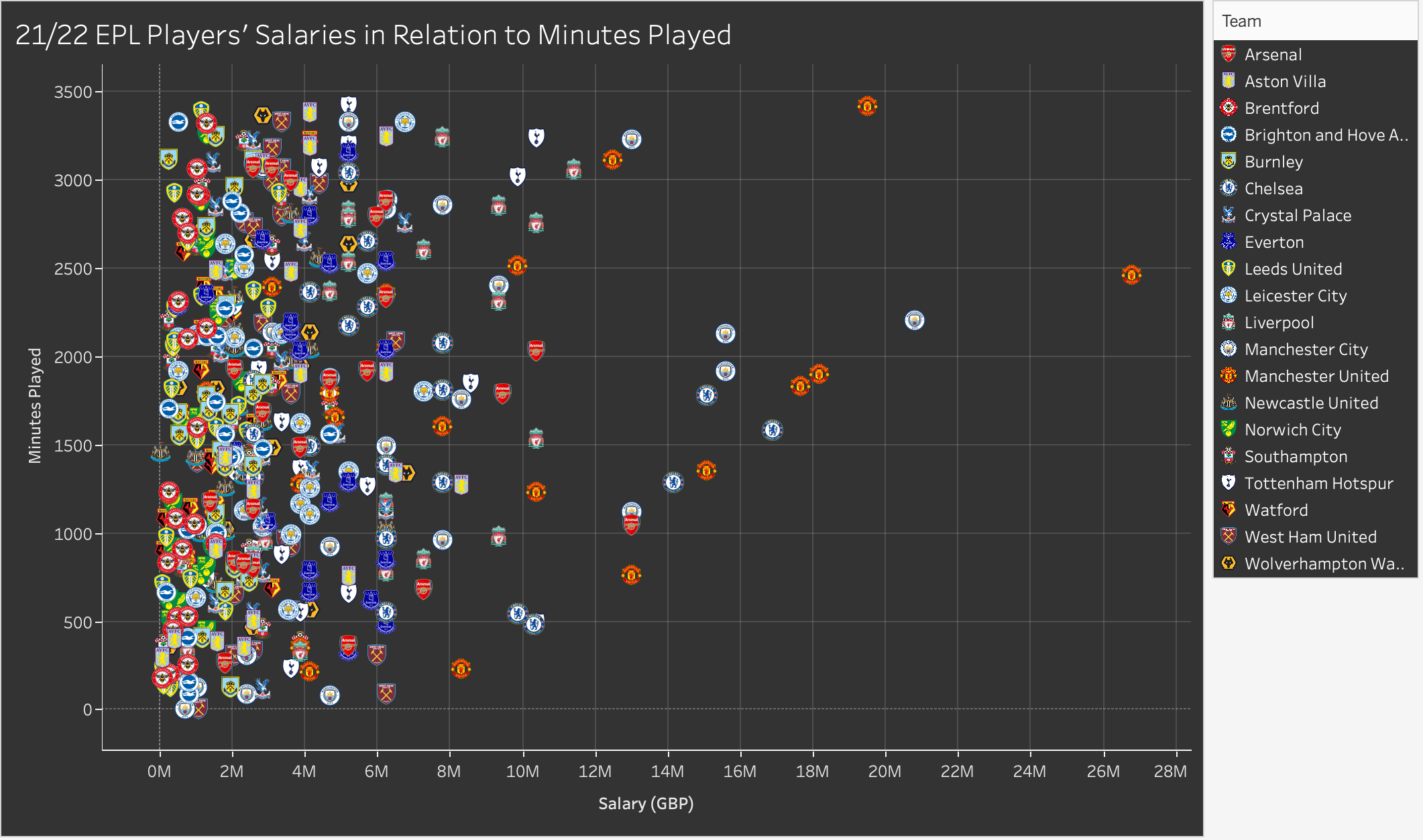
Figure 5: Final scatter plot showing EPL players’ salaries.

We kept the salary on the x-axis to maintain consistency with the visualization that showed salaries compared with Instagram followers. When designing our website we chose a black theme in order to show that our story is not necessarily neutral. It is shocking and dark. With a black website, we wanted to match the color by making our visualizations dark as well. Using the web to figure out how the change the color of the background, different boxes, the text, gridlines, and more, we finally got the visualization’s shading where we wanted it. At that point, some of the logos were not visible against the black background. From our knowledge of opponent process theory as mentioned in Ware (2008), we knew we needed to change the dark blue Tottenham logo to increase visibility. We used the black-white channel by finding a Tottenham logo with a white background to create contrast and fix our problem.

When inputting the data early on in our project, we noticed a huge difference in salaries across teams. We tried a bunch of different ways to visualize the gap. First we made a bar graph, but we ran into the same issue with coloring as we did in our earlier visualizations. We instead opted for a scatterplot, using placement and size to emphasize the differences in average annual player salaries across teams. We chose placement and size because using Muzner (2015)’s explanation of the effectiveness principle, average salaries are quantitative and area and placement are two of the most effective ways to show that.
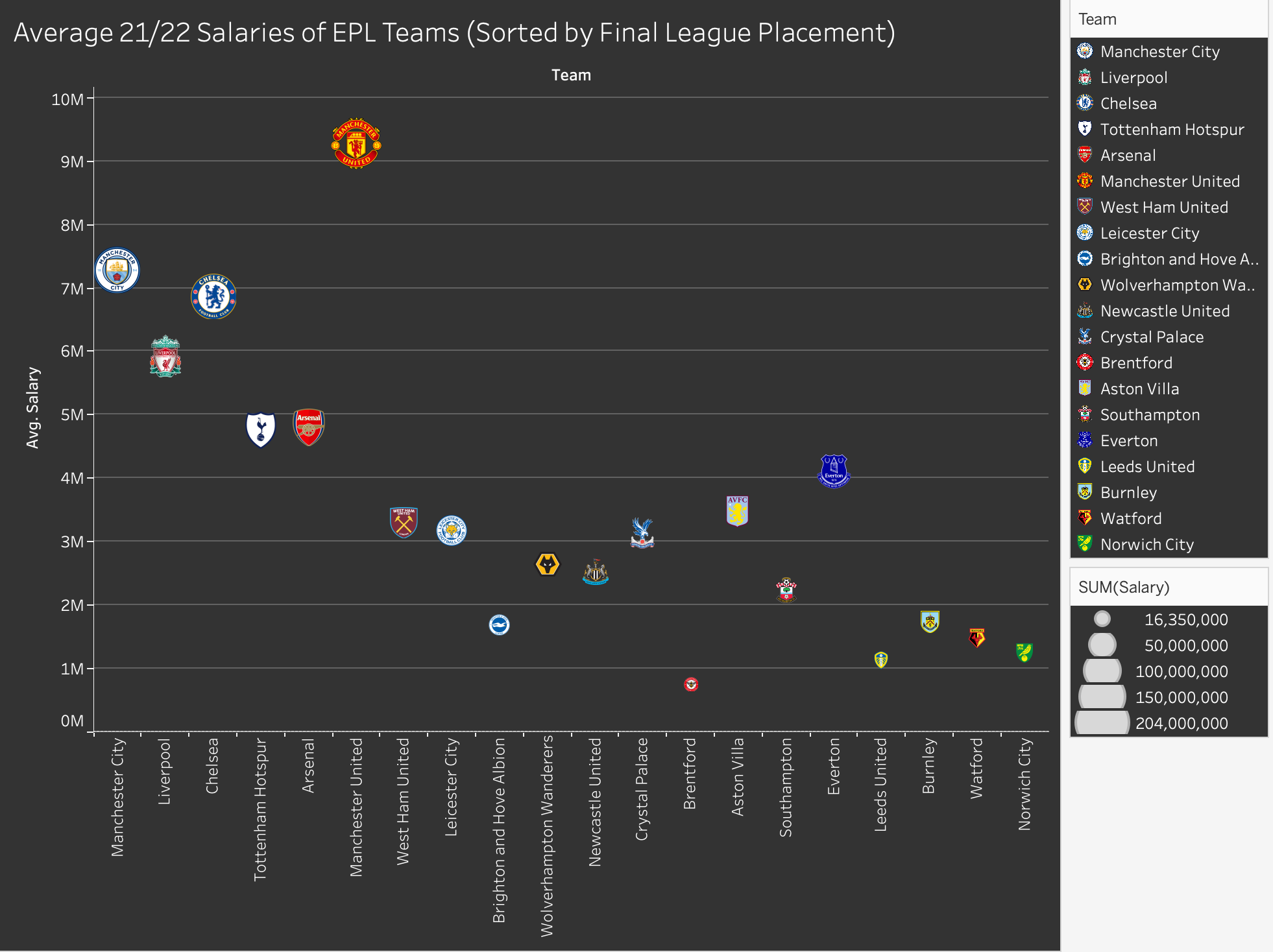
Figure 6: Final team salaries visualization.

Since our visualizations with all the players are very busy, we needed to use interaction to allow viewers to sort the data by team and be see more details on a player using the tooltip. We chose to have players of the same team highlighted on hover because hovering is one of the most intuitive ways to interact with a visualization and we did not want users to skip over the ability to interact. For our visualization of Instagram followers we chose to include one visualization using Ronaldo’s data and one excluding it on the same dashboard. We linked the interaction on the two visualizations so that the hover for teams linked.
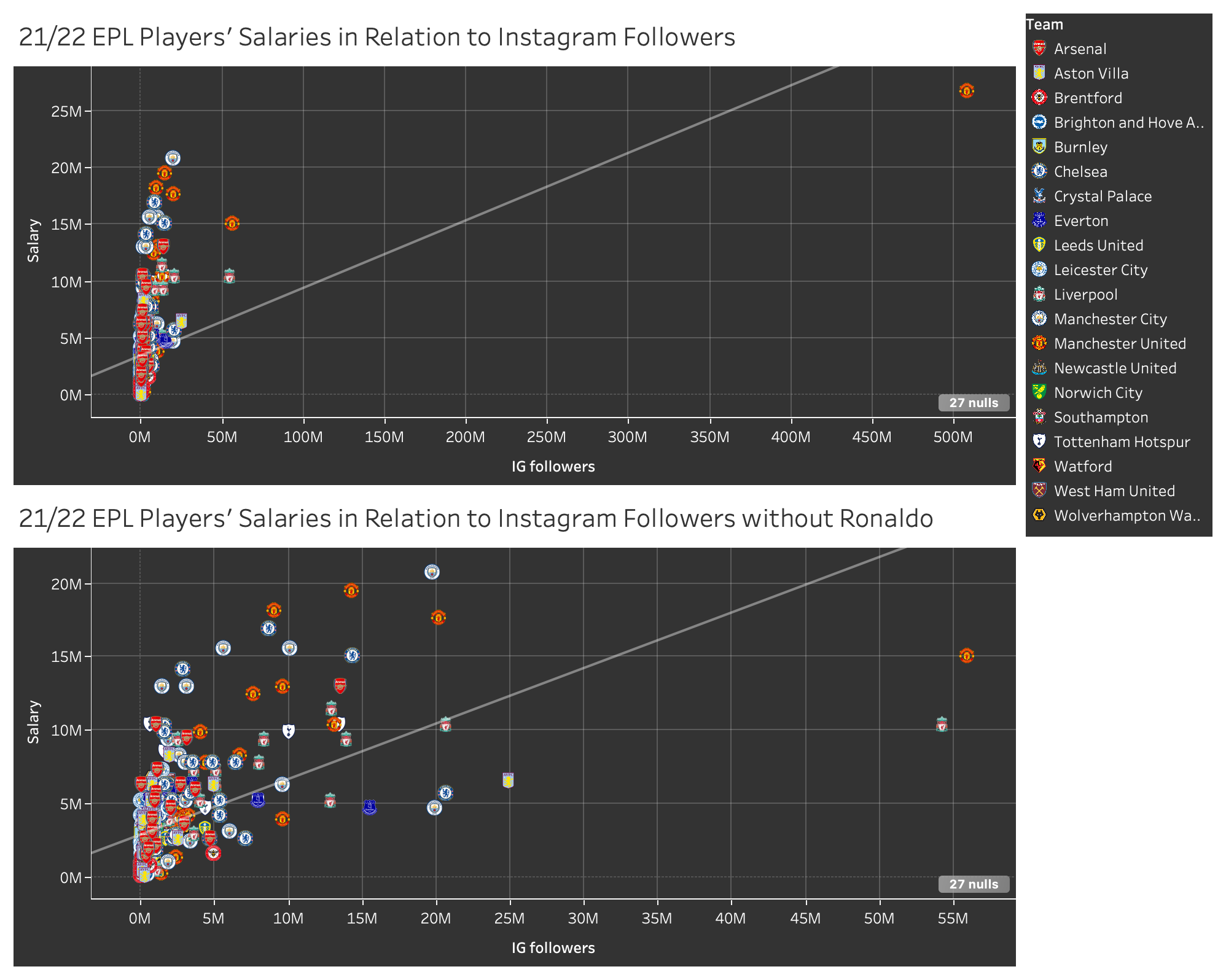
Figure 7: Dashboard of visualizations showing IG followers with and without Ronaldo.

Finally, we made a box and whiskers plot to show income disparity amongst and within teams, we chose a box and whiskers visualization because it was the most effective in showing all of the key differences in salaries by team.

There were also several visualizations we made that we did not end up using in our final story. We tried to make a visualization using some of the other attributes we had in our data set. We first attempted to find a link between position or nationality and salary but we didn’t have enough data to draw conclusions. Then we tried to make a pie chart of the demographic of EPL players. The pie had too many slices to make an effective visualization, so we turned to a chloropleth map instead. The final visualization was not that interesting as most of the players are from the UK. Since the map did not push forward our story either we decided to scrap it.
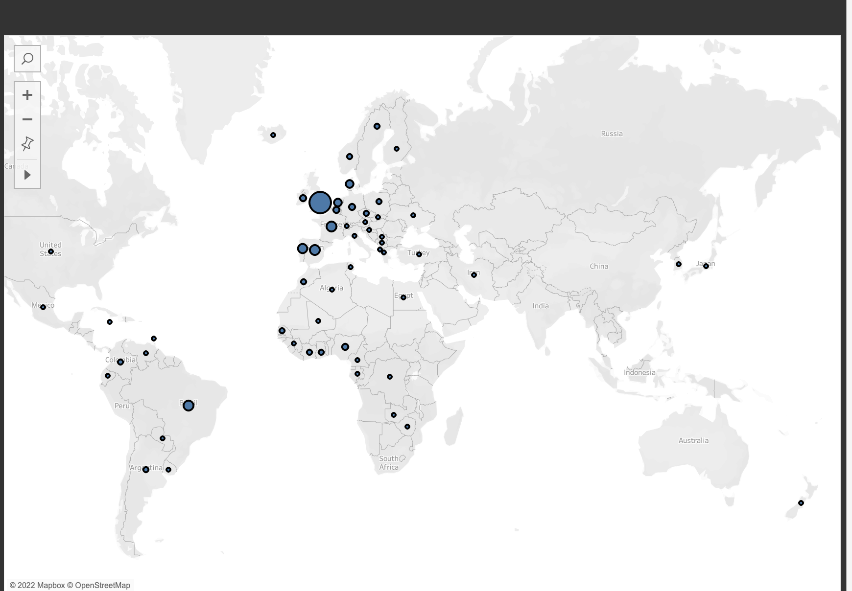
Figure 8: Scrapped map design.

The Story

Once all of our visualizations had been made, we started thinking about how we wanted to tell our story. A website seemed like the best choice because it allowed us to embed our visualizations and maintain their interactive elements. Our website guides the viewer through four visualizations, prompting thoughts and asking questions throughout the experience.

When we did embed our visualizations onto the website, the color of the logos appeared very overexposed and washed out. We aren’t sure why this happened because the visualizations look the way they do in the screenshots throughout this report when we view them on Tableau.

We started off with a short introduction to get the viewer thinking about our topic. Then, we showed our most complex visualization, showing all the players and how their salary compares to their playing time. From there we guided them to another visualization which shows each player individually, this time comparing salary to popularity. At this point we introduce the idea of stardom and the effect it has on salary. After that, we begin to move away from individuals, showing the difference in average salary between teams. This is where we are starting to move more towards the crux of our project. Our next visualization ties the knot, showing a box and whiskers plot that makes the salary disparity within and amongst teams shocking. We prefaced each visualization with a small description of what is being shown. While each visualization can stand on its own, we wanted the story to flow through words and visuals alike.

We end with a conclusion that summarizes the key takeaways and why this data matters. At the very end of the page, we added a note on where we sourced our data from and how viewers can access our data set. We did this in order to abide by Schwabish and Feng’s “Do No Harm Guide,” and be transparent with our data.

Evaluation of Design

Pros

Our visualizations accomplish what we had aimed for, which is to visualize a dataset in ways that compare attributes pertaining to EPL players that may not have been done before. We made sure to capitalize on effectiveness and expressiveness during our design process and feel that the choice to use the team logos for the individual marks was successful and unique, and makes it easier to digest the data and gain an understanding of it even at first glance. If viewers feel compelled to inspect the data further, they can do so by hovering over the points, and the interactiveness adds an engaging element overall. 

Cons

The cons of our visualizations are that some of the data attributes are inherently messy, even if they are technically accurate. For example, the measurement of a player’s minutes on the field may have been impacted by things like injury, and therefore that dataset must be taken with a grain of salt in terms of how accurately it represents a player’s contributions to the team. There is also the con that the logos we’ve used are somewhat complex in their designs, and might confuse viewers at first glance or if seen from afar. In the box and whisker plot, we decided to use hue to encode the teams, and opted for colours that are most associated with the teams, using the eyedropper tool to make them exact. While this is understandable to a well-versed EPL fan, a lot of the colours are quite similar, but we hoped that the inclusion of labels would counteract this con and make it so that each team was still distinguishable.

Also, a con that only occurred once we published our visualizations is that the colours in the logos appear to be quite faded on our website, which they didn’t appear to be during the design process. The screenshots we’ve included in this blog post have the properly saturated colours.

References

Capology. (2022). 2021-2022 Premier League Player Salaries. [Data file]. Retrieved from https://www.capology.com/uk/premier-league/salaries/2021-2022/?fbclid=IwAR0IqWGxxciPJ8DO7_4TwOhV8SumyChvYncsMw-LapSF4IjIJU9vwwkszto

Football TV Audience Figures – Who Is The Premier League’s Most Watched Club? (2022, 

October 21). Sporting Index. Retrieved December 6, 2022, from https://www.sportingindex.com/spread-betting-blog/premier-league-viewing-figures#:~:text=More%20than%201.4%20billion%20people,League%20followers%2C%20with%20300%20million.

Munzner, T. (2014). Visualization Analysis and Design (1st ed.). A K Peters/CRC Press. https://doi-org.ezproxy.library.ubc.ca/10.1201/b17511 

Premier League. (2022). Premer League Player Stats. [Date file]. Retrieved from https://www.premierleague.com/stats/top/players/mins_played?fbclid=IwAR1cKESBknrnz5eBhF_78n7NC8-m6eacrPk0O_3lEAOfw8StxMhiGIK9lIE

Schwabish, J. & Feng, A. (2021). Do No Harm Guide: Applying Equity Awareness in Data Visualization. Urban Institute.

Ware, C. (2008). Color. Visual Thinking, 65–85. https://doi.org/10.1016/b978-0-12-370896-0.00004-4 

Minority Report – Minority Representation in Star Trek

Link to Our Website – https://milarad12.wixsite.com/info-419-star-trek 

The Objectives of Our InfoVis Design

With our project, we aimed to find and display how diverse the Star Trek franchise is and, moreover, the priority given to certain cast members/characters through screen time, based on the number of lines they speak per episode. The goal was to see how much the franchise emphasizes the minority characters, considering that it is deemed revolutionary for its inclusivity. Characters such as Benjamin Sisko from Star Trek: Deep Space Nine have been said to have contributed to “part of larger more inclusive history in which Africans were the first to go boldly into the unknown,” (Pounds, 2009, p. 228) for instance. In some cases, however, scholars are finding the inclusion of minorities in the franchise to be performative, and so the result is that these groups are being misrepresented. Writing on the “demotion of women,” Tudor and Meehan say that the “Star Trek franchise exemplifies the textual operations of gender in neoliberal, postfeminist media, which frequently make the female roles seem more significant than they are” (2013, p. 130). Scholars have also assessed “how gender and race define certain characters… as the Other,” and therefore how Star Trek “exposes American ideological systems and those concepts that are deemed alien” (Casavant, 2003, pp. 799-800). 

Even though a variety of academic research on the representation of minorities throughout the Star Trek franchise exists, much of this research is inaccessible to the general public. These documents also typically include dense academic jargon, making the information even further inaccessible to those with any interest outside the strictly academic. Our aim was to make visuals which would depict the essential information about representation in the franchise clearly and effectively, so as to reduce the barrier of entry to this data. 

The Details of the Data Set 

The data set we used consisted of six attributes/columns: every line spoken by each character, the character names, and the number of the season and episode each line was spoken in. The title of each episode was also present, although this ended up unused in our final visualizations. The data set included information from every episode of Star Trek: The Next Generation (TNG), Star Trek: Deep Space Nine (DS9), and Star Trek: Voyager (VOY). While there is a limitation present in that this does not represent minority inclusion across the franchise as a whole, which includes twelve television series and many films, books, and other media products, we felt that this would generally represent an effective sample. TNG was a huge success during its original run (Cerone, 1992) and, while they didn’t reach the same heights as TNG, DS9 and VOY were produced and created by many of the same creative forces behind TNG, and enjoyed their own relative success. Reflecting this, these three series are often placed in “top ten best” lists generated by reviewers and fans of the franchise. (Diaz, 2021; Hanson, 2022; Snellgrove, 2022)  Due to their popularity, we wanted to find out whether these shows were representative of a large portion of their fanbase. (Gallaher, 2011)

The Tools We Used

In order to clean the data for the purpose of creating information visualizations, we used Excel. In Excel, we manually added two more attributes/columns: one which indicates whether the character/cast member is a racial minority, and another which indicates whether they are a gender minority, by checking every character entry against an associated entry on the Star Trek fan wiki, Memory Alpha (Various Contributors, 2022). We chose not to include sexual orientation in the data, as this information is largely unavailable for most of the cast, and not relevant to the characters they are representing in the show. Using Excel meant this data had to be sorted manually – with tens of thousands of entries, this was a slow process, but due to the nature of the sorting, the only possible way to do so. As a side effect, every entry in the data set was scrutinized, leading to a very low margin of error in terms of data cleanliness. Tableau Prep was used to combine the three data sets, one for each series, into a single unified data set for ease of use.

To create the information visualizations, Tableau was used. Our familiarity with the program allowed us to experiment with a variety of visualization methods, as well as interpret the data through the use of calculated fields. The limitations of Tableau’s suite of visual editing options, however, resulted in some ideas for visualizations being discarded after failed attempts to create these through Tableau. We also included three visualizations made in Infogram which were initially designed in Tableau. The visualizations made in Infogram are simpler, and the way they are embedded match the appearance and animations on the website, which makes them more appealing and approachable.

Analytic Steps 

The very first analytic step we had to complete in our design process was to remove characters that, for a variety of reasons, could not have their ethnicity or gender verified. This included uncredited actors, roles that were too small to have any information on the character accessible, and typos or mismatching character names. Additionally, we noticed that some characters were played by the same actor, such as in the case of clones or possession, and so their entries were adjusted so as to only represent the one character. This helped us to prevent unintentionally inflating the data with misleading and redundant entries. Errors, such as null entries or lines with an unknown speaker, were noticed during this process and removed.

Once the information was in Tableau, a few visualizations based on rough ideas were drafted, although some had to be discarded as previously mentioned. From there, we went through a round of analysis on this data – identifying trends, notable data points, data that was well within or wildly outside expected parameters, and other relevant aspects of the data. Using this analysis, our visualizations were revised, and new visualizations were experimented with, so as to best display the relevant and important aspects of this data. With these visualizations complete, we went through a final round of analysis similar to the previous, leading us to our final results.

Design Process

The first step of the design process was rough sketches of potential visualizations – the data set was too large for any even close to accurate drafts to be made by hand, so these were primarily focused on visual design and ensuring the visualizations were utilizing effectiveness through the choice of visual measures. (Fig. 1, Fig. 2) Once the data had been brought into Tableau, accurate visualizations could be drafted, and we could experiment with aspects of expressiveness, (Fig. 3, Fig. 4) making sure that the information contained within the data was clearly and efficiently communicated to the reader through the selected measures, without sacrificing any of our hard won effectiveness (Munzner, 2015, pp. 100-101).

Due to the vast size of our data set, interactions were necessary for any in-depth visualization. This was implemented through the use of Tableau’s filters feature – allowing information to be viewed at a scale of every episode of every season of every series, or on an episode-to-episode basis. In this way, we were able to introduce what we feel is a high degree of expressiveness without the loss of effectiveness that initially resulted from the size of our data creating a cluttered visualization (Munzner, 2015, pp. 111). Overall, the filters allow the user to “limit the number of items in [each] display,” (Heer & Shneiderman, 2012, pp. 4-6) which was crucial in our visualizations, as it would permit both a big picture view as well as nuanced, magnified views that depend on the user’s interests. 

In terms of the aesthetics of the website and visualizations, we chose a colour palette based on the LCARS computer operating system from TNG (Koopa, 2017). The hues chosen were distinct and all equally saturated to ensure that the data is viewed as categorical rather than ordered (Munzner, 2015, pp. 223-224)

Fig. 1 – A prototype sketch.

Fig. 2 – A prototype sketch.

Fig. 3 – A discarded visualization.

Fig. 4 – An early draft of a visualization used in the final results.


The Story 

The story that we are telling in our infographic is one that demonstrates the performativity of the effort to include minorities in the casting in prominent roles as the franchise evolved. 

The first series, TNG, shows a prominence of white, male cast members. The character with the most lines in this series, and in all of these series overall, is Captain Jean-Luc Picard, who is portrayed by Patrick Stewart, a white male actor. He is followed in line count by Commander William Riker and Lieutenant Commander Data, portrayed by Jonathan Frakes and Brent Spiner, respectively. Both of these actors are also white men. Following these characters are POC male actors Levar Burton and Micheal Dorn, playing Lieutenant Commander Geordi LaForge and Lieutenant Commander Worf. It is with noting that Burton, who has the most lines of the two POC main cast of TNG, has just a little over a third of the amount of lines as Stewart, and almost two thousand fewer lines than Spiner. At the tail end of this are the white, female characters, Dr. Beverly Crusher and Counsellor Deanna Troi, played by Gates McFadden and Marina Sirtis. Each has about 3200 lines across a series with a total of 178 episodes, around a quarter of Stewart’s line allocation. There are no female POC actors in TNG’s main cast. We can see that, initially, TNG was making an effort at diverse representation, but was still heavily prioritizing white, male cast members. The data of representation across the entire cast of the series reflects this as well, although it is worth noting that as the series progressed minority characters were gradually given more lines, and white male characters less, although the hierarchy of minority representation remained consistent throughout the series. 

Following TNG was DS9. The main cast of this was notably more diverse. Commander Sisko is the character with the most lines in this series – he is played by Avery Brooks, a POC male. Following him in line count are Kira Nerys, played by white actress Nana Visitor, and Doctor Julian Bashir, played by POC male actor Alexander Siddig. After Bashir are white male actors Colm Meaney, René Auberjonois, and Armin Shimerman, representing Miles O’Brien, Odo, and Quark. Next is Dax, played by multiple actors, both white women, and finally Worf, with Dorn reprising the role. It is notable that most of the main cast of DS9 have a similar amount of lines throughout the series, with only Brooks and Dorn having significant variations, Brooks due to his character’s important role in the show, and Dorn due to Worf joining the main cast partway through the series. This cast is not much more inherently diverse than that of TNG, however the line distribution being much more equitable among minority and non-minority cast members, leading to much more diversity of representation on this series compared to the previous. It is worth noting, however, that this cast also does not include a female poc actor. The overall cast’s line distribution reflects this as well – while representation of white male cast trends upwards, representation of gender and racial minorities are more consistent and consistently higher than that of TNG. Representation of POC women remains low, however.

VOY stars Kate Mulgrew, a female white actor, as Captain Kathryn Janeway. She has the most lines in this series, and the second most lines overall, behind Stewart by less than a thousand lines. Following this are Robert Picardo as EMH, also known as The Doctor, and Commander Chakotay, played by male POC actor Robert Beltran. Next are white male actor Robert Duncan McNeill as Lieutenant Tom Paris, and male POC actors Tim Huss and Garret Wang as Lieutenant Commander Tuvok and Ensign Harry Kim. Following is B’Elanna Torres, played by Roxann Dawson, is notable for being the only female POC cast member of the main cast of any of the series analyzed. Finally are Seven of Nine, played by white female actress Jeri Ryan, and white male actor Ethan Phillips as Neelix. VOY is the most diverse of the three series – its main cast has an equitable distribution of lines, similar to DS9, but is also the most diverse. This is highlighted even further when looking at the representation in the cast as a whole. Minority representation is much more common than in the previous two series, and representation of every minority group trends upwards as the series progresses. It is the only series of the three to break a strict hierarchy of representation – in some seasons, female cast members are given equal screen time as males. Female POC representation is also significantly higher than in the other series, although it still remains low.

We can gather general trends through this data. The franchise, as represented by these three series, begins with line counts dominated by white male actors. As the franchise continues, these characters are given less screen time as a diverse range of main and side characters are introduced, increasing efforts of minority representation, culminating in VOY, which has a remarkably diverse cast represented, in comparison to TNG. A clear hierarchy is still maintained, however, and room for improvement still exists.

Potential Cons of Our Data and Analysis Process

One major con is that our data was not set up to analyze the number of words per line. This means that, while some characters have fewer distinct lines, they may have longer lines and therefore more screen time than other characters who have more but shorter lines. This is also related to the fact that our analysis does not identify the type of dialogue spoken. A character may have thousands of lines which perhaps reinforce negative or inaccurate stereotypes, which does not contribute positively to inclusivity and diversification (Carrington, 2021). A sentiment analysis would need to be conducted, but this type of data analysis is outside of the scope of this project, yet is still very important for a complete understanding of minority representation. 

In addition to limiting our scope to just three series in an expansive franchise, our data lacks similar, contemporary data to be compared to. Repeating these analytical steps on shows from the same era and from current times would allow us insight into how the representation in Star Trek fares relative to its contemporaries and to current franchises. Perhaps representation in TNG is lacking, for example, but compared to other shows it is quite progressive? Or vice versa, perhaps VOY was nowhere near as diverse as other shows from the era. These questions cannot be answered without further data analysis. 


References 

Carrington, R. (2021, February 26). Voyager’s Native American consultant was a fraud. Redshirts Always Die. https://redshirtsalwaysdie.com/2021/02/26/voyagers-native-american-consultant-was-a-fraud/

Casavant, M. M. (2003). “to boldly go where no other has gone before: The construction of race and gender in star trek”. American Quarterly, 55(4), 799. 

Cerone, D. (1992, November 6). ‘Star trek’ –Still on the Beam : Television: One year after creator Gene Roddenberry’s death, the born-again series tops the syndication charts. Los Angeles Times. https://www.latimes.com/archives/la-xpm-1992-11-06-ca-1286-story.html.

Diaz, E. (2021, April 12). Every STAR TREK Series, Ranked from Worst to Best. Nerdist. https://nerdist.com/article/star-trek-series-ranked/

FoundationINTERVIEWS. (2019, Jan 16). Nichelle Nichols on Martin Luther King, Jr. convincing her not to leave “Star Trek” [Video]. YouTube. https://youtu.be/zrzygziT11I.

Gallaher, V. (2011, March 14). More Female Trekkies Than Male, According To New Survey. MTV. https://www.mtv.com/news/m0qnf3/more-female-trekkies-than-male-according-to-new-survey-demographics-of-star-trek-fans.

Hanson, D. (2022, May 9). Every Star Trek TV Series, Ranked by Popularity. ScreenRant. https://screenrant.com/star-trek-tv-series-tos-tng-ds9-voyager-ratings/

Heer, J., & Shneiderman, B. (2012). Interactive Dynamics for Visual Analysis. Queue, 10(2), 1–26. 

jkingsman. (2021, April 12). Star-Trek-Script-Programmatics. GitHub. https://github.com/jkingsman/Star-Trek-Script-Programmatics. 

Koopa, R. (2017, February 17). LCARS-style wallpaper [Image]. Wikipedia. https://commons.wikimedia.org/wiki/File:Lcars_wallpaper.svg#/media/File:Lcars_wallpaper.svg. 

Munzner, T. (2015). Visualization Analysis and Design. Boca Raton, FL: CRC Press. 

Pounds, M. C. (2009). ‘explorers’ – star trek: Deep space nine. African Identities, 7(2), 209-235. 

Snellgrove, C. (2022, September 12). The best ‘Star Trek’ series, ranked. Entertainment Weekly. https://ew.com/tv/best-star-trek-series-ranked/

Tudor, D. V., & Meehan, E. R. (2013). Demoting women on the screen and in the board room. Cinema Journal, 53(1), 130-136. 

Various Contributors. (2022, December 6). Memory Alpha. https://memory-alpha.fandom.com/.

Canadians’ Causes of Stress and Ability to Handle Stress Before the COVID-19 Pandemic

By Evens Wong and Jueun Park

Link to our final InfoVis: https://ewong05.wixsite.com/canadiansstress

The Objective
This project investigates the causes of stress and one’s ability to handle stress among Canadians before the COVID-19 pandemic. Why are we focusing on the pre-pandemic dataset? It is observant that the global pandemic, even at this endemic phase, had life-changing impacts on people’s physical and mental health. A report by the Mental Health Commission of Canada observed that COVID-19 immediately impacted many Canadians’ mental health one month after the outbreak (Nanos 2020). Since then, there were increased reports on the varying degrees of impacts of COVID-19 on people’s mental health, including stress, anxiety, depression and suicide (World Health Organization 2022; Statistics Canada 2021). The general discourse around mental health today emphasizes the consequences of the global health crisis on one’s well-being (Nealon 2021). Although this observation helps us understand the causes of stress in times of a historical, extreme and uncontrollable crisis, it leaves out the world before COVID-19, an “ordinary” everyday life. As many nations declare the endemic phase of the pandemic, it is imperative to propose an outlook of the public’s mental health in the back-to-normal world. While the lasting impacts of the pandemic may present a different outlook from the pre-pandemic data, this project attempts to enhance the public discourse around destigmatizing mental health in one’s everyday life.
This project explored the correlation between the causes of stress and one’s ability to handle stress by age and provinces (excluding territories) within Canada. The goal of this InfoVis project is to contribute to the communication of existing knowledge through creative storytelling that can be accessible and engaging to the public. The project echoes the current discourse around the importance of mental health by offering additional insight into the average Canadian’s stress management before the COVID-19 pandemic. The intended audience of this InfoVis. are the everyday-life Canadians. The InfoVis. Incorporates a creative storytelling aspect to engage the audience. The story narrates the everyday life of Canadians’ stress management through the first-person voice of a fictional character. 

The Data Used
The dataset “Mental health characteristics: Ability to handle stress and sources of stress” by age group, sex, and provinces (excluding territories) in Canada is sourced from the Government of Canada’s open data, published by Statistics Canada. The governmental documentation of statistics reassures the authenticity and credibility of the dataset. It is a three-year-apart report completed under the same conditions comparing 2016 and 2019. The dataset provides metadata and the dataset file in CSV format.
In the data cleaning process, we removed unnecessary attributes and double-checked for inconsistent variables. We organized data to be read by Tableau. Removed attributes include Statistics Canada-specific indexical codes and gender as they were not required attributes for the analysis in this project. Data items that were indicated as “too unreliable to be published” was removed as well. An example of such a data item is the number of people in the age group of 12 to 17 years responding to the causes of stress such as “work”, “financial concerns”, and “health” in many provinces. The number of respondents for these categories was too low and was considered unreliable by the source provider. Additionally, for the age group 35 to 65+, their data items for causes of stress, “school” was removed as they were not surveyed for that particular cause.
In addition, we referenced “Table 13-10-0802-01, Mental health characteristics: Ability to handle stress and sources of stress”, based on the same dataset published by Statistics Canada, to explore the data by geography (province), age, and indicators in a more organized format (Statistics Canada 2020). The analysis of the cleaned dataset built the project’s final deliverable and statistical conclusions in understanding everyday life Canadians’ causes of stress in the pre-pandemic time. Ultimately, the dataset supported the idea and narrative of the Canadians who are under stress due to “work”, “finance”, “family”, “school”, “time pressures”, “health”, and other unstated reasons—which were surveyed causes of stress—in their daily lives by different provinces and ages.

Before Cleaning

After Cleaning

The Tools
Microsoft Excel for Cleaning Data
We used Microsoft Excel software to clean data before importing it to Tableau for making InfoVis. Excel features such as filtering and searching was used to detect unnecessary—” too unreliable to be published”—data and remove them. Then we organized the data sequentially by year, grouping the order by provinces and age group to better understand the overview of the data before visualizing it (After Cleaning image). The strength of Microsoft Excel is its compatibility with Tableau. When the final CSV file was imported, it displayed data as it was reorganized on Microsoft Excel. 

Tableau for Data Analysis and InfoVis.
We used Tableau and the Tableau Server to make drafts of InfoVis. for analysis and the final deliverable. As we have done many tutorials for Tableau during class, we were equipped to explore various features and functions it offered. The particular strength of this software was its wide variety of idioms including maps. Using its built-in feature for maps, we created the choropleth map of Canada visualizing which province is most “stressed” filtered by year and age and the listed causes of stress. 

Infogram for Storytelling with InfoVis.
We used Infogram as the design software for creating our final story of the project. The digital, interactive infographic unfolds the story as the viewer scrolls down with their cursor on the published website. The strength of this tool is that it engages the audience through animation and interactivity. The weakness of this tool is that the free version of the software is very limited. We were not able to incorporate map idiom on Infogram but rather had to find a way to embed InfoVis. designed by Tableau. 

Wix for Sharing InfoVis.
The final visualization was made and hosted on Wix, with help from Infogram. Hosting the Tableau and Infogram visualizations on Wix allowed us to embed HTML links to easily display everything created for this visualization on a single scrollable webpage. However, difficulties encountered, included Infogram’s restrictions without upgrading to a Pro version, therefore unable to access map visualizing tools for Canada specifically. This meant having to incorporate map visualizations directly from Tableau and momentarily breaking the consistency of the visual design concept.

Analytic Steps
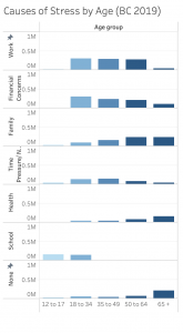
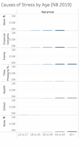
The analytic step involved making many edits to InfoVis. on Tableau. Since the amount of data was too large to comprehend by just reading and cleaning the datasheet, we needed to make drafts of data visualizations to understand the overview. Even though our final design goal was to create an interactive map that shows the varying degrees of causes of stress between provinces, we first created a compound bar chart that showed the causes of stress in a comparative layout, sequentially ordered horizontally by age groups and filtered by the year. Such a visualization helped us understand the overall picture of the data and analyze that the most stressed age group is the young adult to mid-age concerned about work and financial concerns. This bar graph allowed us to understand a certain pattern across provinces, showing that causes of stress are closely correlated with age. For example, for the cause of stress, “health”, the number of people concerned about it increases by age from youngest to oldest. In all provinces, youth (age group 12 to 17 and 18 to 35 years), were most stressed about school.

To avoid “lying with data”, we fixed the vertical scale to the highest number of respondents. In this step, we discovered another pattern in the data. Ontario, Quebec and British Columbia were always the top 3 provinces that showed the darkest shade, meaning they had most respondents expressing their causes of stress. It was clear that this pattern was revealed not because certain provinces were more stressed than others but because the population and number of total respondents from each province varied. Instead of making rushed judgements on which province has the most issues causing people to be stressed, it was important for us to observe the pattern using an objective scale. While more population and concentration of people may be a factor, it cannot be implied solely by the analysis of this data visualization.

After we had a better understanding of the overall data, we designed drafts of InfoVis. using the map idiom. In this step, we filled in the gaps that were not as clear in the bar charts—comparing provinces in one overview. The first map did not include filters and was misleading as it was showing the sum number of the cause of stress, only for “family” between all ages in the year 2016. We fixed the issue by filtering “Measured Values” for different causes of stress. We also customized the map by assigning a colour to specific values. For example, the “unreliable to be published” data is displayed as a grey shade in the gradient scale. 

Design Process and Principles
To create the infographic, we started off knowing what form of data visualizations we wanted and what we wanted them to show through filters and luminance. While creating the bar chart for the first data visualization comparing 2016 and 2019 statistics, a filter was applied to toggle between provinces. Additionally, being able to hover and highlight features as interactive aspects of our final InfoVis was also something we strived to achieve in our designs.
We used a consistent colour palette to achieve beauty/attractiveness in the overall website and InfoVis. The set of colours is coded for different sections of the infographic, narrative and InfoVis., making it easier for the eye to follow the pattern of the whole delivery of information. Having a clear hierarchy seen in the data visualizations, followed by the statistical spotlight near the end of the graphic, the website is easy to follow while still pertaining to a clear theme. Additionally, our design follows utility principles of “explorative infographic” (Lankow et al., 2012) methods, showing numbers and providing statistical facts to the audience, as well as evidence of being a “narrative infographic” Lankow et al. (2012). There are a clear narrative and character that walks the audience through the entire visualization, leaving a clear message and intention that stress and mental health issues with various causes have always existed in Canada before COVID-19. The soundness of our final website is ultimately derived from the message and topic of research that we are presenting. The topic of mental health and stress across Canada is caused by very prevalent issues such as work, school, financial concerns, time, health, etc. apparent and existing as issues well before the COVID-19 pandemic.
The geospatial idiom, map, portrays the overview of Canadians’ everyday life causes of stress expressively (Muzner, 2015, p.102). It uses the spatial region, an identity channel suitable for categorical data (provinces). The number of respondents for causes of stress, quantitative data, is visualized through the magnitude channel of colour luminance—the more stressed, the darker the shade is (Muzner, 2015, p. 223). The InfoVis. is effective as it achieves the goal of showcasing the overview of the causes of stress among everyday Canadians before the COVID-19 pandemic. The sliding filter for age group, selective filter for year and highlighter for each cause of stress provide necessary interactivity for the audience to explore the data by their desired search. Through hovering, the viewer can observe further details of each mark, the provinces and the numbers of people indicating different causes of stress. 

The Story
Our project follows the narrative story of a hypothetical, typical Canadian ‘Kris’, throughout their adolescence and adulthood as they navigate through the leading causes of stress across Canada. We are highlighting and emphasizing the existing causes of pre-pandemic stress, acknowledging and making aware that stress caused by work, financial concern, school, etc. has always existed and has always been an issue prevalent throughout the past several years.

Pros and Cons
Our design explicitly includes a creative story narrative based on a hypothetical character representing a typical Canadian. This story guided the viewer through a clear story arc. This strategy of incorporating the concept of a “quantified selfie”, is based on the understanding of empathy in data visualization and storytelling (Bui 2019). We intentionally narrated the story as an individual’s story to personalize the audience’s encounter with this data. Stress and mental health, as serious subject matters, we had to make empathetic and conscious design choices. We incorporated strategies from the “Do No Harm Guide” to “put people first”, and “use personal connections to help readers and users better connect with the material” (Schwabish, 2021, p. 6).
One of the design choices we can improve is the bar chart comparing causes of stress organized by age across Canada. While its animation makes the highest peaks pop out for individual bar graphs, it is difficult to see the changes between the years. The filter on Tableau allowed a more dynamic interaction for the audience—animating the height of the bar graph as we applied filters between years. Our initial design plan was to make the years into “layers”. The idea of the layer was to reveal and allow the viewer to compare changes or (remains) over the years in Canadians’ causes of stress immediately by scrolling down. Due to the technical limitations of the software, we could not achieve our initial design strategy. Nevertheless, it was a learning opportunity to explore other mediums for InfoVis., realizing that the choice of design software has a significant impact on the delivery of information and InfoVis.’s expressive and effectiveness.

References
Bui, K. (2019, June 11). Designing data visualizations with empathy. Data Journalism. https://datajournalism.com/read/longreads/data-visualisations-with-empathy

Government of Canada. (2022 June, 20). Map of canadian mental health during the COVID-19 pandemic. Retrieved October 18, 2022, from https://health-infobase.canada.ca/covid-19/mental-health/. 

Lankow, J., Ritchie, J., Crooks, R., & O’Reilly for Higher Education. (2012). Infographics: The power of visual storytelling. John Wiley & Sons, Inc.

Munzner, T. (2015). Chapter 5: Marks and Channels.Visualization Analysis and Design. Boca Raton, FL: CRC Press.

Munzner, T. (2015). Chapter 10: Map color and other channels.Visualization Analysis and Design. Boca Raton, FL: CRC Press.

Nanos. (2020, April). Canadians report an increase in feeling stressed regularly or all the time now compared to one month before COVID-19. Mental Health Commission of Canada. Retrieved October 17, 2022, from https://mentalhealthcommission.ca/resource/canadians-report-an-increase-in-feeling-stressed-regularly-or-all-the-time-now-compared-to-one-month-before-covid-19/. 

Nealon, M. (2021 October, 9). The pandemic accelerant: How COVID-19 advanced our mental health priorities. United Nations. Retrieved October 17, 2022, from https://www.un.org/en/un-chronicle/pandemic-accelerant-how-covid-19-advanced-our-mental-health-priorities. 

Schwabish, J & Feng, A. (2021, June 9). Do no harm guide: Applying equity awareness in data visualization. Urban Institute. 

Statistics Canada. (2021, September 24). Canadian social survey: COVID-19 and well-being. Retrieved October 17, 2022 from https://www150.statcan.gc.ca/n1/daily-quotidien/210924/dq210924a-eng.htm. 

Statistics Canada. (2020 August, 6). Table 13-10-0802-01 Mental health characteristics: Ability to handle stress and sources of stress. Retrieved October 14, 2022, from https://doi.org/10.25318/1310080201-eng. 

World Health Organization. (2022, March 2). Covid-19 pandemic triggers 25% increase in prevalence of anxiety and depression worldwide. World Health Organization. Retrieved October 17, 2022, from https://www.who.int/news/item/02-03-2022-covid-19-pandemic-triggers-25-increase-in-prevalence-of-anxiety-and-depression-worldwide. 

IN LABOUR: The Impact of the Pandemic on Working Mothers in B.C.

IN LABOUR: The Impact of the Pandemic on Working Mothers

Click here to view our project

Objective

In this project, our aim is to tell the story of working mothers aged 25-44 during January 2021 to September 2022 and to connect our findings with the myriad studies (Andrada-Poa et al., 2022; Fuller & Qian, 2021; Turner et al., 2022; Zanhour & Sumpter, 2022) conducted on the experiences of working mothers that were documented in the earlier days of the pandemic, when more restrictions and nationwide uncertainty prevailed. We further contextualize the reasons for these changes in employment with respect to significant economic dimensions of this period, including inflation, the rollback of public health measures, and the volatile nature of the post-pandemic work environment.

Our goals for this project are twofold: first, to validate the hardships and tell the story of what working mothers experienced during the pandemic, and second, to reach policy makers considering the stratified nature of the post-pandemic labour economy. We articulate the patterns of change in the employment of Canadian working mothers while demonstrating the economic changes that occurred during this period. 

Our static infographics are necessary to supplement our analysis and provide insight into changes in the provincial and national economy during the time the labour force surveys were conducted. A combination of static and interactive visualizations will help the viewer understand some of the forces behind Canada’s economic volatility between January 2021 and September 2022, while allowing them to see how this is reflected in LFS data from that time.

Data

Our primary data sources for our visualizations include the Canadian Labour Force Survey (LFS), the Consumer Price Index (CPI) for Canada, and various other inflation and pandemic-related secondary source and journal articles. The Canadian LFS has been collected monthly since 1945. If requested, it is mandatory for Canadians to respond to the survey.


Each LFS dataset contains variables including, but not limited to, responder demographic, labour force status, types of labour, length of employment, and so on. One of the first steps for cleaning our data was to decide specifically which variables to omit from consideration, and which to include. We ended up using over 20 individual LFS datasets, each of which originally containing ~80,00 rows of data
We decided to narrow down the focus of our project to mothers within British Columbia, rather than all of Canada. After conducting random sampling on each dataset, we ended up with ~3400 rows of data to work with

Additionally, we needed to analyze the consistency between variables for each monthly survey, and account for discrepancies or gaps in the type of data gathered each month. Renaming the variables was also required, as many of them were acronyms for technical terms.


We used the Consumer Price Index (CPI) to supplement what our LFS data revealed. The dramatic rise of inflation in the last 18 months in Canada is directly intertwined with employment, and we felt that there may be overlap in the trends occurring to the labour economy, and cost of living for Canadians.
Aside from the CPI and LFS, most of our other sources needed to be more qualitative, to help contextualize our topic and relate it more directly to the viewer.

Tools

R: Faced with an overwhelming volume of data (with 21 datasets to clean and merge from January 2021 to September 2022), our team struggled to perform our cleaning procedures in Microsoft Excel, as originally planned, as the software and the limitations of our personal computers created obstacles for working with such large datasets. Instead, we turned to the R Statistical software where we wrote a script to automate the data cleaning processes. A crucial step in our R cleaning process was running a simple random sample on our dataset to decrease our data observations to a more manageable level, while still maintaining the integrity of the dataset.


Tableau Prep Builder: We used Tableau Prep Builder for importing our master dataset, and making some final adjustments before we could create our visualizations. All of our variable names needed to be changed from acronyms into more interpretable names. Certain data types weren’t imported correctly into Tableau from the .csv file, and needed to be manually changed.


Tableau Desktop: This was used to create our main visualizations. It took some time to figure out the most effective way to represent our data, and which filters to include. Our primary visualizations appear as follows:


Wix: We felt that Wix was the most appropriate platform for hosting our project. It gave us the  ability to easily integrate our visualizations, and efficiently re-organize and format the layout of text and other images. The end result is a visually clean and easily accessible website which required no coding to create. 

Analytic Steps

Starting from scratch, we chose this subject as it was one with a lot of recent data. We started by selecting and analysing the data and variables we wanted to work with. While our objective remained the same throughout the process of our research, the largest obstacle was properly choosing and cleaning our datasets. Even though we had no issue finding the appropriate datasets to analyse, each dataset contained a substantial amount of irrelevant information (such as information or attributes that had nothing to do with working mothers), which needed to be manually removed.

Our initial plan was to analyze monthly datasets across a period of 21 months for all of Canada, but this proved to be unrealistic considering the size of each dataset. We ended up reducing the analysis to British Columbia, from January 2021 to September 2022 and using R to clean the data and conduct random sampling.

Design Process

Our storyboarding process was slow getting started, as we spent a considerable amount of time strictly working to clean our data. As soon as we had the ability to start creating visualizations, we realized how many directions we could go with our narrative, and found it difficult to settle on the scope of our analysis.
Our secondary sources provided strong insight into the understandably shaky labour force in Canada, while also highlighting the unique difficulties that inflation creates for mothers compared to other demographics.

Once we began understanding how inflation impacts women more than men, we realized the need to include data about fathers in our visualization.

Our visualizations emphasize how fathers in B.C., on average, work more hours per week than mothers. We included a filter for age-groups to show the variation between younger and older parents.


Pros and Cons

The most critical aspect of our project was the time period we analyzed. Although there is sufficient LFS data from before and during the pandemic, the datasets are difficult to work with due to their size.
An alternative approach, this analysis could have been conducted using quarterly datasets from each year, starting well before 2020, and ending as close to the current date as possible. This would have been a more comprehensive approach, which would have provided stronger context for the severity of the current economic crisis, and how dramatically the pandemic has affected the labour market.
Additionally, we recognized after creating our visualizations that certain age-groups may have been underrepresented in our datasets. We could have omitted the youngest age group (20-24), and included a few older age groups (above age 44). While we know there are many 20-24 year olds who fit the criteria for our analysis, it seems that there are significantly more on the older end of the spectrum.

Despite these areas which could be improved, the results of our analysis are thought-provoking, and create other questions for future research.


Citations 

Andrada-Poa, M. R. J., Jabal, R. F., & Cleofas, J. V. (2022). Single mothering during the COVID-19 pandemic: A remote photovoice project among Filipino single mothers working from home. Community, Work & Family, 25(2), 260–278. https://doi.org/10.1080/13668803.2021.2006608

Canadian COVID-19 Intervention Timeline | CIHI. (n.d.). Retrieved October 19, 2022, from https://www.cihi.ca/en/canadian-covid-19-intervention-timeline

Consumer price index (CPI) – province of british columbia. (2022, November 16). Retrieved December 1, 2022, from https://www2.gov.bc.ca/gov/content/data/statistics/economy/consumer-price-index

Fuller, S., & Qian, Y. (2021). Covid-19 and The Gender Gap in Employment Among Parents of Young Children in Canada. Gender & Society, 35(2), 206–217. https://doi.org/10.1177/08912432211001287

Heer, J. & Shneiderman, B. (2012). Interactive Dynamics for Visual Analysis: A Taxonomy of Tools that Support the Fluent and Flexible Use of Visualizations. Queue, 10(2), 1-26. https://doi.org/10.1145/2133416.2146416

Inflation affects women more than men. civil society can help. World Economic Forum. (n.d.). Retrieved December 1, 2022, from https://www.weforum.org/agenda/2022/10/inflation-crisis-hits-women-harder/

Labour Market: Definitions, Graphs and Data. (n.d.). Bank of Canada. https://www.bankofcanada.ca/rates/indicators/capacity-and-inflation-pressures/labour-market-definitions/

Lemieux et al. (2020) Impact of Covid on Labour Market Lemieux et al. 2020 Impact of Covid on Labour Market.pdf

Munzner, T. (2015). Why: Task Abstraction. Visualization analysis and design (43-65).  CRC Press, Taylor & Francis Group. https://doi.org/10.1201/b17511

The Daily — Labour Force Survey, August 2021. (n.d.). https://www150.statcan.gc.ca/n1/daily-quotidien/210910/dq210910a-eng.htm

Statistics Canada. (2022). Mean age of mother at time of delivery (live births) [Dataset] https://www150.statcan.gc.ca/t1/tbl1/en/tv.action?pid=1310041701&cubeTimeFrame.startYear=2015&cubeTimeFrame.endYear=2021&referencePeriods=20150101%2C20210101

 Statistics Canada. (2022). Labour Force Survey: Public Use Microdata File. [Dataset]. https://www150.statcan.gc.ca/n1/pub/71m0001x/71m0001x2021001-eng.htm 

Statistics Canada. (2022). Consumer Price Index (CPI) statistics, measures of core inflation and other related statistics.[Dataset]. https://www150.statcan.gc.ca/t1/tbl1/en/tv.action?pid=1810025601&cubeTimeFrame.startMonth=01&cubeTimeFrame.startYear=2021&cubeTimeFrame.endMonth=09&cubeTimeFrame.endYear=2022&referencePeriods=20210101%2C20220901

Turner, L. H., Ekachai, D., & Slattery, K. (2022). How Working Mothers Juggle Jobs and Family during COVID-19: Communicating Pathways to Resilience. Journal of Family Communication, 22(2), 138–155. https://doi.org/10.1080/15267431.2022.2058510

Zanhour, M., & Sumpter, D. M. (2022). The entrenchment of the ideal worker norm during the COVID‐19 pandemic: Evidence from working mothers in the United States. Gender, Work & Organization, gwao.12885. https://doi.org/10.1111/gwao.12885


Evaluating National Hockey League Attendance vs In-Arena Experience

By Aaron Schmidtke and Callum Haldenby

The link to our infographic can be found here.

The Objectives

Our project seeks to observe and analyze where the 32 National Hockey League (NHL) teams position themselves when it comes to fan attendance, fan experience, and Fan Cost Index. Fan Cost Index is a metric provided by Team Marketing Report, a Chicago-based sports business intelligence firm that formulates and publishes the numbers after conducting team surveys. Fan Cost Index is an attempt to express expenses from visiting one home game from a professional sports team (in this case, NHL) down to a single number. The Fan Cost Index metrics are based on the average cost of four non-premium tickets, two beers, two sodas, four hot dogs, two souvenir hats (as a proxy for merch buying) and parking. This helps us determine which NHL clubs are the most successful from an attendance standpoint as this information visualization will be focusing primarily on average home attendance, arena capacity, and the aforementioned Fan Cost Index. The main objectives we aim to communicate through this information visualization include making our insights on NHL in-arena experience accessible to the average hockey fan, developing a better understanding of the business aspects of professional sports franchises as well as a tool for NHL clubs’ management teams and ownership groups to evaluate.

The Data

Since our visualization project is centered around NHL in-arena experiences, we wanted to represent a number of different avenues available to analyze. There is a wide variety of different aspects that can affect arena attendance around the league including but not limited to: capacity of their entertainment sports plexes, the price of admission (or Fan Cost Index), who the visiting team is, the respective team’s performance during that particular season, time of game (matinee games versus evening games), and special event games (such as jersey retirement nights, bobblehead giveaway nights, etc). For gathering these data sources, we’re primarily looking at Statista as well as Team Marketing Report’s gathering of data translated by The Athletic. Statista is a recognizable and reliable source for market and consumer data as the leader in the provision of reliable business data. They deliver insights and facts across 170 industries in over 150 countries. The Athletic, owned by The New York Times Company, is one of the premier and credible sports publications since its inception in 2016. The Athletic, using data provided by Team Marketing Report, does some cleaning of initial data for us by translating the information into an easy-to-read board which we have continued to visualize in a digestible manner. Since Team Marketing Report’s establishment of Fan Cost Index, it has become the industry standard for gathering statistics for the cost of a family of four to attend a game at all MLB, NFL, NBA or NHL game venues. We feel confident that this data is appropriate and productive for us to represent our information visualization and facilitates the communication of important data points. Our data sources from Statista looking at average league attendance and respective Fan Cost Index scores courtesy of Team Marketing Report are both specific to the 2021-22 NHL campaign therefore equate to the same relevancy for that determined season. These datasets are not too convoluted nor exhaustive as we have a maximum of 32 franchises to evaluate. They were not, however, in an Excel or CSV format. Therefore we cleaned and organized the data into a proper CSV format before we are able to utilize it in Tableau. 

Strengths and Weaknesses of Tools Used

The tools we used for this project included Canva, Tableau, and Google sheets. Canva is very simple and intuitive to use, and allowed us to create a simple yet visually appealing infographic for the purpose of telling the story related to our data, as it offered all the graphic design elements we needed (besides team logos). We were able to create graphs within the program itself, as it allows for data from a CSV file to be uploaded directly into its built-in graphing feature. Tableau allowed us to initially visualize how our data would look on our infographic, and while it can be visually appealing, we decided that since we wanted to be able to grab the attention of viewers with eye-grabbing visuals, canva would be the ideal platform to produce our final product on in the form of an infographic. Finally, google sheets was where we formed our datasets. 

Analytic Steps

Since both of us went into this project with preexisting knowledge about all aspects of hockey, we were able to visualize ahead of time what kind of story the data would tell, as we understand the elements which significantly impact a team’s success in their market. For example, teams located in less traditional hockey markets depend heavily on overall team success as well as an engaging and satisfying fan experience to build a fanbase around, and this is reflected within our visualization with teams such as the Tampa Bay Lightning, the Nashville Predators, and the Vegas Golden Knights. These teams exemplify what franchises which aim to generate further interest in their markets should strive to be like. Finding and using the metric referred to as ‘fan cost index’ was especially helpful in expressing multiple key factors which play into the overall fan experience in a way which is easy to digest and understand by fans new and old alike. We decided that since we already knew what argument we were trying to get across that it would be more within the scope of our intentions to focus on visually communicating the data and evidence which was most important to determining a team’s ability to fill seats instead of representing every single team. 

The Design Process and Principles 

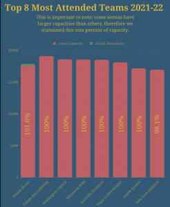
The overall design process began when we used tableau to initially visualize our data before we migrated to Canva to follow through with our final design. In terms of expressiveness, all information relevant to the narrative is graphed. The attendance levels for each franchise are presented on a common scale, and additionally, colour was used to differentiate between the average number of seats which are filled each game and the total number of seats in the arena; red represents the percentage filled, and green represents the percentage left empty. As for effectiveness, using said common scale was clearly the most effective channel we could have used, as doing so allows for viewers to make an easy visual comparison between the presented franchises. Utility is evident in the order in which we present the factors which play into some key takeaways that are presented on the final page of the infographic. The information flows in a manner which is easy for viewers to digest by first providing the informational framework upon which the graphs are based, then presenting the teams which have performed the best in recent years before delving into visual depictions of the data along with the aforementioned key takeaways at the end. We also ensure that the principle of soundness is utilized in that we don’t go overboard in terms of how much data is presented. We stick to the most noteworthy examples of teams which excel as well as teams which fall short in comparison to the rest of the league in terms of attendance, and supplement this data with some relevant information on the last page. Plenty of blank space is also accounted for to make sure that viewers will not be at risk of getting distracted by unnecessary visual aspects. Attractiveness is also taken into account throughout our infographic. The soft yet deep blue background allows for our consistent and uniform use of yellow text as well as team logos (even blue ones) to pop from the page in a visually satisfying manner. On the last page, we subvert the background and font colours with the intention of having the information presented on this page stand out from the rest, given that they are intended to be key takeaways. We also use pictorial graphics to help users visualize the three metrics we use in our evaluation and reserve their use for this aspect of the infographic alone to once again avoid overcrowding the pages. 

The Story

Our infographic demonstrates several different categories that can be evaluated through the information that has been sourced. Firstly, we wanted to provide context as to why attendance statistics may be leaning a certain direction — we state our metrics that will be evaluated followed by a breakdown of Fan Cost Index, and then provide a baseline context of the best performing NHL teams in wins the last five seasons. Secondly, we want to actually visualize the information that we have been working with. We visualize the most attended teams as well as the least attended teams through a bar chart which integrates proper colour to be distinctive and represents clearcut data facilitating readability. Something important to note in both the most attended and least attended graphics is that some teams’ arenas have larger capacities than others, therefore we translated this into percent of capacity metric. The final story we are telling with our infographic is relating the aforementioned information to the Fan Cost Index which we provide six easy-to-understand metrics of best Fan Cost Index, worst Fan Cost Index, highest capacity arena, and relating team performance to Fan Cost Index and attendance records.

Pros and Cons

We believe that we have created an attractive and accessible infographic that avoids the spread of misinformation or misrepresented data. Soundness and utility were of utmost importance when crafting our initial ideas for what this infographic would include and we believe that was done effectively. At the forefront of our design principles was to make sure our infographic represented and applied both effectiveness and expressiveness. The importance of each of our attributes matches the saliency of our channels while our visual encoding expresses all of the information in the dataset attributes. Additionally, it was very important to us to demonstrate the information which each fan base and organization would find interesting to draw their own conclusions about the statistics with equal representation. We wanted to offer every avenue available for readers to interpret the information in any way they see fit with us simply showing them the facts in front of them derived from our sources. 

Despite us both being fans of the Vancouver Canucks and Edmonton Oilers respectively, there was no inherent bias while piecing together our statistics and information and in fact, neither team came up at the top nor bottom of any category so their presence in our work is non-existent. A con, however, may be that our information is relatively limited in factoring in several situations. The first of which is COVID-19 which drastically affected professional sports teams revenue and undoubtedly attendance through those years (especially when sports plexes were operating at half capacity or no in-person fans) which could have skewed the average attendance metric slightly given the economy’s effect on teams and fans. Another factor that we could have considered more is an additional look at which teams actually have the highest revenues to determine whether the Fan Cost Index provides insight into that relation.

References:

“The Business of Hockey.” Forbes, 2022, www.forbes.com/nhl-valuations/list/#tab:overall. Accessed 19 October 2022.

Gough, Christina. “NHL teams average attendance 2021/22.” Statista, 2022, https://www.statista.com/statistics/193749/regular-season-home-attendance-of-national-hockey-league-teams-in-2010/. Accessed 18 October 2022. 

Hartweg, Chris. “Fan Cost Index.” Team Marketing Report, 2022, https://teammarketing.com/fancostindex// Accessed 18 October 2022. 

Ozanian, Mike. “NHL Team Values 2021: New York Rangers Become Hockey’s First $2 Billion Team.” Forbes, 2022, https://www.forbes.com/sites/mikeozanian/2021/12/08/nhl-team-values-2021-22-new-york-rangers-become-hockeys-first-2-billion-team/?sh=4275b9b5360c. Accessed 18 October 2022.

Shea, Bill. “Florida Panthers Remain The NHL’s Best Deal For Fans, But Others May Surprise You.” The Athletic, 2022. https://theathletic.com/3200274/2022/03/23/florida-panthers-remain-the-nhls-best-deal-for-fans-but-the-others-may-surprise-you/. Accessed 19 October 2022.

20 Years’ of Women in Movies: Have Movies Become More Gender-Equal Since 2002? On the Example of Passing the Bechdel Test  

Objectives

Our project aims to show how many movies in the last 20 years (2001 – 2021) have passed the Bechdel test. The Bechdel test, or Bechdel-Wallace test, is a simple test for movies which names the following of three criteria: 1) it has to have at least two [named] women in it, who 2) talk to each other, about 3) something besides a man (Bechdel Test Movie List, n.d.). The main objective for our project is to display whether there has been a change in movie production and analyze whether the movies have become more gender equal.

Since mass media (film in this case) is an agent of socialization (Macionis et al. 2017), it is important that it represents minority groups in a way that will not negatively shape the users’ view. Studies have shown that stereotyped representation in media reflects and distorts how minority groups see themselves and how they are seen by others (Hudson 1998, Hook 1992). Although in later years there have been improvements in women’s representation on screen (Women and Hollywood, n.d.), many of the female characters can be stereotyped roles. With the help of InfoVis techniques, this project will help viewers understand the change of pattern (or a lack of change) of representation in movies and find out whether this mass media platform has been doing a part to set not as stereotyped examples to the public.


Our goal was to analyze how many Bechdel criterias a movie has passed (1, 2, or all 3), in connection to its production year, and genre.


This infographic can be used by film studies and film production students and scholars, gender studies students and scholars, and movie fans who want to learn more about the industry.


Data

For our project, we have used data from an open data source – the official Bechdel test website. To gather information on movie genres, we will use another open data source provided by IMDB. We were able to connect our attributes smoothly, using a name as a connecting variable. After the cleaning and connecting, our dataset consisted of 6 attributes (title, year, IMDb ID, Bechdel test rating, year, genre) and 5,660 items. Our dataset had categorical data (movie names, pass/fail indication, genres) and ordinal data (years).


Tools Used

To sort and clean our data before importing it into Tableau, we have used Microsoft Excel. The data we collected was not cleaned, so it contained a lot of irrelevant information that we had to filter out, such as information for the movies created earlier than 2001 and later than 2021. Since both of us were familiar with Microsoft Excel before, using the software was relatively easy.


To merge the datasets and to create the visualizations, we have used Tableau. Many Tableau techniques learnt in class and on our own time proved to be very helpful in creating and effective and expressive visualization.


Analytical Steps

We came up with the concept after talking about how even popular movies do not always have the representation of the women that women deserve. Eduarda knew the principle of the Bechdel test, so we browsed the Bechdel test website for a while and realized that it can be an interesting source for our project.


In recent years, there have been a lot of talks in the media industry about the more fair representation of minorities, so we decided to check if women have become more represented during the last 20 years.


Since at the beginning of our project we did not know whether the moviemaking traditions changed in the past 20 years, we focused on producing the knowledge, rather than presenting evidence to support the existing argument. Only after creating the visualization, we were able to analyze the patterns of womens’ representation in different movie genres, and answer our own question.


Our first steps were gathering and cleaning the data. We discovered that most of the data comes in txt. format, so our first challenge was to convert it into an Excel format. After this, we removed the data for all the movies created before 2001 and after 2021. Since the movies in the original data tables were not organized by year, we had to use the “filter” tool in Excel. After that, we removed the odd attributes, such as its ESRB rate, and its rating. Then we organized them by year, using “sort” toll in Excel.


To make the dataset more suitable to work on the first scatterplot (How many movies passed all three criteria of the Bechdel test), we have created a separate dataset with information on the movies which passed all three criteria. We have created it using a “Data-Filter” function and saved it as a separate Excel sheet.


Then we uploaded the datasets into Tableau and merged the tables. After that, we realized that most of our movies have more than one genre. So, we decided to group the genres based on the first one. For example, if one movie was assigned as “comedy, musical”, and another – as “comedy, action”, both of them were grouped as “comedy”.


Then our data was clean, organized and ready to be visualized.


Design Process

When thinking about the best way to visualize our data we decided to look for inspiration online. We were able to see many different possibilities and from there choose the one that thought would work the best. We sketched and specified what are the parameters and what we wanted to tell about the data. When working with the data we decided that as “genres” are categories they would be better represented with different hues as we did not want to show order. The graphs that used these colours were the scatterplot and the pie chart. The other attributes of the pie chart were the spatial region and size which allowed us to easily show what genres passed the test more frequently. For the scatterplot, we were able to show the genres with the colours and the passage of time and the amount of movies with spatial region. The scatterplot was key to conveying this categorical information in an easily readable way. Meanwhile, for the line graph we wanted to show the trend and amount for the 4 criterias of the Bechdel: not pass, pass 1, pass 2 and pass all. We used a grayscale for darkest being “not pass” and lighter being pass all criterias. This was deliberated in order to give a sense of order.

We also wanted to implement interactions in our data. So we have a filter by genre which affects the whole worksheet. For the scatterplot allows you to easily play and understand the movie numbers according to genre. It also affects and helps to see the changes in how many movies did not pass or passed 1, 2 or 3 of the criteria (line graph). We also created a filter by year, which allows to select determine periods. This affects all the visualizations in the worksheet but especially our pie chart as it sums all years instead of giving a yearly breakdown as the scatterplot and line chart.


The Story

Movies have a huge part in shaping one person’s mind. Mass Media (film in this case) is an agent of socialization (Macionis et al. 2017). It is important that it represents minority groups in a way that will not negatively shape the users’ views. Studies have shown that stereotyped representation in media reflects and distorts how minority groups see themselves and how they are seen by others (Hudson 1998, Hook 1992). Given such an important role in society, we would expect most movies in Hollywood to pass all 3 criteria of the Bechdel test, however, the story our InfoVis tells is different. With an overall increase in creating a gender-equal society, one would imagine that graphs showing the movies that passed the Bechdel test would have an upward slope as the years go by, but our graph shows us a different story. It tells us the peak year for movies that passed the Bechdel test and what genres of movies are performing better in that sense. It can also tell whether these genres continued performing in the same manner or whether it had downfalls or improvements. Overall, we are trying to expose with data the truth behind stereotyped roles in Hollywood stories. That despite beliefs of it getting better, evidence shows otherwise.


Limitations

Our visualizations are great at showing how Hollywood has done better in having more women’s presence on screen, especially when you are looking at specific genres. But this also makes you question the dataset. Have the movies really decreased or is the data not being accounted for as much as it was in 2007? (Despite the data having the same yearly amount overall one may doubt it). Another point is that the movies that pass all three tests are actually way higher than the ones that do not. This is positive when looking for fewer stereotype roles but it also raises more questions. Maybe the individuals filling up the data were unconsciously biased and were looking for movies that did pass the test. Another visualization con is that movies that do not entirely pass the Bechdel test are separated into 3 categories, which means the number of movies that do not pass the Bechdel test may be higher when combined than the ones that do pass for certain parts.

Check Our Visualization Project:

https://us-west-2b.online.tableau.com/t/info419/views/Bechdel-Test-Final-Project/Dashboard1/f54fc5f6-8d44-4f5d-9892-1d6d4dc57bd4/0e3c9fbb-e12c-4d6d-8c8f-9a6387c1cc4f

Works Cited

About (n.d.). Bechdel Test Movie List. https://bechdeltest.com/.

Hooks, B. (1992). Black looks: Race and representation. Choice Reviews Online, 30(04). https://doi.org/10.5860/choice.30-2391

Hudson, S. V. (1998). Re-creational television: The paradox of change and continuity within stereotypical iconography. Sociological Inquiry, 68(2), 242–257. https://doi.org/10.1111/j.1475-682x.1998.tb00464.x

Macionis, J. J., Jansson, M., Benoit, C., & Burkowicz, J. (2021). Society: The basics. Pearson.

Munzner, Tamara (2014). Visualization Analysis and Design. CRC Press, Taylor & Francis Group.

Statistics. Women and Hollywood. (n.d.). Retrieved from https://womenandhollywood.com/resources/statistics/2021-statistics/

Breaking Down the Top Songs from 2011-2022 on the Hottest Days of the Year in New York

https://infogram.com/top-eleven-songs-form-2011-2021-on-the-hottest-days-in-new-york-1h0n25yr9rg9z6p?live

Objectives

Our infographic is designed to show an exploration of the top ranking songs over the past eleven years, on the hottest day of each year.  The hottest day is not influenced by any major holidays like Christmas or New Years, and the most popular song that day will be indicative of the types of hits being released or resurfacing with the heat.  Using that as a starting base, we further delve into the top artist’s nationality, ethnicity, age, and gender. Then, we go deeper into the song’s genre.  Our entire data set goes into the intricacies of how long each song was ranking in the top chart, as well as their ranking on the chart for each week, so it is very elaborate and intricate in the number of idioms and attributes used.  We used this elaborate dataset to carve out the information we needed to tell our story about the top songs.

 What are the determining factors that decide who “makes” it in the music industry?  What genres become the most popular, performed by which demographics of people? Our story aims to take all of this cumulative data from Billboard’s top 100 chart over the years and streamline the facts into something digestible for a larger audience, shining a bit more transparency onto the American Music Industry. 

Data

Collecting our data was a long and arduous task.  We decided that we needed to explore how much diversity there was between artists and genres in order to paint a better picture of the music landscape at the time.  The majority of our data was taken from a collection of “The Hot 100” charts on Billboard, accessed through online data set sharing network Kaggle.  We needed to clean this data set, as it had an abundance of years and weeks of top 100 ranking songs to sort through. We thoroughly expunged and cleaned this data to best fit our needs, creating our own set, then combined this with a last, third data set, “Hot 100 Songs Weekly 2010-2020“.   Additional details like each performer artist’s ethnicity, gender, and nationality needed to be collected by hand, as well as the age of the artist at the time of their song’s release and the music genre of their song.  These details had to be researched, and so the information was collected from the Wikipedia pages of both artist and song.  Wikipedia is not often a credible source, however, when gathering information on such high profile individuals in society, some individuals who have been making billboard top hits for almost a decade, it’s reliable when looking for basic personal information, such as age and family history.  Anything that could not immediately be determined on a precursory glance was looked into with greater intensity, on artists personal websites or social media accounts.  When it came to gender, a performer was assumed cisgender unless otherwise stated by the artist themselves.  All of this data was compiled into one excel sheet. Each entry was both a song and week, which resulted in multiple entries of the same song, alongside that song’s ranking for the week and the number of weeks the song spent on the top 100 board at that current point in time.  A lot of the additional data not accessed through the Kaggle set collection had to be done by hand.

Once we split the song genre into two columns for better visualization and clarity, there were 11 attributes and 6238 records all together.


(fig 1. A snapshot of our excel data) 


There were certain collected factors that needed to be taken into consideration when classifying both songs and people.  Ethnicity does not always include nationality, and there are intricacies that call for more inspection before fitting a person into a box for diversity’s sake.  A song needs that same consideration when it comes to genre.  For each song that had more than one genre attached to a song, the first genre listed for the song was the accepted genre, unless it was too obscure or specific of a genre (such as East Coast Hip Hop, Cloud Rap, ect).  For each ethnicity encountered, the artist’s family’s personal background and history was taken with extra consideration: For example, one would have to be careful when engaging with an artist born from immigrant parents, or a mixed-race artist.  All of this personal data was handled with extensive research and care into both the artist’s personal identification as well as their early lives and family ancestry.  

(fig. 2 a snapshot of cleaning our data in Tableau Prep)


Because this data was so large and complex, we decided that the best course of action was, instead of looking at an entire year, to look at the top song for a singular days of the year:  The hottest recorded day of the year, when artists were competing to earn that spot of “Song of the Summer”.   For our location, we chose the location of Billboard Magazine’s headquarters, The Big Apple.  New York City.

We cleaned our data through Tableau prep, fixing any inconsistencies between spellings and capitalizations, and adding another column to allow for more variation with song genre.  By narrowing down our scope, we were able to not only more effectively clean the data, we were able to both find and fix inconsistencies within the original data set.

(fig. 3, 4, and 5: snapshots of the inconsistencies found within our data).  

(fig. 6: A snapshot of our weather data) 

Visualizations/Design Process

While first going through our data in Tableau, the amount of data we’d accumulated was massive.  We made sense of our data by exploring how the results accumulated and organized themselves in the program, as the data alone was too dense to parse through.  In doing this, we added another column for the easier division of song genres, and a filter for artists.  There were a few visually interesting patterns that we had to tweak and unfortunately not include in our final visualization, but it was very satisfying to see all of the genres come together through Tableau.


(fig. 7: a spiral design of popular genres by year)


Our original idea was to parse through the years all at once, resulting in the accumulation of the top songs for each year, but our limitations in Tableau and the complex nature of our data sets proved this to be a difficult task.  So we pivoted to something much more manageable, and focused on a singular day instead of an entire year.  We wanted to communicate a chronological change in music taste, as the musical landscape increased its diversity, and while we couldn’t do it to the same scale as originally planned because of time restraints, we were still able to communicate this idea through our design choices and visualizations.


(fig. 8 Evan’s sketch for our original design)

Following the principles of utility, soundness, and aesthetics, we made sure to balance the functionality and practicality of our infographic with the design and colour choices, especially since our template A) was heavily inspired by an already existing brand and B) was so vibrant that it held the potential to overwhelm viewers with beauty and outweigh both utility and soundness.  To combat this, we used simple design elements with the information itself, and saved our creative liberties for the outskirts of the visualization.  We communicated the simple concepts and ideas with the recognizable icons, for example, temperature was signified with the icon of a thermometer.   

Since our Infovis project is a fun topic, we wanted our template and design to also be fun!  We chose a design that’s grown in massive popularity over the past few years, something recognizable that’s also very personal to each user: Spotify Wrapped!  The bright, vivid colours associated with Spotify’s own end of the year data visualizations, their gradient blues, pinks, and greens.  Spotify as a brand also uses soft, rounded graphics, which we implemented into our own design choices.  Abstract oblong figures decorate the sides of our information visualizations, not to take away attention from our main visualizations, but to emphisize them and lead the eye towards the important information. 

Our colour palette was bright and consistent, using a variety of both warm colours and cool colours.  When appropriate, warm colours were used to convey the sentiment of summer and heat, and cool colours were used when legibility prioritized aesthetics.  We were balancing both expressiveness and effectiveness alongside our creative choices.  Our data descended in chronological order, and as a reader would scroll, they would follow the timeline of our visualization year by year.  When text was shown, it was either a dark text placed on a light background, or a light text on top of a dark background.  It was not tilted, as Munzner suggests to stay away from (6.3.6), and we also made sure to have luminance contrast for all of our detailed information, like song titles, temperatures, dates, ect. 

(fig. 9: Our bar chart visualization)

When creating bar charts with photoshop, we’d use the snap to grid function in order to make sure the data was not misconstrued or distorted.  We separated our genres into categorical data, assigning each genre a colour, with no particular hierarchical order.   We used these design choices and tools to represent how many weeks each song spent on the top 100 charts.  

PROS

Our design is colourful and eye catching.  It is also familiar to whoever may have previously used the Spotify streaming service, and so there’s an expectation present in the very design choices:  The expectation of topic choice and stats presented. 

It moves, adding a fun, dynamic aspect to our visualization.

Even though we couldn’t achieve most of our goals, the goals we reached were easily communicable, making it so there was very little room for miscommunication during our information relay. 

CONS 

Our design, while beautiful, made it so that it would be difficult to include any interactive visualizations without taking away from the information already presented.  We could not include any hover points due to the tools we used to create our visualizations.

Much of the data we painstakingly collected had to be discarded for simplicity’s sake.  Most of that data had to be simplified during the cleaning process, but the data we’d cleaned had to undergo further simplification during the design process in order to effectively communicate the story we were trying to convey. 


Tools

We gathered and compiled the majority Tableau using Microsoft Excel and Google Sheets, for collaboration purposes.  Once the data was all collected, we cleaned it in its entirety using Tableau Prep, and visualized our data to better understand the information as we’d gathered it.  Then, because of our own limitations with Tableau, we transferred this data and these visualizations over to Infogram and Photoshop, which better met the aesthetics of what we wanted to create.


Story

Billboard’s Top 100 chart has been a dominating factor in determining what music plays on public radio.  It’s only been in more recent years that personal music streaming has been favourite in lieu of public broadcasting.  The electronic data that plays on the radio is experienced in real time, as long as there is a listener on the other end to perceive it.  Therefore, when combined with the data of the most extreme days of weather, we will be able to create a record of what the most popular song had been for those days.  We will have a nostalgic insight to the music being listened to at that moment in time, and what other factors may have been present in that specific moment.  

Our story is fun and all-inclusive, as most listeners of public radio will recognize these top, nostalgic hits.  However, our story is also indicative of the demographics of people in America who succeed in the music industry, and the types of music that not only become successful, but the type of music that’s expected out of certain demographics.  

Analytics

There were a few interesting moments to note that stood out within our data analysis.  For example, our data represented the American Billboard top 100, so of course, the majority of the artists featured had American nationalities.  Additionally, Christmas music trended in late December and early January, but only in years as recent as 2016 and onwards.  There is no sign of this phenomenon from 2011-2015, which might speak to changing American values regarding Christmas-time.  2017 was the only year when the rap genre overtook the pop genre.  There were only 3 out, non-cisgendered artists in the last eleven years, and these musicians only came out in the years after 2019.  While the number of non-cisgendered artists is clearly quite small, it’s clear that the slow acceptance of LGBT celebrities in the later half of the 2010’s is responsible for creating a safer environment for those who do not fit into the gender dichotomy as it has been traditionally presented.  The pop genre dominates, however, in recent years more diverse genres have begun to break into the music scene.  However, this does not mean that diverse songs break into the top 10 songs, even if they appear on the top 100 chart.  As time went on, more and more sub-genres of music increased in popularity, while simultaneously established sub-genres continued to ground themselves into the music landscape as more artists contributed to said genre.  

Our visualization is only a compilation of the most popular songs in the past 11 years.  However, whenever a popular artist from the past passed away, (Michael Jackson, Whitney Houston, Prince), their songs were resurfaced as radios paid tribute to the recently deceased.  Additionally, more and more subgenres with nods to past music trends were beginning to reappear.  Genres like Disco-nu and Synthpop are reflective of the circular nature of recycled trends in pop-culture.  


Conclusion

While one wouldn’t necessarily find a correlation between weather and the songs that are trending, Christmas songs prove us wrong every year.  Even though there’s a holiday surrounding that time of the year where those familiar songs start to resurface, the weather is definitely a factor that plays into popular lyrics and themes.  Not to mention how songs are released during the year strategically, in order to try and best monetize their success.  While there may be only a little correlation between the time of year and what songs become popular, the trending songs as the years go on speaks to how the music landscape has evolved over time.  As time goes on and as diversity becomes more important in our current political climate, our artist choice and music taste seem to evolve alongside it.  


__________
Edit:

We were able to overcome some of our limitations with Tableau and work out how to go deeper into the data we’d procured!  Using the same aesthetic themes and formats from before, we transferred this data visualization into Photoshop to create the desired effect we needed.  Thank you for the helpful comments and suggestions!

References:


Dave, D. (2021, November 09). Billboard “The hot 100” songs. Retrieved December 7, 2022, from https://www.kaggle.com/datasets/dhruvildave/billboard-the-hot-100-songs?resource=download&fbclid=IwAR31OQPBZqSqP5Q1ZVVgzMQ86RsRVuiLlVTytg32PIholaaHaoPwpuKQWWQ

Guzmán, D. (2020, November 30). Hot 100 Songs Weekly 2010-2020. Retrieved December 7, 2022, from https://www.kaggle.com/datasets/diegoguzmn/hot-100-songs-weekly-20192020

Jay Lawrimore. 2016. Global Summary of the Year, Version 1.0. NOAA National Centers for Environmental Information. 

Munzner, T. (2014). Visualization Analysis & Design. doi:10.1201/b17511

Ware, C. (2008). Color. Visual Thinking, 65-85. doi:10.1016/b978-0-12-370896-0.00004-4
 

Childhood Trauma and America’s Most Notorious Serial Killers

By: Natalie Muk, Nick Chung, Ryan Liggayu

Link to the website: https://serialkillertrends.weebly.com/

Objectives

Our term project explores the relationships between childhood trauma and serial killers. Serial killing has been and is currently a trending topic in popular culture due to the public’s fascination with the twisted nature of these murderers. With the advent of Netflix series and movies that have aimed to educate and entertain in the genre of true crime, such as ‘Dahamer,’ it begs the question- Were serial killers born this way? Or were they somehow nurtured to become who they are now? If it is the latter, and in conjunction with a world that is increasingly distressed, then rigorously exploring the childhood and upbringing of serial killers in the past becomes a pressing field of study for the present.

This project attempts to visualize and find intersections between the different facets of childhood trauma/abuse, inflictors of trauma, planning of killings, gender of victims, and motives of serial killers in adulthood. To that regard, we aim to reach audiences that seek educational insight surrounding those topics, including counsellors, psychiatrists, victims of childhood trauma, and potentially even the casual viewer. However, our objective is not only to reach these audiences, but to do so with utmost caution, sensitivity, and empathy. We recognize the gravity of serial killers and their actions and how this topic may affect others. Our group acknowledges that although pop culture may capitalize on these subjects, ethics maintain that the purpose behind studying serial killers should primarily be to inform and improve the conditions of those affected, or to increase awareness on behavioural patterns that may require medical help. To that effect, we hope our information can be used productively (and not just entertainment) and advances knowledge on serial homicide. 

Our project mainly worked with a high-level perspective that included our audience consuming and analyzing the information presented. To consume information, Munzner breaks down three audience objectives: Discover, Present and Enjoy—to which our visualizations accomplish all three (2015). Our interactive visualizations and infographics mainly serve to present data to our audience; however, there are also opportunities, especially in our interactive visualizations, to discover insights to the data. Outside of consumption, viewers are also able to analyze our data by deriving patterns that we missed. Specifically, and in contrast to our project that analyzes the most common characteristics in a serial killer, a viewer may instead look to find the characteristics least found in a serial killer- the rare characteristics. Finally, mid-level actions like browsing, and subsequently the low-level actions to identify and to compare what was browsed, are all supported by our interactive visualization.

Data

Our data was harvested from an academic, peer reviewed article from the Journal of Police and Criminal Psychology which analyzed the childhood trauma of 73 serial killers (Aamodt and Mitchell 2005). Of them, more than 90% reported at least one type of childhood abuse. 50 of these killers were put into a dataset that detailed the type of childhood abuse they experienced and if their attacks were planned, categorized as: organized, disorganized, and mixed. Maintaining consideration for the sensitivity of the issue, we decided more information about the correlation between serial killers and childhood abuse was needed. For a more in-depth analysis, the dataset was cleaned to 21 rows, which included a mix of killers with victims ranging from 1 – 70 and a range of all 3 organization types. The small sample size ensures viewers can scrutinize each killer without merely developing a generalization. From there, we researched each killer and created columns for the identified gender of their victims, motive for killing, and who their trauma was inflicted by.

We recognize, however, that despite the study being for academic purposes and the clear disclaimers, there is still bias in the portrayal of the serial killers. It should also be noted that the dataset is centered around male serial killers, but the potential inaccuracies with the information (as they are not primary sources) are the biggest risk in the accuracy of our visualizations. In addition, the small sample size may limit the quality of our insight as typically accuracy improves with larger sample sizes.  As a result, we had to include examples of serial killers in our data set that exhibited those traits and supported our conclusion rather forcing a generalization of all killers.

Further, our original dataset had types of abuse organized with “yes” or “no,” but since we noticed that these would be boolean values, we cleaned the data to be represented as T or F instead. This allowed us better input the cleaned dataset into Tableau. 

Tools

Tableau Desktop was the perfect tool to create our interactive visualizations because it allows the viewer to filter categories and isolate individuals, simplifying the complex data and prompting a deeper examination through its interactive functions which highlight relevant metadata for each killer. Further, the ability to put two sheets together, facilitates the ease of comparing quantitative and qualitative data. Our knowledge in piecing together a quality visualization through Tableau Desktop is also fairly high, given that we had previous experience in class, so ultimately it was the best choice. However, it is not the most effective tool for demonstrating how the data relates to the overall narrative we are conveying. 

Therefore, we used Infogram to create more aesthetic infographics that best depicted the data in a way that better displayed our narrative. The user-friendly interface, extensive features, and our group’s previous experience creating Youtube thumbnails with it aided our ability to produce high-quality, complex designs. Infogram also has animation features that help us effectively direct attention to information on the graphic that we want to emphasize, while maintaining its visual, aesthetic elements. The primary disadvantage to the tool is the limited number of pictures and graphics that are available for use through the free plan, and the change in formatting of the graphics between mobile and desktop views. 

Weebly was used for the website as it was extremely user friendly and best facilitated our needs for a simple, one-scroll display.

Analysis

After watching the Netflix series Monster: The Jeffrey Dahmer Story, we gained inspiration to dive deeper into analyzing and identifying patterns between childhood abuse that may or may not lead to the actions of serial killers in the United States. 

In our early stages of brainstorming, we had discussed about laying the foundation for types of childhood abuse into four categories (physical, psychological, sexual, and neglect), and motives for killing into three categories (anger, lust, and power) to see if there were correlations between these attributes. We realized that a child’s abusive experiences tended to come from two main sources: parents and peers; thus we added two more pieces of metadata to consider in our analysis. As we progressed in our design process, we noticed the staggering number of lust-driven motives while playing around with the visualization on Tableau, prompting us to add ‘gender of majority of victims.’ 

Because our dataset dealt with so many different attributes, it was a challenge at first to decide on what sort of narrative we wanted to pursue in our visualization. We had sketched out several different ways our design could look like, but after much deliberate consideration, we honed in on creating four separate graphics to illustrate the narrative as we wanted a clear takeaway from our infographics that was specific enough to be memorable. To drive an effective narrative, we knew we had to start broad and have each connection/intersection add new information to our ‘overall insight.’ Therefore, we used what we like to call a “narrative funnel” to tie each element together and ease our design process.

Upon designing the draft infographics and visualizations, we noticed certain patterns in both the data and how we presented the designs that prompted us to shift our narrative. For example, we originally thought that gender played a larger role in the motive for murders, but we eventually noticed that it played no role at all. As a result, our conclusion emphasized more heavily on the inflictor of the abuse, rather than the victims’ profiles. This back and forth of designing and realizing patterns allowed us to best communicate our findings in a comprehensive manner.

Design Approach

After a few general sketches and notes were drafted we immediately knew that a bar chart best demonstrated the number of reported victims for each killer because, as per expressiveness, position on a common scale most clearly illustrated quantitative data (Munzner 2009). The different heights of the bars made identifying and comparing the number of victims extremely easy. We also knew that we wanted two views for our interactive visualization on Tableau because of the sheer amount of qualitative data we had. So a second visualization was conjoined in order to allow viewers to have a full overview of the specific metadata pertaining to each killer, as well as facilitate comparisons between the killers. For all our visualizations, we used colour hues to encode our qualitative data as it was the most effective identity channel to separate the attributes (Munzner 2009). For example, we used three different hues to illustrate the types of motives throughout our website, like red for psychological abuse. Though, as noted by Professor Arias, we wanted to ensure that our visualizations maintained respect for the sensitive topic/information, so we had to rethink our colour palette after first encoding it because it was seemingly too happy and bright. 

We thus used more subdued colours to reflect the solemn nature of the topic (Schwabish and Feng 2021). Our deliberate choice to use these colours to represent each motive comes as such: In English culture, purple is a colour often associated with royalty, wealth, and power. Yellow is a colour which often invokes strong feelings and can be associated with actions of deceit, hence, why we used it to represent lust. As for anger, it was clear to us that we were unable to use the commonly represented red, as it would have overlapped in connection to ‘psychological abuse’ in our website and caused confusion. Thus, we chose to go with blue as it is a colour heavily tied to the emotion of sadness, which arise in situations where we feel threatened, frustrated, or powerless, commonly translating to anger.

In accordance with effectiveness, we ensured the most important attributes of our infographic and visualizations were encoded with the salience of the channel. For example, when we depicted the percent of killers who experienced each type of abuse, we used position on a common scale to encode the quantitative data as it was the most important consideration in our dataset. 

Icons were similarly used to make the identifying of types of abuse easier, and the overall consistency of our colour palette and careful attention to the spacing of our text ensured the principle of beauty in our website as a whole (Lankow et al. 2012). We included a variety of visualization styles, like word cloud and bar charts to best mix qualitative and quantitative data for soundness (Lankow et al. 2012).

To make our visualization more appealing, we encoded motion into it. Referencing concepts from Colin Ware’s book Visual Thinking, he notes that humans are naturally programmed to be attracted to movement from prehistoric hunter and gatherer societies, thus motion in our graphics can aid the viewers to focus on important areas of our graphic (25). For instance, our graphic/word cloud about motive is animated for ‘lust’ to pop up first. Guiding emphasis is to ‘lust’ as the words continue to reveal, further highlighted by the colour and spacing. 

For our website, we chose to keep the design fairly simple and straightforward, as we wanted to avoid unnecessary decorations that distracted from our key points (Esteban 2015). An emphasis was put into designing the website with empathy and sensitivity while maintaining the gravity of the topic being discussed. To do this, we first added a content warning after the title to ensure that our audience understands that the information being discussed is sensitive. The colour palette of our website was kept minimal and dark, to once again mirror the gravity of our topic. In accordance with Schwabish and Feng’s recommendation, an equity lens was applied regarding our wording (2021). As much as possible, people-first language was used, and morbid language was kept to a minimum. Discussing serial killers is a complex issue, and the language used aimed to recognize (not discredit) both the horrors of their actions as adults, as well as their tragic and traumatic childhood experiences. Finally, our infograms and visualizations were reviewed to ensure an equity lens was applied. One example of this is in our gender infogram, where orange (rather than a mix of red or blue) was used to avoid perpetuation of any gender stereotype and maintain neutrality.

Our website design includes definitions of terms and concepts, as well as questions to engage the reader’s interest and thinking, remembering the principle of utility to make an objective-based visualization (Lankow et al. 2012). This addition was intentional and served to support our narrative form of communication, in order to optimize presentation flow and information retention by our audiences (Lankow et al. 2012).

Story

After our content warning, our project begins with setting up the viewer’s understanding of what a serial killer is. With context, we then jump into the exploratory question of nature versus nurture and its application to a serial killer’s upbringing. Since the most common abuse experienced was psychological, we filtered our analysis to only serial killers in that category so that we could have a deeper dive into the intersections between the attributes in our data. After a short description of what exactly psychological abuse entails, we move onto our next parameter of analysis- the perpetrator of childhood psychological abuse. Interestingly enough, all serial killers had parent-induced psychological trauma. Our story takes note of this pattern and uses a probing question to transition to the next parameter of analysis- motives of murder. Again, we demonstrate our findings in this parameter through confluent infographics, text, and captivating visuals. Finally, we end our story with an in-depth inspection of serial killers that fit into these specific attributes. By doing this, we connect the numbers to real people, almost like a “case study.” Our conclusion sums up patterns noticed, but also acknowledges that there is still room for exploration in our dataset. We finally encourage viewers to further explore via Tableau and provide resources for mental health. 

Pros and Cons of a Website       

The use of a website to convey our narrative was very useful, albeit challenging. The website allowed the freedom to combine texts and visuals in a variety of ways. But, Weebly’s website building interface proved to be slow and inaccurate at times, with limited customizability. With time, however, we came up with creative ways to overcome these limitations and work with what we had.

Pros of the website were that it was useful in accommodating our text-heavy visuals where graphics needed to have more detailed information to ensure sensitivity. The website format with scrolling allowed us to design our visuals and text keeping in mind spatial distancing, in a way that was linear and simple to read. The ability to embed Tableau, Infograms, and images also allowed viewers to interact with the visuals immediately and directly. 

Some cons of the website include the poor formatting once transferred to a mobile version of our site as the visualizations become morphed and the structure becomes skewed. Further, there may be less engagement with our data as the material is so linear, it is mostly reading from start to finish, instead of interacting. 

References

Andone, D. (2019, May 24). A convicted serial killer and rapist was executed as 2 women who survived his attacks watched. CNN. https://edition.cnn.com/2019/05/24/us/bobby-joe-longexecution-florida

Behance. (n.d.). The science behind serial killers infographic. Behance. Retrieved October 20, 2022, from https://www.behance.net/gallery/124193809/The-Science-Behind-Serial-KillersInfographic 

Blanco, J. I. (n.d.-a). Glen Edward Rogers | Murderpedia, the encyclopedia of murderers. https://murderpedia.org/male.R/r/rogers-glen.htm

Blanco, J. I. (n.d.-b). James Edward Wood | Murderpedia, the encyclopedia of murderers. https://murderpedia.org/male.W/w/wood-james-edward.htm

Blanco, J. I. (n.d.-c). Joel Rifkin | Murderpedia, the encyclopedia of murderers. https://murderpedia.org/male.R/r/rifkin-joel.htm

Blanco, J. I. (n.d.-d). Lesley Eugene Warren | Murderpedia, the encyclopedia of murderers. https://murderpedia.org/male.W/w/warren-lesley-eugene.htm

Blanco, J. I. (n.d.-e). Randall Woodfield | Murderpedia, the encyclopedia of murderers. https://murderpedia.org/male.W/w/woodfield-randall.htm

Blanco, J. I. (n.d.-f). Randy Kraft | Murderpedia, the encyclopedia of murderers. https://murderpedia.org/male.K/k/kraft-randy.htm

Blanco, J. I. (n.d.-g). William Lester Suff | Murderpedia, the encyclopedia of murderers. https://murderpedia.org/male.S/s/suff-william.htm

Crockett, Z. (2016, December 2). What data on 3,000 murderers and 10,000 victims tells us about serial killers. Vox. Retrieved October 20, 2022, from https://www.vox.com/2016/12/2/13803158/serial-killers-victims-data 

Gary Heidnik’s House of Horrors, 30 years later. (2019, July 7). 6abc Philadelphia. https://6abc.com/philadelphia-crime-mass-murder-serial-killer/3429565/

Hunter, B. (2021, September 11). CRIME HUNTER: Serial killer Pee Wee Gaskins a half-pint horror. Torontosun. https://torontosun.com/news/world/crime-hunter-serial-killer-pee-wee-gaskins-was-a-half-pint-horror

Hunter, B. (2022, August 6). CRIME HUNTER: Larry Eyler trolled Midwest for murder victims. Torontosun. https://torontosun.com/news/world/crime-hunter-larry-eyler-trolled-midwest-for-murder-victims

Jenkins, J. P. (2006, November 2). John Wayne Gacy | Biography, Murders, Execution, & Facts. Encyclopedia Britannica. https://www.britannica.com/biography/John-Wayne-Gacy

Jenkins, J. P. (2022, November 24). Jeffrey Dahmer | Biography, Crimes, Death, & Facts. Encyclopedia Britannica. https://www.britannica.com/biography/Jeffrey-Dahmer

Macleans.ca. (2017, January 26). How a reporter’s painful past led to her obsession with a serial killer. https://www.macleans.ca/culture/books/how-a-reporters-painful-past-led-to-her-obsession-with-a-serial-killer/

Marono, A. J., Reid, S., Yaksic, E., & Keatley, D. A. (2020). A Behaviour Sequence Analysis of Serial Killers’ Lives: From Childhood Abuse to Methods of Murder. Psychiatry, psychology, and law : an interdisciplinary journal of the Australian and New Zealand Association of Psychiatry, Psychology and Law, 27(1), 126–137. https://doi.org/10.1080/13218719.2019.1695517

Mitchell, H., & Aamodt, M. G. (2005). The incidence of child abuse in serial killers. Journal of Police and Criminal Psychology, 20(1), 40–47. https://doi.org/10.1007/bf02806705 

Munzner, T., Taylor & Francis eBooks A-Z, & O’Reilly for Higher Education. (2015;2014;). Visualization analysis and design. CRC Press, Taylor & Francis Group, CRC Press is an imprint of the Taylor & Francis Group, an informa business. https://doi.org/10.1201/b17511

Nolasco, S. (2020, September 2). “Butcher Baker” prosecutor says Robert Hansen was “a small guy” who quickly transformed into “a monster”: doc. Fox News. https://www.foxnews.com/entertainment/butcher-baker-robert-hansen-documentary

Penned by an American Psychopath | SDSU Library. (n.d.). https://library.sdsu.edu/scua/new-notable/panzram

Schwabish, J., & Feng, A. (2021, June 9). Do no harm guide: Applying equity awareness in data visualization. Urban Institute. https://www.urban.org/research/publication/do-no-harm-guide-applying-equity-awareness-data-visualization

White, M. U. G. T. (2022, January 14). “Scream” documentary details the real serial killer who inspired the original movie. Shreveport Times. https://eu.usatoday.com/story/entertainment/movies/2022/01/13/scream-movie-documentary-danny-rolling-serial-killer-gainesville-ripper-hometown-shreveport/6520568001/

Wiley, J. K. (2006, January 7). Wash. Serial Killer Pleads Guilty. ABC News. https://abcnews.go.com/US/story?id=95301

Trends of Success in Feminist Cinema

Meryl Stevens, Ben Clark, Madeleine Meyer
7 December 2022

Website: https://merylmstevens.wixsite.com/info419-bechdel 

​​Introduction

Film is a traditionally male-dominated medium. For decades, male writers, directors and producers have entrenched a system that has left authentic female voices marginalized both in front of and behind the camera. Feminist cinema has typically held a separate category from the mainstream— seldom getting the funding or recognition it deserves in order to be considered “successful” by capitalist standards. However, we believe that a trend is emerging— media ecosystems are changing to properly support feminist films and offer them greater chances of success. Our baseline for determining whether a film is ‘feminist’ is whether or not it passes the Bechdel Test, and we will be analyzing films’ success according to three metrics:

  1. Financial: A function of production budget subtracted from box office revenue
  2. Cultural: Critical and audience reception
  3. Institutional: Awards and recognitions given by major festivals and film organizations.

We have created an infographic and a series of visualizations to chart the growing financial, critical and institutional success of films which pass the Bechdel test from 1970-2014. We believe that this data will be of interest to audiences and producers alike—or any individual who is passionate about quality and feminist cinema.

Data

We found all of our datasets on Data.World, and they each carried a wealth of information for our project. These included Bechdel scores, budget, revenue, awards, IMDb/Metacritic ratings and key cast and crew. We had initially hoped to try and explore films’ success not only based on whether they passed the Bechdel test, but also on the gender representation of their key cast and crew. However we quickly encountered difficulties with our datasets that made such an endeavour impossible— our cast and crew data only covered movies released in one year rather than a span of several. We also encountered issues with aligning our datasets— different datasets had different collections of titles, organized in different orders. Fortunately, we were able to find a good overlap of  titles across all of our datasets, and thus merge and reorganize like titles in Tableau prep. One problem remained, which was that the items within the Awards attribute contained multiple values. To handle this problem, the merged dataset was then brought into Excel, where the split columns feature was better suited to the goal of separating nominations and wins into two different columns. Through Excel’s conditional formatting and text to columns features, the awards category was split by total wins, total, nominations, as well as those totals for each awarding organization. 


Then, this dataset was again exported and brought back into Tableau Prep, where the data was cleaned by removing all letters, spaces, and punctuation from these columns. At this point, the dataset was complete and ready for visualizing.

We were ultimately able to assemble a master dataset of roughly 1600 films ranging from 1970-2014, including revenue, award and critical data for each title. 

Tools

Our team used four main tools over the course of this project:

  • Tableau Prep Builder: This software allowed us to merge and clean our data. We did this primarily through the Join function, as well as grouping values, setting attribute types, and removing unnecessary characters in cells with multiple values. We exported our final data source from this platform as it could seamlessly translate to Tableau Desktop.
  • Excel: We referred to Excel to mitigate any issues encountered in Tableau Prep. This software was better suited to splitting text into columns, sorting, and filtering data. Additionally, we felt more comfortable using functions in this software for tasks requiring merging values.
  • Tableau Desktop: Desktop was the primary software used for creating our interactive visualizations. We had received extensive training with this software over the course of the semester, and both were able to help us satisfactorily build our visualizations at a detailed level. We encountered slight issues organizing certain attributes in Tableau Desktop, however these issues were either overcome or worked around.
  • Canva: This was the platform used to design our infographic. We chose Canva for its wide range of customizable infographic templates, ease of use, aesthetic graphics, and collaborative quality.
  • Wix: Wix was chosen as the host for our web domain in which we compiled our findings. Wix was ideal for our team as it is a very easy-to-learn platform that allowed us to customize and incorporate necessary tools such as linking, embedding, and appealing page design.

Design and Analysis

Given that we were measuring films’ success along three different metrics, we decided to individually design separate visualizations for each angle. We were unified in some basic design elements:

  • Movie data was to be compared based on Bechdel score; films that passed the Bechdel test were set to a green hue, while films that failed were set to a red hue. We chose these hues for their strong visual contrast, which would allow instant identification of a film’s pass/fail value.
  • At least one visualization must include an attribute of time, so as to show trends. Otherwise, the year of release must be referenced in the tooltip.

Ben created a set of visualizations dealing with film revenue:

These visualizations show the box office revenue, and the number of films which pass and fail the Bechdel test year-by-year. I began with the bar chart— intending to create a single, unified visualization that could display each film’s revenue and Bechdel score chronologically throughtime. I assumed that bars would be an excellent visual channel for displaying revenue as a magnitude channel, but quickly realized that it was impossible to discern any meaningful information from an overwhelming 1600 individual titles. I then created two line charts to filter and re-frame my data. One line chart shows the total annual revenue of films based on their Bechdel score, and the other shows total annual Bechdel scores. I was torn between using an area chart versus a line chart; both would represent their values in a continuous, positional manner. I determined that area charts’ tendency to stack values rather than overlay might be visually misleading, and subsequently chose a line chart instead. I added some high-level interactivity to my dashboard that allows users to narrow the range of titles in the bar chart to a single year selected on either of the line charts. These three visualizations clearly display an upward trend of films passing the Bechdel test, especially taking off in the 1990’s. Over the span of our dataset, Bechdel-passing films financially outperformed Bechdel-failing films five times: in 1991, 1993, 1997, 2004 and 2007. Meanwhile, more films passed the Bechdel test in 1991, 1997, and 2003-2007 than failed. In all other cases, Bechdel-passing films competed fairly closely with Bechdel-failing films, favouring our hypothesis of a growing trend of feminist cinema.

Meryl examined the institutional success of the movies in our dataset:

To visualize the critical success angle, I created a high-level interactive dashboard on Tableau Desktop. For my angle, the important attributes were Bechdel Test, Title, Year, Total Wins, Total Nominations, and the Wins and Nominations attributes for each organization. For my first visualization, I chose to represent total film accolades earned per year against the Bechdel test via a double line chart. This was an expressive visualization of data as total wins and nominations are magnitude channels with data conveyed through a position on a common scale. 

The next visualizations I created were titles against bechdel test by awards. Since there are a large number of titles that shew data for awards, it was important to show the data in a way that was comprehensive. My choice was to create two packed bubble charts: one for nominations, and one for wins. I felt this type of graph was the best choice because it allowed all titles to be included in a single view. Here, each title is represented by a graphic mark, in this case a circle. The size of each circle is reflective of the number of awards associated with the film, as area/size is an effective choice for magnitude channels and qualitative data. For the tooltips of each mark, I included not only total wins/nominations but also included any awards from notable organizations.

Lastly, I created a visualization for the number of wins by awarding organization. I chose to represent this data through a side-by-side bar graph. As another magnitude channel, a bar graph is an effective choice as it expresses qualitative data on an unaligned scale. One interesting choice I made for this graph was to include the title attribute as a detail mark. Although I could have left the bar to represent only the full sum of awards, I felt that being able to highlight each title in each category was to the benefit of my dashboard as it would add detail and help to link all of the worksheets. Then, the full sum of awards could be identified via the Y-axis scale or by clicking on the organization on the X-axis. In order to execute this choice of including title details without creating a false sense of hierarchy, I created a true hierarchy by sorting the data by number of wins. That way, titles with more wins were at the top of the bars.

Lastly, I compiled all of these worksheets into one dashboard. Here is where I included and linked all worksheets through filters and added highlights as actions. The most important part of this data was applying hue to my Bechdel Test categorical data, as hue is effective in expressing an identity channel. I feel the red for Bechdel-failing and green for Bechdel-passing films makes it very clear to the viewer where to look for the information they seek. On my dashboard, I employed a number of interaction techniques, such as selection, brushing, a search function, and reconfiguration.

Madeleine worked with the films’ critical reception:

This collection of visualizations represents the average user ratings per year against the Bechdel Test. First, the line graphs represent the average ratings and metascores for all films that either passed or failed the Bechdel Test that year. Looking closer, both line graphs show that there have been 2 significant dips in the metascores and ratings for passing films, in 1983 and 1987. Since then, both passing and failing films have been consistent and almost equal in their megastores and ratings, with passing films almost surpassing failing films in metascores in recent years, while ratings are getting there.  To further test this, I used scatterplots to plot the averages per year of metascores and ratings, and then used trend lines to clearly see the averages over the years. Like I observed earlier, the average metascores of passing films actually passed the failing films starting in 2002. For the ratings, the trend lines were actually parallel and very close together, showing that ratings of passing and failing films have similar ratings across the board (with exceptions in 1983 and 1987). 

Next in our process was the creation of the infographic. The infographic was another aspect of our deliverable. The idea behind including it was that it could summarize the general findings of our research in an appealing, compact, and (most importantly,) sharable form. Some key sections of the infographic include the overall most successful film from both Bechdel-failing and passing categories, the years with the highest number of passing and failing films, and finally the average Metascore, IMDb Rating, Revenue, Budget, and Accolades for all films which passed and failed the Bechdel Test. We employed a number of design principles to ensure the quality of our infographic. Firstly, we opted not to include graphs or charts as we explore those visualizations in detail in our website. This guaranteed that in our snapshot of findings, we did not have any misleading data. The infographic is meaningful as it uses key data to tell a clear story about how audiences receive films representing an unrepresented group. We ensured utility, soundness, and beauty by using neutral colors, aside from red and green hues representing failing and passing titles respectively. Additionally, we ensured the infographic would coordinate well as part of our website by using a transparent background.

Finally, all visualizations, research, and findings were compiled into the deliverable of a website. We chose to produce a website as it allows our research to be accessible to anyone that may take interest in our work while still providing ample opportunity for us to go into detail. In designing the website, the main goals were to ensure that it was both comprehensive yet easily navigable. This was accomplished through the creation of a homepage with three subpages, and three main pages. The homepage served as an introduction and summary page, including a breakdown of our project goals, our summarizing infographic, and a conclusion. 

The three subpages of this page link to our references page, our embedded original dataset and download link, and to a page providing additional resources relating to our topic, inviting viewers to further pursue the issue we raise in our project.

Also linked at the bottom of our homepage and in our navigation menu are the three main pages for each angle on our topic: cultural success, critical success, and commercial success. Each page includes our embedded Tableau public visualizations, as well as a brief summary of our specific findings.

Pros and Cons

Overally, we were satisfied with all of our software and design choices. We generally found that Tableau was able to help us render our visualizations adequately, however A couple of our visualizations dealt with a complex intersection of values that Tableau had difficulty rendering easily and satisfactorily. We especially had difficulty when trying to arrange movie titles chronologically rather than alphabetically, and had to rearrange our source datasheet to compensate.

Also, while our dataset covered a wide range of titles over multiple decades, it was nevertheless somewhat limited. Most of our data was weighted toward films released after the mid-1990’s; we had significantly more titles to work with in the range of 1995-2013 than in 1970-1994. Alongside that, because our date range ends in 2013, we are unable to speculate how films perform relative to the Bechdel test in more recent years.

Story

The story that we aimed to tell with our research is one of evolving attitudes towards the representation of women onscreen. As consumers of media and especially as Media Studies students, we ourselves have noticed a shift in entertainment values in recent years. Not only are we seeing more film and television media centring women’s stories, but we have also noticed an increase in discourse surrounding the topic of feminist cinema. As a result, our team made the choice to focus on this evolving media landscape. 

Conclusion

As a group, we found that in general, audience and commercial reception of Bechdel-passing films is trending upwards, supporting our hypothesis. Meanwhile, critical reception still tends to favour failing films. Our team hopes to continue to track these trends in the future and continue to see rising successes of feminist cinema.

References

Brener, S. (2016, August 4). Movies.csv [Data set]. https://data.world/sharon/bechdel-test/workspace/file?filename=movies.csv.

Brener, S. (2016, August 4). Bechdel-master/imdb_data.json [Data set]. https://data.world/sharon/bechdel-test/workspace/file?filename=Bechdel-master%2Fimdb_data.json.

Center for the study of women in television & film. (n.d.). https://womenintvfilm.sdsu.edu/

Chun-houh, C., Wolfgang, H., & Antony, U. (Eds.). (2008). Handbook of data visualization. Springer.

Geena davis institute on gender in media. (n.d.). Geena Davis Institute. https://seejane.org/

Heer, J., Bostock, M., & Ogievetsky, V. (2010). A tour through the visualization zoo. ACM Queue, 8(5), 1–22. https://queue.acm.org/detail.cfm?id=1805128

Heer, J., & Shneiderman, B. (2012). Interactive Dynamics for Visual Analysis: A taxonomy of tools that support the fluent and flexible use of visualizations. Queue, 10(2), 30–55. https://doi.org/10.1145/2133416.2146416

Hickey, W. (2014, April 1). The dollar-and-cents case against Hollywood’s exclusion of women. FiveThirtyEight. https://fivethirtyeight.com/features/the-dollar-and-cents-case-against-hollywoods-exclusion-of-women/

Lankow, J., Ritchie, J., & Crooks, R. (2012). Infographics: The power of visual storytelling. John Wiley & Sons, Inc.

Miss Representation. (n.d.). The Representation Project. https://therepproject.org/films/miss-representation/

Munzner, T. (2015). Visualization analysis and design. CRC Press, Taylor & Francis Group, CRC Press is an imprint of the Taylor & Francis Group, an informa business.

No Film School. (2018, August 10). The bechdel test—Everything you need to know. YouTube. https://www.youtube.com/watch?v=Meq3CyuKOjM

Schwabish, J., & Feng, A. (2021, June 9). Do no harm guide: Applying equity awareness in data visualization. Urban Institute. https://www.urban.org/research/publication/do-no-harm-guide-applying-equity-awareness-data-visualization

The Take. (2020, July 14). The female friendship revolution onscreen. YouTube. https://www.youtube.com/watch?v=8FR3B5s_JUI

The Take. (2022, October 25). Female characters still need to be better—Why the bechdel test didn’t really help. YouTube. https://www.youtube.com/watch?v=ExlpSFbpwyA

Ware, C. (2008). Visual thinking for design. Morgan Kaufmann Elsevier Science & Technology.

Ware, C. (2010). Visual thinking: For design. Morgan Kaufmann.

WestEndFilmsUK. (2019, July 25). This Changes Everything—International trailer. YouTube. https://www.youtube.com/watch?v=wzqr1V4xauI

Wezerek, W. H., Rachael Dottle, Ella Koeze, Gus. (2017, December 21). Creating the next Bechdel test. FiveThirtyEight. https://projects.fivethirtyeight.com/next-bechdel/

Women and Hollywood. (n.d.). Women and Hollywood. https://womenandhollywood.com/

Women in film and television international. (n.d.). WIFTI. https://www.wifti.net/


How The Queen’s Gambit Changed the Chess World

By Liam Jackson, Savannah Rawlins & Taylor Weiss

Link to our Infographic: https://www.canva.com/design/DAFTv_-WZoM/XuvfgmAJxzvUA522ZL46EQ/view?utm_c

Objective 

The intended goal of our infographic is to show how Netflix’s mini-series The Queen’s Gambit had an impact on the global chess world –the chess entertainment market, internet platforms, and gender disparity. The static infographic is to be shared online through social media platforms, specifically Instagram, since The Queen’s Gambit trended on social media after its’ release on October 23, 2020. Our intended viewers for the infographic are people who have come across and interacted with posts about The Queen’s Gambit on social media platforms, as this will be of most interest to them. Social media is about consuming small amounts of information for a short amount of time, and most notably, is used as an escape from work and responsibilities. This means that users will have the high level action of analyzing data by consuming existing information presented in our infographic (Munzner, 2015). The goal is for the user to enjoy the information that they happen to find, as they will most likely be scrolling through social media on posts related to chess. For the mid level action of searching, our users are specifically exploring the infographic for information. We have placed pop-outs and indicators to help the user find the most important–or interesting–information. These indicators will also help guide the user along as they swipe through the infographic. Lastly, the low level query actions are identification and comparison, which involve visualizations containing either single or multiple targets depending on the data being presented.

Dataset details

From an early stage, we realized that data on internet chess and The Queen’s Gambit is scarce. As a result, we pulled a very large breadth of information from a variety of different sources. This allowed us to pick and choose the narrative that we wanted to focus on. Statista, a market and consumer data aggregator, was particularly useful in providing us with a global perspective through the dataset entitled “Size of the global chess market from 2012 to 2022”. As mentioned previously, the data for this topic is few and far between. We were required to manually wrangle a significant percentage of the information that eventually would go into our infographic. One of the major sources for this data is The International Chess Federation’s official website, which provides detailed statistics on chess player rankings and tournaments. Normally this data can be downloaded as a text file, but the links are currently broken. We pulled the top professional players from several categories and for both men and women which allowed us to examine the perceived gender disparity in the chess community. 

Another important site of investigation was the website “twitchtracker.com”, which records statistics related to Twitch, a live broadcasting service and popular platform for chess entertainers. The website allowed us to specify date ranges for channels of interest, allowing us to look for trends during the pandemic. Unfortunately, the service does not provide any csv files. 

Additional sources of data include: the size of one of the largest internet chess servers over time (sources from lichess.org), amount of visits to chess-related wikipedia pages (sourced from wikimedia statistics), and popular google trends. 

We used excel and google sheets to clean the majority of our datasets. As we were dealing with a relatively small amount of data, it was manageable to format using basic platforms rather than Tableau Prep. That it is rather time-consuming is one of the major drawbacks of this process. 

When gathering our data, we took into consideration the sources of where the information came from, such as their credentials. We were also aware of avoiding any harm, both physical and mental, that may have occurred during the data gathering process –or the potential for harm in the overall story and visuals of the infographic. Additionally, we acknowledge that data cannot entirely be unbiased, as any process that involves human application will leave traces of subjectivity. Since part of our story is about revealing the gender gap in the chess world, we have attempted to leave out any biases in the data we’ve gathered and its representation through visualizations.

After the excel files were finished, we uploaded them to Tableau and made graphs to help identify and observe trends in the data. This principal step was to assist us in building and organizing the story for our infographic. Once we understood how to correctly express the data, we finalized the storyline and design for each page. Some of the visualizations, such as the map on page 2, were created in Tableau because the app afforded us to do so. Other data, such as the size of the global chess market on page 4, was able to be imported directly into Canva. We chose to build the infographic using Canva because of our familiarity with the platform. The tools available on Canva’s platform allow for easy building of correctly sized pages and resolutions, exact to Instagram’s post formatting options. Another strength is that Canva allows csv files to be uploaded which affords easy manipulation and building for further data visualizations that were previously created in Tableau.

Analytic Steps

The overall goal for understanding the data was to identify the timeline of when The Queen’s Gambit was released in relation to the information –what it was conveying before, during, and after the show came out. Some of the data we found was already organized visually, so we used this as a starting point for understanding how our data could be presented. This meant that for some of our data, we knew what the interesting patterns looked like before creating them on our own. Once we had decided that we were designing an infographic for mobile display, we knew that the use of certain idioms would be unfeasible. Therefore, even though some of the data was already presented to us in a visually pleasing way, we had to take into consideration the design principles best suited for viewing on mobile devices. 

One of the first decisions we had to make was which data to focus on from the Twitch dataset. We gathered two metrics for various streamers: average viewers and followers gained. We determined that the viewership data is more misleading because it fails to account for the fact that the number of viewers can fluctuate almost haphazardly depending on what other events are going on or what types of content is being streamed. Therefore, it was best to show only the data for number of followers gained because it charts a more consistent rise, especially after the release of The Queen’s Gambit.

 
One of the issues we encountered was that most of our data was showing the same thing: a “spike”. We decided it would be wasteful to include more line graphs than necessary, so we had to pick and choose from a number of interesting graphs.


Based on articles from multiple magazines and news sources such as Variety, Deadline, Vanity Fair, Business Insider, and even Netflix itself, we knew from the beginning that there was a key idea to be communicated which is that the show had impacted multiple areas of the chess world. While most of the data we collected supported these articles and their arguments, there was one subject that surprised us. Before collecting any data, we had hypothesized that there was an exponential increase in the number of women in the chess community, slightly closing the gender gap. However, when we visually compared the data for men and women chess players, we noticed that there was not much of a change in the gender gap following the release of The Queen’s Gambit. As a result, this part of our story had to change and our visualization needed to illustrate that there remains an unequal dichotomy between men and women in the sport.

Design Process and Principles:

To begin designing our infographic we created a mood board that clearly laid out the themes and desired color palette in order to stay consistent throughout the whole design. Our infographic would include data visualizations, illustrations, and text to guide the viewer along the story of how The Queen’s Gambit changed the chess world. We wanted to create a static infographic that could be used on social media platforms to convey the information discovered about when The Queen’s Gambit was released in 2020, and further the chess statistics from that time period. Our infographic would then be made interactive through the sharing abilities made available on social media. As the buzz around the show and the emerging chess world all occurred online, during the peak of the global pandemic, we considered our infographic as designed for social media purposes would do the best in terms of visibility and attainment. Thus, we majorly considered the audience appeal and information retention of our design to achieve a high-performing engaging post. Our infographic has a total of 5 hues (2 of them having 2 separate saturations) and minimal, readable text. As well, chess iconography and terminology is included throughout to attract users. We began analyzing our data visualization made in Tableau, finding the major trends and themes, sketching out the order of this storyline and how it would occur in an Instagram carousel post, for effortless utility of following along the storyline. We made a rough draft of the layout in Canva, piecing together the topics of each individual frame, and began designing.


In this process of our design we wanted to ensure the data visualizations and captions surrounding them were not only the focus, but also legible to be viewed and understood on a cellphone. In creating our data visualizations to match our color scheme and theme, we ensured to match all attributes to their correct visual channels, implemented design principles of expressiveness and effectiveness. For example, looking at the page titled “Streamers Spotlight ”, the categorical data of chess streamers is mapped to the identity channel of hue, ensuring the principle of expressiveness. With each data visualization we also took into account the principle of effectiveness, mapping each attribute to the most salient channels. For example, again in streamers line chart, the dotted line added a pop-out effect to indicate when The Queen’s Gambit was released.

Keeping with Lankow’s et al. (2012) critical framework on what makes a good infographic: beauty, utility and soundness were at the heart of our design. We took format and design quality into consideration, along with the beauty of our final product, given the social media audience of our infographic and how the title page is perceived on a feed. As Lankow et al. (2012) states the utility of an infographic is measured by how it reaches its objectives (p. 199). The utility of our final project is a narrative infographic that guides the viewer along a story, focusing mainly on audience appeal and information retention. Finally, as Lankow et al. (2012) comments on soundness as the meaningfulness of an infographic, we choose to include the final framed image as the sources used to create our datasets to give our infographic sound and allow credibility for our viewers.

As you can see below, our final infographic fits within Instagram’s carousel formatting, making it available and easily viewable for our audience.

The Story of our Infographic

The objective is to explain to the audience how The Queen’s Gambit has impacted chess set sales, certain demographics, and chess streamers by presenting the information through visualizations. With this case study, we thought we could point out that although the public interest in chess clearly improved, the show’s introduction shed light on a more negative side of the sport: its glaring gender disparity. The enormous rise in online chess participation coupled with meteoric increases in viewership of female chess streamers overshadows the seemingly stagnant ratio of men to women in the professional scene. While the growth in chess playing offers interesting insights, it’s also important to remember that it can be misleading to assume that the pandemic played no part in this. We hope that our infographic will both draw attention to the issue and at the same time help researchers to gain insight into key areas for change and development.

Pros and Cons of Our Design

Our infographic is easily accessible and shareable. In terms of design appeal, it contains chess iconography that captures users’ attention. However, we didn’t find all of the data we expected to, so we had to fill in gaps of the story. Compared to a more desktop-friendly format, the infographic is limited in terms of how much textual information can be displayed. This means that we were forced to prioritize clarity over depth in some cases. 

The final two slides, which show data related to the gender breakdown of professional chess players, are interesting because they demonstrate that there is very much still a disparity between the top men and women in the scene. However, it doesn’t necessarily show an impact on the community, which is what our infographic is meant to concentrate on. We were aware of this during our data gathering process and had limited options to choose from as far as data sources. Finishing the graphic with these statistics is still useful because it leaves viewers with questions for future inquiry.

Sources

Dottle, R. (2020, December 16). Netflix’s ‘the queen’s gambit’ drives major boom in chess sales, games. Bloomberg.com. Retrieved December 6, 2022, from https://www.bloomberg.com/graphics/2020-chess-boom/?leadSource=uverify+wall 

FIDE ratings and statistics. FIDE Ratings and Statistics. (n.d.). Retrieved December 6, 2022, from https://ratings.fide.com/

Framke, C. (2020, October 21). ‘the queen’s gambit,’ starring a magnetic Anya Taylor-Joy, is a shrewd study of Genius: TV Review. Variety. Retrieved December 5, 2022, from https://variety.com/2020/tv/reviews/the-queens-gambit-review-anya-taylor-joy-1234810169/ 

From the ‘queen’s gambit’ to a record-setting checkmate. About Netflix. (n.d.). Retrieved December 5, 2022, from https://about.netflix.com/en/news/the-queens-gambit-netflix-most-watched-scripted-limited-series 

Heer, J., & Shneiderman, B. (2012). Interactive Dynamics for visual analysis. Queue, 10(2), 30–55. https://doi.org/10.1145/2133416.2146416 

Lankow, J., Ritchie, J., & Crooks, R. (2012). Infographics: The Power of Visual storytelling. Wiley. 

Munzner, T. (2015). Visualization Analysis & Design. CRC Press, Taylor & Francis Group. 

The queen’s gambit streaming • flixpatrol. FlixPatrol. (n.d.). Retrieved December 5, 2022, from https://flixpatrol.com/title/the-queens-gambit/streaming/ 

Tighe, D. (2022, January 14). Global Chess Market Size 2012-2022. Statista. Retrieved December 6, 2022, from https://www.statista.com/statistics/809953/global-chess-market-size/ 

Twitch channels, games and Global Statistics · Twitchtracker. (n.d.). Retrieved December 7, 2022, from https://twitchtracker.com/