Anatomy of a Hit
Han, Joseph, Lynette
Introduction
What makes a hit song? There are a plethora of fascinating ways to approach this discussion, but we decided that in order to answer this question, we needed to explore and dissect the technical music data. By following empirical evidence derived from objective data we believed that we could ultimately model the anatomy of a hit. As such, we looked towards the largest database and most popular music streaming platform, which was none other than Spotify, with a user base of 350 million. By harvesting their internally collected data, we were able to gather extensive information about the top hits on Spotify from the year 2000-2019.
Within this data, we were most intrigued by how song duration has shortened in the last two decades; and from this observation, we came to a hypothesis that the duration of hit songs are shortening over time possibly due to reducing attention spans. Beyond this, however, we wanted to make space to consider the natural evolution of a music industry that is largely dictated by social changes, those which influence general musical preferences. These changes manifest as attributes in music like loudness, energy, tempo, and valence, all of which we were able to identify in the Spotify metadata. Amongst these attributes we also encountered Spotify’s very own “Popularity Index”, which we came to understand as an algorithmically calculated 0-100 scale rating that shows how popular one artist is compared to every other artist on the platform.
Having all this data in hand, we intended to assemble our infographic and visualizations in a way that could inform key players in the music industry like musicians and labels, and any parties involved with the process, such as managers, advertisers, brands, etc. essentially, anyone who could directly benefit from the data to make informed decisions based on what are essentially market trends.
Data
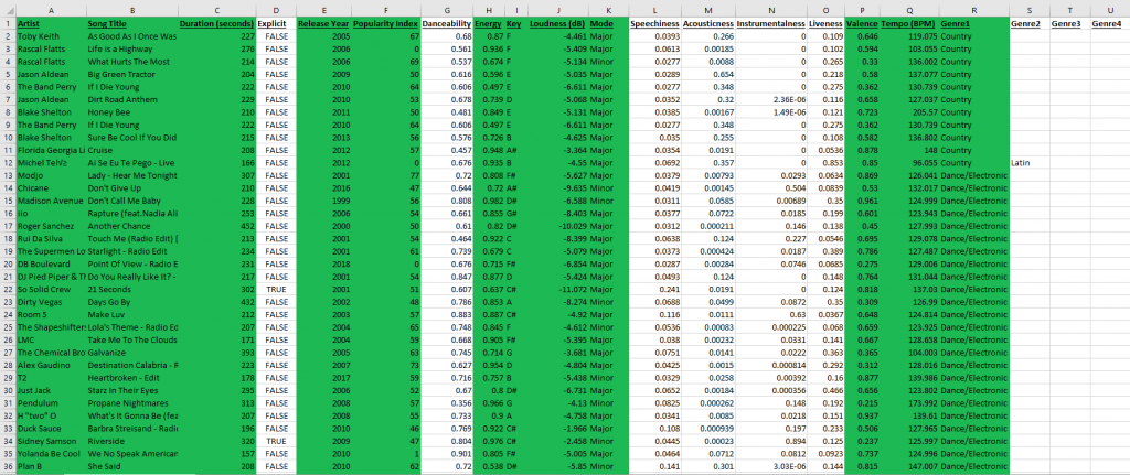
We found both of our data sets on Kaggle, an online community platform where professional data scientists and enthusiasts collaborate and share data. Both of our data sets were collected by Kaggle users who pulled the raw data directly from Spotify’s API. To accomplish this they used the popular Spotipy library, which is an open-source Python script. For the first data set, the user pulled the raw data of top hits from the years 2000-2019 organized by playlists on Spotify. The data included the following features of music: artist names, song name, total song duration, whether or not the song was explicit, release year, popularity, danceability, energy, key, loudness, mode, speechiness, acousticness, instrumentalness, liveness, valence, tempo, and genre. The original data set as it came was relatively organized but still required some cleaning to be processed without issue.
During the cleaning process, we converted duration from ms to s, then we converted mode from binary to major/minor, and we also converted “key” from numerical values to musical keys. Additionally, we also had to manually fix 22 items in the genre column that were incorrectly collected or perhaps corrupted. Finally, we also realized an issue with the genre attribute, where many songs were labelled under multiple genres. Thus, we decided to separate genres within the data set and center our focus on a song’s primary genre, to avoid overlapping data items during filtering.

Sample of Cleaned Dataset #1 (Kaggle Link)
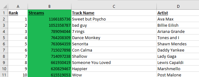
Our secondary data set was collected in the same way, but it instead contained information derived from Spotify’s globally most-streamed tracks in 2019; which was music that appeared in the daily top 200 Spotify chart in that year. The data set included information on country, song ranking, track ID, number of streams, track name, artist name, the url, acousticness, danceability, and energy. Dataset 2 included information unique from dataset 1, but it also came with some information that overlapped, so we cleaned the data and isolated our attribute of interest; which was just total streams for those charting songs of 2019.

Sample of Cleaned Dataset #2 (Kaggle Link)
Tools
Microsoft Excel:
Microsft Excel was both an efficient and excellent tool that we used to check and manually clean our data. By using Excel, we were able to easily read the original data and identify potential errors by using the find and replace tool, it was also easy to convert whole columns of data where necessary. Through Excel, we were able to identify data that we wanted to focus on and sort our data to find potential points of interest.
Tableau Prep / Tableau Desktop:
For our information visualizations, we used Tableau Prep in conjunction with Excel to output cleaned versions of our datasets. We then imported this data into Tableau Desktop to encode our visualizations and dashboard. Both Tableau Prep and Tableau Desktop were very effective to use and we didn’t run into many difficulties. Since our data was already well prepared, the process of creating the visualizations was smooth, it was simply a matter of deciding which channels to include and the level of detail we wanted. Since our aim was also to encourage exploratory usage of our interactive views, Tableau was great for adding filtering options and parameters. The only small issue we had with Tableau was with overlapping data points, which would display as asterisks. For example, multiple artists with the same song names or identical popularity index scores would lead to indistinguishable data points. This is the only weakness of the tool, otherwise, Tableau was quite effective in capturing and presenting our data in an interactive and compelling manner.
Canva:
When it came to our infographics we had many tools to choose from but we chose to use Canva as it offered features that made collaboration easier. It was easy to use in tandem with Google Drive, and the service allowed us to edit our work together through a shared link, add real-time comments, and track progress. The only downside was that we had much less access to certain templates, fonts, photos, etc unless we paid for the service but even without premium access Canva was still useful.
Analysis
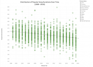
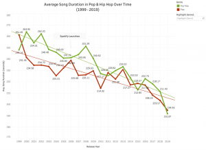
From the beginning, our analysis was rooted in the hypothesis that popular music was getting shorter and shorter. This was our group’s consensus after reflecting on our individual listening experience, this was combined with the common assumption that social media is also shortening our generation’s collective attention spans. Therefore, when combing through and making sense of our data, we were prepared for our visualizations to either support or refute our hypothesis. Initially, our approach was simply to create one visualization plotting all our data points against song duration to present our predicted downtrend. While this approach did support our hypothesis, we felt the scope was too large. We realized a deeper dive into the data was required. At the end of the day, music is an art form and there are many variables involved with just a single song. Thus, we decided to create a second visualization that would provide further insight into the trend identified. We noticed the bulk of our data consisted primarily of the hip-hop and pop genres, so we isolated that dataset and aggregated each year’s data points into one average duration. Together, this second visualization combined with our first provided both a macro and micro perspective to answer our proposed question.
For the remaining visualizations, our aim was to simply provide an exploration for some of the other data attributes. This required some experimenting and processing as our group wanted to identify elements that may contain other potential narratives. After exploration of our data, we decided to focus on the Spotify Popularity Index and four musical attributes.
Design Process


We approached our design process with a lot of experimentation, as there were many possibilities with the number of variables in our data sets. Before we even cleaned our data, we did already have some sketches with basic ideas of how we expected the visualizations to look. These rough sketches consisted of plotting as much of the data items as possible to provide a comprehensive visualization. We wanted the viewer to be able to navigate through each visualization and identify areas of interest to them, while also conveying our narrative. Music is a subjective and often personal thing, so this was a key consideration. For example, it is highly likely the viewer will be familiar with some of the songs plotted on our charts. From these initial sketches and ideas, we were able to effectively encode them using Tableau although it required a little more experimentation than expected.
For our first visualization, we concluded that a scatter plot with a trend line was an appropriate idiom. Since our data is ordinal, the magnitude channel of positioning on a common scale was important as all data points can be easily identified at a glance. This visualization follows principles of effectiveness as it uses spatial region to distinguish the progression of data over time. As there is a comprehensive amount of data in this encoding, we decided not to implement color hues as it would overcomplicate things or even imply a secondary hierarchy.
With our second visualization that dives deeper into the dataset, we concluded the idiom of a line chart complied best with the ordered attribute of average song duration. The downward trajectory of average song durations per year is clearly presented, and the use of color hues further distinguishes the categorical channels of genres, allowing for ease of comparison. A similar approach was taken with our fourth visualization of the dashboard with other musical attributes.
Finally, we also encoded the Spotify Popularity Index on a similar scatter plot to our first visualization. We chose to also implement color hue onto the number of streams to maximize the visibility of the progression, while our data is not categorical here, the use of color does help effectively guide the eyes upwards. From our exploration of the data, we wanted to present the correlation between the Popularity Index metric and the total number of streams per song. The Popularity Index metric is more ambiguous than the other attributes as its generated internally and updated constantly by Spotify’s algorithm. Thus, while this snapshot of the index on a particular day gives us a better idea of the correlation (perhaps causation), it’s not as indicative of a trend as we hoped.
Infographics


With our infographics, we chose to highlight key information from the interactive views as well as show the potential findings the reader could further investigate on their own. Through a consistent visual style aligning with Spotify’s aesthetics, as well as minimizing the amount of information being presented, we applied principles of beauty. These striking visual elements of the infographics also make our report more interesting and engaging to the audience.
Story
Digitization and emerging technology revolutionized music consumption, bringing radical changes to the music industry. Raw materials like CDs and LPs are removed, and physical storage requirements such as shelves for records or racks for CDs are no longer needed. It is not necessary to purchase an entire album for only a few desired songs; music consumers have the freedom to choose how and when to consume music. Traditional distribution channels have been transformed to digital streaming, offering easy access to the market for music producers and artists.
Now in the digital era, everything is quickly digested and people are looking for instant gratification when scrolling through social media. Our narrow windows of free time as well as attention spans are inevitably dictated by technology. As Tik Tok clips, memes, and gifs emerge and become popular, it is not uncommon for music producers and industry to produce diminutive songs and stuff them into one album, rather than making lengthy ones, to maximize economic potential. This is especially efficient for new and independent artists; since people always want to get to the “good stuff” faster, short songs tend to sell better because they keep listeners’ retention and establish immediate impact. Our primary purpose of the designs is to reflect the trends and patterns of music duration as well as any notable attributes that make a song popular, particularly from 1999-2019. It is evident that there’s a higher chance for shorter music to become popular, and consumers tend to choose them over other ones because they are catchy and compact and therefore stand out in the crowd. It seems this trend will continue as this has become a golden rule of social media marketing.
Pros and Cons
Overall, the interactive visualizations and infographics we created are effective in supporting the hypothesis that music is getting shorter as digital streaming rises, and platforms like Spotify greatly alter the music industry and production.
The scatter plot viz successfully shows a drastic drop in song duration from 1999 to 2019. Music genres can be filtered by simply checking the checkboxes. Further, a line chart viz is used to exhibit a closer view of average song duration in Pop and Hip Hop over time. The viz is clean and straightforward, the two lines explicitly show the fall of pop and hip-pop song duration over time. The graph also indicates the point where Spotify launches to draw a connection between song duration drop and the rise of digital streaming platforms.
The popularity index viz clearly shows the pattern of Spotify’s algorithm that songs with a higher popular index tend to have higher chances of exposure. We used scatterplots to represent songs and different saturation of green to represent the number of streams, where the darker the green, the more streams it has. To further explore the secrets behind hit songs, we made a Tableau dashboard containing four key components of music: loudness, energy, tempo, and valence. The switches allow viewers to filter songs by their musical mode, key and explicitness, providing more detailed views. To make viz and infographics look more appealing, we chose green as the main color for both to match Spotify’s theme.
There are some challenges encountered in this project. At the data cleaning stage, we chose to exclude attributes that we considered irrelevant in affecting music popularity, such as danceability and speechiness, which may narrow the resulting findings. Another limitation was that we couldn’t figure out how to make a viz directly relating musical attributes to the popularity index. With that, we would’ve been able to create a more accurate view.
References
About Spotify. Spotify. (2022, October 25). Retrieved November 28, 2022, from https://newsroom.spotify.com/company-info/
Ceccanti, E. (2019). Spotify Data Visualization. Behance. Retrieved November 28, 2022, from https://www.behance.net/gallery/86943261/Spotify-Data-Visualization.
Grow, K. (2018, June 25). Taylor Swift Shuns ‘grand experiment’ of streaming music. Rolling Stone. Retrieved November 28, 2022, from https://www.rollingstone.com/music/music-news/taylor-swift-shuns-grand-experiment-of-streaming-music-187594/
How much does Spotify pay per stream in 2022. Ditto Music Distribution. (2022, November 20). Retrieved November 28, 2022, from https://dittomusic.com/en/blog/how-much-does-spotify-pay-per-stream/
Loud and Clear by Spotify. Loud and Clear. (2022, June 3). Retrieved November 28, 2022, from https://loudandclear.byspotify.com/%E2%80%8B
Robley, C. (2022, July 5). The Spotify Algorithm: What musicians need to know. DIY Musician. Retrieved November 28, 2022, from https://diymusician.cdbaby.com/music-career/spotify-algorithm/#:~:text=Spotify’s%20Popularity%20index%20is%20a,get%20you%20onto%20Discover%20Weekly.
Spotify global 2019 most-streamed tracks. 2019. Retrieved November 18, 2022, from https://www.kaggle.com/datasets/paradisejoy/top-hits-spotify-from-20002019
Top Hits Spotify from 2000-2019. July 2022. Retrieved October 16, 2022, from https://www.kaggle.com/datasets/paradisejoy/top-hits-spotify-from-20002019
What a well done project! The detail in your execution is impressive and speaks to the dedication your team’s put into this visualization. I’m especially impressed by the interactive graphs Spotify Popularity Index of Most Streamed Songs in 2019 (Global) and Distribution of Popular Song Durations Over Time
(1999 – 2019). The darkening saturation for the number of streams is especially effective, and the filtering system by genre is fun to explore and interact with.
My one constructive thought would have to do with your visualization of the Average Emotional Valence. The glow around your text takes a little legibility away from the content and doesn’t add much to the aesthetics of the overall piece. Additionally, it personally added a little eye strain for me, in addition to the spotify green and white. If you want to keep the glow, I’d replace the Spotify Green with Spotify’s Black, or remove the glow all together. I also think that there’s room to play a little more with this visualization and add more recognizable elements if you want to make a direct call to Spotify’s brand. I’d check out their design/branding guidelines and appropriate their fonts, icons, and more of their colours.
What a beautiful Tableau visualization. Well done!
First I want to say that I absolutely love your visualizations and the overall approach to the infovis! You guys tackled such a large data set and I want to make sure that all that cleaning work was noted and applauded! What I appreciated the most was how your project gave me all the necessary background information and a breakdown of key terms and numbers so that I could properly access and assess the visualizations (especially with the visualization “Explore Other Musical Attributes Over Time”!).
I think in terms of feedback my only thought was for the visualizations spread across the project that summarized the Tableau visualizations: “Shortest Hits” and “Is Music Getting Sadder?”, could utilize a few font changes in terms of colour to help increase contrast and visibility but that is a very negligible aspect as the rest of the project is pretty much perfect!
Overall I really enjoyed your work and it will most definitely permeate into my own music listening habits from now on!!