Objectives
Our infographic is designed to show an exploration of the top ranking songs over the past eleven years, on the hottest day of each year. The hottest day is not influenced by any major holidays like Christmas or New Years, and the most popular song that day will be indicative of the types of hits being released or resurfacing with the heat. Using that as a starting base, we further delve into the top artist’s nationality, ethnicity, age, and gender. Then, we go deeper into the song’s genre. Our entire data set goes into the intricacies of how long each song was ranking in the top chart, as well as their ranking on the chart for each week, so it is very elaborate and intricate in the number of idioms and attributes used. We used this elaborate dataset to carve out the information we needed to tell our story about the top songs.
What are the determining factors that decide who “makes” it in the music industry? What genres become the most popular, performed by which demographics of people? Our story aims to take all of this cumulative data from Billboard’s top 100 chart over the years and streamline the facts into something digestible for a larger audience, shining a bit more transparency onto the American Music Industry.
Data
Collecting our data was a long and arduous task. We decided that we needed to explore how much diversity there was between artists and genres in order to paint a better picture of the music landscape at the time. The majority of our data was taken from a collection of “The Hot 100” charts on Billboard, accessed through online data set sharing network Kaggle. We needed to clean this data set, as it had an abundance of years and weeks of top 100 ranking songs to sort through. We thoroughly expunged and cleaned this data to best fit our needs, creating our own set, then combined this with a last, third data set, “Hot 100 Songs Weekly 2010-2020“. Additional details like each performer artist’s ethnicity, gender, and nationality needed to be collected by hand, as well as the age of the artist at the time of their song’s release and the music genre of their song. These details had to be researched, and so the information was collected from the Wikipedia pages of both artist and song. Wikipedia is not often a credible source, however, when gathering information on such high profile individuals in society, some individuals who have been making billboard top hits for almost a decade, it’s reliable when looking for basic personal information, such as age and family history. Anything that could not immediately be determined on a precursory glance was looked into with greater intensity, on artists personal websites or social media accounts. When it came to gender, a performer was assumed cisgender unless otherwise stated by the artist themselves. All of this data was compiled into one excel sheet. Each entry was both a song and week, which resulted in multiple entries of the same song, alongside that song’s ranking for the week and the number of weeks the song spent on the top 100 board at that current point in time. A lot of the additional data not accessed through the Kaggle set collection had to be done by hand.
Once we split the song genre into two columns for better visualization and clarity, there were 11 attributes and 6238 records all together.

(fig 1. A snapshot of our excel data)
There were certain collected factors that needed to be taken into consideration when classifying both songs and people. Ethnicity does not always include nationality, and there are intricacies that call for more inspection before fitting a person into a box for diversity’s sake. A song needs that same consideration when it comes to genre. For each song that had more than one genre attached to a song, the first genre listed for the song was the accepted genre, unless it was too obscure or specific of a genre (such as East Coast Hip Hop, Cloud Rap, ect). For each ethnicity encountered, the artist’s family’s personal background and history was taken with extra consideration: For example, one would have to be careful when engaging with an artist born from immigrant parents, or a mixed-race artist. All of this personal data was handled with extensive research and care into both the artist’s personal identification as well as their early lives and family ancestry.

(fig. 2 a snapshot of cleaning our data in Tableau Prep)
Because this data was so large and complex, we decided that the best course of action was, instead of looking at an entire year, to look at the top song for a singular days of the year: The hottest recorded day of the year, when artists were competing to earn that spot of “Song of the Summer”. For our location, we chose the location of Billboard Magazine’s headquarters, The Big Apple. New York City.
We cleaned our data through Tableau prep, fixing any inconsistencies between spellings and capitalizations, and adding another column to allow for more variation with song genre. By narrowing down our scope, we were able to not only more effectively clean the data, we were able to both find and fix inconsistencies within the original data set.

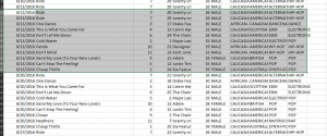

(fig. 3, 4, and 5: snapshots of the inconsistencies found within our data).
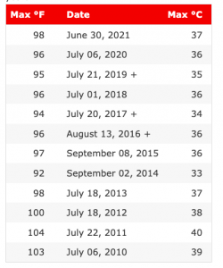
(fig. 6: A snapshot of our weather data)
Visualizations/Design Process
While first going through our data in Tableau, the amount of data we’d accumulated was massive. We made sense of our data by exploring how the results accumulated and organized themselves in the program, as the data alone was too dense to parse through. In doing this, we added another column for the easier division of song genres, and a filter for artists. There were a few visually interesting patterns that we had to tweak and unfortunately not include in our final visualization, but it was very satisfying to see all of the genres come together through Tableau.

(fig. 7: a spiral design of popular genres by year)
Our original idea was to parse through the years all at once, resulting in the accumulation of the top songs for each year, but our limitations in Tableau and the complex nature of our data sets proved this to be a difficult task. So we pivoted to something much more manageable, and focused on a singular day instead of an entire year. We wanted to communicate a chronological change in music taste, as the musical landscape increased its diversity, and while we couldn’t do it to the same scale as originally planned because of time restraints, we were still able to communicate this idea through our design choices and visualizations.
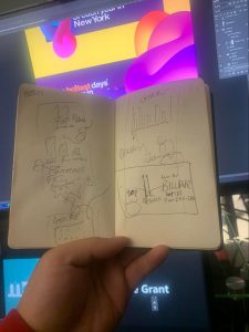
(fig. 8 Evan’s sketch for our original design)
Following the principles of utility, soundness, and aesthetics, we made sure to balance the functionality and practicality of our infographic with the design and colour choices, especially since our template A) was heavily inspired by an already existing brand and B) was so vibrant that it held the potential to overwhelm viewers with beauty and outweigh both utility and soundness. To combat this, we used simple design elements with the information itself, and saved our creative liberties for the outskirts of the visualization. We communicated the simple concepts and ideas with the recognizable icons, for example, temperature was signified with the icon of a thermometer.
Since our Infovis project is a fun topic, we wanted our template and design to also be fun! We chose a design that’s grown in massive popularity over the past few years, something recognizable that’s also very personal to each user: Spotify Wrapped! The bright, vivid colours associated with Spotify’s own end of the year data visualizations, their gradient blues, pinks, and greens. Spotify as a brand also uses soft, rounded graphics, which we implemented into our own design choices. Abstract oblong figures decorate the sides of our information visualizations, not to take away attention from our main visualizations, but to emphisize them and lead the eye towards the important information.
Our colour palette was bright and consistent, using a variety of both warm colours and cool colours. When appropriate, warm colours were used to convey the sentiment of summer and heat, and cool colours were used when legibility prioritized aesthetics. We were balancing both expressiveness and effectiveness alongside our creative choices. Our data descended in chronological order, and as a reader would scroll, they would follow the timeline of our visualization year by year. When text was shown, it was either a dark text placed on a light background, or a light text on top of a dark background. It was not tilted, as Munzner suggests to stay away from (6.3.6), and we also made sure to have luminance contrast for all of our detailed information, like song titles, temperatures, dates, ect.

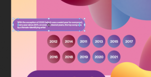
(fig. 9: Our bar chart visualization)
When creating bar charts with photoshop, we’d use the snap to grid function in order to make sure the data was not misconstrued or distorted. We separated our genres into categorical data, assigning each genre a colour, with no particular hierarchical order. We used these design choices and tools to represent how many weeks each song spent on the top 100 charts.
PROS
Our design is colourful and eye catching. It is also familiar to whoever may have previously used the Spotify streaming service, and so there’s an expectation present in the very design choices: The expectation of topic choice and stats presented.
It moves, adding a fun, dynamic aspect to our visualization.
Even though we couldn’t achieve most of our goals, the goals we reached were easily communicable, making it so there was very little room for miscommunication during our information relay.
CONS
Our design, while beautiful, made it so that it would be difficult to include any interactive visualizations without taking away from the information already presented. We could not include any hover points due to the tools we used to create our visualizations.
Much of the data we painstakingly collected had to be discarded for simplicity’s sake. Most of that data had to be simplified during the cleaning process, but the data we’d cleaned had to undergo further simplification during the design process in order to effectively communicate the story we were trying to convey.
Tools
We gathered and compiled the majority Tableau using Microsoft Excel and Google Sheets, for collaboration purposes. Once the data was all collected, we cleaned it in its entirety using Tableau Prep, and visualized our data to better understand the information as we’d gathered it. Then, because of our own limitations with Tableau, we transferred this data and these visualizations over to Infogram and Photoshop, which better met the aesthetics of what we wanted to create.
Story
Billboard’s Top 100 chart has been a dominating factor in determining what music plays on public radio. It’s only been in more recent years that personal music streaming has been favourite in lieu of public broadcasting. The electronic data that plays on the radio is experienced in real time, as long as there is a listener on the other end to perceive it. Therefore, when combined with the data of the most extreme days of weather, we will be able to create a record of what the most popular song had been for those days. We will have a nostalgic insight to the music being listened to at that moment in time, and what other factors may have been present in that specific moment.
Our story is fun and all-inclusive, as most listeners of public radio will recognize these top, nostalgic hits. However, our story is also indicative of the demographics of people in America who succeed in the music industry, and the types of music that not only become successful, but the type of music that’s expected out of certain demographics.
Analytics
There were a few interesting moments to note that stood out within our data analysis. For example, our data represented the American Billboard top 100, so of course, the majority of the artists featured had American nationalities. Additionally, Christmas music trended in late December and early January, but only in years as recent as 2016 and onwards. There is no sign of this phenomenon from 2011-2015, which might speak to changing American values regarding Christmas-time. 2017 was the only year when the rap genre overtook the pop genre. There were only 3 out, non-cisgendered artists in the last eleven years, and these musicians only came out in the years after 2019. While the number of non-cisgendered artists is clearly quite small, it’s clear that the slow acceptance of LGBT celebrities in the later half of the 2010’s is responsible for creating a safer environment for those who do not fit into the gender dichotomy as it has been traditionally presented. The pop genre dominates, however, in recent years more diverse genres have begun to break into the music scene. However, this does not mean that diverse songs break into the top 10 songs, even if they appear on the top 100 chart. As time went on, more and more sub-genres of music increased in popularity, while simultaneously established sub-genres continued to ground themselves into the music landscape as more artists contributed to said genre.
Our visualization is only a compilation of the most popular songs in the past 11 years. However, whenever a popular artist from the past passed away, (Michael Jackson, Whitney Houston, Prince), their songs were resurfaced as radios paid tribute to the recently deceased. Additionally, more and more subgenres with nods to past music trends were beginning to reappear. Genres like Disco-nu and Synthpop are reflective of the circular nature of recycled trends in pop-culture.
Conclusion
While one wouldn’t necessarily find a correlation between weather and the songs that are trending, Christmas songs prove us wrong every year. Even though there’s a holiday surrounding that time of the year where those familiar songs start to resurface, the weather is definitely a factor that plays into popular lyrics and themes. Not to mention how songs are released during the year strategically, in order to try and best monetize their success. While there may be only a little correlation between the time of year and what songs become popular, the trending songs as the years go on speaks to how the music landscape has evolved over time. As time goes on and as diversity becomes more important in our current political climate, our artist choice and music taste seem to evolve alongside it.
__________
Edit:
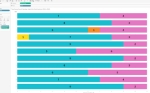
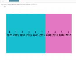
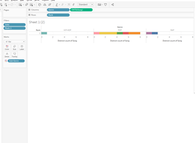
We were able to overcome some of our limitations with Tableau and work out how to go deeper into the data we’d procured! Using the same aesthetic themes and formats from before, we transferred this data visualization into Photoshop to create the desired effect we needed. Thank you for the helpful comments and suggestions!
References:
Dave, D. (2021, November 09). Billboard “The hot 100” songs. Retrieved December 7, 2022, from https://www.kaggle.com/datasets/dhruvildave/billboard-the-hot-100-songs?resource=download&fbclid=IwAR31OQPBZqSqP5Q1ZVVgzMQ86RsRVuiLlVTytg32PIholaaHaoPwpuKQWWQ
Guzmán, D. (2020, November 30). Hot 100 Songs Weekly 2010-2020. Retrieved December 7, 2022, from https://www.kaggle.com/datasets/diegoguzmn/hot-100-songs-weekly-20192020
Jay Lawrimore. 2016. Global Summary of the Year, Version 1.0. NOAA National Centers for Environmental Information.
Munzner, T. (2014). Visualization Analysis & Design. doi:10.1201/b17511
Ware, C. (2008). Color. Visual Thinking, 65-85. doi:10.1016/b978-0-12-370896-0.00004-4
Great work Evan, Chloe and Prisha!
Thank you for sharing such a fun and creative work. I am commenting on both the strengths and areas of improves for two elements of the project: 1) graphic design and 2) content/narrative.
Garphic Design
First of all, as you have mentioned in the report, your Infographic is aesthetically eye-catching. The strength of this InfoVis. is the choice of style in graphic design that visually tells a story about a particular culture, music today. An area of improvement I can suggest is editing the positioning or lengths of each marks (represented as temperature) on the slide, “the number one song on the hottest days of each year”. My eyes immediately detected the “peak” of the InfoVis. on the right side of the graphic for Taylor Swift’s “Shake It Off”. The positioning implied a pattern or order subconsciously to the viewer. Because of this implication, I was left confused why “Shake It Off” (and other songs) has been positioned as they are. Fully reading the InfoVis., I observed that the songs have been ordered by year and positioned by the temperature hottest to coolest, left peak being the hottest (Party Rock Anthem with 40 degree celsius). However, the inconsistency in this pattern also appeared a bit confusing. If it may be possible, I think that adjusting the length of each mark to be the same and stacking them as centre positioned list might clarify the reading of each marks. Or, if you were to indicate a pattern, such as the temperature, I think it can employ a consistent, detectable pattern.
Content/narrative
The objective mentioned in the report proposed an intriguing attempt at analyzing diversity in music industry through data. It is unfortunate that certain limitations challenged your group from further analyzing and presenting the information. I think this challenge is also reflected in the InfoVis. I think that contextualizing your infographic will assist viewers in navigating the story and insights you have found through the analysis. One way you can improve the flow of narrative may be including short blurbs that introduces the purpose of the infographic, findings from the infographic (articulated in the “Analytics” section of this report) and concluding blurb at the end.
Again, thanks for sharing such creative project with the class. I hope that this feedback is helpful.
Best,
Jueun
Amazing choice of data set, topic, and beautifully executed infographic!
I instantly saw the resemblance to Spotify wrapped but as your own original take. The consistency in colour and design assets, as well as animation keep the infographic engaging. As you mentioned, due to limitations with the choice of tools, it is unfortunate that there was not more an opportunity to include for interactive data visualizations, however given the nature and form of visualizations (not graphs which would benefit more from interactive assets) being a representation of top songs depending on weather (which I also want to add is a very refreshing take that I loved to see), the lack of interaction doesn’t seem to take that much away from the infographic as a whole!
One thing, although quite minor: I enjoyed reading your blog post to understand why your group has decided to take this approach and the meaning behind data that may otherwise simply look like numbers for display. After reading your “story” section of the post, I was able to attach deeper meaning to the Infographic as well, and think any typical audience who is provided with only the graphic would also appreciate at least a bit of that story incorporated into the graphic itself. Kept short, something like a concluding comment/statement at the end or more of the little blurbs like the one accompanying “Shake It Off” could possibly add more to the story aspect of the graphic.
Amazing work once again. I thoroughly enjoyed viewing this project. :))
Evens