By Evens Wong and Jueun Park
Link to our final InfoVis: https://ewong05.wixsite.com/canadiansstress
The Objective
This project investigates the causes of stress and one’s ability to handle stress among Canadians before the COVID-19 pandemic. Why are we focusing on the pre-pandemic dataset? It is observant that the global pandemic, even at this endemic phase, had life-changing impacts on people’s physical and mental health. A report by the Mental Health Commission of Canada observed that COVID-19 immediately impacted many Canadians’ mental health one month after the outbreak (Nanos 2020). Since then, there were increased reports on the varying degrees of impacts of COVID-19 on people’s mental health, including stress, anxiety, depression and suicide (World Health Organization 2022; Statistics Canada 2021). The general discourse around mental health today emphasizes the consequences of the global health crisis on one’s well-being (Nealon 2021). Although this observation helps us understand the causes of stress in times of a historical, extreme and uncontrollable crisis, it leaves out the world before COVID-19, an “ordinary” everyday life. As many nations declare the endemic phase of the pandemic, it is imperative to propose an outlook of the public’s mental health in the back-to-normal world. While the lasting impacts of the pandemic may present a different outlook from the pre-pandemic data, this project attempts to enhance the public discourse around destigmatizing mental health in one’s everyday life.
This project explored the correlation between the causes of stress and one’s ability to handle stress by age and provinces (excluding territories) within Canada. The goal of this InfoVis project is to contribute to the communication of existing knowledge through creative storytelling that can be accessible and engaging to the public. The project echoes the current discourse around the importance of mental health by offering additional insight into the average Canadian’s stress management before the COVID-19 pandemic. The intended audience of this InfoVis. are the everyday-life Canadians. The InfoVis. Incorporates a creative storytelling aspect to engage the audience. The story narrates the everyday life of Canadians’ stress management through the first-person voice of a fictional character.
The Data Used
The dataset “Mental health characteristics: Ability to handle stress and sources of stress” by age group, sex, and provinces (excluding territories) in Canada is sourced from the Government of Canada’s open data, published by Statistics Canada. The governmental documentation of statistics reassures the authenticity and credibility of the dataset. It is a three-year-apart report completed under the same conditions comparing 2016 and 2019. The dataset provides metadata and the dataset file in CSV format.
In the data cleaning process, we removed unnecessary attributes and double-checked for inconsistent variables. We organized data to be read by Tableau. Removed attributes include Statistics Canada-specific indexical codes and gender as they were not required attributes for the analysis in this project. Data items that were indicated as “too unreliable to be published” was removed as well. An example of such a data item is the number of people in the age group of 12 to 17 years responding to the causes of stress such as “work”, “financial concerns”, and “health” in many provinces. The number of respondents for these categories was too low and was considered unreliable by the source provider. Additionally, for the age group 35 to 65+, their data items for causes of stress, “school” was removed as they were not surveyed for that particular cause.
In addition, we referenced “Table 13-10-0802-01, Mental health characteristics: Ability to handle stress and sources of stress”, based on the same dataset published by Statistics Canada, to explore the data by geography (province), age, and indicators in a more organized format (Statistics Canada 2020). The analysis of the cleaned dataset built the project’s final deliverable and statistical conclusions in understanding everyday life Canadians’ causes of stress in the pre-pandemic time. Ultimately, the dataset supported the idea and narrative of the Canadians who are under stress due to “work”, “finance”, “family”, “school”, “time pressures”, “health”, and other unstated reasons—which were surveyed causes of stress—in their daily lives by different provinces and ages.
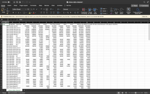
Before Cleaning

After Cleaning

The Tools
Microsoft Excel for Cleaning Data
We used Microsoft Excel software to clean data before importing it to Tableau for making InfoVis. Excel features such as filtering and searching was used to detect unnecessary—” too unreliable to be published”—data and remove them. Then we organized the data sequentially by year, grouping the order by provinces and age group to better understand the overview of the data before visualizing it (After Cleaning image). The strength of Microsoft Excel is its compatibility with Tableau. When the final CSV file was imported, it displayed data as it was reorganized on Microsoft Excel.
Tableau for Data Analysis and InfoVis.
We used Tableau and the Tableau Server to make drafts of InfoVis. for analysis and the final deliverable. As we have done many tutorials for Tableau during class, we were equipped to explore various features and functions it offered. The particular strength of this software was its wide variety of idioms including maps. Using its built-in feature for maps, we created the choropleth map of Canada visualizing which province is most “stressed” filtered by year and age and the listed causes of stress.
Infogram for Storytelling with InfoVis.
We used Infogram as the design software for creating our final story of the project. The digital, interactive infographic unfolds the story as the viewer scrolls down with their cursor on the published website. The strength of this tool is that it engages the audience through animation and interactivity. The weakness of this tool is that the free version of the software is very limited. We were not able to incorporate map idiom on Infogram but rather had to find a way to embed InfoVis. designed by Tableau.
Wix for Sharing InfoVis.
The final visualization was made and hosted on Wix, with help from Infogram. Hosting the Tableau and Infogram visualizations on Wix allowed us to embed HTML links to easily display everything created for this visualization on a single scrollable webpage. However, difficulties encountered, included Infogram’s restrictions without upgrading to a Pro version, therefore unable to access map visualizing tools for Canada specifically. This meant having to incorporate map visualizations directly from Tableau and momentarily breaking the consistency of the visual design concept.
Analytic Steps
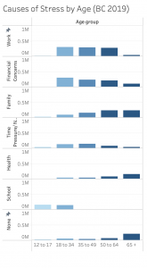
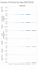
The analytic step involved making many edits to InfoVis. on Tableau. Since the amount of data was too large to comprehend by just reading and cleaning the datasheet, we needed to make drafts of data visualizations to understand the overview. Even though our final design goal was to create an interactive map that shows the varying degrees of causes of stress between provinces, we first created a compound bar chart that showed the causes of stress in a comparative layout, sequentially ordered horizontally by age groups and filtered by the year. Such a visualization helped us understand the overall picture of the data and analyze that the most stressed age group is the young adult to mid-age concerned about work and financial concerns. This bar graph allowed us to understand a certain pattern across provinces, showing that causes of stress are closely correlated with age. For example, for the cause of stress, “health”, the number of people concerned about it increases by age from youngest to oldest. In all provinces, youth (age group 12 to 17 and 18 to 35 years), were most stressed about school.


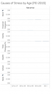
To avoid “lying with data”, we fixed the vertical scale to the highest number of respondents. In this step, we discovered another pattern in the data. Ontario, Quebec and British Columbia were always the top 3 provinces that showed the darkest shade, meaning they had most respondents expressing their causes of stress. It was clear that this pattern was revealed not because certain provinces were more stressed than others but because the population and number of total respondents from each province varied. Instead of making rushed judgements on which province has the most issues causing people to be stressed, it was important for us to observe the pattern using an objective scale. While more population and concentration of people may be a factor, it cannot be implied solely by the analysis of this data visualization.


After we had a better understanding of the overall data, we designed drafts of InfoVis. using the map idiom. In this step, we filled in the gaps that were not as clear in the bar charts—comparing provinces in one overview. The first map did not include filters and was misleading as it was showing the sum number of the cause of stress, only for “family” between all ages in the year 2016. We fixed the issue by filtering “Measured Values” for different causes of stress. We also customized the map by assigning a colour to specific values. For example, the “unreliable to be published” data is displayed as a grey shade in the gradient scale.
Design Process and Principles
To create the infographic, we started off knowing what form of data visualizations we wanted and what we wanted them to show through filters and luminance. While creating the bar chart for the first data visualization comparing 2016 and 2019 statistics, a filter was applied to toggle between provinces. Additionally, being able to hover and highlight features as interactive aspects of our final InfoVis was also something we strived to achieve in our designs.
We used a consistent colour palette to achieve beauty/attractiveness in the overall website and InfoVis. The set of colours is coded for different sections of the infographic, narrative and InfoVis., making it easier for the eye to follow the pattern of the whole delivery of information. Having a clear hierarchy seen in the data visualizations, followed by the statistical spotlight near the end of the graphic, the website is easy to follow while still pertaining to a clear theme. Additionally, our design follows utility principles of “explorative infographic” (Lankow et al., 2012) methods, showing numbers and providing statistical facts to the audience, as well as evidence of being a “narrative infographic” Lankow et al. (2012). There are a clear narrative and character that walks the audience through the entire visualization, leaving a clear message and intention that stress and mental health issues with various causes have always existed in Canada before COVID-19. The soundness of our final website is ultimately derived from the message and topic of research that we are presenting. The topic of mental health and stress across Canada is caused by very prevalent issues such as work, school, financial concerns, time, health, etc. apparent and existing as issues well before the COVID-19 pandemic.
The geospatial idiom, map, portrays the overview of Canadians’ everyday life causes of stress expressively (Muzner, 2015, p.102). It uses the spatial region, an identity channel suitable for categorical data (provinces). The number of respondents for causes of stress, quantitative data, is visualized through the magnitude channel of colour luminance—the more stressed, the darker the shade is (Muzner, 2015, p. 223). The InfoVis. is effective as it achieves the goal of showcasing the overview of the causes of stress among everyday Canadians before the COVID-19 pandemic. The sliding filter for age group, selective filter for year and highlighter for each cause of stress provide necessary interactivity for the audience to explore the data by their desired search. Through hovering, the viewer can observe further details of each mark, the provinces and the numbers of people indicating different causes of stress.
The Story
Our project follows the narrative story of a hypothetical, typical Canadian ‘Kris’, throughout their adolescence and adulthood as they navigate through the leading causes of stress across Canada. We are highlighting and emphasizing the existing causes of pre-pandemic stress, acknowledging and making aware that stress caused by work, financial concern, school, etc. has always existed and has always been an issue prevalent throughout the past several years.
Pros and Cons
Our design explicitly includes a creative story narrative based on a hypothetical character representing a typical Canadian. This story guided the viewer through a clear story arc. This strategy of incorporating the concept of a “quantified selfie”, is based on the understanding of empathy in data visualization and storytelling (Bui 2019). We intentionally narrated the story as an individual’s story to personalize the audience’s encounter with this data. Stress and mental health, as serious subject matters, we had to make empathetic and conscious design choices. We incorporated strategies from the “Do No Harm Guide” to “put people first”, and “use personal connections to help readers and users better connect with the material” (Schwabish, 2021, p. 6).
One of the design choices we can improve is the bar chart comparing causes of stress organized by age across Canada. While its animation makes the highest peaks pop out for individual bar graphs, it is difficult to see the changes between the years. The filter on Tableau allowed a more dynamic interaction for the audience—animating the height of the bar graph as we applied filters between years. Our initial design plan was to make the years into “layers”. The idea of the layer was to reveal and allow the viewer to compare changes or (remains) over the years in Canadians’ causes of stress immediately by scrolling down. Due to the technical limitations of the software, we could not achieve our initial design strategy. Nevertheless, it was a learning opportunity to explore other mediums for InfoVis., realizing that the choice of design software has a significant impact on the delivery of information and InfoVis.’s expressive and effectiveness.
References
Bui, K. (2019, June 11). Designing data visualizations with empathy. Data Journalism. https://datajournalism.com/read/longreads/data-visualisations-with-empathy
Government of Canada. (2022 June, 20). Map of canadian mental health during the COVID-19 pandemic. Retrieved October 18, 2022, from https://health-infobase.canada.ca/covid-19/mental-health/.
Lankow, J., Ritchie, J., Crooks, R., & O’Reilly for Higher Education. (2012). Infographics: The power of visual storytelling. John Wiley & Sons, Inc.
Munzner, T. (2015). Chapter 5: Marks and Channels.Visualization Analysis and Design. Boca Raton, FL: CRC Press.
Munzner, T. (2015). Chapter 10: Map color and other channels.Visualization Analysis and Design. Boca Raton, FL: CRC Press.
Nanos. (2020, April). Canadians report an increase in feeling stressed regularly or all the time now compared to one month before COVID-19. Mental Health Commission of Canada. Retrieved October 17, 2022, from https://mentalhealthcommission.ca/resource/canadians-report-an-increase-in-feeling-stressed-regularly-or-all-the-time-now-compared-to-one-month-before-covid-19/.
Nealon, M. (2021 October, 9). The pandemic accelerant: How COVID-19 advanced our mental health priorities. United Nations. Retrieved October 17, 2022, from https://www.un.org/en/un-chronicle/pandemic-accelerant-how-covid-19-advanced-our-mental-health-priorities.
Schwabish, J & Feng, A. (2021, June 9). Do no harm guide: Applying equity awareness in data visualization. Urban Institute.
Statistics Canada. (2021, September 24). Canadian social survey: COVID-19 and well-being. Retrieved October 17, 2022 from https://www150.statcan.gc.ca/n1/daily-quotidien/210924/dq210924a-eng.htm.
Statistics Canada. (2020 August, 6). Table 13-10-0802-01 Mental health characteristics: Ability to handle stress and sources of stress. Retrieved October 14, 2022, from https://doi.org/10.25318/1310080201-eng.
World Health Organization. (2022, March 2). Covid-19 pandemic triggers 25% increase in prevalence of anxiety and depression worldwide. World Health Organization. Retrieved October 17, 2022, from https://www.who.int/news/item/02-03-2022-covid-19-pandemic-triggers-25-increase-in-prevalence-of-anxiety-and-depression-worldwide.
Hi Jueun and Evens,
Really excellent blog post and design project. I think you did a great job of making it visually appealing. This is something I could see myself stumbling upon on a news site and not thinking twice of it. I think the fact that you integrated both Infogram and Tableau was really conducive to an appealing and engaging data story. As well, you used interactions well and I definitely felt as though I was able to explore the data with you, while following the story of Kris–this was effective as well (and felt the relevance as a fourth-year student, haha).
I had a little trouble with age as a slider for your Tableau embeds, just because I wanted to compare varying ages across large ranges. I think something like a single value list may work better for this purpose, though I do see the rationale behind using a slider to move *through* the years.
Another thing is the focus on Covid-19’s effects on mental health at the very end; I was a little confused but I understood where you were going with it when I read your blog. Maybe make it more clear that you’re linking the studies of post-Covid mental health with pre-Covid mental health in your data story. I think this might help you convey your message more effectively.
Overall, congrats on making such an effective, beautiful and engaging data story! Nice job!!
Just to add on to my comment because I forgot this — this project makes me curious about developments even further back than 2016. I wonder if there’s data for this? What your data shows is that pre-Covid mental health hasn’t always been great, and I wonder if there is even data going back far enough to note some kind of trend not linked with a mass event like Covid.
Again, well done! 🙂
Hi Jueun and Evens!
Your project is really aesthetically appealing and cohesive. The combination of data visualization and more infographic like portions was really effective and created a really nice sense of flow. Your storytelling is great, and your imagined character of “Kris” is a really effective tactic. This is also a perennially relevant topic that’s interesting to examine through time.
My main critique is that, throughout the data story, stress is measured with *counts* rather than *rates*. While this is largely okay for comparing years, it does seriously affect comparisons between provinces. For example, PEI (with a population of less than 200,000) is going to look misleadingly less stressed than Alberta (population of over 4 million). Ideally, you would be able to view the rate of stress, but if this is not possible given how your data is formatted, a note or labelled axes would be very helpful.
There are also potential edits with the filtering options. For age filters, maybe consider a multiple-value list, and for the “causes of stress” filter, maybe consider a single-value list. They function as is, but I found them a little clunky.
In the ending, you write that’s it’s clear that COVID has had “an immense effect on the average Canadian’s mental health.” But I don’t think you’ve really evidenced this in the data story up to this point. Fixing this could be as simple as hyperlinking a news article here, but I do think it’s important that you address it.
Overall, great work! This is such a relevant topic. I would be interested to see a continuation of thus work that is a compare-contrast of stress before, during, and after (however you define after) COVID. Understandably this is beyond the scope of your project, but your project has sparked my curiosity about this!
Hey Jueun and Evens! Great work, this is such a gorgeous infovis! I love the narrative model you decided to use — it also stood out to me that you used a gender neutral name and pronouns 🙂 I think you did an awesome job cleaning the data and picking out the most relevant and reliable data. Great job looking for data that is both accurate and ethical!
I noticed that the title of your website is “Canadians’ Causes and Ability To Handle Stress Before the COVID-19 Pandemic”, but the title of this blog is “Canadians’ Causes [of Stress] and Ability to Handle Stress Before the COVID-19 Pandemic”. Not sure if you’re missing a few words, or perhaps some text isn’t showing up on the website.
I’m fascinated the fact that the dataset separates data gathered by provinces. Although this is probably out of the scope for this project, it’d be interesting to see why there are different leading causes in stress in each province. Is the school curriculum in Ontario exceedingly difficult compared to other provinces? Does a specific provincial legislation in one province affect life quality and stress levels somehow?
Once again, awesome work—and your project has been a convincing argument to use Infogram. The scrolling animations and interactivity was really engaging. I’ll definitely try it out in the future!