By Aaron Schmidtke and Callum Haldenby
The link to our infographic can be found here.
The Objectives
Our project seeks to observe and analyze where the 32 National Hockey League (NHL) teams position themselves when it comes to fan attendance, fan experience, and Fan Cost Index. Fan Cost Index is a metric provided by Team Marketing Report, a Chicago-based sports business intelligence firm that formulates and publishes the numbers after conducting team surveys. Fan Cost Index is an attempt to express expenses from visiting one home game from a professional sports team (in this case, NHL) down to a single number. The Fan Cost Index metrics are based on the average cost of four non-premium tickets, two beers, two sodas, four hot dogs, two souvenir hats (as a proxy for merch buying) and parking. This helps us determine which NHL clubs are the most successful from an attendance standpoint as this information visualization will be focusing primarily on average home attendance, arena capacity, and the aforementioned Fan Cost Index. The main objectives we aim to communicate through this information visualization include making our insights on NHL in-arena experience accessible to the average hockey fan, developing a better understanding of the business aspects of professional sports franchises as well as a tool for NHL clubs’ management teams and ownership groups to evaluate.
The Data
Since our visualization project is centered around NHL in-arena experiences, we wanted to represent a number of different avenues available to analyze. There is a wide variety of different aspects that can affect arena attendance around the league including but not limited to: capacity of their entertainment sports plexes, the price of admission (or Fan Cost Index), who the visiting team is, the respective team’s performance during that particular season, time of game (matinee games versus evening games), and special event games (such as jersey retirement nights, bobblehead giveaway nights, etc). For gathering these data sources, we’re primarily looking at Statista as well as Team Marketing Report’s gathering of data translated by The Athletic. Statista is a recognizable and reliable source for market and consumer data as the leader in the provision of reliable business data. They deliver insights and facts across 170 industries in over 150 countries. The Athletic, owned by The New York Times Company, is one of the premier and credible sports publications since its inception in 2016. The Athletic, using data provided by Team Marketing Report, does some cleaning of initial data for us by translating the information into an easy-to-read board which we have continued to visualize in a digestible manner. Since Team Marketing Report’s establishment of Fan Cost Index, it has become the industry standard for gathering statistics for the cost of a family of four to attend a game at all MLB, NFL, NBA or NHL game venues. We feel confident that this data is appropriate and productive for us to represent our information visualization and facilitates the communication of important data points. Our data sources from Statista looking at average league attendance and respective Fan Cost Index scores courtesy of Team Marketing Report are both specific to the 2021-22 NHL campaign therefore equate to the same relevancy for that determined season. These datasets are not too convoluted nor exhaustive as we have a maximum of 32 franchises to evaluate. They were not, however, in an Excel or CSV format. Therefore we cleaned and organized the data into a proper CSV format before we are able to utilize it in Tableau.
Strengths and Weaknesses of Tools Used
The tools we used for this project included Canva, Tableau, and Google sheets. Canva is very simple and intuitive to use, and allowed us to create a simple yet visually appealing infographic for the purpose of telling the story related to our data, as it offered all the graphic design elements we needed (besides team logos). We were able to create graphs within the program itself, as it allows for data from a CSV file to be uploaded directly into its built-in graphing feature. Tableau allowed us to initially visualize how our data would look on our infographic, and while it can be visually appealing, we decided that since we wanted to be able to grab the attention of viewers with eye-grabbing visuals, canva would be the ideal platform to produce our final product on in the form of an infographic. Finally, google sheets was where we formed our datasets.
Analytic Steps
Since both of us went into this project with preexisting knowledge about all aspects of hockey, we were able to visualize ahead of time what kind of story the data would tell, as we understand the elements which significantly impact a team’s success in their market. For example, teams located in less traditional hockey markets depend heavily on overall team success as well as an engaging and satisfying fan experience to build a fanbase around, and this is reflected within our visualization with teams such as the Tampa Bay Lightning, the Nashville Predators, and the Vegas Golden Knights. These teams exemplify what franchises which aim to generate further interest in their markets should strive to be like. Finding and using the metric referred to as ‘fan cost index’ was especially helpful in expressing multiple key factors which play into the overall fan experience in a way which is easy to digest and understand by fans new and old alike. We decided that since we already knew what argument we were trying to get across that it would be more within the scope of our intentions to focus on visually communicating the data and evidence which was most important to determining a team’s ability to fill seats instead of representing every single team.

The Design Process and Principles
The overall design process began when we used tableau to initially visualize our data before we migrated to Canva to follow through with our final design. In terms of expressiveness, all information relevant to the narrative is graphed. The attendance levels for each franchise are presented on a common scale, and additionally, colour was used to differentiate between the average number of seats which are filled each game and the total number of seats in the arena; red represents the percentage filled, and green represents the percentage left empty. As for effectiveness, using said common scale was clearly the most effective channel we could have used, as doing so allows for viewers to make an easy visual comparison between the presented franchises. Utility is evident in the order in which we present the factors which play into some key takeaways that are presented on the final page of the infographic. The information flows in a manner which is easy for viewers to digest by first providing the informational framework upon which the graphs are based, then presenting the teams which have performed the best in recent years before delving into visual depictions of the data along with the aforementioned key takeaways at the end. We also ensure that the principle of soundness is utilized in that we don’t go overboard in terms of how much data is presented. We stick to the most noteworthy examples of teams which excel as well as teams which fall short in comparison to the rest of the league in terms of attendance, and supplement this data with some relevant information on the last page. Plenty of blank space is also accounted for to make sure that viewers will not be at risk of getting distracted by unnecessary visual aspects. Attractiveness is also taken into account throughout our infographic. The soft yet deep blue background allows for our consistent and uniform use of yellow text as well as team logos (even blue ones) to pop from the page in a visually satisfying manner. On the last page, we subvert the background and font colours with the intention of having the information presented on this page stand out from the rest, given that they are intended to be key takeaways. We also use pictorial graphics to help users visualize the three metrics we use in our evaluation and reserve their use for this aspect of the infographic alone to once again avoid overcrowding the pages.
The Story
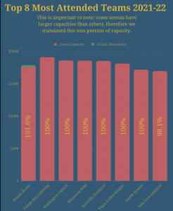
Our infographic demonstrates several different categories that can be evaluated through the information that has been sourced. Firstly, we wanted to provide context as to why attendance statistics may be leaning a certain direction — we state our metrics that will be evaluated followed by a breakdown of Fan Cost Index, and then provide a baseline context of the best performing NHL teams in wins the last five seasons. Secondly, we want to actually visualize the information that we have been working with. We visualize the most attended teams as well as the least attended teams through a bar chart which integrates proper colour to be distinctive and represents clearcut data facilitating readability. Something important to note in both the most attended and least attended graphics is that some teams’ arenas have larger capacities than others, therefore we translated this into percent of capacity metric. The final story we are telling with our infographic is relating the aforementioned information to the Fan Cost Index which we provide six easy-to-understand metrics of best Fan Cost Index, worst Fan Cost Index, highest capacity arena, and relating team performance to Fan Cost Index and attendance records.
Pros and Cons
We believe that we have created an attractive and accessible infographic that avoids the spread of misinformation or misrepresented data. Soundness and utility were of utmost importance when crafting our initial ideas for what this infographic would include and we believe that was done effectively. At the forefront of our design principles was to make sure our infographic represented and applied both effectiveness and expressiveness. The importance of each of our attributes matches the saliency of our channels while our visual encoding expresses all of the information in the dataset attributes. Additionally, it was very important to us to demonstrate the information which each fan base and organization would find interesting to draw their own conclusions about the statistics with equal representation. We wanted to offer every avenue available for readers to interpret the information in any way they see fit with us simply showing them the facts in front of them derived from our sources.
Despite us both being fans of the Vancouver Canucks and Edmonton Oilers respectively, there was no inherent bias while piecing together our statistics and information and in fact, neither team came up at the top nor bottom of any category so their presence in our work is non-existent. A con, however, may be that our information is relatively limited in factoring in several situations. The first of which is COVID-19 which drastically affected professional sports teams revenue and undoubtedly attendance through those years (especially when sports plexes were operating at half capacity or no in-person fans) which could have skewed the average attendance metric slightly given the economy’s effect on teams and fans. Another factor that we could have considered more is an additional look at which teams actually have the highest revenues to determine whether the Fan Cost Index provides insight into that relation.
References:
“The Business of Hockey.” Forbes, 2022, www.forbes.com/nhl-valuations/list/#tab:overall. Accessed 19 October 2022.
Gough, Christina. “NHL teams average attendance 2021/22.” Statista, 2022, https://www.statista.com/statistics/193749/regular-season-home-attendance-of-national-hockey-league-teams-in-2010/. Accessed 18 October 2022.
Hartweg, Chris. “Fan Cost Index.” Team Marketing Report, 2022, https://teammarketing.com/fancostindex// Accessed 18 October 2022.
Ozanian, Mike. “NHL Team Values 2021: New York Rangers Become Hockey’s First $2 Billion Team.” Forbes, 2022, https://www.forbes.com/sites/mikeozanian/2021/12/08/nhl-team-values-2021-22-new-york-rangers-become-hockeys-first-2-billion-team/?sh=4275b9b5360c. Accessed 18 October 2022.
Shea, Bill. “Florida Panthers Remain The NHL’s Best Deal For Fans, But Others May Surprise You.” The Athletic, 2022. https://theathletic.com/3200274/2022/03/23/florida-panthers-remain-the-nhls-best-deal-for-fans-but-the-others-may-surprise-you/. Accessed 19 October 2022.