Trends of Success in Feminist Cinema
Meryl Stevens, Ben Clark, Madeleine Meyer
7 December 2022
Website: https://merylmstevens.wixsite.com/info419-bechdel
Introduction
Film is a traditionally male-dominated medium. For decades, male writers, directors and producers have entrenched a system that has left authentic female voices marginalized both in front of and behind the camera. Feminist cinema has typically held a separate category from the mainstream— seldom getting the funding or recognition it deserves in order to be considered “successful” by capitalist standards. However, we believe that a trend is emerging— media ecosystems are changing to properly support feminist films and offer them greater chances of success. Our baseline for determining whether a film is ‘feminist’ is whether or not it passes the Bechdel Test, and we will be analyzing films’ success according to three metrics:
- Financial: A function of production budget subtracted from box office revenue
- Cultural: Critical and audience reception
- Institutional: Awards and recognitions given by major festivals and film organizations.
We have created an infographic and a series of visualizations to chart the growing financial, critical and institutional success of films which pass the Bechdel test from 1970-2014. We believe that this data will be of interest to audiences and producers alike—or any individual who is passionate about quality and feminist cinema.
Data
We found all of our datasets on Data.World, and they each carried a wealth of information for our project. These included Bechdel scores, budget, revenue, awards, IMDb/Metacritic ratings and key cast and crew. We had initially hoped to try and explore films’ success not only based on whether they passed the Bechdel test, but also on the gender representation of their key cast and crew. However we quickly encountered difficulties with our datasets that made such an endeavour impossible— our cast and crew data only covered movies released in one year rather than a span of several. We also encountered issues with aligning our datasets— different datasets had different collections of titles, organized in different orders. Fortunately, we were able to find a good overlap of titles across all of our datasets, and thus merge and reorganize like titles in Tableau prep. One problem remained, which was that the items within the Awards attribute contained multiple values. To handle this problem, the merged dataset was then brought into Excel, where the split columns feature was better suited to the goal of separating nominations and wins into two different columns. Through Excel’s conditional formatting and text to columns features, the awards category was split by total wins, total, nominations, as well as those totals for each awarding organization. 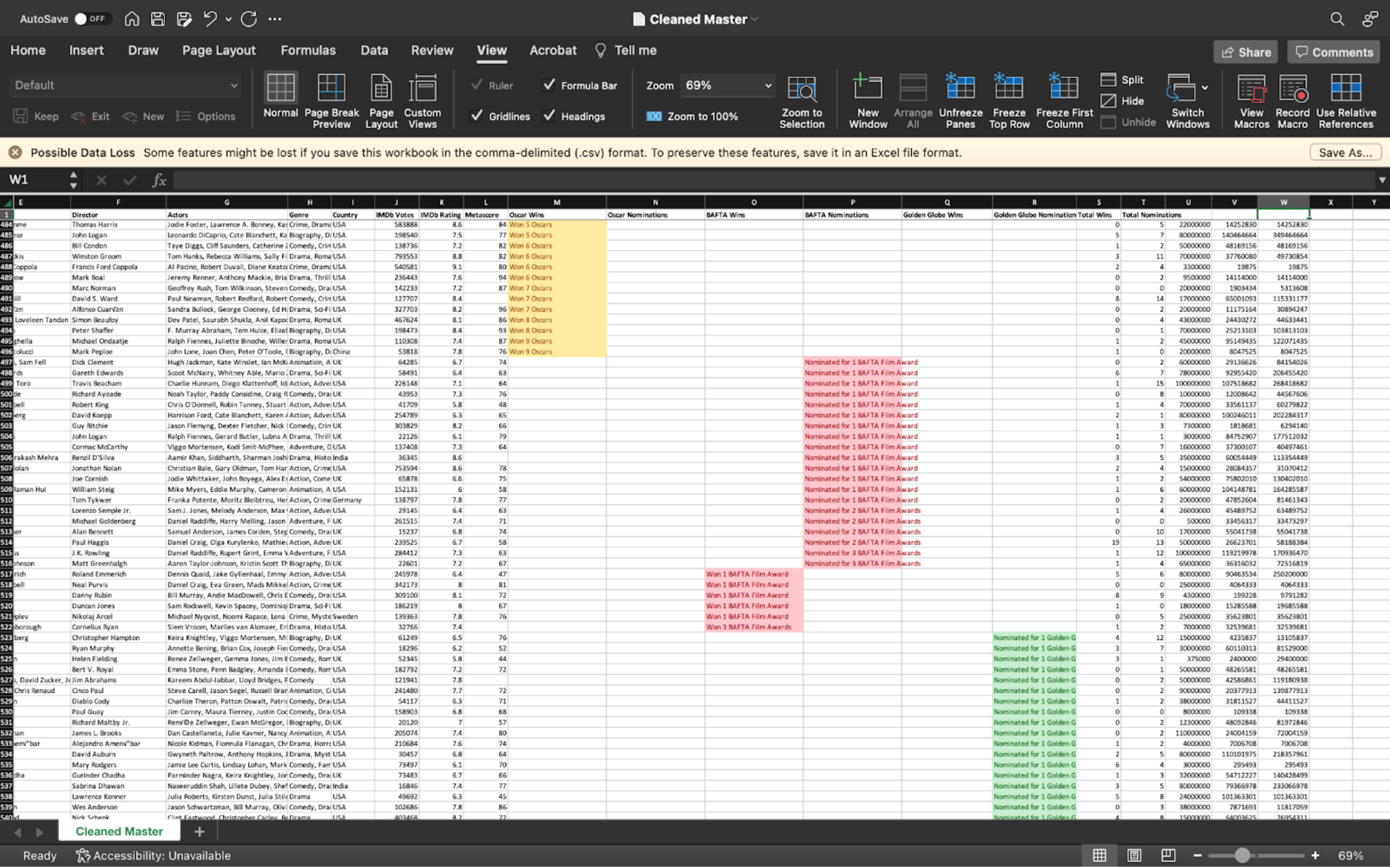
Then, this dataset was again exported and brought back into Tableau Prep, where the data was cleaned by removing all letters, spaces, and punctuation from these columns. At this point, the dataset was complete and ready for visualizing.
We were ultimately able to assemble a master dataset of roughly 1600 films ranging from 1970-2014, including revenue, award and critical data for each title.
Tools
Our team used four main tools over the course of this project:
- Tableau Prep Builder: This software allowed us to merge and clean our data. We did this primarily through the Join function, as well as grouping values, setting attribute types, and removing unnecessary characters in cells with multiple values. We exported our final data source from this platform as it could seamlessly translate to Tableau Desktop.
- Excel: We referred to Excel to mitigate any issues encountered in Tableau Prep. This software was better suited to splitting text into columns, sorting, and filtering data. Additionally, we felt more comfortable using functions in this software for tasks requiring merging values.
- Tableau Desktop: Desktop was the primary software used for creating our interactive visualizations. We had received extensive training with this software over the course of the semester, and both were able to help us satisfactorily build our visualizations at a detailed level. We encountered slight issues organizing certain attributes in Tableau Desktop, however these issues were either overcome or worked around.
- Canva: This was the platform used to design our infographic. We chose Canva for its wide range of customizable infographic templates, ease of use, aesthetic graphics, and collaborative quality.
- Wix: Wix was chosen as the host for our web domain in which we compiled our findings. Wix was ideal for our team as it is a very easy-to-learn platform that allowed us to customize and incorporate necessary tools such as linking, embedding, and appealing page design.
Design and Analysis
Given that we were measuring films’ success along three different metrics, we decided to individually design separate visualizations for each angle. We were unified in some basic design elements:
- Movie data was to be compared based on Bechdel score; films that passed the Bechdel test were set to a green hue, while films that failed were set to a red hue. We chose these hues for their strong visual contrast, which would allow instant identification of a film’s pass/fail value.
- At least one visualization must include an attribute of time, so as to show trends. Otherwise, the year of release must be referenced in the tooltip.
Ben created a set of visualizations dealing with film revenue: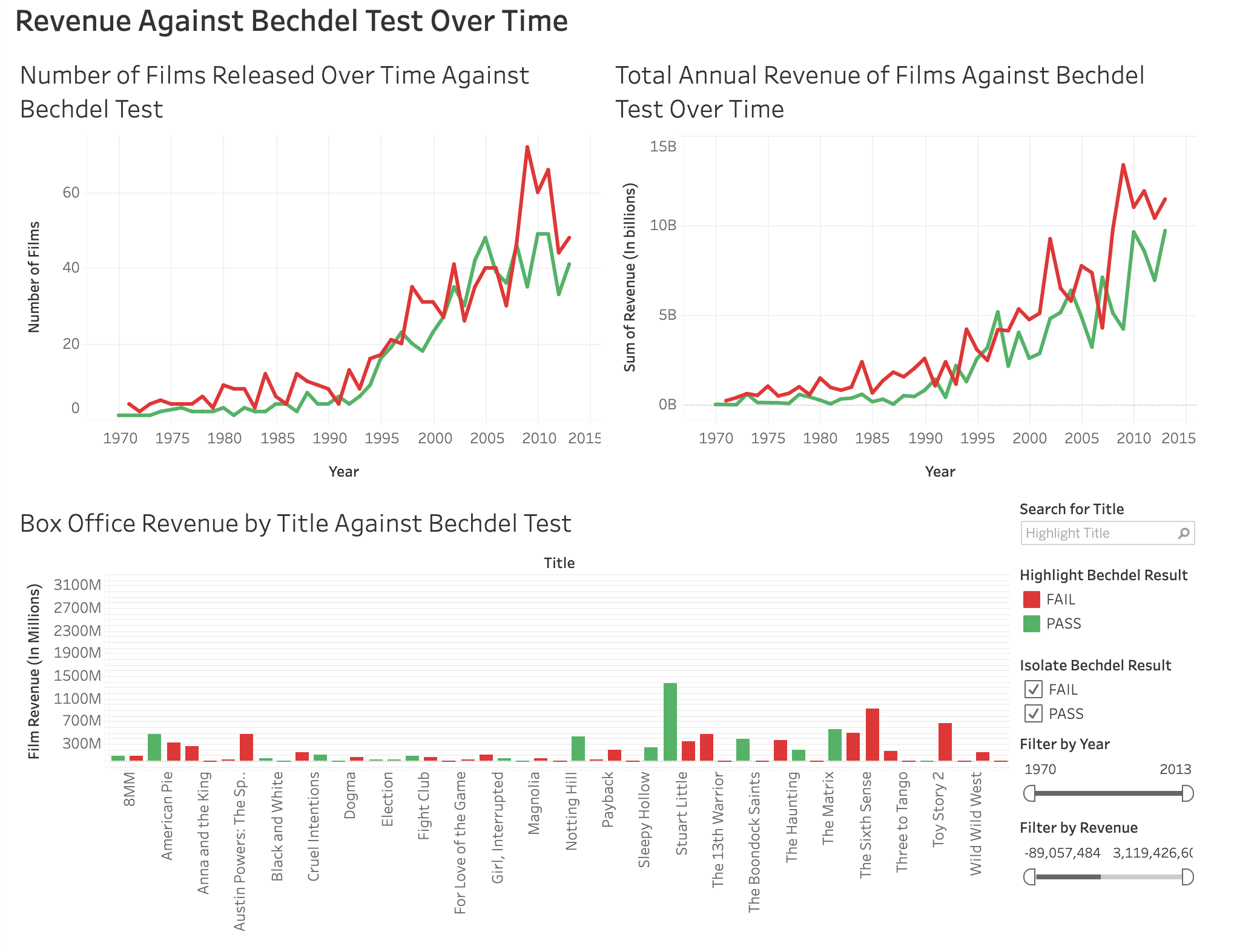
These visualizations show the box office revenue, and the number of films which pass and fail the Bechdel test year-by-year. I began with the bar chart— intending to create a single, unified visualization that could display each film’s revenue and Bechdel score chronologically throughtime. I assumed that bars would be an excellent visual channel for displaying revenue as a magnitude channel, but quickly realized that it was impossible to discern any meaningful information from an overwhelming 1600 individual titles. I then created two line charts to filter and re-frame my data. One line chart shows the total annual revenue of films based on their Bechdel score, and the other shows total annual Bechdel scores. I was torn between using an area chart versus a line chart; both would represent their values in a continuous, positional manner. I determined that area charts’ tendency to stack values rather than overlay might be visually misleading, and subsequently chose a line chart instead. I added some high-level interactivity to my dashboard that allows users to narrow the range of titles in the bar chart to a single year selected on either of the line charts. These three visualizations clearly display an upward trend of films passing the Bechdel test, especially taking off in the 1990’s. Over the span of our dataset, Bechdel-passing films financially outperformed Bechdel-failing films five times: in 1991, 1993, 1997, 2004 and 2007. Meanwhile, more films passed the Bechdel test in 1991, 1997, and 2003-2007 than failed. In all other cases, Bechdel-passing films competed fairly closely with Bechdel-failing films, favouring our hypothesis of a growing trend of feminist cinema.
Meryl examined the institutional success of the movies in our dataset: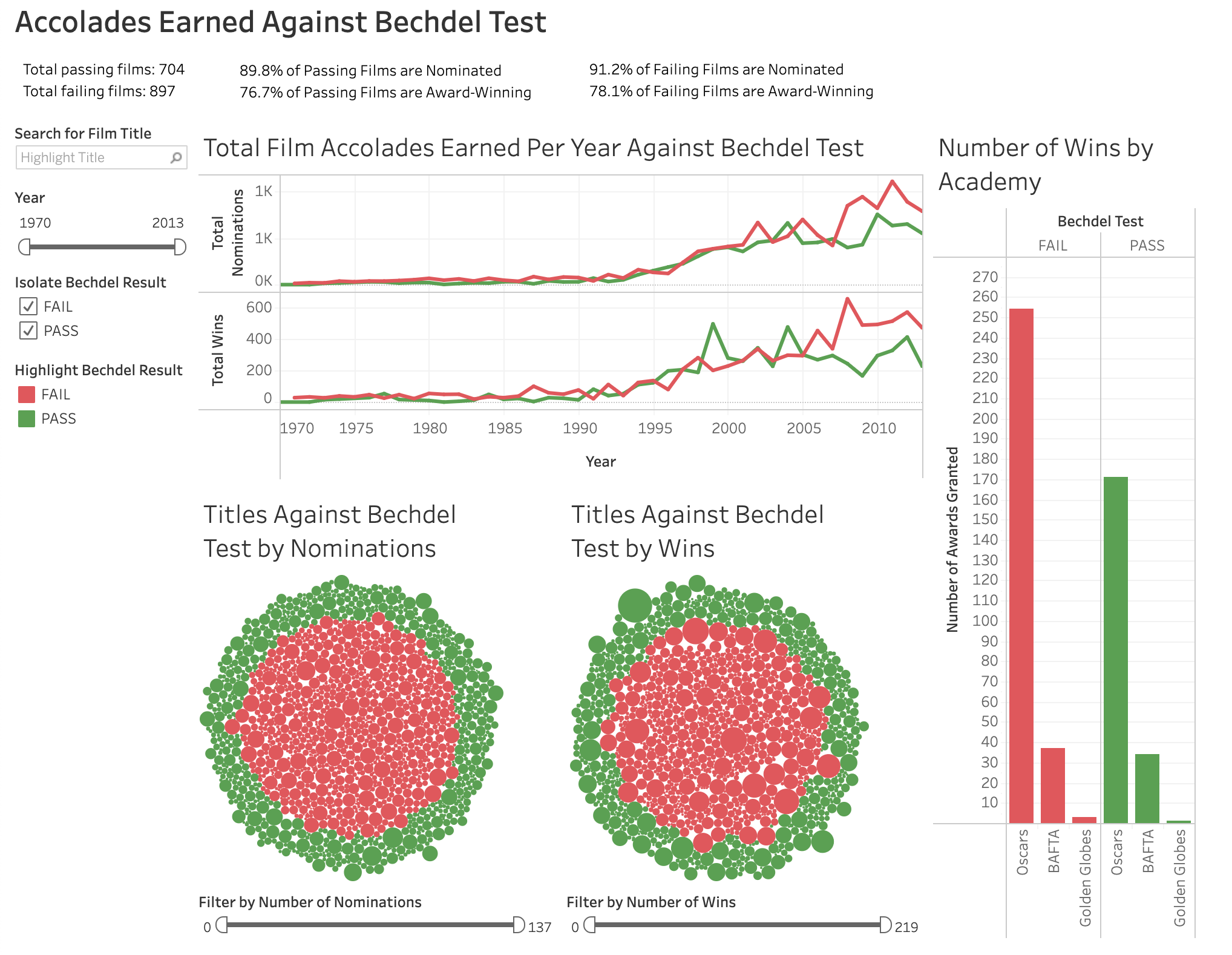
To visualize the critical success angle, I created a high-level interactive dashboard on Tableau Desktop. For my angle, the important attributes were Bechdel Test, Title, Year, Total Wins, Total Nominations, and the Wins and Nominations attributes for each organization. For my first visualization, I chose to represent total film accolades earned per year against the Bechdel test via a double line chart. This was an expressive visualization of data as total wins and nominations are magnitude channels with data conveyed through a position on a common scale.
The next visualizations I created were titles against bechdel test by awards. Since there are a large number of titles that shew data for awards, it was important to show the data in a way that was comprehensive. My choice was to create two packed bubble charts: one for nominations, and one for wins. I felt this type of graph was the best choice because it allowed all titles to be included in a single view. Here, each title is represented by a graphic mark, in this case a circle. The size of each circle is reflective of the number of awards associated with the film, as area/size is an effective choice for magnitude channels and qualitative data. For the tooltips of each mark, I included not only total wins/nominations but also included any awards from notable organizations.
Lastly, I created a visualization for the number of wins by awarding organization. I chose to represent this data through a side-by-side bar graph. As another magnitude channel, a bar graph is an effective choice as it expresses qualitative data on an unaligned scale. One interesting choice I made for this graph was to include the title attribute as a detail mark. Although I could have left the bar to represent only the full sum of awards, I felt that being able to highlight each title in each category was to the benefit of my dashboard as it would add detail and help to link all of the worksheets. Then, the full sum of awards could be identified via the Y-axis scale or by clicking on the organization on the X-axis. In order to execute this choice of including title details without creating a false sense of hierarchy, I created a true hierarchy by sorting the data by number of wins. That way, titles with more wins were at the top of the bars.
Lastly, I compiled all of these worksheets into one dashboard. Here is where I included and linked all worksheets through filters and added highlights as actions. The most important part of this data was applying hue to my Bechdel Test categorical data, as hue is effective in expressing an identity channel. I feel the red for Bechdel-failing and green for Bechdel-passing films makes it very clear to the viewer where to look for the information they seek. On my dashboard, I employed a number of interaction techniques, such as selection, brushing, a search function, and reconfiguration.
Madeleine worked with the films’ critical reception: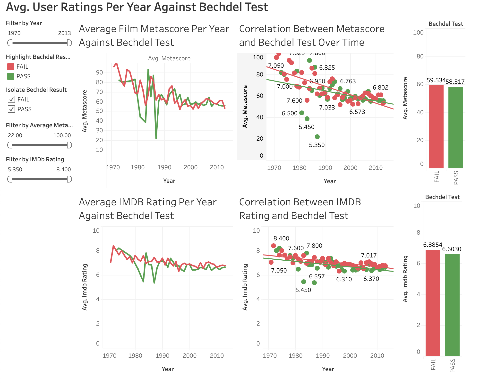
This collection of visualizations represents the average user ratings per year against the Bechdel Test. First, the line graphs represent the average ratings and metascores for all films that either passed or failed the Bechdel Test that year. Looking closer, both line graphs show that there have been 2 significant dips in the metascores and ratings for passing films, in 1983 and 1987. Since then, both passing and failing films have been consistent and almost equal in their megastores and ratings, with passing films almost surpassing failing films in metascores in recent years, while ratings are getting there. To further test this, I used scatterplots to plot the averages per year of metascores and ratings, and then used trend lines to clearly see the averages over the years. Like I observed earlier, the average metascores of passing films actually passed the failing films starting in 2002. For the ratings, the trend lines were actually parallel and very close together, showing that ratings of passing and failing films have similar ratings across the board (with exceptions in 1983 and 1987).
Next in our process was the creation of the infographic. The infographic was another aspect of our deliverable. The idea behind including it was that it could summarize the general findings of our research in an appealing, compact, and (most importantly,) sharable form. Some key sections of the infographic include the overall most successful film from both Bechdel-failing and passing categories, the years with the highest number of passing and failing films, and finally the average Metascore, IMDb Rating, Revenue, Budget, and Accolades for all films which passed and failed the Bechdel Test. We employed a number of design principles to ensure the quality of our infographic. Firstly, we opted not to include graphs or charts as we explore those visualizations in detail in our website. This guaranteed that in our snapshot of findings, we did not have any misleading data. The infographic is meaningful as it uses key data to tell a clear story about how audiences receive films representing an unrepresented group. We ensured utility, soundness, and beauty by using neutral colors, aside from red and green hues representing failing and passing titles respectively. Additionally, we ensured the infographic would coordinate well as part of our website by using a transparent background.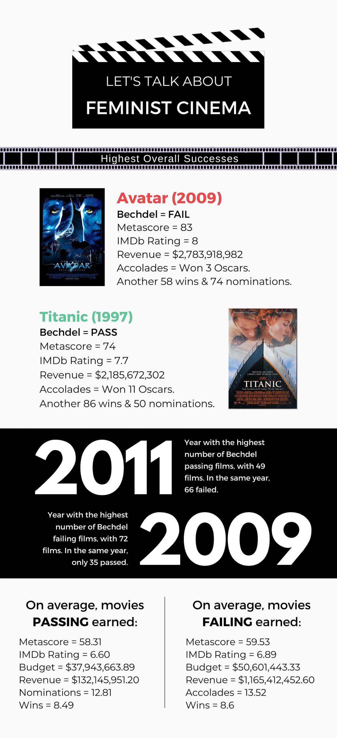
Finally, all visualizations, research, and findings were compiled into the deliverable of a website. We chose to produce a website as it allows our research to be accessible to anyone that may take interest in our work while still providing ample opportunity for us to go into detail. In designing the website, the main goals were to ensure that it was both comprehensive yet easily navigable. This was accomplished through the creation of a homepage with three subpages, and three main pages. The homepage served as an introduction and summary page, including a breakdown of our project goals, our summarizing infographic, and a conclusion.
The three subpages of this page link to our references page, our embedded original dataset and download link, and to a page providing additional resources relating to our topic, inviting viewers to further pursue the issue we raise in our project.
Also linked at the bottom of our homepage and in our navigation menu are the three main pages for each angle on our topic: cultural success, critical success, and commercial success. Each page includes our embedded Tableau public visualizations, as well as a brief summary of our specific findings.
Pros and Cons
Overally, we were satisfied with all of our software and design choices. We generally found that Tableau was able to help us render our visualizations adequately, however A couple of our visualizations dealt with a complex intersection of values that Tableau had difficulty rendering easily and satisfactorily. We especially had difficulty when trying to arrange movie titles chronologically rather than alphabetically, and had to rearrange our source datasheet to compensate.
Also, while our dataset covered a wide range of titles over multiple decades, it was nevertheless somewhat limited. Most of our data was weighted toward films released after the mid-1990’s; we had significantly more titles to work with in the range of 1995-2013 than in 1970-1994. Alongside that, because our date range ends in 2013, we are unable to speculate how films perform relative to the Bechdel test in more recent years.
Story
The story that we aimed to tell with our research is one of evolving attitudes towards the representation of women onscreen. As consumers of media and especially as Media Studies students, we ourselves have noticed a shift in entertainment values in recent years. Not only are we seeing more film and television media centring women’s stories, but we have also noticed an increase in discourse surrounding the topic of feminist cinema. As a result, our team made the choice to focus on this evolving media landscape.
Conclusion
As a group, we found that in general, audience and commercial reception of Bechdel-passing films is trending upwards, supporting our hypothesis. Meanwhile, critical reception still tends to favour failing films. Our team hopes to continue to track these trends in the future and continue to see rising successes of feminist cinema.
References
Brener, S. (2016, August 4). Movies.csv [Data set]. https://data.world/sharon/bechdel-test/workspace/file?filename=movies.csv.
Brener, S. (2016, August 4). Bechdel-master/imdb_data.json [Data set]. https://data.world/sharon/bechdel-test/workspace/file?filename=Bechdel-master%2Fimdb_data.json.
Center for the study of women in television & film. (n.d.). https://womenintvfilm.sdsu.edu/
Chun-houh, C., Wolfgang, H., & Antony, U. (Eds.). (2008). Handbook of data visualization. Springer.
Geena davis institute on gender in media. (n.d.). Geena Davis Institute. https://seejane.org/
Heer, J., Bostock, M., & Ogievetsky, V. (2010). A tour through the visualization zoo. ACM Queue, 8(5), 1–22. https://queue.acm.org/detail.cfm?id=1805128
Heer, J., & Shneiderman, B. (2012). Interactive Dynamics for Visual Analysis: A taxonomy of tools that support the fluent and flexible use of visualizations. Queue, 10(2), 30–55. https://doi.org/10.1145/2133416.2146416
Hickey, W. (2014, April 1). The dollar-and-cents case against Hollywood’s exclusion of women. FiveThirtyEight. https://fivethirtyeight.com/features/the-dollar-and-cents-case-against-hollywoods-exclusion-of-women/
Lankow, J., Ritchie, J., & Crooks, R. (2012). Infographics: The power of visual storytelling. John Wiley & Sons, Inc.
Miss Representation. (n.d.). The Representation Project. https://therepproject.org/films/miss-representation/
Munzner, T. (2015). Visualization analysis and design. CRC Press, Taylor & Francis Group, CRC Press is an imprint of the Taylor & Francis Group, an informa business.
No Film School. (2018, August 10). The bechdel test—Everything you need to know. YouTube. https://www.youtube.com/watch?v=Meq3CyuKOjM
Schwabish, J., & Feng, A. (2021, June 9). Do no harm guide: Applying equity awareness in data visualization. Urban Institute. https://www.urban.org/research/publication/do-no-harm-guide-applying-equity-awareness-data-visualization
The Take. (2020, July 14). The female friendship revolution onscreen. YouTube. https://www.youtube.com/watch?v=8FR3B5s_JUI
The Take. (2022, October 25). Female characters still need to be better—Why the bechdel test didn’t really help. YouTube. https://www.youtube.com/watch?v=ExlpSFbpwyA
Ware, C. (2008). Visual thinking for design. Morgan Kaufmann Elsevier Science & Technology.
Ware, C. (2010). Visual thinking: For design. Morgan Kaufmann.
WestEndFilmsUK. (2019, July 25). This Changes Everything—International trailer. YouTube. https://www.youtube.com/watch?v=wzqr1V4xauI
Wezerek, W. H., Rachael Dottle, Ella Koeze, Gus. (2017, December 21). Creating the next Bechdel test. FiveThirtyEight. https://projects.fivethirtyeight.com/next-bechdel/
Women and Hollywood. (n.d.). Women and Hollywood. https://womenandhollywood.com/
Women in film and television international. (n.d.). WIFTI. https://www.wifti.net/