Category Archives: Uncategorized

Anatomy of a Hit – Han, Joseph, Lynette

Anatomy of a Hit

Han, Joseph, Lynette

Link to our data story

Introduction

What makes a hit song? There are a plethora of fascinating ways to approach this discussion, but we decided that in order to answer this question, we needed to explore and dissect the technical music data. By following empirical evidence derived from objective data we believed that we could ultimately model the anatomy of a hit. As such, we looked towards the largest database and most popular music streaming platform, which was none other than Spotify, with a user base of 350 million. By harvesting their internally collected data, we were able to gather extensive information about the top hits on Spotify from the year 2000-2019. 

Within this data, we were most intrigued by how song duration has shortened in the last two decades; and from this observation, we came to a hypothesis that the duration of hit songs are shortening over time possibly due to reducing attention spans. Beyond this, however, we wanted to make space to consider the natural evolution of a music industry that is largely dictated by social changes, those which influence general musical preferences. These changes manifest as attributes in music like loudness, energy, tempo, and valence, all of which we were able to identify in the Spotify metadata. Amongst these attributes we also encountered Spotify’s very own “Popularity Index”, which we came to understand as an algorithmically calculated 0-100 scale rating that shows how popular one artist is compared to every other artist on the platform.

Having all this data in hand, we intended to assemble our infographic and visualizations in a way that could inform key players in the music industry like musicians and labels, and any parties involved with the process, such as managers, advertisers, brands, etc. essentially, anyone who could directly benefit from the data to make informed decisions based on what are essentially market trends.

Data

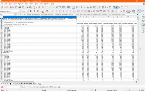
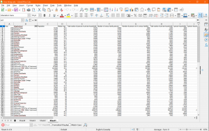
We found both of our data sets on Kaggle, an online community platform where professional data scientists and enthusiasts collaborate and share data. Both of our data sets were collected by Kaggle users who pulled the raw data directly from Spotify’s API. To accomplish this they used the popular Spotipy library, which is an open-source Python script. For the first data set, the user pulled the raw data of top hits from the years 2000-2019 organized by playlists on Spotify. The data included the following features of music: artist names, song name, total song duration, whether or not the song was explicit, release year, popularity, danceability, energy, key, loudness, mode, speechiness, acousticness, instrumentalness, liveness, valence, tempo, and genre. The original data set as it came was relatively organized but still required some cleaning to be processed without issue. 

During the cleaning process, we converted duration from ms to s, then we converted mode from binary to major/minor, and we also converted “key” from numerical values to musical keys. Additionally, we also had to manually fix 22 items in the genre column that were incorrectly collected or perhaps corrupted. Finally, we also realized an issue with the genre attribute, where many songs were labelled under multiple genres. Thus, we decided to separate genres within the data set and center our focus on a song’s primary genre, to avoid overlapping data items during filtering.

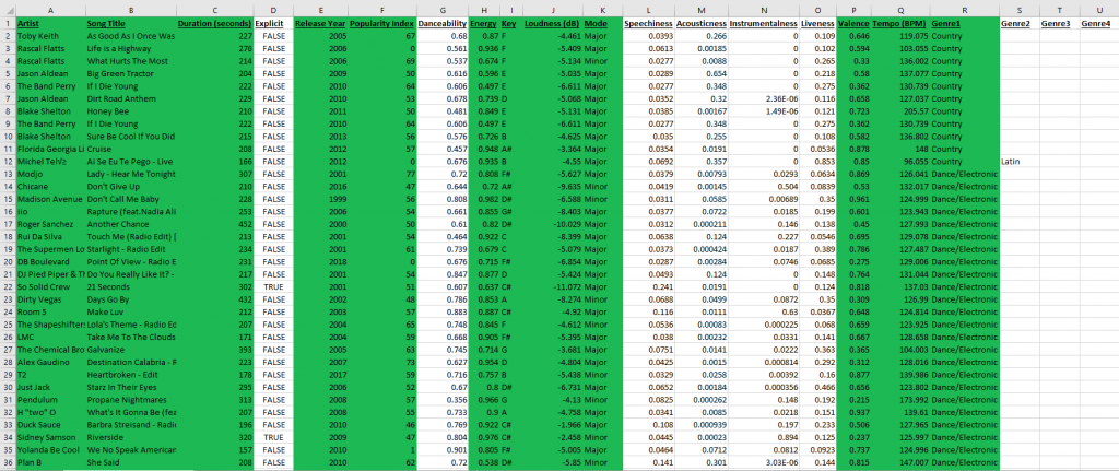
Sample of Cleaned Dataset #1 (Kaggle Link)

Our secondary data set was collected in the same way, but it instead contained information derived from Spotify’s globally most-streamed tracks in 2019; which was music that appeared in the daily top 200 Spotify chart in that year. The data set included information on country, song ranking, track ID, number of streams, track name, artist name, the url, acousticness, danceability, and energy. Dataset 2 included information unique from dataset 1, but it also came with some information that overlapped, so we cleaned the data and isolated our attribute of interest; which was just total streams for those charting songs of 2019.

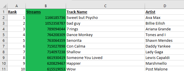
Sample of Cleaned Dataset #2 (Kaggle Link)

Tools

Microsoft Excel:

Microsft Excel was both an efficient and excellent tool that we used to check and manually clean our data. By using Excel, we were able to easily read the original data and identify potential errors by using the find and replace tool, it was also easy to convert whole columns of data where necessary. Through Excel, we were able to identify data that we wanted to focus on and sort our data to find potential points of interest.

Tableau Prep / Tableau Desktop:

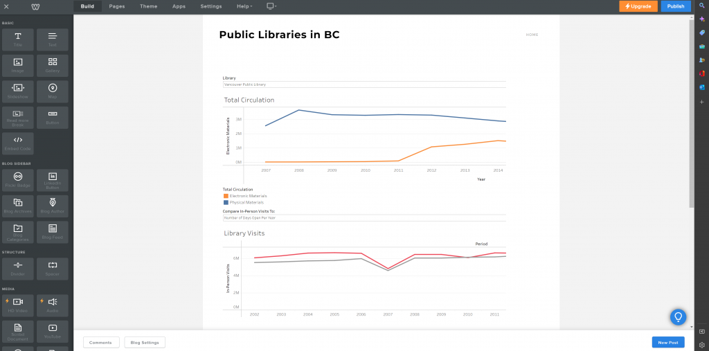
For our information visualizations, we used Tableau Prep in conjunction with Excel to output cleaned versions of our datasets. We then imported this data into Tableau Desktop to encode our visualizations and dashboard. Both Tableau Prep and Tableau Desktop were very effective to use and we didn’t run into many difficulties. Since our data was already well prepared, the process of creating the visualizations was smooth, it was simply a matter of deciding which channels to include and the level of detail we wanted. Since our aim was also to encourage exploratory usage of our interactive views, Tableau was great for adding filtering options and parameters. The only small issue we had with Tableau was with overlapping data points, which would display as asterisks. For example, multiple artists with the same song names or identical popularity index scores would lead to indistinguishable data points. This is the only weakness of the tool, otherwise, Tableau was quite effective in capturing and presenting our data in an interactive and compelling manner.

Canva:

When it came to our infographics we had many tools to choose from but we chose to use Canva as it offered features that made collaboration easier. It was easy to use in tandem with Google Drive, and the service allowed us to edit our work together through a shared link, add real-time comments, and track progress. The only downside was that we had much less access to certain templates, fonts, photos, etc unless we paid for the service but even without premium access Canva was still useful.

Analysis

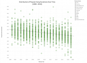
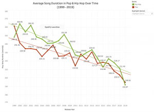
From the beginning, our analysis was rooted in the hypothesis that popular music was getting shorter and shorter. This was our group’s consensus after reflecting on our individual listening experience, this was combined with the common assumption that social media is also shortening our generation’s collective attention spans. Therefore, when combing through and making sense of our data, we were prepared for our visualizations to either support or refute our hypothesis. Initially, our approach was simply to create one visualization plotting all our data points against song duration to present our predicted downtrend. While this approach did support our hypothesis, we felt the scope was too large. We realized a deeper dive into the data was required. At the end of the day, music is an art form and there are many variables involved with just a single song. Thus, we decided to create a second visualization that would provide further insight into the trend identified. We noticed the bulk of our data consisted primarily of the hip-hop and pop genres, so we isolated that dataset and aggregated each year’s data points into one average duration. Together, this second visualization combined with our first provided both a macro and micro perspective to answer our proposed question.

For the remaining visualizations, our aim was to simply provide an exploration for some of the other data attributes. This required some experimenting and processing as our group wanted to identify elements that may contain other potential narratives. After exploration of our data, we decided to focus on the Spotify Popularity Index and four musical attributes.

Design Process

We approached our design process with a lot of experimentation, as there were many possibilities with the number of variables in our data sets. Before we even cleaned our data, we did already have some sketches with basic ideas of how we expected the visualizations to look. These rough sketches consisted of plotting as much of the data items as possible to provide a comprehensive visualization. We wanted the viewer to be able to navigate through each visualization and identify areas of interest to them, while also conveying our narrative. Music is a subjective and often personal thing, so this was a key consideration. For example, it is highly likely the viewer will be familiar with some of the songs plotted on our charts. From these initial sketches and ideas, we were able to effectively encode them using Tableau although it required a little more experimentation than expected. 

For our first visualization, we concluded that a scatter plot with a trend line was an appropriate idiom. Since our data is ordinal, the magnitude channel of positioning on a common scale was important as all data points can be easily identified at a glance. This visualization follows principles of effectiveness as it uses spatial region to distinguish the progression of data over time. As there is a comprehensive amount of data in this encoding, we decided not to implement color hues as it would overcomplicate things or even imply a secondary hierarchy.

With our second visualization that dives deeper into the dataset, we concluded the idiom of a line chart complied best with the ordered attribute of average song duration. The downward trajectory of average song durations per year is clearly presented, and the use of color hues further distinguishes the categorical channels of genres, allowing for ease of comparison. A similar approach was taken with our fourth visualization of the dashboard with other musical attributes.

Finally, we also encoded the Spotify Popularity Index on a similar scatter plot to our first visualization. We chose to also implement color hue onto the number of streams to maximize the visibility of the progression, while our data is not categorical here, the use of color does help effectively guide the eyes upwards. From our exploration of the data, we wanted to present the correlation between the Popularity Index metric and the total number of streams per song. The Popularity Index metric is more ambiguous than the other attributes as its generated internally and updated constantly by Spotify’s algorithm. Thus, while this snapshot of the index on a particular day gives us a better idea of the correlation (perhaps causation), it’s not as indicative of a trend as we hoped.

Infographics

PicturePicture

With our infographics, we chose to highlight key information from the interactive views as well as show the potential findings the reader could further investigate on their own. Through a consistent visual style aligning with Spotify’s aesthetics, as well as minimizing the amount of information being presented, we applied principles of beauty. These striking visual elements of the infographics also make our report more interesting and engaging to the audience.

Story

Digitization and emerging technology revolutionized music consumption, bringing radical changes to the music industry. Raw materials like CDs and LPs are removed, and physical storage requirements such as shelves for records or racks for CDs are no longer needed. It is not necessary to purchase an entire album for only a few desired songs; music consumers have the freedom to choose how and when to consume music. Traditional distribution channels have been transformed to digital streaming, offering easy access to the market for music producers and artists.

Now in the digital era, everything is quickly digested and people are looking for instant gratification when scrolling through social media. Our narrow windows of free time as well as attention spans are inevitably dictated by technology. As Tik Tok clips, memes, and gifs emerge and become popular, it is not uncommon for music producers and industry to produce diminutive songs and stuff them into one album, rather than making lengthy ones, to maximize economic potential. This is especially efficient for new and independent artists; since people always want to get to the “good stuff” faster, short songs tend to sell better because they keep listeners’ retention and establish immediate impact. Our primary purpose of the designs is to reflect the trends and patterns of music duration as well as any notable attributes that make a song popular, particularly from 1999-2019. It is evident that there’s a higher chance for shorter music to become popular, and consumers tend to choose them over other ones because they are catchy and compact and therefore stand out in the crowd. It seems this trend will continue as this has become a golden rule of social media marketing.

Pros and Cons

Overall, the interactive visualizations and infographics we created are effective in supporting the hypothesis that music is getting shorter as digital streaming rises, and platforms like Spotify greatly alter the music industry and production. 

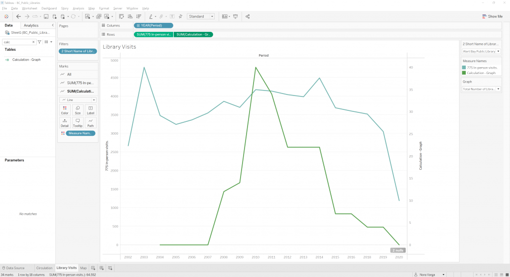
The scatter plot viz successfully shows a drastic drop in song duration from 1999 to 2019. Music genres can be filtered by simply checking the checkboxes. Further, a line chart viz is used to exhibit a closer view of average song duration in Pop and Hip Hop over time. The viz is clean and straightforward, the two lines explicitly show the fall of pop and hip-pop song duration over time. The graph also indicates the point where Spotify launches to draw a connection between song duration drop and the rise of digital streaming platforms.

The popularity index viz clearly shows the pattern of Spotify’s algorithm that songs with a higher popular index tend to have higher chances of exposure. We used scatterplots to represent songs and different saturation of green to represent the number of streams, where the darker the green, the more streams it has. To further explore the secrets behind hit songs, we made a Tableau dashboard containing four key components of music: loudness, energy, tempo, and valence. The switches allow viewers to filter songs by their musical mode, key and explicitness, providing more detailed views. To make viz and infographics look more appealing, we chose green as the main color for both to match Spotify’s theme. 

There are some challenges encountered in this project. At the data cleaning stage, we chose to exclude attributes that we considered irrelevant in affecting music popularity, such as danceability and speechiness, which may narrow the resulting findings. Another limitation was that we couldn’t figure out how to make a viz directly relating musical attributes to the popularity index. With that, we would’ve been able to create a more accurate view.

References

About Spotify. Spotify. (2022, October 25). Retrieved November 28, 2022, from https://newsroom.spotify.com/company-info/

​Ceccanti, E. (2019). Spotify Data Visualization. Behance. Retrieved November 28, 2022, from https://www.behance.net/gallery/86943261/Spotify-Data-Visualization.

Grow, K. (2018, June 25). Taylor Swift Shuns ‘grand experiment’ of streaming music. Rolling Stone. Retrieved November 28, 2022, from https://www.rollingstone.com/music/music-news/taylor-swift-shuns-grand-experiment-of-streaming-music-187594/

How much does Spotify pay per stream in 2022. Ditto Music Distribution. (2022, November 20). Retrieved November 28, 2022, from https://dittomusic.com/en/blog/how-much-does-spotify-pay-per-stream/

Loud and Clear by Spotify. Loud and Clear. (2022, June 3). Retrieved November 28, 2022, from https://loudandclear.byspotify.com/%E2%80%8B

Robley, C. (2022, July 5). The Spotify Algorithm: What musicians need to know. DIY Musician. Retrieved November 28, 2022, from https://diymusician.cdbaby.com/music-career/spotify-algorithm/#:~:text=Spotify’s%20Popularity%20index%20is%20a,get%20you%20onto%20Discover%20Weekly.

Spotify global 2019 most-streamed tracks. 2019.  Retrieved November 18, 2022, from https://www.kaggle.com/datasets/paradisejoy/top-hits-spotify-from-20002019

Top Hits Spotify from 2000-2019. July 2022.  Retrieved October 16, 2022, from https://www.kaggle.com/datasets/paradisejoy/top-hits-spotify-from-20002019

Housing in Vancouver, 2006-2021: A Brief Exploration

Annika Van Vlack, Hui Wong, Claire Lin

Our data story can be found here: https://sites.google.com/view/info419finalproject/home

The objectives
Our chief objective, as spoken to in our data story, was to explore housing data in Vancouver through visualizations that could make trends apparent. We did not intend to construct an argument prior to exploring the visualization, and neither we do not want to present a clear thesis based on the visualization. In terms of actions through Tamara Munzner’s (2015) scheme, we had to first visualize data to support our own high level action of “discovery,” middle-level action of “exploration,” and query the data as it came (p. 46).

We present a survey of trends that we found to be of note, not a thesis or conclusion. We wanted to stress this point in our data story because our data lacks context that may help point to causal factors behind trends—as data often does.

We intend to allow users to casually encounter and “enjoy” the data, as a high level action (Munzner 2015, p. 48).We want to mirror such encounters and enjoyment of the data with our own exploration, and thus include interactive components in our data visualizations that would support middle- and low- level search and query goals. In doing so, we hope that users will be able to engage closely with what we found to be worth presenting, forming a more comprehensive picture of housing in Vancouver.

The data set
We used the Canadian census dataset, taken once every five years, and the 2011 National Household Survey dataset (see bibliographic references for links to these data sets). These datasets are available through open data portals from the city of Vancouver and Statistics Canada. These datasets prove to have a few benefits: first, they are credible and valid data with clear provenance. They are collected directly from government censuses. Further, both the city of Vancouver and Statistics Canada provided notes on data accuracy, including rationale for data rounding and possible omissions. These censuses have a high response rate and count. These datasets are complex and contain a lot of information that we sifted through and pared down.

A screenshot of LibreOffice Calc showing 2006 Vancouver census data

The 2006 census data

A cropped screenshot of LibreOffice Calc, showing that we had 2,209 rows and 25 columns of data.

2209 rows! 25 columns!

We used LibreOffice Calc, Microsoft Excel, and Tableau Prep to clean the data, as well as put them into single data tables ready to be read by Tableau. By the end of it, we had two cleaned data tables: one for data of Vancouver’s neighborhoods from 2006-2016, and the other for data about Vancouver at large from 2006-2021. The reason for this is because the 2011 census did not take comprehensive neighborhood data about certain things like incomes; as well, the 2021 census is not split into neighborhoods. We negotiated this in our data story by focusing on neighborhood data separate from Vancouver-wide data.

A screenshot of LibreOffice Calc showing one cleaned dataset

Sample of cleaned dataset

We did not modify the data too much, save for adjusting for inflation to make incomes consistent, and deriving data to find things like rates of changes and differences between years.

Lastly, for our geospatial dataset, a .geojson file provided by the City of Vancouver was available with the census. This file required minor modifications to move marks on visualizations to appropriate locations.

The tools
Microsoft Excel/LibreOffice Calc/Tableau Prep: These were our data cleaning tools. We used our spreadsheet tools because of their multifaceted strength in cleaning data by supporting simple functions like search and replace, deleting rows, and deriving data through formulas. Tableau Prep was the simplest way to merge sheets and ensure that something would be ready for Tableau, the chief information visualization tool that we would be using. These tools strengths are that they are simple, reliable, and fairly accessible. A possible weakness may have been that they struggled when we tried to use especially large datasets, common with comprehensive censuses. Thankfully, these datasets ended up not being used.

Bank of Canada Inflation Calculator: Since a large part of our project was focused on looking at financial data through time, we needed to account for inflation. During the data cleaning process, we used the Bank of Canada’s Inflation Calculator to make our monetary data appropriately consistent for comparison.

Tableau Desktop/Online/Public: Tableau was key and central to our project. We were most comfortable with this tool as it was what we had learned from class; our use of Tableau informed our conceptual knowledge of data visualization, too. It was through using the tool often that we learned how best to apply theoretical ideas about producing effective visualizations Perhaps the most important strength, however, was Tableau’s ability to provide interactive features in embedded links, something that other tools like Canva and Infogram did not afford. On the other hand, a weakness of Tableau (as opposed to something like Infogram) is that it takes more technical knowledge to make visualizations appealing or “beautiful”, something Lankow et al. (2012) suggest might be taken into consideration when designing public-facing infographics.

After we created our visualizations, we had to figure out how to embed them in our Google Site (discussed later) using Tableau Public. The process was simple and largely intuitive, if somewhat glitchy. One of the features of Tableau Public that we appreciated the most was the online editing feature, which allowed us to edit our published, embedded dashboards without needing to delete/re-embed any visualizations. This proved helpful late in the process when the site was all formatted but we realized we wanted to change colors, tooltips, annotations, etc. There were certainly roadblocks, however; we were met with a stubborn error message while trying to upload. While never fully resolved, we were able to proceed with a creative workaround. Later, as helpful as we found the live editing feature, some edits we made on Tableau Public’s online editor did not publish properly or did not translate properly to their embedded versions. While Tableau Public proved one of the most technically frustrating parts of process, the results–fully interactive embedded visualizations–were worth the effort.

Google Sites: Google Sites served our purpose well. Initially, we tried to use WordPress, but the formatting and “blocks” style proved too fiddly. Additionally, it did not easily support collaborative work. Once we switched to Google Sites, it was smooth sailing. Embedding visualizations from Tableau Public was easy, and while there was some formatting difficulty, it was minimal. Another aspect of Google Sites that served us well was the fact that multiple group members could view and edit the site before it was published.

The analytic steps
The only thing we had agreed upon at the start was a focus on Vancouver. We had an eye to our audience, who were likely to be familiar with the city. We initially wanted to focus on the impacts of Covid-19 across 2016-2021. This focus was born out of exploring a number of datasets on the City of Vancouver’s open data portal, and finding potentially generative information in the 2016 census dataset. However, we came to find out that the 2021 dataset had not yet released all of its information available, which meant there would simply not be enough meaningful data to visualize. We therefore pivoted to a longer-scale data story from 2006 to 2021, choosing something else that was pertinent to Vancouver: housing and living costs.

Because of the nature of data, we were still wary of presenting arguments, which may point to causal factors, based on trends and correlations. Therefore, with the idea that we would be creating visualizations for what Munzner (2015) terms “discovery” and “exploration,” we took steps that would leave a lot of attributes in our cleaned data. Because census data is so large and messy, we still had to remove a lot of data; nonetheless, we kept much of the data that related to housing and affordability. Then, we explored visual idioms with that data, noting down what were interesting trends.

Our data story is thus a reflection of this data exploration process. Our hope is for users and readers to explore the data as we did, as well as “enjoy” consuming it (Munzner 2015).

The design process and principles
We held in mind Munzner’s design principles of expressiveness and effectiveness–the idea that information should be visualized in a way that expresses data attribute types in their appropriate channel (expressiveness) and that information visualization should make salient its most important elements–as well as ethical design principles as discussed by Jonathan Schwabish and Alice Feng (2021). Schwabish and Feng’s ideas about asking certain questions to the data (such as “Who is included and who is excluded from these data?” [p. 11]) are crucial to a sensitive topic like ours, and our data story centers ethical design by paying attention to the ways in which housing in Vancouver can give a more comprehensive picture of that which is underrepresented.

Following Lankow et al. (2012), we tried to strike a balance between retention and comprehension, both crucial parts of utility (p. 199), by our use of familiar idioms and narrative techniques while attempting to ensure our data does not mislead to deceive. Where Tableau afforded, we provided as much aesthetic appeal as possible with formatting and fonts; we matched the blue theme of the images of Vancouver that we used. Lastly, we believe our data story fufils the call for what Lankow et al. (2012) suggest is a crucial part of “soundness”: a data story should “communicate something meaningful” (p. 200).

While including interactions into our visualizations was always on our minds, when we began embedding visualizations into the site we realized that using dashboards with multiple visualizations was essential. While this originated as a choice made because of formatting, it directed us to think more deeply about our use of interactions. While we already had employed many highlighting and filtering actions, in our creation of dashboards we intentionally incorporated brushing and linking (Heer and Shneiderman 2012, p. 13). As well as offering a more advanced, integrated form of interaction, this addition also prompted us to consider how our visualizations related to one another, and how linking them via interactions could reveal connections and help the data tell a story.

A screenshot of an area chart entitled "What kind of dwellings do Vancouverites live in" in Tableau, with data from a tree map of the same name in our final data story.

An area chart, which we deemed ineffective and replaced with a tree map in our data story.

For geospatial data, the expressiveness principle is achieved because spatial data is visualized using spatial channels, and both size and saturation used to express quantitative variables (choropleth and symbol maps). Based on Munzner’s (2015, p. 102) scheme for ranks of effectiveness, the spatial channel, which is most effective, is already taken by the map data. This is something Munzner acknowledges (p. 180). Then, we chose to use saturation to encode quantitative attributes for many of the maps, and symbol maps with choropleth maps to encode a comparison of two different attributes. Though area is, in Munzner’s scheme, more effective than saturation, we decided that the widely-used choropleth map, with our Vancouver-blue color scheme, for most of our visualizations would be more familiar and more appealing, both of which Lankow et al. (2012) take to be important. Thus, we believe that our geospatial visualizations are effective as they nonetheless pay attention to preattentive features, as well as use annotations to make information more salient. We centered data that focused on income divisions and housing density to emphasize the ethical element of our project, wishing to give some insight into how trends surrounding housing affect different individuals differently. 

The story
We wanted to help users and readers gain a more comprehensive picture of housing in Vancouver beyond platitudes like “everything is getting worse” or “we just need the market to bounce back.” Beyond questions of economics, we wanted to center our visualization on people who live in Vancouver, and what trends may be able to shine light on regardingtheir diversity. Therefore, our story comes in the form of questions that we decided to ask: questions about one-parent households, affordability, household sizes, population and income, and spread of dwelling types take precedence. We want to guide users of our data story with captions below our infographics, but also allow users to explore the data on their own with interactive features, just as we had. 

If there is an argument our views may be said to support, it would be that over-simplifying Vancouver’s housing market to absolutely good or bad is a mistake. Views demonstrate that the relative (un)affordability of single-households in Vancouver has been true for a long time in Vancouver, while also showing the way different neighborhoods are differently affected. The story we want to tell is one of complexity: data oftentimes complicates, not simplifies, and this is a good thing.

The pros and cons
The reason the idiomatic “data is never raw” or “all data is cooked” is so often repeated is that data as such commands a certain authority–numbers cannot be wrong. There is a certain intuitive wish to take data as end-all-be-all, and no matter how much we might have considered “soundness” or “utility” and Munzner’s design principles, wrangling data is difficult.

We strongly believe that telling a story with data can be effective. In our data story, we attempt to emphasize the fact that though we identify trends, data requires context. A strength of data is that it can buttress points made about our ethical relationships to the world and, in our case, to housing, the economy, and Vancouver. Data, we suggest, is at its best when used as one part of a holistic picture, and used in such a way that encourages exploration to learn with the data. So perhaps a strong part of our designs is the use of contextual information in captions, and the interactivity that allows data exploration.

Some logistical cons of our data include the possibility of human error when it comes to cleaning large datasets, the question of whether our visualizations may be inconsistent across screens and screen colors, and the possibility that comes with geospatial data that hue and saturation over wide areas may be more difficult to discern. Outside of logistics, cons of working with data include the possibility, and the lull, of using data to leap to illogical conclusions without sufficient contextual evidence.

Nonetheless, data can be potent as an aid to a larger, more complex, story.

Other Links

Google Sites (main deliverable): https://sites.google.com/view/info419finalproject/home

Tableau Public with all visualizations: https://public.tableau.com/app/profile/annika7277

Bibliography

Census local area profiles 2006. (March 25, 2013). City of Vancouver. Retrieved October 19, 2022, https://opendata.vancouver.ca/explore/dataset/census-local-area-profiles-2006/information/.

Census local area profiles 2011. (November 13, 2013). City of Vancouver. Retrieved October 19, 2022, https://opendata.vancouver.ca/explore/dataset/census-local-area-profiles-2011/information/.

Census local area profiles 2016. (April 10, 2018). City of Vancouver. Retrieved October 19, 2022, https://opendata.vancouver.ca/explore/dataset/census-local-area-profiles-2016/information/.

Census Profile, 2021 Census of Population. (2022). Statistics Canada. Retrieved October 19, 2022. https://www12.statcan.gc.ca/census-recensement/2021/dp-pd/prof/details/page.cfm?Lang=E&GENDERlist=1,2,3&STATISTIClist=1&HEADERlist=0&DGUIDlist=2021A00055915022&SearchText=vancouver.

Heer, J., & Shneiderman, B. (2012). Interactive dynamics for visual analysis: A taxonomy of tools that support the fluent and flexible use of visualizations. ACM Queue, 10(2), 30-55. https://doi.org/10.1145/2133416.2146416

Lankow, J., Ritchie, J., Crooks, R. (2012). Infographics: The power of visual storytelling. John Wiley & Sons, Inc.

Munzner, T., Maguire, E., & CRC Press. (2015). Visualization analysis & design. CRC Press, Taylor & Francis Group. Ebook Version.

NHS Profile, Vancouver, 2011. (2011). Statistics Canada. Retrieved October 19, 2022. https://www12.statcan.gc.ca/nhs-enm/2011/dp-pd/prof/details/page.cfm?Lang=E&Geo1=CMA&Code1=933&Data=Count&SearchText=933&SearchType=Begins&SearchPR=01&A1=All&B1=All&Custom=&TABID=3

Schwabish, Jonathan and Alice Feng. (2021). Do No Harm Guide: Applying Equity Awareness in Data Visualization. Urban Institute. https://www.urban.org/research/publication/do-no-harm-guide-applying-equity-awareness-data-visualization

Crime Trend in Vancouver from 2013 to 2022 – By Minh & Jazzy

Check out our InfoVis here!

Introduction

Over the course of the past few years, there has been an increase in crime, especially in random, unprovoked stranger attacks in the streets of Vancouver (Culbert, 2022). In terms of safety, Vancouver is not as safe a city as it used to be, thus, as locals residing in this city, this elicits our interest in the topic of crime prevalence in Vancouver. Furthermore, in a study conducted by Andreson & Hodgkinson (2021), it was observed that crime has increased significantly since the COVID-19 pandemic began. Needless to say, with such a sudden spike of crime in a city where we once believed to be quite safe even in broad daylight, this is a problem relevant for discussion and analysis. By delving our analysis further into this topic, it could potentially unveil an informative narrative, particularly on the trends of crime over the years and provide details on which neighbourhoods of Vancouver are considered to be hotspots for crime.

Objectives

In terms of audience-action support from a high level perspective, the main goals of our InfoVis project is to support the production of new knowledge in our audience. When engaging in the visual analysis of our InfoVis, the audience can observe how the overall crime rate of Vancouver has changed (i.e the trend) from 2013 to 2022, and how each crime category has changed for the past nine years as well. Moreover, for audiences that are interested in using our InfoVis to help them decide which neighbourhood to buy or rent in, they would have a better sense about which neighbourhoods are relatively more dangerous (i.e the hotspots for crime) or safer than others currently based on the choropleth map. Furthermore, because we hypothesize that crime in Vancouver has especially increased due to the impacts of the COVID-19 pandemic, we will also closely analyze the trend of crime during the years of the pandemic since then as well. 

By investigating this topic, the information accomplished from this project would be helpful to professionals like the police, criminologists and, more generally, the field of criminology research in analyzing and introducing better solutions to reduce crime. At the same time, it would also be helpful to the general public and people who are interested in moving to Vancouver to know more about the crime prevalence in each neighbourhood of Vancouver. For instance, the immigrant population that is new to Vancouver, which makes up about 40% of the total population in Metro Vancouver (NewToBC, 2018), could use this information about crime rates to decide which neighbourhood to purchase or rent a property. As a matter of fact, crime rate is one of the deciding factors when buying a property for many people (e.g., 69% of the potential home buyers in the UK have concerns about the crime activity when looking to purchase, according to a research by Churchill Home Insurance in 2019) and a driving factor in determining a property’s value in cities (Shapiro & Hassett, 2012). To deliver this information to a variety of audiences in the most effective way, we have chosen Tableau as a visual analytics tool for this task. Thus, the three elements we hope to examine for this project are the overall crime trend in Vancouver, the crime trend breakdown for each year and the crime trend by neighbourhood.

Changes

Although our goals remained fairly consistent throughout the design process, we did deviate from our plan a little bit to make some revisions on our topic and in the way that we decided to portray this information. Originally, we had planned to focus our project on the timespan of 2007 to 2022. However, we decided to focus on the years of 2013 to 2022 instead because of how large the data size was in our original plan. This allowed us to keep our data manageable for the cleaning process and design stage. 

Furthermore, we had initially proposed to create a heat map of the city of Vancouver to illustrate the crime rate in different neighbourhoods in which warm hues like red would signify a higher crime rate and cool hues like blue would signify a lower crime rate. Our dataset is sequentially ordered data since it has a homogenous range with a minimum to maximum value. Therefore, using divergent colour hues like red and blue for our choropleth map does not make sense because our data cannot be deconstructed into “two sequences pointing in opposite directions that meet at a common 0 point” (Munzner, 2015, p. 33). Since Munzner (2015) advises that continuous choropleth maps should be used for representing quantitative attributes like spatial fields, following the Expressiveness and Effectiveness design principles of the magnitude channel, we decided to use colour luminance to encode the Crime Trend by Neighbhourhood in Vancouver (p. 225).

Moreover, since we generated all our InfoVis and graphs on Tableau, we did not feel the need to use tools like Infogram, Visme, Piktochart or Canva like we originally proposed. Since Tableau created the type of InfoVis that we were hoping to achieve, we did not feel the need to create an Infographic as well as that would just result in an extra InfoVis that illustrated the same story, but only with a different appearance in terms of font and design choices. Thus, since we did not create an Infographic, it felt unnecessary to create a webpage on Weebly, when we only had to upload our InfoVis on UBC Blogspot.

Data Used

The main data that we used for this project was the crime data retrieved from the Vancouver Police Department website. The source contains data dating back to 2003, all the way to the most current year: 2022. This data is appropriate for this project because The Vancouver Police Department is considered to be a professional source, especially since it holds official government records and data, therefore rendering it to be credible and authoritative. There are no biases that we have been aware of in our runthrough of the data, since it is all purely raw data.

Additionally, we used a most up-to-date GeoJSON file of Vancouver spatial data to map out the Vancouver neighbourhood boundaries for the visualization of our map. We retrieved this data set from The City of Vancouver’s Open Data Portal, and it contains the boundaries for the City’s 22 local areas (also known as local planning areas). We also found that this file is most compatible with the crime data we obtained from the Vancouver Police Department website. 

Tools Used

The main tools that we used to design the InfoVis for our project are Microsoft Excel, Tableau Prep and Tableau Desktop. Specifically, we first used Tableau Prep to join the original datasets, which were organized by year on the Vancouver Police Department website, into one big dataset containing data from 2013 to 2022 using the ‘union’ function. Then, we proceeded to clean the raw data by removing unnecessary attributes (e.g x and y coordinates of the reported crime’s location on the map respectively), and exporting it as an excel file. A strength of this tool is that it lets us keep track of all the changes that we have made to the original dataset. Next, we used Microsoft Excel to make the data compatible with a GeoJSON spatial file, both of which are needed to create our map of Vancouver. A great thing about this tool is that it has a find and replace function, which allows us to make the changes quickly, especially with a big dataset like ours. After this, the cleaned data was imported into Tableau Desktop to create the visualizations. All these tools, including Tableau Desktop, were chosen because we have already received training for these softwares in the class, and we believed that they are the best tools to use for this project.


Design Process & Analytic Steps

For our project, we had three different parts that we hoped to investigate on crime in Vancouver: the overall crime trend, the crime type breakdown by year, and the crime trend by neighbourhood. We also included filters in each visualization so that users can adjust their search more easily.

First, to examine the overall crime trend in Vancouver, we created a line chart that spanned from a period of 2013 to 2022. Since the number of reports is a quantitative variable and year is an ordered attribute, we believe that a line chart would be the best option to show their relationship. These attributes and variables are consistent with the principle of expressiveness. Each number that is shown as a point on the graph represents the number of crimes reported in all parts or neighbourhoods of Vancouver of that year. The fact that the numbers are visible in addition to the line allows users to compare and contrast between different years quickly just by looking. This visualization provides an overall picture of how crime in Vancouver has evolved over the past nine years. And a trend line is also added to the line chart to clearly show if crime has increased or decreased over time. 

Next, because we felt that it was equally important to understand what those numbers on the line chart meant, we created a packed bubble chart that shows the breakdown of the types of crime for each of those numbers shown on the line chart. Following the principle of effectiveness, the most important attribute—crime frequency—is encoded with the most effective channel, 2D size (Munzner, 2015). So the bigger the bubble, the more common a type of crime is and the smaller the bubble, the less frequent a type of crime is. And each type of crime corresponds to a different hue, which obeys the principle of expressiveness in design. 

For our third graph, we were interested in creating a choropleth map to illustrate the crime trend of Vancouver by neighbourhood. This allows users to observe which neighbourhoods are relatively more dangerous (i.e., being the hotspots of crime) or safer than others based on luminance. Specifically, a lighter hue of purple represents fewer crime reports, and a darker purple corresponds to more crime reports. Each neighbourhood is also encoded with the position/ spatial region on the map, which is the most effective channel for a categorical variable. These design choices complies with the principle of expressiveness. 

We chose a choropleth map because the regions themselves are encoded using the actual spatial position and the quantitative attribute (number of crimes), which is encoded in the colour hue of purple (Munzner, 2015, p. 181). This regional data is valuable since it allows users to observe how the data is related to the physical space.

Lastly, we created a dashboard that combines the view of the choropleth map with the line chart together so that users could see the big picture of crime in Vancouver over the years, by neighbourhood. Users are able to adjust their filters to a certain neighbourhood, type of crime or year. Moreover, after the filters are applied, the results will be changed accordingly across all four graphs. For instance, if Downtown is selected in the filter, the line chart, choropleth map, and packed bubble chart – all four visualizations will only display the data for Downtown. 

The Story & Key Findings

From the four InfoVis that we have created, we discovered some interesting findings. For instance, 2019 had the highest amount of crime—48,243 reports—out of all the years from 2013 to 2022. In fact, we can compare that number with other years. And from the choropleth map titled ‘Crime Trend by Neighborhood’, we can see that Downtown has the highest number of crime reports among all neighbourhoods in Vancouver, since it has the darkest hue of purple on the map. Furthermore, it is observed that over the years from 2013 to 2021”Theft from Vehicle” is the most common type of crime that was reported. But in 2022, “Other Theft” exceeds that number in “Theft from Vehicle”. So theft in general seems to be the most common crime reported throughout the years consistently. However, a caveat is that the data for 2022 is incomplete, since the year of 2022 had not ended yet at the time we retrieved this data. So the exact numbers might change. Additionally, contrary to our hypothesis, it seems that the number of crime reports have decreased after the pandemic began. In other words, there were fewer crimes in the years after COVID-19 started (2019-2022). And this seems to be the case for every type of crime during this time span. Some possible reasons might be that there were increased travel restrictions and quarantine policies during the pandemic, so people stayed at home most of the time, which led to a decrease in crime activity. At the same time, it is not the case that the crime trend has decreased for every single neighbourhood, but with all the neighbourhoods combined. Therefore, the decrease that we observed is reflective of all the neighbourhoods in the city of Vancouver. This insight is particularly interesting because recent literature has suggested otherwise, and we’d like to explore this more in future projects.

Pros & Cons

In terms of pros, we believe that we have developed effective and user-friendly InfoVis that are quite accessible for a typical user with no specialty in a specific type of background and it would certainly be useful for someone planning or thinking of moving to Vancouver or a young adult planning to move out of their parents’ home to live independently. The InfoVis are pretty straightforward and easy to use, since users can personalize their search results to what they are interested in. Thus, a user would not make the mistake of making a deduction from viewing our InfoVis that Vancouver is dangerous because there are a lot of homicides, but actually that it is because of theft from vehicles.

In terms of cons, the data that we have for the year of 2022 is incomplete since it is not the end of 2022 yet. We downloaded the data on November 20, 2022, so any new data that resurfaces after that on the Vancouver Police Department archives would be excluded from our dataset for this project. This would mean that even if there is a possibility that the statistics could fluctuate, our dataset for this project would be exclusive of that. Another limitation is that the population density is different for each neighbourhood, so that could explain the difference in number of crimes reported by neighbourhood. Specifically in our choropleth map, Downtown showed a much higher crime activity than than other parts as it is the region with the darkest purple hue. This might be due to the fact that it is a neighbourhood that is more densely populated. As such, we hope to explore this factor in future projects.

References

Andresen, M. A., & Hodgkinson, T. (2022). In a world called catastrophe: the impact of COVID-19 on neighbourhood level crime in Vancouver, Canada. Journal of Experimental Criminology. https://doi.org/10.1007/s11292-021-09495-6 

City of Vancouver (2022, November 20). Local area boundary. Open Data Portal https://opendata.vancouver.ca/explore/dataset/local-area-boundary/export/?disjunctive.name

Churchill Home Insurance (2019). Crime fears cause £6.6bn in property sales fall through every year. Retrieved from https://www.churchill.com/press-office/releases/2019/crime-rates

Culbert, L. (2022, August 13). Random stranger attacks in Vancouver: The fear, the reality, the solutions. Vancouver Sun. https://vancouversun.com/news/crime/random-stranger-attacks-in-vancouver-the-fear-the-reality-the-solutions 

NewToBC: The Library Link For Newcomers and Public Library InterLINK (2018). Immigrant Demographics by Community. Retrieved from https://newtobc.ca/settlement-information-for-newcomers/immigrant-demographics-by-community/

Shapiro, R. J., & Hassett, K. A. (2012). The economic benefits of reducing violent crime: A case study of 8 American cities.

Vancouver Police Department. (2022). Crime Data. [Data set]. GeoDASH. https://geodash.vpd.ca/opendata/


Biodiversity and Canadian Birds

Link to Infographic: https://olibeeby.wixsite.com/biodiversity-and-can

By: Kay Snell and Oli Beeby

Objective:

Our information visualization uses historic trends in Canadian bird populations as a jumping off point to explore the ongoing climate crisis. Our infographic highlights how humanity’s impact on the environment not only grows year to year, but poses a critical threat to our nation’s wildlife. Bird populations feel the effects of this environmental devastation for years after events occur and thus serve as useful indicator species.

Climate change, amongst other crises addressed in our infographic pose existential threats to life on earth which when poorly communicated, rather than motivating individuals to call for change, cause paralyzation. It was our goal in this infographic to communicate the catastrophic crisis of the ongoing 6th Mass Extinction event in a way that felt tangible and immediate — which led to the decision to make a visually-appealing infographic that focuses on birds — a familiar subject for our audience. We designed our infographic as if it was for a popular science magazine to be received by a general Canadian public who may or may not already have interest in the concept of biodiversity loss, and therefore we needed to ensure there was a balance of quick to understand visuals you could get at a glance, and thorough text that gives a bigger picture. This approach aligned with our initial info visualization goals drawn from Munzner (2014) : to present our findings, allow viewers to explore our visualization, and to encourage them to compare and make connections between the different data we presented (p. 48).  It is our hope that through exploring this infographic viewers are left engaged and empowered rather than paralyzed.


Dataset Details:

Our project used the dataset for “Trends in Canada’s Bird Populations” from the Government of Canada as the foundation of our project.  We used this data because birds can be used as an indicator species to reveal threats to biodiversity and ecosystem health. To broaden our argument and tell a more compelling story, we utilized multiple datasets that further explore the environmental conditions affecting bird populations across Canada, such as data about sea level rise and pesticide usage. These datasets came packaged as csv files, but had to be cleaned for our purposes by removing the notes and non-applicable portions.

We produced a series of charts that used data from the National Forestry Database, using their dataset for forest fires and their dataset for pest-control product use. Both of these datasets showed data that had been collected over a number of years, and could thus be used to reflect trends that related to the “State of Canada’s Birds” data.

Additionally, we used data from the National Drought Mitigation Center to look at the area of land (in Canada) that had been affected by drought during the past twenty years and how severely it was impacted. This data was exported as a csv file which required minimal cleaning, however because the data was collected monthly it had to be averaged for an annual graph to be made.

We also brought in a csv dataset measuring historic sea level anomalies from 1993 to 2016 around the Canadian coast from the World Bank Group: Climate Change Knowledge Portal to show the impact of rising tides on the surrounding ecosystems.

Tableau Prep:

Originally, we used Tableau Prep to clean the data and find null values. However, we quickly ran into an issue when our Tableau Prep would not allow us to export as anything other than a Tableau Prep file. This made any cleaning we had done to the csv files unusable. Instead, we used Tableau Prep as a diagnostic tool and then made any changes to the dataset primarily in Excel.

Excel:

Excel is useful when processing csv files because it allows for columns to be easily deleted and marks to be replaced in the case of null values. Because we spent more time looking for datasets that were already in csv file format it required less time cleaning than if they were in another format.

Tableau:

When applicable, we would also use Tableau to hide the categories that were irrelevant for the charts we intended to make, then extract that data for a cleaned version that could be shared if needed. Additionally, it also highlighted issues in the data like null values and made it easy to remove/hide categories that were irrelevant. This was useful if we were still considering using the data and did not want to permanently delete it in the Excel file.

We primarily used Tableau as a way to test different versions of charts and explore possible representations of the data. Charts could be made in Tableau quickly and easily. We could then decide which charts would be used in the next stage and if they should be changed before then.  Another good part of Tableau is that the charts are easily alterable. However, because there is no (or if there is we could not find it,) way to export an image of a chart transparently it limited the possibilities for our final version.

Illustrator:

Illustrator provided a great deal of freedom in designing our infographic and integrating our info visualizations. While Illustrator allowed us to start our design from scratch and create it as we saw fit, it also meant InfoVis — once translated to illustrator from Tableau —  had to be hand drawn which required more time and thus made them less changeable which was a challenge. Alternatively, without access to Illustrator the illustrative elements of the infographic (the birds for each panel and the backgrounds throughout) would not have been possible.


Analytic Steps:

In the case of the forest fire and pest control datasets, the National Forestry Database had already used Tableau to visualize a graph for each. This provided a starting point when deciding how to design our own graphic. However, once we downloaded the data as csv files, we realized that there was much more to work with and many more possibilities to show this data visually. Tableau allowed us to easily experiment with different variations of the data before moving to Illustrator for a less alterable product.

In the case of our forest fire data, while we liked the use of hue to aesthetically represent magnitude in a singular line chart, this use of color became challenging to accurately transfer to Illustrator and potentially visually confusing for a magnitude channel. As a result, we ended up using the bar chart version which still employed the use of hue aesthetically to show more forest fires per year as darker. We then overlaid a white line chart that showed the number of hectares burned over the top of the bar chart for number of fires to ensure it popped out.


However, not all of the datasets we used had been previously turned into infovis, or if they had, not in a way that was applicable to us. While the North American drought monitor included a heat map of affected areas across a landscape, it did not show a representation of the dataset historically. We knew that we wanted to produce charts that showed data over a number of years and therefore processed that data accordingly.

In the case of our sea-level dataset, the World Bank Group had already used Tableau to represent this data; however, it was very difficult to understand and did not immediately appear to tell a story. We decided to simplify our chart to focus on one aspect of the rising tides to not overwhelm our audience. Instead, we focused solely on annual anomalies, which allowed us to show minute changes in the data much better and told our story more clearly.

Design Process and Principles:

After we turned the hard data we used for this project — both from the 2019 State of Canadian Birds report and the supplemental environmental data —into a series of graphs, these visualizations next needed to be incorporated into a story about mitigating the impacts of anthropogenic climate change (amongst other human-caused environmental threats). To tell this story, we adhered to Lankow et. al’s (2012) suggestions about prioritizing comprehension in academic and scientific design and in editorial design placing appeal at the forefront (p. 38). As our goal with this infographic was to translate environmental research and dense documents such as the IPCC reports into a narrative the general public could understand, taking simultaneously an academic and editorial (or public facing) approach seemed appropriate. Principles of appeal and comprehension inspired us to create our narrative infographic that takes the viewer on a journey across three Canadian landscapes and teaches about their accompanying under-threat bird populations. This “landscape” design began with a moodboard that included other science communication infographics but also children’s storybooks and classroom posters.

Moodboard

Sketch

Digital sketch of layout to determine topics and placement of copy, info visualizations, and illustrations.

Integrating our info visualizations into the final infographic was, of course, equally as important as writing copy from our research or drawing up illustrations for this project and this required implementing the design principles of expressiveness and effectiveness in each info visualization. We ensured for each infovis that the data types being encoded were paired with the appropriate channel — for example, the ordered quantitative data of hectares of land was paired with the magnitude channel of length in both the forest fire and pesticide usage visualizations — bearing in mind the principle of expressiveness. In each visualization we also took into consideration effectiveness, making sure the most important attributes were given the most salient channels — for example the unordered nominal data of “type of bird” in the “Trends in Canadian Bird Populations 1972- 2017” was given the salient identity channel of hue.

In both the infovis and the final infographic — as has already been alluded to — soundness, utility, and beauty were at the top of our mind as we worked through the project. Lankow et al. (2012) report that for an infographic to be “sound” it must tell a story that is meaningful to its audience with integrity (p. 200). It was our intent with this infographic to make the broad and somewhat intangible story of mass scale biodiversity loss into one our audience could relate to through both our choice of data (i.e. birds are easier to empathize with than the larger concept of biodiversity) and how we translated that data into our infographic. For example, we employed several bar graphs throughout as they make “it easy for the reader to understand what is going on” (Lankow et al., 2012, p. 213) which supported our goal of accurately and meaningfully communicating our narrative to our intended audience. As for utility, in the same vein, every infovis in our infographic uses a relatively straightforward to understand idiom — bar graphs, line charts, and stacked bar graphs are described as effective and viewer-friendly idioms by Lankow et. al. (2012, pp. 212-214). Finally, as previously mentioned, appeal, and thus beauty, were a high priority for us — as an editorial infographic, since we intended this project to appeal to the general public. We used cool tones of green and blue as these colours are associated with Earth and environmentalism (think: recycling bins being blue!). Nonetheless, none of our “beauty” choices detract from the utility of our infographic — in fact, we hope they enhance the usefulness of our graphic; for example, behind the main spread of this graphic is a wavy, low-opacity shape that looks a bit like wind or a cloud, which contributes to the landscape illustration while simultaneously acting as a guide line leading the viewer’s eyes through the entire infographic. This ethos was also taken into account with our infovis; for example, in our “Trends in Canadian Bird Populations” graph we chose to depart from how the data had been visualized previously in the 2019 report the data came from, and instead use reds and oranges for the birds in decline — both to visually group these categories and to associate them with ideas of planetary warming.

Pros and Cons of Our Designs:

The pros and cons of our design choices have already been discussed throughout this report but to summarize, our infographic was designed to tell a story about the large-scale environmental crisis our planet faces and to mobilize our audience to take action against the ongoing 6th great extinction event happening all around us. This goal informed our decision-making throughout the project and meant, for example, that while our final infographic is not especially useful for making new discoveries about the data we utilized, it does communicate its argument in a visually appealing, simple, and easily understandable manner. While we planned our infovis in Tableau, we chose to use illustrator to create our infographic as it allows for the best flexibility in terms of design. Illustrator allowed us to start from scratch and build our design as we saw fit, but this was a trade off and meant we had less flexibility to adjust the info visualizations we’d created as we worked. Furthermore, as we wanted to appeal to a broad audience, we had to ensure our text didn’t get too in the weeds with details — for example, we wrote that sea level anomaly is “when the current sea level trend differs significantly from the historical trend” rather than getting into the nitty gritty of how anomaly is calculated by physical oceanographers. Each of these tradeoffs was made ensuring that we were never “lying with charts”’ or obscuring the true story, while designing our infographic in the interest of supporting our chosen audience and goals.

Sources:

The Cornell Lab. (2022). All About Birds. https://www.allaboutbirds.org/

Environment and Climate Change Canada (2019). Trends in Canada’s bird populations – Trends in bird populations by species group, Canada. 1970-2016 [Data set]. Government of Canada. https://open.canada.ca/data/en/dataset/2d533032-3dc2-4302-b831-65e1bdcf78e7

Environment and Climate Change Canada. (2019). The State of Canada’s Birds. Gatineau, Quebec. http://nabci.net/wp-content/uploads/2019-State-of-Canadas-Birds-1.pdf

Fang, Janet. (2010, July, 21). Ecology: A world without mosquitoes. Nature. https://www.nature.com/articles/466432a

Government of Canada (2019). Air quality. https://www.canada.ca/en/environment-climate-change/services/environmental-indicators/air-quality.html

Government of Canada (2021). Climate change adaptation in Canada. https://www.nrcan.gc.ca/climate-change-adapting-impacts-and-reducing-emissions/what-adaptation/10025

Government of Canada (2021). Geoscience: Climate Change. https://www.nrcan.gc.ca/earth-sciences/earth-sciences-resources/geoscience-climate-change/10900

Government of Canada. (2022-November-29). Why biodiversity is important to you. https://www.canada.ca/en/environment-climate-change/services/biodiversity/publications/why-biodiversity-is-important-to-you.html

​​Lankow, J., Crooks, R., & Ritchie, J. (2012). Infographics: The Power of Visual Storytelling (1st ed.). Wiley.

Northeast Regional Climate Center. (2022) How are Drought Conditions Classified? https://www.nrcc.cornell.edu/services/blog/2018/06/28/index.html

International Panel on Climate Change (2022). Fact Sheet- Biodiversity: Climate Change Impacts and Risks. https://report.ipcc.ch/ar6wg2/pdf/IPCC_AR6_WGII_FactSheet_Biodiversity.pdf

International Panel on Climate Change. (2022). Summary for Policy Makers. IPCC. Retrieved from https://www.ipcc.ch/report/ar6/wg2/

Munzner, T. (2014). Why Task Abstraction. In Visualization Analysis and Design (pp. 43–65). CRC Press. https://doi.org/10.1201/b17511.

National Forestry Database. (2022-May) 3.1.1 Number of fires by cause class. [Dataset]. http://nfdp.ccfm.org/en/download.php

National Forestry Database. (2022-May) 3.2.1 Area burned by cause class. [Dataset]. http://nfdp.ccfm.org/en/download.php

National Forestry Database. (2022). 8.1.1. Area treated with insecticides by product. [Dataset]. http://nfdp.ccfm.org/en/download.php

National Oceanic and Atmospheric Administration. (2022) Sea Level Trends. https://tidesandcurrents.noaa.gov/sltrends/anomalymapmonth.html

North American Drought Monitor. (2022). Percent Area in North American Drought Monitor Categories. [Dataset]. https://droughtmonitor.unl.edu/NADM/Statistics.aspx

Rauh, V. et al. (2012, May, 15 ). Brain anomalies in children exposed prenatally to a common organophosphate pesticide. Proceedings of the National Academy of Sciences Vol. 109 | No. 20. https://doi.org/10.1073/pnas.1203396109

Schulte, Cara. (2021, May). Canada Bans Use of Toxic Pesticide: One of Many Countries Waking Up to the Dangers of Chlorpyrifos. Human Rights Watch. https://www.hrw.org/news/2021/05/20/canada-bans-use-toxic-pesticide

World Bank Group: Climate Knowledge Portal. (2016) Historical Sea Level for Coastal Canada (1993-2015). [Dataset] https://climateknowledgeportal.worldbank.org/country/canada/impacts-sea-level-rise

It’s CORN – the Corn Kid’s Rise to Fame

Chloe Zhang, Penny Chan and Jennifer Kwok

Check out our interactive and corntastic visualization here:

InfoVIS: Corn Kid Tariq’s Rise to Fame

Overview:

“When I tried it with butter – everything changed!”

Listen to the Corn Song here

Our topic is the internet sensation of summer 2022: ‘Tariq the Corn Kid.’  The video interview where Tariq expressed his passion for corn on the kids-interview web series ‘Recess Therapy’ quickly gained massive popularity across YouTube and TikTok. On August 4th 2022, a short clip of the interview where Tariq describes his love for corn gained massive virality and was soon remixed into a song by The Gregory Brothers – an American musical group that specializes in comedy music and pitch-correcting through their YouTube channel called ‘Schmoyoho.’ Schmoyoho also posted their remix of the interview to TikTok, which has garnered 81.3 million views and 10.4 million likes as of today. Using this tune, 1.3 million people reacted, danced to, and utilized it on their own TikTok content throughout August and September, making it one of the greatest hits of the summer. 

We’ve made an interactive online showcase that consists of one timeline, one line graph, one bar graph and a people network graph, which are all expandable for an elevated and detailed viewing experience.


Objective:

The objective of our Information Visualization design is to make an interactive digital showcase that features five InforVis: a timeline, a line graph, a bar graph, a stream graph and a people network graph. Our intended audience is social media users who are interested in or have engaged in viral content.

Our overarching InfoVis goal is to illustrate the power of viral positivity on social media and how it cultivates meaningful relationships between content creators and media consumers.

How did one kid’s love for corn change him from a nameless boy to an internet sensation?  From a high-level action perspective, our InfoVis supports our audience to consume information about Corn Kid’s rise to fame in a succinct and coherent manner. Through various research and data analysis methods, we will curate all of the relevant data points, trends, and details to present them as an enjoyable narrative. Among the mid-level actions, our InfoVis support our audience in searching for trends, patterns, and other points of interest within the data. These search actions may include lookup, locating, and exploring data visualizations. The interactive nature of our InfoVis will also lead users to explore across multiple corresponding views. Narrowing down to low-level query actions, we will aid visual analysis in identifying single-target scopes, comparing multiple-target scopes, and summarizing an overview of targets. In order to keep our audience engaged with the data’s storyline, we aim to make the most out of interactive design components that align with expressiveness and effectiveness principles. 

Visualizations:

  • Interactive line graphs on TikTok and YouTube growth for stakeholders.
  • Interactive line graph on Google search terms
  • Interactive bar graph on corn stock
  • Interactive network graph on stakeholders


Data: 

Since we have a lot of visualizations, we are working with multiple data sets. For one of the line graphs, we are working with the engagement data for Tariq’s video and other viral videos that revolve around him. These data span across TikTok and Spotify. However, there was a slight change in the plan for data harvesting. We were planning to illustrate how specific videos increase following counts for YouTube and TikTok stakeholders. However, we were unable to harvest those data as official analytics is only available for creators on those platforms.

Therefore, we decided to design and visualize growth trends for these creators by sourcing data from third-party websites. We managed to harvest platform growth data over time (6 weeks after their first post about Corn Boy) for YouTube and TikTok, specifically for Schmoyoho and Recess Therapy, the two creators who played some major roles in Tariq’s fame. We are able to observe a growth in following for these two creators, and we’ve decided to showcase the growth trend as line graphs and compare them side by side. We cleaned the dataset using Microsoft Excel and used Tableau to draft a line graph visualization, before moving our visualization to Figma.

Another set of data we are working with is the Google search term we harvested using Google Trends, to observe a rise in trend on the topic of Tariq the corn kid. The terms we selected are: ‘it’s corn’, ‘corn kid’, ‘corn song’, and ‘Tariq corn’. ‘It’s corn’ came directly from Tariq himself during the interview, and appeared repetitively throughout his song remixes. ‘Corn kid’ is the name that the internet users granted him and are widely used by people who are only getting to know him. The term ‘corn song’ also captures the essence of Schomoyoho’s remix. We’ve decided to track the usage of the keyword every 7 days from August 1st to Oct 31st, as this is the time period when Tariq gained his virality, and keep observing how this trend progressed over two months after the initial rise of fame.


Tools: 

  1. Microsoft Excel: we are using excel sheets to organize, store and clean raw data. 
  2. Tableau: we are using Tableau to build graphs and visualizations from Excel file data. By applying the skillset learned from INFO419, the tableau graphs act as a foundation for our final design. Tableau is a powerful tool to build these visualizations with interactive features. We are able to make design decisions that positively impact a viewer’s experience. Our team is equally if not more skilful in Figma, which we migrate our Tableau graphs to for final views. 
  3. Figma: We use this collaborative design tool to combine all our graphs from Tableau, using the Figma prototype tool to achieve brushing and linking. We are manipulating hues, luminance, spatial region and motion using Figma. It is easy to control the creative features of our visualizations on Figma while following effectiveness and expressiveness as if they are the North Stars. Figma is powerful in formatting our multiple InfoVis into one dynamic narrative that is best suitable for a cohesive viewing experience. 

Analytics:

After harvesting and gathering all data into the Excel sheet, we ended up with six views of the data set. Right from the beginning, we know that we wanted to tell a story of social media virality and how one piece of content influences other media content and stakeholders. We know we are working with numbers (magnitude) here, therefore we wanted to design line and bar graphs that show spatial region and length. When we first looked at the dataset for Google Search Terms, we noticed an increase in the number of keywords around mid-August. Therefore, our graph needs to demonstrate the growth clearly, so we ended up choosing a line graph that showcases the highs and lows of the numbers of searches. We also wanted to show the visible association between attributes such as viral content, trending search words and time. Therefore, we implemented highlight and linking features on Tableau. Our finished design communicates our findings on the growth of trendiness, fluctuates of the stock market, as well as important stakeholders. 

Design Process: 

Google Trend Line Graph:

The Google Trend Line Graph was initially designed on Tableau and later refined in Figma. The graph shows how many times a key search term appeared from August to October. It is interactive, encoded by hues, and organized by showing relative spatial position. We chose four hues for the marks; the four hues are distinctive from the background and from each other, which stand out in the viewer’s pre-attentive vision. The viewer is able to hover over each search term on the bottom to activate the highlight feature, which dims out un-hovered lines and guides the viewer’s attention to focus on one coloured line graph that pops out against other graphs. The viewer is also able to hover over each coloured dot to expand an overlay view that associates each dot with their search term, number of searches, and date. As the magnitude attribute is the most important attribute in this dataset, encoding it with spatial position directly shows the viewer the highest amount of searches for the term “corn kid”. The graph also shows a rise in the number of searches for all four key search terms, which indicates the start of Tariq’s virality starting in late August. 

People Network Graph:

Keeping up with the same colour scheme as the line graphs, the people network graph shows relevant stakeholders as nodes and their connections with Tariq as coloured lines. Designed for effectiveness, the identity channels are differentiated by different pictures for each stakeholder, and the viewer is able to hover over each node to expand on details (name and introduction) for each stakeholder. The detailed overlays are also different by hue. By hovering over the coloured lines on the bottom left, the viewer can activate the highlight feature which dims out un-hovered lines and nodes, and spotlights on selected network relationships. Thus, the viewer can better associate stakeholders and their type of relationship with Tariq. 

Bar graph:

The bar graph uses bars made from corn emojis as marks, which are identifiable by dates. Since the purpose of the graph is to observe stock values – a magnitude channel- it uses differences in length to effectively show growth in stock prices of corn. We also implemented an animated yellow trend line to further indicate the growth. The viewer can hover over each corn bar, and the interactive feature allows a detailed pop-up of the exact price in USD, pointing to their respective dates. For precision matters, the dates we chose to include in our data are business days. 

Our Story: 

The story we want it to tell is engraved with the gen-z popular culture, of one boy’s passion for corn is uncovered by social media, which results in the boy’s unexpected fame which influences his entire lifepath and the stock prices for corn. The virality of Tariq created a major ripple effect on creators, artists, and media consumers to generate more viral content. Our InfoVis goes behind the scenes of pop-culture influences, and uncover its effects on the real world, specifically on publicity, streams, new relationships and new opportunities. We tell the story of how young generation media consumers are positively impacted by Tariq’s passion; how he influences content creators, who keep on influencing each other; how short video platforms help an ordinary kid walk on a road that might be drastically different from what he ever imagined. In the end, this story is helpful for creators and brands who seek to promote their work and offers them insights into the ways that organic content production and meaningful relationships with audiences can be achieved. This is a truly magical and corntastic story – a blizzard one, too – yet it is very suitable for the world of social media in 2022.

Self-reflection /Pros and Cons:

By combing each InfoVis into a single scrollable presentation, our design is proficient in presenting a cohesive and interactive visualization with a down-to-earth narrative. The viewers can easily explore our features such as highlighting and expanding; they are able to observe trends and patterns, and they are left with a refreshed memory of a cute kid’s rise to fame with the help of the internet. We placed the viewers on a guided tour with high memorability and findability, with minimal to no confusion on the viewer’s end. 

However, there are certain limitations to our design. Our data for social media engagement such as total views, likes and comments are from the day of our data harvest – in other words, they are not live. As social media and virality are ever-changing, trends come and go, and the data displayed currently in our InfoVis might not achieve maximum accuracy. We would aim to integrate live data if we are given more time and resources for another similar InfoVis project in the future. 

Cleaned Data

See cleaned data here

Public Libraries in BC

By Celeste Wu, Maite Mayeta Cumba and Nora Varga.


Link to our final product: Public Libraries in BC – Home (weebly.com) Make sure you visit the Explore Trends page for our Tableau visualizations! 🙂

Introduction

BC’s public libraries serve 99% of the population with 2.2 million cardholders (Province of British Columbia, n.d.-a). Public libraries are considered democratic and progressive social institutions worldwide. In BC, public libraries serve a diversity of users in rural and urban communities. All over the province, British Columbians of all levels and backgrounds use public libraries. Public libraries provide communities with literacy; safe and inclusive physical spaces; access to knowledge, information, and technology; as well as connection to community services and resources. Local libraries maintain a curated collection of physical and digital materials and services that keep library patrons connected, literate, and engaged in society.

Objectives

Our objective for this project was to create a website with interactive data visualizations and infographics that would enable users to discover trends and produce new knowledge from our dataset. Specifically, our main goals were to reveal patterns in the circulation of print and digital library materials, trends in in-person and virtual library visits, and patterns in library funding. The website we created with the accompanying data visualizations and infographic elements has a wide range of potential audiences, including library professionals, decision-makers, or those who are simply interested in public library services. The visualizations we created are interactive; allowing audiences to explore, browse, locate, and look up data by filtering, hovering and clicking.

The Data

We decided to use a dataset we found in the Government of British Columbia’s Data Catalogue (Province of British Columbia, 2020). Since 2002, public libraries in British Columbia have filled out a questionnaire for the BC government every year. The dataset we found is comprised of the answers for this questionnaire provided by all the libraries from 2002 up to 2020.

The spreadsheet we downloaded consists of 19+1 sheets: each of the 19 sheets represents a year, and one sheet serves as the table of contents. On each sheet, there are 71 data items: every one of the 71 rows corresponds to one library. Each data item has up to 170 attributes: in other words, there are 170 columns. Every attribute represents one question from the questionnaire.

As far as credibility goes, since this data was collected and published by the government, it is relatively credible and authoritative. However, we expected to find some errors and omissions, as it is self-reported data, and was collected via a questionnaire.

This dataset is licensed under the Open Government Licence (Province of British Columbia, n.d.). According to these terms, we, data users are granted a “worldwide, royalty-free, perpetual, non-exclusive licence”. There are only a few conditions users must abide by; for instance, users are required to include an attribution statement in their final product, and they need to provide a link to the Open Government Licence. It is also clearly stated in the license, that the information provider is not liable for any errors or omissions in the data.

Data cleaning

Before we could work with this dataset in Tableau (our choice of visualization tool), we had to perform a little bit of data cleaning. We previously decided to use Excel for data cleaning, as we expected it to be sufficient for our purposes. We created a new Excel spreadsheet and copied all the data from our original spreadsheet into one, single, sheet. As the names of libraries in our dataset were not consistent, we went through the “Short Name of Library System” column and standardized all the library names. We had to add a new column for library locations as well, since we wanted to include some geographical data in our final visualizations.

Once our data was cleaned, we imported it into Tableau. We decided to import the whole dataset, as we were not sure initially which attributes we were going to include in our final visualizations. We were able to start creating visualizations in tableau right away, which meant there were no major errors in our dataset. As expected, our original dataset turned out to be relatively clean and easy to work with.

Analytic steps

We had some idea from the very beginning what story we wanted to tell. Specifically, we wanted to look at how the usage of public libraries had been evolving, and how geographical location affected library funding. Our dataset includes a considerable amount of data, as it is based on responses to a very long and detailed questionnaire. However, it turned out that not all libraries had answered all questions in the questionnaire every year, therefore there are “gaps” in the dataset. We had to take this into consideration when we were selecting the attributes that we were going to visualize. We selected parts of the dataset that were relatively complete, and therefore they were useful for our visualizations.

Tableau Visualizations

Tools Used

We previously decided to use Tableau for our visualizations, as this is the software we used for our assignments and in-class exercises. Tableau turned out to be a good choice: we did not encounter any major issues or challenges while using it. We appreciated many of Tableau’s features, such as the ability to filter the data on multiple worksheets simultaneously or to create duplicates of worksheets. Sharing our Tableau workbooks or embedding our Tableau views in our final Weebly site was relatively easy too.

Design Process

As our Tableau visualizations are relatively simple, we did not need to create any sketches before we created the viz-es. Our visualizations all adhere to the principle of expressiveness: we encoded all and only the information we wanted to communicate (Munzner, 2015). We followed the principle of effectiveness as well: we used simple line charts where we had one ordered key attribute (i.e., year) and one quantitative value attribute (i.e., circulation, library visits etc.). These line charts use the position on a common scale channel, which is the most effective channel to encode ordered attributes. On our map, we used the area channel to encode our quantitative attributes (i.e., population served, library revenue, and library revenue per capita). Area is not the most effective channel to encode ordered attributes, however, it is commonly used on maps, and for aesthetic and practical purposes, we decided to use it as well.

Infographic

Tools Used

The infographic materials we created for this project were produced using Canva, a web-based data visualization tool, that allows users to create charts, graphs, and infographics. It enabled us to condense heavy information into a more digestible format, and present complex data in a clear, concise, understandable, and engaging way through high-level visualizations. A weakness of Canva is that several features are limited to premier membership subscribers, such as the ability to change the size of infographic templates.

While our plan was to use Infogram initially, we later found that Canva had more templates for infographics. Additionally, all members in our team were more familiar with Canva, having more or less experience with it.

Design Process

Since we were creating graphics for a website rather than a purely a standalone infographic, we did not use a single template for our project. Instead, we chose a template, deleted many of its elements, and picked up elements from other templates. Besides, to accommodate website dimensions, we resized our graphics. We also broke the infographic up into individual panels to integrate a chart we created with Tableau. Additionally, we chose the green and yellow color palette for our infographic.

All the icons such as the library and book icons are related to our topic and our objective. The color of these icons was set with the intent of consistency with the green and yellow color palette. Regarding the text, we limited the total number of words, only choosing the relevant and significant lines to avoid any distraction. We used the sans serif font family for all text except the title, as that is one of most easy-readable fonts. All critical information such as numbers were bolded, and we used a larger font size for them to grab the attention of the audience. Generally, our design follows the principles of utility by employing an objective-based approach, and only using unpersuasive texts and relevant icons to avoid the distortion of information. Additionally, we follow the principles of soundness by using reliable, authoritative data, and employing the expressiveness and effectiveness principles when choosing effective channels to communicate the complete, trustworthy, and meaningful information. Further, we follow the principles of beauty and attractiveness by consistently using a high-contrast color palette, an easily readable layout and font-family, and different font-sizes for titles and texts (Lankow et al., 2012; Munzner, 2015).

Website

We decided to create a Weebly site to host our final visualizations and infographics. Similarly to many other web design and web hosting platforms, Weebly is free, as long as you do not use your own domain name. Weebly is supposed to be an easy-to-use, drag-and-drop website builder, however, we found it a bit clunky and frustrating to use sometimes.

The story that we are telling

Our data reveals patterns in the circulation of print and digital library materials. For example, as the use of digital material increased, the use of physical material decreased over time. This is a general trend in all public libraries in BC.

Virtual visits were steadily increasing until 2020, the beginning of the pandemic lockdowns. Once physical visits dropped dramatically; virtual visits also showed a steep decline. The number of days open per year has been very stable from 2008 until the beginning of the pandemic.

In our province, there are public libraries even in areas with smaller populations. The cost per capita of operating these libraries in BC is higher in these low-population areas (but we believe it is absolutely necessary). The data shows that in smaller, interior rural communities where the local library serves a small population, the cost of library services per person is noticeably higher when compared with larger library systems located in high-population areas. Since 2002, BC has maintained the same number of public libraries across the province, but the role of libraries in the community has changed overtime. Public libraries are more than repositories of books and materials. Modern libraries help communities, help individuals access information, and connect resources to vulnerable people. Libraries are a place for socialization as well.

Reflection

While our visualizations are simple, they are effective in revealing trends and patterns in public library services in BC. An immense dataset like ours is not very consumable by a human user unless it is visualized. Even though we studied our dataset before we created our visualizations, we were surprised to see some of the trends our visualizations had revealed.

While our final product is informative, the story we tell is not complete. Due to time constraints, we were only able to visualize a small portion of our data. Moreover, since our data was collected through questionnaires, there might be some errors and omissions in it. We need to take this into consideration before we draw conclusions or make decisions based on our visualizations.

Finetuning After Peer Review

After receiving feedback from our peers, we made the following adjustments to our final product:

  • Updated the colors of the infographic.
  • Added captions under the bottom icons in the infographic.
  • Instead of using a screenshot of the Tableau viz in our infographic, we created a cvs file containing the circulation data, and used that file to create a native chart in Canva.
  • Changed the labels “revenue” to “funding” in our map viz. (“Revenue” here is essentially the sum of all the funding and grants a library receives.)

References

Lankow, J., Ritchie, J., & Crooks, R. (2012). Infographics: The power of visual storytelling. John Wiley & Sons, Inc.

Munzner, T. (2015). Visualization analysis & design. CRC Press.

Province of British Columbia. (n.d.-a). Facts and stats. Province of British Columbia. Retrieved October 18, 2022, from https://www2.gov.bc.ca/gov/content/sports-culture/arts-culture/public-libraries/facts-and-stats

Province of British Columbia. (n.d.-b). Open Government Licence—British Columbia. Province of British Columbia. Retrieved October 18, 2022, from https://www2.gov.bc.ca/gov/content/data/open-data/open-government-licence-bc

Province of British Columbia. (2020). BC Public Libraries Statistics 2002-Present. https://catalogue.data.gov.bc.ca/dataset/bc-public-libraries-statistics-2002-present

Screenshots

Working in Tableau.

Publishing visualizations in Tableau Public.

Editing our Weebly site.