Numbers Speak: The Consequences of Attacks on Women’s Reproductive Rights
By Eden Solarik & Indyanna Vanderlaan
Objectives
Women’s rights, particularly our rights relating to autonomy and reproductive health, are threatened worldwide. In many developing countries, women and girls lack the autonomy that is granted to their male counterparts. Since the overturning of Roe v. Wade in the US, rendering abortion no longer constitutionally protected, there has been a dramatic upset of women’s reproductive rights. (Totenberg & McCammon, 2022) While in Canada we still currently have robust protections for the reproductive rights of women, this could easily change. The Abortion Rights Coalition of Canada recently designated 100% of the Canadian Conservative caucasus as anti-choice based on their votes in the House of Commons. (ARCC Declares Conservative Caucus to Be 100% Anti-Choice, n.d.) With the Conservative party currently polling ahead of the Liberals in Canada, it may not be long before Canada is facing a tangible risk to women’s autonomy and reproductive rights. (Poilievre’s Conservatives Widen Lead over Liberals, 2024)
We aimed to illustrate the consequences of the erosion of women’s reproductive rights and autonomy to the general public using three data sets – one directly related to family-planning needs like contraceptives and one to the rates of stillbirths – representing possible consequences when those needs are not fulfilled. At the high level, we aimed for the user to consume data. Using Munzner’s scheme for task abstraction, we wanted to present the viewer with information to succinctly communicate our goal – though we do not believe the viewer will necessarily be completely unaware of this knowledge, they will not necessarily agree with the conclusions we are trying to lead them to. (Munzner, 2014, p. 47) Munzner describes that the knowledge communicated in the visualization must be knowledge that is previously known to the viewer, but this was the closest fit in Munzner’s scheme. The mid-level action we aimed to support is exploring – we wanted our user to observe the correlations between the presented variables. (Munzner, 2014, p. 54) Finally, the low-level action we aimed to support is that of comparison. (Munzner, 2014, p. 55) We wanted the user to compare countries with higher rates of satisfied family planning needs to those which have lower rates and view this alongside the other data sets. We also wanted this comparison to extend to first-world countries such as America and Canada where women’s reproductive rights are being threatened or no longer fulfilled.
Data Sets
We used two data sets from the World Health Organization: the rates of family planning needs satisfied and stillbirth rate data by country:
WHO defines family planning needs as modern methods of contraception. This data set included a range of 184 countries, a large range of years that we decided to limit to 2000-2020 due to the sheer amount of data included, and a percentage of women of reproductive age that declared their need for modern family planning methods satisfied.
The stillbirth data set included a range of 195 countries, from the years 2000-2021, and the stillbirth rate per 1000 total births in each country.
Tools
-
Excel
Rationale: We used Excel as our main tool for data cleaning and organization, as well as the creation of one graph (figure 3). It was the most user-friendly option for cleaning data, as we were familiar with the software beforehand and there were many straightforward tutorials online should we need a question answered
Strengths: Excel is relatively easy to use for simple tasks, and we found the functions to be helpful for cleaning most of our data, as well as creating a simple bar chart.
Weaknesses: We were unable to figure out how to use some functions—which likely could be done in Excel—as we are not very well versed in the mathematical functions of the software.
-
Tableau
Rationale: We used Tableau for numerous visualizations, both creating cursory visualizations in order to better understand our data, as well as creating some of our final visualizations.
Strengths: We found Tableau to be a powerful software with a wide range of functionality wherein we could create diverse visualizations in order to support our goals for the project.
Weaknesses: Sometimes Tableau feels overly complicated in its user interface, and changing charts manually or creating simple charts (such as bar charts) is not as easy as it is in other software such as Excel. However, we found workarounds for this.
Analytic Steps
Initially, we used three data sets – stillbirths, family planning needs, as well as the adolescent birth rate by country. The adolescent birth rate set had 198 countries and was per 1000 girls ranging from 10-14 and 15-19 years. Upon cleaning the data, however, we found the third data set was too limited, and there was very little correlation between the three.
Before performing analyses on the data, we had an idea of what our argument would be. We hypothesized that there would be a correlation between family planning needs being met and lower stillbirth and adolescent birth rates. We cleaned and organized the data, bettering our understanding of what we were working with.
Once we created cursory visualizations in Tableau, we found we hypothesized correctly for the correlation between stillbirths and family planning needs, however, it was negligible for adolescent birth rates. We discussed and since the adolescent birth rate data set was also very limited, we decided to drop it from our project.
We focused on almost exclusively forming an argument with the data visualizations. All of our visualizations were made in service of our goal to demonstrate the negative consequences that come from women’s reproductive rights being threatened. After we dropped our third data set, we fixed the scatter plot to reduce the amount of colour (as each country was assigned its own colour initially) and created the visualizations that are now in the final product.
Design Process & Principles
These are some of our first visualizations of the data:


As stated above, we chose to not inlude our third data set and fixed the amount of colour and distinct variables in the visualizations.
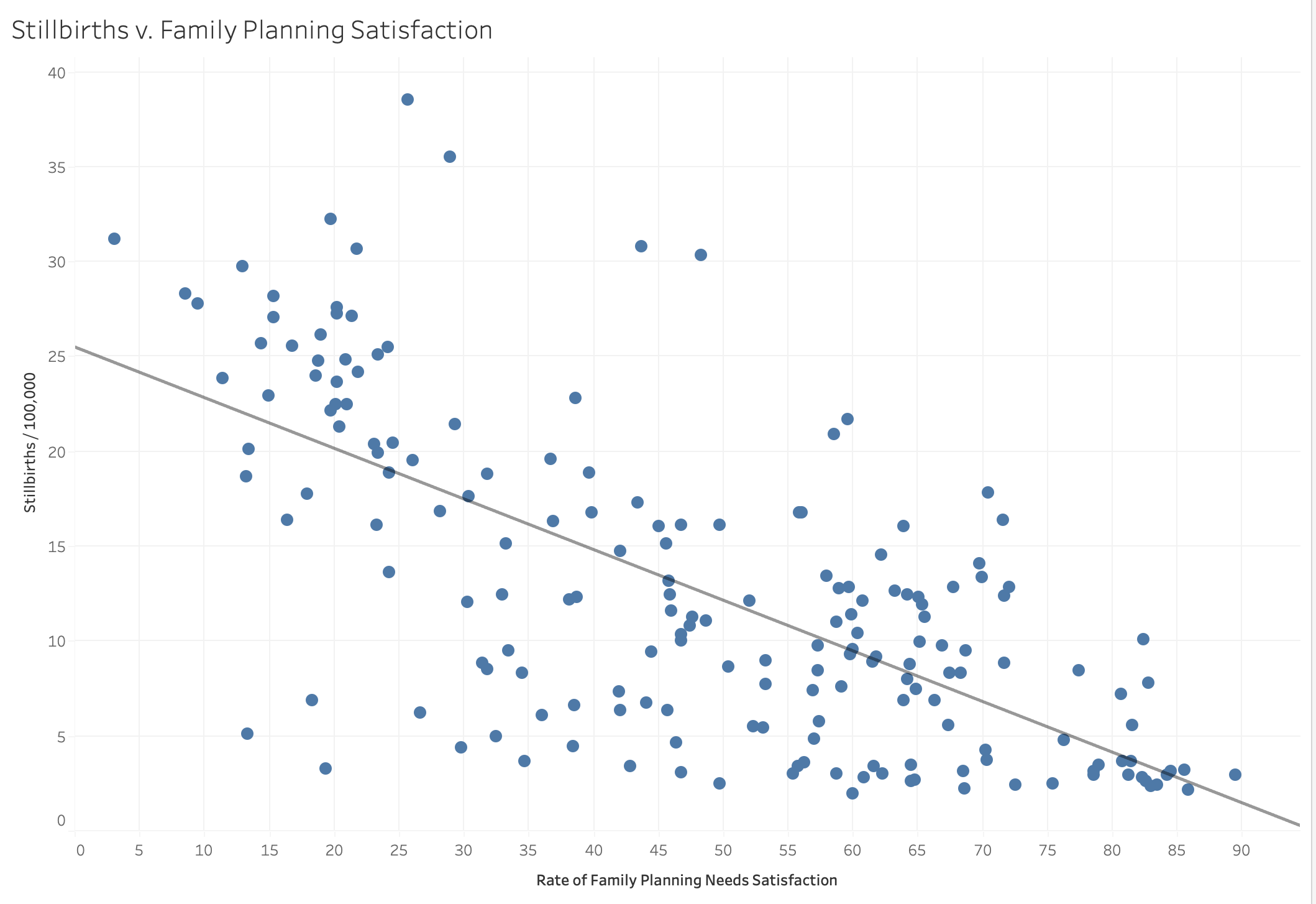
We wanted our visualizations to support the goals of our project – most importantly, to convince our readers that the restriction of reproductive rights is a negative thing. To do so, we needed to make clear visualizations showing the relationship between the satisfaction of family planning needs and the stillbirth rate. That is how we created Figure 2 in the journalistic story, which depicts the inverse relationship that we correctly hypothesized was present:
A key piece of the story is the differences in countries with high versus low satisfaction of family planning. We tried numerous ways to represent this data, ultimately deciding on a bar chart with a different luminance for Canada, as our story raises concerns about the direction our country could potentially go in. We included the averages of the top and bottom 10 countries for family planning needs as well as Japan and Guinea-Bissau to provide viewers with a scale to compare Canada to.

At this point, we felt that there was still something missing to tie the story together. We looked at our data together and the story thus far, and decided it may be meaningful to compare America’s rate of family planning satisfaction by year since Roe v. Wade was decided in 1973. Line graphs are one of the most effective ways to identify trends using quantitative data, so we plotted the data for America and positioned a dot to indicate 1973.

After creating this visualization, we felt our project flowed better and provided readers with a more well-rounded understanding of our thesis.
The Story
Our journalistic story starts by introducing the important issue of reproductive rights and autonomy to the reader. We explain the serious concerns for women’s rights in the United States after the overturning of Roe v. Wade and how family planning concerns relate to abortion and reproductive rights. We lay this foundation – stating that “the limitation of abortion rights is the canary in the coal mine for the subsequent restriction of women’s reproductive rights” – before beginning to visualize the data.
We use our visualizations to support the story we are telling. First, we connect family planning needs and abortion rights via Figure 1, a line chart that portrays family planning needs being fulfilled further post-Roe v. Wade. Then, we go on to visualize correlations between stillbirth rates and family planning needs satisfaction. These figures help readers to understand and connect our story with the data.
Ultimately, we introduce real concerns to our readers with data visualizations that support our claims. These visualizations establish the importance of family planning needs and how they connect to women’s reproductive rights, then how this impacts the rate of stillbirths. We end with an impactful bar graph that plots the stillbirth rates of different countries. Canada is highlighted, signalling to our audience where the nation lies and what it stands to lose when reproductive rights are threatened.
We end by summarising our key points and making a call to continue to fight for women’s reproductive rights. The story teaches our audience some of what we stand to lose should we follow in America’s footsteps and diminish the protections currently put in place.
Design Pros
Our graphs satisfy the expressiveness and effectiveness principles, encoding the most important ordered attributes (the rates of stillbirths and family planning needs satisfied) with the most effective channels (positioning). We used robust, reliable data from the World Health Organization, and backed up our claims with extensive research from reliable sources. Due to the sensitivity and complexity of the issue, we feel that a journalistic story was the best way of delivering the information to ensure that nothing was minimized or overly simplified.
Design Cons
Due to the nature of a journalistic story, there is a lot of reading that viewers must do in order to understand our project, though we tried to keep it as succinct as possible. Our visualizations alone also cannot capture the nuances of this topic, meaning they may appear overly simplified. Without the added context, viewers may be unable to understand fully or come away with any significant insights.
These data sets also lacked information from more recent years (2022 and 2023) so despite our story being largely to do with recent developments, we were unable to show data closer to this year.
References
ARCC declares Conservative Caucus to be 100% anti-choice. (n.d.). Abortion Rights Coalition of Canada. Retrieved 1 March 2024, from https://www.arcc-cdac.ca/conservative-party-anti-choice/
GHO | By category | Adolescent birth rate—Data by country. (n.d.). WHO. Retrieved 1 March 2024, from https://apps.who.int/gho/data/node.main.REPADO39?lang=en
GHO | By category | Catastrophic out-of-pocket health spending (SDG indicator 3.8.2 and regional indicators where available)—Data by country. (n.d.). WHO. Retrieved 1 March 2024, from https://apps.who.int/gho/data/node.main.UHCFINANCIALPROTECTION01?lang=en
GHO | By category | Family planning needs satisfied—Data by country. (n.d.). WHO. Retrieved 1 March 2024, from https://apps.who.int/gho/data/node.main.FAMILYPLANNING?lang=en
GHO | By category | Stillbirth rate—Data by country. (n.d.). WHO. Retrieved 1 March 2024, from https://apps.who.int/gho/data/view.main.STILLBIRTHv?lang=en
Munzner, T. (2014). Visualization analysis and design (0 ed.). A K Peters/CRC Press. https://doi.org/10.1201/b17511
Poilievre’s Conservatives widen lead over Liberals: Nanos. (2024, February 21). CTVNews. https://www.ctvnews.ca/canada/poilievre-s-conservatives-widen-lead-over-liberals-nanos-1.6777766
Totenberg, N., & McCammon, S. (2022, June 24). Supreme Court overturns Roe v. Wade, ending right to abortion upheld for decades. NPR. https://www.npr.org/2022/06/24/1102305878/supreme-court-abortion-roe-v-wade-decision-overturn
Visualizing Public Art in Vancouver
By: Vidushy Avasthi, Helena Miranda, Sophie Diebold
WEBSITE: https://vidushyavasthi.wixsite.com/info-419-term-projec
OBJECTIVES
This project reviews public art in Metro Vancouver through Information Visualization. It looks at how the types of art, occurrence, and ownership of public art have changed between 1901 and today, and places public art trends in a historical context.
Public art is defined as artwork that is open to the general public, regardless of whether it is situated on public or private property, or if it has been purchased with public or private funds (Tate). This topic is relevant due to the institutionalization of art and the controversial opinion that art is only art when in an institution, often one that requires a fee to gain admission and is therefore inaccessible to much of the general public. Accessibility is an interesting facet of public art since Vancouver is a relatively young city where the lack of affordable space is a major problem. There is a rapidly rising industrial and commercial land value that as a consequence promotes the loss of affordable spaces where artists can share their work (Vancouver City Council, 2019, p. 1).
Our objectives for this project were to visualize the prevalence of public art according to type of art, neighborhood, year of installation, and whether they are owned by public or private bodies. We wanted the visualizations to show a narrative where viewers can see how attitudes to, importance given, funding given to public art projects have evolved over the past century. The InfoVis show how art popularity changes by neighborhood, and how ownership of public art influences the area where it is located.
Intended users are local and visiting artists trying to understand public art trends in Vancouver over time, space, and according to type of art (sculpture, media work, mosaic, relief, among others), and tourists or anyone else wanting to explore and learn more about the artistic landscape of the city.
DETAILS ABOUT THE DATASET
Some questions we wanted our InfoVis to answer were:
- How does the popularity of a type of art change throughout the years?
- Are more pieces of public art privately or publicly owned?
- Do certain neighborhoods have more privately owned art? Why or why not?
The data used for this project was sourced from the City of Vancouver Open Data Portal (https://opendata.vancouver.ca/explore/dataset/public-art/information/). The portal has hundreds of datasets that are updated daily, all of which are specific to the City of Vancouver. The dataset we have chosen contains the following attributes: Title of work, artist project statement, type of art, status (whether it is still in place or not), site name, site address, primary material, URL to artwork, URL to an image of the artwork, ownership, neighborhood, on-site location specifications, coordinates, geographical area, description of work, year of installation, and photo credits. The data we sourced needed to be cleaned to create visualizations. We used Tableau Prep to polish the data. This process involved eliminating repeated values and identifying the attributes we would need to work with to fulfill our objectives. This cleaned data was then imported into Tableau Desktop to create visualizations. We settled on the idioms, color schemes, and fonts beforehand to allow all visualizations to look cohesive. These tools were familiar to us through coursework hence they were not too difficult to use for basic visualizations, but since we hadn’t yet explored the full potential of either Tableau Prep or Desktop, going through multiple features and identifying the ones we needed was an overwhelming task. Tableau’s self-contained help videos and discussion forums were very helpful for when we got stuck.
INFOVIS
Both the website and the InfoVis were created with this color palette in mind for a more cohesive visual structure.

1 – TRENDS IN TYPE OF ART INFOVIS
The dataset includes an attribute called ‘type of art’ and we thought it could be interesting to explore how these types of art in public art changed across the years since 1901. The dataset also contains the status of these public art, that is, if they are still in place or not, or if they have been deaccessioned (removed for selling or discard). We thought including their status would help the understanding of trends in public art across time since we are able to see which type of art ‘survives’ or not different periods of time and thus how mediums, materials, cultural and social aspects that are associated with these different types of art change throughout the years (e.g. new media work with LED lights versus classical bronze busts of historical figures).
The categories in the dataset were mixed and sometimes overlapped. For example ‘Memorial or monument’ and ‘Figurative’ sometimes incorporated the same type of art so I created a definition for each category and re-organized the dataset according to these new definitions. The definitions and examples can be found on the website.
We tried many ways of encoding the data like with the treemap and packed bubble chart on Tableau Desktop but the bar chart worked best alongside the filtering options of year and status. Moreover, the line chart helps having a general and less detailed overview of the different trends of types of art throughout the years, something the bar chart does not allow. In this sense, Tableau was really versatile and thus we were able to quickly create many different InfoVis with the same attributes to see which ones communicate more clearly the trends of type of art throughout the years.
From the beginning, we thought bard charts would be the ideal form of encoding a number of types of art throughout the years, although we did some other experiments mentioned above.

This was one of the first sketches we did when brainstorming the InfoVis for our project. It was helpful to see what I need to do with my data right away (creating a calculating field to find the number of each type of art and also getting the types of art themselves). According to the principle of expressiveness and effectiveness, the categorical attribute of type of art was encoded with identity channels of spatial regions and hue were assigned to each of them so it is visually more interesting and cohesive with the theme of public art. The attribute of count of type of art was encoded with the magnitude channel of length in a common scale, especially because it is cumulative, that is, indicates a counting number, so length felt more appropriate than spatial position. Moreover, to avoid lying charts, the count of the type of art axis’s numbers are fixed when the viewer filters the data, so they have a fair comparison of the count of type of art throughout the years.
The cons of this Infovis is that it should include more images and perhaps the titles of the artworks, but there were enough attributes included in the visualization already and it would make it overwhelming to look at. That is why we included some examples in the website, so the viewer sees what we mean by each type of art and also to highlight some of the iconic public art of the city of Vancouver.


Some conclusions can be made about the trends in type of art, like the fact that sculpture is the most prevalent type of public art across time and one of the most lasting types of art as well. In 2016 we see an explosion in the number of Murals, adding up to 42 murals, which is the highest rate we see within a year compared to the other years and art types. The second biggest rate of type of art in a year was Two-Dimensional Work in 2020, adding up to 27 artworks. In the beginning, starting from 1901, the prevalent Types of Art however are Memorial or Monument, Totem Poles, Fountain or water feature, and Figurative up to the 1950s. Then we see the emergence of Sculpture as one of the main types of art, followed by Site-Integrated work around the 70s and 90s. Media Work, Murals, Two-Dimensional Art, and Site-integrated works gained force around the 2000s and this pattern continues until 2024 although murals seem less popular since the pandemic, after 2019.
2 – INSTALLATION PER YEAR INFOVIS
This is one of the simpler charts in our project. The goal here was to visualize any notable trends in the number of installations per year from 1901 (first public art installation according to our dataset) to 2024 (the present day). The main attribute we looked at to plot this visualization was the year of installation. Tableau Prep read this attribute as an integer instead of a year (so a comma was included after the thousand), so we had to make sure the program read it as a year. It is interesting to note that there is some correlation with our “Trends in Types of Art” InfoVis. Evidently, 2016 was a good year for murals.

This is an interesting visualization when taking into consideration the fact that Vancouver is a relatively new city. This proves that over the years, there has been a push for public funding in favor of those things that help foster culture. Art has the ability to raise awareness and educate people, and when it is displayed publicly, these statements make their way to more audiences. It would be interesting to see a data set that approaches public art in Vancouver through demographics to note what kind of voices are being most amplified.
3 – LOCATION MAP INFOVIS
The idea for the location map was to have an interactive viz that would allow users to navigate across the city and see neighborhoods where art installations are located. The use of a GeoJson file type made it easy to create a map since that file comes with the geospatial component integrated with the file. We used the coordinates to mark places on the map where art installations are located. These marks were then color coordinated by neighborhood to make them more distinct from other marks that appeared nearby but were in a different neighborhood. To make this map more visually interesting, instead of using regular Tableau-provided shapes for marks, we imported a vector icon of the Mona Lisa. We used that as a mark instead after adjusting the size for legibility. Then we added a hover interaction that will allow users to highlight all installations in a single neighborhood. This action can also be done by using the filters on the right-hand bar.
A positive about this InfoVis would be that it’s interactive and easy to use, however, critically speaking this InfoVis would have benefited from the addition of filters to make it easier to distinguish between types of installations between neighborhoods, instead of just having their locations mapped.

Sketch:

4 – OWNERSHIP DISTRIBUTION INFOVIS
The ownership attribute proved that the dataset needed some cleaning in order to produce a visualization that would be effective and easy to digest. With over 40 different values, each being quite specific, the visualization could probably only be read by someone who is familiar with the city of Vancouver and the various organizations and companies that occupy it. Below a screenshot of what this looks like in Tableau prep:

We encountered many vague labels such as “university” and “Bosa”. Although not ideal, we had to make assumptions about these. We assume that “university” could possibly represent UBC. When Googling “Bosa”, we encountered “Bosa Properties” and “Bosa Foods”. Both would be in the private category, so we are not putting too much importance on what it represents. After dissecting the values within this attribute, we used the grouping feature in Tableau Prep to form the following categorizations:
- Public
- Private (Owned by a person)
- Private (Corporation)
- Private (Non-profit/Society)
- Private (Institution)
- Privately owned (no further information)
- Unknown
After cleaning the data through Tableau Prep, I exported it to Tableau to start working on the visualization. I realized the data somehow got mixed up in the cleaning process, and the program was reading the “Ownership” attribute as one of the other attributes. I tried cleaning it again and the same thing kept happening, so I had to create a new dataset that only included the “Ownership” attribute. I ended up using this to plot the pie chart in Tableau. As stated previously, we followed a specific color palette, which was implemented in this visualization as well. Each distinct color represents an ownership category. The pie chart is a good way to visualize the distribution of ownership’s because it divides the big picture to show parts of a whole. It is easy to see what percentage of public art is owned by who.

It’s nice to see that most public art in Vancouver is actually Public! The runner up was “Privately owned” with no further information. Because the dataset did not provide any more detail, there is a knowledge gap present, and all pieces that fall within this value could, in actuality, belong to any of the subsections we came up with. The third largest category were those with unknown ownership, so we have another knowledge gap as well. From the data we had access to, most privately owned pieces are owned by a non-profit organization, or a society. It was also surprising to see that two pieces in the dataset were owned by a sole person. One of them being owned by Bob Rennie, an art collector, and another one being owned by the artist Janet Echelman. Overall, the method in which the values were categorized is somewhat reductive, but it shows a general idea of how ownership of public art is distributed within Vancouver. This process had to be done to make the understanding of the data more accessible.
Bibliography
Munroe, D. C. (1973). Public art in Vancouver (T). University of British Columbia. Retrieved from https://open.library.ubc.ca/collections/ubctheses/831/items/1.0101387
Tate. (n.d.). Public art. https://www.tate.org.uk/art/art-terms/p/public-art
Vancouver City Council. (2019). (rep.). Making Space for Arts and Culture: Vancouver Cultural Infrastructure Plan (pp. 1–40). Vancouver, BC.
Does Religion Conflict with Science According to Academics?
By Naomi Kim and Brandon Lee
Link to our information visualization: https://www.canva.com/design/DAGB4Vq5wf8/L1nlSyZZPgpCGQxi583Xtg/view?utm_content=DAGB4Vq5wf8&utm_campaign=designshare&utm_medium=link&utm_source=editor
Objectives
Our visualization intends to unravel narratives surrounding religious and spiritual belief within the scientific community. Particularly in Western scientific circles, there exists a presumption of conflict between religious beliefs and scientific inquiry. Some posit that the small number of religious belief within the scholarly community undermines its scientific credibility. Yet, global variations in religious belief among scientists challenge such assertions. Numerous factors influence an individual’s faith or spirituality, including cultural backgrounds, upbringing, marriage status, and number of children.
From a high-level action perspective, our project is formulated to foster the generation of fresh insights within our audience. Our aim is to facilitate the emergence of new discoveries and understandings through the visual examination of accumulated data. We aspire for both our team and our audience to unearth novel insights concerning the interplay between scientific vocations and individual belief systems. This exploration goes beyond merely accentuating established knowledge; rather, it seeks to unveil latent patterns, trends, and correlations that have thus far remained largely unexplored. Through our visualizations, we endeavor to stimulate dialogue, inspire further investigation, and cultivate a deeper comprehension of how religious and spiritual convictions manifest among scientists relative to the general populace.
At a mid-level action perspective, our project will bolster the dissemination of existing knowledge, amalgamating it with fresh data to offer a comprehensive outlook. This methodology ensures that our audience can engage with both established facts and contemporary analyses, thereby enriching their comprehension and perspectives regarding the subject matter.
Datasets Used
Our main dataset was the “Religion among Academic Scientists” (RAAS) survey by Elaine Howard Ecklund. We used another study conducted by the same author titled “Religion among Academic Scientists in International Context ” (RAASIC) to fill in gaps of knowledge that were left from the first data. Initially, our hope was to have the RAASIC survey be our primary dataset but because the full survey results were not published and only part of the data is available online, we used it only as a secondary source.
The main difference between these two surveys is their sample size and regional coverage. The RASIC study gathers answers from scientists across eight-culturally distinct regions, whereas the RAS study, focuses on elite scholars in the United States. The first dataset has a respondent number of 9,442 scientists and in-depth interviews with 609 of these scientists. The second has only 1868 respondents. Both surveys are credible – being scholarly and peer-reviewed. However, like any dataset, these may have bias. To minimize the chance of bias, we chose these datasets due to their large sample sizes and detailed question bank.
Tools Used
To clean the dataset we used PSPPIRE Data Editor and Excel. Our original plan was to use Excel by itself for data cleaning, but PSPPIRE was an incredibly useful secondary tool. The CSV file only utilized acronyms for column titles and variables for row values – which would make it tedious to manually replace each column with understandable values from the online codebook. Luckily, the SAV file – that could be opened in PSPPIRE Data Editor – gathered descriptions for acronyms in the dataset in a compact space and allowed us to view row values as words rather than variables.
To produce the information visualizations we used Canva. We utilized Canva’s in built graphing tools since it would reduce the number of steps we would need to take and could produce nearly the same results as Tableau for visualizations like a bar graph.
Analytic Steps
To make sense of the dataset, we used the survey’s online codebook and its SAV file which had two tabs that made it easier to reference longer descriptions for column acronyms which are hard to understand without further information. Furthermore, PSPPIRE Data Editor has a function which allows you to switch from a variable to value view. This meant that the initial dataset view, which was mainly composed of only numbers, representing specific values such as days of the week or gender, where now viewable in a more intuitive way. The CSV file unfortunately did not allow you to toggle between these two views, so by having the SAV file I was able to copy paste row values and create better titles for columns. Rather than to have acronyms like RELIG16, we now had column titles like “in what religion were you raised?” that described exactly what the column represented.

We explored the data visually to find interesting patterns that later became our final visualization. Before we transferred our cleaned data to Tableau or Canva we used the simple graphing tool in Excel to quickly test different visualization types and colours. The graph titled “Scientists’ Views on Religion and Science across different countries” is an example of this.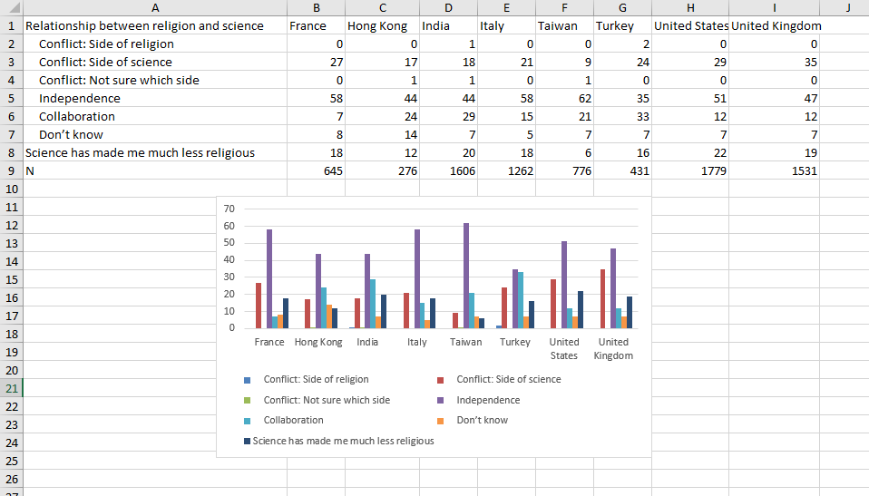

Luckily, we knew what we hoped to communicate with this project since the proposal. We were wrong on some of our initial hypothesis, but the end message stayed the same. Initially we thought that older age would be a predictor higher religiosity or belief in God or the divine, but it was the opposite. Through the RAAS dataset we discovered that younger academics are stating more belief in religion than their older peers. This could indicate a potential shift in attitudes towards religion in the scientific community. Additionally, rather than any other demographic, the biggest predictor in a scientist’s religious belief stems in their family’s religiosity and how important it was to the family.
Design Process
In the process of transforming our data on the religious and spiritual beliefs within the scientific community into a comprehensive infographic, we adopted a design approach centered around Lankow et al’s principles for good infographics: utility, soundness, and attractiveness. In alignment with Lankow et al’s first principle, we went with a narrative approach to encourage viewers to be more informed on the topic and to prevent misconceptions on religion and science to continue to spread. The infographic takes the viewer through the data in a storylike format. We selected two datasets from credible sources to ensure that the information is sound.
Initially, we used tableau to conceptualize how our data could be visualized effectively and attractively. This step was crucial for envisioning the layout and deciding on the visual encodings that would best represent our findings. We specifically focused on expressiveness and effectiveness, ensuring that our visualizations clearly communicated the data’s nuances without oversimplification or distortion.
Our design principles were heavily influenced by the concepts of utility, soundness, and beauty. Utility was priority, guiding us to choose visual encodings and layouts that made the information accessible and easy to understand for our audience. For example, we used pie charts to depict the range of the significance of religious upbringing among scientists, employing a colour gradient to signify varying levels of conviction. This choice allowed viewers to quickly grasp the distribution of beliefs within the scientific community.
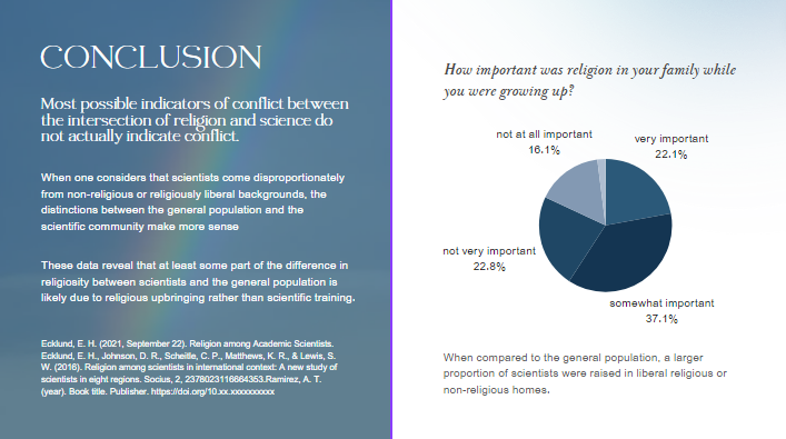
Soundness was addressed by carefully curating our data sources and representations to avoid misleading interpretations. Our infographic includes precise labels and annotations to ensure that viewers can trust the information presented. For instance, when illustrating the perceived conflict between religion and science, we provided context about the geographical and cultural diversity among scientists to underscore that perceptions of conflict are not uniform.
Lastly, we focused on the attractiveness of our infographic. Recognizing the power of aesthetics to draw and retain viewer attention, we selected a colour scheme and typography that were pleasing to the eye while enhancing readability and understanding.


Story
Our hope is that this information visualization can tell a story about religious and spiritual beliefs in the scientific community and reduce widespread misconceptions. In particular, we seek to challenge prevailing notions that science and religion are inherently at odds. By examining global patterns of religious belief among scientists, we aim to debunk oversimplified claims regarding the correlation between atheism and scholarly credibility. Our objectives encompass highlighting the multifaceted nature of faith and spirituality, emphasizing the diversity of perspectives within scientific discourse, and underscoring the complex array of factors influencing individual beliefs.
Pros and Cons of the Information Visualization
Pros
By using straightforward visual elements like bar and pie charts, our design makes complex datasets understandable at a glance. This clarity ensures that viewers, regardless of their familiarity with the subject matter, can follow the narrative thread from the prevalence of belief in God among scientists to the impact of religious upbringing. Even though some audiences don’t have any knowledge about religion and science, they can still understand all diagrams.
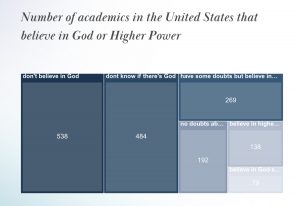
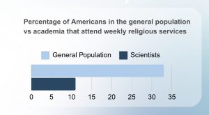
The visual design allows for easy comparison between different data points, such as comparing beliefs across different countries or the impact of scientific work on religious beliefs. This comparative aspect is crucial for deriving analytical insights and understanding broader patterns within the scientific community.
Cons
If experts or students seeking deep, detailed analyses might find the infographic format somewhat limiting. While effective for storytelling and initial insights, it may not provide the depth required for a comprehensive academic or professional examination of the data. Given the static nature of infographics, our design lacks interactive elements that could allow viewers to explore the data more dynamically. Interactivity could enable users to delve into specific areas of interest, examine underlying data, or understand the variability within the data more deeply.
Works Cited
Ecklund, E. H. (2021, September 22). Religion among Academic Scientists.
Ecklund, E. H., Johnson, D. R., Scheitle, C. P., Matthews, K. R., & Lewis, S. W. (2016). Religion among scientists in international context: A new study of scientists in eight regions. Socius, 2, 2378023116664353.
Ecklund, E. H., & Scheitle, C. P. (2007). Religion among academic scientists: Distinctions, disciplines, and demographics. Social problems, 54(2), 289-307.
Lankow et al. (2012). Infographics: the power of visual storytelling. John Wiley & Sons.
Munzner, T. (2015). Visualization Analysis and Design. Boca Raton, FL: CRC Press. https://doi.org/10.1201/b17511
Ware, C. (2008). Visual Thinking for Design. Burlington, MA: Morgan Kaufmann.
Exploring the Impact of Urbanization on Air Quality: A Comparative Analysis of India, China, Cameroon, and Cote D’Ivoire
Team Members: Aryan Varma, Delaney Woods, Zainab Osman
Website Link: https://urbanizationandairquality.squarespace.com
Password for website: info419
Introduction
The rapid pace of urbanization in today’s world has brought about significant changes; both positive and negative. While conventional theory suggests that urbanization leads to deteriorating air quality, our analysis challenges this notion. By examining data from four countries—India, China, Cameroon, and Cote d’Ivoire—we aim to uncover the nuanced relationship between urbanization and air quality. Our findings suggest that the impact of urbanization on pollution levels is more complex than previously assumed; with sustainability initiatives playing a key role in shaping environmental outcomes.
Objectives
Our primary objective is to enhance understanding of the relationship between urbanization and air quality by visualizing and analyzing data from multiple countries. Through interactive visualizations and the use of a static infographic, we aim to communicate key findings and insights to a diverse audience, including policymakers, urban planners, and environmental advocates. By using visual analytics tools, we seek to uncover patterns and trends that may inform strategies for sustainable urban development; ultimately leading to improved air quality.
Description of the Dataset
We obtained data on air quality from the World Health Organization (WHO) for the years 2010 to 2019. Additionally, we collected population data for India, China, Cameroon, and Cote d’Ivoire from the United Nations (UN). This allowed us to analyze the relationship between urbanization and air quality by comparing pollutant levels with the share of the population living in urban areas.
The air quality data provided by the WHO included measurements from monitoring stations located in urban and rural areas across the selected countries. These measurements were recorded at regular intervals, allowing us to analyze temporal trends and spatial variations in pollutant levels. We conducted thorough data cleaning and preprocessing to address any inconsistencies or missing values, ensuring the integrity of our analysis.
Furthermore, the population data from the UN provided valuable context for interpreting the air quality trends observed in our analysis. By tracking changes in urban population shares over time, we were able to assess the impact of urbanization on air quality within each country. This interdisciplinary approach enabled us to uncover nuanced patterns and relationships that would not have been apparent from analyzing either dataset in isolation.
Design Process and Principles
Throughout the design process, we adhered to a set of guiding principles aimed at creating informative, engaging, and visually compelling visualizations and an infographic. Our approach was informed by principles of expressiveness & effectiveness, ensuring that our deliverables effectively communicated key insights while catering to the needs and preferences of our target audience.
Expressiveness: Our visualizations and infographics were designed to be expressive, conveying complex data and insights in a clear and engaging manner. We utilized a variety of visual elements, including charts, graphs, maps, and illustrations, to effectively communicate trends, patterns, and relationships within the data. By incorporating rich visual imagery and intuitive design elements, we aimed to capture the attention of our audience and convey the significance of our findings.
Effectiveness: Effectiveness was a central consideration in our design process, as we aimed to create visualizations and infographics that effectively communicate key messages and insights. We carefully selected visualization techniques and design elements that aligned with the objectives of our project, ensuring that our deliverables accurately represented the underlying data and facilitated comprehension and interpretation by our audience. Through iterative design and testing, we refined our visualizations to optimize clarity, readability, and impact.
Utility: To incorporate the concept of utility into our infographic, we strategically used our acquired data to inform our readers of the connection between urbanization and air pollution. By incorporating numerical quantities in our infographic, we hope our audience can gain a clear understanding of the scale and magnitude of the issue.
Attractiveness: Our infographic aims to incorporate an effective and eye-catching colour palette that is representative of the subject matter. Additionally, our layout is separated in sections which we hope aids our audience in following the story through an expected sequence.
Description of Tools used
In the data collection phase, we employed Microsoft Excel to compile and organize our dataset. Gathering information from reputable sources such as the World Health Organization (WHO) and the United Nations (UN), we meticulously inputted data into Excel spreadsheets, ensuring accuracy and consistency.
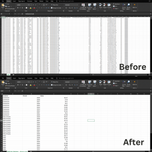
Figure 1: Our dataset on Excel.
During the initial brainstorming and sketching phase, we utilized traditional pen and paper to outline ideas for visual representations of our data. These sketches served as a preliminary guide for our visualization design process.
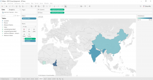
Figure 2: Our Visualization on Tableau
Once our dataset was prepared, we utilized Tableau Desktop for data analysis and visualization creation. Tableau allowed us to manipulate and analyze our dataset effectively, assigning appropriate attribute types and creating dynamic visualizations that captured key insights. We utilized online resources to learn new functions within Tableau, such as customizing mark types and color palettes, enhancing the expressiveness and effectiveness of our visualizations.
After completing our visualizations in Tableau, we chose to embed them into a website for our final product. We selected Squarespace as our website-building platform for its user-friendly interface and seamless integration capabilities. By embedding Tableau visualizations into our Squarespace website, we maintained interactivity and provided viewers with a guided narrative through our visual story.
In addition to Tableau Desktop, we used Tableau Prep for data cleaning and preparation. Tableau Prep provided advanced data cleaning and formatting capabilities, ensuring that our dataset was optimized for analysis in Tableau Desktop.
Finally, for the creation of the static infographic, we utilized Canva. Canva’s intuitive drag-and-drop interface allowed us to design a visually appealing infographic that effectively communicated our insights to a wider audience.
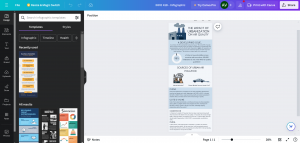
Figure 3: Our infographic on Canva
Analytic Steps
Our analytical process involved several key steps aimed at uncovering insights and patterns within our data. These steps consisted of data cleaning, exploration, visualization design, and interpretation, allowing us to derive meaningful conclusions about the relationship between urbanization and air quality.
- We began by gathering air quality data from the World Health Organization (WHO) and population data from the United Nations (UN) for India, China, Cameroon, and Cote D’Ivoire for the years 2010 to 2019. This involved compiling data from multiple sources and ensuring consistency and accuracy. In Microsoft Excel, we conducted thorough data cleaning, addressing missing values, outliers, and inconsistencies to prepare the dataset for analysis.
- With the cleaned dataset, we performed our data analysis to gain a deeper understanding of the variables and their relationships. Using statistical measures, visualization techniques, and Tableau’s data profiling features, we identified trends, patterns, and potential correlations within the data. This phase of analysis allowed us to formulate hypotheses and guide our visualization design process.
- Using Tableau Desktop, we designed interactive visualizations that effectively communicated key insights about urbanization and air quality. We created a variety of visualization types, including choropleth maps, line charts, scatter plots, and bar graphs, to highlight spatial and temporal trends in pollutant levels and population growth. Through iterative design and feedback, we refined our visualizations to enhance clarity, readability, and impact.
- As we analyzed the visualizations, we interpreted the patterns and trends observed to generate actionable insights about the relationship between urbanization and air quality. We considered contextual factors such as government policies, economic development, and environmental regulations to contextualize our findings and draw meaningful conclusions. This process of interpretation involved critical thinking and domain expertise, as we sought to uncover the underlying drivers of changes in air quality over time.
- Finally, we transferred our findings into a cohesive narrative, incorporating visualizations, data summaries, and contextual information into our final deliverables. Through interactive dashboards, a website, an infographic, and a written report, we communicated our insights to a diverse audience, including policymakers, urban planners, and environmental advocates. We emphasized the importance of sustainable development practices in mitigating air pollution and fostering healthier urban environments.
Storyline
Urbanization is the process through which an increasing proportion of a population comes to live in cities and urban areas, leading to the growth and development of cities in various countries. It is often accompanied by the expansion of industrialization, economic development, and technological advancements. As cities expand into bustling centers of commerce and innovation, the allure of urban life draws in migrants seeking opportunities and a better quality of life. Yet, amidst the glittering skyscrapers and bustling streets lies a serious problem – air pollution. The stark reality is that urbanization, while driving economic progress and societal advancements, often comes hand in hand with a dark cloud of pollution that permeates the very air we breathe. The expansion of industrialization and the reliance on fossil fuels for energy generation propel emissions of harmful pollutants into the atmosphere, casting a shadow over the urban landscape in many countries. As our cities swell in size and population density, the train on transportation methods intensifies, which unleashes a flood of vehicular emissions from automobiles using gasoline. The incessant hums of construction machinery echoes through urban corridors, leaving clouds of dust and debris that further degrade air quality. According to the United Nations Economic Commission for Europe (n.d.), air pollution in urban areas claims the lives of 7 million people per year.
Therefore, we aim to shed light on the hidden costs of unchecked urbanization in our infographic and overarching project to raise awareness about the dangerous path of non-sustainable growth in four countries. Our storyline began with a comprehensive dashboard analysis using Tableau, encompassing all selected countries (India, Cameroon, China, and Cote d’Ivoire). This initial visualization presented a map depicting air pollution rates spanning from 2010 to 2019, providing an overarching view of the trends across these nations. Building upon this overview, our subsequent visualization was a detailed dashboard focusing on each country individually, with a spotlight on the years 2011, 2015, and 2019. This closer examination allowed us to discern nuanced variations in air pollution levels within each country over time. Finally, our last visualization showcased the urban population share for each country from 2010 to 2019, revealing a consistent upward trend across all nations. This progression of visualizations provided a layered understanding of the complex relationship between urbanization and air quality, highlighting the evolving dynamics over the past decade.
Evaluation of Design
Pros
- One of the key strengths of our approach was the comprehensive analysis of air quality and urbanization data across multiple countries. By examining data from India, Cameroon, China, and Cote d’Ivoire, we gained a holistic understanding of the global dynamics at play, allowing for more nuanced insights into the relationship between urbanization and air quality.
- Using Tableau for visualization design enabled us to create interactive dashboards that engaged our audience and facilitated the exploration of the data. The interactive nature of the visualizations encouraged users to delve deeper into the data, uncovering patterns and trends that may have otherwise gone unnoticed.
- Our approach prioritized contextual understanding, weaving together data analysis, visualizations, and contextual insights to provide a comprehensive narrative. By considering factors such as government policies, economic development, and environmental regulations, we were able to contextualize our findings.
Cons
- One of the main challenges we encountered was technical difficulties in embedding visualizations onto our website. Despite Squarespace’s user-friendly interface, we faced limitations and formatting issues that required time-consuming troubleshooting and experimentation to resolve. This hindered the seamless integration of visualizations and impacted the user experience on our website.
- Another limitation of our approach was the reliance on available datasets, which may have been incomplete or inconsistent. While we aimed to gather data from reputable sources such as the World Health Organization and the United Nations, there may have been limitations in data coverage or accuracy that affected the robustness of our analysis.
- As with any data analysis project, interpreting the findings and drawing meaningful conclusions from the data presented its own set of challenges. Balancing statistical insights with contextual understanding required careful consideration and expertise, and there may have been limitations in our ability to fully capture the nuances of the relationship between urbanization and air quality.
Conclusion
In our analysis, we discovered a trend that challenged conventional assumptions about the relationship between urbanization and air quality. While population density showed a correlation with air pollution levels, the impact of urbanization itself did not align with our expectations. Contrary to the notion that rapid urbanization inevitably leads to deteriorating air quality, our findings revealed a different narrative.
Countries such as China, India, Cameroon, and Cote d’Ivoire experienced high pollution rates during the initial phases of urbanization. However, as urbanization continued and cities pursued more sustainable development projects, we observed a decline in total pollution levels. This trend suggests that urbanization, when accompanied by eco-friendly policies and sustainable infrastructure, can actually contribute to improved air quality. The shift towards sustainable urban development initiatives, aimed at reducing carbon emissions and minimizing environmental impact, played a significant role in mitigating pollution levels. Investments in public transportation, green spaces, renewable energy sources, and waste management systems have helped to create healthier and more livable cities.
Our findings highlight the importance of proactive measures and policy interventions in shaping the environmental outcomes of urbanization. By prioritizing sustainability and environmental stewardship, cities can harness the potential of urbanization to create cleaner, healthier environments for their residents. Moving forward, it will be crucial for policymakers, urban planners, and environmental advocates to continue prioritizing sustainable development practices. By fostering collaboration and innovation, we can build resilient and thriving cities that prioritize both human well-being and environmental sustainability.
References
Airqoon. (n.d.). Urban Air Pollution: Sources and Pollutants. https://airqoon.com/resources/urban-air-pollution-sources-and-pollutants/
Clean Air Fund. (n.d.). Yaounde and Air Pollution. https://www.cleanairfund.org/clean-air-africas-cities/yaounde-and-air-pollution/
He, G., Pan, Y., & Tanaka, T. (2020). The short-term impacts of COVID-19 lockdown on urban air pollution in china. Nature Sustainability, 3(12), 1005-1011. https://doi.org/10.1038/s41893-020-0581-y
IEA (2021, May). Air quality and climate policy integration in India. https://www.iea.org/reports/air-quality-and-climate-policy-integration-in-india
Liang, L., Wang, Z., & Li, J. (2019). The effect of urbanization on environmental pollution in rapidly developing urban agglomerations. Journal of Cleaner Production, 237, 117649. https://doi.org/10.1016/j.jclepro.2019.117649
Ren, X., & Princeton University Press Complete eBook-Package 2020. (2020). Governing the urban in china and india: Land grabs, slum clearance, and the war on air pollution (1st ed.). Princeton University Press. https://doi.org/10.1515/9780691203416
(n.d.). UN Health agency warns of rise in urban air pollution. https://www.un.org/sustainabledevelopment/blog/2016/05/un-health-agency-warns-of-rise-in-urban-air-pollution-with-poorest-cities-most-at-risk/
World Health Organization. (2016, May 16). Air pollution levels rising in many of the worlds poorest cities. https://www.who.int/news/item/12-05-2016-air-pollution-levels-rising-in-many-of-the-world-s-poorest-cities.
Building Blocks of the LEGO Brand: An InfoVis Project
Lara McBean, Shu Sasaki
Link to Our Infogram: https://infogram.com/info419-project-1hxj48mpnpz052v?live
Link to our Tableau Data Files: https://us-west-2b.online.tableau.com/#/site/infovisubc/projects/549884?:origin=card_share_link
Intended Goals
As avid fans of the LEGO brand, our team has been noticing the increasing prevalence of more adult-oriented sets from the LEGO brand in recent years. Advertisements promoting sets for older audiences seem to be on the rise, and the emergence of more themes specifically targeting older audiences such as the LEGO Ideas line or the LEGO ICONS line lead us to suspect this. This move to capitalize on a new market demographic, which seems to be a branching-out from the brand’s primary target of younger audiences, led us to investigate what could have motivated this shift in the brand’s positioning.
Actions/tasks supported
From a high-level user-action perspective, we want our intended users to analyze pre-existing data. To do this, our team focused on telling a story with our data; aligning with the present goal (Munzner, 2014, p. 47). The intended users will be able to use the presented data to suit their discovery needs. However, as LEGO as a brand is enjoyed by a wide age range and community of individuals, we also anticipate more casual encounters with our infovis. In order to fulfill an enjoy goal (Munzner, 2014, p. 48) to support the curiosity of this new audience, we included a number of did-you-know style details about specific lego sets that marked a massive turning point in the brand’s history in order to be more educational and entertaining for our intended audiences.
From a mid-level perspective, each viewer will have different expectations on how they want to approach this InfoVis. As our data hopes to accommodate for a wide user base from casual buyers, parents, avid fans looking to further immerse themselves, amongst many more demographics and age ranges, we feel it important to offer viewers the opportunity to engage however they please. As such, they will be able to browse (Munzner, 2014, p. 53) the InfoVis to find specific visualizations that are relevant to them.
From a low-level perspective, we focused our InfoVis on providing users with the data to allow them to compare and summarize the data. We compared multiple data sources and created visualizations to look for correlations. However, we have to provide ample support for comparison in our InfoVis due to our diverse audience, which is why a summary is necessary to provide a comprehensible overview of the data. Our data relies on story narratives, where we guide users to help them understand why we suspect that LEGO is diversifying their demographic to accommodate older demographics in recent years. Our ability to summarize the story allows this visualization to ultimately come together as a cohesive source of data for all audiences.
The Intended users:
The intended audience for this InfoVis could be the LEGO corporation, parents of young kids, teachers searching for access to educational and creative tools, and avid collectors and fans of LEGO products. The visually intuitive design we aim to create using visual analytics tools should help all of the aforementioned audiences, regardless of their familiarity with the LEGO brand, to effectively understand the data we plan to showcase. Creating an InfoVis that all audiences can interact with is important, especially because we are dealing with the LEGO brand, as
Dataset Details
As LEGO is a private company, they do not have a publicly accessible database that keeps track of the prices of each LEGO set ever sold. As a result, many LEGO fans utilize third-party software created by fans within the LEGO community, such as Brickset and Rebrickable. Websites such as Brickset, created by Huw Millington have been pillars of the LEGO community, cataloging an extensive list of mostly all LEGO set releases ranging as far back as 1949. As such we consider Brickset and Rebrickable’s data sources to be reputable sources of data.
Github user seankross’s legosets.csv contains a list of 6172 LEGO sets between 1970-2015. This data includes the set’s number, name, year released, Theme, Subtheme, piece count, Minifgures, links to the set’s images on brickset, as well as the Manufacture’s Suggested Retail Price (MSRP) for GBP, USD, CAD, EUR. This data set is extremely valuable, as none of Brickset or Rebrickable readily accessible data files includes the MSRP upon release. We deem seankross’s data to be reliable as their raw data shows that each field was picked from Brickset’s API, and thus is utilizing a data source that we deem is reputable. Utilizing this data set, our team was able to calculate and map out the increase in Price Per Part of each lego set throughout 1970-2015. Price Per Part is an important metric in the LEGO community, as it is a metric to determine if the set can be deemed “worth the price” or “too expensive” to purchase. This data allows our team to understand if LEGO’s increased marketing towards older audiences can be correlated to, if any, an increasing price of manufacturing. This suggested correlation led us to initially set up a hypothesis that a factor in LEGO’s marketing towards adults can be attributed to the fact that adults possess more purchasing power than younger audiences, and may therefore be more forgiving in spending more to purchase LEGO products specifically catered towards them.
Kaggle.com user JONATHAN KRAAYENBRINK’s LEGO Sets & Themes Database (1949-2023) contains a list of 21,503 LEGO sets from Rebrickable’s API. This data includes each set number, set name, year released, number of parts, image url and the theme of each set. This is helpful when calculating the average size of sets over the years. No dataset broke down each LEGO set released per year by age group, which was required to solve one of the key aspects of our investigation; visualizing how each age group is prioritized over the years. In order to combat this, we looked at the LEGO website to manually record information on their current themes and sets, taking in the total number of sets per theme and the number of occurrences for 18+ sets. LEGO has only introduced the 18+ labeling in 2020, so by comparing the count of these sets to the younger age ranges, we can determine how much LEGO is dedicated to a solely adult audience.
We will also use LEGO’s annual report, which is posted directly onto their website’s ‘About’ section. This has information about the company’s revenue, and highlights the company’s values, and future steps for growth. Also, from 2012, the Lego group also began sharing data of their top performing themes, which is useful in helping us understand LEGO’s customer base by considering the targeted age ranges for each theme. As this data is coming directly from the LEGO company, we can confirm that this data is credible. However, it is potentially susceptible to bias in favor of the company. In order to parse through the data, we manually collected and created a dataset from scratch on Microsoft Excel and utilized Tableau Prep to prepare our dataset for Tableau Desktop and Infogram.
Tools Used
We first utilized Tableau Prep and Tableau Desktop respectively in order to clean and analyze our datasets. By utilizing Tableau Prep’s clean step, we were able to remove unnecessary fields and help us effectively grapple with the gargantuan data sets (over 20,000 rows) we were analyzing. Furthermore, Tableau Desktop allowed us to make sense of the data we were seeing, and allowed us to create custom pills to calculate important metrics such as the Price Per Piece metric, which we utilized to ultimately backup our findings. However, while Tableau Prep and Desktop respectively are useful in the initial visualization processes, they lack the tools to properly incorporate visual narratives in order to tell a cohesive visual story, thus making it a lackluster tool for the scope of our project.
Once the data had been studied, and key metrics for our data analysis were located, our team exported the data files over to Infogram, where we created a visualization utilizing their interface. While we had initially considered Figma, the data tools we collected felt better represented in the customizability of Infogram, which ultimately led to our decision. Unlike Figma, which lacks the robust infrastructure to handle large data sets and deal with decimals, Infogram’s capacity to incorporate not only eye catching visuals, but seamlessly incorporate texts to guide users allowed us to feel confident that the InfoVis we created could truly be utilized by all intended audiences we account for.
Analytic Steps
When starting the design process, we were not sure of any specific trends, we only knew about the recent popularity of adult LEGO. We then hypothesized what type of data we should look into to visualize the adult demographic as part of the LEGO market. Some of our ideas included Price per Piece. If there was an increasing trend line, then it might indicate an increase in cost which would deter younger people from purchasing sets. We then thought of the Average Size of Sets Over Time, because it seemed intuitive for larger sets (with more pieces) to be intended for older age groups. We also wanted to explore the popular themes over time because the primary age group for each set is different. We looked for datasets that had the information we wanted through Google Dataset and used those results as a jumping point to explore the development of 18+ products and how adults were a viable market. However, we were not able to find datasets for themes over time
This led to researching sets admired by AFOLs (Adult Fans of LEGO) before the first instance of an 18+ rating on a LEGO set in 2020. These were particularly the Ultimate Collectors Sets and the LEGO Modulars. Then we looked into how 18+ sets compared to the other ranges since 2020. We also looked into LEGO conventions where older builders could display unique LEGO builds, which indicates how adults are a viable market for the brand.
Design Process
We ensured to follow the principles of utility, soundness, and beauty/attractiveness within our infographic through the following:
- Utility: Our infographic follows the utility of an explorative infographic by providing statistics and facts from reputable sources
- Soundness: All data was received by reputable data sources from Google Dataset or manually recorded from the official LEGO website
- Beauty/attractiveness: We followed the bright colours fitting of the LEGObrand without reducing the readability from readers
We relied on the visual channels of shape and colour to differentiate between different statistics. The bright colours of red and yellow from the brand are used to accentuate differences in the pie charts and graphs we have made.
Story
Through this InfoVis, our team is looking to answer 2 main questions. 1), Has LEGO been increasing the number of LEGO sets targeted towards adult, more advanced builders? 2), If so, what could be a reason for why they are doing so?
As fans of the LEGO brand ourselves, we’ve noticed the emergence of a new age rating in 2020, the 18+ line, and have been noticing an increase in LEGO sets with larger piece counts, and typically more expensive sets. This diversification in their demographic portfolio, one that is no longer only catering to the main target demographic of children, is a fascinating shift to see for a toy company.
We answer the aforementioned 2 questions by taking users on a data visualization journey, accompanied by a narrative text that helps guide users to understand why we are using the data.
We begin the explanation with the brand’s history of creating sets for more advanced builders. From the introduction of the Ultimate Collector Series in 2000, the LEGO® Modular Buildings line in 2007, the most expensive retail LEGO set in history in 2017, to the introduction of the official 18+ age rating in 2020, LEGO’s has been targeting advanced builders for sometime now. This data is backed up by the annual increase in the percentage of 18+ sets since the introduction of the rating in 2020.
Given the data that LEGO has been diversifying its portfolio to market towards adults, we provide 2 theories on why they may be doing this: Increase in Manufacturing cost, and Increase in AFOL Demand. Though we are not on the board of directors at LEGO, and therefore cannot know the real intent, we believe that our theories do shine a light on the potential reasonings behind this move.
Given these findings, we can conclude that there is both an increase in the number of LEGO sets for adults, and that this increase may be due to the rising demand from adult fans of LEGO.
Pros and Cons
Pros:
One of the strongpoints regarding our project is our utilization of narratives to help tell our story in a cohesive manner. Through the inclusion of narrative storytelling that guides users through our thought process, providing entertaining and interesting information about the brand, and imagery to help provide context for our data works as a way to keep audiences engaged with our info visualization, and promotes audiences to scroll through our data to the bottom to learn more.
Cons:
As we are drawing from a diverse range of angles to tackle the question of whether LEGO’s targeting demographics are shifting towards more adult demographics, we acknowledge that one of the potential shortcomings of our designs could be a lack of cohesion in the data presented upon initial viewing. While there may not be the most apparent connection between data of Price per Piece and attendance at BrickCon, we are confident that our narrative can effectively tie these concepts together. We also acknowledge that the increase in attendees to an adult event cannot fully explain the increase in adult interest in the LEGO brand on the whole. While this may be the case, we hope that looking through the multitudes of different data sources can help viewers understand that the reason behind why an industry leading toy manufacturer may choose to market towards adults is far more nuanced than simply due to a shift in the cost of production.
References:
BrickCon. (1 C.E., January 1). About BrickCon. BrickCon 2024! https://brickcon.org/about-us/
LEGO System in play. (n.d.). LEGO® History. https://www.lego.com/en-us/history/articles/lego-system-in-play
Lankow, Jason, et al. Infographics: The Power of Visual Storytelling, John Wiley & Sons, Incorporated, 2012. ProQuest Ebook Central, https://ebookcentral.proquest.com/lib/ubc/detail.action?docID=882721.
KRAAYENBRINK, JONATHAN. LEGO Sets & Themes Database (1949-2023). (2023, August
23). Kaggle. https://www.kaggle.com/datasets/jkraak/lego-sets-and-themes-database/data
Munzner, T. (2014). Visualization Analysis and Design. https://doi.org/10.1201/b17511
seankross. (n.d.). lego/data-tidy/legosets.csv at master · seankross/lego. GitHub. https://github.com/seankross/lego/blob/master/data-tidy/legosets.csv
Changes in Gaza Since October 7th
By Eden Stephanson, Felicia Ye and Wenqi Zhang
Our slides are here visualizations can be found on Tableau Public here.
Objectives
The primary goal of our project is to provide clarity about the effects of the present conflict in Palestine amidst widespread disagreement about the extent of the ongoing destruction. From a high-level action perspective, we hope to aggregate and present pre-existing data on the conflict to illustrate the effects of Israel’s genocidal military campaign. We also aim to support the mid-level action of searching for patterns, such as changes in the cost of essential commodities. From a low-level action perspective, we hope the audience will be able to use patterns identified in the data to develop a better understanding of the conflict and compare the data to other sources of information to distinguish between reliable and unreliable claims more accurately.
The ultimate objective of this visualization project is to convey to the user the specific effects and scale of the humanitarian crisis that has emerged as a consequence of the conflict in Gaza. By providing a clear, data-driven picture of the situation, this project seeks to inform the public about the scope of destruction and, by identifying the most critical areas for intervention, potentially guide humanitarian efforts and policy decisions in the region.
Data We Used
We used publicly available data from the United Nations Office for the Coordination of Humanitarian Affairs’ Humanitarian Data Exchange (HDX). While HDX is a reliable and credible source of open data, it is important to note that the widespread destruction of research infrastructure in Gaza will likely result in underreporting, and the precise numbers indicated in the data may change over time as more information about the conflict is discovered. Amongst the 185 different data sets pertaining to the State of Palestine, we focused on the following:
“State of Palestine – Impact of the Escalation of Hostilities”
This dataset logs deaths of females, males, undefined and total people in Gaza from October 7, 2023 to March 26, 2024. It also includes information on the injured, displaced, and the total damaged housing units.
“State of Palestine – Prices of Basic Commodities in Gaza”
Data on price changes for over 30 products are documented from October 7, 2023, to February 2024. The dataset includes a variety of food items and essentials, such as rice, bread, eggs, as well as vegetables, cheese, sugar, and gas. Prices are categorized into different time frames: before October 7, after October 7, November 2023, December 2023, January 2024, and February 2024. Additionally, the dataset provides both monthly percentage changes and cumulative percentage changes, offering a comprehensive view of price trends over this period.
“State of Palestine – Internally Displaced Persons”
Data on the number of internally displaced persons (or IDPs) who sought refuge in shelters between October 7, 2023, and January 14, 2024. The dataset is broken down by region, providing a number of IDPs sheltering each day in the five governorates of the State of Palestine which make up the Gaza Strip: North Gaza, Gaza City, Deir al-Balah, Khan Yunis, and Rafah. In addition to the total number of IDPs sheltering in each region, the dataset also provides information about what proportion of the total number of IDPs are residing in government shelters versus shelters operated by the United Nations Relief and Works Agency for Palestine Refugees in the Near East (UNRWA).
The Tools
- Excel: Cleaning data
- Tableau: Creating information visualizations
- Figma: Designing more dynamic, creative presentation components
Analytic Steps
Before beginning our project, we already had a pretty good idea of what the data might look like once we created our visualizations based on our first impressions of the tabular datasets and the widespread accessibility of news coverage about the scale of destruction in Gaza. Our hypotheses were as follows: (1) that the price of all commodities would fluctuate, but that the amount of fluctuation would vary based on the type of commodity, and (2) that both the data on the number of casualties and the data on the number of internally displaced persons in would demonstrate significant increases.
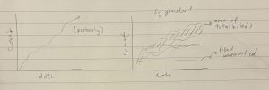
Example sketches for “Impact of the Escalation of Hostilities” dataset prior to visualizations

Example visualization ultimately made for “Prices of Basic Commodities in Gaza” dataset
Since the primary objective of our project was to inform audiences about the scale of destruction in Gaza caused by the Israel-Hamas War, we already knew that our primary goals in creating information visualizations were clear and effective communication of the data and, considering the sensitive subject matter of our project, respectful presentation of the data. Therefore, most of the analytical work consisted of experimenting with the capabilities of Tableau Desktop and trying out different idioms, whether that be a line chart or maps, that would most effectively communicate the facts in a sensitive, considerate manner. Tableau was a clear frontrunner for us in terms of info vis platforms because we were all already familiar with it, meaning it required much less of a learning curve than if we were to opt for a new platform.
Design Process
Before we started designing our info visualizations, we assigned each member of the group one of out of the three datasets to take the lead on. This allowed us to equally apportion the workload of cleaning the datasets and creating our first drafts of visualizations, since each group member would complete those steps for their assigned dataset. Consequently, this means the design process vastly differed across each member. For the sake of a simpler preview for our peers reading this blog, we’ll share the process for our “Prices of Basic Commodities in Gaza” dataset.
Firstly, the commodity names are categorical data. For the monthly change and price, these are quantitative data. Our objective is to showcase the price change from October 7th to February 2024 for different products. The most crucial aspect we aim to highlight is the price change, which constitutes ordinal data. According to the principle of expressiveness, visual encoding should accurately represent all the information in the dataset attributes. Ordinal data should utilize magnitude channels.
In line with the principle of effectiveness, the significance of the attribute should correspond to the prominence of the channel. Hence, we chose to use position to illustrate the price changes, as it is one of the most effective methods. Given the extensive range of products, our initial diagram straightforwardly lists all items in one visualization. We also employ hue to indicate prices from different times, further distinguishing the changes (Figure 1).

Figure 1. Price Change for All Commodities
Our goal is to understand the overarching price changes in Palestine post-October 7th. Therefore, we have another diagram that aggregates the cumulative price changes from October 7th to February 2024 for all commodities, showcasing only the overall percentage of price changes. Adhering to the principles of expressiveness and effectiveness, we use position to display the magnitude channel of the price percentage change. We also rank the commodities from the largest to the smallest percentage change to provide a clearer perspective on the current economic situation in Palestine (Figure 2).
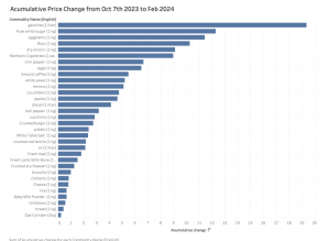
Figure 2. Accumulative Price Change from Oct 7th 2023 to Feb 2024
However, it requires considerable effort to check every product for the audience, and we still wish to analyze certain products more closely. Therefore, we randomly selected basic commodities for an in-depth review. This time, to highlight the changes, we opted for line graphs to observe the trends and movements. We chose the commodities randomly to provide detailed insights without introducing biases into the data visualization (Figure 3,4,5).
Overall, our data here is quite straightforward. Wenqi experimented with different methods of ranking them using bar charts and varying orientations, such as horizontal or vertical, to decide which grouping offers the most objective storytelling. Initially, we used paper and pen to brainstorm ideas on how we wanted to present the data, creating a draft to work from, and then implemented it using Tableau. In our design, we also aimed to show empathy, so we avoided using colors like red as the main theme, which could evoke unpleasant memories associated with this tragic event.

Figure 3. Price Change for Apples from Oct 2023 to Feb 2024
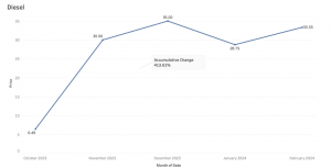
Figure 4. Price Change for Diesel from Oct 2023 to Feb 2024
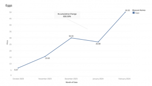
Figure 5. Price Change for Eggs from Oct 2023 to Feb 2024
The Story
On October 7, 2023, Israel and Hamas-led Palestinian militant groups engaged in an armed conflict, primarily in the Gaza Strip and its surroundings (United Nations, 2023). These attacks triggered the ongoing Israel–Hamas war, during which Israel’s bombing campaigns have led to an overwhelming number of Palestinian casualties and catastrophic damage to essential infrastructure in the Gaza Strip and the West Bank. According to Palestinian statistics, it is estimated that about 1 in every 100 people in Gaza have been killed since the war erupted on October 7 (Kottasová & Greene, 2024). Israel’s military campaign, which the International Court of Justice has recognized as an act of genocide, has precipitated a number of humanitarian crises in the Gaza Strip, including the mass killing of thousands of civilians, the internal displacement of hundreds of thousands of Palestinians, and the destruction of essential food sources and other basic commodities (Adler & Milisic, 2024).
Consequently, our infovis is a timely and sensitive piece that is meant to combat disinformation during this overwhelming flood of information and provide clarity amidst the significant emergence of disparity between international media organizations’ coverage of the Israel-Hamas war and media coverage among Israel’s allied nations in the Global North, such as the United States, the United Kingdom, and Canada. There is also a significant disparity between the sentiments on the war expressed by institutional media sources and users on social media.
In addition to informing the public, our information visualization project would also support the rapid dissemination of information about the conflict to key stakeholders, facilitating data-informed interventions to address the region’s urgent needs more effectively. In this sense, to the extent that it is plausible, our project seeks to attract those capable of providing relief to those victimized by the conflict on the ground.
Additionally, our project will also allow us to inform the public about the traumatic effects of the conflict, drawing attention to the humanitarian crisis at hand.
Evaluation of Design
Pros
Since we had multiple datasets to use for our project, our designs utilized a variety of different visualizations. This offers viewers a lot more options and streams of information, allowing them to explore and discover freely! This can also lend to our overall goal of expanding the data-driven picture of the situation, helping those with the power to make changes in policy and humanitarian efforts to clearly identify the most critical areas as quickly and effectively as possible.
Cons
Given the scope of our project, we are limited to the time frame of October 7, 2023 and beyond, meaning there is less than 1 full year of data that is collected. In addition, because underreporting is inevitable considering the nature of attempting to gather demographic data during an active conflict, some data was too stagnant or inconsistent to use. On the other hand, some of the data was so straightforward, it limited us to the creation of rather simple visualizations, which clearly demonstrated the steady increase of destruction, but which leaves room for more impactful narrative storytelling (see below).
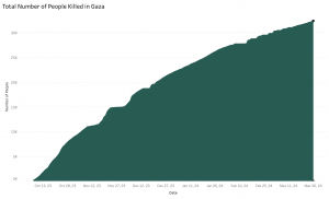
References (APA)
Adler, N., & Milisic, A. (2024, January 26). ICJ updates: Court orders Israel to prevent acts of genocide in Gaza. Al Jazeera. https://www.aljazeera.com/news/liveblog/2024/1/26/live-icj-to-issue-preliminary-ruling-in-south-africa-genocide-case-against-i.
Humanitarian Data Exchange. (n.d.). The State of Palestine – Escalation of Hostilities [Data set]. Humdata. https://data.humdata.org/dataset/the-state-of-palestine-escalation-of-hostilities.
Humanitarian Data Exchange. (n.d.). State of Palestine – Price of Basic Commodities in Gaza [Data set]. Humdata. https://data.humdata.org/dataset/state-of-palestine-price-of-basic-commodities-in-gaza.
Humanitarian Data Exchange. (n.d.). State of Palestine – IDPs [Data set]. Humdata. https://data.humdata.org/dataset/state-of-palestine-idp-s.
Kottasová, I., & Greene, R. A. (2024, January 8). Gaza: One in 100 people has been killed since October 7. CNN. https://edition.cnn.com/2024/01/08/middleeast/gaza-death-toll-population-intl/index.html
United Nations. (2023, October 7). UNRWA situation report #1 on the situation in the Gaza Strip – question of Palestine. United Nations. https://www.un.org/unispal/document/unrwa-situation-report-1-on-the-situation-in-the-gaza-strip/
Recent Layoffs In The Tech Industry
By Emily Chan, Angela Lucas, Katie Lui
Link to Figma interactive visualization here!
Link to Tableau files here!
Objectives
Tech layoffs is a commonly known recent phenomenon that mostly started in 2022 and is currently ongoing until this day (Hetler, 2024). With the tech field being more commonly known for its job benefits such as high salaries and job growth opportunities, this ongoing phenomenon significantly impacts those who are in the field or pursuing to be in the field. An example of recent outcome of these mass layoffs is Google laying off their advertisement team in favor of automation (Reuters, 2023). As a result, we had the high-level goal of sharing a story related to advancing technology and the current economy to layoffs in the tech industry. Through this goal we aimed for our InfoVis project to showcase the tech layoffs from 2021 until 2024 opting to bring insights into why it could be happening, when it started, and how it’s currently affecting the public. With the tech industry layoffs being something that is still predominantly happening, we also wanted to see if this is affected by factors such as overhiring, an increase in AI technology or an increase in AI investment (Maslej et al., 2023; Hetler, 2024). As a result, we intended to target those who are interested in gaining more insight into the ongoing tech layoffs, those who are currently affected by these ongoing tech layoffs, and those who are possibly interested in pursuing a career related to the tech industry. Overall, we wanted to tell a story on tech layoffs in relation to other continuously changing aspects within society.
Changes
As our project progressed, we found that there is limited publicly accessible data focusing on the economy and layoffs in the tech industry. We opted to supplement this through the use of data relating to overhiring and company investments on artificial intelligence (AI) to provide a picture on how much corporate and global leaders are putting importance towards this field within technology. To avoid ‘lying with charts,’ we would like to acknowledge that there could possibly be other factors with a relationship to these ongoing layoffs and learning about tech layoffs in relation to the current development of AI and AI investment is only a small part of the big picture (Schwabish & Feng, 2021).
About the data
To achieve our goals we mainly explored layoffs.fyi’s dataset, an ongoing dataset on tech layoffs since COVID-19 until as of recently (April 2024) to gain a further understanding on the progression of layoffs in the tech industry. This dataset contains information such as company, company location, numbers of people laid off, industry, country, and money raised from the layoffs. Specifically, we used this dataset on the years 2021 to 2024 to have a perspective on tech layoffs before it happened (2021) and as it started happening (2022-2024).
 Fig 1. Preview of Layoffs.fyi
Statista provides measures and research reports regarding artificial intelligence (AI) with a public database related to current research, investments, economic relations, and policy on AI from 2020-2022. We plan to use aspects of this database that has information on 2021 and 2022 to determine a relationship between AI development and investments towards ongoing layoffs in the tech industry.
HiringLab is an economic research database owned by Indeed. It provides recent job posting data around the world and we plan on using this to determine the relationship of overhiring to layoffs in the tech industry.
Tools
Our team initially had trouble harvesting data from layoffs.fyi due to it being a dataset from Airtable which we could only export as a PDF file that did not convert to a CSV properly. To combat this, we found a free and open-source data converter, Tabula, in order to convert our 2022 and 2023 dataset (consisting of 1000+ rows) from a PDF file to a CSV. With most of the data left from Tabula being easier for us to clean by converting our dataset to correct columns and rows, this eased our initial challenges.
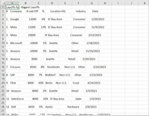
Fig 2. Our dataset before using Tabula
We mainly used Google Sheets to clean and collect some of our data from layoffs.fyi (smaller datasets such as from years 2021 and 2024) as it’s a software that we are most familiar with and is the most accessible for us. With our dataset initially needing to be thoroughly cleaned (spelling and wrong data types), the familiarity of this software allowed us to efficiently gather data that we need and clean the data to suit our goals.
To determine if we have cleaned our datasets enough, we put our dataset through Tableau Prep Builder in order to further assess if more adjustments are needed in our data and if our data is displaying the way that we wanted. Data types on geographic location did not transfer properly from our CSV file which resulted in manually checking and changing these factors in order for the column to be changed into the appropriate data type.
To make the base for our visualizations, we opted to use Tableau in representing our data. Tableau is another tool we are quite familiar with, through most class exercises and assignments being done through this software. Through this, it would allow us to experiment with possible visualizations we can make with our data before finalizing them. This software also gives us the advantage to use maps for the geographic data that we have which boosts the effectiveness and expressiveness in our data.
To present and add interactivity in our visualizations we plan to finalize our visualizations on Figma. This software has strong flexibility in possibilities of interactivity, it gives us the creative freedom we need in order to engage our audience and tell the story we want to share. With Figma having limited capacities when it comes to management of data, but having strong capabilities in creating visual designs, we opted to use it to add final touches in our visualization.
Analytic Steps
Google Sheets
We were set on the idea to communicate tech layoffs that have been increasingly intensified in the past 5 years. In order to do so, we sought out public data that would help support the narrative, and found data and articles linking the increased corporate investment in AI to the tech layoffs. We first determined what pieces within the data would be most helpful for us in the visualizations we anticipated making and ensuring they would appear cleaner on Tableau Prep and Tableau to minimize further cleaning efforts. Through many uses of changing data types, using filters, and find and replace we were able to clean extra columns(attributes), additional letters, warped text, and wrong data types. There were some columns we kept despite not using just in case we changed our minds while making our visualizations.
Fig 3. Our data cleaning in progress, some cities (e.g. Calgary) has extra letters and some industries (e.g. construction) has some letters removed
Tableau
After cleaning the data on Excel, we combined the data from all 4 years into one Excel spreadsheet and imported it into Tableau. To keep each visualization as clear as possible, we deleted columns and excluded data entries that had no number of layoffs inputted as well as the companies who were stationed outside of the United States as we had decided to focus on layoffs mainly in the US after discovering the country with more companies conducting layoffs were in the US. This was done to keep our narrative as concise and straightforward as possible as we had a huge pool of data to work with.
Fig 4. Cleaned data sorted alphabetically by city name in the US only
Furthermore, through exploring different visualization options available on Tableau, we found that there was always a spike around the end of 2021 to the middle of 2022, so we thought to draw correlations between the different visualizations temporally to draw our story. In addition, we have also standardized the presentation of the data points for our line graphs temporally as quarters of the year. This not only imitates how companies present their financial and business plans, but also allows for easier comparison between the infovis.

Fig 5, 6. Standardized presentation of years by quarter
In regard to the visualization representing the number of job postings on Indeed, we chose to focus on 5 sectors that were most closely related to the tech industry and therefore had more possible openings for tech jobs as we wanted to keep it as focused on the tech sector as possible from the data we gather.

Fig 7. Chosen sectors relating to tech
Design Process
In designing the visualizations for layoffs in 2021 to 2024 we aimed to showcase the differences of layoff amounts within each year. To do this, we decided to do a line graph showcasing a quarterly version of the years 2021 to 2024 to the amount of employees that were laid off. With the main attribute that we want to showcase in this dataset being quantitative we opted to use the magnitude channel of position to ensure expressiveness and effectiveness while providing an easily digestible way to present our story to our audience (Munzner, 2014; Ware, 2008). The map created shows the number of layoffs using the element of hues to represent the 4 years we were visualizing. The choice to use distinctly contrasting colors for each of the years, with the intention of aligning with the order of importance of the categorical data to the most salient channels, allows for greater differentiation. Furthermore, the choice to make use of circles and size to correlate with a higher number of layoffs works to immediately draw attention to those areas. This is also made in consideration of the effectiveness and expressiveness in relation to position that helps make the map’s intention clearer.
The choice to use line charts for most of our other visualizations is intended to show the trend and continuous increase in corporate AI investments, and subsequent decline in job postings relating to tech as well as the increase in the number of employees being laid off.
We found strong correlations between two events, such as increase in tech hiring and subsequent layoffs, and we wanted to convey this story to our viewers. To do so, we made sure to create two line charts of both events, with the same intervals of time to convey the correlation, without having the graph be misleading due to inconsistencies in our design. We then combined and superimposed both graphs together so that the viewers can see the correlation directly.
We also wanted to take advantage of interaction techniques in our data visualization, and have options to filter out certain datasets, and hover options to better view data for better accessibility. We also ensured that the graphs were legible, and that the font and colours chosen are easy to distinguish.

Fig 8, 9, 10. Interaction designs on Figma
Story
Our main goal for the project was to explore the issue of tech layoffs that have intensified over the past 4 years, and uncover the reasons for the rapid increase in loss of employment within the tech sector. Through interactive line graphs that show the trend of layoffs and increase in AI investment, as well as the increase in hiring in the midst of the pandemic, we hope to open a discussion on the effects these corporate practices have posed on white collar workers and the trajectory of the tech sector in years to come.
Within our Figma, we also created a timeline supplementing the various visualizations to show the key dates that contribute to the rapid escalation of layoffs.
Fig 11. Timeline of events leading to escalation of tech layoffs
While the story narrated does not provide a definitive answer that explains the tech layoffs, we hope that it provides a suitable explanation that could better support our understanding of the correlation between technological improvements and job market availability, especially for people who are about to enter the job market.
Pros Evaluation & Cons Evaluation
By combining each of our visualizations onto a Figma presentation, our design allows viewers to gain an understanding of the issue of tech layoffs through a simple timeline that utilizes infovis to narrate a story. Viewers can easily interact with each graph, making use of highlighting and hovering to spotlight data points, and observe the trends shown on the line graphs. Additionally, by overlaying the graph expressing the number of employees laid off and the number of job postings relating to the tech sector, we have provided the viewers with a clear comparative view for further analysis.
That being said, our design certainly comes with limitations. Given that we have extracted our data from live trackers, we are aware of the fact that these numbers are ever changing. This could result in inaccurate results over time or may not fully represent the larger context in future years. Furthermore, in the pursuit of providing a clear and concise narrative that supports our story, our interpretations of the graphs may be subject to personal bias and beliefs, therefore potentially influencing viewers’ perception of the issue of tech layoffs as well.
References
Acemoglu, D., Autor, D., Hazell, J., & Restrepo, P. (2022). Artificial intelligence and jobs: Evidence from online vacancies. Journal of Labor Economics, 40(S1), S293-S340. https://doi.org/10.1086/718327
Armstrong, M., & Richter, F. (2023, November 22). Infographic: How much are companies investing in ai?. Chart: How much are companies investing in ai? https://www.statista.com/chart/31314/global-corporate-investment-in-artificial-intelligence/
Carbonero, F., Davies, J., Ernst, E., Fossen, F. M., Samaan, D., & Sorgner, A. (2023). The impact of artificial intelligence on labor markets in developing countries: A new method with an illustration for lao PDR and urban Vietnam. Journal of Evolutionary Economics, 33(3), 707-736. https://doi.org/10.1007/s00191-023-00809-7
Esteban, C. (2015). A Quick Guide to Spotting Graphics That Lie. https://news.nationalgeographic.com/2015/06/150619-data-points-five-ways-to-lie-with-charts/
Hetler, A. (2024, April 1). Tech sector layoffs explained: What you need to know. WhatIs. https://www.techtarget.com/whatis/feature/Tech-sector-layoffs-explained-What-you-need-to-know#:~:text=The%20tech%20industry%20increased%20its,in%202020%20and%202021%20combined.
Hossen, M. N., Mollah, M. A., Lipy, N. S., Hossain, G. M. S., & Rahman, M. S. (2023). factors affecting layoff in high-tech industry: Evidence from usa. International Journal of Information, Business and Management, 15(1), 1-13.
Malik, N., Tripathi, S. N., Kar, A. K., & Gupta, S. (2022). Impact of artificial intelligence on employees working in industry 4.0 led organizations. International Journal of Manpower, 43(2), 334-354. https://doi.org/10.1108/IJM-03-2021-0173
Maslej, N., Fattorini, L., Brynjolfsson, E., Etchemendy, J., Ligett, K., Lyons, T., Manyika, J., Ngo, H., Niebles, J.C., Parli, V., Shoham, Y., Wald, R., Clark, J., and Perrault, R. (2023). The AI Index 2023 Annual Report. AI Index Steering Committee, Institute for Human-Centered AI, Stanford University. https://aiindex.stanford.edu/report/
Reuters. (2023). Google plans ad sales restructuring as automation booms – the information | reuters. Google plans ad sales restructuring as automation booms – The Information. https://www.reuters.com/technology/google-plans-ad-sales-restructuring-automation-booms-information-2023-12-20/
Schwabish, J., & Feng, A. (2021). Do no harm guide: Applying equity awareness in data visualization. Do No Harm Guide: Applying Equity Awareness in Data Visualization. https://www.urban.org/research/publication/do-no-harm-guide-applying-equity-awareness-data-visualization
Sherif, A. (2024). Tech sector layoffs – statistics & facts. Statista. https://www.statista.com/topics/10370/tech-sector-layoffs/#topicOverview
Ware, C. (2008). Color. Visual Thinking, 65–85. https://doi.org/10.1016/b978-0-12-370896-0.00004-4
Effectiveness of Government Initiatives in Alleviating the Vancouver Homeless and Housing Crisis
By Madison Stiver, Amelia Liza-Carre, and Jane Diokpo
Link to our website: https://stopthecrisis.my.canva.site/
Objectives:
As of 2023, there were about 2400 homeless people living in Vancouver. For this report, our aim is to use effective visualizations in order to show how ineffective certain government policies are in alleviating the current homeless and housing crisis in Vancouver (as both correlate). The government is inserting billions of dollars into certain policies that are meant to assist the homeless but in actuality, they are not doing anything for our homeless population. We are able to clearly see that these policies are not working because the homelessness count is only increasing. Using information visualizations, we plan to create an interactive dashboard aimed at policy makers (and any interested public members) to better inform them on this issue and to influence how they pivot their current strategies. This dashboard will visualize data related to housing prices, policy or initiative interventions, homelessness rates, and demographic information to tell a compelling story about the state of housing in BC. By presenting data in an accessible and interactive format, utilizing visualization to sway perspectives and answer the right questions, we aim to highlight areas where initiatives may be falling short or where they are succeeding (Munzner, 2015).
By employing a visual analytics tool, this project will provide explorations of complexly organized datasets, allowing users to interact with the data to uncover trends, correlations, and insights that may not be immediately apparent. This approach aims to support evidence-based decision-making and encourage a shift in initiative focus towards areas needing the most aid, such as homelessness and vulnerable demographics. By making this information more visible and easily digestible, this InfoVis project aspires to inform, influence, and instigate change towards better housing initiative solutions in BC.
Data we used:
For our project, all data we used required cleaning and reorganizing in Excel sheets before usage on Tableau. We tried to stay within 2013 to 2023 as a designated time period of study to provide enough width to see more changes as well as stay as current as possible.
We utilized data of four government policies with the highest funding and the year of their introduction (within the designated time period we were examining), such as:
Building BC: Community Housing Fund (Government of British Columbia, 2024) in 2019
- Announced to provide funding for affordable rental homes for middle-income families, seniors, and people with disabilities. In addition to the $2-billion financing from the Government of Canada, BC Builds is supported through an investment of $950 million from the Province to ensure units are available at below-market rates, as well as $2 billion in provincial low-cost construction financing.
- Funds: $5 Billion
Temporary Rental Supplement (Government of British Columbia, 2020) in 2020
- Launched to provide temporary rental support to tenants experiencing financial hardship due to the COVID-19 pandemic. $300 per month for eligible households with no dependents and $500 per month for eligible households with dependents.
- Funds: $5 Billion
BC HousingHub (BC Housing, n.d.) in 2021
- Expanded to facilitate more partnerships with the private sector and non-profit organizations to develop affordable housing.
- Funds: $2 Billion
Indigenous Housing Fund (Government of British Columbia, 2023) in 2021
- Increased investment to support the construction of affordable housing units for Indigenous peoples both on and off reserves.
- Funds: $1.8 Billion
We utilized data of rent increase in Vancouver from 2013 to 2023 (Canadian Mortgage and Housing Corporation, n.d.). We wanted to see how rent has increased over time to better gauge the effectiveness of government policies since they were introduced.
We utilized data of homeless increase in Vancouver from 2013 to 2023 (City of Vancouver, n.d; BC Non-Profit Housing Association & Urban Matters CCC, 2018.). We wanted to confirm our assumptions that homeless rates, compared to similarly increasing rent prices, have yet to slow down.
We used data of Indigenous population in Vancouver as well as Indigenous homeless population in Vancouver from 2013-2023 (City of Vancouver, n.d.). We wanted to examine this demographic as according to Lupick and Mauboules, “39% of [homeless] survey respondents identify as Indigenous compared to 2.3% of population [and] Indigenous people are 18 times more likely to be homeless than non-Indigenous people” (Lupick & Mauboules, 2023). These data sets were compared between each other to show how homelessness in an otherwise stagnant Indigenous population has fluctuate constantly, with an affinity for increasing overtime.
The Tools:
Prior to the data collection step, we decided on using data that was provided by the BC Government, Canadian Government, and the City of Vancouver websites. This ensured that the data we collected would be reliable and consistent. As we collected the data, we noticed that the scope of our study, and the questions we were asking, were too broad. Instead, we decided on focusing on smaller sets of data. We used Excel to organize, clean, and put together all the data that we would be using to create our visualizations.
As the majority of the data was separated by year we combined the data we would be using for each theme under separate excel sheets. Once the data was cleaned, we brainstormed on what our final visualizations would look like, we did so by making drawings of our different ideas and how we could use the data we had collected.


Figure 1. & 2. Initial drafts of potential visualizations
Once we discussed our potential graphs, we decided on what and how the data we collected could be used. We decided on having a graph to represent the increasing homeless crisis in Vancouver, one to represent an increase in rent prices, which policies have the largest funding and when they were implemented, as well as looking into what groups are being most affected by this crisis.
In order to create the graphs, we used Tableau Desktop. We chose to use Tableau Desktop as we were more familiar with creating interactive visualizations here. As we wanted to present our visualizations in a way that allowed the viewer to follow a story, one that we wanted to convey with empathy, we chose on building a website that allowed the viewer to follow along, as well as we were able to include text that allowed us to speak on this topic and draw our own conclusions from the graphs we had created.
Analytic Steps:
After we had cleaned our data and brainstormed our initial drafts of the visualizations, we knew we wanted to analyze the policies that are set in place in Vancouver, BC. to alleviate the homeless crisis. The four policies chosen were the Temporary Rental Supplement implemented in 2020, Building BC implemented in 2013, BC Housing Hub implemented in 2021, and the Indigenous Housing Fund implemented in 2021. The reason why we chose to focus on these specific policies is because these have the largest funding from the government.
Furthermore, we chose on focusing on what seems to be one of the largest contributing factors, the lack of affordable housing. We demonstrated this by having a graph that depicted the rent prices increasing in Vancouver per year, besides the amount of people per year identifying as homeless. This allowed us to demonstrate that both of these are increasing.
Additionally, we believed that by touching on this subject we had to look into whether any BIPOC groups were affected by this crisis disproportionately. Whilst we were collecting the data we found that Indigenous Peoples were being affected by this crisis, and this percentage was increasing by nearly every year.
Design Process:
After we had collected all of our data, we each individually worked on visualizations that were assigned to us. The goals for our design process were to create visualizations that told a story. We made sure that we followed Schwabish and Feng’s “Do No Harm Guide” and Munzner’s expressiveness and effectiveness principles. Following Munzner, we made sure that we used the correct expressive type to show our ordinal and categorical data across all visualizations (Munzner, 2015). We further made sure that the effectiveness principle was followed by using one of the most effective attributes each time (Munzner, 2015). When choosing the hues for our visualizations, we made sure that it did not look like we were taking “a racially equitable approach” while also offering “sufficient contrast between colors for readers with vision difficulties” (Schwabish & Feng, 2021). For our first visualization of homeless count, we decided to use a striking red hue in order to get across that we need to act on it. For the three other visualizations, we chose to use colours from the Flag of Vancouver as we thought that it was very fitting and the colours did have a large contrast (Schwabish & Feng, 2021).

Figure 3. “Flag of Vancouver.” Wikipedia, Wikimedia Foundation, 4 July 2023
We decided to show our data, all utilizing Tableau, using a variety of different plots. In total, we made four visualizations as we thought that was a sufficient amount of visualizations to get our points across. We made one scatterplot, two line graphs, and one bar graph. We decided to make two line graphs as they are able to show growth over time most effectively.
Our first graph is a line graph that shows homeless count in Vancouver over the years. We chose to use a line graph as it is a simple, yet effective way of showing growth over time. You can see that the amount increases by about 800 people in 10 years. We did not want to crowd this graph as it is important to show everyone exactly what is going on in terms of the amount of homeless people in Vancouver.
Our second graph shows the percentage of Indigenous People in Vancouver vs. the percentage of Indigenous People in Vancouver that are homeless. For this graph, we were able to collect data from 2005 to 2023 which is better to see the growth overtime. From the scale of this graph, you are clearly able to see how much of a difference it is between the amount of homeless Indigenous people in Vancouver vs. the amount in the total population.
Our third graph shows the policies of Vancouver against how much the Government has spent on them. We wanted to utilize a bar graph for this data as it is clearly able to show how much the Government has spent on various policies throughout the years.
Our fourth graph combines our first and third graphs which are showing the homeless count along with the policies of Vancouver. While showing a comparison between these two things, it also compares the monthly rent amount by year. This graph shows what policies were in place and how that affects or doesn’t affect the rent amount per month. We thought that a scatterplot would be the most effective to show the two different graphs and how they compare.
The Story:
Our project narrates the impact of governmental housing policies on affordability and homelessness in Vancouver from 2013 to 2023. We analyzed the largest funding initiatives, like the Building BC: Community Housing Fund and Temporary Rental Supplement, assessing their introduction and financial contributions to the housing sector. Our data, meticulously cleaned and organized in Excel before visualizing in Tableau, highlights the evolution of rental prices and homeless rates. To see the policies’ impact on a demographic, we also examined the Indigenous population’s homeless rate as they are the most likely to be homeless. This demographic, experiencing a disproportionately high rate of homelessness, offers a critical lens to evaluate policy effectiveness against the backdrop of rising living costs and general homelessness in Vancouver.
Pros:
Our first graph utilizes a line chart. This clearly shows the rise of homelessness in Vancouver from 2013-2023 in a way that is easy for viewers to follow and is in red to indicate urgency to viewers. The second graph also utilizes a line graph to contrast Vancouver’s stagnant Indigenous population to its constantly fluctuating and increasing Indigenous homeless population from 2013-2023. The third graph is a bar chart to show the differences in funding by year, all showcasing Billions in funding (that has had little alleviation on the crisis). For the fourth graph, it is a scatter plot graph and homeless increase as well as housing rent increase are split side by side to show correlations between the two. The policies by year have also been added to see how much impact they made since being introduced. For the second, third and fourth graphs, hues (sourced form Vancouver’s flag) have been used to differentiate the marks and color keys have been included to filter through the graph more easily.
Cons:
The main issue we encountered was in creating the fourth graph. Due to 2021 and 2022 lacking homeless and rent values from our datasets, it was a lot harder to guage how much impact the policies (BC HousingHub and Indigenous Housing Fund) for 2021 had.
Additionally, it proved complicated to find other policies with extensive imformation that suited our criteria, such as years they were implemented as well as having a high amount of funding. This is because most sources, especially the BC and Vancouver government, typically do not archive their initiatives properly all in one accessible resource.
References:
Applications open for temporary rental supplement. Government of. (2020) https://news.gov.bc.ca/releases/2020MAH0050-000669#:~:text=%E2%80%9CTogether%20with%20the%20other%20provincial,for%20eligible%20households%20with%20dependents.
BC Builds will deliver thousands more homes with Canada contribution. Government of British Columbia. (2024) https://news.gov.bc.ca/releases/2024HOUS0007-000232#:~:text=In%20addition%20to%20the%20%242,provincial%20low%2Dcost%20constru
“Flag of Vancouver.” (2023). Wikipedia, Wikimedia Foundation, en.wikipedia.org/wiki/Flag_of_Vancouver.
Homeless count. City of Vancouver. (n.d.) https://vancouver.ca/people-programs/homeless-count.aspx
HousingHub Program Overview. BC Housing. (n.d.). https://www.bchousing.org/projects-partners/housinghub#:~:text=process%20%2D%20benefiting%20everyone.-,Funding,homes%20for%20middle%20income%20families
Lupick, Dustin, and Celine Mauboules. Presentation – 2023 Homeless Count, Vancouver, 31 Oct. 2023, council.vancouver.ca/20231031/documents/regu20231031p1_2023_Homeless_Count.pdf.
More than 1,000 new affordable homes coming for Indigenous people. Government of British Columbia. (2023). https://news.gov.bc.ca/releases/2023HOUS0166-001896#:~:text=The%20IHF%20provides%20approximately%20%241.8,open%20or%20underway%20throughout%20B.C.
Munzner, T. (2015). Visualization Analysis and Design. Boca Raton, FL: CRC Press. [Available online as an e-book from UBC Library].
Schwabish, Jonathan, and Alice Feng. (2021). Do No Harm Guide: Applying Equity Awareness in Data Visualization. Urban Institute, www.urban.org/research/publication/do-no-harm-guide-applying-equity-awareness-data-visualization.
VANCOUVER HOMELESS COUNT 2018 [Report]. Urban Matters CCC & BC Non-Profit Housing Association. (2018). https://vancouver.ca/files/cov/vancouver-homeless-count-2018-final-report.pdf
Vancouver — Rental Market Statistics Summary by Zone. (n.d.). Canadian Mortgage and Housing Corporation. (n.d.) https://www03.cmhc-schl.gc.ca/hmip-pimh/en/TableMapChart/Table?TableId=2.1.31.3&GeographyId=2410&GeographyTypeId=3&DisplayAs=Table&GeograghyName=Vancouver
Vancouver’s Economic Crisis: Housing Edition
By: Leen Naser, Nada Alsaka, Anna Shubina
Links
Website: https://vancouverhousingcrisis.my.canva.site/
Average Rent Per Area Tableau Map Link: https://us-west-2b.online.tableau.com/#/site/infovisubc/views/INFOFINALPROJECT/Sheet1?:iid=1
Demographic Data Per Area Tableau Map Link: https://us-west-2b.online.tableau.com/t/infovisubc/views/INFODEMOGRAPHICPERAREAFINALPROJECT/Sheet1
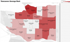
The InfoVis Story (Background)
The topic of our project is on the wealth disparity of Lower Mainland Vancouver occupants. This is an important topic to delve into because there is an increasingly large group of people struggling to find a home and/or a place to stay (e.g. East Hastings). As residents of Vancouver, we are alarmingly aware of this issue and its drastic escalation post-Covid. We aim to reveal why there is a large disparity in wealth in Vancouver and to bring to light its effect on the population. This information could enforce change in the BC government and ensure it becomes more of a focus within BC Housing. The primary audience for our data is the BC NDP (provincial government) to give them a clear preview of the issue happening in our city to which it needs an immediate response. Our secondary audience is the BC residents, to educate them on the issue and elaborate on the minimal information they may already know. By having data backing up our research we can give valid information to our audience, and create a viable argument as to why this issue should be prioritized. Having data presented will ensure residents truly understand what is happening in their neighborhoods. InfoVis has allowed for this story to be presented compellingly and simply by transforming heavy data into easily digestible and explorable visualizations.
Rent is increasing at a rate triple of the inflation rate, which is causing a growing alarm from residents. By looking at the data provided on Rental.ca, it indicated that there was a 21% increase in rent from 2021 to 2022 (Devlin, Megan.). Vancouver is now being classified as the most unaffordable city in North America. Over the years there has been a large increase in foreign investors in Vancouver, resulting in the increase in prices and decrease in local investment opportunities. In addition to this, the population in Vancouver has been increasing exponentially, with a projection of 3.4 million residents by 2041 (Paul, David.).
To place things into perspective let’s delve into a slightly hypothetical story… say you are earning the average income as a Vancouver resident – $5,792 a month (“What Is the Average Salary in Vancouver, BC?”). Now, you are also paying the average rent rate in Vancouver which is about $3000. Therefore, 51.8% of your income is going into rent (Zumper.). It has been recommended that residents should not be paying more than 30% of their income towards rent (Lloyd, Mike.).
Our Goals and Objectives:
The high-level objective of our InfoVis project is to support the communication of pre-existing knowledge regarding the cost of living crisis, specifically relating to the argument of the unrealistic standard cost of living expected for residents in lower mainland Vancouver as it qwkeeps increasing exponentially. We delve into how marginalized communities are disproportionately affected. Our arguments are supported through the comparisons of data on the cost of housing, average income, and the population demographics (racial/ ethnic identity) of the different areas in the lower mainland as of 2021.
In regards to our data collection, analysis, and visual design our mid-level goals are to gather comprehensive data on the cost of housing, average income, and population demographic per area within Vancouver which would involve accessing reliable sources such as government databases and census reports. Meanwhile our low-level goals are to dive deep into the collected data to identify trends, patterns, and disparities to analyze how the cost of living has increased over time and break down demographic data to highlight whether visual minorities are affected differently by the rising costs. Using what we have gathered, we will create a design visualization that effectively communicates our data through maps and appropriate chart types where on the lower-level, we will pay close attention to design details such as color schemes and interactivity to ensure that the infographic is intuitive and accessible to our target audience of Vancouver locals and BC government officials.
The Datasets Involved
We are using data researched throughout the years from Statistics Canada Census 2021, the City of Vancouver’s Local Area Boundary Map, and Canada Mortgage and Housing Corporation (CMHC). These research analyses are authoritative enough to support our objective as well as prove our argument for the need for more affordable housing to the provincial government. We use Vancouver areas defined by CMHC as our categorical data items, which are West End/Stanley Park, English Bay, Downtown, South Granville/Oak, Kitsilano/Point Grey, Westside/Kerrisdale, Marpole, Mount Pleasant/Renfrew Heights, East Hastings, and Southeast Vancouver. We considered those areas as also our spatial data in the form of a map of Vancouver to aid in filtering and categorizing all of the attributes. The data attributes include the following characteristics: average rent prices, average income before and after tax, and numbers of visible and non-visible minorities populating each area.
(1) Statistics Canada did not have data specific to the areas we needed but rather it included a list of small regions with census track codes (e.g. CT 0001.01, CT 0016.04). To deal with such a complex dataset (about 66 items and 16 attributes), we had to figure out what area each code belongs to and then calculate our average demographic numbers, also our quantitative data attribute. We used the terms “visible minority,” “non-visible minority,” and “Indigenous identity” as our categorical attributes, which are outlined on the Statistics Canada Website. This way we will reflect how housing rates justify the conditions of living for different populations.
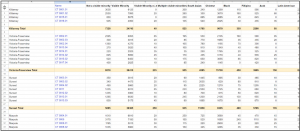
(2) We used the CMHC portal to gather quantitative data on average income (before taxes and after taxes) as well as average rent prices per area. Using this information helped us to assess the price of living across the Vancouver Area. Moreover, to provide more context to the target audiences we used additional population income data, which would complement our project’s goal of showing a correlation between the housing rates and the income people receive living in each Vancouver area.
Tools Used: (strengths and weaknesses)
Google Sheets: We used Google Sheets to manually clean our data and combine the data from the multiple sources we used. We filtered the relevant and irrelevant data through Excel to pertain to our objective. We especially used Google Sheets instead of another tool for cleaning our data as it was the easiest to share with our group when filtering our multiple datasets and ensuring each dataset followed the same Lower Mainland locations.
- Strengths: we could easily share our data with each other and work on it simultaneously through Google Sheets as it is very accessible and a simple online tool. It is a great tool when filtering data manually, as the Command F tool can be used to quickly find the similarities between the multiple datasets.
- Weaknesses: Everything must be done manually on Google Sheets when filtering data, which slowed down the process.
Tableau Desktop: We used Tableau Desktop to create our graphs, including the Vancouver map visualization.
- Strengths: There are many options when creating visualizations, especially interactive visualizations.
- Weaknesses: It was difficult to create a map of Vancouver. If you are not certain how to do certain tasks, there is no guidance given from the interface.
Infogram: To combine everything and include context, we created an infographic on Infogram to which contains the visualizations from Tableau embedded within. With Infogram we created an infographic that includes our research and interactive tables which we created using Tableau.
- Strengths: There are many design options available, which makes it easy to make the information and data we input cohesive.
- Weaknesses: When creating charts you are limited by what the platform can do. When we had certain ideas in mind, many times it could not be done as the chart/graphic function is very limited.
Analytical Steps

First steps [Produce]: We explored the data visually before creating our final InfoVis and putting all our datasets together. Although we knew our initial direction, to ensure all our data would make sense together we tried finding similar visualizations. We created a map during our research that distinguished the different areas within Vancouver (Services, M. of C.). We used it to create our own more filtered dataset to make it easier to understand and correlate all our datasets. The updated map is to the right. We connected nearby areas (as seen in the image) and accordingly combined certain numbers from our datasets to align. Since there were a lot of specific changes that needed to be made to our datasets when cleaning/filtering, we used Google Sheets as it was more accessible to share and adjust. After completing our initial rounds of research, we annotated and abstracted specific topics that we wanted to focus on, which led to our final topic (Munzner, Tamara.).
- Once each dataset was retrieved and filtered through, we needed to align the attributes to the new location points we created. To do this, we manually added information together to place them under one category.
Initial idea + focus [Communicate]: We knew the argument we wanted to communicate from the beginning of this project, as well as how we wanted to communicate our collected data visually. This is because we chose our specified topics and their relations before collecting the datasets. As we completed our data cleaning and began putting all our information together to create the infographic and visualizations, we found new information that would benefit our argument, such as the rent increase freeze in 2020-2021. As we went through the whole process of researching and filtering, our abstract target was to illustrate a trend and correlation between the datasets we retrieved, to further emphasize the economic crisis Vancouver has been and is currently facing, as well as its impact on its residents. Once we placed all datasets together, we knew we needed to illustrate the correlation between demographic – income, demographic – rent, and income – rent (Munzner, Tamara.).
Design Process:
When converting the data we collected from its original form into the infovis we created, we began by individually cleaning all the datasets. The most difficult aspect was finding data for each segment we covered with the same breakdown of the lower mainland area. Since they were not the same, we chose one list of segments to follow and organized the remaining data pertaining to that list of areas.
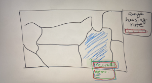 Sketches: When figuring out how to put together all our datasets (each one of us found different ones), we created sketches to try to understand how we could put all the data together. The image to the right is how we pictured it when converting all our data into spatial data.
- To make the difference in housing rate evident in our map, we used a primary visual primitive that is pre-attentive, color. We decided on having it be different shades of red to emphasize the urgency, (as well as it being one of the colors on the Canadian and BC flag).
- We chose selection as a design tool for our map, so when readers click on an area, it will highlight the filtered data of that area’s average income and demographic (Heer, Jeffrey, and Ben Shneiderman.).
Expressiveness and Effectiveness considerations:
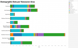 The demographics which are categorical, are classified as unordered data so we did not use channels that are perceived as ordered, using the identity channels. Therefore in the following visualization we portrayed demographics through color.
- The areas distinguished within the lower mainland are categorical data, therefore unordered, so we used the identity channels to depict it, placing it on the Y axis of the visualization above. Using both expressiveness and the effectiveness principles, position was most recommended.
- The income and rent prices from our datasets are quantitative ordered data, therefore within the expressiveness and effectiveness principle, we placed it using the positioning on the X-axis.
- We assessed spatial data in the form of a map of Vancouver to aid in filtering and categorizing each area within the lower mainland.

- Within the infographic, we included a graph presenting Metro Vancvouer’s median market rents. Effectiveness was demonstrated by choosing a spatial position and region channels to represent both the year and the price, ultimately creating a line that demonstrates the changes over time.
We ensured to follow the principles of utility, soundness, and beauty/attractiveness within our infographic through the follow:
- Utility: expressed by providing valuable information about the ongoing economic crisis in vancouver through the lens of the housing/rental market and presenting some ways in which the issue is being addressed by the City of Vancouver, ultimately informing Vancouver resident of a certain issue within their community and empowering them to engage in conversation of what changes would be beneficial.
- Soundness: We collected our data from reputable sources such as Canadian Housing Rental Index which we conducted background research on to ensure they were unbiased, complete, and trustworthy.
 Beauty/attractiveness: our infographic seamlessly balances visually engaging design with concise, impactful information which was prevalent through all our design choices such as a cohesive color palette to create visual harmony, and minimalist graphics which improve readability while reinforcing the subject matter.
Design Principle Exploration
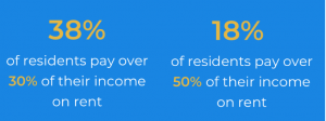 When trying to illustrate specific data, such as the percentage of income citizens pay towards rent, we initially created a circular chart comparing the data, but we later decided the information was being skewed by how complicated it looked. This led to altering the visualization to focusing on the percentage (larger text and bolding) to emphasize the numbers.
Pros & Cons:
A con to our designs is the limitation of our data, for we only found substantial data from 2021, although we had initially planned on looking at the data from 2019-2022. On the other hand, we successfully correlated all our different datasets to create a clearly outlined map. We were also about to create simple yet useful designs on our infographic to emphasize the importance of our research as well as the steps that can be done moving forward. This aids in indicating who our target audience is and actionable items, for an infographic should always allow for further elaboration from the reader’s part.
Bibliography
Devlin, Megan. “Asking Rents in Vancouver Are Increasing at Double to Triple the Rate of Inflation.” Urbanized, Daily Hive, 15 Dec. 2023, dailyhive.com/vancouver/massive-asking-rent-increase-year-over-year#.
Government of Canada, S. C. (2023, February 1). Census profile, 2021 census of Populationprofile Table. Profile table, Census Profile, 2021 Census of Population – Vancouver, City (CY) [Census subdivision], British Columbia. https://www12.statcan.gc.ca/census-recensement/2021/dp-pd/prof/details/page.cfm?Lang=E&GENDERlist=1%2C2%2C3&STATISTIClist=1%2C4&HEADERlist=0&DGUIDlist=2021A00055915022&SearchText=vancouver
Heer, Jeffrey, and Ben Shneiderman. “Interactive Dynamics for Visual Analysis: A Taxonomy of Tools That Support the Fluent and Flexible Use of Visualizations: Queue: Vol 10, No 2.” Queue, 1 Feb. 2012, dl.acm.org/doi/10.1145/2133416.2146416.
High-income households. Census Mapper. (n.d.). https://censusmapper.ca/maps/3524#11/49.2458/-123.0949
Lloyd, Mike. “Metro Vancouver: Renters Spend 50% of Income on Housing.” CityNews Vancouver, 6 Oct. 2022, vancouver.citynews.ca/2022/10/05/metro-vancouver-renters-income/#:~:text=When%20renting%20a%20home%2C%20the,cent%20of%20your%20monthly%20income.
“Local Area Boundary.” City of Vancouver Open Data Portal, 24 June 2023, opendata.vancouver.ca/explore/dataset/local-area-boundary/table/?disjunctive.name&location=12%2C49.2474%2C-123.12402.
Munzner, Tamara. “Why: Task Abstraction: 3 : Visualization Analysis and Design: Tamara.” Taylor & Francis, Taylor & Francis, 1 Dec. 2014, www.taylorfrancis.com/chapters/task-abstraction-tamara-munzner/10.1201/b17511-3.
Paul, David. “Vancouver’s Housing Crisis: Unraveling the Reality of North America’s Most Unaffordable City.” Medium, Medium, 31 Aug. 2023, medium.com/@david.p.lemon79/vancouvers-housing-crisis-unraveling-the-reality-of-north-america-s-most-unaffordable-city-db124312f13#:~:text=By%20the%20Numbers%3A%20Vancouver’s%20Startling%20Housing%20Stats&text=Median%20Multiple%20(price%2Dto%2D,22%20for%20every%20100%20(2021)).
“What Is the Average Salary in Vancouver, BC? (Mar 2024).” Zip Recruiter, 2024, www.ziprecruiter.com/Salaries/-in-Vancouver,BC.
Services, M. of C. (2024, February 23). Population projections. Province of British Columbia. https://www2.gov.bc.ca/gov/content/data/statistics/people-population-community/population/population-projections
Zumper. “Average Rent in Vancouver, BC.” Zumper, 2024, www.zumper.com/rent-research/vancouver-bc.