- The Objectives
In 2024, Taylor Swift reached new and unprecedented levels of global cultural success; not only was she voted Time Magazine’s 2023 ‘Person of the Year’ (Pazzanese 2023), but estimated $4.1 billion U.S. dollars in earnings from her global stadium tour (The Era’s Tour). Ed Sheeran has previously accomplished similar heights in his music career by being the first artist to surpass 100 million streams on Spotify in 2021 (Dellatto, 2021). This project aims to tackle that question through a visual investigation of Taylor Swift and Ed Sheeran’s discography and compare their respective successes. Like many pop culture investigators of today, we want to ask: “What makes music popular?”. More specifically, is there an element to musicality that can be attributed to explosive global success?
Thus, our objective for this project is to (1) analyze and (2) discover various musical metrics of Swift’s studio releases that potentially explicate her recent global success. We plan to conduct our study through a comparative analysis that contrasts Swift’s rise in musical popularity with her contemporary male counterpart: Ed Sheeran. By the end of our project, our goal is to present a compelling visual narrative of our findings that can explain Taylor Swift’s explosion to global fame that engages with Swifties, Sheerios, and the average pop-music consumer alike.
- Details of the data
Our Term Project requires the analysis of two corresponding datasets: ‘Taylor_Swift_Spotify.cvs’ and ‘Ed_Sheeran_Spotify.cvs.’ Both datasets provide information regarding each artist’s relative popularity and musical qualities on the music streaming service, Spotify.
Because both datasets had the same metrics and were both from the same source (Spotify), we consolidated both tables into a master table and added the artist’s name as an additional metric. This master table includes data pertaining to the lyrical and audio features of all songs produced by Taylor Swift and Ed Sheeran during their careers. This data source includes metrics regarding the artist’s entire discography, including tracks published in their studio albums, EPs, singles, and any re-releases. Specifically, the attributes included (such as ‘liveness,’ ‘acousticness,’ and ‘danceability’) compare and quantify various characteristics of both artist’s music in relation to the other songs available on Spotify’s open streaming service.
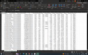
Figure: “Sheeran_vs._Swift_Master_Table(Cleaned).csv”
Dataset Source: https://www.kaggle.com/datasets/jarredpriester/taylor-swift-spotify-dataset
It’s important to note that the datafile ‘Ed_Sheeran_Spotify.cvs.’ contains an error regarding the release date of Sheeran’s album ‘X’ (correct date is November 25, 2012).
Data Provenance:
Both datasets were published and distributed on Google LLC’s open data repository ‘Kaggle’ (an online community of data scientists) that participates in providing online education through free datasets and open collaboration (Wikipedia Foundation, n.d.). While each file was collected and distributed by an individual member on Kaggle, both datasets were generated using Spotfy’s open data source tool: ‘Spotify API.’ By attributing Spotify API as the authoritative data source (and linking the corresponding metadata), each dataset exemplifies proper data provenance standards to be considered reliable for our project.
Data Metrics:
Both datasets contain identical attributes (or ‘metrics’) about the singers’ complete discography. These metrics were further explicated within the corresponding metadata provided by Spotify API (and posted on Kaggle):
- Tools Used.
- Microsoft Excel: Excel was initially utilized to clean and aggregate our two datasets into a singular (‘Swift v. Sheeran’.csv) file to be later imported into Tableau. The only noticeable limitation of the program was its inability to effectively differentiate and display album titles; numerical album titles were often recognized as integers (instead of a string of characters), and the program entirely failed to recognize Ed Sheeran’s album, titled “÷” (“Divide”).
- Tableau Desktop: Tableau was subsequently utilized for exploratory and visualization purposes. Once we had a single cleaned dataset to import, Tableau provided the means to conduct our initial research regarding existing correlations between the pop singer’s musicality and popularity. While Tableau allowed us to explore and confirm our initial research suspicions, its major limitation was the program’s inability to provide the aesthetic customization of idioms that we desired.
- Google Slides: Although Google Slides does not provide interactivity with the graphs it does provide us with the ability to customize our exported graphs from Tableau by inserting as many visual elements as was needed over our marks that better expressed their individual items and attributes to the casual viewer.
- Analytic steps
STEP 1: Data cleaning (Group Meeting 1):
The first step of the analytical research process entailed preparing the data for effective data analysis. At the start of our research project, we had two separate Excel spreadsheets containing Spotify data belonging to Taylor Swift (‘Taylor_Swift_Spotify.cvs”) and Ed Sheeran (‘Ed_Sheeran_Spotify.cvs.’) – both of which were cleaned and combined into the master excel file. Once the ‘master repertoire’ (consisting of 782 songs shared by the artists) was aggregated in one table, we embarked upon an extensive cleaning process.
STEP 2: Research and Data Exploration on Tableau (Meetings 2 + 3):
This step entailed a thorough exploration of the recently cleaned data to:
- Confirm our initial suspicions that Swift and Sheeran provide a likely musical comparison; and,
- Locate potential divergences within their musical qualities that explain why their career trajectories have so fatefully “divided.”
From there, we were able to plot the two singers’ comparative streaming popularity over the course of their careers (both across albums and individual song titles). Once we were able to confirm some patterns, our Tableau research took a more refined and goal-oriented approach.
- STEP 3: Narrative design:
When beginning to explore our data we knew that Taylor Swift would come out to be the more popular artist overall. However, we also knew that we needed to investigate the data in Tableau to gain a comprehensive understanding of why Taylor Swift was more popular. We were looking to spot the differences in their musical metrics from Spotify to distinguish how each metric related to their overall popularity. What we found was that we were correct that Taylor Swift’s albums are, on average, more popular than Ed Sheeran’s albums. We created graphs that explicitly show each album’s popularity by year and each song’s popularity by year:

Figure: “Album Popularity by Year”
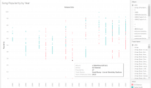
Figure: “Song Popularity by Year”
Following this, we made graphs for each metric in the dataset. The metric (for example, danceability) was graphed against the y-axis of popularity and hue coded by singer, for example:
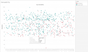
Figure: “Danceability”
We learned that the individual metrics did not give us as clear of a story as we had assumed they would. Other than, the instrumental quality (instrumentalness) of their songs which had a larger discrepancy than other metrics which could be a factor in Taylor Swift’s overall popularity.
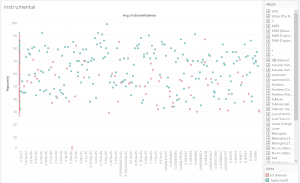
Figure: “Instrumental”
Then, we graphed all metrics by year of release and discovered a description of each artist’s average popularity by year with a line graph to aid the viewer in understanding the continuous nature of their temporal relationships with popularity.
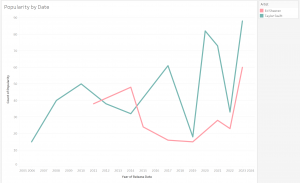
Figure: “Popularity by Date”
Finally, once we determined the difference in their popularity by year, album, song, and the average of all metrics we filtered our data further to investigate the difference in instrumentalness after 2010 when Ed Sheeran released his first studio album.
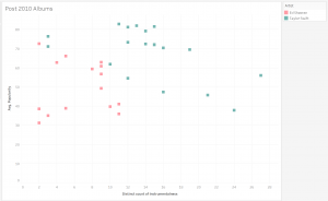
Figure: “Post 2010 Albums”
- Design Process
After creating the master Excel table “Sheeran_vs._Swift_Master_Table(Cleaned).csv” we began creating graphs. At this point in our data exploration, specificity in design principles was not considered beyond the basic necessity of information communication – for example: Taylor Swift and Ed Sheeran were assigned arbitrary hues for easy visual division between data types. Once we understood the data and our story, it was time to consider the effectiveness and expressiveness when designing the finished graphs (Munzner, 2014). Tableau could have been a fine option to tell our story; however, the lack of interactivity in our ultimate storytelling platform would limit the amount of information that the viewer would have access to which could compromise the graph’s effectiveness. Therefore, the work of creating graphs by hand began. Google Slides allowed for the greatest amount of images and freedom of image placement.
For our graph that represents each album’s popularity by year, we needed to share not only the year, popularity, and the artist’s name but also which album corresponded to each data point. Text description could have been only slightly effective because the labelling technique appeared overwhelming and did not provide enough space for each label to be seen.
Therefore, we chose to use icons as our marks. Each mark is represented through the iconic use of a specific album cover. There is a legend which clearly shows the album name and cover. Furthermore, the entire graph is laid over a translucent photo of the two singers to provide context, as this communicates race, gender, identity, and the interpersonal relationship between the two singers.
Link to Graphs: https://docs.google.com/presentation/d/16ARxa9z2UPcgGfIoBDJUKK_OS4tXk_Z8mzH3-cS0ldg/edit?usp=sharing
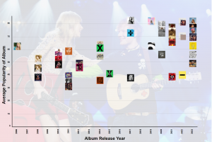
Figure: “Albums by Date (Google Slides)”
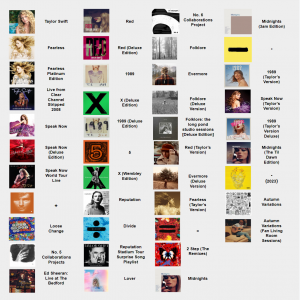
Figure: “Albums by Date (Google Slides) Legend”
The same tactic was used to display the average instrumentalness of each album by popularity after 2010.
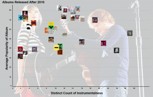
Figure: “Albums Released After 2010: Popularity and Instrumentalness (Google Slides)”

Figure: “Albums Released After 2010: Popularity and Instrumentlaness (Google Slides) Legend”
To explore each artist’s popularity over time we opted to display this using a line graph. The line graph expresses the relationship between the metrics of popularity and temporally. The transparent image behind the graph serves two purposes. The first is to show that this graph’s objective is to compare by having two separate photos of the celebrities. The second reason is to reinforce the hue choices of the two artists as Taylor Swift is wearing blue in her photo and Ed Sheeran has orange hair.
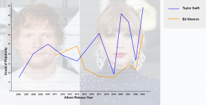
Figure: “Popularity by Year ( Google Slides)”
The last graph we produced explores each artist’s overall popularity based on the average results of all the Spotify metrics. This is done through an iconic bar chart on a black background to draw the eye to the two differently-sized figures of Taylor Swift (a larger icon) and Ed Sheeran (a smaller icon).
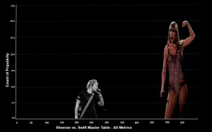
Figure: “Master Popularity (Google Slides)”
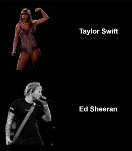
Figure: “Master Popularity (Google Slides) Legend”
6. Describe the story
After playing with the data, we decided to focus on four graphs that helped us discover why Taylor Swift’s music is so good?
Albums by Date
This scatterplot graph displays each artist’s album according to their release year and popularity count until 2024. We measured an album’s popularity by averaging the popularity score from each track. Using their respective cover art to represent each album is an easily discernible way to read this graph at a glance 一 especially for audiences who are fans of either artist.
Here, we can see that before 2014, Swift and Sheeran’s albums had oscillated between the popularity range of 30 to 65. Both Swift and Sheeran released highly acclaimed albums in 2014 一 “1989” and “÷” (“Divide”) 一 which were fairly equal in popularity with scores of 62 and 61, respectively. Although both artists reached higher peaks in the following years, this is the last time they will be comparable in terms of popularity. From 2017 to 2024, Swift’s album’s average popularity consistently stays between 65-85, with only two albums scoring below 57 (“Folklore: The Long Pond Studio Sessions” (2020); and “Reputation Stadium Tour Surprise Song Playlist” (2017)). During this same period of 2017-2023, Sheeran’s album’s average popularity ranges between 38 and 72. It’s also important to note that within this period, Swift has released 16 albums, double that of Sheeran.
Popularity by Year
Our line graph measuring the popularity and release date of Swift and Sheeran’s albums gives us more insight into their careers. We used the popularity averages from each album to measure their overall popularity in the year they were released. If the artist released multiple albums in a year, we calculated the average of those albums. We can identify some divergences between this graph and the scatterplot. For example, if only focusing on albums you’ll see that Swift’s 2017 album “Reputation” is her most popular at a score of 82.8. Yet, in the line graph, her popularity just reaches 60. This is because Swift also released her least popular album, “Reputation Stadium Tour Surprise Song Playlist.” Reading the data this way gives us a continuous and thorough understanding of how the artists compare.
We decided to display this data to give audiences a visualization of each artist’s music popularity over 19 years. We manipulated and displayed the data in two different ways.
These graphs show that despite there being a time when Sheeran was more popular than Swift, overall Swift has been consistently more popular.
Master Popularity
For this graph, we wanted to feature the overall scores for each artist and how they compare to each other. We decided to measure their discographies’ cumulative popularity scores against the cumulation of all other recorded metrics. Even from a distance, it’s clear to see that Swift outranks Sheeran in both popularity count and musicality metrics. Sheeran has a combined popularity score of 12, 623 and a combined musicality metric score of 252. In comparison, Swift has a combined popularity score of 33, 266 and a combined musicality metric score of 530. Overall, Swift’s scores are over twice as high as Sheeran’s and this stark contrast is noticeable on the graph thanks to our design choices. They are similar in terms of number of releases], with Swift having released 18 albums and Sheeran releasing 15. Though it should also be noted that Swift debuted in 2006 whereas Sheeran debuted in 2011.
Overall, this graph does indicate that there is a possible correlation between the musical elements of both artists’ discographies and their level of popularity.
Albums Released After 2010: Popularity and Instrumentalness
Here we are asking the question, could Swift’s popularity be affected by a specific musical attribute? After going over each metric, we have decided to present our findings regarding the metric of instrumentalness. As previously outlined, the instrumentalness metric is measured by Spotify as a float between 0.0 and 1.0 determining the amount of vocals within a certain track (with 0.0 being none and 1.0 being the maximum).
We decided to visualize albums rather than songs as it would render the graph too crowded to read. We sorted tracks into their respective albums and then accumulated all Instrumentalness scores and assigned that score to the albums. We also chose to compare Swift and Sheeran’s data starting from 2012 as it was the first year where both were actively releasing music. All except two of Swift’s albums had an Instrumentalness score of 10 or higher, with the exceptions both scoring at 3 (“Speak Now (Taylor’s Version)” and “Fearless (Taylor’s Version)”). In comparison, all of Sheeran’s albums score at 11 or below for Instrumentalness. Overall, Swift scores higher across the board with her five most popular albums scoring between 11 to 15. In contrast, Sheeran’s most popular album, “÷” (“Divide”), is his least instrumental with a score of only 2. Overall, this graph does indicate that there is a correlation between the instrumentalness of Taylor’s music and how it impacts her popularity.
In conclusion, each of these graphs gives us an insight into both Swift and Sheeran’s popularity throughout their careers. We are able to map their intersections, identify their most/least popular albums, and compare their overall popularity. Our findings show that, especially in the last 5 years, Swift has outscored Sheeran in album popularity, and musical metrics. With further analysis, it would be interesting to explore if Swift’s music success is attributed to her stardom, or vice versa.
- Discuss the pros and cons of your designs
Pros:
- Using the cover art to represent the album on the graphs was done to promote intuitive reading and visual association.
- Our use of different types of graphs to show similar data gave audiences a more well-rounded picture of the findings.
Cons:
- Our designs were not interactive
References
Dellatto, M. (2021, December 22). Ed Sheeran’s ‘Shape Of You’ The Most Streamed Song In Spotify History. Forbes. https://www.forbes.com/sites/marisadellatto/2021/12/22/ed-sheerans-shape-of-you-the-most-streamed-song-in-spotify-history/?sh=33796f4875e6
Munzner, T. (2014). Visualization Analysis and Design. CRC Press.
Newman, T. (2024, January 3). Top 10 most-streamed artists of all-time on Spotify in 2024. RouteNote. Retrieved April 9, 2024, from https://routenote.com/blog/most-streamed-artists-all-time-spotify/
Pazzanese, C. (2023, August 2). So what exactly makes Taylor Swift so great?. Harvard Gazette. https://news.harvard.edu/gazette/story/2023/08/so-what-exactly-makes-taylor-swift-so-great/
Priester, J. (2024) Ed Sheeran Spotify Dataset. Kaggle. https://www.kaggle.com/datasets/jarredpriester/ed-sheeran-spotify-dataset
Priester, J. (2024) Taylor Swift Spotify Dataset. Kaggle. https://www.kaggle.com/datasets/jarredpriester/taylor-swift-spotify-dataset
Spotify. (n.d.). Get Track’s Audio Features. Web API Reference | Spotify for Developers. Retrieved April 9, 2024, from https://developer.spotify.com/documentation/web-api/reference/get-audio-features
Wikipedia Foundation. (n.d.). Kaggle. Wikipedia. Retrieved April 9, 2024, from https://en.wikipedia.org/wiki/Kaggle
By:
Anna Gibson, Vanessa Matsubara, Lauren Maharaj
This project absolutely stands out for its creative combination of data analysis and pop culture. The narrative is compelling, and the work done so far lays a solid foundation for an even richer exploration of the topic. Great job on truly exploring the potential of data visualization to tell a story in the music industry.
Positive highlights: Your research makes extensive use of a big dataset to create an interesting story that compares two important musicians, Taylor Swift and Ed Sheeran. The well-made visuals offer a clear and visually appealing contrast that is both educational and easy to follow. It is fantastic that Spotify’s API data is being used in this creative way to analyze pop cultural trends. One very smart design decision that strengthens the user’s connection to the data is the scatterplot’s inventive use of album covers as data points.
Feedback for Improvement: In the next few days, you might want to think about making the visualizations more interactive so that people can interact with the data in more detail. Changes could consist of additional tooltips, data sorting filters, or interactive features that provide greater explanations of certain variables. Also, simplifying the story to highlight the most important parts of it might further improve clarity. Given the error with Sheeran’s record release date, ensuring that all data is correct is also critical.
Ideas for Further Development: Beyond the present research, adding more datasets like sentiment on social media, ticket sales for concerts, or awards could provide a more comprehensive picture of the musicians’ popularity. The impact of outside events on streaming statistics may be seen through a time-series study.
Hi Anna, Vanessa, and Lauren,
This blog post is such an effective and entertaining way to express such a relevant topic in popular culture. This InfoVis was especially successful in my opinion because throughout this post, I had many follow up questions inspired by your research that inspire me to want to do further research into these trends.
Positive highlights: I found that the attributes you used: ‘liveness,’ ‘acousticness,’ and ‘danceability’ were all very intriguing and creative concepts to explore in this category. I also appreciate your reasoning for choosing to compare these two specific artists, as well as the graphical elements utilized to properly visualize the concept (eg. the different scaled images of the two pop stars, the album images on the scatterplot etc). I also acknowledge how extensively you cross-referenced each dataset to create multiple accurate visualizations.
Feedback for Improvement: Upon reading your post, I think your work would be well-expressed through an interactive website that could potentially spark users to further explore your graphs seeing as how the visualizations themselves are not interactive – it might be a good way to incorporate this instead of restructuring your vis to make them interactive.
Ideas for Further Development: For further development, and not necessarily in this specific vis, I would be so interested to know whether you have determined any trends between the popularity of streaming, music genres, and other factors that may have contributed to these outcomes. This could potentially be incorporated into the aforementioned website recommendation by attaching journal articles or blurbs around the timeline trends around popular culture during these two stars’ rise to fame.
All in all, your work looks amazing and is very extensive – I learned more about these two artists through your post than I have ever before 🙂