By Naomi Kim and Brandon Lee
Link to our information visualization: https://www.canva.com/design/DAGB4Vq5wf8/L1nlSyZZPgpCGQxi583Xtg/view?utm_content=DAGB4Vq5wf8&utm_campaign=designshare&utm_medium=link&utm_source=editor
Objectives
Our visualization intends to unravel narratives surrounding religious and spiritual belief within the scientific community. Particularly in Western scientific circles, there exists a presumption of conflict between religious beliefs and scientific inquiry. Some posit that the small number of religious belief within the scholarly community undermines its scientific credibility. Yet, global variations in religious belief among scientists challenge such assertions. Numerous factors influence an individual’s faith or spirituality, including cultural backgrounds, upbringing, marriage status, and number of children.
From a high-level action perspective, our project is formulated to foster the generation of fresh insights within our audience. Our aim is to facilitate the emergence of new discoveries and understandings through the visual examination of accumulated data. We aspire for both our team and our audience to unearth novel insights concerning the interplay between scientific vocations and individual belief systems. This exploration goes beyond merely accentuating established knowledge; rather, it seeks to unveil latent patterns, trends, and correlations that have thus far remained largely unexplored. Through our visualizations, we endeavor to stimulate dialogue, inspire further investigation, and cultivate a deeper comprehension of how religious and spiritual convictions manifest among scientists relative to the general populace.
At a mid-level action perspective, our project will bolster the dissemination of existing knowledge, amalgamating it with fresh data to offer a comprehensive outlook. This methodology ensures that our audience can engage with both established facts and contemporary analyses, thereby enriching their comprehension and perspectives regarding the subject matter.
Datasets Used
Our main dataset was the “Religion among Academic Scientists” (RAAS) survey by Elaine Howard Ecklund. We used another study conducted by the same author titled “Religion among Academic Scientists in International Context ” (RAASIC) to fill in gaps of knowledge that were left from the first data. Initially, our hope was to have the RAASIC survey be our primary dataset but because the full survey results were not published and only part of the data is available online, we used it only as a secondary source.
The main difference between these two surveys is their sample size and regional coverage. The RASIC study gathers answers from scientists across eight-culturally distinct regions, whereas the RAS study, focuses on elite scholars in the United States. The first dataset has a respondent number of 9,442 scientists and in-depth interviews with 609 of these scientists. The second has only 1868 respondents. Both surveys are credible – being scholarly and peer-reviewed. However, like any dataset, these may have bias. To minimize the chance of bias, we chose these datasets due to their large sample sizes and detailed question bank.
Tools Used
To clean the dataset we used PSPPIRE Data Editor and Excel. Our original plan was to use Excel by itself for data cleaning, but PSPPIRE was an incredibly useful secondary tool. The CSV file only utilized acronyms for column titles and variables for row values – which would make it tedious to manually replace each column with understandable values from the online codebook. Luckily, the SAV file – that could be opened in PSPPIRE Data Editor – gathered descriptions for acronyms in the dataset in a compact space and allowed us to view row values as words rather than variables.
To produce the information visualizations we used Canva. We utilized Canva’s in built graphing tools since it would reduce the number of steps we would need to take and could produce nearly the same results as Tableau for visualizations like a bar graph.
Analytic Steps
To make sense of the dataset, we used the survey’s online codebook and its SAV file which had two tabs that made it easier to reference longer descriptions for column acronyms which are hard to understand without further information. Furthermore, PSPPIRE Data Editor has a function which allows you to switch from a variable to value view. This meant that the initial dataset view, which was mainly composed of only numbers, representing specific values such as days of the week or gender, where now viewable in a more intuitive way. The CSV file unfortunately did not allow you to toggle between these two views, so by having the SAV file I was able to copy paste row values and create better titles for columns. Rather than to have acronyms like RELIG16, we now had column titles like “in what religion were you raised?” that described exactly what the column represented.

We explored the data visually to find interesting patterns that later became our final visualization. Before we transferred our cleaned data to Tableau or Canva we used the simple graphing tool in Excel to quickly test different visualization types and colours. The graph titled “Scientists’ Views on Religion and Science across different countries” is an example of this.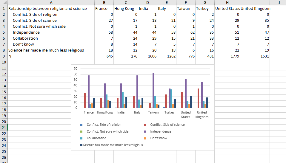

Luckily, we knew what we hoped to communicate with this project since the proposal. We were wrong on some of our initial hypothesis, but the end message stayed the same. Initially we thought that older age would be a predictor higher religiosity or belief in God or the divine, but it was the opposite. Through the RAAS dataset we discovered that younger academics are stating more belief in religion than their older peers. This could indicate a potential shift in attitudes towards religion in the scientific community. Additionally, rather than any other demographic, the biggest predictor in a scientist’s religious belief stems in their family’s religiosity and how important it was to the family.
Design Process
In the process of transforming our data on the religious and spiritual beliefs within the scientific community into a comprehensive infographic, we adopted a design approach centered around Lankow et al’s principles for good infographics: utility, soundness, and attractiveness. In alignment with Lankow et al’s first principle, we went with a narrative approach to encourage viewers to be more informed on the topic and to prevent misconceptions on religion and science to continue to spread. The infographic takes the viewer through the data in a storylike format. We selected two datasets from credible sources to ensure that the information is sound.
Initially, we used tableau to conceptualize how our data could be visualized effectively and attractively. This step was crucial for envisioning the layout and deciding on the visual encodings that would best represent our findings. We specifically focused on expressiveness and effectiveness, ensuring that our visualizations clearly communicated the data’s nuances without oversimplification or distortion.
Our design principles were heavily influenced by the concepts of utility, soundness, and beauty. Utility was priority, guiding us to choose visual encodings and layouts that made the information accessible and easy to understand for our audience. For example, we used pie charts to depict the range of the significance of religious upbringing among scientists, employing a colour gradient to signify varying levels of conviction. This choice allowed viewers to quickly grasp the distribution of beliefs within the scientific community.
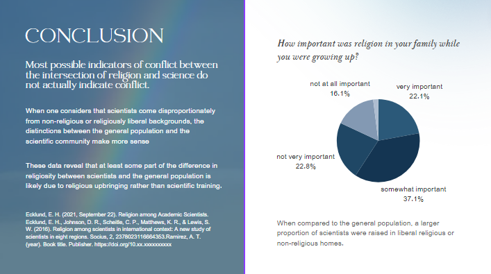
Soundness was addressed by carefully curating our data sources and representations to avoid misleading interpretations. Our infographic includes precise labels and annotations to ensure that viewers can trust the information presented. For instance, when illustrating the perceived conflict between religion and science, we provided context about the geographical and cultural diversity among scientists to underscore that perceptions of conflict are not uniform.
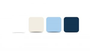
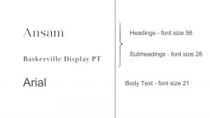
Lastly, we focused on the attractiveness of our infographic. Recognizing the power of aesthetics to draw and retain viewer attention, we selected a colour scheme and typography that were pleasing to the eye while enhancing readability and understanding.
Story
Our hope is that this information visualization can tell a story about religious and spiritual beliefs in the scientific community and reduce widespread misconceptions. In particular, we seek to challenge prevailing notions that science and religion are inherently at odds. By examining global patterns of religious belief among scientists, we aim to debunk oversimplified claims regarding the correlation between atheism and scholarly credibility. Our objectives encompass highlighting the multifaceted nature of faith and spirituality, emphasizing the diversity of perspectives within scientific discourse, and underscoring the complex array of factors influencing individual beliefs.
Pros and Cons of the Information Visualization
Pros
By using straightforward visual elements like bar and pie charts, our design makes complex datasets understandable at a glance. This clarity ensures that viewers, regardless of their familiarity with the subject matter, can follow the narrative thread from the prevalence of belief in God among scientists to the impact of religious upbringing. Even though some audiences don’t have any knowledge about religion and science, they can still understand all diagrams.
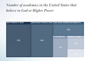
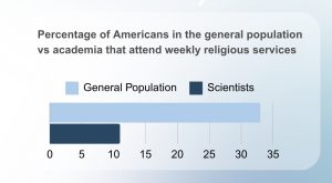
The visual design allows for easy comparison between different data points, such as comparing beliefs across different countries or the impact of scientific work on religious beliefs. This comparative aspect is crucial for deriving analytical insights and understanding broader patterns within the scientific community.
Cons
If experts or students seeking deep, detailed analyses might find the infographic format somewhat limiting. While effective for storytelling and initial insights, it may not provide the depth required for a comprehensive academic or professional examination of the data. Given the static nature of infographics, our design lacks interactive elements that could allow viewers to explore the data more dynamically. Interactivity could enable users to delve into specific areas of interest, examine underlying data, or understand the variability within the data more deeply.
Works Cited
Ecklund, E. H. (2021, September 22). Religion among Academic Scientists.
Ecklund, E. H., Johnson, D. R., Scheitle, C. P., Matthews, K. R., & Lewis, S. W. (2016). Religion among scientists in international context: A new study of scientists in eight regions. Socius, 2, 2378023116664353.
Ecklund, E. H., & Scheitle, C. P. (2007). Religion among academic scientists: Distinctions, disciplines, and demographics. Social problems, 54(2), 289-307.
Lankow et al. (2012). Infographics: the power of visual storytelling. John Wiley & Sons.
Munzner, T. (2015). Visualization Analysis and Design. Boca Raton, FL: CRC Press. https://doi.org/10.1201/b17511
Ware, C. (2008). Visual Thinking for Design. Burlington, MA: Morgan Kaufmann.
Hi both,
This is a super interesting and valuable topic, thank you for the presentation and slides! This project excels at incorporating a narrative guide to the data and really helps bring the whole thing together in an easy-to-follow format!
In terms of a readily implementable fix for this project, I’d like to recommend a change to the hues of the INFOVis! Two graphs in particular I believe could be altered, Number of academics in the United States that believe in God or Higher Power and How important was religion in your family while you were growing up? While it may interfere with the color scheme of the presentation, it follows Muzner’s data vis order for categorical attributes. Implementing different hues can make it especially easier for individuals who may be color blind, and also aid in making the differences more distinguishable for said audiences.
Best of luck in the rest of term!
Hi Naomi and Brandon!
I apologize for sending this in rather late. I really appreciate the presentation! It makes it super simple to follow along, I feel like you had a very clear direction in how you wanted the presentation to go, and you’ve succeeded in telling a story!
As for recommendations, there are adjustments that might help with readability. The font used in the second slide for “Particularly in Western Society…” slide is a little too thin to see, especially with the font colour and bg colour being similar in hue. The serif font having a thin point seems to meld the word and the background together. Maybe bolding the font, making the font colour darker or changing the font to a different serif might help with this. I would also try to use a contrasting pallete to create more contrast! As pretty as the blue is, I find that it is hard to distinguish in the 3rd slide.
Overall, great work!