By Madison Stiver, Amelia Liza-Carre, and Jane Diokpo
Link to our website: https://stopthecrisis.my.canva.site/
Objectives:
As of 2023, there were about 2400 homeless people living in Vancouver. For this report, our aim is to use effective visualizations in order to show how ineffective certain government policies are in alleviating the current homeless and housing crisis in Vancouver (as both correlate). The government is inserting billions of dollars into certain policies that are meant to assist the homeless but in actuality, they are not doing anything for our homeless population. We are able to clearly see that these policies are not working because the homelessness count is only increasing. Using information visualizations, we plan to create an interactive dashboard aimed at policy makers (and any interested public members) to better inform them on this issue and to influence how they pivot their current strategies. This dashboard will visualize data related to housing prices, policy or initiative interventions, homelessness rates, and demographic information to tell a compelling story about the state of housing in BC. By presenting data in an accessible and interactive format, utilizing visualization to sway perspectives and answer the right questions, we aim to highlight areas where initiatives may be falling short or where they are succeeding (Munzner, 2015).
By employing a visual analytics tool, this project will provide explorations of complexly organized datasets, allowing users to interact with the data to uncover trends, correlations, and insights that may not be immediately apparent. This approach aims to support evidence-based decision-making and encourage a shift in initiative focus towards areas needing the most aid, such as homelessness and vulnerable demographics. By making this information more visible and easily digestible, this InfoVis project aspires to inform, influence, and instigate change towards better housing initiative solutions in BC.
Data we used:
For our project, all data we used required cleaning and reorganizing in Excel sheets before usage on Tableau. We tried to stay within 2013 to 2023 as a designated time period of study to provide enough width to see more changes as well as stay as current as possible.
We utilized data of four government policies with the highest funding and the year of their introduction (within the designated time period we were examining), such as:
Building BC: Community Housing Fund (Government of British Columbia, 2024) in 2019
- Announced to provide funding for affordable rental homes for middle-income families, seniors, and people with disabilities. In addition to the $2-billion financing from the Government of Canada, BC Builds is supported through an investment of $950 million from the Province to ensure units are available at below-market rates, as well as $2 billion in provincial low-cost construction financing.
- Funds: $5 Billion
Temporary Rental Supplement (Government of British Columbia, 2020) in 2020
- Launched to provide temporary rental support to tenants experiencing financial hardship due to the COVID-19 pandemic. $300 per month for eligible households with no dependents and $500 per month for eligible households with dependents.
- Funds: $5 Billion
BC HousingHub (BC Housing, n.d.) in 2021
- Expanded to facilitate more partnerships with the private sector and non-profit organizations to develop affordable housing.
- Funds: $2 Billion
Indigenous Housing Fund (Government of British Columbia, 2023) in 2021
- Increased investment to support the construction of affordable housing units for Indigenous peoples both on and off reserves.
- Funds: $1.8 Billion
We utilized data of rent increase in Vancouver from 2013 to 2023 (Canadian Mortgage and Housing Corporation, n.d.). We wanted to see how rent has increased over time to better gauge the effectiveness of government policies since they were introduced.
We utilized data of homeless increase in Vancouver from 2013 to 2023 (City of Vancouver, n.d; BC Non-Profit Housing Association & Urban Matters CCC, 2018.). We wanted to confirm our assumptions that homeless rates, compared to similarly increasing rent prices, have yet to slow down.
We used data of Indigenous population in Vancouver as well as Indigenous homeless population in Vancouver from 2013-2023 (City of Vancouver, n.d.). We wanted to examine this demographic as according to Lupick and Mauboules, “39% of [homeless] survey respondents identify as Indigenous compared to 2.3% of population [and] Indigenous people are 18 times more likely to be homeless than non-Indigenous people” (Lupick & Mauboules, 2023). These data sets were compared between each other to show how homelessness in an otherwise stagnant Indigenous population has fluctuate constantly, with an affinity for increasing overtime.
The Tools:
Prior to the data collection step, we decided on using data that was provided by the BC Government, Canadian Government, and the City of Vancouver websites. This ensured that the data we collected would be reliable and consistent. As we collected the data, we noticed that the scope of our study, and the questions we were asking, were too broad. Instead, we decided on focusing on smaller sets of data. We used Excel to organize, clean, and put together all the data that we would be using to create our visualizations.
As the majority of the data was separated by year we combined the data we would be using for each theme under separate excel sheets. Once the data was cleaned, we brainstormed on what our final visualizations would look like, we did so by making drawings of our different ideas and how we could use the data we had collected.


Figure 1. & 2. Initial drafts of potential visualizations
Once we discussed our potential graphs, we decided on what and how the data we collected could be used. We decided on having a graph to represent the increasing homeless crisis in Vancouver, one to represent an increase in rent prices, which policies have the largest funding and when they were implemented, as well as looking into what groups are being most affected by this crisis.
In order to create the graphs, we used Tableau Desktop. We chose to use Tableau Desktop as we were more familiar with creating interactive visualizations here. As we wanted to present our visualizations in a way that allowed the viewer to follow a story, one that we wanted to convey with empathy, we chose on building a website that allowed the viewer to follow along, as well as we were able to include text that allowed us to speak on this topic and draw our own conclusions from the graphs we had created.
Analytic Steps:
After we had cleaned our data and brainstormed our initial drafts of the visualizations, we knew we wanted to analyze the policies that are set in place in Vancouver, BC. to alleviate the homeless crisis. The four policies chosen were the Temporary Rental Supplement implemented in 2020, Building BC implemented in 2013, BC Housing Hub implemented in 2021, and the Indigenous Housing Fund implemented in 2021. The reason why we chose to focus on these specific policies is because these have the largest funding from the government.
Furthermore, we chose on focusing on what seems to be one of the largest contributing factors, the lack of affordable housing. We demonstrated this by having a graph that depicted the rent prices increasing in Vancouver per year, besides the amount of people per year identifying as homeless. This allowed us to demonstrate that both of these are increasing.
Additionally, we believed that by touching on this subject we had to look into whether any BIPOC groups were affected by this crisis disproportionately. Whilst we were collecting the data we found that Indigenous Peoples were being affected by this crisis, and this percentage was increasing by nearly every year.
Design Process:
After we had collected all of our data, we each individually worked on visualizations that were assigned to us. The goals for our design process were to create visualizations that told a story. We made sure that we followed Schwabish and Feng’s “Do No Harm Guide” and Munzner’s expressiveness and effectiveness principles. Following Munzner, we made sure that we used the correct expressive type to show our ordinal and categorical data across all visualizations (Munzner, 2015). We further made sure that the effectiveness principle was followed by using one of the most effective attributes each time (Munzner, 2015). When choosing the hues for our visualizations, we made sure that it did not look like we were taking “a racially equitable approach” while also offering “sufficient contrast between colors for readers with vision difficulties” (Schwabish & Feng, 2021). For our first visualization of homeless count, we decided to use a striking red hue in order to get across that we need to act on it. For the three other visualizations, we chose to use colours from the Flag of Vancouver as we thought that it was very fitting and the colours did have a large contrast (Schwabish & Feng, 2021).

Figure 3. “Flag of Vancouver.” Wikipedia, Wikimedia Foundation, 4 July 2023
We decided to show our data, all utilizing Tableau, using a variety of different plots. In total, we made four visualizations as we thought that was a sufficient amount of visualizations to get our points across. We made one scatterplot, two line graphs, and one bar graph. We decided to make two line graphs as they are able to show growth over time most effectively.
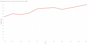
Our first graph is a line graph that shows homeless count in Vancouver over the years. We chose to use a line graph as it is a simple, yet effective way of showing growth over time. You can see that the amount increases by about 800 people in 10 years. We did not want to crowd this graph as it is important to show everyone exactly what is going on in terms of the amount of homeless people in Vancouver.

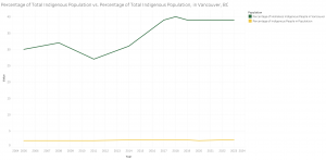
Our second graph shows the percentage of Indigenous People in Vancouver vs. the percentage of Indigenous People in Vancouver that are homeless. For this graph, we were able to collect data from 2005 to 2023 which is better to see the growth overtime. From the scale of this graph, you are clearly able to see how much of a difference it is between the amount of homeless Indigenous people in Vancouver vs. the amount in the total population.

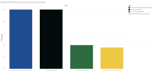
Our third graph shows the policies of Vancouver against how much the Government has spent on them. We wanted to utilize a bar graph for this data as it is clearly able to show how much the Government has spent on various policies throughout the years.

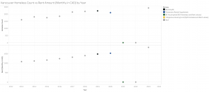
Our fourth graph combines our first and third graphs which are showing the homeless count along with the policies of Vancouver. While showing a comparison between these two things, it also compares the monthly rent amount by year. This graph shows what policies were in place and how that affects or doesn’t affect the rent amount per month. We thought that a scatterplot would be the most effective to show the two different graphs and how they compare.

The Story:
Our project narrates the impact of governmental housing policies on affordability and homelessness in Vancouver from 2013 to 2023. We analyzed the largest funding initiatives, like the Building BC: Community Housing Fund and Temporary Rental Supplement, assessing their introduction and financial contributions to the housing sector. Our data, meticulously cleaned and organized in Excel before visualizing in Tableau, highlights the evolution of rental prices and homeless rates. To see the policies’ impact on a demographic, we also examined the Indigenous population’s homeless rate as they are the most likely to be homeless. This demographic, experiencing a disproportionately high rate of homelessness, offers a critical lens to evaluate policy effectiveness against the backdrop of rising living costs and general homelessness in Vancouver.
Pros:
Our first graph utilizes a line chart. This clearly shows the rise of homelessness in Vancouver from 2013-2023 in a way that is easy for viewers to follow and is in red to indicate urgency to viewers. The second graph also utilizes a line graph to contrast Vancouver’s stagnant Indigenous population to its constantly fluctuating and increasing Indigenous homeless population from 2013-2023. The third graph is a bar chart to show the differences in funding by year, all showcasing Billions in funding (that has had little alleviation on the crisis). For the fourth graph, it is a scatter plot graph and homeless increase as well as housing rent increase are split side by side to show correlations between the two. The policies by year have also been added to see how much impact they made since being introduced. For the second, third and fourth graphs, hues (sourced form Vancouver’s flag) have been used to differentiate the marks and color keys have been included to filter through the graph more easily.
Cons:
The main issue we encountered was in creating the fourth graph. Due to 2021 and 2022 lacking homeless and rent values from our datasets, it was a lot harder to guage how much impact the policies (BC HousingHub and Indigenous Housing Fund) for 2021 had.
Additionally, it proved complicated to find other policies with extensive imformation that suited our criteria, such as years they were implemented as well as having a high amount of funding. This is because most sources, especially the BC and Vancouver government, typically do not archive their initiatives properly all in one accessible resource.
References:
Applications open for temporary rental supplement. Government of. (2020) https://news.gov.bc.ca/releases/2020MAH0050-000669#:~:text=%E2%80%9CTogether%20with%20the%20other%20provincial,for%20eligible%20households%20with%20dependents.
BC Builds will deliver thousands more homes with Canada contribution. Government of British Columbia. (2024) https://news.gov.bc.ca/releases/2024HOUS0007-000232#:~:text=In%20addition%20to%20the%20%242,provincial%20low%2Dcost%20constru
“Flag of Vancouver.” (2023). Wikipedia, Wikimedia Foundation, en.wikipedia.org/wiki/Flag_of_Vancouver.
Homeless count. City of Vancouver. (n.d.) https://vancouver.ca/people-programs/homeless-count.aspx
HousingHub Program Overview. BC Housing. (n.d.). https://www.bchousing.org/projects-partners/housinghub#:~:text=process%20%2D%20benefiting%20everyone.-,Funding,homes%20for%20middle%20income%20families
Lupick, Dustin, and Celine Mauboules. Presentation – 2023 Homeless Count, Vancouver, 31 Oct. 2023, council.vancouver.ca/20231031/documents/regu20231031p1_2023_Homeless_Count.pdf.
More than 1,000 new affordable homes coming for Indigenous people. Government of British Columbia. (2023). https://news.gov.bc.ca/releases/2023HOUS0166-001896#:~:text=The%20IHF%20provides%20approximately%20%241.8,open%20or%20underway%20throughout%20B.C.
Munzner, T. (2015). Visualization Analysis and Design. Boca Raton, FL: CRC Press. [Available online as an e-book from UBC Library].
Schwabish, Jonathan, and Alice Feng. (2021). Do No Harm Guide: Applying Equity Awareness in Data Visualization. Urban Institute, www.urban.org/research/publication/do-no-harm-guide-applying-equity-awareness-data-visualization.
VANCOUVER HOMELESS COUNT 2018 [Report]. Urban Matters CCC & BC Non-Profit Housing Association. (2018). https://vancouver.ca/files/cov/vancouver-homeless-count-2018-final-report.pdf
Vancouver — Rental Market Statistics Summary by Zone. (n.d.). Canadian Mortgage and Housing Corporation. (n.d.) https://www03.cmhc-schl.gc.ca/hmip-pimh/en/TableMapChart/Table?TableId=2.1.31.3&GeographyId=2410&GeographyTypeId=3&DisplayAs=Table&GeograghyName=Vancouver
Your report is very thorough and I love the website you created. Your data tells a great story, it’s visually captivating, and I think having the suggestions and a call to action at the end is a really cool extra.
I know you don’t have the data regarding this so you wouldn’t be able to put it into any graphs. But it may be fulfilling to have a bit of information regarding neighbourhoods. For example, the downtown eastside and chinatown have noticeably higher rates of homelessness than most of metro vancouver. I know that Jane said the city doesn’t provide super detailed data, so it would have to be based on another source. Going further with this, there are some campaigns in the dtes fighting for more social housing/against eviction, so you could add that as a more direct call to action with the blurb about neighbourhoods above it.
These are just extra suggestions. Y’all did a great job!!
Hello,
Great work with this story. I think that your graphs and hue choices are very effective at communicating the information that you want to be seen the most. I also really like how you utilized your research to support your claims.
I might suggest fleshing out your story a little more. At the moment it feels a little short and it could be more impactful with a few more empathy-inducing sentences.
Thank you for your work!
Anna G.
Hey Jane, Amelia, and Madison,
I love the focus of your project — you chose something that is extremely relevant and concerning for our community. The homelessness crisis affects all members of the Vancouver community, and therefore crucially requires public attention.
Your graphs do a wonderful job in utilizing the concepts of expressiveness and effectiveness to highlight your findings from the data regarding the four government policies. The only thing I would suggest is considering the affective ability of your graphs to connect to viewers of Vancouver’s public and further stimulate their interest in this critical topic. This can be difficult given the serious nature of your topic. Maybe consider strong and attention-capturing titles?
Otherwise, fantastic job!
Lauren M.