Team Members: Aryan Varma, Delaney Woods, Zainab Osman
Website Link: https://urbanizationandairquality.squarespace.com
Password for website: info419
Introduction
The rapid pace of urbanization in today’s world has brought about significant changes; both positive and negative. While conventional theory suggests that urbanization leads to deteriorating air quality, our analysis challenges this notion. By examining data from four countries—India, China, Cameroon, and Cote d’Ivoire—we aim to uncover the nuanced relationship between urbanization and air quality. Our findings suggest that the impact of urbanization on pollution levels is more complex than previously assumed; with sustainability initiatives playing a key role in shaping environmental outcomes.
Objectives
Our primary objective is to enhance understanding of the relationship between urbanization and air quality by visualizing and analyzing data from multiple countries. Through interactive visualizations and the use of a static infographic, we aim to communicate key findings and insights to a diverse audience, including policymakers, urban planners, and environmental advocates. By using visual analytics tools, we seek to uncover patterns and trends that may inform strategies for sustainable urban development; ultimately leading to improved air quality.
Description of the Dataset
We obtained data on air quality from the World Health Organization (WHO) for the years 2010 to 2019. Additionally, we collected population data for India, China, Cameroon, and Cote d’Ivoire from the United Nations (UN). This allowed us to analyze the relationship between urbanization and air quality by comparing pollutant levels with the share of the population living in urban areas.
The air quality data provided by the WHO included measurements from monitoring stations located in urban and rural areas across the selected countries. These measurements were recorded at regular intervals, allowing us to analyze temporal trends and spatial variations in pollutant levels. We conducted thorough data cleaning and preprocessing to address any inconsistencies or missing values, ensuring the integrity of our analysis.
Furthermore, the population data from the UN provided valuable context for interpreting the air quality trends observed in our analysis. By tracking changes in urban population shares over time, we were able to assess the impact of urbanization on air quality within each country. This interdisciplinary approach enabled us to uncover nuanced patterns and relationships that would not have been apparent from analyzing either dataset in isolation.
Design Process and Principles
Throughout the design process, we adhered to a set of guiding principles aimed at creating informative, engaging, and visually compelling visualizations and an infographic. Our approach was informed by principles of expressiveness & effectiveness, ensuring that our deliverables effectively communicated key insights while catering to the needs and preferences of our target audience.
Expressiveness: Our visualizations and infographics were designed to be expressive, conveying complex data and insights in a clear and engaging manner. We utilized a variety of visual elements, including charts, graphs, maps, and illustrations, to effectively communicate trends, patterns, and relationships within the data. By incorporating rich visual imagery and intuitive design elements, we aimed to capture the attention of our audience and convey the significance of our findings.
Effectiveness: Effectiveness was a central consideration in our design process, as we aimed to create visualizations and infographics that effectively communicate key messages and insights. We carefully selected visualization techniques and design elements that aligned with the objectives of our project, ensuring that our deliverables accurately represented the underlying data and facilitated comprehension and interpretation by our audience. Through iterative design and testing, we refined our visualizations to optimize clarity, readability, and impact.
Utility: To incorporate the concept of utility into our infographic, we strategically used our acquired data to inform our readers of the connection between urbanization and air pollution. By incorporating numerical quantities in our infographic, we hope our audience can gain a clear understanding of the scale and magnitude of the issue.
Attractiveness: Our infographic aims to incorporate an effective and eye-catching colour palette that is representative of the subject matter. Additionally, our layout is separated in sections which we hope aids our audience in following the story through an expected sequence.
Description of Tools used
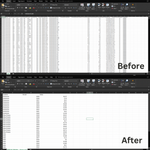
In the data collection phase, we employed Microsoft Excel to compile and organize our dataset. Gathering information from reputable sources such as the World Health Organization (WHO) and the United Nations (UN), we meticulously inputted data into Excel spreadsheets, ensuring accuracy and consistency.

Figure 1: Our dataset on Excel.
During the initial brainstorming and sketching phase, we utilized traditional pen and paper to outline ideas for visual representations of our data. These sketches served as a preliminary guide for our visualization design process.

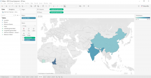
Figure 2: Our Visualization on Tableau
Once our dataset was prepared, we utilized Tableau Desktop for data analysis and visualization creation. Tableau allowed us to manipulate and analyze our dataset effectively, assigning appropriate attribute types and creating dynamic visualizations that captured key insights. We utilized online resources to learn new functions within Tableau, such as customizing mark types and color palettes, enhancing the expressiveness and effectiveness of our visualizations.
After completing our visualizations in Tableau, we chose to embed them into a website for our final product. We selected Squarespace as our website-building platform for its user-friendly interface and seamless integration capabilities. By embedding Tableau visualizations into our Squarespace website, we maintained interactivity and provided viewers with a guided narrative through our visual story.
In addition to Tableau Desktop, we used Tableau Prep for data cleaning and preparation. Tableau Prep provided advanced data cleaning and formatting capabilities, ensuring that our dataset was optimized for analysis in Tableau Desktop.
Finally, for the creation of the static infographic, we utilized Canva. Canva’s intuitive drag-and-drop interface allowed us to design a visually appealing infographic that effectively communicated our insights to a wider audience.

Figure 3: Our infographic on Canva
Analytic Steps
Our analytical process involved several key steps aimed at uncovering insights and patterns within our data. These steps consisted of data cleaning, exploration, visualization design, and interpretation, allowing us to derive meaningful conclusions about the relationship between urbanization and air quality.
- We began by gathering air quality data from the World Health Organization (WHO) and population data from the United Nations (UN) for India, China, Cameroon, and Cote D’Ivoire for the years 2010 to 2019. This involved compiling data from multiple sources and ensuring consistency and accuracy. In Microsoft Excel, we conducted thorough data cleaning, addressing missing values, outliers, and inconsistencies to prepare the dataset for analysis.
- With the cleaned dataset, we performed our data analysis to gain a deeper understanding of the variables and their relationships. Using statistical measures, visualization techniques, and Tableau’s data profiling features, we identified trends, patterns, and potential correlations within the data. This phase of analysis allowed us to formulate hypotheses and guide our visualization design process.
- Using Tableau Desktop, we designed interactive visualizations that effectively communicated key insights about urbanization and air quality. We created a variety of visualization types, including choropleth maps, line charts, scatter plots, and bar graphs, to highlight spatial and temporal trends in pollutant levels and population growth. Through iterative design and feedback, we refined our visualizations to enhance clarity, readability, and impact.
- As we analyzed the visualizations, we interpreted the patterns and trends observed to generate actionable insights about the relationship between urbanization and air quality. We considered contextual factors such as government policies, economic development, and environmental regulations to contextualize our findings and draw meaningful conclusions. This process of interpretation involved critical thinking and domain expertise, as we sought to uncover the underlying drivers of changes in air quality over time.
- Finally, we transferred our findings into a cohesive narrative, incorporating visualizations, data summaries, and contextual information into our final deliverables. Through interactive dashboards, a website, an infographic, and a written report, we communicated our insights to a diverse audience, including policymakers, urban planners, and environmental advocates. We emphasized the importance of sustainable development practices in mitigating air pollution and fostering healthier urban environments.
Storyline
Urbanization is the process through which an increasing proportion of a population comes to live in cities and urban areas, leading to the growth and development of cities in various countries. It is often accompanied by the expansion of industrialization, economic development, and technological advancements. As cities expand into bustling centers of commerce and innovation, the allure of urban life draws in migrants seeking opportunities and a better quality of life. Yet, amidst the glittering skyscrapers and bustling streets lies a serious problem – air pollution. The stark reality is that urbanization, while driving economic progress and societal advancements, often comes hand in hand with a dark cloud of pollution that permeates the very air we breathe. The expansion of industrialization and the reliance on fossil fuels for energy generation propel emissions of harmful pollutants into the atmosphere, casting a shadow over the urban landscape in many countries. As our cities swell in size and population density, the train on transportation methods intensifies, which unleashes a flood of vehicular emissions from automobiles using gasoline. The incessant hums of construction machinery echoes through urban corridors, leaving clouds of dust and debris that further degrade air quality. According to the United Nations Economic Commission for Europe (n.d.), air pollution in urban areas claims the lives of 7 million people per year.
Therefore, we aim to shed light on the hidden costs of unchecked urbanization in our infographic and overarching project to raise awareness about the dangerous path of non-sustainable growth in four countries. Our storyline began with a comprehensive dashboard analysis using Tableau, encompassing all selected countries (India, Cameroon, China, and Cote d’Ivoire). This initial visualization presented a map depicting air pollution rates spanning from 2010 to 2019, providing an overarching view of the trends across these nations. Building upon this overview, our subsequent visualization was a detailed dashboard focusing on each country individually, with a spotlight on the years 2011, 2015, and 2019. This closer examination allowed us to discern nuanced variations in air pollution levels within each country over time. Finally, our last visualization showcased the urban population share for each country from 2010 to 2019, revealing a consistent upward trend across all nations. This progression of visualizations provided a layered understanding of the complex relationship between urbanization and air quality, highlighting the evolving dynamics over the past decade.
Evaluation of Design
Pros
- One of the key strengths of our approach was the comprehensive analysis of air quality and urbanization data across multiple countries. By examining data from India, Cameroon, China, and Cote d’Ivoire, we gained a holistic understanding of the global dynamics at play, allowing for more nuanced insights into the relationship between urbanization and air quality.
- Using Tableau for visualization design enabled us to create interactive dashboards that engaged our audience and facilitated the exploration of the data. The interactive nature of the visualizations encouraged users to delve deeper into the data, uncovering patterns and trends that may have otherwise gone unnoticed.
- Our approach prioritized contextual understanding, weaving together data analysis, visualizations, and contextual insights to provide a comprehensive narrative. By considering factors such as government policies, economic development, and environmental regulations, we were able to contextualize our findings.
Cons
- One of the main challenges we encountered was technical difficulties in embedding visualizations onto our website. Despite Squarespace’s user-friendly interface, we faced limitations and formatting issues that required time-consuming troubleshooting and experimentation to resolve. This hindered the seamless integration of visualizations and impacted the user experience on our website.
- Another limitation of our approach was the reliance on available datasets, which may have been incomplete or inconsistent. While we aimed to gather data from reputable sources such as the World Health Organization and the United Nations, there may have been limitations in data coverage or accuracy that affected the robustness of our analysis.
- As with any data analysis project, interpreting the findings and drawing meaningful conclusions from the data presented its own set of challenges. Balancing statistical insights with contextual understanding required careful consideration and expertise, and there may have been limitations in our ability to fully capture the nuances of the relationship between urbanization and air quality.
Conclusion
In our analysis, we discovered a trend that challenged conventional assumptions about the relationship between urbanization and air quality. While population density showed a correlation with air pollution levels, the impact of urbanization itself did not align with our expectations. Contrary to the notion that rapid urbanization inevitably leads to deteriorating air quality, our findings revealed a different narrative.
Countries such as China, India, Cameroon, and Cote d’Ivoire experienced high pollution rates during the initial phases of urbanization. However, as urbanization continued and cities pursued more sustainable development projects, we observed a decline in total pollution levels. This trend suggests that urbanization, when accompanied by eco-friendly policies and sustainable infrastructure, can actually contribute to improved air quality. The shift towards sustainable urban development initiatives, aimed at reducing carbon emissions and minimizing environmental impact, played a significant role in mitigating pollution levels. Investments in public transportation, green spaces, renewable energy sources, and waste management systems have helped to create healthier and more livable cities.
Our findings highlight the importance of proactive measures and policy interventions in shaping the environmental outcomes of urbanization. By prioritizing sustainability and environmental stewardship, cities can harness the potential of urbanization to create cleaner, healthier environments for their residents. Moving forward, it will be crucial for policymakers, urban planners, and environmental advocates to continue prioritizing sustainable development practices. By fostering collaboration and innovation, we can build resilient and thriving cities that prioritize both human well-being and environmental sustainability.
References
Airqoon. (n.d.). Urban Air Pollution: Sources and Pollutants. https://airqoon.com/resources/urban-air-pollution-sources-and-pollutants/
Clean Air Fund. (n.d.). Yaounde and Air Pollution. https://www.cleanairfund.org/clean-air-africas-cities/yaounde-and-air-pollution/
He, G., Pan, Y., & Tanaka, T. (2020). The short-term impacts of COVID-19 lockdown on urban air pollution in china. Nature Sustainability, 3(12), 1005-1011. https://doi.org/10.1038/s41893-020-0581-y
IEA (2021, May). Air quality and climate policy integration in India. https://www.iea.org/reports/air-quality-and-climate-policy-integration-in-india
Liang, L., Wang, Z., & Li, J. (2019). The effect of urbanization on environmental pollution in rapidly developing urban agglomerations. Journal of Cleaner Production, 237, 117649. https://doi.org/10.1016/j.jclepro.2019.117649
Ren, X., & Princeton University Press Complete eBook-Package 2020. (2020). Governing the urban in china and india: Land grabs, slum clearance, and the war on air pollution (1st ed.). Princeton University Press. https://doi.org/10.1515/9780691203416
(n.d.). UN Health agency warns of rise in urban air pollution. https://www.un.org/sustainabledevelopment/blog/2016/05/un-health-agency-warns-of-rise-in-urban-air-pollution-with-poorest-cities-most-at-risk/
World Health Organization. (2016, May 16). Air pollution levels rising in many of the worlds poorest cities. https://www.who.int/news/item/12-05-2016-air-pollution-levels-rising-in-many-of-the-world-s-poorest-cities.
Hello, I am impressed by your website and the report is very detailed! Something you guys did really well is using Tableau for interactive dashboards and Canva for the static infographic has resulted in visually engaging and informative outputs. The interactive elements offer users a hands-on opportunity to explore the data further, enhancing the learning experience. The only thing I suggest is deepening the discussion around policy implications and specific sustainability initiatives could further enrich your narrative for the infographic.
I’m so impressed by your group’s project! The report is detailed and you included many InfoVis’ to present your points and paint a story. I like the idea of having both a static infographic and interactive data visualizations to compliment one another and reach wider audiences. One thing I’d potentially include, just as a short addition to your data overview page would be to explain the ways that COVID-19 had on pollution. You could even use a scholarly article to explain the COVID-19 changes. I also just have some comments on the design choices of your infographic. These are not major changes and overall I like your colour palette and design, but making these small tweaks could make your final product look more cohesive, accessible, and attractive. First, I would think about the potential future of the infographic. If it were to be published publicly online one day, the infographic alone might be reshared and this would mean that the works cited section might be left out. Second, it would be ideal to keep the icons or illustrations cohesive. I’ve noticed that some of the illustrations in the infographic have thick lines while some of them, like the car, have no lines. Pick one or the other. Also, if you decide to go with the illustrations with lines, like the second factor illustration, make sure that all of the illustrations you select have similar sized line widths. The third feedback I have would be to implement more graphs and data charts onto your infographic. For example, rather than to write down changes in urbanization as a sentence, you could incorporate a stacked line graph comparing China and Cote D’Ivoire from 2010 to 2023. Other than that, I think it looks perfect!