By Lakshanyaa Ganesh and Aarthi Krishnan Sharma
Tableau Links:
Dashboard 1 (click for interaction):
Dashboard 2 (click for interaction):
Canva Infographic (volume up!):
Background and objectives
Presently, Spotify publishes listening statistics for the past year through Spotify Wrapped at the end of every year. It presents data of the individual user, covering parameters such as Top Artist, Top Genre, and Top Song to name a few. It also does the Artist Wrapped, which tells artists how much their music has been listened to. The parameters that we discovered in this data set were unique and more niche, such as the number of playlists the song was added to on Spotify, Apple Music, Shazam, and Weezer, as well as the number of times it charted on each of those platforms. We wanted to focus our analysis on Spotify and examine the correlation between the total number of streams of a song and the number of playlists it has been added to, and also if the month and/or day that songs are released play any role in how popular they become.
We wanted to support the production of new knowledge and communicate these trends through the data as it presently stands. Since this data is not readily available to the public, we hope that our current visualizations will be interesting and engaging for our audience of Spotify users who are very interested in and engage with Spotify Wrapped to learn more about the listening patterns of the world. According to the levels of interaction as described by Heer in “Interactive Dynamics for Visual Analysis”, we are hoping that those interacting with our visualizations can participate in high level interaction, where they discover trends and connections between data through our Tableau dashboard, and also are presented the information in an eye-catching, enjoyable way through our static Canva infographic (2012, p. 2).
Details of the dataset
We used the dataset “Most Streamed Spotify Songs [in] 2023, which we found on the open source data website “Kaggle”. It is most likely derived from Spotify API (Spotify’s platform for developers), thoughit was difficult to find the exact source of the data. This kind of data, especially the more niche parameters available through the dataset, is not readily available in the public realm, It can therefore be relatively safe to assume that the data has been extracted from Spotify by the publisher. The data also has a usability score of 10 out of 10 on Kaggle. This additionally includes scores on its completeness, credibility and compatibility. We also found that the publisher of the dataset is a data scientist who has published many other reliable datasets on Kaggle. These factors confirmed the validity of the data to use for our visualizations.
The file has 943 unique entries, with 24 parameters. Apart from the attributes “track_name”, “artist(s)_name”, “key”, and “mode”, all of which are strings, the rest of the attributes are integers. We were able to manually clean the few instances of wrongly formatted data and also were able to run it through Tableau Prep to confirm that the dataset as a whole is valid. Out of all the available attributes, we only used a few: track_name, artist(s)_name, “released_year”, “released_month”, “released_day”, “in_spotify_playlists”, and “streams”. For the sake of this project, we decided to use the top 250 entries by streams.
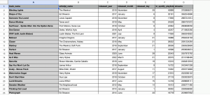
A snapshot of our cleaned data
In terms of the data itself, we found that a key weakness was in the fact that the data was cumulative. Since the data shows how many streams and how many playlists a certain song has accumulated since its release, it makes sense that songs released prior to 2023 have more streams. It would have been more beneficial and more fair of a visualization if streams were counted per year.
Tools: strengths and weaknesses
Tableau proved to be a very useful tool in exploring this dataset. Due to the size of the dataset, Tableau proved to be useful in allowing us to adjust and modify the parameters, as well as view and analyze individual data points in the views that we created. The brushing and linking feature in particular helped us in creating effective interactive dashboards. As we are relatively new to using Tableau, this was slightly difficult to implement at the beginning, where we did not include our switch as one of the parameters in Dashboard 2, so the sheets were not linked as we wanted. We were eventually able to achieve the effect that we wanted, but it took a lot of trial and error within the software. A shortcoming of Tableau in this sense is that it is a very complex software that is not always easy to manipulate in the exact ways that we want on the first try. However, there are not many other softwares that would allow us to deal with a dataset of this size as effectively as Tableau would.
In comparison, Canva was a lot easier to use, as both of us already had experience using it for various other purposes. It is a graphic design software that is extremely user friendly, allowing us to manipulate objects and their positions very easily. We also had a rough idea of the kind of visuals we wanted to use based on Spotify Wrapped, so we were able to implement those in a relatively straightforward manner. Since the task we had to do with Canva (summarizing findings from our dataset and dashboards) was simpler than what we had to do with Tableau, we did not run into any major issues with using this software.
Understanding our data
At the beginning of our project, we had a very good idea of what our goals with our project were, and we knew which parts of the dataset we wanted to analyze and use specifically: the track names, artists, release dates, the amount of playlists they were in, and their total streams by the end of 2023. We had a general sense of wanting to see if there were any differences between song streams versus how many playlists they were in, and if release dates had any significance or correlation to streams at all.
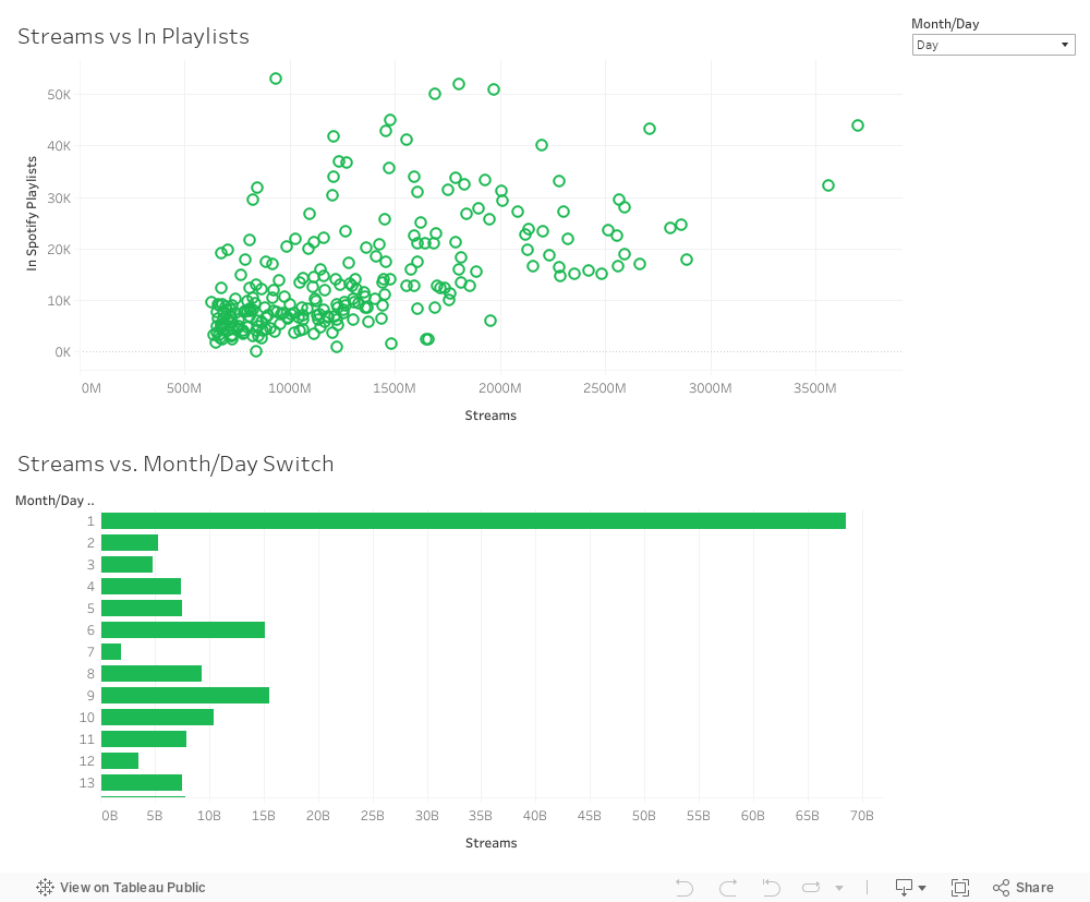
We were not able to solidify any specific patterns, however, until after we began to focus on creating visualizations to communicate the data effectively. Over the course of the project, we were more focused on communicating existing data and analyzing its trends visually as opposed to producing anything new from insights derived just by reading the dataset itself. When we began creating visualizations, we began to notice significant trends in how January seemed to be a very successful month for songs to be released, as well as the first of every month. We also found that the popularity of songs seemed to differ when comparing streams versus the amount of playlists certain songs are in – some songs might have a low number of streams but are in many playlists or vice versa.
Design process
Although we did not start our project by creating sketches, we were eager to explore Tableau, so we spent time doing trial and error with it, creating multiple different views to see what would best represent our data, and used the most relevant ones in our dashboard. We did also keep the ones we did not use in the dashboards, for us to keep track of our design process. We had a rough idea of the interactions that we wanted to create, such as linking the months and days to the individual data points of each song (Dashboard 2). Even though we did struggle with it initially, we were able to implement the brushing and linking using prior knowledge gained through the class activities and assignments.
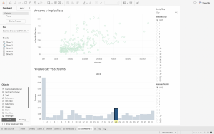
An early version of one of our dashboards
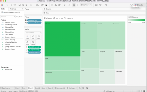
A view that we created and like but ultimately did not use
We also believe that our visualization was expressive and effective, as we attempted to match the attributes to the right kinds of data, and as a result, the most salient channels according to their importance in our visualization. According to Munzner’s ranking (Munzner, 2015), our data was encoded using the following channels:
- Month (ordinal data): Length – 1st on Munzner’s ranking
- Day, Released Year, Streams, In Spotify Playlists (quantitative data): Position – 2nd on Munzner’s ranking
- Artist Name, Song Name (categorical data): viewable through interaction of hovering
In terms of maximizing the expressiveness of our data, we picked the most important data to communicate visually: the dates of song release as well as popularity in terms of streams and number of playlists. Since all of this data is quantitative in nature, we primarily used the magnitude channel to encode all of this information. To maximize expressiveness, our visualizations still show all of the data such as track name and title when the user hovers on all of the data points, but since these attributes are categorical and there were 250 individual data points, we did not want to crowd our visualizations through expressing each individual artist and song name.
The Story
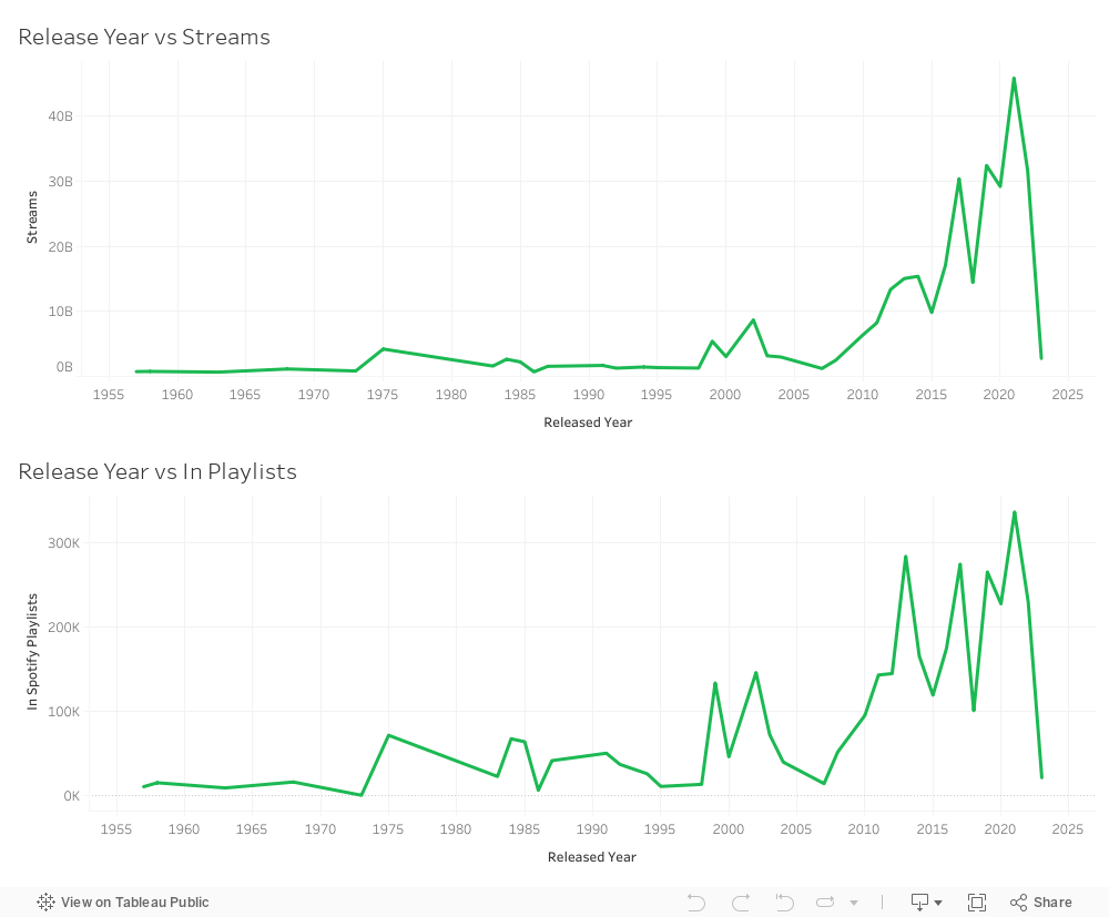
Through our InfoVis and Infographic, we want to tell the story of the most popular songs and artists on Spotify, as well as the most popular release dates (months and days) that get the most amount of streams. We also wanted to add the extra dimension of the amount of playlists songs are placed in, and if this says anything about a song’s popularity. We found that 2021 was a good year for music, with the most streams peaking that year along with the number of playlists songs from that year were saved to. As this dataset is cumulative, there are more streams for the songs that were released in earlier years as opposed to in 2023. We also found that streams do not necessarily dictate popularity, as the songs that came out in 2013, 2017, 2019, and 2021 were in the most amount of playlists.
It was also interesting to look at 2013 in particular. The number of streams in total for that year was not that high, but the number of playlists that songs from 2013 were saved to peaked. According to a Billboard article by Andrew Unterberger, the rise in popularity of streaming through YouTube music and other online platforms helped streaming platforms like Spotify to explode in use. This can be one of the reasons why songs from that year that were newly released garner more streams and gain popularity. We also found that songs released in January had the most number of streams, whereas songs released in February had the least. We also found that songs released on the first of every month had the most number of streams by a landslide, whereas songs released on the 7th had the least. The 21st and the 9th of the month were also successful release days for streams.
There are outliers to these trends, however. Blinding Lights by the Weeknd came out on November 29th (both an unpopular day and month for a song to be released) but still had the most streams and was in the most amount of playlists. Shape of You by Ed Sheeran was also an outlier song. It came out on January 6th – whilst January is a successful month for streams, the 6th is not a popular date. On the other hand, Get Lucky by Daft Punk and Wake Me Up by Avicii both came out on January 1st but did not receive many streams. Get Lucky is saved to many playlists, however, in an inversely positive relationship with the number of streams it has. The popularity of songs released in January may be due to market concerns, given that the market is significantly less saturated at this time, according to a Bandsintown article by Randi Zimmerman. They also state that January is also when people tend to be more likely to branch out in general and try new things, which applies to new music as well.
Pros and cons of our design
We feel that we have curated our views in a manner that is conducive to telling the story that we just described. The individual outliers that we mentioned are easily visible in Dashboard 2, as they are clearly distanced from the larger cluster of data points. More information about each data point, such as the track name, exact number of streams and number of playlists it is in, as well as the year, month and day it was released. The availability of this additional information allowed us to craft a more well-rounded story, which does not just point out trends and outliers, but allows the audience to view the additional factors which may have contributed to a song’s position on the dashboard. Data points like Get Lucky and September proved our hypothesis that the number of playlists a song is in is an adequate measure of its popularity, whereas songs like Someone You Loved and STAY disproved this. A main con of this dashboard was that there were 250 individual data points fit into the Streams vs. In Playlists view, which made it slightly messy to look at. However, the fact that we brushed and linked it to the Streams vs. Month/Day switch made it easier to identify trends, as clicking on the bars in this view highlighted the corresponding data points in the Streams vs. In Playlists view.
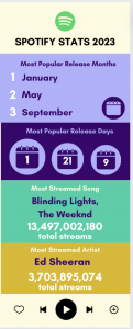
The first iteration of our infographic – too much information, too little space
Due to the fact that the data was a bit crowded on Tableau, we created the additional visual on Canva to consolidate our information and point out the important facts from our story. We started off by creating a traditional infographic, but realised soon into the process that this was not entirely conducive to the amount and kind of information we wanted to convey, as it was too cluttered and crowded. As a result, we decided to pivot to a slide format, in order to break down the information into smaller sections, for improved effectiveness and digestibility. We created this to present our story in a more visually appealing and attractive manner that we were not able to do with Tableau. Using the colour drop tool, we also used the exact hues from Spotify Wrapped 2023 to make our story look more cohesive and in line with the Spotify brand. Additionally, since we chose not to represent textual details of our data points overtly in Tableau, we chose to collate and present them here.
References
Aswad, J. (2020, July 5). The Weeknd Talks ‘American Dad,’ and What Most People Don’t Know About Him. Variety. https://variety.com/2020/music/news/the-weeknd-american-dad-what-people-dont-know-1234695111/
Capaldi. (n.d.). Lewis Capaldi. YouTube Music. https://music.youtube.com/channel/UCxrxwFTBU3DTJ9Y5TKeW7KA
Cole, R. (2024, April 7). Ed Sheeran | Biography, Songs, Wife, & Facts. Encyclopedia Britannica. https://www.britannica.com/biography/Ed-Sheeran
Elgiriyewithana, N. (2023, August 26). Most streamed Spotify Songs 2023. Kaggle. https://www.kaggle.com/datasets/nelgiriyewithana/top-spotify-songs-2023?resource=download
Heer, J., & Shneiderman, B. (2012). Interactive Dynamics for visual analysis. Communications of the ACM, 55(4), 45–54. https://doi.org/10.1145/2133806.2133821
Rubin, R. (2021, December 16). The best and worst months to release music. Bandsintown for Artists. https://artists.bandsintown.com/support/blog/the-best-and-worst-months-to-release-music
Unterberger, A. (2020, April 14). 2013 was the year that… streaming officially became Unignorable. Billboard. https://www.billboard.com/music/music-news/2013-year-of-streaming-8545169/
