By Eden Stephanson, Felicia Ye and Wenqi Zhang
Our slides are here visualizations can be found on Tableau Public here.
Objectives
The primary goal of our project is to provide clarity about the effects of the present conflict in Palestine amidst widespread disagreement about the extent of the ongoing destruction. From a high-level action perspective, we hope to aggregate and present pre-existing data on the conflict to illustrate the effects of Israel’s genocidal military campaign. We also aim to support the mid-level action of searching for patterns, such as changes in the cost of essential commodities. From a low-level action perspective, we hope the audience will be able to use patterns identified in the data to develop a better understanding of the conflict and compare the data to other sources of information to distinguish between reliable and unreliable claims more accurately.
The ultimate objective of this visualization project is to convey to the user the specific effects and scale of the humanitarian crisis that has emerged as a consequence of the conflict in Gaza. By providing a clear, data-driven picture of the situation, this project seeks to inform the public about the scope of destruction and, by identifying the most critical areas for intervention, potentially guide humanitarian efforts and policy decisions in the region.
Data We Used
We used publicly available data from the United Nations Office for the Coordination of Humanitarian Affairs’ Humanitarian Data Exchange (HDX). While HDX is a reliable and credible source of open data, it is important to note that the widespread destruction of research infrastructure in Gaza will likely result in underreporting, and the precise numbers indicated in the data may change over time as more information about the conflict is discovered. Amongst the 185 different data sets pertaining to the State of Palestine, we focused on the following:
“State of Palestine – Impact of the Escalation of Hostilities”
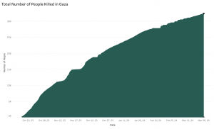
This dataset logs deaths of females, males, undefined and total people in Gaza from October 7, 2023 to March 26, 2024. It also includes information on the injured, displaced, and the total damaged housing units.
“State of Palestine – Prices of Basic Commodities in Gaza”
Data on price changes for over 30 products are documented from October 7, 2023, to February 2024. The dataset includes a variety of food items and essentials, such as rice, bread, eggs, as well as vegetables, cheese, sugar, and gas. Prices are categorized into different time frames: before October 7, after October 7, November 2023, December 2023, January 2024, and February 2024. Additionally, the dataset provides both monthly percentage changes and cumulative percentage changes, offering a comprehensive view of price trends over this period.
“State of Palestine – Internally Displaced Persons”
Data on the number of internally displaced persons (or IDPs) who sought refuge in shelters between October 7, 2023, and January 14, 2024. The dataset is broken down by region, providing a number of IDPs sheltering each day in the five governorates of the State of Palestine which make up the Gaza Strip: North Gaza, Gaza City, Deir al-Balah, Khan Yunis, and Rafah. In addition to the total number of IDPs sheltering in each region, the dataset also provides information about what proportion of the total number of IDPs are residing in government shelters versus shelters operated by the United Nations Relief and Works Agency for Palestine Refugees in the Near East (UNRWA).
The Tools
- Excel: Cleaning data
- Tableau: Creating information visualizations
- Figma: Designing more dynamic, creative presentation components
Analytic Steps
Before beginning our project, we already had a pretty good idea of what the data might look like once we created our visualizations based on our first impressions of the tabular datasets and the widespread accessibility of news coverage about the scale of destruction in Gaza. Our hypotheses were as follows: (1) that the price of all commodities would fluctuate, but that the amount of fluctuation would vary based on the type of commodity, and (2) that both the data on the number of casualties and the data on the number of internally displaced persons in would demonstrate significant increases.
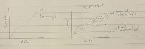
Example sketches for “Impact of the Escalation of Hostilities” dataset prior to visualizations

Example visualization ultimately made for “Prices of Basic Commodities in Gaza” dataset
Since the primary objective of our project was to inform audiences about the scale of destruction in Gaza caused by the Israel-Hamas War, we already knew that our primary goals in creating information visualizations were clear and effective communication of the data and, considering the sensitive subject matter of our project, respectful presentation of the data. Therefore, most of the analytical work consisted of experimenting with the capabilities of Tableau Desktop and trying out different idioms, whether that be a line chart or maps, that would most effectively communicate the facts in a sensitive, considerate manner. Tableau was a clear frontrunner for us in terms of info vis platforms because we were all already familiar with it, meaning it required much less of a learning curve than if we were to opt for a new platform.
Design Process
Before we started designing our info visualizations, we assigned each member of the group one of out of the three datasets to take the lead on. This allowed us to equally apportion the workload of cleaning the datasets and creating our first drafts of visualizations, since each group member would complete those steps for their assigned dataset. Consequently, this means the design process vastly differed across each member. For the sake of a simpler preview for our peers reading this blog, we’ll share the process for our “Prices of Basic Commodities in Gaza” dataset.
Firstly, the commodity names are categorical data. For the monthly change and price, these are quantitative data. Our objective is to showcase the price change from October 7th to February 2024 for different products. The most crucial aspect we aim to highlight is the price change, which constitutes ordinal data. According to the principle of expressiveness, visual encoding should accurately represent all the information in the dataset attributes. Ordinal data should utilize magnitude channels.
In line with the principle of effectiveness, the significance of the attribute should correspond to the prominence of the channel. Hence, we chose to use position to illustrate the price changes, as it is one of the most effective methods. Given the extensive range of products, our initial diagram straightforwardly lists all items in one visualization. We also employ hue to indicate prices from different times, further distinguishing the changes (Figure 1).

Figure 1. Price Change for All Commodities
Our goal is to understand the overarching price changes in Palestine post-October 7th. Therefore, we have another diagram that aggregates the cumulative price changes from October 7th to February 2024 for all commodities, showcasing only the overall percentage of price changes. Adhering to the principles of expressiveness and effectiveness, we use position to display the magnitude channel of the price percentage change. We also rank the commodities from the largest to the smallest percentage change to provide a clearer perspective on the current economic situation in Palestine (Figure 2).
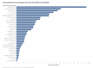
Figure 2. Accumulative Price Change from Oct 7th 2023 to Feb 2024
However, it requires considerable effort to check every product for the audience, and we still wish to analyze certain products more closely. Therefore, we randomly selected basic commodities for an in-depth review. This time, to highlight the changes, we opted for line graphs to observe the trends and movements. We chose the commodities randomly to provide detailed insights without introducing biases into the data visualization (Figure 3,4,5).
Overall, our data here is quite straightforward. Wenqi experimented with different methods of ranking them using bar charts and varying orientations, such as horizontal or vertical, to decide which grouping offers the most objective storytelling. Initially, we used paper and pen to brainstorm ideas on how we wanted to present the data, creating a draft to work from, and then implemented it using Tableau. In our design, we also aimed to show empathy, so we avoided using colors like red as the main theme, which could evoke unpleasant memories associated with this tragic event.

Figure 3. Price Change for Apples from Oct 2023 to Feb 2024
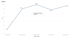
Figure 4. Price Change for Diesel from Oct 2023 to Feb 2024
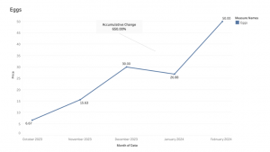
Figure 5. Price Change for Eggs from Oct 2023 to Feb 2024
The Story
On October 7, 2023, Israel and Hamas-led Palestinian militant groups engaged in an armed conflict, primarily in the Gaza Strip and its surroundings (United Nations, 2023). These attacks triggered the ongoing Israel–Hamas war, during which Israel’s bombing campaigns have led to an overwhelming number of Palestinian casualties and catastrophic damage to essential infrastructure in the Gaza Strip and the West Bank. According to Palestinian statistics, it is estimated that about 1 in every 100 people in Gaza have been killed since the war erupted on October 7 (Kottasová & Greene, 2024). Israel’s military campaign, which the International Court of Justice has recognized as an act of genocide, has precipitated a number of humanitarian crises in the Gaza Strip, including the mass killing of thousands of civilians, the internal displacement of hundreds of thousands of Palestinians, and the destruction of essential food sources and other basic commodities (Adler & Milisic, 2024).
Consequently, our infovis is a timely and sensitive piece that is meant to combat disinformation during this overwhelming flood of information and provide clarity amidst the significant emergence of disparity between international media organizations’ coverage of the Israel-Hamas war and media coverage among Israel’s allied nations in the Global North, such as the United States, the United Kingdom, and Canada. There is also a significant disparity between the sentiments on the war expressed by institutional media sources and users on social media.
In addition to informing the public, our information visualization project would also support the rapid dissemination of information about the conflict to key stakeholders, facilitating data-informed interventions to address the region’s urgent needs more effectively. In this sense, to the extent that it is plausible, our project seeks to attract those capable of providing relief to those victimized by the conflict on the ground.
Additionally, our project will also allow us to inform the public about the traumatic effects of the conflict, drawing attention to the humanitarian crisis at hand.
Evaluation of Design
Pros
Since we had multiple datasets to use for our project, our designs utilized a variety of different visualizations. This offers viewers a lot more options and streams of information, allowing them to explore and discover freely! This can also lend to our overall goal of expanding the data-driven picture of the situation, helping those with the power to make changes in policy and humanitarian efforts to clearly identify the most critical areas as quickly and effectively as possible.
Cons
Given the scope of our project, we are limited to the time frame of October 7, 2023 and beyond, meaning there is less than 1 full year of data that is collected. In addition, because underreporting is inevitable considering the nature of attempting to gather demographic data during an active conflict, some data was too stagnant or inconsistent to use. On the other hand, some of the data was so straightforward, it limited us to the creation of rather simple visualizations, which clearly demonstrated the steady increase of destruction, but which leaves room for more impactful narrative storytelling (see below).
References (APA)
Adler, N., & Milisic, A. (2024, January 26). ICJ updates: Court orders Israel to prevent acts of genocide in Gaza. Al Jazeera. https://www.aljazeera.com/news/liveblog/2024/1/26/live-icj-to-issue-preliminary-ruling-in-south-africa-genocide-case-against-i.
Humanitarian Data Exchange. (n.d.). The State of Palestine – Escalation of Hostilities [Data set]. Humdata. https://data.humdata.org/dataset/the-state-of-palestine-escalation-of-hostilities.
Humanitarian Data Exchange. (n.d.). State of Palestine – Price of Basic Commodities in Gaza [Data set]. Humdata. https://data.humdata.org/dataset/state-of-palestine-price-of-basic-commodities-in-gaza.
Humanitarian Data Exchange. (n.d.). State of Palestine – IDPs [Data set]. Humdata. https://data.humdata.org/dataset/state-of-palestine-idp-s.
Kottasová, I., & Greene, R. A. (2024, January 8). Gaza: One in 100 people has been killed since October 7. CNN. https://edition.cnn.com/2024/01/08/middleeast/gaza-death-toll-population-intl/index.html
United Nations. (2023, October 7). UNRWA situation report #1 on the situation in the Gaza Strip – question of Palestine. United Nations. https://www.un.org/unispal/document/unrwa-situation-report-1-on-the-situation-in-the-gaza-strip/