By Emily Chan, Angela Lucas, Katie Lui
Link to Figma interactive visualization here!
Link to Tableau files here!
Objectives
Tech layoffs is a commonly known recent phenomenon that mostly started in 2022 and is currently ongoing until this day (Hetler, 2024). With the tech field being more commonly known for its job benefits such as high salaries and job growth opportunities, this ongoing phenomenon significantly impacts those who are in the field or pursuing to be in the field. An example of recent outcome of these mass layoffs is Google laying off their advertisement team in favor of automation (Reuters, 2023). As a result, we had the high-level goal of sharing a story related to advancing technology and the current economy to layoffs in the tech industry. Through this goal we aimed for our InfoVis project to showcase the tech layoffs from 2021 until 2024 opting to bring insights into why it could be happening, when it started, and how it’s currently affecting the public. With the tech industry layoffs being something that is still predominantly happening, we also wanted to see if this is affected by factors such as overhiring, an increase in AI technology or an increase in AI investment (Maslej et al., 2023; Hetler, 2024). As a result, we intended to target those who are interested in gaining more insight into the ongoing tech layoffs, those who are currently affected by these ongoing tech layoffs, and those who are possibly interested in pursuing a career related to the tech industry. Overall, we wanted to tell a story on tech layoffs in relation to other continuously changing aspects within society.
Changes
As our project progressed, we found that there is limited publicly accessible data focusing on the economy and layoffs in the tech industry. We opted to supplement this through the use of data relating to overhiring and company investments on artificial intelligence (AI) to provide a picture on how much corporate and global leaders are putting importance towards this field within technology. To avoid ‘lying with charts,’ we would like to acknowledge that there could possibly be other factors with a relationship to these ongoing layoffs and learning about tech layoffs in relation to the current development of AI and AI investment is only a small part of the big picture (Schwabish & Feng, 2021).
About the data
To achieve our goals we mainly explored layoffs.fyi’s dataset, an ongoing dataset on tech layoffs since COVID-19 until as of recently (April 2024) to gain a further understanding on the progression of layoffs in the tech industry. This dataset contains information such as company, company location, numbers of people laid off, industry, country, and money raised from the layoffs. Specifically, we used this dataset on the years 2021 to 2024 to have a perspective on tech layoffs before it happened (2021) and as it started happening (2022-2024).
 Fig 1. Preview of Layoffs.fyi
Statista provides measures and research reports regarding artificial intelligence (AI) with a public database related to current research, investments, economic relations, and policy on AI from 2020-2022. We plan to use aspects of this database that has information on 2021 and 2022 to determine a relationship between AI development and investments towards ongoing layoffs in the tech industry.
HiringLab is an economic research database owned by Indeed. It provides recent job posting data around the world and we plan on using this to determine the relationship of overhiring to layoffs in the tech industry.
Tools
Our team initially had trouble harvesting data from layoffs.fyi due to it being a dataset from Airtable which we could only export as a PDF file that did not convert to a CSV properly. To combat this, we found a free and open-source data converter, Tabula, in order to convert our 2022 and 2023 dataset (consisting of 1000+ rows) from a PDF file to a CSV. With most of the data left from Tabula being easier for us to clean by converting our dataset to correct columns and rows, this eased our initial challenges.
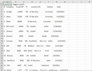
Fig 2. Our dataset before using Tabula
We mainly used Google Sheets to clean and collect some of our data from layoffs.fyi (smaller datasets such as from years 2021 and 2024) as it’s a software that we are most familiar with and is the most accessible for us. With our dataset initially needing to be thoroughly cleaned (spelling and wrong data types), the familiarity of this software allowed us to efficiently gather data that we need and clean the data to suit our goals.
To determine if we have cleaned our datasets enough, we put our dataset through Tableau Prep Builder in order to further assess if more adjustments are needed in our data and if our data is displaying the way that we wanted. Data types on geographic location did not transfer properly from our CSV file which resulted in manually checking and changing these factors in order for the column to be changed into the appropriate data type.
To make the base for our visualizations, we opted to use Tableau in representing our data. Tableau is another tool we are quite familiar with, through most class exercises and assignments being done through this software. Through this, it would allow us to experiment with possible visualizations we can make with our data before finalizing them. This software also gives us the advantage to use maps for the geographic data that we have which boosts the effectiveness and expressiveness in our data.
To present and add interactivity in our visualizations we plan to finalize our visualizations on Figma. This software has strong flexibility in possibilities of interactivity, it gives us the creative freedom we need in order to engage our audience and tell the story we want to share. With Figma having limited capacities when it comes to management of data, but having strong capabilities in creating visual designs, we opted to use it to add final touches in our visualization.
Analytic Steps
Google Sheets
We were set on the idea to communicate tech layoffs that have been increasingly intensified in the past 5 years. In order to do so, we sought out public data that would help support the narrative, and found data and articles linking the increased corporate investment in AI to the tech layoffs. We first determined what pieces within the data would be most helpful for us in the visualizations we anticipated making and ensuring they would appear cleaner on Tableau Prep and Tableau to minimize further cleaning efforts. Through many uses of changing data types, using filters, and find and replace we were able to clean extra columns(attributes), additional letters, warped text, and wrong data types. There were some columns we kept despite not using just in case we changed our minds while making our visualizations.
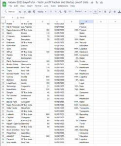
Fig 3. Our data cleaning in progress, some cities (e.g. Calgary) has extra letters and some industries (e.g. construction) has some letters removed
Tableau
After cleaning the data on Excel, we combined the data from all 4 years into one Excel spreadsheet and imported it into Tableau. To keep each visualization as clear as possible, we deleted columns and excluded data entries that had no number of layoffs inputted as well as the companies who were stationed outside of the United States as we had decided to focus on layoffs mainly in the US after discovering the country with more companies conducting layoffs were in the US. This was done to keep our narrative as concise and straightforward as possible as we had a huge pool of data to work with.
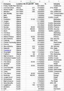
Fig 4. Cleaned data sorted alphabetically by city name in the US only
Furthermore, through exploring different visualization options available on Tableau, we found that there was always a spike around the end of 2021 to the middle of 2022, so we thought to draw correlations between the different visualizations temporally to draw our story. In addition, we have also standardized the presentation of the data points for our line graphs temporally as quarters of the year. This not only imitates how companies present their financial and business plans, but also allows for easier comparison between the infovis.

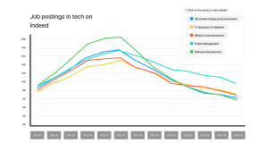
Fig 5, 6. Standardized presentation of years by quarter
In regard to the visualization representing the number of job postings on Indeed, we chose to focus on 5 sectors that were most closely related to the tech industry and therefore had more possible openings for tech jobs as we wanted to keep it as focused on the tech sector as possible from the data we gather.

Fig 7. Chosen sectors relating to tech
Design Process
In designing the visualizations for layoffs in 2021 to 2024 we aimed to showcase the differences of layoff amounts within each year. To do this, we decided to do a line graph showcasing a quarterly version of the years 2021 to 2024 to the amount of employees that were laid off. With the main attribute that we want to showcase in this dataset being quantitative we opted to use the magnitude channel of position to ensure expressiveness and effectiveness while providing an easily digestible way to present our story to our audience (Munzner, 2014; Ware, 2008). The map created shows the number of layoffs using the element of hues to represent the 4 years we were visualizing. The choice to use distinctly contrasting colors for each of the years, with the intention of aligning with the order of importance of the categorical data to the most salient channels, allows for greater differentiation. Furthermore, the choice to make use of circles and size to correlate with a higher number of layoffs works to immediately draw attention to those areas. This is also made in consideration of the effectiveness and expressiveness in relation to position that helps make the map’s intention clearer.
The choice to use line charts for most of our other visualizations is intended to show the trend and continuous increase in corporate AI investments, and subsequent decline in job postings relating to tech as well as the increase in the number of employees being laid off.
We found strong correlations between two events, such as increase in tech hiring and subsequent layoffs, and we wanted to convey this story to our viewers. To do so, we made sure to create two line charts of both events, with the same intervals of time to convey the correlation, without having the graph be misleading due to inconsistencies in our design. We then combined and superimposed both graphs together so that the viewers can see the correlation directly.
We also wanted to take advantage of interaction techniques in our data visualization, and have options to filter out certain datasets, and hover options to better view data for better accessibility. We also ensured that the graphs were legible, and that the font and colours chosen are easy to distinguish.

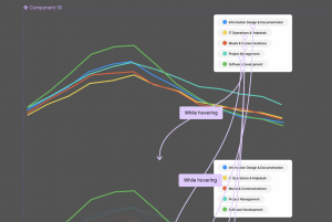
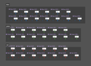
Fig 8, 9, 10. Interaction designs on Figma
Story
Our main goal for the project was to explore the issue of tech layoffs that have intensified over the past 4 years, and uncover the reasons for the rapid increase in loss of employment within the tech sector. Through interactive line graphs that show the trend of layoffs and increase in AI investment, as well as the increase in hiring in the midst of the pandemic, we hope to open a discussion on the effects these corporate practices have posed on white collar workers and the trajectory of the tech sector in years to come.
Within our Figma, we also created a timeline supplementing the various visualizations to show the key dates that contribute to the rapid escalation of layoffs.
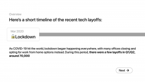
Fig 11. Timeline of events leading to escalation of tech layoffs
While the story narrated does not provide a definitive answer that explains the tech layoffs, we hope that it provides a suitable explanation that could better support our understanding of the correlation between technological improvements and job market availability, especially for people who are about to enter the job market.
Pros Evaluation & Cons Evaluation
By combining each of our visualizations onto a Figma presentation, our design allows viewers to gain an understanding of the issue of tech layoffs through a simple timeline that utilizes infovis to narrate a story. Viewers can easily interact with each graph, making use of highlighting and hovering to spotlight data points, and observe the trends shown on the line graphs. Additionally, by overlaying the graph expressing the number of employees laid off and the number of job postings relating to the tech sector, we have provided the viewers with a clear comparative view for further analysis.
That being said, our design certainly comes with limitations. Given that we have extracted our data from live trackers, we are aware of the fact that these numbers are ever changing. This could result in inaccurate results over time or may not fully represent the larger context in future years. Furthermore, in the pursuit of providing a clear and concise narrative that supports our story, our interpretations of the graphs may be subject to personal bias and beliefs, therefore potentially influencing viewers’ perception of the issue of tech layoffs as well.
References
Acemoglu, D., Autor, D., Hazell, J., & Restrepo, P. (2022). Artificial intelligence and jobs: Evidence from online vacancies. Journal of Labor Economics, 40(S1), S293-S340. https://doi.org/10.1086/718327
Armstrong, M., & Richter, F. (2023, November 22). Infographic: How much are companies investing in ai?. Chart: How much are companies investing in ai? https://www.statista.com/chart/31314/global-corporate-investment-in-artificial-intelligence/
Carbonero, F., Davies, J., Ernst, E., Fossen, F. M., Samaan, D., & Sorgner, A. (2023). The impact of artificial intelligence on labor markets in developing countries: A new method with an illustration for lao PDR and urban Vietnam. Journal of Evolutionary Economics, 33(3), 707-736. https://doi.org/10.1007/s00191-023-00809-7
Esteban, C. (2015). A Quick Guide to Spotting Graphics That Lie. https://news.nationalgeographic.com/2015/06/150619-data-points-five-ways-to-lie-with-charts/
Hetler, A. (2024, April 1). Tech sector layoffs explained: What you need to know. WhatIs. https://www.techtarget.com/whatis/feature/Tech-sector-layoffs-explained-What-you-need-to-know#:~:text=The%20tech%20industry%20increased%20its,in%202020%20and%202021%20combined.
Hossen, M. N., Mollah, M. A., Lipy, N. S., Hossain, G. M. S., & Rahman, M. S. (2023). factors affecting layoff in high-tech industry: Evidence from usa. International Journal of Information, Business and Management, 15(1), 1-13.
Malik, N., Tripathi, S. N., Kar, A. K., & Gupta, S. (2022). Impact of artificial intelligence on employees working in industry 4.0 led organizations. International Journal of Manpower, 43(2), 334-354. https://doi.org/10.1108/IJM-03-2021-0173
Maslej, N., Fattorini, L., Brynjolfsson, E., Etchemendy, J., Ligett, K., Lyons, T., Manyika, J., Ngo, H., Niebles, J.C., Parli, V., Shoham, Y., Wald, R., Clark, J., and Perrault, R. (2023). The AI Index 2023 Annual Report. AI Index Steering Committee, Institute for Human-Centered AI, Stanford University. https://aiindex.stanford.edu/report/
Reuters. (2023). Google plans ad sales restructuring as automation booms – the information | reuters. Google plans ad sales restructuring as automation booms – The Information. https://www.reuters.com/technology/google-plans-ad-sales-restructuring-automation-booms-information-2023-12-20/
Schwabish, J., & Feng, A. (2021). Do no harm guide: Applying equity awareness in data visualization. Do No Harm Guide: Applying Equity Awareness in Data Visualization. https://www.urban.org/research/publication/do-no-harm-guide-applying-equity-awareness-data-visualization
Sherif, A. (2024). Tech sector layoffs – statistics & facts. Statista. https://www.statista.com/topics/10370/tech-sector-layoffs/#topicOverview
Ware, C. (2008). Color. Visual Thinking, 65–85. https://doi.org/10.1016/b978-0-12-370896-0.00004-4