China, the World’s Next Reserve Currency: Is De-Dollarization an Upcoming Reality?
By Nuria Bahr and Kavya Vohra
Objectives
BRICS, an intergovernmental organization comprising Brazil, Russia, India, China, South Africa, Egypt, Iran, Ethiopia, and the UAE, collectively cover about 30% of the land’s surface and 42% of the population. Considered the foremost rivals to the G7 bloc – Canada, France, Germany, Italy, and Japan – due to the implementation of initiatives such as NDB (New Development Bank), BRICS Pay, and the BRICS Contingent Reserve Arrangement, the geopolitical bloc in question is arguably growing to place itself center-stage in terms of the global economy. With this in mind, our project intends to elucidate the growing significance of BRICS countries, specifically noting China’s growing leadership within the organization and on the forefront of the global economy.
In order to illustrate exactly how this geopolitical bloc poses a risk to the economic standing of the G7 countries, our project, with the help of data visualization, will also delve into the concept of “de-dollarization” – which denotes “a significant reduction in the use of dollars in world trade and financial transactions, decreasing national, institutional, and corporate demand for the greenback. This would diminish the dominance of the dollar-denominated global capital market, in which borrowers and lenders around the world transact in dollars” (Wise, 2023). Looking at whether de-dollarization is becoming more of a realistic possibility, our project will look into an analysis of “grand debt cycles” that show a repeating pattern of the rise and fall of leading world economies (Monfort, 2024).
Our intended audience would be anybody with an interest in the changing landscape of the economy – but specifically members of the countries that comprise BRICS. We aim to present our project on a website, accompanied by visualizations. Our intention is to put forth our findings in a narrative manner so as to easily convey where BRICS countries stand on a global stage with an emphasis on GDP, import/export of goods, inflation rates, and other statistics that elucidate their growing economic importance.
Data Used
Given that the topic in question surrounded statistics related to the leading global economies in the world, we had a plethora of resources to gather information from. In order to provide the clearest, most accurate narrative, the majority of our dataset was sourced from the International Monetary Fund website (IMF). We used this website to group countries based on geopolitical blocs, grouping BRICS countries together versus G7 countries. We then downloaded datasets for various telling aspects of each group – namely population, inflation rates, GDP, and imports and exports.
Once we had all the required data in Excel sheets, we proceeded to manually clean up the rows and columns to make the data easily digestible for Tableau. This involved removing rows that included headings (to be added back in later) and taking out columns that were descriptive of the type of data being presented, such as “in %”.
Tools Used
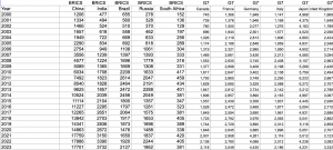
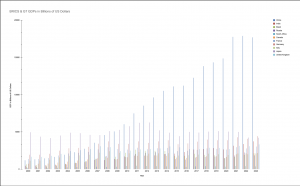
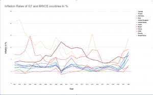
For the initial two graphs which intended to compare GDP and inflation of the BRICS vs G7 countries, we used google sheets, seeing as this was a simplistic visualization. We found this would be the clearest way to aggregate and clean the data, and subsequently produce final graphs on the same platform.
Strengths –
(i) Google sheets allowed us to clean data, view it and produce visualizations all on the same platform. Furthermore, the process of cleaning data, although tedious, was quite simple.
(ii) Easily accessible for simultaneous use, this platform allowed us to work together on visualizations, therefore letting us actively collaborate on creating these visualizations
Cons –
(i) Given that this is a platform designed to bring about fairly simplistic data visualizations, we found it difficult to separate G7 countries from BRICS ones, as sheets didn’t allow us to create seperate groups for each geopolitical bloc.
(ii) We also noticed an inability of the platform to work with larger datasets. Although the data sets we used for these initial graphs were on the smaller, more manageable side – during our preliminary research we found putting larger data sets into the same platform caused lags and crashes on more than one occasion.
After we researched our topic further, and decided to focus more on China’s role within BRICS as compared to our initial plan to focus on all of BRICS, we did not end up using the following graphs in our final infographic:

Improved Designs
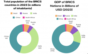
Once we had finalized our nuanced topic we found it best to explore specific aspects of BRICS countries that highlighted where they stood in the global economy. Focusing on GDP, import/export rates, Gross Trade flows and population we created our final graphs.
For population, GDP and import/export rates we used the same method of importing data into google sheets to be cleaned. Following this we created our visualizations on Canva.
Strengths –
(i) Canva’s easy-to-use drag and drop interface has always been a major strength. For these visualizations in particular, once the data was cleaned, Canva was an extremely user-friendly platform when creating the graphs.
(ii) It was important for us to include interactivity in our graphs and Canva allowed us to do this with ease.
Cons –
(i) We noticed that Canva did not automatically code data as expressively and effectively as possible, so this was a manual task that we undertook.
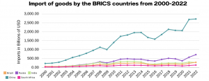

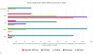
For our 2D graph explaining Gross Trade Flows we found it easiest to import the data into Excel and create a line graph on the same platform.
Analytic Steps
Initially, our project’s aim was to be to portray the BRICS geopolitical bloc as one of growing importance, in every aspect, and furthermore as a true contender for the G7 bloc. As we research data on the members of BRICS, we decided to change our topic to make it slightly more nuanced, as the data we were making visualizations out of, told a more compelling story.
We noticed, especially once we looked at import/export statistics, that China led its allied countries by a vast majority. For example, since 2000, China has consistently been the largest exporter of goods among the BRICS countries, and its share of exports from the bloc has increased significantly. In the year 2000, China’s share of BRICS exports was just over 50%; in 2020, this share has risen to 74%.
Next we looked at Gross Trade Flows, for which we found, now less surprisingly, that China takes up the majority of overall trade within BRICS. With this in mind, our narrative shifted to highlighting the role of China as a leader in the BRICS bloc, as well as a possible contender for the next World Reserve Currency.
Design Process
The first step in the design process was to thoroughly understand the data, including its structure, relationships, and key insights. To this end, we determined the main messages or insights that the visualization should convey. For instance, in the case of BRICS import and export data, the message pertained to trends in trade balances and the relative importance of trade partners, as well as the sheer volume of China’s activities compared to other BRICS nations. Next, we selected appropriate visual encodings (such as line graphs with markers and bar charts) based on the data characteristics and the messages to be conveyed. For line graphs showing trade flows, the choice of lines, markers, and colors helps differentiate between BRICS countries and other selected countries. We ensured that the visualizations effectively communicate the key insights without overwhelming the audience with unnecessary details. This involves striking a balance between expressiveness and effectiveness. The visualizations provide valuable insights to the audience. For instance, the BRICS import and export line graph clearly depicts trade trends over time, highlighting China’s growth and prominence within the space. In terms of soundness, we ensured that the visualizations accurately represent the underlying data without distorting or misleading the audience. This involved careful data processing and understanding. Color coding was used both to differentiate between individual BRICS countries in some cases and to group them against G7 countries as well. This aids in easy identification and comparison between BRICS nations as well as with the wider selected countries depending on the visualization.
The Story
The designed information visualization and infographic offer a comprehensive narrative on the trade dynamics within the BRICS countries and their interactions with other selected nations. Through visually engaging line graphs and comparisons, the visualization highlights the import-export trends of BRICS nations over time, shedding light on key fluctuations and growth patterns. Additionally, the comparative analysis of gross trade flows provides valuable insights into the relative trade importance of BRICS countries within the global context, revealing potential opportunities for economic cooperation and growth. By delving into analytical insights, the visualization identifies emerging trends, challenges, and implications for regional and global economic stability. Ultimately, the narrative concludes with a forward-looking outlook, emphasizing opportunities for collaboration, innovation, and sustainable economic development within the BRICS framework.
Evaluation of Design
Pros:
- The visualizations provide a clear and concise representation of the data, making it easier for viewers to grasp complex trade patterns and trends. This aids in storytelling by presenting information in a visually intuitive manner.
- The use of line graphs with markers allows for easy comparison between different countries’ import and export trends over time. Similarly, the separate 2D line graph facilitates comparisons of gross trade flows between BRICS countries and other selected countries, enabling analytical insights into trade dynamics.
- Visually appealing designs enhance viewer engagement and interest in the data, therefore increasing the likelihood of information retention. This is advantageous for storytelling, as engaged viewers are more likely to internalize the key insights conveyed.
Cons:
- Some visualizations may oversimplify complex datasets, potentially leading to the loss of nuanced insights. In some cases, the visual representations may not capture all the details or exceptions present in the original datasets.
- Visualizations may lack the contextual information necessary for a comprehensive understanding of the data. Without additional context or annotations, viewers may struggle to interpret the visualizations accurately, hindering their ability to derive meaningful insights.
- Certain visualizations, particularly those with complex layouts or interactive elements, may pose accessibility challenges for users with disabilities.
References
Monfort, J. (n.d.). BRICS is intent on de-dollarization but its chances of success are Slim. FXStreet. https://www.fxstreet.com/analysis/brics-is-intent-on-de-dollarization-but-its-chances-of-success-are-slim-202404091602
Munzner, T. (2014). Visualization Analysis and Design (1st ed.). A K Peters/CRC Press. https://doi-org.ezproxy.library.ubc.ca/10.1201/b17511