By: Leen Naser, Nada Alsaka, Anna Shubina
Links
Website: https://vancouverhousingcrisis.my.canva.site/
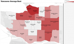
Average Rent Per Area Tableau Map Link: https://us-west-2b.online.tableau.com/#/site/infovisubc/views/INFOFINALPROJECT/Sheet1?:iid=1
Demographic Data Per Area Tableau Map Link: https://us-west-2b.online.tableau.com/t/infovisubc/views/INFODEMOGRAPHICPERAREAFINALPROJECT/Sheet1
The InfoVis Story (Background)
The topic of our project is on the wealth disparity of Lower Mainland Vancouver occupants. This is an important topic to delve into because there is an increasingly large group of people struggling to find a home and/or a place to stay (e.g. East Hastings). As residents of Vancouver, we are alarmingly aware of this issue and its drastic escalation post-Covid. We aim to reveal why there is a large disparity in wealth in Vancouver and to bring to light its effect on the population. This information could enforce change in the BC government and ensure it becomes more of a focus within BC Housing. The primary audience for our data is the BC NDP (provincial government) to give them a clear preview of the issue happening in our city to which it needs an immediate response. Our secondary audience is the BC residents, to educate them on the issue and elaborate on the minimal information they may already know. By having data backing up our research we can give valid information to our audience, and create a viable argument as to why this issue should be prioritized. Having data presented will ensure residents truly understand what is happening in their neighborhoods. InfoVis has allowed for this story to be presented compellingly and simply by transforming heavy data into easily digestible and explorable visualizations.
Rent is increasing at a rate triple of the inflation rate, which is causing a growing alarm from residents. By looking at the data provided on Rental.ca, it indicated that there was a 21% increase in rent from 2021 to 2022 (Devlin, Megan.). Vancouver is now being classified as the most unaffordable city in North America. Over the years there has been a large increase in foreign investors in Vancouver, resulting in the increase in prices and decrease in local investment opportunities. In addition to this, the population in Vancouver has been increasing exponentially, with a projection of 3.4 million residents by 2041 (Paul, David.).
To place things into perspective let’s delve into a slightly hypothetical story… say you are earning the average income as a Vancouver resident – $5,792 a month (“What Is the Average Salary in Vancouver, BC?”). Now, you are also paying the average rent rate in Vancouver which is about $3000. Therefore, 51.8% of your income is going into rent (Zumper.). It has been recommended that residents should not be paying more than 30% of their income towards rent (Lloyd, Mike.).
Our Goals and Objectives:
The high-level objective of our InfoVis project is to support the communication of pre-existing knowledge regarding the cost of living crisis, specifically relating to the argument of the unrealistic standard cost of living expected for residents in lower mainland Vancouver as it qwkeeps increasing exponentially. We delve into how marginalized communities are disproportionately affected. Our arguments are supported through the comparisons of data on the cost of housing, average income, and the population demographics (racial/ ethnic identity) of the different areas in the lower mainland as of 2021.
In regards to our data collection, analysis, and visual design our mid-level goals are to gather comprehensive data on the cost of housing, average income, and population demographic per area within Vancouver which would involve accessing reliable sources such as government databases and census reports. Meanwhile our low-level goals are to dive deep into the collected data to identify trends, patterns, and disparities to analyze how the cost of living has increased over time and break down demographic data to highlight whether visual minorities are affected differently by the rising costs. Using what we have gathered, we will create a design visualization that effectively communicates our data through maps and appropriate chart types where on the lower-level, we will pay close attention to design details such as color schemes and interactivity to ensure that the infographic is intuitive and accessible to our target audience of Vancouver locals and BC government officials.
The Datasets Involved
We are using data researched throughout the years from Statistics Canada Census 2021, the City of Vancouver’s Local Area Boundary Map, and Canada Mortgage and Housing Corporation (CMHC). These research analyses are authoritative enough to support our objective as well as prove our argument for the need for more affordable housing to the provincial government. We use Vancouver areas defined by CMHC as our categorical data items, which are West End/Stanley Park, English Bay, Downtown, South Granville/Oak, Kitsilano/Point Grey, Westside/Kerrisdale, Marpole, Mount Pleasant/Renfrew Heights, East Hastings, and Southeast Vancouver. We considered those areas as also our spatial data in the form of a map of Vancouver to aid in filtering and categorizing all of the attributes. The data attributes include the following characteristics: average rent prices, average income before and after tax, and numbers of visible and non-visible minorities populating each area.
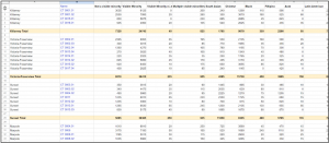
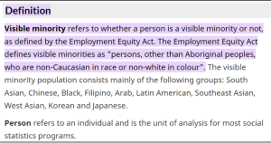
(1) Statistics Canada did not have data specific to the areas we needed but rather it included a list of small regions with census track codes (e.g. CT 0001.01, CT 0016.04). To deal with such a complex dataset (about 66 items and 16 attributes), we had to figure out what area each code belongs to and then calculate our average demographic numbers, also our quantitative data attribute. We used the terms “visible minority,” “non-visible minority,” and “Indigenous identity” as our categorical attributes, which are outlined on the Statistics Canada Website. This way we will reflect how housing rates justify the conditions of living for different populations.
(2) We used the CMHC portal to gather quantitative data on average income (before taxes and after taxes) as well as average rent prices per area. Using this information helped us to assess the price of living across the Vancouver Area. Moreover, to provide more context to the target audiences we used additional population income data, which would complement our project’s goal of showing a correlation between the housing rates and the income people receive living in each Vancouver area.
Tools Used: (strengths and weaknesses)
Google Sheets: We used Google Sheets to manually clean our data and combine the data from the multiple sources we used. We filtered the relevant and irrelevant data through Excel to pertain to our objective. We especially used Google Sheets instead of another tool for cleaning our data as it was the easiest to share with our group when filtering our multiple datasets and ensuring each dataset followed the same Lower Mainland locations.
- Strengths: we could easily share our data with each other and work on it simultaneously through Google Sheets as it is very accessible and a simple online tool. It is a great tool when filtering data manually, as the Command F tool can be used to quickly find the similarities between the multiple datasets.
- Weaknesses: Everything must be done manually on Google Sheets when filtering data, which slowed down the process.
Tableau Desktop: We used Tableau Desktop to create our graphs, including the Vancouver map visualization.
- Strengths: There are many options when creating visualizations, especially interactive visualizations.
- Weaknesses: It was difficult to create a map of Vancouver. If you are not certain how to do certain tasks, there is no guidance given from the interface.
Infogram: To combine everything and include context, we created an infographic on Infogram to which contains the visualizations from Tableau embedded within. With Infogram we created an infographic that includes our research and interactive tables which we created using Tableau.
- Strengths: There are many design options available, which makes it easy to make the information and data we input cohesive.
- Weaknesses: When creating charts you are limited by what the platform can do. When we had certain ideas in mind, many times it could not be done as the chart/graphic function is very limited.
Analytical Steps

First steps [Produce]: We explored the data visually before creating our final InfoVis and putting all our datasets together. Although we knew our initial direction, to ensure all our data would make sense together we tried finding similar visualizations. We created a map during our research that distinguished the different areas within Vancouver (Services, M. of C.). We used it to create our own more filtered dataset to make it easier to understand and correlate all our datasets. The updated map is to the right. We connected nearby areas (as seen in the image) and accordingly combined certain numbers from our datasets to align. Since there were a lot of specific changes that needed to be made to our datasets when cleaning/filtering, we used Google Sheets as it was more accessible to share and adjust. After completing our initial rounds of research, we annotated and abstracted specific topics that we wanted to focus on, which led to our final topic (Munzner, Tamara.).
- Once each dataset was retrieved and filtered through, we needed to align the attributes to the new location points we created. To do this, we manually added information together to place them under one category.
Initial idea + focus [Communicate]: We knew the argument we wanted to communicate from the beginning of this project, as well as how we wanted to communicate our collected data visually. This is because we chose our specified topics and their relations before collecting the datasets. As we completed our data cleaning and began putting all our information together to create the infographic and visualizations, we found new information that would benefit our argument, such as the rent increase freeze in 2020-2021. As we went through the whole process of researching and filtering, our abstract target was to illustrate a trend and correlation between the datasets we retrieved, to further emphasize the economic crisis Vancouver has been and is currently facing, as well as its impact on its residents. Once we placed all datasets together, we knew we needed to illustrate the correlation between demographic – income, demographic – rent, and income – rent (Munzner, Tamara.).
Design Process:
When converting the data we collected from its original form into the infovis we created, we began by individually cleaning all the datasets. The most difficult aspect was finding data for each segment we covered with the same breakdown of the lower mainland area. Since they were not the same, we chose one list of segments to follow and organized the remaining data pertaining to that list of areas.
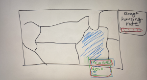 Sketches: When figuring out how to put together all our datasets (each one of us found different ones), we created sketches to try to understand how we could put all the data together. The image to the right is how we pictured it when converting all our data into spatial data.
- To make the difference in housing rate evident in our map, we used a primary visual primitive that is pre-attentive, color. We decided on having it be different shades of red to emphasize the urgency, (as well as it being one of the colors on the Canadian and BC flag).
- We chose selection as a design tool for our map, so when readers click on an area, it will highlight the filtered data of that area’s average income and demographic (Heer, Jeffrey, and Ben Shneiderman.).
Expressiveness and Effectiveness considerations:
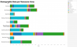 The demographics which are categorical, are classified as unordered data so we did not use channels that are perceived as ordered, using the identity channels. Therefore in the following visualization we portrayed demographics through color.
- The areas distinguished within the lower mainland are categorical data, therefore unordered, so we used the identity channels to depict it, placing it on the Y axis of the visualization above. Using both expressiveness and the effectiveness principles, position was most recommended.
- The income and rent prices from our datasets are quantitative ordered data, therefore within the expressiveness and effectiveness principle, we placed it using the positioning on the X-axis.
- We assessed spatial data in the form of a map of Vancouver to aid in filtering and categorizing each area within the lower mainland.

- Within the infographic, we included a graph presenting Metro Vancvouer’s median market rents. Effectiveness was demonstrated by choosing a spatial position and region channels to represent both the year and the price, ultimately creating a line that demonstrates the changes over time.
We ensured to follow the principles of utility, soundness, and beauty/attractiveness within our infographic through the follow:
- Utility: expressed by providing valuable information about the ongoing economic crisis in vancouver through the lens of the housing/rental market and presenting some ways in which the issue is being addressed by the City of Vancouver, ultimately informing Vancouver resident of a certain issue within their community and empowering them to engage in conversation of what changes would be beneficial.
- Soundness: We collected our data from reputable sources such as Canadian Housing Rental Index which we conducted background research on to ensure they were unbiased, complete, and trustworthy.
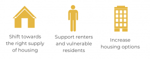 Beauty/attractiveness: our infographic seamlessly balances visually engaging design with concise, impactful information which was prevalent through all our design choices such as a cohesive color palette to create visual harmony, and minimalist graphics which improve readability while reinforcing the subject matter.
Design Principle Exploration
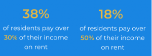 When trying to illustrate specific data, such as the percentage of income citizens pay towards rent, we initially created a circular chart comparing the data, but we later decided the information was being skewed by how complicated it looked. This led to altering the visualization to focusing on the percentage (larger text and bolding) to emphasize the numbers.
Pros & Cons:
A con to our designs is the limitation of our data, for we only found substantial data from 2021, although we had initially planned on looking at the data from 2019-2022. On the other hand, we successfully correlated all our different datasets to create a clearly outlined map. We were also about to create simple yet useful designs on our infographic to emphasize the importance of our research as well as the steps that can be done moving forward. This aids in indicating who our target audience is and actionable items, for an infographic should always allow for further elaboration from the reader’s part.
Bibliography
Devlin, Megan. “Asking Rents in Vancouver Are Increasing at Double to Triple the Rate of Inflation.” Urbanized, Daily Hive, 15 Dec. 2023, dailyhive.com/vancouver/massive-asking-rent-increase-year-over-year#.
Government of Canada, S. C. (2023, February 1). Census profile, 2021 census of Populationprofile Table. Profile table, Census Profile, 2021 Census of Population – Vancouver, City (CY) [Census subdivision], British Columbia. https://www12.statcan.gc.ca/census-recensement/2021/dp-pd/prof/details/page.cfm?Lang=E&GENDERlist=1%2C2%2C3&STATISTIClist=1%2C4&HEADERlist=0&DGUIDlist=2021A00055915022&SearchText=vancouver
Heer, Jeffrey, and Ben Shneiderman. “Interactive Dynamics for Visual Analysis: A Taxonomy of Tools That Support the Fluent and Flexible Use of Visualizations: Queue: Vol 10, No 2.” Queue, 1 Feb. 2012, dl.acm.org/doi/10.1145/2133416.2146416.
High-income households. Census Mapper. (n.d.). https://censusmapper.ca/maps/3524#11/49.2458/-123.0949
Lloyd, Mike. “Metro Vancouver: Renters Spend 50% of Income on Housing.” CityNews Vancouver, 6 Oct. 2022, vancouver.citynews.ca/2022/10/05/metro-vancouver-renters-income/#:~:text=When%20renting%20a%20home%2C%20the,cent%20of%20your%20monthly%20income.
“Local Area Boundary.” City of Vancouver Open Data Portal, 24 June 2023, opendata.vancouver.ca/explore/dataset/local-area-boundary/table/?disjunctive.name&location=12%2C49.2474%2C-123.12402.
Munzner, Tamara. “Why: Task Abstraction: 3 : Visualization Analysis and Design: Tamara.” Taylor & Francis, Taylor & Francis, 1 Dec. 2014, www.taylorfrancis.com/chapters/task-abstraction-tamara-munzner/10.1201/b17511-3.
Paul, David. “Vancouver’s Housing Crisis: Unraveling the Reality of North America’s Most Unaffordable City.” Medium, Medium, 31 Aug. 2023, medium.com/@david.p.lemon79/vancouvers-housing-crisis-unraveling-the-reality-of-north-america-s-most-unaffordable-city-db124312f13#:~:text=By%20the%20Numbers%3A%20Vancouver’s%20Startling%20Housing%20Stats&text=Median%20Multiple%20(price%2Dto%2D,22%20for%20every%20100%20(2021)).
“What Is the Average Salary in Vancouver, BC? (Mar 2024).” Zip Recruiter, 2024, www.ziprecruiter.com/Salaries/-in-Vancouver,BC.
Services, M. of C. (2024, February 23). Population projections. Province of British Columbia. https://www2.gov.bc.ca/gov/content/data/statistics/people-population-community/population/population-projections
Zumper. “Average Rent in Vancouver, BC.” Zumper, 2024, www.zumper.com/rent-research/vancouver-bc.