Team Members: Rachel Zhang, Heather Wan, Fangyi Liu
Link to Our Website
https://fangyiliu2002.wixsite.com/publicart
Our Story
The story that we are telling with our design
The story we’re telling through our designed Information Visualization and website revolves around the vibrant yet often overlooked world of public art in Vancouver and the crucial role local artists play within this tapestry. At the heart of our narrative is the acknowledgment of the challenges faced by local artists—how their work, integral to the cultural and aesthetic fabric of the city, needs greater visibility and support.
The interactive map at the core of our project does not merely serve as a navigational aid; it’s a gateway to discovery. By cataloging artworks and offering detailed information—such as the title of the work, the year of installation, materials used, and the artist’s name—it invites users to delve deeper into the story behind each piece. This level of detail fosters a deeper appreciation of the art and, by extension, the artists behind them.
Moreover, our project aims to ease the journey of exploration. It simplifies the process of finding and visiting art installations, making the experience more efficient and fulfilling. Whether someone is planning a leisurely stroll through Downtown Vancouver or seeking to immerse themselves in the city’s art scene, our platform empowers them to make the most of their visit.
The narrative we weave is one of connection and support. It’s about creating a link between the community and local artists, highlighting the significance of public art in enriching our shared spaces. Our design is a call to action: to explore, to appreciate, and to support the vibrant art that makes Vancouver unique. Through this project, we aim to not only increase visibility for local artists but also to inspire the community to engage with and champion the arts in their locality.
The objectives of our design
Our goals for this visualization project are to create an interactive map for the users to explore the available public art in Vancouver and to plan the route of their visit based on the basic information about the public artworks. Specifically, our goals aimed to:
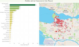
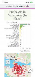
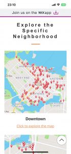
Enhance Accessibility: Provide an easy-to-use platform for both locals and visitors to discover and access public artworks in various districts, including Downtown. By visiting our website and interacting with the map, users can view the number of artworks in each area with the option to zoom in for more detailed street-level information.
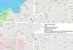
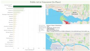
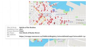
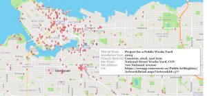
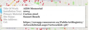
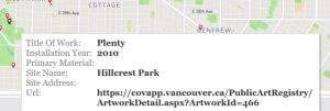
Detailed Artwork Information: Enable users to access detailed information about each artwork by clicking on the red icons on the map. This information includes the Title of Work, Installation Year, Primary Material, Site Name, Site Address, and the artwork’s URL, assisting users in making informed decisions about which artworks they wish to visit.
Optimize Visit Planning: By categorizing and displaying the number of artworks by region, our design supports users in selecting districts to visit based on the density of artworks. This feature aims to maximize the efficiency and fulfillment of their journey, allowing for a more organized and enriched exploration experience.
Design Process
Prepare Stage
Sketching
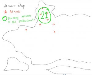
Before we start, we have a meeting about what we actually want to create – a map. So we first drew a sketch about that, including the location of each artwork and the number of artworks in that neighborhood. Based on what we learned in class, we think this kind of visualization is expressive and effective.
Data Sets
The details of the data set we used
We use two datasets as the source of our project. We choose the “CSV Whole Data Set” and “GeoJSON’ ‘ from the open data portal on the website “City of Vancouver”. The “CSV Whole Data Set” dataset provides detailed information on public art installations across Vancouver, including the art’s location (site address and neighborhood), description, artist and their nationality, installation date, installation status (whether in place or no longer in place) and general features of the artworks such as the type of the artworks and materials. The dataset is comprehensive, updated weekly to reflect new additions or changes, and includes coordinates for mapping, which are used for creating the Geographical map in Tableau. The “GeoJSON” dataset serves as a resource for exploring the detailed and precise location of the artworks.
The tool we used to transform the data into an information visualization and rationale for using it
We mainly use Tableau Desktop’s Data Source interface to clean the data and combine it with Tableau Desktop to create the information visualization of the dataset of public artworks and artists in the Greater Vancouver Area. Our goals for this visualization project are to create an interactive map for the users to explore the available public art in Vancouver and to plan the route of their visit based on the basic information about the public artworks. As we’ve learned in creating a geographical map, location information such as coordinates and zip codes can be identified by tableau and transformed into the markers on the map. Tableau is the most intuitive and easiest interactive mapping tool available.
Data Cleaning
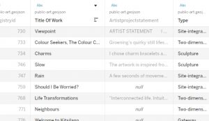
At the beginning of our discussion, we wanted to include as much detail as possible about various artworks, such as the artist’s statement, the artist’s ID number, etc. We thought our perspective on some of the information might change during the process of data visualization in Tableau, so we didn’t delete any data in Excel. Instead, after importing the data into Tableau, we hid columns that seemed unnecessary as the data visualization progressed. This way, if we need the data later, we can simply unhide it. Additionally, we made some titles in the original file more concise to improve aesthetics, such as changing “StatementofArtist” to “Artist Statement,” even though we ended up not using this column.
Visualization Process
After hiding and filtering the data, we started to create our first worksheet, a map named In Place. We dragged the Geometry, Title of Work, Primary Material, Installation Year, Site Address, URL, and Site Name into the Marks section.

To offer our users detailed specifics for each piece of art, including the Title of Work, Primary Material, Installation Year, Site Address, URL, and Site Name, we realized the order should prioritize the Title of Work. Initially, the sequence in Tableau was not orderly, prompting us to utilize the Tooltip function for a new arrangement and organization of the sequence, enhancing our users’ ability to access information in a more logical and user-friendly manner.
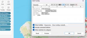
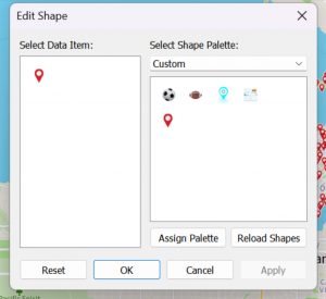
For the map feature, we chose a colorful map background to enhance the visual appeal of our visualization (Select Map > Map Layers > Style FYI: https://help.tableau.com/current/pro/desktop/en-us/maps_options.htm). We designed it to resemble popular mapping services like Google Maps, aiming to provide a familiar and easy-to-use experience on our website. The shape of the coordinate markers was customized with an image of a red marker we found online and added to Tableau’s icons (We created a folder with our custom icons, and then we pasted the folder into the Tableau folder named “My Tableau Repository” and clicked Reload Shapes button FYI: https://www.tableau.com/drive/custom-shapes). The positioning of each art piece’s location was determined using latitude and longitude data from a GeoJSON file.
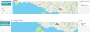
We prioritized showcasing art pieces marked as In Place, believing this would optimize the relevance of our information. By adding Status to the filters and choosing only the In Place option, we tailored the display to include these specific artworks. Anticipating a future need for information on artworks not currently in place, we created a duplicate of this sheet. In the duplicate, we adjusted the filter to display only those pieces categorized as No Longer In Place.
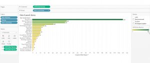
Next, we embarked on developing bar charts to visualize the quantity of artworks within various regions. A new worksheet titled “Geo Local Area” was established for this purpose, where Site Address, Status, and Geo Local Area were added to the Filters. The Status filter was specifically set to include only artworks identified as In Place. The Site Name was assigned to the color feature with a choice of a green palette, and it was also inserted into the Labels for clarity. The layout was organized with the Site Name designated for Columns and Geo Local Area for Rows.
In our final step, we focused on providing a user-friendly interface. Therefore, we created a dashboard that merged the sheets for In Place artworks and Geo Local Area. This amalgamation led to the completion of our final Visualization.
And we design an interaction, when users click on each region, it will display only the number of artworks and detailed information for that specific area.
Website Design
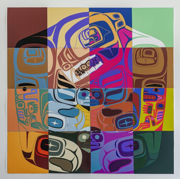
Our website excels in visual variety, simplicity and intuitiveness of page design, and narrative integrity. We focused on clean page design, aiming to highlight the interactive map as the visual centerpiece. In the interface design, we Integrate elements of Vancouver’s cityscape or indigenous art, to give the site a unique and culturally relevant aesthetic.

In terms of the website’s use of visual diversity, we feature not only a comprehensive map of the Greater Vancouver area but also detailed maps of specific neighborhoods like Downtown and Mount Pleasant. Users can navigate to these detailed maps without following the narrative order to scroll down, by clicking buttons on our site, showcasing the diversity and the convenience of our visualizations. The interactive map on our website supports user-initiated zooming in and out, offering a detailed view of public art installations. Users can hover the mouse over each coordinate to access basic information about each public art piece, enabling an interactive and informative exploration of art in the area.
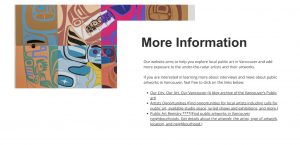
Additionally, our homepage includes a text introduction and a “more info” section, listing third-party websites to encourage further exploration of public art, thus enriching the narrative completeness and integrity of our webpage, making it a comprehensive storytelling platform.
For our general website creation process, we begin by using the web-design platform Wix. We then focus on crafting interactive elements to engage our audience, followed by writing an introductory section that outlines the site’s purpose and a “more info” section that is directed to other third-party resources. Next, we integrate Tableau visualizations by embedding the code into Wix, ensuring the data is displayed effectively. Finally, we meticulously adjust the details, optimizing the layout and design to enhance both the visual appeal and functionality of our site.
Additionally, considering that our website might be used while people are traveling, we also made it allow mobile access. The mobile view allows users to open the webpage to view searches anytime and anywhere when they are out and about, increasing the flexibility of our visualization.

You May Ask
How did we make sense of the data to create our visualizations?
Our team aimed to include as much detail as possible about various artworks for the visualization, focusing on details like the artist’s statement and ID number. They imported data into Tableau without deleting any, choosing to hide unnecessary columns during the visualization process. This approach allowed them to adapt their visualization as needed without losing any initial data.
Did we explore the data visually to find interesting patterns that later became our final visualizations?
Yes, the process involved creating an initial map worksheet where various data points such as Geometry, Title of Work, Primary Material, Installation Year, Site Address, URL, and Site Name were dragged into the Marks section. This step, along with prioritizing artworks marked as “In Place” and developing bar charts for visualizing the number of artworks within various regions, indicates a methodical exploration of the data to discover and emphasize significant patterns.
Did we know the argument or idea to be communicated right from the beginning, and we focused on presenting the data/evidence to communicate it visually?
Our group’s primary idea was to create an interactive map to help users explore public art in Vancouver and plan their visit routes. This goal was clear from the start, guiding the visualization process. The team focused on presenting data that would enable a user-friendly experience, emphasizing artworks “In Place,” optimizing the relevance of the information provided, and tailoring the visualization to ensure it was both intuitive and practical for users to navigate. Our visualization project was guided by the initial objective to make public art in Vancouver accessible and navigable for users, with a clear focus on enhancing user interaction with the data. The team’s approach to data preparation, exploration, and visualization was strategically aligned with this goal, employing tools and techniques in Tableau to effectively communicate the intended message.
Our Review
The pros and cons of our designs to tell a story based on data or to derive analytical insights
Pros: Our designs effectively utilized clear, concise maps that directly served our core objective of enabling users to explore public art in Vancouver. By dividing the artwork by regions and providing detailed information such as the artwork’s exact address, we significantly improved the usability and aesthetic appeal of our visualizations. This design choice not only facilitated a more engaging user experience but also underscored the visual appeal as a pivotal component of our project. The aesthetic design was not merely an afterthought but a deliberate strategy to enhance user interaction and engagement with the visualized data.
Cons: Despite these strengths, our designs faced several challenges. One major issue was the incomplete data; for instance, the absence of specific addresses for some artworks introduced gaps in our map’s comprehensiveness. The differentiation between artworks that were “In Place” versus “No Longer In Place” prompted considerable discussions within our team regarding the inclusion of the latter. These discussions revealed a deeper concern about how filtering options might affect the visual appeal and the relevance of displaying artworks no longer present to our users. Such artworks, while no longer physically present, remain integral to Vancouver’s art narrative. Balancing the aesthetics of our visualizations with the inclusivity of all relevant data emerged as a critical consideration. Future endeavors will need to navigate these complexities, striving for a design that marries beauty with a comprehensive data narrative.
Our observations about the strengths and weaknesses of the tool(s) in relation to our task and the data
Strengths
Clarity and Simplicity: The tools allowed us to create clear and simple data visualizations that communicated our message directly and effectively. The logical structure of the tools facilitated a straightforward design process, enabling us to meet our objectives efficiently.
Strong Logical Framework: The inherent logical capabilities of the tools we used, such as Tableau, were instrumental in organizing and presenting the data. This aspect was particularly valuable in managing and filtering vast datasets, ensuring that the final visualizations were coherent and aligned with our project goals.
Maximized Achievement of Objectives: Through the use of these tools, we were able to maximize the realization of our project’s aims. The functionalities provided by the tools supported our tasks, from data cleaning to the creation of interactive maps, allowing us to achieve a high level of precision and relevance in our visualizations.
Weaknesses
Limited Aesthetic Options: While functional, the tools offered limited options for enhancing the visual appeal of our visualizations. The basic set of images and icons constrained our ability to infuse creativity and innovation into the designs. This limitation was a significant drawback, as a more attractive and engaging presentation could potentially improve user engagement and the overall impact of our project.
Need for Greater Creativity and Innovation: The tools’ constraints on visual elements highlighted the need for greater creativity and innovation in our visualizations. Expanding the range of visual customization options, including images, icons, and overall design aesthetics, would significantly enhance the ability to create more visually appealing and engaging visualizations.
Future Implement
The decision to not include a section on the type of artwork in the website for users to explore is primarily based on our current stage of development and priorities. Our focus has been on ensuring user accessibility and providing a seamless experience for tourists and other users. While we acknowledge the potential benefits of including a “type” feature to enhance the exploration of Tableau’s functionalities in the future, it is a new concept and functionality that cannot be implemented at this stage. Our website already fulfills all aspects of our storyline and meets the immediate needs of our users. However, we remain open to future improvements and innovations, including the incorporation of a “type” feature, as we continue to refine and enhance our visualization platform.
Citation Page
Dataset
City of Vancouver. (n.d.). Public art. Retrieved Apr. 8 2024, from https://open data.vancouver.ca/explore/dataset/public-art/export/?location=12,49.26097,-123.13232
Web design
Create A Stir. (n.d.). Luke Parnell: Indigenous History in Colour at Bill Reid Gallery. Retrieved Apr. 8 2024, from https://www.createastir.ca/articles/luke-parnell-indigenous-history-in-colour-bill-reid-gallery
Our city. our art. our Vancouver. (n.d.). Our City. Our Art. Our Vancouver.
https://ourcityourart.wordpress.com/
Vancouver, C. O. (n.d.). Artist opportunities. City of Vancouver.
https://vancouver.ca/parks-recreation-culture/opportunities-for-artists.aspx
IT application. (n.d.-b). https://covapp.vancouver.ca/PublicArtRegistry/
