Week 9 – Using the Golden Record Music Selection Data in a Palladino Project Visualization
I am going to pre-empt this post with the note – I love the Palladio Project. It is a very interesting program to permit the visualization of data, using different factors as the underlying keys to the data. It allowed for the visualization of a data set that set out some general ideas about how the class made its musical selections from the Golden Record.
The political implications of the groups of the music choices are not fully known by the visualization. In particular, the Palladino visualization – in its various iterations, cannot convey: (i) if all the musical pieces were selected at least once; there does not appear to be a node for “0”; (ii) why certain students selected the same musical piece; do we or can we make assumptions as to why without more information about the individuals making the selections; and (iii) the data could be early misinterpreted by someone with a particular bias. It just seems to be very open to interpretation if so desired.
In my opinion, the visualization provided by the Palladio file does not provide the reasons behind the choices of music made by the different students. More data would be required in the database. Possibly, geographic location, geographic origin (where you were born or brought up), ethic background, age, sex, any training in music – lessons, for what period of time, current occupation (does that influence one having a global viewpoint or thought that the music should reflect a more global viewpoint).
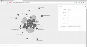
The following is a visualization of the data: student selection of musical pieces. This visualization sets the size of the nodes to increase with the number of times a music piece was selected by a student. The node size does assist with the visualization of the data. (But again, it is a positive affirmation of data and does not necessarily advise which pieces were not selected).
This visualization highlights how node size is an important visual cue.
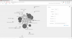
The Palladino visualization also provided information to group students based upon common musical selections. Again, the use of the node function provides a visual element wherein the larger nodes represented greater common connections. However, this visualization alone does not advise, for example, why students selected common musical choices.
This is a visualization of the students by common choice of music.
The Palladino visualization program did allow for the manipulation of the data in a few variations, but without additional data can only provide general information. It cannot tell us if certain pieces were not selected. It can principally only provide general information about which musical selections were common selections by the group.
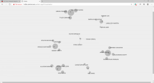
This is a visualization: Track by Group
This is an interesting visualization of working with the program – trying to pull out the links and nodes to better show the information. It was very interesting to experiment with the program to try to manipulate the display to provide clearer information.

This visualization shows the groups by track and shows the commonality of choices by student.

The Palladio program is very interesting. I would like to use in a situation where I have more data to provide greater more precise distinctions between choices. But again, a fabulous introduction to a new media form that is the new digital text world.