Author Archives: mmartin7

Task 10: Attention Economy

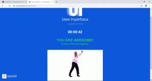
User Inyerfeace Online Game by Bagaar

userinyerface.com


It was my first time playing User Inyerface  and I wasn’t sure what to expect.  Once I made it to the second page it was a bit easier to navigate. Perhaps it’s because I know it’s a game so less pressure and I’m familiar with online persuasion architecture ( Zeynep Tufekci).  I wasn’t extremely frustrated, but I was still frustrated at parts of the game such as when I had to fill out the email and password portion and all these pop-ups kept appearing again and again. It also took some time to navigate through the buttons that didn’t work and the texts that try to deceive you.  I had to re-read these parts a few times. Upon reflection, in the past, I’m going to say I was caught in some of the dark patterns employed such as the hidden costs when your paying for airfare or for a cruise.  I’m going to agree with Tristan Harris in his Ted Talk video that a step to change is to acknowledge that we can be persuaded.  When Zeynep Tufekci mentioned about googling for boots and suddenly those boots pop up everywhere on my Facebook to articles I read, it’s scary how learning algorithms work.

Using Brignull’s Dark Pattern types, I was trying to categorize some of them in the game. One was the Forced Continuity where it showed the four easy step visual to complete the form, but if you check the terms and agreements that was in small print which was lengthy, confusing and required additional steps to complete.  Do I sense a trap here ?  This could also be under the Trick Question type also. The Roach Motel in the game was when the pre-select mode for the email gave the illusion that it was trying to help the consumer by making it easier for them to complete the form and I see this a lot in online subscriptions, but it’s always a difficult process to get out of it.   The beginning page of the game was under Disguised Ads as I see this on a lot of online articles where in the middle of the article there are usually words that are highlighted, underlined, or capitalize to draw your attention to click on it.


References:

Brignull, H. (2011). Dark Patterns: Deception vs. Honesty in UI Design. Interaction Design, Usability338.

Harris, T. (2017). How a handful of tech companies control billions of minds every day. Retrieved from https://www.ted.com/talks/tristan_harris_the_manipulative_tricks_tech_companies_use_to_capture_your_attention?language=en

Tufekci, Z. (2017). We’re building a dystopia just to make people click on ads. Retrieved from  https://www.ted.com/talks/zeynep_tufekci_we_re_building_a_dystopia_just_to_make_people_click_on_ads?language=en


Task 9 Using Palladio on the Golden Record

THE DATA:

The first time I looked at Stanford’s Palladio where each individual and song were plotted on the graph, I thought the data was beautiful as well as overwhelming, like an intricate spider web.  When I placed the data into groups, I belonged to Group two with Sarka, Shawn, and Brain.

There are twenty-seven songs in the Golden Record. Brian and I had five songs in common and five that were not. The five songs that I pick that Brian didn’t were El Cascabel, Rite of Spring, Flowing Streams, Dark was the Night, and Pygmy Girls’ Initiation Song.  The songs that Brian pick that I didn’t were Melancholy Blues, Magic Flute, Tsuru No Sugomori, Percussion, and Night Chant.   Sarka and I also had five songs in common and five songs that were not.  I thought it was interesting that three of Sarka’s songs that he picked which I didn’t,  had a connection to the songs Brian picked.  These songs were Night Chant, Magic Flute, and Percussion.  Shawn and I had the strongest connection as we had six songs in common and four songs that were not.  The only song that Shawn and I had in common within the group was El Cascabel, while the only song Shawn and Brian had in common was Melancholy Blues.  From the graph, the strongest nodes we had as a whole group were the songs Wedding Song, Jaat Kahan Ho, Johnny B. Goode, Morning Star Devil Bird, and Tchakrul.

I thought it was interesting that Brian was the only one who had one edge that didn’t have any relation to anyone in the group.  I had four songs that wasn’t attach to a node, Shawn had three edges, and Sarka had two edges that wasn’t attach to anyone in the group.  I think based on connectivity, Brian would be a central node or network bridge because his edges had more connections to other nodes in our group.

Looking at a macro scale of the graph, this time of the all the groups and songs, the data depicted that some songs were attached to all the groups.  These songs were:

-India, raga, “Jaat Kahan Ho,” sung by Surshri Kesar Bai Kerkar

-“Johnny B. Goode, “ written and performed by Chuck Berry

-Australia, Aborigine songs, “Morning Star” and “Devil Bird,” recorded by Sandra LeBrun Holmes

-Beethoven, Fifth Symphony, First Movement, the Philharmonica Orchestra, Otto Klemperer, conductor

-Mexico, “El Cascabel,” performed by Lorenzo Barcelata and the Mariachi Mexico

These songs were important because they were central to all the groups or somehow a network bridge to other nodes.  Why ?  Unfortunately, it is hard to extrapolate the reason based on the data.

SOME THOUGHTS:

Since the graph delineated connections, I was trying to look at the data based on relationship and the significance of a node in a network.  The data was a lot of quantitative information that can be presented in different ways.  The graph showed how we are all somehow connected through one node or several nodes to each other and that some nodes are more central and significant than others.

However, the data cannot tell the reason why some songs such as Jaat Kahan Ho or Brian in our group are a central node or a bridge between nodes.  Perhaps, it was because the song Jaat Kahan Ho was an incredibly catchy tune?  Maybe Brian had a musical background and therefore knowledgeable in picking the songs that would represent the world?  These would be assumptions though.  What is missing in the data to give it more depth are people’s personal information, their habits, and background history.  Without knowing people or interviewing them, the only alternative to gather more information is to search their personal blogs, Instagram, Facebook, and Linkedin account.

Another thing that you cannot obtain from the data are people’s choice and the reason why or why not.  In the past, I participated in a yogurt marketing research where we did a taste test.  The company created a new type of flavoured yogurt and wanted to unveil it to the market. I w as in part two of the research where the company wanted a sample of the response on the taste and the reason why you would buy the product, why you wouldn’t, and how the company could make the yogurt more appealing.  A person’s qualitative response is something that is missing from the data.  Having said all this, I thought the Stanford Palladio tool created an elegant graph that was visually friendly to use.

References:

Code.org. (2017, June 13). The Internet: How Search Works . Retrieved from https://youtube/LVV_93mBfSU

Systems Innovation. (2015, April 18).  Graph Theory Overview . Retrieved from https://youtube/82zlRaRUsaY

Systems Innovation. (2015, April 19).  Network Connections . Retrieved from https://youtube/2iViaEAytxw

Systems Innovation. (2015, April 20).  Network Centrality . Retrieved from https://youtube.com/watch?v=NgUj8DEH5Tc&feature=emb_rel_end


Task 7 Mode-Bending

During the first task, what’s in my bag, I was defining things in a very practical and functional way.  Ernesto commented that the chapstick I had was a Yelp brand and that reviews are very postmodern.  This made me think.

What if logos were like an emoji, communicating a thought but also defining you as part of a group.  This led me to search if it was possible to find an audio-visual for each of the items I had in my bag without orally saying the name of the item.

Surprisingly, there was a lot of English audio-video commercials on the items I had in my bag from home made commercials to professional advertising.   I decided to arrange the audio-video clips from current ads to those that look like they were made in the 70s and 80s.  I thought it was interesting to see that the ones from the past, such as the Vaseline ad was more literal and would orally say the name and visually show you the function.  The more recent audio-visuals  conveyed mood and meaning  from visuals and sound.

From an archeology point of view,  the first task delineate that I live in the city since all of the items enable me to move around the city in comfort.  But upon closer scrutiny, an archeologist would notice that the brands communicated which mini communities I belong to within the city.   I used to be an Android person, but the plug from my iphone would say I belong to a community that uses Apple language and Mac functions on a laptop.  You’d probably find me at an Apple workshop 🙂

I think we live in this big blogging and video making society that is continually growing where we communicate by text, but we also use sound to create mood and meaning , such as the Lexus ad.  As technology becomes easier to use, this fueled a more multimodal approach of communicating where everyone can become an author or co-author creating different dialogues.  However, this does bring up the question of author and authenticiy……

As I slice, pull apart and put together different visuals and sounds to create a playlist like a DJ, I decided to add in an Apple audio-video but from China.  I was thinking about multiliteracies from The New London Group which was why I wanted to try incorporating this.  I chose Apple because this was not as easy to find as I thought it would be.  Some audio-visual were universal, a lot of the ones I was looking for were not.  Some items were cultural specific and difficult to find in any other language such as that of Nature Valley and Sunkist.

References:

Jessiedamage. (2008, April 2).  Hello Kitty Theme Song [Video].  YouTube. https://www.youtube.com/watch?v=9J6-WITRcVg
Nature Valley Canada. (2019, June 28).  Nature Valley | Rediscover The Joy of Nature [Video].  YouTube. https://www.youtube.com/watch?v=O9GvhjVejSA
Suzanne Ciani. (2017, March 13).  Sunkist Orange Juice [Video].  YouTube. https://www.youtube.com/watch?v=T-mdKMcHblI
80scommericalsforever. (2011, March 11). VINTAGE 80’S VASELINE “THE WONDER JELLY” COMMERCIAL [Video].  YouTube. https://www.youtube.com/watch?v=cGNoKknQ73o
Seeker. (2013, Sept 7).  Does Yelp Really Impact Businesses? [Video].  YouTube.  https://www.youtube.com/watch?v=zFv87mxbPfs&list=RDCMUCzWQYUVCpZqtN93H8RR44Qw&index=1
Pilot Pen. (2018, Feb 12).  Pilot FriXion Erase Doubt [Video].  YouTube. https://www.youtube.com/watch?v=TBprh1Ztuzk
RK Reid. (2009, Oct 27).  Derek Alexander Handbags [Video].  YouTube. https://www.youtube.com/watch?v=5GbQ892YXfs
Lexus International. (2018, November 23).  Discover the Lexus UX [Video].  YouTube. https://www.youtube.com/watch?v=rlqmWCID6mc
3dmihai.  (2009, March 18).  Thermos commercial ad [Video].  YouTube. https://www.youtube.com/watch?v=lGGpEQg9U3Q
Apple. (2015, March 9).  West Lake, China – Apple Store Opening [Video].  YouTube. https://www.youtube.com/watch?v=L9bq33sbYsc


Twine Task: A Version of the Little Pigs

A Version of the Little Pigs

The idea of creating an online interactive game was definitely interesting, but I was worried because I didn’t have any coding skills.  However, I found Twine surprisingly user friendly.  Every time I went back to edit my game, I felt like I learned a new feature.  Ah, if only I had a month to explore what Twine had to offer.

I wanted to create an interactive story geared towards elementary students.  I thought that this was such a fun and creative way to motivate reluctant readers and writers because I can see students thinking that this isn’t “school work” but playing on the ipad.

I like making the mind map with the arrows linking the different frames because it was a great visual to see where you can add more connections and where you can add more details to parts.  In my mind, I wanted to include some hand drawn pictures to the story.  I struggled with this part and couldn’t include the pictures I wanted (I’m definitely still at the novice level with Twine).  However, I still wanted to include visuals so I thought I would try a different approach.  I played around using letters and words as my art.

This picture was supposed to be in one of the frames in the story.

Can you guess the frame that was supposed to be this picture ?


I hope you enjoy interacting with the story !

  Twine Task – Version of the Little Pigs (2)