by Janet Hilts & Eleanor Ren
Link to our final project can be found here
Recently, the topic of equity, diversity and inclusion has been back in the spotlight. As information students and women in the workforce, our information visualization project focuses on the topic of equal work and analyses gender differences in job positions and earnings.
The British Columbia Human Rights Code prohibits discrimination in hiring and requires equal pay regardless of gender identity and expression (Government of British Columbia, 1996). However, we believe that equal pay for the same kind of work does not mean the equality of work. Even in the progressive city of Vancouver, there is still an existing unbalanced hiring pattern where women are in a disadvantageous position.
During the initial research, we found a dataset from the City of Vancouver Open Data Portal titled Workforce pay rates and gender. The dataset is current, with data from 2019. Because we are accessing this dataset through the municipal government’s repository, we also believe this data is credible, and are not aware of biases in it.
Meanwhile, we found an article from Vancouver Sun, which noted that three-quarters of the women who work in BC’s public sector are in the lowest salary bracket, while men are massively overrepresented in the higher pay scales (Culbert & Griffiths, 2020). Based on this evidence, we believe that the dataset we chose is meaningful and worth studying. Thus, we elaborated our topic to be the current gender wage gap situation in Vancouver’s public sector, with a focus on gender distribution within different positions.
Overall, our project intends to communicate knowledge about the pay gap between genders among City of Vancouver employees. With the main goal of raising people’s awareness among Vancouverites while calling on the City of Vancouver to make equal choices during the recruitment process, our target audience will be the general public.
The Dataset
The original dataset has 189 items (rows) and 8 attributes (columns). The attributes include categorical and quantitative data types, including “Year”, “Classification”, “Exempt/Union”, “Minimum hourly rate”, “Maximum hourly rate”, “Women”, “Men”, and total. The dataset was compiled internally by the Human Resources – Equity, Diversity and Inclusion Office (City of Vancouver, 2020). It is well structured and does not appear to include inconsistent data formats, duplications, or errors.
-
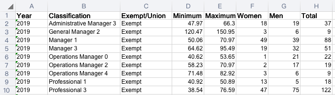
- Fig.1 Abstract of the Original Dataset
To clean the data, we removed the irrelevant column “Year” and deleted the summation record “Total”. To make sure the consistency and informativeness of the variables, we renamed some attributes to be more descriptive as well.
Since there are 187 different classifications within the dataset, readers from the general public may find detecting hiring patterns challenging. Thus, we emailed the dataset publisher and got a spreadsheet from a City official that has job titles for each classification (see attachment). Based on job duties, we added an attribute named “Classification Group”, and sorted all the jobs into 31 categories, for example, Admin Management, Trades, and so on. Additionally, to examine the influence of unions in equal pay, we added another attribute called “Unionized”, and assigned all entities a “Yes” or “No” value.
-
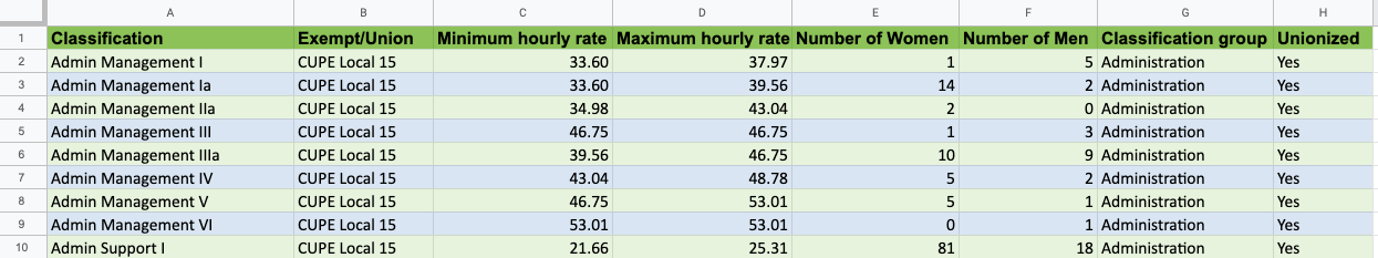
- Fig. 2: Abstract of the Finalized Dataset
The Tools
In general, we used five tools to create the visualization, the infographic, and the final webpage: Excel, Canva, Wix, Tableau Desktop, and Adobe Color Wheel.
First, we used Excel to process the data and edit the idioms. Because our data does not need sophisticated cleaning, we used the software that our team members are the most familiar with rather than Tableau Prep to clean it. Meanwhile, when creating the infographic, the average salary and the total number of men and women need to be calculated. By using the formulas function and the AutoFill feature, all these tasks can be easily achieved.
Second, we used Canva as the primary tool to create the infographic. As an all-in-one online graphic design platform, Canva is easy to use and share design as a group, which is super helpful in the quarantine period. Although we were using the free version, it still has enough resources for us to design and make the infographic. One weakness of Canva is the inability to customize the chart colour, even for prime members. Thus, we had to change the colours of the pie chart on Excel and paste the copied idiom to the platform. Also, Canva can’t do some fine/advanced design. We can’t adjust the length of the template and delete the unnecessary parts. Designers can’t adjust the sizes of the elements in a precise way – we can only zoom in and out with the mouse/control pad.
For the final deliverable, we chose to display our visualizations and story on a simple webpage, so we used Wix since it is free, simple to use, and allows Tableau visualizations to be embedded. We also used Adobe Colour Wheel to choose colour combinations that are aesthetically pleasing and impactful for our webpage and infographic.
Last, we used Tableau Desktop, the tool that we have received training in during class to make the visualization. The software is powerful, especially with the calculated field function allowing further manipulation of the data. It also helps us to add the interactive feature of the website without knowing much JavaScript knowledge. However, Tableau is the tool that requires the most professional training and is the most expensive. The other thing we found in Tableau is that it has no function to calculate the weighted average. Thus, we have to “cheat” Tableau and create a vertical line ourselves to present the “real average” of our dataset.
Initial Analyses
During the design period, our team organized two Zoom conferences, where we set three directions for data research: the overall distribution of male and female in the City of Vancouver jobs, the percentage of male and female in high-income positions, and whether the labour unions contribute to equality.
To find patterns within these three directions, our team members played around with the data with the help of Tableau Desktop and Excel and found there was an unbalanced position distribution between men and women. Therefore, we further focused on presenting the evidence, and went ahead and tried a variety of Tableau idioms. In the end, we decide to present the data in two ways: an overview infographic and interactive visualizations (the bar chart and scatter plots).
Design Process
To comply with the principles of effectiveness and expressiveness, we first chose the spatial region channel and put classification groups on the horizontal position on the common scale to convey the identity attribute in the first visualization (Fig. 3). Then, we use the most effective magnitude channel, position, to present the proportion of women in different groups (numeric attribute).
The advantage of this design is its simplicity. Audiences can easily tell the percentage of women in each job classification group by the location of the dots. However, this also sacrifices the representation of the group of another statistic: the specific numbers of men and women in each group. Since the purpose of our design is to provide the big picture, audiences interested in more detailed information can access the clean data we provided in the attachment and produce with their own tools.
-
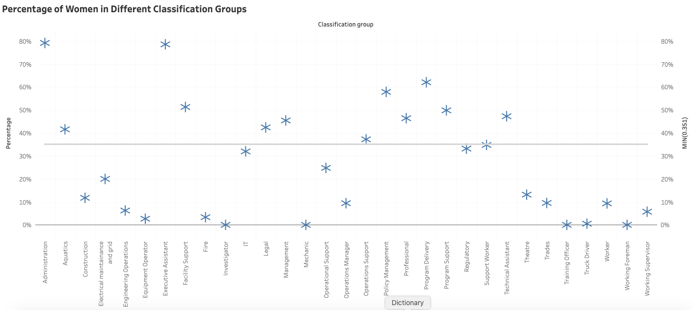
- Fig. 3 Final Visualization 3-1
In our second visualization (Visualization 3-2), we chose to represent the data using a stacked bar chart to show the relative proportions of parts of a whole, in our story, the number of women vs the number of men able to earn maximum hourly wages, from lower to higher wages. Munzner (2014, pp 151-53) indicates a stacked bar chart is the proper idiom to express 2 categorial key attributes – men and women – and 1 quantitative key attribute – max hourly rate.
The primary pro of this visualization is our choice of idiom, which is able to express the story of women being over-represented in lower-paying positions and less represented as pay increases, vis-a-vis men. Helping to make this aspect of our story clear, we chose the second-best identity channel to express categorical attributes, colour hue, to express the categorical attributes of men and women, while the magnitude channel position-on-a-common-scale expresses the number of employees.
A weakness of stacked bar charts, especially one with a wide range of values on the y-axis, is comparing the length of the stacked components can be challenging (Munzner, 2014, pp. 151-52). As a result, this chart may over-complicate the details in the story we want to tell. We feel that judging the heights of the stacked components is somewhat tricky when viewing all pay rates, but using the filter helps to see differences better.
-
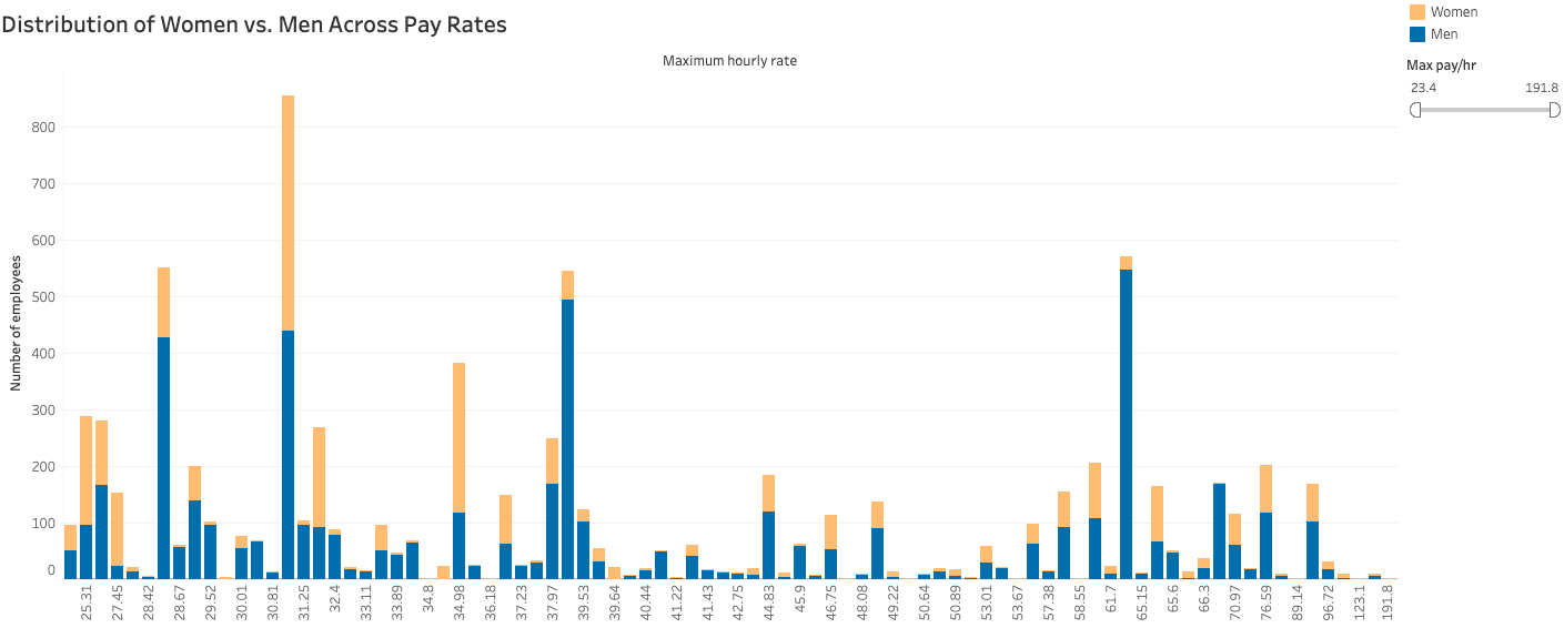
- Fig. 4 Final Visualization 3-2
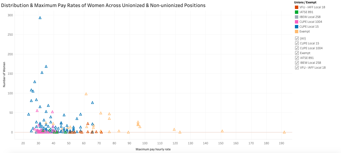
Also following Munzner’s guidance on idioms (2014, pp. 146-148), for our third visualization (see Fig. 6), we used a scatterplot to encode two qualitative value variables (max hourly rate and number of women employees) in the spatial channel while adding a categorical attribute (Union Yes/No) encoded with the colour (hue) channel. Munzner explains this idiom is useful for seeing correlations, and we hoped with it, we could tell the story that Unions are part of the gender wage gap problem. With this visualization, we hoped readers could see correlations between wage and number of employees while comparing how this correlation is or isn’t affected by unionization, and between unions as well.
-
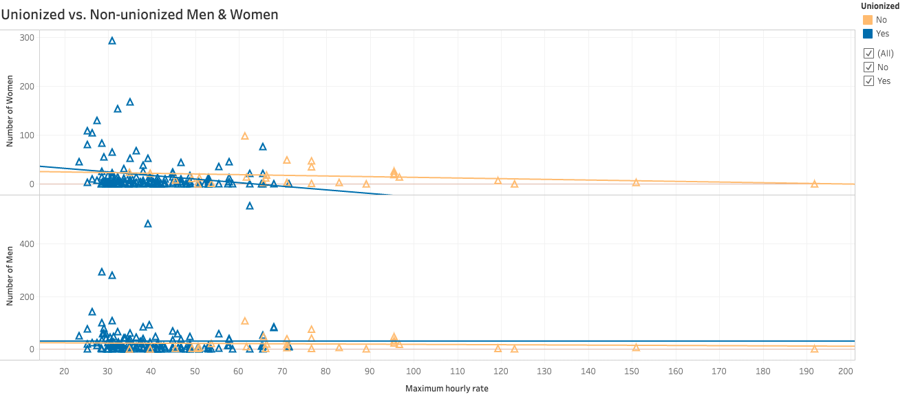
- Fig. 5 Final Visualization 3-3.1
In the fourth visualization (see Fig. 5) we also encoded the number of men employees to allow for comparison between the distribution of men and women employees. These visualizations are effective in helping us to tell our readers that there are differences between unions and between union vs non-union positions concerning the distribution of women over the pay scale. However, their main pro is they tell the story that unions are not mitigating the gender wage gap.
A major con of this idiom for telling this story, though, is the scatterplot is not intuitive to many people. As a result, members of our user group may not be able to derive much meaning from this visualization. Another weakness is that many users may have trouble comparing the men and women distributions since they may not understand the trend lines we added. (We hoped the lines angling downwards in the women’s chart would help to tell the story that as wages increase in both unionized and -non-unionized positions, fewer and fewer women employees are represented).
-
- Fig. 6 Final Visualization 3-3.2
Infographic is the first presented and the most important part of our storytelling. To ensure the consistency and consistency of all the content, we first decided on the theme colors of the website: blue (#087CB4) and brown(#B56807). The choice of blue we made referred to the same colour used by the City of Vancouver and the Open Data Portal website, and we used this colour to present men, the “majority”. Then, we correspondingly chose its complementary colour, brown, to present women in our infographic.
Following the principles of utility, soundness and beauty, we replaced the default font Knewave with Montserrat Extra, which is more formal and easier to read. Also, we strictly limited the number of words in our infographic and emphasized the comparisons by using idioms and the diagram.
That said, a merit of our infographic is it is “[c]ommunicating a message worth telling [and so] provides readers with something of value” (Lankow et al., 2012, p. 200), which should entice many readers to keep reading to find out more about the women workers’ situation. As well, we chose intuitive and easy-to-comprehend idioms for our charts: a bar chart and pie chart. Lankow et al (2012) explain that using bar charts is highly valuable in helping the reader understand what is going on and pie charts, despite their criticism, are useful for “…communicating big ideas quickly” (Lankow et al., 2012, pp. 213, 216). With these simple charts, we quickly introduce the story of how women workers are faring in a way that a large number of our readers can easily grasp.
Accordingly, a weakness of our infographic is it may emphasize comprehension too much and appeal too little. Our goal was to make a clear and intuitive narrative infographic to “… leave readers with a specific message to take away” (Lankow et al., 2012, p. 199), that women workers at the City of Vancouver are fewer and earning less than men. But because our design is quite simplistic and safe, we may not catch viewers’ attention sufficiently enough to compel all readers to read the rest of our story.
Our Story: the Website
In the final deliverable, the news-like webpage we created, we concluded the true but disappointing reality: despite Vancouver’s image as a progressive city, its municipal government’s workforce has not escaped the gender wage gap. Taken together, we combined text, an infographic and visualizations to help to tell the story of this wage gap and give readers the opportunities to uncover trends that reveal why women are not earning as much as men at the City of Vancouver.
First, our infographic provides an overview of how women employees are faring, answering the questions “How balanced is the workforce’s gender representation?”, “How much are women able to earn per hour on average compared with men?” and last, “Are an equal number of women earning the biggest bucks yet?.” Answering these questions, our infographic provides a snapshot that, yes, a gender wage gap exists at the City of Vancouver.
Our visualizations fill out our story, adding complexity and details, offering insight into how this wage inequality persists. One visualization helps to show that women workers are overrepresented in classifications of work dominated by jobs “traditionally held by women,” such as administration, instruction, and service and support roles. We make the connection to the gender wage gap that these jobs tend not to be as high paying as more masculine jobs, including skilled trades such as mechanics, machinists, and so on.
Our visualizations also help to reveal the sticky floor and glass ceiling that holds women back from earning as much as men (McInturff & Tulloch, 2014). We reveal the story of how women are not nearly as evenly distributed across the pay scale as men, with many women in positions toward the pay scale’s lower end. Last, since most City jobs are unionized, we examine what role the various unions play in our story. We reveal that despite unions helping to mitigate the gender wage gap overall in Canada (McInturff & Tulloch, 2014), the women workers represented by unions at the City of Vancouver are not faring better than their non-unionized counterparts. In short, we reveal that unions remain part of the gender wage gap problem.
References
City of Vancouver. (2020). Workforce pay rates and gender. City of Vancouver Open Data Portal. [Data set]. Retrieved June 1, 2020 from https://opendata.vancouver.ca/explore/dataset/workforce-pay-rates-and- gender/information/
Culbert, L., & Griffiths, N. (2020). Public sector salaries: Where are the women? In BC, not many are near the top of the pay scale. Vancouver Sun. Retrieved May 31, 2020 from https://vancouversun.com/news/local-news/public-sector-salaries-where-are-the- women-in-b-c-not-many-are-near-the-top-of-the-pay-scale
Government of British Columbia. (1996). Human Rights Code. Bclaws. Retrieved May 31, 2020, from http://www.bclaws.ca/civix/document/id/complete/statreg/00_96210_01.
Lankow, J., Ritchie, J., & Crooks, R. (2012). Infographics: the power of visual storytelling. John Wiley & Sons, Inc.
McInturff, K., & Tulloch, P. (2014). Narrowing the Gap: The difference that public sector wages make. Canadian Centre for Policy Alternatives. https://www-deslibris-ca.ezproxy.library.ubc.ca/ID/244703
Munzner, T. (2014). Visualization analysis and design. A K Peters/CRC Press. https://doi.org/10.1201/b17511
- Access to the Clean Dataset: https://drive.google.com/file/d/1uZE5HiOJN-jDwaPHkyci7DhOnV5zPoU5/view?usp=sharing
- Link to our Tableau visualizations:
https://us-west-2b.online.tableau.com/#/site/info419/workbooks/233278/views (1st InfoVis)
https://us-west-2b.online.tableau.com/#/site/info419/workbooks/233282/views (2nd)
https://us-west-2b.online.tableau.com/#/site/info419/workbooks/232630/views (3rd) - City of Vancouver – Open Data Portal: https://opendata.vancouver.ca/pages/home/
- City of Vancouver – Job Tittles and Classifications:
https://drive.google.com/file/d/1NksSSbty_-Ra-hwJnbC3Rc4BDBQ9jnbQ/view?usp=sharing
Hi Janet and Eleanor!
Your project is great – you clearly define your research question and the steps you had taken that led you through your research. I appreciate your transparency in how you found the datasets and even reached out directly to the dataset publisher to get job title descriptions. Your references to Munzner clearly explain the rationale behind your design choices, and I’m impressed by your attention to detail in incorporating the City of Vancouver’s website themes into your design. I think your designs are very straightforward, clean, and easy to read.
While I could see all your Tableau screenshots in the post, none of them loaded in your Wix page – it’s just long blank spaces. Not sure if it’s something on my end or if something is missing in the back end? Either way, it might be a good idea to upload your Tableau files to Tableau Public and link to them to make sure they’re accessible to your user.
As you noted, your project excels in the expressiveness of information but perhaps isn’t the most beautiful. I like the aesthetic of your overall design, so I would consider changing the font styles or colors of your explanatory text – maybe using a different color for words in bold, choosing a different font color for the section headings, and/or adding more graphic elements to your explanatory sentences. I encourage you to highlight some of your stats, as they get a bit lost in the text but are very important to note.
Overall, I can tell you put a lot of thought into your research and design process, and your final product illuminates an important issue that probably isn’t common knowledge to the average Vancouver employee. Nice job!
Mandy
Hi Mandy,
Thank for your helpful feedback. That is odd the visualizations didn’t load for you. May I ask which browser you used?
Janet and Eleanor,
Great project! You did a good job defining your objectives and detailing your processes for completing the assignment. You showed a strong rational for all your choices, and cited accordingly. The Wix site really enhanced the project- your design choices created a cohesive whole and hearken back to the City of Vancouver website. I didn’t have any problems with your visualizations loading on the Wix site, and I liked that I was able to interact with them and explore the data on my own.
I think you could make a few format changes that would make for a more polished final product. The section headings are a bit inconsistent; The first and third sections (Where are women employees?, and What about unionized jobs?) are both headed with questions, while the second section is just a statement with odd capitalization. Perhaps there’s a way to frame the pay-gap section as a question so it matches the other. The subheaders are also formatted inconsistently.
I also think you could play a little more with the colouring and sizing of the headings to help direct the readers attention.
Overall, great job! Feel free to reach out on Canvas if you have any questions about my feedback!
Jack
Thanks for the feedback, Jack. Your attention to detail and tips to fix our headings are really helpful! We will fix those, for sure. Glad all the visualizations loaded for you and you were able to explore them.