By Mari Allison, Claire Swanson, and Chase Nelson
Find the Tableau dashboard here.
Introduction
This Tableau dashboard displays information on community gardens at a neighborhood level in the City of Vancouver. Community gardens appear throughout the city in a variety of forms; they provide urban residents with access to fresh produce and land to cultivate in a heavily-developed environment. Such gardens can be publicly or privately managed, and are often divided into multiple plots to be rented by or assigned to individual gardeners. They often offer significant benefits to the physical health and social cohesion of communities in urban and rural spaces (Armstrong, 2000; Wakefield, Yeudall, Taron, Reynolds, and Skinner, 2007). Understanding these gardens as socially-charged spaces, the creators of this dashboard were interested in seeing if there is a relationship between the presence of the gardens and the socioeconomic status of their respective neighborhoods. Particularly, the dashboard uses median income derived from the 2016 Census to explore this relationship. After experimenting with different idioms and creating the final dashboard, no clear, direct correlations could be found; rather, the dashboard highlights specific points of interest that could be further expanded upon by scholars or community organizers interested in studying the roles of community gardens within these areas. Before discussing these points of interests, this blog post will share the process of selecting and cleaning the relevant data, and expand upon why certain design decisions were made for the final product.
Data Selection and Cleaning
The dashboard derives its data from two main data sets, each obtained from the City of Vancouver Open Data Portal. The first dataset provides location and descriptive data on “community gardens and food trees” within Vancouver proper. Along with an arbitrary ID number for each item, the dataset outlines the following attributes: year the garden was created, self-identified name of the garden, street address and geo local data, number of plots in each garden, jurisdiction level (private, Vancouver Park Board, city, Translink, other), steward and management information, and any relevant contact information for each garden. Median income data was derived from the 2016 Census dataset published in the same portal. The group also included late addition data provided by Inside AirBNB. The AirBNB website provided a geoJSON file of spatial data encoding Vancouver neighborhoods. This geoJSON file was used to create the choropleth maps which colored each neighborhood by median income. The creators were able to relate the geoJSON file with the other datasets in Tableau because the “neighborhood” variable in the geoJSON file matched the “geo local area” variable in the Community Garden and Census datasets. There is one disparity, however, in the connection of the datasets. The geoJSON file included a separate item for Downtown Eastside, but this neighborhood was not included in the census or community garden datasets. On the map views, Downtown Eastside is marked off but has no other accompanying data. The creators decided to proceed with the dataset relationship and essentially assume that the Strathcona neighborhood data includes the geographical area of Downtown Eastside. The creators made this decision because Strathcona and Downtown Eastside are contiguous with Strathcona, in fact encompassing Downtown Eastside to the north and south.
The datasets in their original format did not support the investigation of what effect (if any) socioeconomic status had on community garden prevalence. While the creators’ analysis required information at the neighborhood level, the original datasets had individual gardens as the data items. To clean the data, the creators made Vancouver neighborhoods (under the original variable name “geo local area”) the data items and aggregated the number of gardens in each neighborhood. The aggregation of gardens became a new column. The same aggregation process was applied to the number of individual plots available in each neighborhood, and then variables of interest from the census data were added. There was some debate over how to handle the Jurisdiction variable because some gardens had combined jurisdiction: City & Park Board, City & Translink). Because there were not many combined values, the creators decided to group these values with “city.” The creators felt that including separate hues for combined jurisdictions would add unnecessary visual noise considering all of these jurisdictions are, in broad terms, public. Because both the Community Garden dataset and census dataset included information on geo local area, the creators were able to easily connect the two datasets. To add the census data, the rows and columns from the original census dataset were inverted as it placed geo local area as the variable column headers and census questions (language, population, income, etc) as the data items in rows.
Tools
The creators decided to use Tableau Desktop to create their visualizations given the program’s ability to easily map geo local data points. Tableau was not a perfect tool; the creators experienced initial challenges when attempting to establish neighborhood locations that matched the geo-local data attributes, and display settings within the dashboard often led to data being cut out of the main view. While the geoJSON data allowed the group to eventually create a choropleth map view, the tenuous connection between the datasets make highlighting and filtering the data in the layered maps somewhat awkward. Because the group was unable to figure out how to use tableau to connect the choropleth map layer and symbol map layer (thus allowing for filtering and highlighting both layers simultaneously) the group decided to forego including a filter function.
Making Sense of the Data
Given the categorical nature of the base community garden location data, the creators opted to present the data using a symbol map idiom laid over a choropleth map. At first, the creators lacked the geoJSON location data and were not able to effectively display multiple data points using appropriate channels; the initial dashboard contained two side-by-side symbol maps (Figures A & B), where area represented number of gardens/garden plots and luminance represented median income. Luckily, with the inclusion of the geoJSON data, the creators were able to include a choropleth map as well.
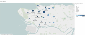
Figure A
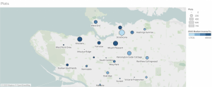
Figure B
The visual channels used by the creators follow the expressiveness principle. Position is used to encode the categorical variable “neighborhood.” The quantitative data attributes of number of gardens/plots and median income level are represented using area and luminance channels respectively. Rather than using a filter to explore the difference between garden and plot data, two layered maps are presented side by side in order to make the differences between the two more apparent; a highlight interaction is included to ensure that the viewer can single out specific neighborhoods in each map with ease. As stated earlier, the forced relationship between the datasets makes the highlighting function somewhat awkward because, while the highlight is linked between the two map views, this interaction is not linked between the map layers. For example, selecting the geographical area of “Marpole” will not also highlight the accompanying circular area symbol. In addition to the two main maps, a stacked bar graph idiom presents the jurisdiction makeup of each neighborhood using hue to represent the categorical data attribute of jurisdiction type as well as spatial position to encode the categorical variable of neighborhood.
When developing the dashboard, the creators experimented with other idioms and data attributes to determine if there were correlations between relevant data. The 2016 Census dataset included many data attributes that would have been interesting to add to the dashboard, such as the “percent visible [racial/ethnic] minority” of each neighborhood (while the term “minority” is not preferred as a blanket term, the creators opted to adopt the terms used in the census data for consistency). Researchers find that urban food amenities such as farmers’ markets tend to target overwhelmingly white audiences and promote processes of gentrification (Slocum, 2007). At the same time, Wakefield et al. find that many urban gardening spaces are tended to by culturally-diverse communities, and often provide spaces for the growth of “culturally appropriate foods” that either cannot be found or are over-priced at local grocery stores. The creators initially wished to expand on these findings by comparing the presence of gardens/garden plots with the proportion of racial/ethnic minority residents in each neighborhood (Figure C), however no direct correlation could be found. Furthermore, a scatter plot (Figure D) was created to visualize the relationship between jurisdiction and percent of visible minorities in each neighborhood; again, no significant correlation stood out.
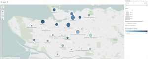
Figure C
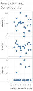
Figure D
Because the spatial, size, and luminance channels were already in use to represent other attributes, there was a lack of additional effective channels to display such data in the final visualization. While the creators decided not to include these visualizations, they did find these graphs useful as visual analytic tools to make sense of the data and inform the contents of the final dashboard.
Confusions: Gardens, Plots, and Jurisdiction
Some of the data attributes inspired confusion that could not be rectified through initial internet research. The deviation in quantities between the number of plots and number of gardens within each neighborhood led the creators to believe that each garden was not organized in the same manner. For example, the Arbutus-Ridge neighborhood has two community gardens, but these gardens have zero plots. In her analysis of community gardening in New York State, Donna Armstrong (2000) noted the presence of undivided gardens that were tended to communally, and often affiliated with community service organizations. Arbutus-Ridge may be an example of such a garden, however the creators were unable to visit the location to confirm due to geographic disbursement and the state of the COVID-19 pandemic. More on the difference between gardens and plots will be touched upon in the discussion of the final dashboard.
Another point of confusion presented itself in who has ultimate jurisdiction over each garden. As noted previously, gardens can fall under the management of one or more of the following groups: private groups or organizations, the Vancouver Board of Parks and Recreation, Translink, the City of Vancouver itself, or “other”. The Vancouver Board of Parks and Recreation is unique in that it “is the only elected body of its kind in Canada” (City of Vancouver, 2020), meaning that residents have a greater say in the management of the city’s public recreation spaces. Furthermore, the dataset failed to define “other” in terms of jurisdiction. The variety in makeup of jurisdiction is interesting to observe through each neighborhood, but the implications are hard to determine through online research alone. Beyond certain zoning laws restricting the size of structures such as sheds and greenhouses allowed on the garden’s land, this group found little information illuminating whether jurisdiction type had any meaningful impact on the actual operations of the gardens and/or allotment of plots. Again, in-person visits may have provided more context for the analysis of each jurisdiction.
Concluding Discussion
Ultimately, this dashboard shares potential points of interest that could be further explored in research regarding the role of community gardens in the City of Vancouver. As one can see in the two symbol maps, two of the neighborhoods with the largest number of gardens and garden plots, Mount Pleasant and Strathcona, also represent the extremes of median income. While both neighborhoods have a good variety in jurisdiction makeup, Strathcona has a significant number of gardens that fall under the “other” category, implying unique forms of management. Additionally, the number of gardens and garden plots increase as one gets closer to the city, which could imply a greater need for cultivable land in heavily-urbanized areas.
It is important to note a distinction between the outcome of the dashboard and the group’s original project proposal. In the proposal, the group intended to create knowledge through the display of particular variables mapped onto the neighborhoods of Vancouver. The group also intended to communicate existing knowledge about the benefits of community gardening through the creation of an infographic, but time limits did not allow for the completion of this task. With regard to the former intention of this project, the dashboard displayed by this group did not create new knowledge, but rather raised further questions. For example, what does the deviation between number of gardens and number of plots mean for community engagement with communal gardening? As questioned earlier, does jurisdiction type impact how the garden is operated? Another important question that remains unanswered is that of each garden’s condition. There exists no known data illuminating whether or not these gardens are in use or are overgrown. Further research should be done on the implications of management and organizational styles, particularly regarding their effects on community health and social cohesion.
Data Sources:
City of Vancouver. (2016). Census local area profiles 2016. [Data file]. Retrieved from https://opendata.vancouver.ca/explore/dataset/census-local-area-profiles-2016/information/
City of Vancouver. (2019). Community gardens and food trees. [Data file]. Retrieved from https://opendata.vancouver.ca/explore/dataset/community-gardens-and-food-trees/information/?sort=name
Inside AirBNB. (n.d.). Vancouver, British Columbia, Canada. [Data file]. Retrieved from http://insideairbnb.com/get-the-data.html
Work Cited:
Armstrong, D. (2000). A survey of community gardens in upstate New York: Implications for health promotion and community development. Health & Place, 6(4), 319-321. https://doi.org/10.1016/S1353-8292(00)00013-7
City of Vancouver. (2020). Vancouver Board of Parks and Recreation. Retrieved from https://vancouver.ca/your-government/vancouver-board-of-parks-and-recreation.aspx
Slocum, R. (2007). Whiteness, space and alternative food practices. Geoforum, 38(3), 520-533. https://doi.org/10.1016/j.geoforum.2006.10.006
Wakefield, S., Yeudall, F., Taron, C., Reynolds, J., & Skinner, A. (2007). Growing urban health: Community gardening in South-East Toronto. Health Promotion International, 22(2), 92-101. https://doi.org/10.1093/heapro/dam001
Hello Claire, Mari and Chase.
Thank you for posting the images! I have never seen a map displaying community gardens in Vancouver before, and found myself examining your visualizations with curiosity. I think my interest means that your visualizations help to tell a valuable story, and so are good.
I’m impressed that you found and made use of two datasets for your project, requiring extra effort on your part for cleaning and exploring your data, and finally connecting the two datasets. I appreciate your creativity and problem solving used when finding ways to wrangle the data to support your goal to investigate the gardens’ prevalence related to the socioeconomic status of Vancouverites. (For example, creating the new attribute, “geo local data” to allow you to sort the gardens by location at the neighborhood level). Also, I think your choice of placing the two symbol views side by side, rather than using a filter, helps with making comparisons. As well, I appreciate how you discovered how the gardens might be organized differently and how these differences, as represented in the data, may not be that meaningful/useful. The choice of idioms are suitable the data types and number of keys and values. Choosing area and luminance channels to encode the number of gardens/plots and median income level respectively were good choices – these charts are quite effective and I find I can grasp what information they represent easily and quickly (they are intuitive).
Despite your visualization not revealing what you had hoped and not meeting your goal of creating new knowledge, it still is valuable for revealing new questions to users.
Tips for improvement:
– In the stacked bar chart Jurisdiction, I see Null values are displayed. I’m not sure if this is correct. Would it be better to hide these values? I’m not sure what the Null values represent within the attribute Jurisdiction (is no jurisdiction different from Other jurisdiction?).
– In the same chart, I think renaming the attribute heading “Geo Local Area” to something more descriptive (e.g. neighbourhood? Or area in Vancouver?) could be helpful for users’ understanding.
– Because the plots and gardens distinction, and the relation of one to the other, may not be intuitive to some users, is it possible to add a subheading to each which might be more descriptive?
– In the dashboard, is there a way to tweak the format of the stacked bar’s x-axis area so that all the categorical variables display? Right now, only labels for every other neighbourhood seem to be displaying. From my experience, tweaking the format in Tableau can be a bit frustrating, but maybe there is a quick solution?
– I wonder if changing the order of the items in the stacked bar chart could make it more effective.
For future work, it would be interesting to examine the data further to look for reasons for why the southern part of the city has fewer gardens and plots than does the centre and northern areas (except for Killarney). Your maps make me very curious about why the most and least wealthy areas have the most community gardens. Rather than differences, are there similarities between these areas that are connected to this high number of gardens? Investigating this could be valuable to city planners, landscape architects, community organizers, and so on.
Hi Janet,
Thank you so much for your feedback; this is all really helpful!