Our dashboard can be found here.
Our infographics can be found here.
Introduction
In this project, we designed an interactive dashboard that enables the audience to explore the relationship between the characteristics of a medical insurance beneficiary, such as age, Body Mass Index (BMI), smoking status, and the insurance costs incurred in the United States. By visualizing the Medical Cost Personal Dataset, we try to answer questions such as does an increasing BMI increase the medical costs? How about age? Number of children? Smoking status? Furthermore, we designed infographics to demonstrate our findings in the correlation between personal factors and medical costs.
Our intended audience is the public that is interested in medical expenses. The US is well-known for its lack of universal healthcare and perplexing health insurances. We hope our design could help the audience make informed decisions with regard to healthier lifestyles, no matter if they have the privilege to visit hospitals.
Data
For this project, we are using the Medical Cost Personal Dataset. This dataset is used in the book Machine Learning with R by Brett Lantz and extracted from Kaggle by Github user @meperezcuello. The data is in the public domain. (meperezcuello, 2019) Originally, the dataset was used to train a machine learning model to predict the insurance cost. We are aware that it is only a small sample of medical insurance costs in the US of people aging from 18 – 64. There’s no detailed demographic information such as race and county. And it cannot reflect the health condition of people who don’t have insurance.
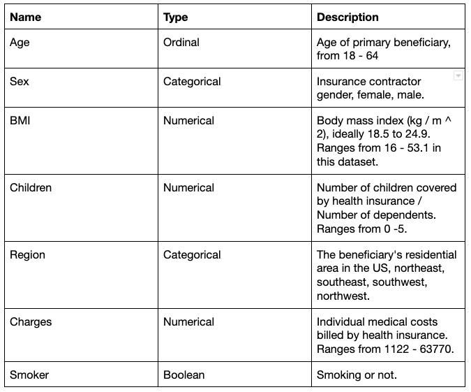
It has 7 attributes and 1338 records. The attributes are as follows:
Tools
For the interactive dashboard, we use the Tableau Desktop. Tableau is very easy to use when doing visual analytics. Compared with Shiny or Plotly, Tableau requires minimal technology shrewdness to build a dashboard. It also provides a variety of native visualization idioms and color palettes that are sufficient for our project. Another reason we choose Tableau is that it provides a free platform where we can easily publish our work. For the infographics, we used infogram. It was a great tool to use because it had lots of templates which are easy to modify. And it’s also user friendly.
Analysis
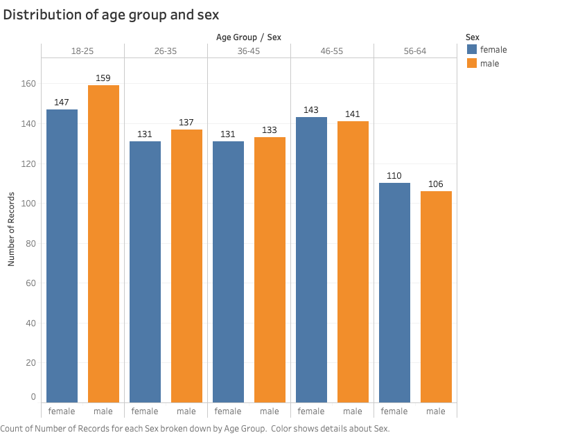
We first made some static visualizations to get familiar with the data and understand the distribution. The dataset has most samples in the 18 – 25 age group. The largest difference of numbers of beneficiaries from both sexes is also in this age group.
The distribution of insurance charges is right skewed. More than half of the charges are lower than 12,000. A few records are higher than 50,000.

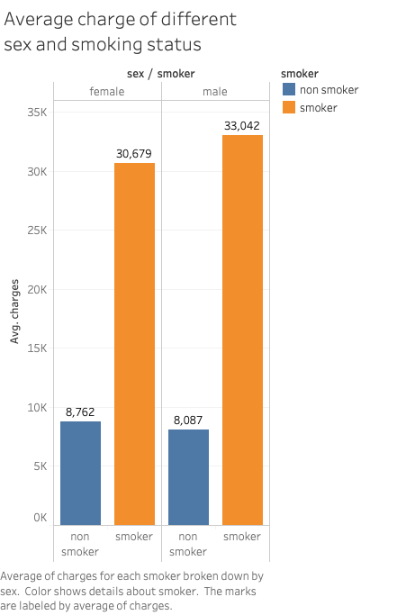
On average, male beneficiaries are charged more than female ones. The difference is more drastic across different age groups and smoking status.
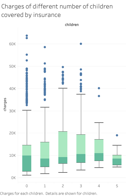
We once thought the number of children covered by insurance may also be a factor that affects the charges. But the following box plot shows that the medians of charges across different numbers of children are quite close to each other. The distribution of charges of beneficiaries having no minor dependents is wider than other beneficiary groups. The most expensive charges also show up in this group. The minimum of charges grows steadily when there are more children covered by insurance. But there’s no clear pattern of the maximum. One possible explanation is that people who have no minor dependents may be older and have independent grown-up kids. Therefore they may have more medical costs due to their age.
We used two scatter plots to discover the relationship between quantitative variables, namely age vs. charges, and BMI vs. charges.
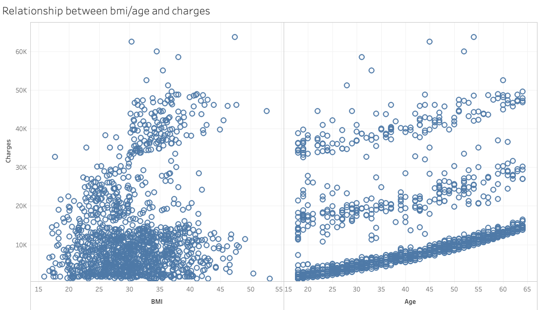
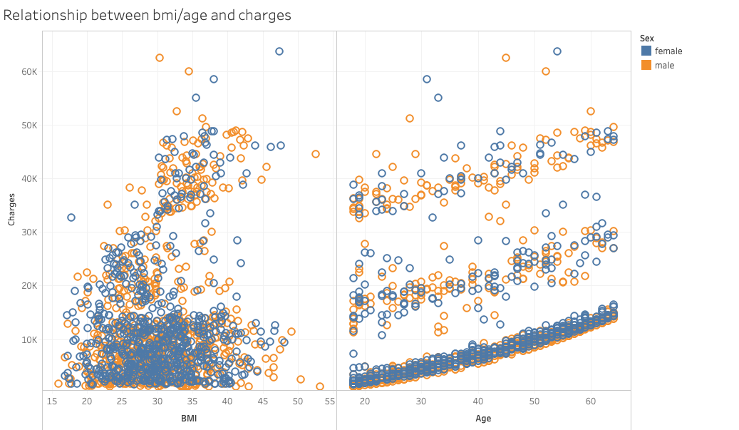
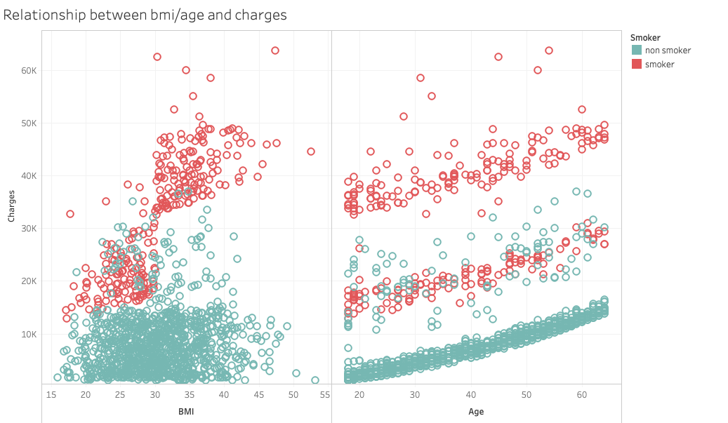
The scatter plot on the left hand side indicates the relationship between BMI and medical charges. There’s no clear pattern in the graph. The plot on the right hand side shows the relationship between age and charges. There are three clusters with similar slopes, growing as the age increases. When we take sex and smoking status into concern, it shows that there’s no clear difference in distribution between sexes, while the smoking status tells us more interesting information.
The BMI-vs-charges graph implies a positive correlation between BMI and medical charges within smokers. The age-vs-chages graph shows that smokers dominate the highest cluster, non smokers the lowest. These two graphs are later used in the interactive dashboard.
Design Approach
We developed our design approach by analyzing our target audience’s tasks. We aim to allow users to play with the data and find out the relationship between medical costs and factors of their choice, such as age, gender, and region. Using Munzner’s framework of task abstraction, we identify our audience’s goal at the highest level is to discover the relationship between medical costs and other factors. At the lower level, our design should allow users to compare between different groups, such as age, sex, and region. Due to the simplicity of our data (only 7 attributes and 1338 records) and the lack of granularity, our design doesn’t emphasize the mid-level tasks such as looking up and locating.
To support discovery of the relationship between quantitative variables, we designed a scatter plot where users can choose the x-axis. The y-axis is fixed and indicates the medical costs. Furthermore, to support the visual queries of comparing groups of data, such as male vs. female, and smoker vs. non-smoker, we used a pre-attentive visual primitive, namely colors (Ware, p.29). When choosing “breakdown by sex” or “breakdown by smoking status”, the spots will be divided into two colors. When breaking down by sex, it is difficult to separate the two colors, which indicate male and female, from each other. On the other hand, when breaking down by smoking status, the red spots indicating smokers pop up and show a clear trend different from the green spots, which indicates non-smokers.
The principle of soundness/utility/attractiveness were used in the design. The infographics gives a detailed overview of the factors that affect medical cost in the Northwest, Northeast, Southwest and Southeast region of the United States. It shows the Sex and number of records for each age group. It also shows how age and lifestyle (smoking) plays a factor in medical cost. All information in the infographics are truthful and honest. The data representation and credible analysis was gotten from Medical Cost Personal Dataset. Simple illustrations were used which complements the data conveyed in the infographic. Being a medical related topic, white was used as the background colour as it is associated with medicine/hospital. For the age factor, bold colours were used for the younger age range as it signifies strength and agility that comes with young age while warm colours were used for the older age range as it signifies security. Furthermore, two font sizes were used, one for heading and subheading while the other for body. All texts were aligned evenly. Overall, infogram was a great tool to use expect for one or two challenges we had- we found it difficult to customise the pictogram template to our desired choice.
Reference
Meperezcuello. (2019). Medical Cost Personal Dataset. Retrieved from https://gist.github.com/meperezcuello/82a9f1c1c473d6585e750ad2e3c05a41#file-readme-md.
Munzner, T. (2014). Visualization analysis and design. Boca Raton: CRC Press.
Ware, C. (2008). Visual thinking for design. Burlington, MA: Morgan Kaufmann.
Hi Margot & Busola,
Great job on your project! The idioms you picked out were really effective and I enjoyed learning all sorts of new information!
Here are my recommendations:
One thing that I would recommend is that you make sure that different elements don’t have the same hue. For example, the number of female records is the name as individual female records when they were plotted. Similarly, the number of total records from the “null” section is the same color as female when you apply the gender filter.
I would also love to see some reference lines or labels on the graph that demonstrate the details that you put into your blog post. For example, you discuss positive correlation on the BMI graphs that analyze distinctions between smoking status and what each band corresponds to. It would be great if you could introduce labels to show what these bands represent within the visualization or trend lines that show their differences and similarities.
For your infographic, I wondered if there might be a different idiom for your smoker breakdown than the one you have. The text mostly focuses on cost, but the graphic itself is more to do with population. Because color does not differentiate between sex, and the icons are fairly small, it’s kind of hard to understand what’s going on. I would recommend that if you would like to keep the population breakdown graphic (which is a neat idea and I think it adds value), I would suggest maybe putting two side by side, one for female and one for male records.
One last note: the “56-64” text hue is really difficult to read. As is the “325 from the Northwest Region”.
Thanks again for creating this project!
Hi Margot and Busola,
I think you’ve done a really great job! Some things that I really liked about your blog post: 1) your writing is very clear and concise making it easy to connect your narrative with the visualizations; 2) I thought including the table that describes your data and its attributes was a helpful addition to get a better sense of what is being investigated; 3) I also appreciate that you avoid broad claims of causation and instead focus on correlation. This is also apparent in the box plot graph explanation in which you identify possible confounding variables; 4) Additionally, I find your color choice to be appropriate for encoding categorical variables.
Some very minor adjustments you may want to consider: 1) it would be helpful for the reader if you either add figure numbers within the text that point to the appropriate graph or rearrange the placement of the graphs within the text so that when your narrative discusses a particular visualization it comes right after that sentence (adding figure numbers would probably be easier though?). I found that sometimes there was a disconnect between the visualization you were discussing in the text and the next visualization to be shown on the page. 2) You might also consider changing the colors of the bar graph depicting smokers vs nonsmokers since the scatterplot uses green and red. This way, the graphs that distinguish between male/female would be blue and orange, and the graphs that distinguish smokers/nonsmokers would all be green and red.
Ideas for further development: While this is not meant to be included in your project, one potential idea for further investigation would be to look at the differences in charges based on race (keeping in mind that there would also be confounding variables involved in this). This might be relevant given the terrible history and ongoing crisis of health care inequality in the US.
Overall, I think you’ve done some really strong work! Good job!
-Claire
Highlights:
-really useful table in the blog post breaking down the attributes and using the description column to help me understand their relevance. I’m just a little confused by the “insurance contractor” description for sex. This makes it sound like it’s capturing the sex of the insurance agent, is that right?
-blog post section on tools and your analysis was eloquently written and really shows off your knowledge and expertise of these tools. It seems your team was able to come up with many sound hypotheses from the data patterns, especially from the scatterplots. Like you mention, the division between smokers and non-smokers is made exceedingly and instantly obvious by the higher spatial position of the dots (representing higher medical costs).
-really appreciate breaking up the blog post with all the different charts and breaking down each attribute and the way you examined the data for each.
-I love all the different interactions you’ve included in the dashboard – lots of things for me to play around with and look at! I didn’t feel like the charts for distribution were that helpful to me though. It’s useful to see, in the region view, that the distribution of data points remains relatively similar across all regions, showing that location doesn’t seem to be much of a contributing factor.
Tableau improvements:
-Using the Exploring Quantitative Factors scatterplot for example but this goes for all the graphs utilizing dots: I’m concerned about the way the blue dots overlap the orange dots to my naked one, it gives the impression that there’s much more blue than orange in that area, but in reality it’s just because the orange dots are getting blocked by the blue. And you guys recognize this in your writeup. Would it help to minimize the size of the dots? But you are right, the distinction between smokers and non-smokers is very clear.
Infographic improvements:
-The sub-title could use capitals for “Cost” and “Personal” to be more uniform!
-Easy to see the 5 different areas of the United States; makes sense to have the text in corresponding colours, but perhaps you could put them inside a box so they’re easier to read! The red font especially is hard on the eyes. Similar for the blue font “56-64” under the “It is observed that the older you get…” section.
-The bar graph for the “It is observed that the older you get…” section looks great, but it might be useful to include the unit of measurement for Medical Cost as (USD)
-In the smoking section, that cyan blue is again difficult on the eyes! I like the hovering effects, so that I can see the category and numbers pop up. However, can you contextualize these numbers further? It took me a while before I realized that the numbers must represent money (I initially thought it was # of people). Maybe you could make that more clear? I’m not sure if this pictogram is the most effective way to represent the breakdown of categories and the amount they spend on medical. I have a hard time finding a clear link between the number of human icons and the financial facts on the side. If you couldn’t hover over the human icons, it would be mere decoration.
-Super interesting discussion on why your team chose all the different colours. I like how the colours were meaningfully chosen. However, I did initially think there were a few too many colours and the infographic no longer felt like a cohesive whole.
Other:
-I’m unfamiliar with reading box plots – I wasn’t too sure how to understand the Charges of Different Number of Children Covered by Insurance section. I feel like if this were included in the Tableau dashboard, I could hover over the data points and understand it better!
-I actually like the way your team represented the distribution of records in your infographic more than the distribution charts at the top of the Tableau dashboard! If you were ever to embed all your content into a single webpage, I don’t think the distribution charts are necessary to represent in Tableau because that information doesn’t require being manipulated by the viewer.
-And lastly, just a few small grammar and punctuation mistakes in the blog post! Margot, you have me on Facebook. I’m happy to do a proofread if you guys want it!
This was such an interesting topic for me, given that I have quite an interest in health and have an undergraduate minor in Health Sciences (although that was with a Canadian context and the American way of doing things is o very different!). For further developments beyond the project’s scope, I would be interested in seeing a breakdown of what these medical costs actually are and if these same factors (age, sex, BMI, smoker/non-smoker) still apply (my hypothesis is yes!). Hope my thoughts were clear; let me know if you need me to elaborate more!
These two were supposed to be separate points. I’ve re-posted for clarity.
-I love all the different interactions you’ve included in the dashboard – lots of things for me to play around with and look at! I didn’t feel like the charts for distribution were that helpful to me though.
-It’s useful to see, in the region view, that the distribution of data points remains relatively similar across all regions, showing that location doesn’t seem to be much of a contributing factor.