Readiness of Countries for Covid-19
Our website can be found here https://covidreadiness.weebly.com/
By Eiman Elnoshokaty and Hannah Tanna
Objective
Our goal in our InfoVis is to offer a visualization of both socio-economic and health-related data in an attempt to explore possible relationships between the levels of fatalities attributed to the Covid-19 pandemic in selected countries and the health sector infrastructure preceding the pandemic outbreak. We want to explore whether the readiness of health services in countries’ socio-economic circumstances (represented through GDP) has any influence on their ability to manage the health crisis during the current Covid-19 pandemic outbreak. Despite the general understanding and belief that the current Covid-19 outbreak is considerably perplexing to countries regardless of their actual healthcare system and infrastructure (Le Page, 2020), we think that the understanding of the nuances differentiating countries in terms of preparedness prior to the outbreak and making a connection with their manifested performance in handling the growing numbers of infected cases as Covid-19 attacked, helps inform the general public, media and news agencies, and policy makers of the consequences of governmental policies and practices, raises questions of accountability, mobilizes public debate, and eventually dictates future policy changes to learn from best practices and develop into a more prepared state to face similar challenges in the future.
Data
Four datasets were extracted from reliable open access resources affiliated with the United Nations: the World Health Organization (WHO) and the World Bank. As was expected, many countries did not have consistent reports to the UN and so some statistical figures were missing on the datasets. A few countries were missing data from the previous two or three years, others have gaps in the reported data during years of recent political turmoil. Accordingly, we have decided to extract the last reported figures for every country for each of the indicators.
During our data cleaning process, we eliminated unneeded data and attributes to help make the data relatively manageable, for example we extracted only the data for the corresponding thirty countries we had chosen for this project and deleted rows that included totals and notes. The cleaning process also included the unification of country names (sticking to shorter names) and verifying values from multiple data sources (for example World Bank data with UNDP’s and WHO’s figures).
The attributes included in most datasets are either categorical (including countries) or ordered quantitative (such as the numbers of physicians per 1000 persons, total numbers of reported cases and deaths or percentage of health expenditure with reference to GDP), and one quantitative derived attribute to deduce the death rate from Covid-19 (Munzner, 2014, p.32).
Our datasets include the following:
- The number of hospital beds per 100 persons (https://data.worldbank.org/indicator/SH.MED.BEDS.ZS)
- The number of physicians per 1000 persons (Physicians include generalist and specialist medical practitioners) (https://data.worldbank.org/indicator/SH.MED.PHYS.ZS). The dataset was also compared to similar data from the World Health Organization (WHO).
- The expenditure on the health sector as a percentage of the country’s Gross Domestic Product (GDP) (https://data.worldbank.org/indicator/SH.XPD.CHEX.GD.ZS). The dataset was also compared to similar data from the United Nations Development Programme (UNDP).
- GDP (in current USD) (https://data.worldbank.org/indicator/NY.GDP.MKTP.CD)
Tools
The tools we used for this project to establish and clean data and then visualize them are MS Excel and Tableau Desktop, respectively (image 1).
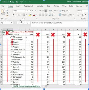
Image 1. Example of data cleaning process performed using MS Excel
Both of us are familiar with Excel and so for working with data, this was the most convenient way. For visualizing our data, we used Tableau Desktop as we have already worked with this software throughout this course so we have become somewhat comfortable with it. The choropleth maps were created using the Tableau mapping feature which allowed for a luminance-based representation of both the income level and the percentage of deaths for the sample countries we decided to work with. It also allows for demonstrating more data/information upon hovering over any of the represented countries. Tableau Desktop also enabled us to create a number of static bar and line charts and link them to the choropleth maps. It also ensures a final product that looks polished.
We used Infogram to create an infographic to illustrate excess deaths during covid. This was created using a blank page and all the idioms, text, and images were manually designed and inserted to form the infographic. This was a tedious task and it would have been more efficient and less time-consuming if Infogram had more preset templates. It also made it tough to ensure everything is lined up and the infographic well-balanced. On the other hand, it enabled us to create a personalised product.
We used Infogram again for another infographic, however this time, we relied on customizing preset templates to create an infographic to communicate the in-focus story on Egypt as one of the low- to middle-level income countries in our sample. Infogram was helpful in providing a wide array of templates, icons, importing of external images to incorporate in the design, and allowing for sharing the final design using HTML scripts to embed within other content management websites. Initially, we found difficulty in resizing both infographics while maintaining proportionality of the icons and design elements incorporated in the design; fortunately, this was able to be adjusted on our host site for the project later on.
Finally, we published our visualization on Tableau Public and chose to host it, together with the infographic, on Weebly. We found Weebly to be quite easy to use, included simple yet aesthetically pleasing templates, and allowed for much customization of embedded elements (hosted on the former listed external websites and platforms). On the other hand, Weebly is not an Open Source tool, so access to the backend code of the website is inaccessible; the exporting of the contents to other platforms is very complicated, and other than the incorporation of external images and embedded content, it is very complicated to include contents other than the internal items and icons offered by drag and drop. As neither of us had used Weebly before, there was also a slight learning curve to overcome.
Analysis
When it came to the analytics that preceded visualizations and designing the infovis, infographic, and website, we relied on our story that we were predetermined to tell. It is based on our understanding of the story that we selected the datasets to extract and a broad understanding of the visualizations we wanted to design. Our goal has been the production of new knowledge about the factors underlying the performance of world countries in handling the Covid-19 crisis through the visualizations of data which the audience can consume and interpret. To achieve this, we allowed for search and query of the visual data. Prior to the creation of the visualizations, we were wondering whether countries with higher GDPS and higher percentage of GDP spent on health expenditure would mean that they were more prepared than those that had lower numbers. We also knew that with certain countries the reported figures and what we hear on the news would not add up. We did explore the data, but it was only once we created the visualizations that some of initial thoughts were either proven to be false or confirmed.
After creating the map visualization and linking it to the static graphs representing the indicators for healthcare infrastructure, we came to the conclusion that there was no clear-cut correlation between the healthcare indicators and the death rate from Covid-19. A positive relationship could be found between both data clusters especially in some low-income countries such as Yemen and Egypt. This could be attributed to the wide claims of world-wide under reporting of Covid-19 cases and deaths (Burn-Murdoch, J., et al., 2020) (Findlay, S. & Singh, J., 2020).
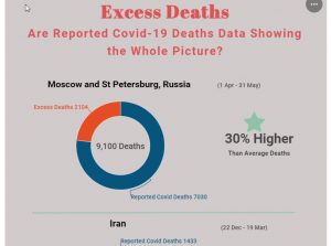
Since we are in the midst of the pandemic still, our project was constantly informed. One argument that came about due to the constant revelations was how much higher the number of average deaths are in all countries, evidently as a result of Covid-19 or Covid-related deaths. Yet, there is a discrepancy between the official deaths caused by Covid-19 and the other excess deaths. Examining these total excess deaths helps us see the true numbers. These thoughts and other side of the story came up thanks to the constant reports on the pandemic.
Design Process
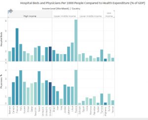
For visualizing the physicians and hospitals per 1000 persons indicators (pictured above), we chose the bar chart as an idiom to represent three datasets. Luminance was added on top of the bar chart to add another dimension to the analysis process which is the percentage of health expenditure. In terms of expressiveness, the visual encoding expresses all (and only) the information in the data set, using magnitude channel (length for the 1D bars – since bar width has no significance), which happens to also be highly ranked in terms of effectiveness for the quantitative attribute type (number of paid leave weeks). In terms of countries, the expressiveness was put into consideration when selecting the identity channel (hue) to represent the selected countries on the choropleth map using the same color (red), while using luminance to indicate the death rate, where darker red indicates higher death rate and vice versa. thus making the comparison between countries more efficient and easier.
(Pictured above, portions our two infrographics)
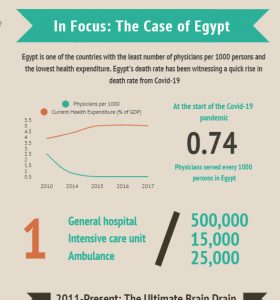
According to Lankow et al. (2012) the Vitruvius’ principles of good design is fulfilled by combining utility, soundness, and beauty. Utility-wise, this is better classified as a narrative infographic for it guides its intended audience through a specific set of information that conveys a message through a story. Moreover, any details and analysis related to Covid-19 is currently highly relevant to audiences around the world. Icons such as hospital and physicians’ images and icons in addition to graphs have been included to balance the amount of text and to communicate information in a more visually appealing manner. On “Case of Egypt” infographic, the colour palette that includes four main colors: teal, brown, white and occasionally orange was selected and abided to. Teal was also widely used throughout the website on Weebly, including in the selected welcome image at the page title, and in the InfoVis. Infogram was used to design and produce the infographics. In the Egypt infographic, a line chart was the idiom used to visualize data related to Egypt. Two datasets were represented in the graph to demonstrate possible patterns and correlations between the two datasets. In the “Excess Deaths” infographic, doughnut charts were used as the idiom to visualize the data, the figures for which were sourced from the BBC News.
The Story
The InfoVis and infographics that we designed for this project tell the story of whether there is a direct (or any) correlation between higher GDPs and higher expenditure on healthcare including more hospital beds and physicians to result in lower percentage of deaths from COVID-19. Our visualizations show this all in one place to allow brushing and linking and enabling comparisons to be made between countries with higher and lower incomes. We are ultimately creating visualizations to allow the audience to make connections and see if patterns exist. The result we found was that there is no direct correlation as certain countries with higher GDPs and more robust health infrastructure had a higher percentage of deaths than certain countries with lower GDPs and fewer hospitals and physicians. Our infographics go deeper to give reasons and add to this story by using Egypt as an example in addition to showcasing that the death tolls that have been officially reported to have been caused by COVID-19 may in fact be underreporting the deaths.
We kept the number of countries to 30 so that the data is easier to digest and also took into consideration the limitations of time and scope for this project. Our selection process include the following categories and rationales:
- Countries receiving extensive media attention and coverage
-
- This gives the audience a sense of familiarity from which they can make comparisons and also get a better sense of the data
- Example: Italy, USA, and Canada
-
- Countries that we have not been hearing about often or at all in the news and other media (note: we thought choosing countries surrounding the Mediterranean represented this goal well).
-
- Audience can look at the data for regions unfamiliar to them and/or whose covid-related reports has not been covered as much
- Example: Lebanon, Syria, and Tunisia
-
- Countries whose data and comparisons we were interested in due to their current political climate
-
- Example: Russia and Iran
-
Pros and Cons
Overall, our project has achieved the goals and questions we had about the relationship between death tolls from COVID-19, GDP, and health infrastructure.
The Tableau dashboard we created is clear and easy to understand/intuitive for users to explore as well as search for information. We have many filters to help the users navigate the visualization. The idioms have taken into consideration expressiveness and effectiveness and using appropriate visual channels to enhance the visualizations. Our infographics are also easy to read/understand and complement as well as extend our primary story of making connections between death tolls, GDPs, and health infrastructure. Furthermore, they are visually appealing and incorporate idioms and text to clearly display data.
There are some downfalls to our project. The first one is that we have represented the data for only 30 countries. This is something we decided because we wanted to focus on certain countries and also because of time limitations we had for this project. However, this also means that if a user is interested in comparing the data in our Tableau dashboard with a country outside of the ones we have selected, they would have to leave the visualization and find the data of the country they are interested in. Another issue is that the embedded Tableau Public (where we are hosting the visualization) works slower in Weebly as it takes a while to load the results that the user selects (i.e. from the filters). To help mitigate this, we have placed a link to Tableau Public on the Weebly site, where this visualization is hosted, to allow for faster loading speeds.
References:
Abd El-Galil, T. (2019, Jul 29). Egypt’s Doctors are Fleeing, Leaving Behind a Physician Shortage. Al-Fanar Media. Retrieved from: https://www.al-fanarmedia.org/2019/07/egypts-doctors-are-fleeing-leaving-behind-a-physician-shortage/
Burn-Murdoch, J., et al. (2020, April 26). Global coronavirus death toll could be 60% higher than reported. The Financial Times. Retrieved from: https://www.ft.com/content/6bd88b7d-3386-4543-b2e9-0d5c6fac846c
Dale, B., Stylianou, N. (2020, June 18). Coronavirus: What is the true death toll of the pandemic? BBC News. Retrieved from: https://www.bbc.com/news/world-53073046
Egypt’s Medical Syndicate refuses suggestion to give pharmacists doctor’s license. (2020, May 5). Egypt Independent. Retrieved from https://egyptindependent.com/egypts-medical-syndicate-refuses-suggestion-to-give-pharmacists-medical-license/
Findlay, S. & Singh, J. (2020, June 11). Delhi accused of under-reporting coronavirus deaths. The Financial Times. Retrieved from: https://www.ft.com/content/5049c66f-449d-4a13-ba1c-f95893b60597
Global Health Workforce Statistics, OECD, supplemented by country data. World Health Organization.
Lankow, J., Ritchie, J., Crooks, R. (2012). Infographics: The power of visual storytelling. Hoboken, N.J: John Wiley & Sons, Inc.
Le Page, M. (2020, February). Coronavirus: How well prepared are countries for a Covid-19 pandemic? New Scientist. Retrieved from https://www.newscientist.com/article/mg24532693-500-coronavirus-how-well-prepared-are-countries-for-a-covid-19-pandemic/
Munzner, T. (2014). Visualization Analysis & Design. doi:10.1201/b17511
World development indicators. Washington, D.C.: The World Bank.
Hi Eiman and Hannah! Great work so far on your visualization project and your blog post. This is a complex topic and you’ve done a nice job of framing the issue you’re investigating: whether countries with higher GDPs and more robust health infrastructure have better managed the COVID-19 crisis than those without.
I’m particularly impressed by the Tableau dashboard, where you’ve included several linked views that allow readers to manipulate various filters in order to look up stats on specific countries, or to compare countries they’re interested in by selected them from the list. Your choice of idioms and your selection of channels with which to encode attribute values seems appropriate for the data types and enables readers to make quick visual queries. Your infographics are also very clean and readable, with good choice of iconography. (I like the confused doctor at the bottom!).
Some suggested tweaks are listed below.
– You may wish to check the size and resolution of some of your embedded images. The image at the top of the post, in particular, is a bit pixelated.
– I suggest making the width of your text sections, dashboards, and infographics consistent throughout the post, with equal margins on each side. This should make the page feel more cohesive, and make certain sections easier to read. The infographic, for instance, takes up most of my screen, and would appear more approachable if you decreased the size a bit.
– I wished for a bit more context to explain your inclusion of various news headlines at the top of the post!
– Within the infographic, I think the bar chart on Egyptian physician salaries needs more framing. What do the numbers on the scale represent? Thousands of dollars? In which currency? What does “other specializations” refer to? Other kinds of medical professionals, or specialized professions in general? What does “monthly spending” refer to? Is it the physician’s cost of living?
– I wished for a bit of explanation as to why you selected these countries in particular to include in your analysis.
Your project raised some other questions for me that are beyond the scope of the assignment. I wondered how timing might be affecting some of these measures. Countries that contracted the virus earlier in this crisis might be showing higher numbers simply because the virus has been slower to emerge in other places. I would also be interested to know how reliable the reporting mechanisms are in different countries, given varying socio-political conditions. Finally, I’d like to see how China measures up against these countries, since it was the first place the virus took hold. Was it difficult to find reliable data on the health care conditions within China?
Overall I congratulate you on your work on this project so far. Best of luck with your remaining tweaks and I look forward to seeing the finished project!
–Jessica
Blog
Your blog post made for a very interesting read and offered several ways for audiences to access your data. (I.e. through the narrative, tableau dashboard, and infographic). I might recommend having the title featured above the banner image to ensure legibility. I might also recommend including a small caption for each of the media screen caps to clarify their connection to the narrative. Also (really getting into the minutia here!) there’s a break missing after the first paragraph.
Dashboard
Your embedded tableau dashboard was so interesting to investigate!! The interactivity that you’ve introduced helps to illustrate relationships between recorded deaths, GDP, and resource allocation. The only point of feedback that I can offer here is that the amount of information being represented on this single dashboard could prove somewhat overwhelming to general audiences. Perhaps clarification on the intended audience could help to rationalize the amount of data being represented.
Infographic
Drawing out this case study is an interesting approach. Perhaps adding a bit of narrative to clarify why Egypt was chosen might help to illustration the selection of this country over others. The narrative within this infographic draws the viewer from the current situation through to the systemic reason for such. I’m not sure how much flexibility is afforded by infogram, but I might recommend creating greater text hierarchy and differentiation between pieces of data. Some of the information is tightly spaced and competes for the viewer’s attention.