Clara Gimenez-Delgado & Caroline Halley
Access our (almost) final version here
What’s the Story?
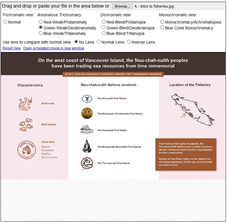
The last two decades of the 20th Century saw an exponential increase in Indigenous resurgence movements claiming the implementation and extension of what the government of Canada had called “Aboriginal Rights.” One of those concerned the right to fish and sell all traditionally harvested species within First Nations territories.
As a result of continuous litigations, in 1990 the Supreme Court of Canada ruled that Indigenous peoples fishing for food, social, and ceremonial purposes had priority over commercial fishing after demands of conservation had been met (Aboriginal Fisheries in British Columbia, Indigenous Foundations, UBC). A direct consequence of said ruling was the launch of the Aboriginal Fisheries Strategy (AFS) in 1992, with Fisheries and Oceans Canada (DFO) overviewing it. Several projects followed the creation of the AFS, and collaboration between DFO and different Nations started. However, the accords and agreements had to be reached individually, nation by nation, and case by case, making Reconciliation efforts slow and frustrating for the communities.
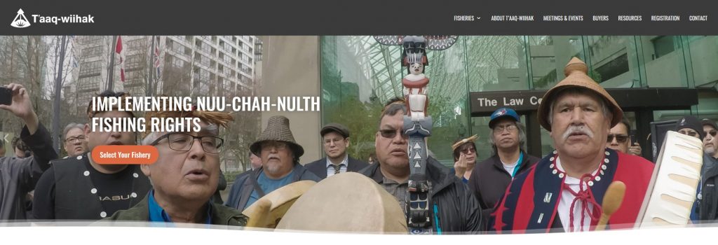
Image from T’aaq-wiihak Fisheries https://taaqwiihakfisheries.ca
What are our Goals?
Our project aims to provide an overview of the evolution of First Nations’ rights and access to natural resources and creation of commercial fisheries while focusing on a specific: the T’aaq-wihaak Fisheries. Through the use of different tools and strategies, we want to tell the story of First Nations’ possibilities and opportunities and the different projects and strategies in development. We want to ultimately reflect on the impact of small and large scale approaches to food production (both in ecological and social terms), and the formulation of production alternatives and marine conservation in the context of climate change.
We start by providing a short overview of the evolution of fishing rights in Canada the 1980s and shortly mentioning different forms of Indigenous resurgence strategies. We then turn our attention to the specific court case started by the Nuu-chah-nulth Nations and their T-aaq-wihaak Fisheries after previous negotiation attempts had failed. We then move to the results of said litigation in terms of Total Allowable Catch (TAC), comparing those to all fisheries, while also providing a measure for the Proposed T’aaq-wiihak share (T’aaq-wiihak Fisheries, 2018). The final two slides contain some reflections over the ecological impact of small and large fisheries and the final results on the T’aaq-wihaak Fisheries.
How do we tell the story?
To achieve our goals and provide our audience with an engaging story, we have combined different narration tools and strategies, and aggregated data from several sources. Our story is completed with the combination of contextual and detailed information, statistical and text data. Finally, we take our audience to the results and downfalls of the process followed by the T’aaq-wihaak Fisheries, to leave them reflect on the journey itself, its length, and its frustrating results.
Who is that audience that we keep talking about?
Our audience is anyone looking for a comprehensive and comparative framework for understanding the evolution and current state of First Nations’ commercial practices and opportunities, access to resources, and marine preservation, as well as the different paths to Reconciliation.
Our audience can be looking for a general picture, or for the specific case provided. However, thanks to the insights of the T’aaq-wihak Fisheries process, the audience might be able to better understand the benefits and limitations of Reconciliation efforts, community-based commercial ventures, and localized environmental preservation efforts.
What dataset did we use?
The datasets gathered and used for this project were gleaned from many sources, both public and private, and took many forms but were predominantly harvested from textual documents. Our datasets are drawn from official federal and provincial court issued documents, reports, and journalistic and research articles:
- The T’aaq-wiihak Fisheries — having done the work of compiling some press releases, court ruling documents, Total Allowable Catch (TAC) data, etc. — were a good reference point while gathering contextual and detailed timelines, and raw data.
- Fisheries and Oceans Canada (DFO), although a complex maze of yearly reports, was used to confirm information and complete raw datasets.
- Textual data was gathered from scholarly thesis, journalistic, research articles on the topics of marine conservation, Indigenous resurgence, and the impact of climate change on coastal First Nations.
- The contextual data was gathered through Provincial court documents, that were perused to confirm timelines, provide context, and finer details.
Most datasets had to be built from scratch, and they involved a lot of cleaning and wrangling.
What tools did we use?
For cleaning the data, we mainly used Tableau Prep, although there was some quick and dirty manual wrangling needed (especially when rectifying small typos and aspects we had forgotten about in previous cleaning steps). In general, Tableau Prep proved to be a very useful and versatile tool that helped us make sense of, sometimes, senseless statistics and government publications.
For the scatter plot graph, the bar chart, and the timelines we used Tableau Desktop. Since we had used this tool to make the graphs before, the creation part was simple and straightforward. Moreover, Tableau Desktop gave us the option of brushing and linking the graphs, or filtering, so the audience could compare the data within the general context (Munzer, 2014). By allowing the audience to interact with the charts, we wanted to give them more control to explore the data according to their interests and so they could get to their own conclusions (Heer & Shneiderman, 2012).
The timelines were a bit more complex, since we hadn’t had any practice before and the software doesn’t integrate the timeline view. So, we had to watch some more advanced tutorials and try to make sense of experts’ terminology. Even if timelines are not an idiom per se (they don’t compare information nor they show time series) (Lankow et al., 2012, 209), we thought Tableau and the interactions it provided could be a good tool to convey that information.
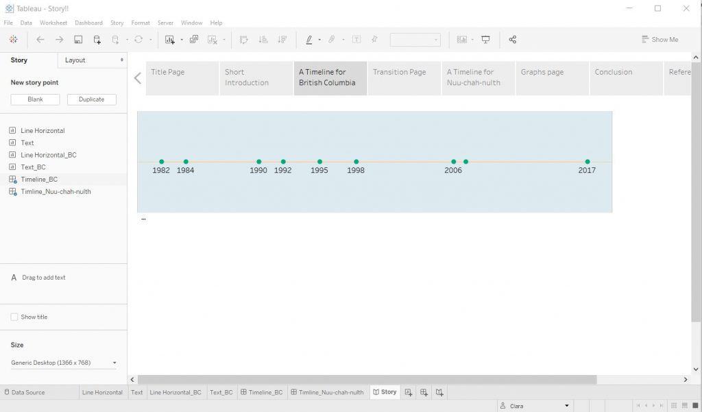
Making timelines in Tableau Desktop
For the infographics, we started using Infogram, since we had used it before and seemed like an easy tool. However, after a while on it, we realized how slow and restrictive it was in some of its functions and how more comfortable we felt using a design tool that we could control more. That’s why we ended up moving to Adobe Illustrator. Although we are not experts in Adobe Suite, we had used it before and controlled some of its interactions. On top of that, the resulting images were of much higher quality of those from Infogram and, therefore, more appealing.
Moving to Adobe Illustrator
Working with Infogram
Creating the story was easy once we got the hang of it on Tableau Desktop. The software allowed us to design a story in horizontal, so that the audience could browse its pages without much scrolling. Tableau Desktop also allowed for the size of the dashboard to be automated so they could adapt to different screens.
What analytic steps did we take?
Making sense of all the data that we had gathered for the story wasn’t an easy task. Some unexpected datasets surfaced as integral to the story while other datasets, painfully collected through the perusing of hundreds and hundreds of journalistic, academic, and official reports appeared to suddenly have lost their place in it… With wobbly confidence, we first filtered out and sorted our most important datasets and focused on the different visual possibilities they afforded us (Heer & Schneiderman, 2012). Once the backbone of our story was created we were able to refine it and integrate almost all datasets gathered by diversifying our visuals, through the creation of infographics. Establishing the story’s priorities was done by identifying the most salient datasets, meanwhile considering all datasets as a whole, and through discussions. Since we wanted to include varied types of information (not only statistical or text), from the get go, we knew different visualization strategies needed to be applied.
We first created the InfoVis with some ideas on the facts and data we wanted to convey. We decided on that initial summary by first cleaning the data. Once the data was ready for use, we explored it visually by creating different idioms, trying to find patterns and implement correlations.
Then, we created the infographics. How? Simple, we followed a step-by-step process. First, we wrote what we wanted the infographic to narrate. Then, we gave it a structure and a flow. Finally, we created the infographic a couple dozen times so it could exactly reflect what we wanted it to say.
One of many steps in the creation of our story
What design process and principles we followed?
For all our designs, we started by considering and applying the principles of expressiveness and effectiveness. The direct consequence was our selection of the data attributes we were going to encode in our graphs and infographics (Munzer, 2014, 100-101).
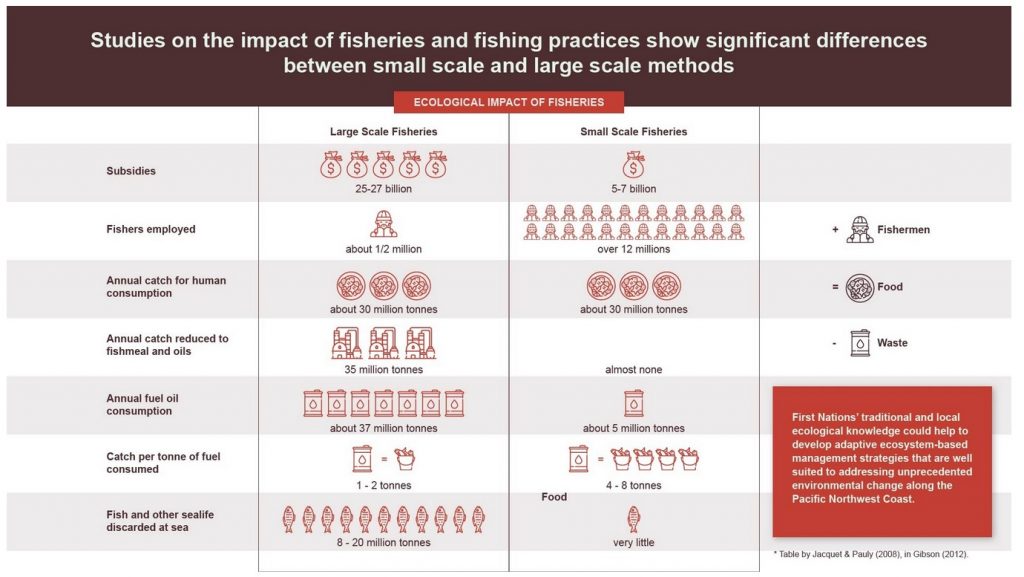
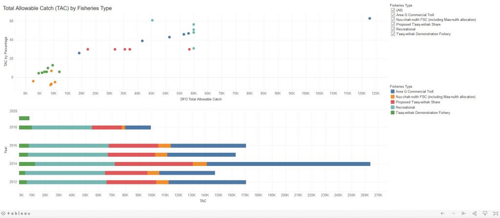
For the design of diagrams, specifically the Total Allowable Catch (TAC) diagrams, the principles of expressiveness and effectiveness were considered, and applied. We included and visualized: two quantitative data attributes; TAC and TAC Percentage, one qualitative data attribute; Fisheries Type, and one ordinal data attribute; and Year. The scatter plot was the first idiom chosen to visualize the data, as it allows for the encoding of quantitative data through spatial position using a zero dimensional mark and allows for the encoding of the qualitative data through the hue channel (Munzner, 2014). The ordinal data was included, on demand, through the brushing action. Further visualizing of the data produced a stacked bar chart diagram, among others, which is also included in the story. We chose the stacked bar graphs to clearly show the comparison between the total numbers of TAC allocated between different fisheries (Lankow et al., 2012, 215). Since the total sum depended on the year analyzed, we put several years and quantities together so the audience could make sense of the image in total and in comparison. Both the scatter plot and the stacked bar chart tell a slightly different story as one uses spatial position to reveal trend lines on TAC distribution and the other uses length to encode the totality of TAC’s subtotals by year offering comparatives over years (Munzner, 2014).
Since our infographic was going to be mostly narrative, we focused on using more illustrative design than textual information (Lankow et al., 2012, 204). When designing them, we decided to include as much visual information as possible to engage the viewer. We did so by conveying data through icons and visual representations. We needed to choose valid and relevant information to convey our message effectively, but also to engage and not overwhelm the audience.
Since we decided on a fairly broad audience, our illustrative design elements had to be appropriate for different possible viewers. We looked for colour palettes, icons, and illustrations that could be audience and content appropriate, but mostly discrete (Lankow et al., 2012).
An example of our design choices
As we already mentioned, our main goal was to produce editorial information. Therefore, our first priority was appeal, followed by comprehension and retention (Lankow et al., 2012). Overall, our design choices were motivated by the story we wanted to tell and the message we wanted the viewers to retain. As a result, we included a limited variety of colours that would not invade the story and could work well with different colourblindness degrees, especially with the use of high contrast (Ware, 2008).
We made sure our design was as accessible as uniform and sound
Most of the graphic elements of our project were created following the same colour scheme and palette, so that our story could transmit uniformity and quickly engage the audience (Ware, 2008). This design decision was easy to achieve when producing the infographics and some of the InfoVis (the timelines). We chose our colour palette based on the image we had chosen as a title page to provide uniformity and soundness (Lankow et al., 2012). However, in the case of the scatter plot and bar chart, the colour palette was chosen by the tool (Tableau Desktop) and we had to conform. Thus, we chose to leave the basic tableau colour palette; it would not feel too intrusive for the experienced Tableau users.
Our Tableau Dashboard
One aspect that we could easily implement across the board was the font. Since we were using different tools (Tableau Desktop, Infogram, and Adobe Illustrator), we focused on using a font available in all of them. We also considered the screen readability of the font and the audience’s ability to recognize it and engage with it. Finally, we wanted a font that could transmit the currentness of the topic (sans serif), so the audience would not forget about it, although going through the story they sometimes could think they were in a past time (Font Psychology, n.d.).
What are the Pros and Cons of our design?
Our design is strong in emphasising the context of Indigenous resurgence and the context in which the T’aaq-wiihak Fisheries came to operate. It also succeeds in visualising the disparities in the distribution of Total Allowable Catch, fishing areas, and in demonstrating the different ecological impacts between small and large scale fishing operations. As our timelines contain informative but lengthy blurbs explaining and describing litigation processes and court rulings, the decision was made to link those blurbs with the brushing action so as to provide on demand information. The idioms then have the double advantage of avoiding overloading the viewer with dense information, while also staying uncluttered and informative. The action of brushing on a specific date further allows the viewer the freedom to focus on the event title only or take in the more in depth, detailed information. Moreover, Tableau Desktop’s tooltip allowed us to hide the information when the user wasn’t needing it. Using Tableau Desktop’s Dashboard and Story features combined with Adobe Illustrator files afforded us to combine multiple types of data under one platform.
Additionally, the colour palette and the typography is consistent throughout which adds cohesion to our story and allows the viewer to focus on drawing coherence from the exposed/digested data/information.
Our design, however, could have been enriched with interactive maps so the viewer could gain analytical insights. Our story involves the mapping of fairly remote and oceanic locations. The difficulty of creating such idioms, combined with our limited knowledge of Tableau and waking hours, forced us to choose static maps.
After all this babbling and bragging, we think you’re ready to see our story. Access the (almost) final version and enjoy! And, please, don’t be shy about letting us know how we can improve!
Signing off, Caroline and Clara.

The warm and welcoming screen of Collaborate Ultra, used daily to communicate struggles, findings, and progress
References
Heer J., Shneiderman, B. (2012). Interactive Dynamics for Visual Analysis: A Taxonomy of Tools that Support the Fluent and Flexible Use of Visualizations. ACM Queue. Doi:10.1145/2133416.2146416
Lankow, Jason, Ross Crooks, and Josh Ritchie. (2012). Infographics: The Power of Visual Storytelling. John Wiley & Sons, Incorporated. Retrieved from https://ebookcentral.proquest.com
The definition of font psychology and how to use it. (n.d.). Retrieved from https://www.canva.com/learn/font-psychology/
https://www.color-blindness.com/coblis-color-blindness-simulator/
Munzner, T. (2015). Visualization Analysis & Design. CRC Press. Retrieved from
https://doi-org.ezproxy.library.ubc.ca/10.1201/b17511
Ware, C. (2008). Visual Thinking for Design. Elsevier Inc. https://doi.org/10.1016/B978-0-12-370896-0.00001-9
Hi Caroline and Clara,
This is a fascinating subject, and definitely not an issue that I’ve thought about! I think the choice to use infographics to help communicate information was appropriate; it definitely grabbed my attention. I’m sure wrangling all of that data from all those sources was very tough!
The body text on the “a closer look” infographic seems a bit small – would it be possible to scale it up a little bit? On the same infographic – ‘location of the fisheries’, I think it might be helpful to label the name of the general area, or use colour to denote what area you’re referring to. For all of the infographics, I think the colour palette is excellent, and its great you took colour blind individuals into account when creating them.
I think the timeline is really cool as well! One suggestion I’d make, though, is maybe labelling each point with the event (e.g., Ron Sparrow Litigation Begins), and putting in the title (hover for more details). That way, the viewer knows that the Ron Sparrow Litigation began in 1984, and they can hover for more details of the story. I’m not sure if this is possible though! Another option would be to only annotate the more important events – but each event is probably equally important, so I’m not sure how good that idea is.
For the contextual map, I find the maps hard to read due to their resolution. It might be worth separating them into two separate slides, or finding a infographic maker where you can download the image with greater resolution, especially since the Area G Troll information gives context to understanding the next vis.
For the Total Allow Catch dashboard, I was extremely surprised by that one blue dot to the far right, and that one reaaaally long blue bar. I also had no clue that there was so much recreational fishing going on!
A quick question- was it clarified earlier in the story what FSC stands for, or did I miss it?
For the ecological impact infographic, I really like the icons being used. However, the column to the far right is somewhat hard to parse – it’s not immediately intuitive that there is a comparison being made between large-scale and small-scale fisheries. Maybe making the plus/equal/minus bigger would help, or somehow highlighting those rows? I’m sure that you were taking into account possibly misrepresenting information (as large scale operations tend to have large scale waste), but would it be worthwhile to just turn that column into a comparison column? A small nitpick – in the Catch per tonne of fuel consumed row, it might be better to have the bucket of fish (catch) before the barrel of oil (fuel).
Throughout the whole story, I like the use of iconography. It’s always appropriate and enhances the viewing experiences.
Overall, I think that this is a important topic that is not often thought about, so its really cool to see this topic illustrated in a fashion that’s accessible to people, like me, who may not know anything about fisheries and their relation to indigenous self-determination. Thank you for such a great story!
I forgot to provide ideas for further interesting developments! Anyway, I’m curious if there are other First Nations that are currently working with the DFO outside of BC, and if they are seeing any success. It would also be cool if there was a representative company of the Area G Commercial Troll people so we could see a representation of how Area G fisheries operate! I have read news about coastal BC nations having issues with salmon health due to all of the large scale fish farming in the area, and how that affects their nation. It would also be interesting to see how large companies fishing and selling out of Indigenous lands impacts the living standards of that nation and reconciliation efforts.
In the first timeline, the bottom shows icons representing various Indigenous resurgence strategies, however I was unsure of how these strategies were actually connected to the timeline. To me, all of the events described seemed to focus on the legal rights and negotiation with the heavy focus on rulings by the Canadian Supreme Court. For both timelines, I think it would be great if after you click on a dot, the text stays in place. If my mouse moved off the dot at all, the text would disappear, and this was very distracting.
I think it may be helpful to combine the second timeline and the T’aaq-wiihak fisheries diagram into a single view. This would help contextualize the events in the timeline to the shifts shown across the years in the bar chart.
I really liked the ecological impact comparison. Even before the additional text box at the bottom, it very clearly demonstrated the advantages of small scale fisheries. I would say this is the main persuasive element of the narrative.