Link to Website: https://northarmfraser.weebly.com/
The Story
The story I am telling with my website is that the place names along the North Arm Fraser River reflect the British colonial legacy, but do not adequately reflect the people who live here and who have lived here. The most names refer to white, British men, and only six names refer to Indigenous peoples or women. My website questions how the names were given, who is left out, and how likely it is for names to change.
Objectives
The main goals of this project are to inform viewers about the colonial legacy in place names along the North Arm Fraser River and to entertain viewers by letting them discover the history of names. Viewers are able to explore place names and their histories and compare the origins of various names. Users are also able to filter and select data, and consume the information. These tasks are both high level and low level. In making the visualization, I produced new knowledge – I had hypotheses about what the data would show, but no one I know of has done a similar analysis along the North Arm Fraser River.
Dataset Details
The dataset I used includes the names of places along the North Arm Fraser River and categorizations of what the names refer to. I collected and categorized the names myself using three sets of maps: Google Earth, North Arm Fraser River Harbour Head Line Maps from 1965-1967 (Underhill & Underhill 1965-7), and the Sto:lo-Coast Salish Historical Atlas (Carlson et al. 2001). I chose these three sources because Google’s platform is commonly used by the public for navigation and remote exploration, and it shows names the public is most likely to be familiar with. The harbour maps add a historical perspective, showing places where names have changed or streets have been altered. These were paper maps that happened to be in an appendix to a past student’s thesis, which I picked up at the library before campus closed (Figure 1). Finally, because of the lack of indigenous names in the other datasets and my desire to emphasize that this is Indigenous land, I included names from the Sto:lo-Coast Salish Historical Atlas.
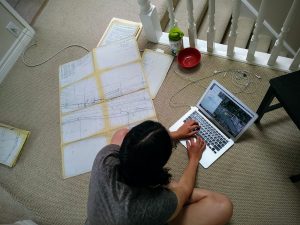
Figure 1. Collecting names from the harbour maps.
Most of the maps I viewed were not specific to the river and contained names across Metro Vancouver. For this project, I limited the names I collected to those that described the water (ie inlets, jetties, sloughs), described the shore (parks, neighborhoods), and named streets that ended at the shoreline or traversed the shoreline. Collecting names in Google Earth was most challenging, because different names appeared depending on the level of zoom I used.
I organized the names into eight categories with the help of the Greater Vancouver Book, Street Names of Vancouver, the City of Richmond Archives place names search, and Google searches (citations for these resources can be found at the bottom of the website I created). When the names referred to people, I collected more information, including gender, race, year of birth, and notable facts. I was sometimes unable to find the history of a place name or information about the person. Such names were added to an unknown category, which is visible on the map and in the bar charts. Some people were repeated in names and excluded repeats in my demographic analyses. Part of this spreadsheet can be seen in Figure 2.
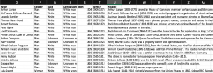
Figure 2. My Excel spreadsheet.
Tools
As I collected place names, I georeferenced them using Google Earth Pro. This program let me mark points on a map and name them. I then exported the points from Google Earth as a kml file. Working with the kml file was challenging because the file type cannot be opened and viewed as a spreadsheet on my computer. After I had added all my places, I was able to copy the names from the Table of Contents (a sidebar allowing the user to control layers and points) and paste the names into an Excel file, where I categorized and described the place names. This categorization required significant research into the history of Vancouver, Richmond, and New Westminster. References for the various sources I used can be found in the Bibliography section of my website. I was uncertain if joining the kml data with my Excel file would be successful, but luckily it was.
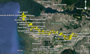
Figure 3. The Google Earth interface with my data points.
I joined the two files in Tableau Desktop, then used Tableau to create a map of my dataset and several bar charts showing trends in the data. The Tableau mapping feature allowed me to plot my points by category, highlight similar points, allow sorting by category and by source, and show information when hovering over a point. Being able to both map and run analytics in the same program was convenient. I could also have used QGIS or ArcGIS for creating a map and charts, but I am less familiar with interactivity on those mapping tools, and I don’t feel as though I have as much control over associated analytics with those tools and my current knowledge.
Once I created my visualizations, I wanted to add them to a platform where they could be combined with textual information. I chose to use Weebly website creator, because I’ve used Weebly before, I knew I could embed interactive visualizations, and I don’t like how Tableau Stories looks. I uploaded my map to Tableau public, then added embedded it in Weebly. I also embedded a map from Native Land. Weebly had themes and outlines prepared that I used, and to add extra features, I simply dragged-and-dropped. Weebly is not an open-source platform and their websites do not stay around forever – I would rather have used a different platform like Github or Jekyll, but did not have the time or energy to learn something new.
Analytic Steps in the Design Process
To create my website, I relied on observations that I made during data collection and patterns that appeared while mapping. As I collected names, I noticed certain patterns, such as repetitive names, lack of names relating to Indigenous peoples and women, and high representation of British patriotic symbols and British men’s names. When I began the project, I had hypothesized that names would refer mostly to white men, there would be few Indigenous names, and the names would have been given in the late 19th and early 20th century, as Vancouver grew, meaning that people would have been born in the early-mid 1800s. These hypotheses were affirmed, and new patterns, such as repetition of certain names like River Rd and Boundary Rd and a high number of British names appeared. I produced knowledge while gathering the data, albeit working from a hypothesis, and then communicated knowledge as I made my visualizations. The analytics I ran on my data, visible as bar charts on my website, were used to communicate my findings – I had already observed the patterns while inputting the data.
Design Process and Principles
The first visual I designed was a Tableau map, which I later embedded in Weebly. On the map, the places are color-coded and sortable by category, and they can also be sorted by source. Users can pan and zoom and use the a search bar to search for specific places names. I chose a neutral color scheme for the points that is distinct from the background and is not hierarchical. I also changed the background map to one with more color, because when I initially embedded the grey map on my website the map disappeared into the background rather than standing out as the highlight of the project. Due to the gentle colors of my website, the colors of the dots and background features on my map stand out in our pre-attentive/tunable vision. On my map, I used the highlight feature so that all points of a similar category appear when a viewer hovers over one point. I also added text on hover that gives the place name, category, and any notable information about the name. I ensured that the place name was in bold and separated from the other information, so that it would catch the viewer’s attention before the extra details. See Figure 4.
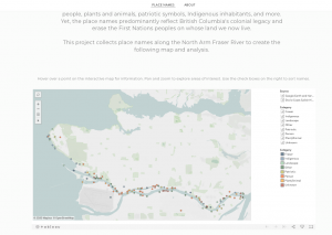
Figure 4. Place names map embedded in website.
The map is expressive because spatial data is shown using geographic coordinates and color is used to encode an identity channel. The colors chosen are not hierarchical implying a magnitude channel. The map is also effective because it communicates information using interactivity rather than flooding the viewer with information at first glance, offers various means of sorting the data, and is visually appealing.
In my bar charts, I maintained the color scheme from the map for the chart of categories, but I used the green hue from the map for the other charts. These charts can be seen in Figure 5. The consistency in color choice helps maintain unity on the website and makes the charts feel like they go together, rather than being separate visuals. To maintain expressiveness, I ensured that repeat names were not present in the data for the bar charts. The choice of bar charts was also to ensure expressiveness, because bar charts allow comparison between values without suggesting a hierarchy or that individual groupings are sections of a whole.
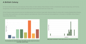
Figure 5. Sample bar charts.
For the color scheme of my website, I chose green and white, using the green from my map and bar charts. The green backgrounds are the green with less luminance because we learned that background colors should not be as vibrant. I maintained the darker green in my headers. Finally, the pre-created theme from Weebly had fonts that were readable and matched the semi-serious but exploratory mood of my content.
Pros and Cons of a Website
I chose to use a website because the format allows more text than other formats, such as infographics or stand-alone visualizations. For my story, in which I’m inviting viewers to question dominant narratives, having text to guide viewers through new ideas is essential. A website also allows for a variety of visuals, including photos and newspaper articles, to be embedded, which can break up large chunks of text.
On the other hand, websites can make a story challenging to tell, because there can be too much text and viewers can get “scroll fatigue.” In making my website, I struggled to keep my sections visually interesting so that the viewer would want to read on and continue scrolling down the page. Adding blank space and muting the colors helped with readability. Another drawback of a website is that the length of the text on my website draws away from the effort I put into my map – the map disappears into the page, rather than being highlighted as the main output of my project.
References
- Carlson, K., McHalsie, A. J., & Perrier, J. (2001). A Sto:lo-Coast Salish historical atlas. Douglas & McIntyre.
- Underhill & Underhill (Cartographer). (1965-7). North Arm Fraser River Harbour Head Line [maps]. In J. L. Laithwaite, J. L. (1971), The use of the North Arm Fraser River by the forest products industry in competition with other users (Bachelor’s thesis). University of British Columbia, Vancouver.