
We have created a Tableau Story which will show people the violent situations that children and youth in care (YCIC) of the British Columbia (BC) government face. This is a serious subject, sowe needed to consider carefully the approach we would take. We consulted Spotlight: Child Welfare’s Best Practices: child welfare journalism (Cohen, 2019) in order to avoid treating the subject as “trauma porn,” and they are the reason why our first story point, Reasons Why Children and Youth Enter Care, begins with text reminding people of the goal of our infovis, reminding people that it’s a sensitive subject. Our audience is the general public who may not know anything about CYIC. Who is in the system, how the system works, and what some of the shortcomings of the system might be are topics that we are trying to enlighten for the viewer. In the course of everyday life, the general public gathers general impressions through news coverage or social media about CYIC, so we wanted to give them the opportunity to delve into the data in a way that’s more accessible and visually engaging than the tabular datasets that are published by the BC government. Our communicative goal is to highlight injustices that can occur to helpless children and youth in the care of the BC government, and who these children and youth are.
As with most plans, several adjustments had to be made once we actually started working on the project. After much discussion, we decided to scrap the concluding infographic and integrate the introduction information throughout the story. We ended up with a larger number of story points and Tableau infovis than we had originally planned, and we were having trouble determining what an infographic would bring to the narrative. Our original plan of having an infographic as a conclusion to summarize the data was inconsistent with the exploratory nature that we wanted this infographic to have: allowing the viewer to walk away having discovered their own connections and discoveries. Potentially we could have come up with good infographics to include with this narrative, but we did not have enough time to spend planning it out. We decided that it was better to focus our attention on producing a high quality project in Tableau, than to create a mediocre infographic. The second thing that was changed from our Project Proposal was our plan to create a more robust introduction. This was mostly due to the increased number of visualizations that we had created. Rather than providing all of the context, definitions, and information at the beginning, we decided it would be better to have that information, where applicable, be included in the story point. This reduces the amount that we are relying on the viewer to remember the information they read at the beginning – provided that they even read it at all. By distributing the information along with the infovis it is relevant for, breaking it down into smaller chunks, and removing information that doesn’t directly relate to our infovis creations, we have made the textual content easier to navigate and process.
Dataset
Since our project focuses specifically on children and youth in care (CYIC) of the BC government, we went looking for government data to see what information they have been keeping track of. Since the government tracks data over several years, we knew that this would be a good way of gathering consistent data. All of our data comes from the BC Ministry of Children and Family Development (MCFD): the branch of the government who is responsible for taking care of CYIC. The data is open source and publicly available for download.
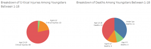
Our first story point shows the reasons why children and youth are ordered into care. For this data, we used datasets published by the MCFD on Permanency for Children & Youth in Care. We used MCFD office and region location data to map the regions associated with demographic data, as there was no boundary information available. We also used the demographics dataset available from DataBC. Again, this dataset was available in Excel format, including year information, case numbers, and placement/legal category information. For our critical injuries and fatalities infovis, we used data from the MCFD report on Case Data and Trends to illustrate the differences in critical injuries and fatalities among children and youths who lived in care homes and those who did not, as well as differences between Aboriginal and non Aboriginal children and youths. That report also gave us data on children and youth in care who had gone back to their families but were again maltreated. All datasets were downloaded in Excel format.
Tools
Microsoft Excel: We used Microsoft Excel to combine, clean, and wrangle the data. For our group, the strength of Excel laid primarily in its familiarity. For the most part, we were dealing with small datasets which were easily handled by Excel. However, the data set for the demographics of children in care was very unwieldy and here Excel showed its weakness in handling large datasets. The demographics dataset was several thousand rows long, and the year month was included in a single field as y/m, eg., 199001. As the month information was extraneous, we needed to remove the month from the y/m field. By using find and replace, we were able to slowly work through the data and clean it by removing irrelevant data, such as street address, and keeping latitude/longitude data and region names.
Tableau Desktop: To create our visualizations, we used Tableau Desktop. To create a dashboard, we combined several worksheets together. During this process, we noticed several advantages and disadvantages of Tableau. The interface can be confusing sometimes, with key tasks such as calculations being hidden behind dropdown menus. However, once you know what to do being able to drag and drop the different pills makes the interface easy to use. Additionally, the “Show Me” feature is incredibly helpful to show the different idioms that Tableau is capable of creating as well as the types of data required to use them. A definite pro for Tableau is the ability to explore and try out different idioms, data types, and marks and easily being able to go back using the undo button; no matter what we tried, we did not break Tableau and felt comfortable exploring the interface. This does not mean that we had an easy time of it. For the Type of Death Depending on Care Category chart, we ran into some issues with Tableau. We wanted to include a “Total” on the filter for “Causes of Fatality” but we were unable to do so because Tableau could not sum up aggregate and non-aggregate data. However, the data that we were trying to sum up were all aggregate data and the sum should have worked. We have no idea why this would not work and we were not able to find a solution.
Tableau Story: In order to tell a story, we used Tableau’s Story feature to combine all of our worksheets into a cohesive group to present our data. Even though our datasets all came from the government, we were limited in our ability to link them together into a combined dataset. We linked together the data that we could, but we ended up having five different datasets which we were using. Tableau Story allowed us to connect to all five datasets in order to use the dashboards that we had created. This was extremely helpful, since it meant that we didn’t need to worry about combining our data using unwieldy composite keys or manipulating the data. The process of creating a Tableau Story was very easy and intuitive, but we were frustrated by the sizing features. All of the dashboards were sized for maximum readability, but once the dashboards were imported into the story, they would be resized. Once the Story was uploaded, the sizing would be different than what showed on Tableau, making it hard to prevent images/text from being cut off. Even though Tableau has automatic sizing, it didn’t work as expected- it didn’t resize to fit the screen, and would often cut off text or cause the reader to need to scroll through content.
Analytic Steps
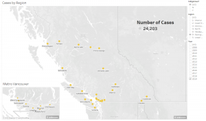
Our analytic steps varied depending on the data we were dealing with. Initially, we wished to use a map to indicate which regions had more CYIC. However, the MCFD regions did not line up with the health regions, and region 9 overlapped with other regions, which meant that a chloropleth map was not a viable option. Thus, we decided to use MCFD regional offices to illustrate on a map where the regions would be located, and the colour of the mark would indicate the region, and the size of the mark would indicate the amount of cases. However, as the case numbers in each region were similar in scale, using size to illustrate the number of cases was not as effective as we hoped. The scale, however, when responding to the region filter, lists the amount of cases, so it is effective as a tool for showcasing the number of cases in a region.
During the first stage of our project, we ended up with a large amount of bar charts since most of our data was measurements and length is the most expressive way to represent that data. However, since our audience is the general public we didn’t want to run the risk of them becoming bored looking at a bunch of bars. We then discussed and explored different idioms which could be used. For example, the two infovis used to show the reasons why CYIC entered into care were a result of exploring what design options were available in Tableau and were changed from bar charts into packed bubbles and a scatterplot. The packed bubbles were possible because there are only a few bin sizes and it’s easy to see the size differences. Likewise, the Breakdowns of Critical Injuries and Fatalities infovis were changed into pie charts because the amount of categories was below the bin threshold.
Design Process
In order to efficiently present our data, we considered expressiveness and effectiveness, as well as interactive visualizations to engage with our users. For example, we used highlighting and linking features in our story to highlight each unique datapoint.
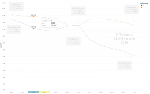
In the “trends” storypoint, we chose to highlight and label the number of cases by year, so viewers could easily compare the difference in case numbers year over year. We also used annotations to point out key areas of the data so viewers, even if skimming the graph, could quickly take away key numbers.
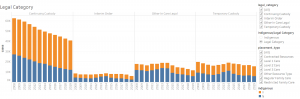
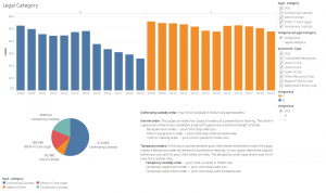
We used switches in Legal and Placement story points as a tool for viewers to easily compare the number of indigenous/non-indigenous individuals in each situation, enhancing the expressiveness of our vis when it comes to differentiating the number of indigenous/non-indigenous in a certain category, by year. In the Category switch view mode, the viewer can see the total number of CYIC in each category, which is another aspect that we wish to communicate.
For location data, we chose to use a map to most effectively communicate where in BC these cases were, linking them to the caption “number of cases” to the side.
Pie graphs were used when we wanted to show proportions of a whole-specifically, they help the viewer quickly grasp the proportion of individuals in each category, letting the bigger and smaller slices quickly stand out.
We chose what we perceived to be the best method to visually encode our dataset attributes to satisfy expressiveness, and chose the best channels for the most important attributes, satisfying effectiveness.
Finally, we decided to create a title page for the project as a neutral landing place for visitors before they are presented with data. The image we chose for this was of a mother bear and her bear cub to represent taking care of children. Although it has been suggested that this image might not be clearly related to the topic, we wanted to avoid the type of “trauma porn” mentioned in our introduction that would be associated with using pictures of actual children. Additionally, since the comparison between Indigenous and non-Indigenous children is a strong component of our project, we wanted to avoid misrepresenting or over-emphasizing Indigenous peoples. In the end, we decided that using an image of animals, instead of people, with a theme related to the topic but not directly connected was the best way to approach this sensitive issue.
Reflection on Designs
One of the strong points of our designs is that we tried, wherever possible, to include explanations of what the terms used in the charts mean. For example, we wrote descriptions of the different legal categories used by the MCFD when categorizing their children and youth in care. This helps the viewer understand what is being visualized. Additionally, our use of positioning and spatial region for the Cases by Region infovis by using a map of BC will be extremely useful to individuals who may not know the geography of British Columbia, but also useful to viewers who will be able to recognize locations and regions.
However, there are several things about our design that could be improved on. There are several story points where the infovis could be linked together so that there is more interaction between the charts. This would allow the viewer to analyze and make connections easier. Due to a lack of time, there are a lot of small details that we could have edited in order to make our designs more polished, such as making sure that our tooltips contain more information, cleaning up filter wordings, and more consistent colour choices. In the Cases by Region chart, size is being used as an indicator of the number of cases. However, we think that this information isn’t really helpful because the reason for the increased number of cases is because of population density. By presenting the size indicator, we may be misleading the viewer into thinking this is a bigger issue than it is, even though the data is correct. Additionally, there is an issue with discriminability since it is difficult to differentiate between the different size categories. The reason we decided to keep this in was to be able to see the total number of cases for the filtered selections. Further time and investigation might show how to do this without using size in the marks.
Another issue is that viewers may not feel the need to read through the whole thing or explore the visualizations provided. Because of the amount of information provided, the viewer might find it overwhelming and lose interest. However, if the viewer takes the time to read through the explanations provided and use the filters, the viewer can form a much more nuanced view of the issue.
References
Cohen, Dylan. (2019). “Best Practices: child welfare journalism. Working with lived experience.” Spotlight: child welfare. Retrieved from https://www.spotlightchildwelfare.com/wp-content/uploads/2019/05/Best-Practices-child-welfare-journalism-dylan-cohen-FINAL.pdf
Ministry of Children and Family Development. (N.D.). Admissions into Care [Data file]. Retrieved from https://mcfd.gov.bc.ca/reporting/services/child-protection/services-to-children-in-need-of-protection/case-data-and-trends
Ministry of Children and Family Development. (N.D.). Breakdown of ‘Neglect’ [Data file]. Retrieved from https://mcfd.gov.bc.ca/reporting/services/child-protection/permanency-for-children-and-youth/case-data-and-trends
Ministry of Children and Family Development, (N.D.). Child Protection Services – Four Key Stages. Retrieved from https://mcfd.gov.bc.ca/reporting/services/child-protection
Ministry of Children and Family Development. (N.D.). Children and Family Development – Cases in Care Demographics [Data file]. Retrieved from https://catalogue.data.gov.bc.ca/dataset/children-and-family-development-cases-in-care-demographics
Ministry of Children and Family Development. (N.D.). CYIC Recurrence of Maltreatment [Data file]. Retrieved from https://mcfd.gov.bc.ca/reporting/services/child-protection/permanency-for-children-and-youth/performance-indicators/children-in-care
Ministry of Children and Family Development. (N.D.). Fatalities of Children in Care & Receiving Services Under the CFCSA – by Calendar Year [Data file]. Retrieved from https://www2.gov.bc.ca/gov/content/family-social-supports/data-monitoring-quality-assurance/reporting-monitoring/statistics
Ministry of Children and Family Development. (N.D.). Fatalities of Children Receiving Services (Not In Care) by Calendar Year [Data file]. Retrieved from https://www2.gov.bc.ca/gov/content/family-social-supports/data-monitoring-quality-assurance/reporting-monitoring/statistics
Ministry of Children and Family Development. (N.D.). Reasons for CYIC by Court Order for Protection [Data file]. Retrieved from https://mcfd.gov.bc.ca/reporting/services/child-protection/permanency-for-children-and-youth/case-data-and-trends
Ministry of Children and Family Development. (N.D.). Provincial Rate of CYIC per 1,000 Population [Data file]. Retrieved from https://mcfd.gov.bc.ca/reporting/services/child-protection/permanency-for-children-and-youth/performance-indicators/children-in-care