By: Lydia Huey and Rhiannon Wallace
Thursday, June 18th, 2020
Here is the link to our Tableau Story on Tableau Public: https://public.tableau.com/views/HUEY_WALLACE_TableauStory/InvasiveSpecies?:language=en&:display_count=y&publish=yes&:origin=viz_share_link
Tableau Story Objectives:
We had two main goals for our design: to teach children aged 9 to 12 about invasive species in an accessible format and age-appropriate language, and to help children increase their visual literacy by practicing reading and analyzing information visualizations. We chose the topic of invasive species because it has real-world impacts here in British Columbia (BC) and globally, and because students who are interested in the topic can continue learning or become involved in invasive species management efforts, potentially making the learning opportunity into an ongoing interest. Visualizations are prevalent in the current world of information, including on government sites and in news articles, so it is important for children to learn how to understand, analyze, and evaluate visual information. Ursyn (2016) states that students of all ages benefit from improving their “[k]nowledge visualization ability” and that visualization is also helpful for “learning, teaching, or sharing the data, information, and knowledge because it amplifies cognition, outperforms text-based sources and increases our ability to think and communicate” (p. 16). Zheng and Wang (2016) find that in science education, “schema-induced analogical reasoning in a multimedia environment can significantly reduce learners’ cognitive load and facilitate their knowledge acquisition” (p. 316). The Province of British Columbia’s Grade 5 Applied Design, Skills, and Technologies curriculum includes the overarching concepts that “Skills are developed through practice, effort, and action,” and that “The choice of technology and tools depends on the task” (2020a). The Province’s Grade 5 Science curriculum includes the overarching concept that “Multicellular organisms have organ systems that enable them to survive and interact within their environment” (2020b). Since our age group corresponds roughly to the age of fifth grade students, we believe that our topic and format is appropriate, since it seems to correspond to some of the goals of the BC curriculum.
Details of the Datasets:
Three of our datasets came from a web page that contains detailed species information for English ivy, summarized from many scientific sources (CAB International, 2020).
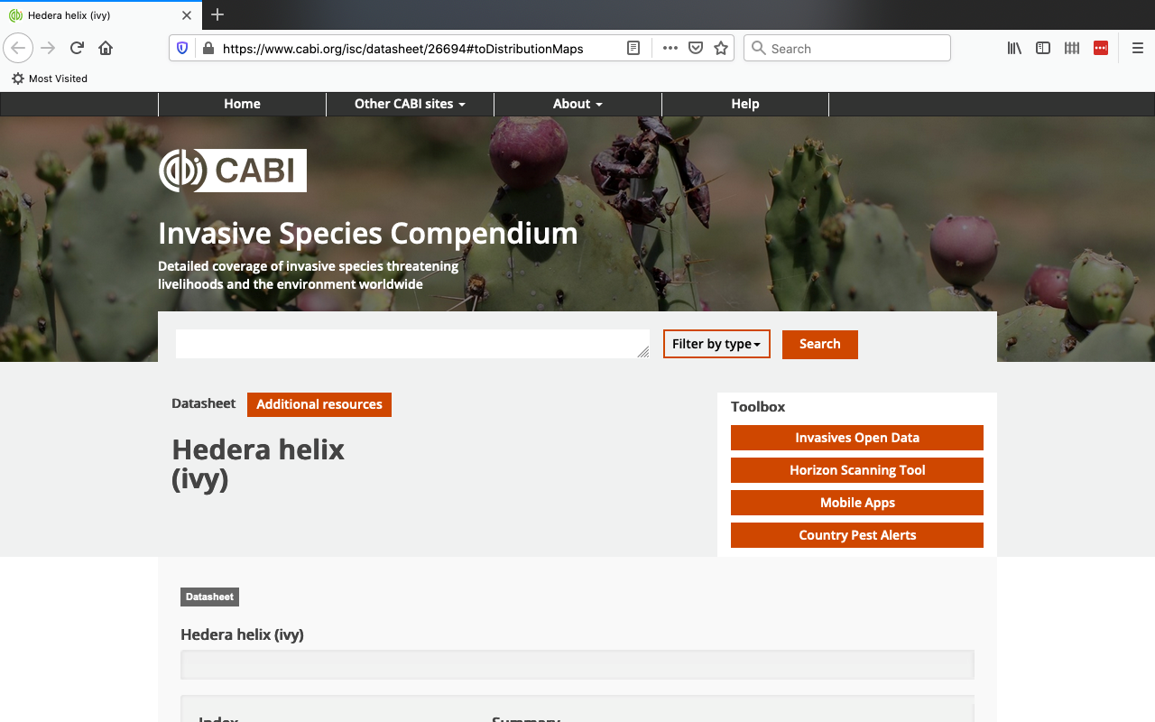
Figure 1: screenshot of the top of CAB International web page for English ivy (Hedera helix)
The major dataset obtained from that website was taken from a detailed “Distribution Table,” which contained geographical data about the presence or absence of English ivy in countries around the world (CAB International, 2020).
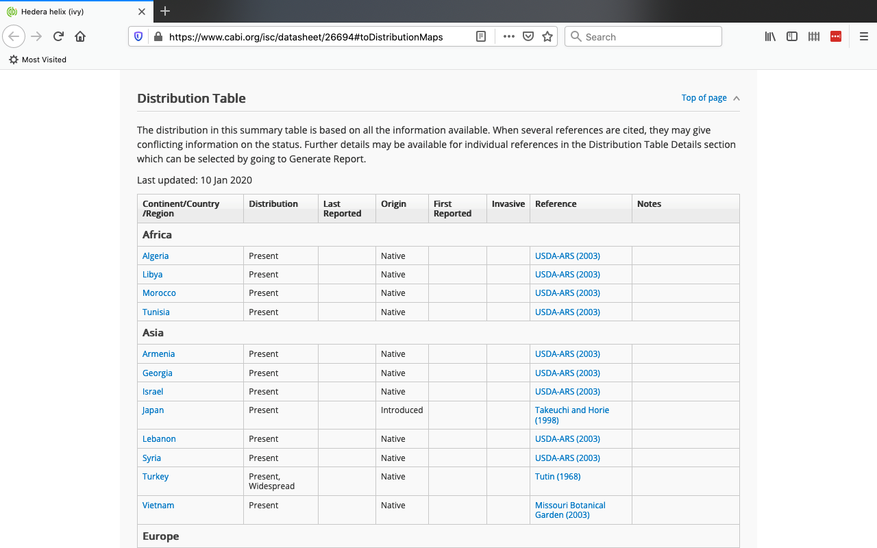
Figure 2: screenshot from CABI webpage showing the “Distribution Table” used for one of our large datasets
The dataset was downloaded as a CSV file from the full dataset that was used to make the above table and was copied into Google Sheets.
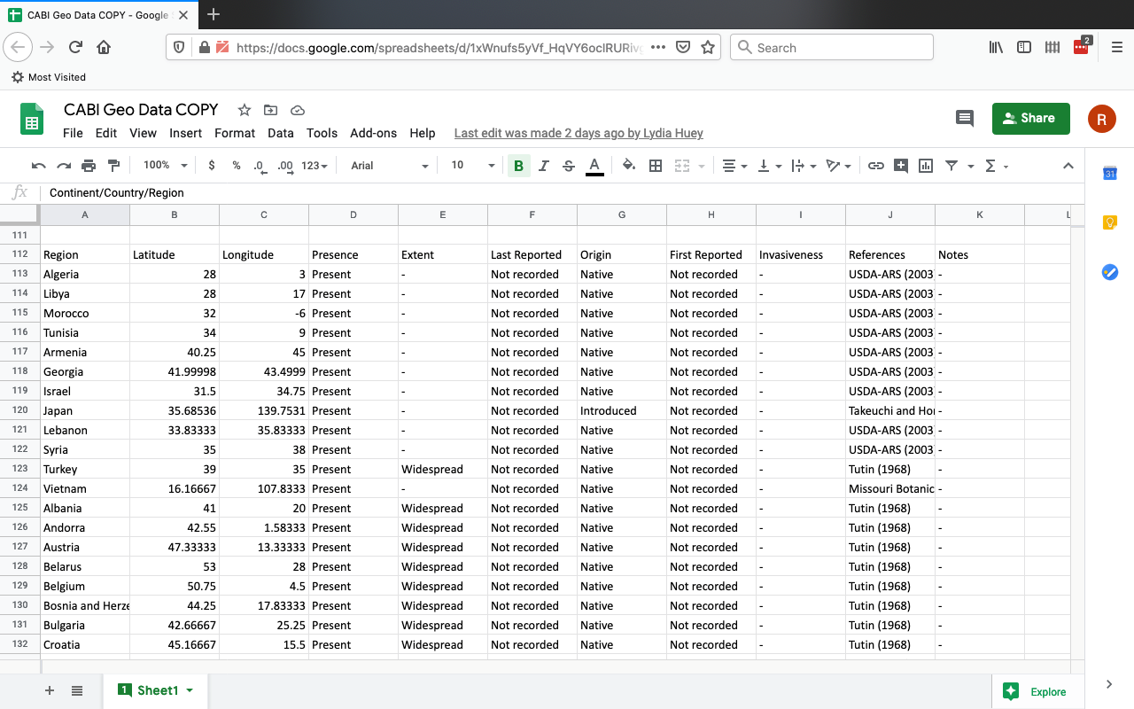
Figure 3: screenshot of the top of the original CABI dataset copied into Sheets
Two minor (smaller) datasets were taken from a table “Impact Summary” and an indented list “Risk and Impact Factors” (CAB International, 2020).
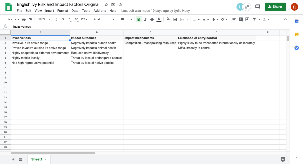
Figure 4: screenshot of the entire Risk and Impact Factors dataset copied into Google Sheets, converted into tabular format
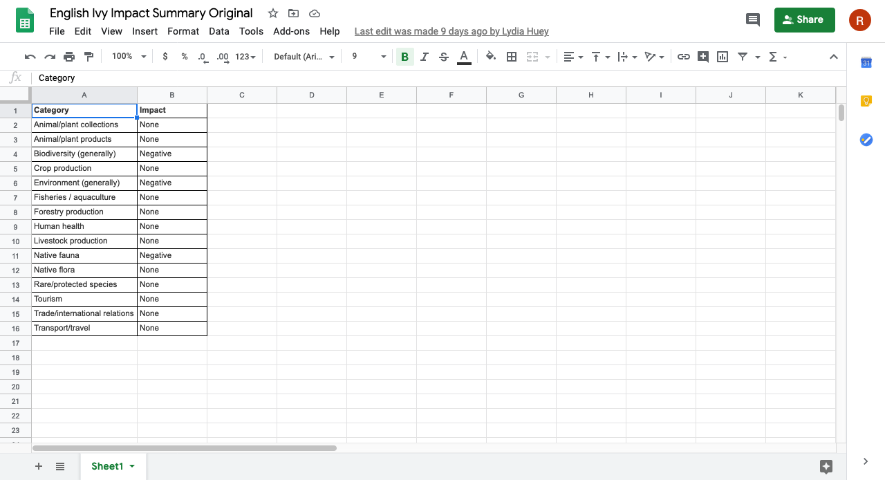
Figure 5: screenshot of the entire Impact Summaries dataset copied into Sheets
Another major dataset was extracted from E-Flora BC: Electronic Atlas of the Flora of British Columbia, using a polygon tool to select marks on a map that were located within British Columbia (E-Flora BC Distribution Map of Hedera helix (English ivy), 2020). The dot marks represented specific instances of a collector observing the presence of English ivy in that geographical location.
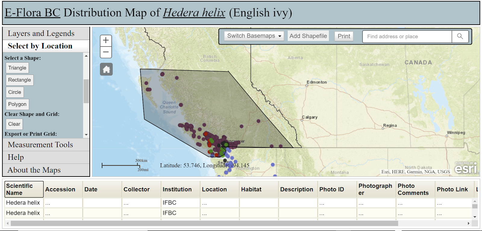
Figure 6: screenshot showing a recreation of the method used to obtain the data for occurrences of English ivy in BC
The dataset was downloaded as a CSV file and copied into Google Sheets.
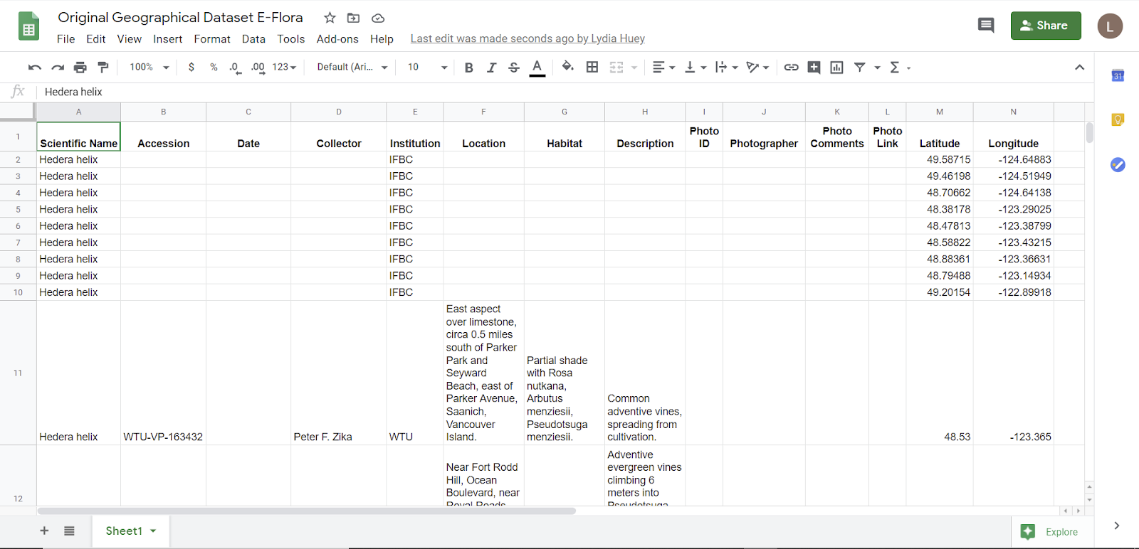
Figure 7: screenshot of the top of the original E-Flora dataset, showing the names of all the attributes in the first row
All datasets were taken from websites that included summaries of multiple scientific sources such as journal articles.
Limitations of the Datasets:
While we felt that the CABI geographical data set came from a reliable source and was therefore trustworthy, we found that it did have limitations that made the visualization process challenging; the main limitation was the prevalence of fields with ‘null’ values. For example, “Invasiveness” was only identified as an attribute of English ivy in a few countries and provinces, and we did not know if its absence for any given item meant that the item was not considered invasive, or if the data was just not available. The dataset also included three former countries that were not recognized on the map in Tableau: Czechoslovakia, Federal Republic of Yugoslavia, and Serbia and Montenegro. Since our focus was mainly on BC, and since we were unsure if the borders of these countries would be consistent with existing borders as shown in Tableau, we decided to leave these three countries out of the final visualization; we recognize that this is may have skewed the data, but we hoped that our general global view and our more detailed view of English ivy in BC would not be greatly affected by this missing data.
The E-Flora dataset had several limitations. To select the marks that occurred in BC, Lydia had to approximate using a polygon selection tool and then add in another row manually to include a mark that had not been included in the initial selection. Furthermore, when the CSV was downloaded, all the entered dates were garbled and had to be re-entered by manually locating each mark and typing in the correct date. Unfortunately, not all the data marks had corresponding longitudes and latitudes so those longitude and latitude for those marks had to be determined manually. These estimates were only somewhat accurate, so Lydia had to re-estimate many of the longitudes and latitudes using the information provided in the Location attribute column and Google map locations and determine estimated longitudes and latitudes from Google Maps. Since the original dataset had a high number of data points, due to time constraints, Lydia did not include two of the data sources within the dataset for occurrences of English ivy in BC. The E-Flora dataset only includes a small amount of data and Lydia suspects that the data was not collected evenly across BC. The localization of data in the Southwest of BC could be data could be due to both collection of data focused in that area and also the fact that English ivy may not be able to survive in less temperate areas of BC such as the Interior. For example, the CABI website states that “[i]n North America (Midwest and New England states) it is reported that severe winter cold inhibits its spread (Moriarty, 2001) and in late autumn, flowers are susceptible to frost (Grime et al., 1988)” (CAB International, 2020).
Tools Used:
We used Microsoft Excel, Google Sheets, and Tableau Prep for data cleaning and wrangling. We used Tableau Desktop and Tableau Online to create our data visualizations. We used our chosen tools because we are somewhat familiar with them (for example, we learned about using the Tableau programs through class). We chose Google Sheets and Tableau Online to make it easier to work on the same file, including the option to work on the same file synchronously when needed. We used Canva (https://www.canva.com/) to create infographics to import into our Story, because it was free, it was recommended in class, and it allowed us to create image files such as PDFs, PNGs, and JPGs, which were easy to import into a Tableau Dashboard to be incorporated into the Story.
Google Sheets and Microsoft Excel were more simple, more intuitive, and easier to use than Tableau Prep, especially since we are more familiar with them. Lydia found that Microsoft Excel was easier to use than Google Sheets since she has used Excel for a longer period of time and more often than Sheets.
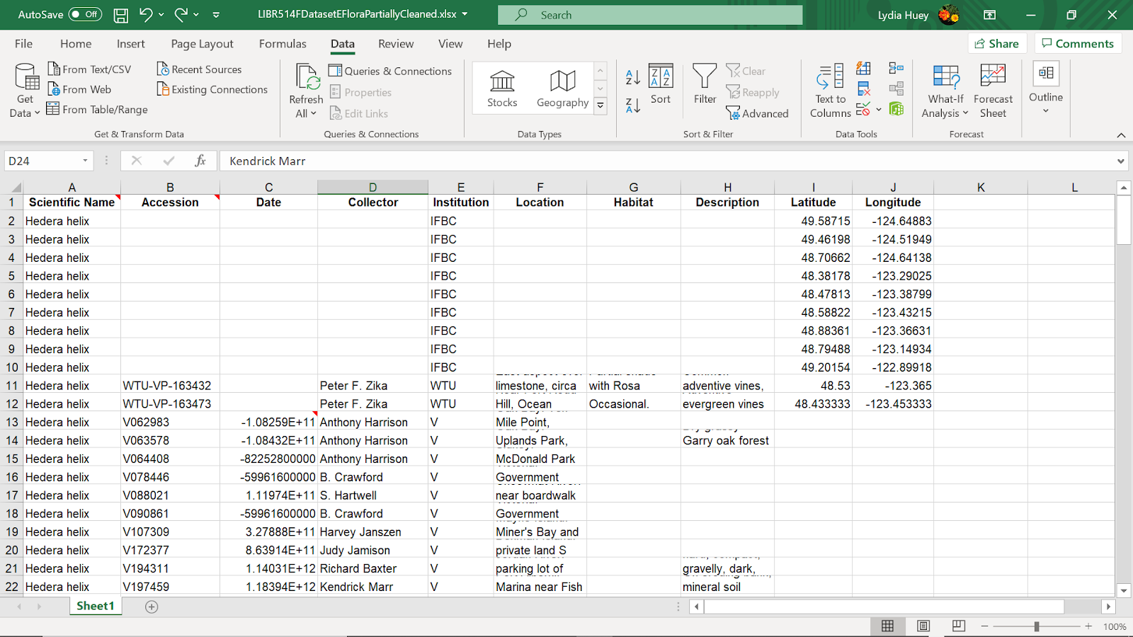
Figure 8: screenshot of using Excel to clean data; the dates were not properly formatted when the data was downloaded as a CSV, so Lydia was required to manually click on each dot mark on the E-Flora map and manually type in the correct date for each row.
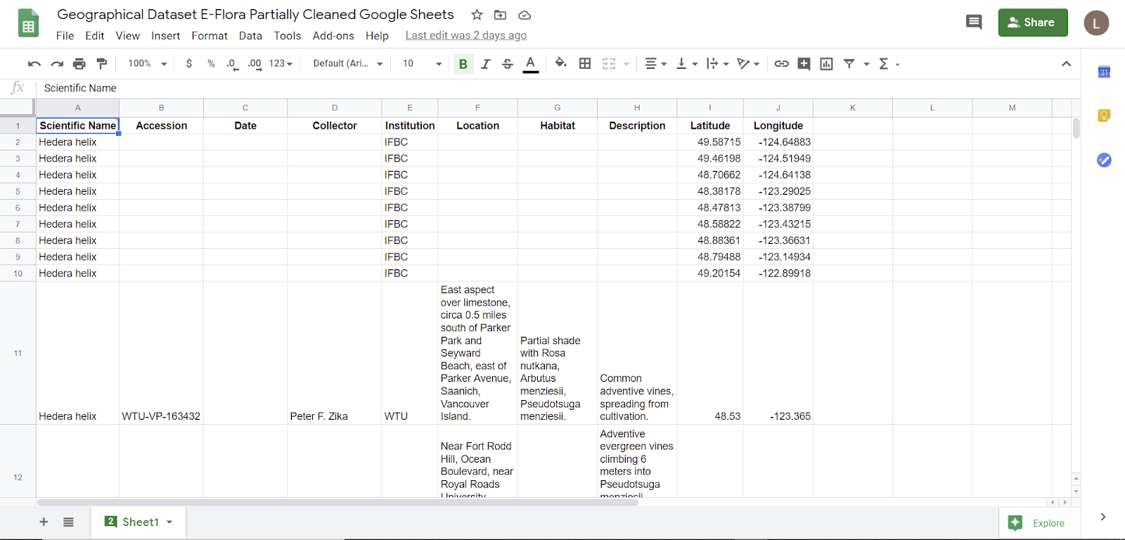
Figure 9: screenshot of using Sheets to clean data
Lydia found that Excel and Sheets had about the same functionality, including the useful function of the function “find and replace”. Although Tableau Prep was slightly harder to use since Lydia was less familiar with it, it was much easier to locate items with the same words within them and simply type to edit those items as a group. Tableau Prep’s use of aggregation and visualization of the data attributes made the data easier to survey as a whole and locate desired items, along with finding data that required editing. For example, one collector’s name was written in two formats and it was easy to group and replace those names in Tableau Prep. If one was using Excel or Sheets, the process would be more onerous.
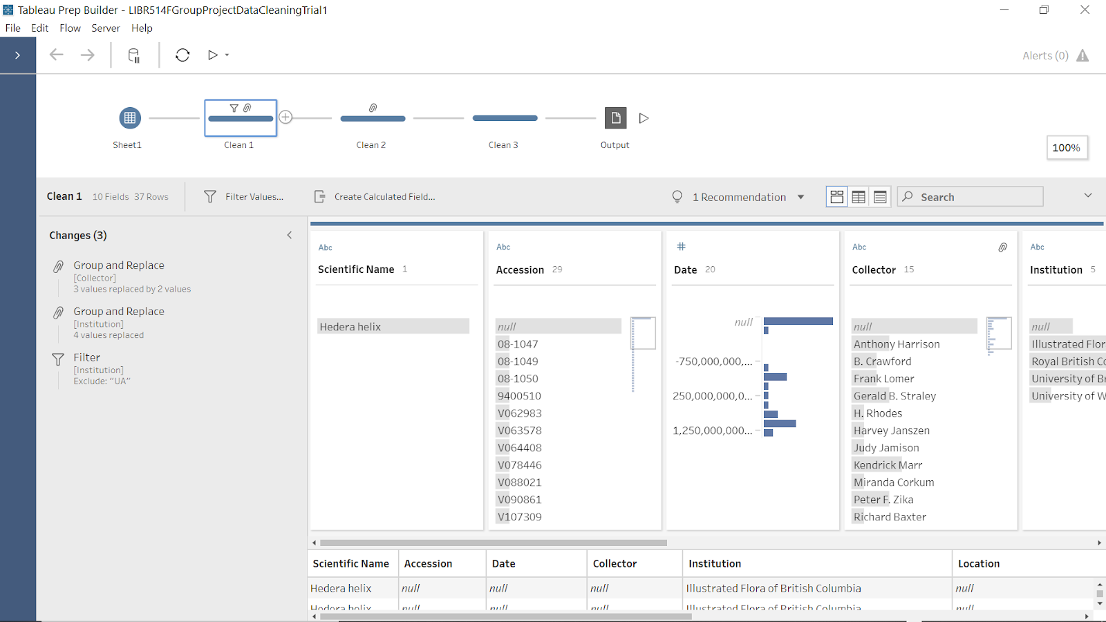
Figure 10: screenshot of Clean 1 in Tableau Prep showing cleaning steps
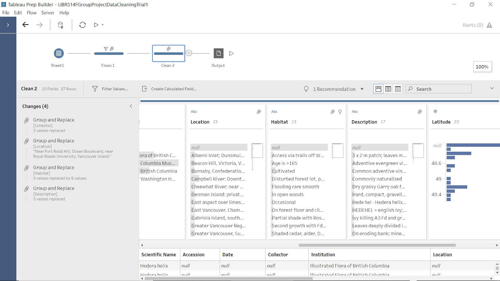
Figure 11: screenshot of Clean 2 in Tableau Prep showing cleaning steps
Tableau Desktop and Tableau Online were relatively straightforward to use to create information visualizations. Strengths include the “Show Me” function which can be used to quickly experiment with different visualizations and the Marks section, which allows for the data to be visually encoded using different visual channels such as size and colour.
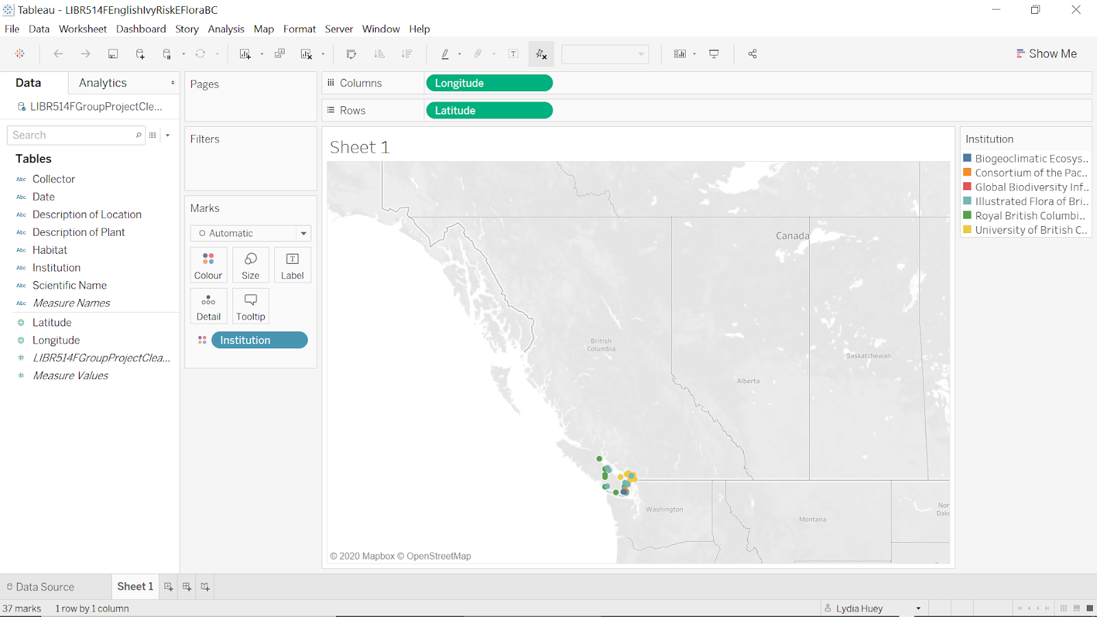
Figure 12: screenshot of a trial of visualizing the E-Flora dataset in Tableau Desktop
Another strength is that the Dashboard function allows importing text and images, along with visualizations created in Tableau, and the story function is useful for creating a narrative. One weakness of the Dashboard is that one can not easily move and align components within it: one has to use vertical and horizontal layout containers.
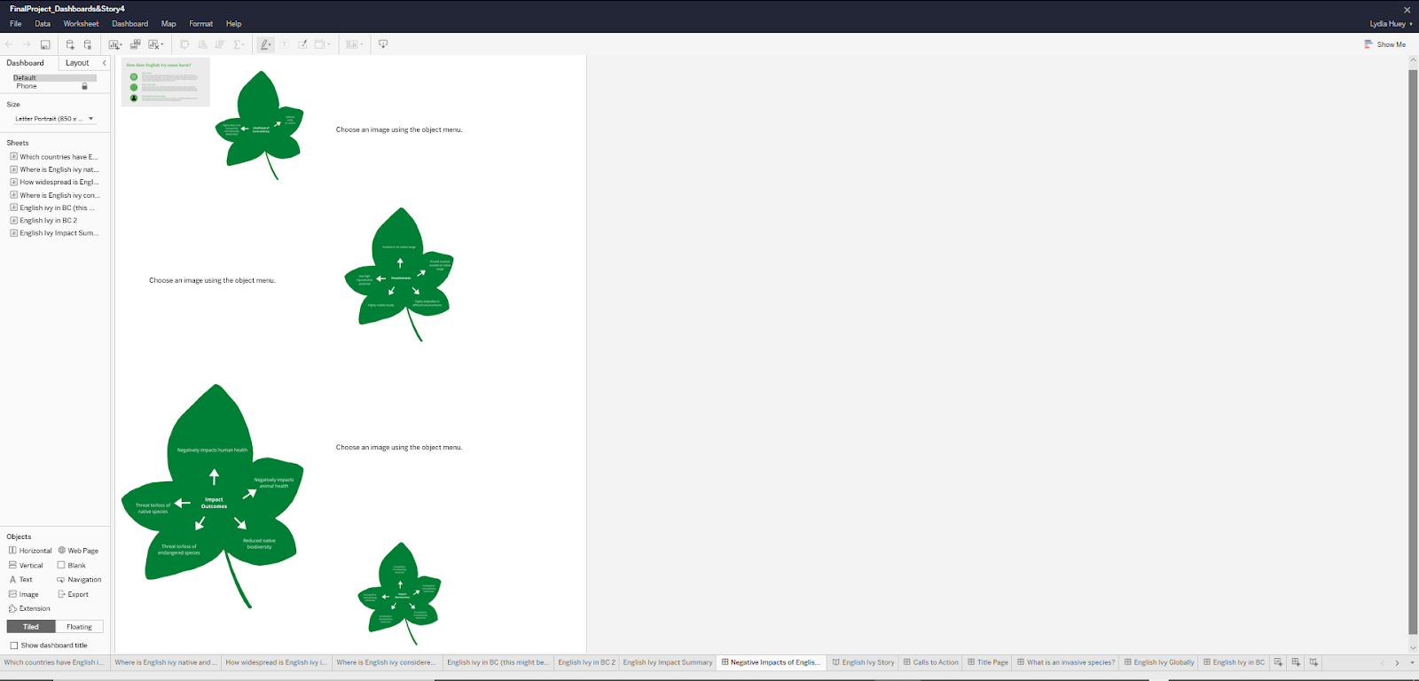
Figure 13: screenshot of Tableau Online showing a non-ideal layout of components (the four images with leaves are supposed to be readable and all the same size)
Two weaknesses are that the difference between “Tooltip” and “Detail” in the Mark section is not obvious, and that only a small number of map backgrounds are available in Tableau itself. One weakness of Canva (https://www.canva.com/) was that we could not change the size of the page with the free version to crop to an image so that it would fill the whole page.

Figure 14: screenshot showing multiple pages of one of the small datasets made into an infographic in Canva
Design Process Analytic Steps:
We knew the argument/idea to be communicated from the beginning and focused on presenting the data/evidence to communicate it through information visualizations. Since we knew the argument, we did not need to explore data visually to find patterns to make into visualizations. Since we are presenting to children aged 9 to 12 years of age, we had the idea of presenting the data in Tableau Story because it would be similar to a story with many pages in a book. We also decided to use infographics within our story to also make it visually engaging and simple for the children to understand. Additionally, since the audience is children, we tried to make our geographical visualizations simple to understand and analyze. For instance, we included four similar world maps emphasizing different attributes of the data, so that children could easily compare them visually. We also included opportunities for simple interactions such as hovering, highlighting, and filtering.
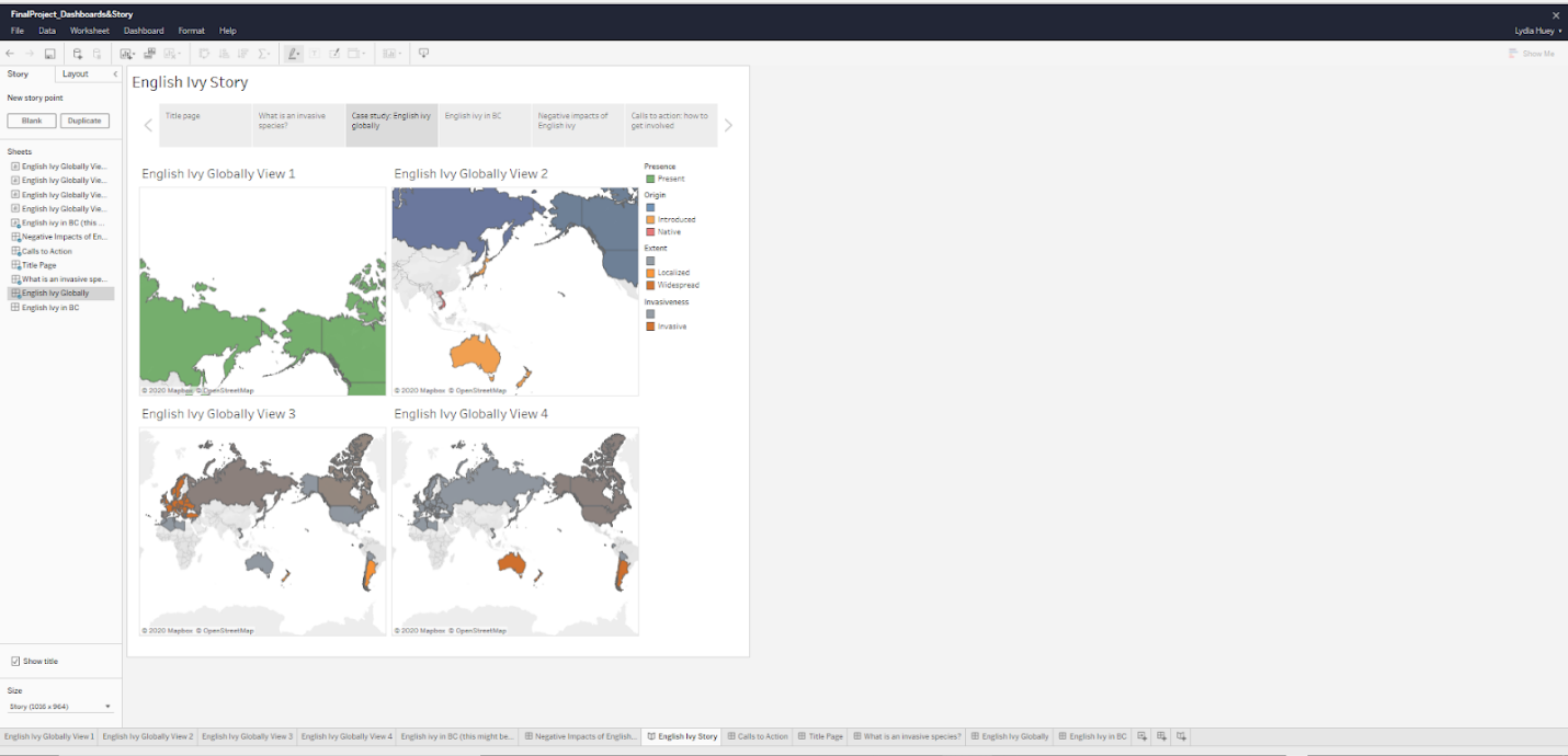
Figure 15: screenshot of a Tableau Story interactive dashboard draft in Tableau Online
We used the geographical information visualizations that the two source websites presented as inspirations for our own geographical information visualizations.
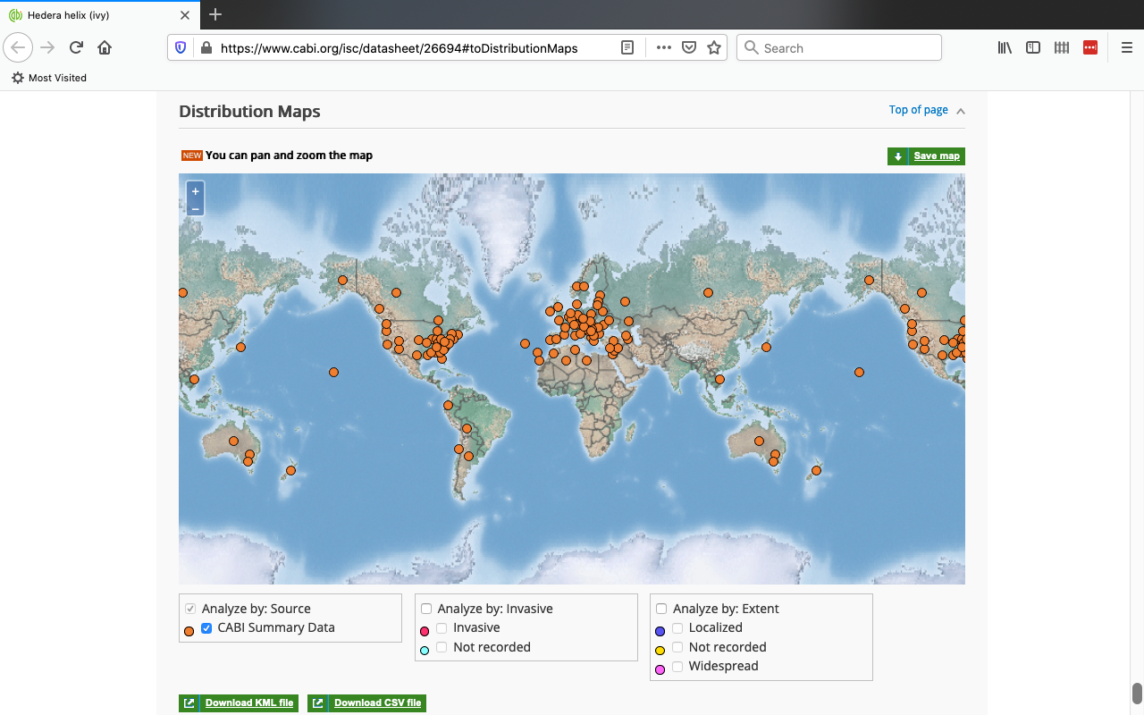
Figure 16: screenshot of an information visualization created by CABI
Design Process and Principles:
We decided early in the process of analyzing our data sources that geographical maps would be our main idiom. This was partly because of the nature of the data, and partly because we felt that maps would be an intuitive form of visualization for children still learning how to understand visualized data. Munzner (2015) explains, if “the given spatial position is the attribute of primary importance because the central tasks revolve around understanding spatial relationships…the right visual encoding choice is to use the provided spatial position as the substrate for the visual layout” (pp. 179-180). To meet the requirements of expressiveness, we used mostly identity channels because we were working with location-based and categorical data rather than quantitative data (Munzner, p. 99). To meet the requirements of effectiveness, we considered channel rankings as described by Munzner (2015): we used spatial region and color hue because these are the most effective channels for categorical data (p. 101). Our choice of geographical maps as an idiom also followed the effectiveness principle because, as Munzner states, “the most effective channel of spatial position is used to show the most important aspect of the data” (Munzner, 2015. p. 180).
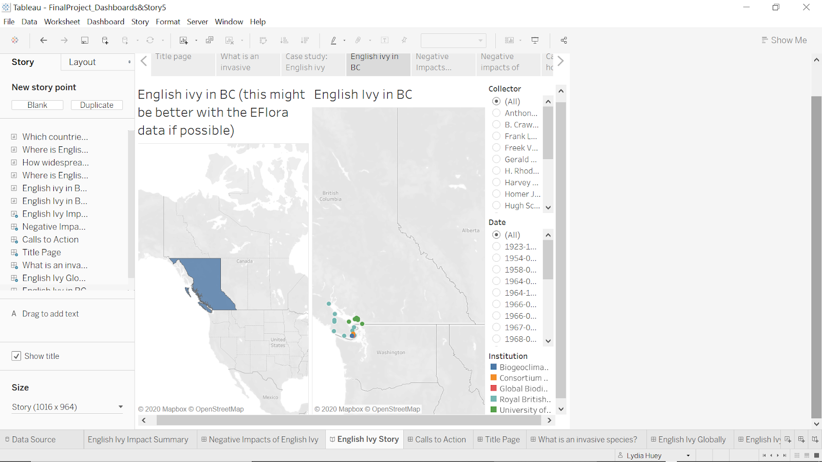
Figure 17: screenshot of a trial of creating an interactive geographical dashboard in Tableau Desktop
We attempted to follow the principle of separability by using separable or mostly separable channels when we were trying to indicate “two different data attributes, either of which can be attended to selectively” (Munzner, p. 108); for instance, the two main channels we used were the separable channels of position and colour hue (p. 108), to show the locations of English ivy at the same time as other attributes such as “Invasiveness.” Following the principle of discriminability was not one of our main challenges (Munzner, p. 106); because much of our data had attributes that only included a small number of categories (for instance, “Present” or “Null”), we did not need to consider whether our selected channels allowed for large numbers of bins. We also attempted to create visual popout using hue and saturation, and tried to limit distractors (Munzner, pp. 109-110). The following images show how we adjusted the default colours in a view to increase visual popout using both hue and saturation.

Figure 18: screenshot of Impact Summary initial colours
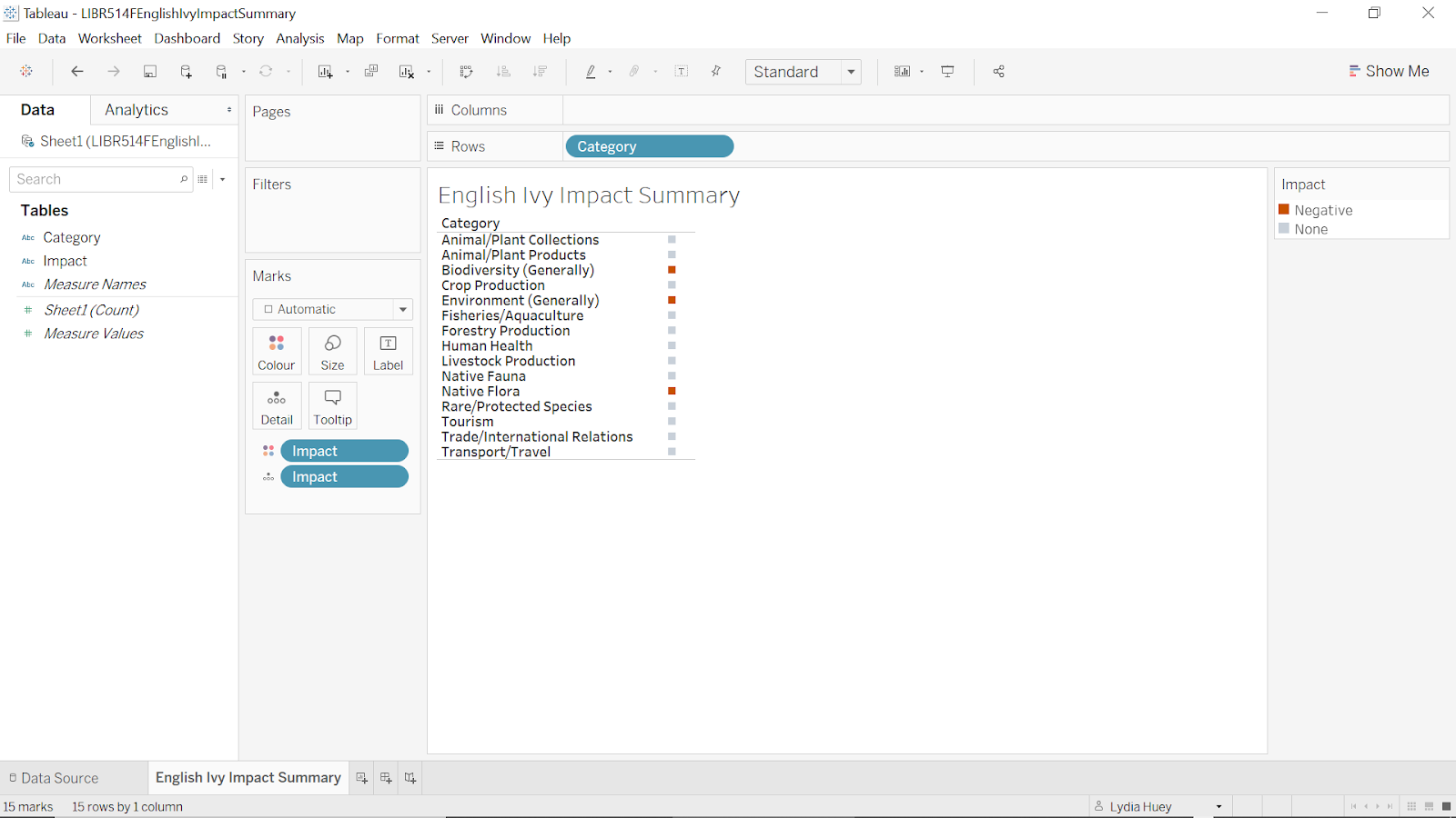
Figure 19: screenshot of Impact Summary final colours
Using Canva, we created infographics to present qualitative data such as definitions of concepts and terms. We aimed to follow Lankow, Crooks, and Ritchie’s (2012) principles of utility, soundness, and beauty. Because we chose a narrative form of communication rather than an explorative one, we were able to meet the principle of utility by leading our viewers “through a specific set of information that tells a predetermined story”; we also tried to follow Lankow et al.’s recommendation for narrative communication, to “focus on audience appeal and information retention” (p. 199), by combining visuals with text and attempting to engage readers’ interest with questions. We attempted to follow Lankow et al.’s principle of soundness, by choosing a topic that we felt would be interesting and relevant to at least some viewers in our chosen age group; we feel that the data we chose is trustworthy, and we endeavoured to present it with integrity (p. 200); however, we did face limitations which we have discussed in our description of the data. We also strove to meet Lankow et al.’s requirement of beauty, ensuring that the aesthetic style of our infographics was consistent with the story we wanted to tell and was appropriate for our audience (p. 201). We decided to use some illustration in our infographics (including both images available on Canva and photographs found elsewhere), because we felt that they would make the topic more interesting and engaging, and because certain concepts, such as the negative impacts of English ivy, seemed easier to understand if shown in visual form (Lankow et al., p. 204).
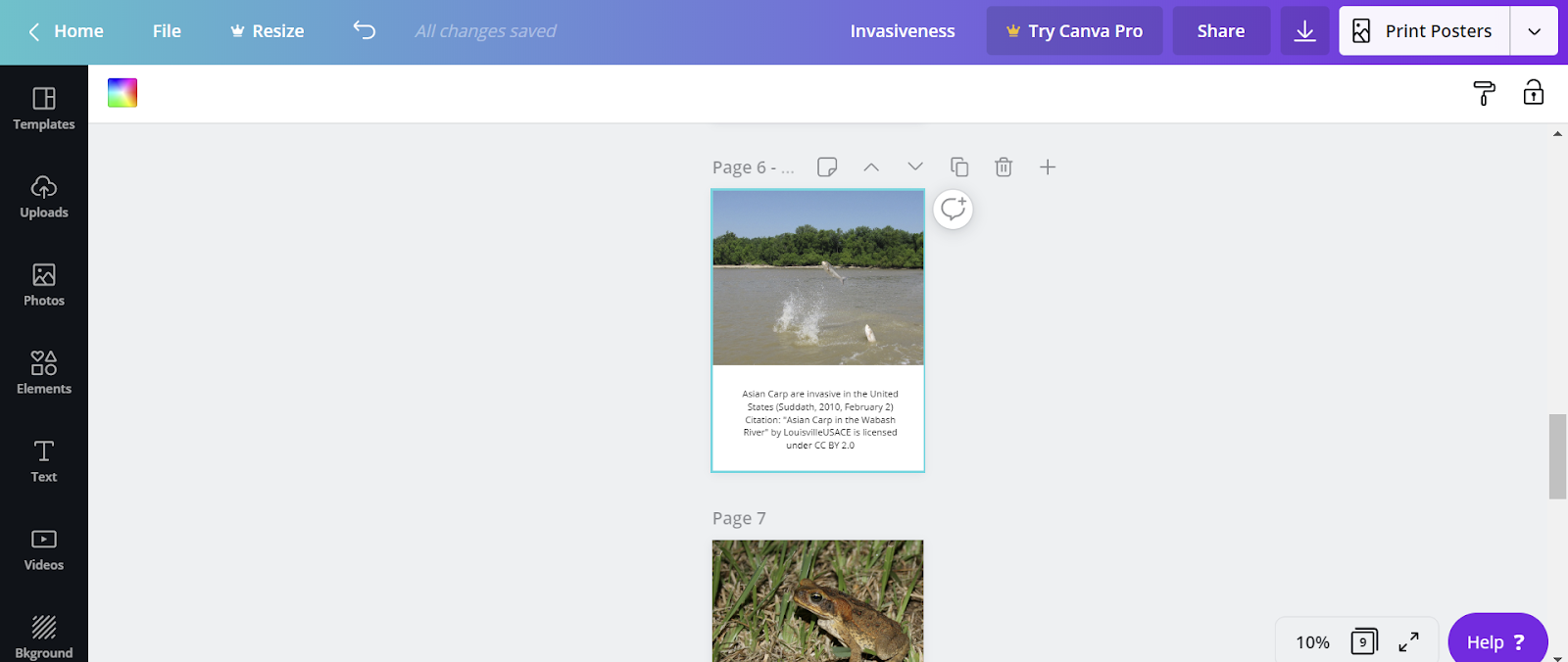
Figure 20: screenshot showing images and text being combined in Canva
In this way, we tried to incorporate what Lankow et al. call “audience appropriateness” and “content appropriateness” into our design (p. 206). Lankow et al. note that because a narrative infographic has a pre-established message, illustration is often more appropriate than it would be in an explorative infographic (p. 205).
Story Description:
Our story is about invasive species: introducing what they are to children aged 9 to 12, presenting a case study of an invasive species, communicating that invasive species have a negative impact on the world, and having a call to action. We also wanted to introduce information visualizations and how to use them. Our story moves from general to specific (invasive species to English ivy), and communicates ideas of how children can get involved to decrease the negative impact of invasive species. This story is credible because it is based on scientific evidence of negative impacts of invasive species. It is relevant because those negative impacts can be quite severe, impacting humanity and other organisms as a whole.
Pros and Cons of Designs:
One benefit of our design is that the story format clearly separates each topic into its own story point, so that viewers can concentrate on one story point at a time and so that we can guide them through the narrative. One drawback of this design may be that viewers who want to engage in more active analysis may have difficulty comparing information across different pages. The use of infographics allows readers to understand ideas through a combination of text and images; we hope that this combination, common in children’s educational materials, will allow viewers to combine their visual and textual literacy skills to help them understand and interpret the data. One limitation in Tableau’s map feature is that it is distorted to make the northern hemisphere seem larger than the southern hemisphere. While two-dimensional world maps are necessarily distorted, we worried that the relatively large size of the northern hemisphere could distort a viewer’s understanding of the prevalence and locations of English ivy globally.
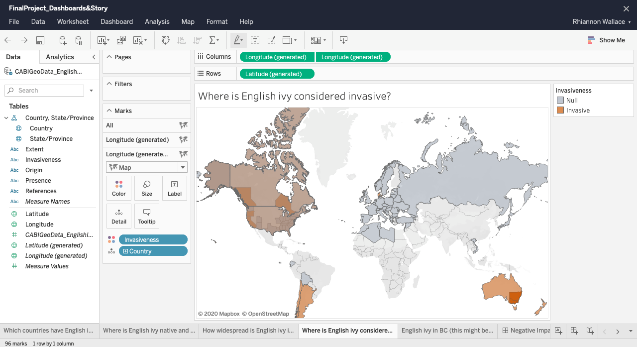
Figure 21: screenshot of a map in Tableau Online with distorted sizes of geographical land masses
This was less problematic in our more focused map of BC. Another design challenge related to the map idiom was being able to show presence or absence of English ivy in different countries, without misleading viewers to associate the area of the country with the amount of ivy; for instance, Canada or Russia does not necessarily have more English ivy than a smaller country like the UK. If we had been able to find a dataset pinpointing the exact regions where English ivy can be found in each country, we would have been able to create a more accurate view. Another limitation was that we were unable to find a way to incorporate audio narration into our Tableau Story. While we worried that this may make the story more difficult for some students to follow, we imagine that a teacher could guide students through the resource in a classroom setting.
References:
CAB International. (2020). Hedera helix (ivy) [Online datasheet]. Retrieved from
https://www.cabi.org/isc/datasheet/26694
E-Flora BC. (2020). E-Flora BC distribution map of Hedera helix (English ivy) [Interactive
map]. Retrieved from https://linnet.geog.ubc.ca/eflora_maps/index.html?sciname=
Hedera%20helix&BCStatus=Not%20listed%20provincially&synonyms=%27
Hedera%20helix%20var.%20hibernica%27&commonname=English%20ivy&PhotoID
=14929&mapservice=VascularWMS
Lankow, J., Crooks, R., & Ritchie, J. (2012). Infographics: The power of visual storytelling.
Retrieved from https://ebookcentral.proquest.com/lib/ubc/detail.action?docID=882721
Munzner, T. (2015). Visualization analysis and design. doi:10.1201/b17511
Province of British Columbia. (2020a). Applied design, skills, and technologies 5 [Web page].
Retrieved from https://curriculum.gov.bc.ca/curriculum/adst/5/core
Province of British Columbia. (2020b). Science 5 [Web page]. Retrieved from
https://curriculum.gov.bc.ca/curriculum/science/5/core
Suddath, C. (2010, February 2). Top 10 invasive species. Time. Retrieved from https://time.com/
Ursyn, A. (2016). Chapter 1: Teaching and learning science as a visual experience. In A. Ursyn
(Ed.), Knowledge visualization and visual literacy in science education (pp. 1-27).
doi:10.4018/978-1-5225-0480-1.ch001
Zheng, R., & Wang, Y. (2016). Chapter 11: Optimizing students’ information processing in
science learning: A knowledge visualization approach. In A. Ursyn (Ed.), Knowledge
visualization and visual literacy in science education (pp. 307-329). doi:
10.4018/978-1-5225-0480-1.ch001