In 2010 the University of British Columbia (UBC) formed the UBC Sustainability Initiative (USI) as a means of bridging the gap between its efforts towards greater environmental, social, and economic sustainability both on and off campus. Described as a “curator and facilitator of a wide breadth of sustainability programs and activities across campus” a significant challenge for the unit is how best to communicate these efforts to support knowledge development and encourage behaviour change.
This challenge is not unique to UBC. Post-secondary institutions as a whole need to consider how best to translate scientific knowledge to varied audiences to increase familiarity with processes, goals, and strategies that support sustainability (Adomßent, 2013, pp.11-12). This ‘knowledge transition’ has been cited as a key component of social change, as it develops awareness of the environmental, social, and economic challenges at hand, while further illustrating possible solutions (Biermann, 2004, p.3).
In an effort to communicate UBC’s efforts towards sustainability, a series of static infographics have been developed, using a narrative approach with explorative characteristics to distil data and research into a format that is easily understood by a general audience, while further presenting this data through charts that are understood by an audience with scientific knowledge. This audience might include UBC students, staff and faculty, as well as external funders and key university stakeholders. The development of static pieces ensures that they can be easily replicated and distributed both digitally and in print.
DATA SET
USI produces UBC’s Annual Sustainability Report – a document outlining the University’s efforts and achievements towards sustainability from each preceding year. Units across the Vancouver and Okanagan campuses provide data that is distilled into one excel file and used to inform the development of charts, tables, and key achievements throughout the report. This file features data resulting from a wide range of activities including those connected to teaching and learning, operations and infrastructure, and the campus communities, with results organized by category and year. Quantitative data was drawn from this file for use in the infographics.
Given that the file is compiled with data from various units within multiple campuses, there are inconsistencies in the presentation of datasets, specifically between those provided by the Vancouver and Okanagan campuses. Several datasets are compiled on a single tab, with multiple levels of headings, and some tables include a combination of numbers formatted generally and as percentages. Complicating the wrangling of data is that several data points are linked via equations to other data points presented in the same tab.
Data wrangling was therefore a first significant step to remove extraneous data and create more consistency in data for analysis. Multiple levels of headings were translated into additional columns and all data pertaining to information outside the scope of the infographics was removed. This process clarified what visual encoding to use to present quantitative data, whether as a chart or a stand-alone key achievement.
Qualitative data was drawn from the narrative of the 2018/19 Annual Sustainability Report. This narrative reports on key initiatives undertaken by the Vancouver and Okanagan campuses that, in part, inform results presented through quantitative data. Sections of the report that relate to the scope of the infographics were reviewed and salient information used to inform the narrative of the infographics.
TOOLS
Microsoft Excel, as well as Adobe Illustrator and InDesign were used to create the infographics.
Microsoft Excel | Given the nature of data being collected and the intent to represent it statically, Microsoft Excel offered enough features to wrangle data with minimal complication. Its tabular layout further aligned with tools used to develop charts in Adobe Illustrator.
Adobe Illustrator | Charts were developed and illustrations adapted from originals sourced from the Noun Project using Adobe Illustrator. The ability to shrink and expand vectors created through the program supported the ability to replicate their use in print and digital formats. The program further offered chart-making tools, which facilitated the creation of accurate graphs.
Adobe InDesign | Given its ability to produce both print and digital outputs, the final infographics were produced using Adobe InDesign. The program allowed for rich formatting of text, colour, and graphics, which ensured a high degree of control over how both qualitative and quantitative data was presented.
ANALYSIS
In reviewing both qualitative and quantitative data, a narrative curve involving the intentions, actions, and results of UBC’s efforts towards sustainability became evident. Intentions included the University’s goals to address key contributors to climate change at the Vancouver and Okanagan campuses. Actions included the University’s efforts towards these goals, as outlined through qualitative data drawn from the narrative of the 2018/19 Annual Sustainability Report. Results included the output influenced by these efforts, as presented via quantitative data provided to inform the development of charts, tables, and key achievements throughout the report.
The proposal for this project included the creation of two infographics, one for energy emissions and water use, and another for transportation and housing. However, during data analysis, it became evident that each energy emissions, water use, transportation, and housing involved enough independent data to inform the creation of four separate infographics. The combination of such would likely confuse the narrative and require audiences to sift through data related to each subject. As a result one infographic was prepared for energy emissions and another for water use. By separating these subjects, it was further possible to present data pertaining to both the Vancouver and Okanagan campuses equally, rather than favouring one campus in the presentation of its data over the other.
A narrative approach was employed to reduce the need for interpretation among a general audience. However, expressive characteristics were further incorporated into the final designs for members of this audience with some degree of scientific knowledge. This combination of narrative and expressive approaches endeavoured to create pieces that were versatile and readily disseminated without additional adjustment.
DESIGN PROCESS
Forming the foundation of the design was adherence to USI branding, which included application of its green colour palette, as well as font selection that echoes UBC brand guidelines. This both branded the infographics as a product of USI while ensuring visual cohesion and consistency among each piece in the series. Each infographic is presented in a landscape format that can be uploaded to campus digital screens as well as printed for individual distribution. The provision of a format replicable in digital and print allows for greater flexibility in the dissemination of the infographics both on and off campus.
FIGURE 1: USI COLOUR PALETTE

FIGURE 2: UBC FONTS

A portrait format for each infographic was additionally originally proposed for web use. Given the static nature of these pieces, they ought to be updated annually to remain current. With that in mind, they are better suited for display on static digital viewing platforms and in print than on web platforms, where data can be more easily updated and information more dynamically and interactively visualized. Given that a static representation online does not leverage online capacities for information visualization, it was decided to focus on the landscape format alone.
Following the principles of utility, soundness and beauty, illustrative components were limited to those either intended to identify qualitative data, or to visualize quantitative data. Specifically, vector illustrations were used to draw attention to the presentation of qualitative data, which consisted of short narratives related to key efforts towards addressing university goals. Given that quantitative data consisted of time series, simple bar graphs were selected to visualize the comparison between GHG emissions per year and water use per year. Extraneous elements were avoided in the presentation of these graphs to draw focus to the overall trend of data for each set rather than drawing attention to individual measurements within a set.
The overall layout of the infographics conformed to western reading standards. Starting with a description of UBC’s goals related to each subject in the top left hand corner of the page, the eye follows a ‘Z’ pattern across narratives outlining key efforts to achieve these goals, then downward to the bottom left corner and across results influenced, in part, by the above efforts. Colour was used to distinguish qualitative data – presented through goals and efforts – from quantitative data – presented in key figures and charts.
FIGURE 3: SKETCHES
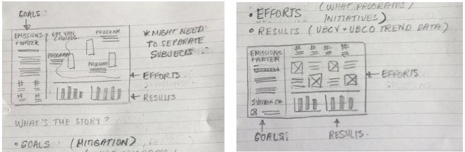
These decisions came about as part of an iterative process starting with consideration of the narrative arc. What followed was the development of concepts in the form of sketches, then the creation of individual components required – including vector illustrations, charts, and text blocks – to the arrangement of these components in the final digital layout. The preparation of sketches at the outset facilitated fairly quick construction of individual components into the final digital layouts.
NARRATIVE
The narrative arc presented in these infographics is that of UBC goals, key efforts to achieve these goals, and results influenced, in part, by these efforts for both energy emissions and water use at the Vancouver and Okanagan campuses. The intent of such was to highlight UBC’s goals, efforts, and achievements towards sustainability, as a means to transfer this knowledge to general audiences while further suggesting what kinds of efforts contribute to tangible results.
Employing a primarily narrative approach, these infographics sought to share information and data without need for interpretation. Targeted to general audiences, the final pieces were created so that both individuals with and without a scientific knowledge could find information and data that resonates with them. To reach more general audiences, this involved simplification of some concepts and terminology used in narratives informed by the 2018/19 Annual Sustainability Report.
REFLECTION
Employing a narrative approach in the design of static infographics allows for the presentation of information and data in a format that can be easily interpreted by general audiences without need for further analysis. Adherence to USI brand guidelines – including colour and font selection – supports brand recognition while creating visual cohesiveness and consistency among pieces in the series. This resulting infographics carry a uniform message about UBC’s goals and efforts towards sustainability and the results of such.
However, as largely promotional pieces, they do not encourage critical review of these goals, efforts, and results. While the two infographics present data pertaining to environmental sustainability, they do not encourage room for interpretation or assessment of this data in relation to efforts beyond that of the university. Moreover, the static presentation of this data requires manual updating annually. While suited for the sake of increasing knowledge of and engagement with these topics among general audiences, these pieces would not be appropriate to share with practitioners in the field of environmental sustainability for greater analysis.
INFOGRAPHICS
The following are the final iterations of the infographics.
FIGURE 4: ENERGY EMISSIONS INFOGRAPHIC
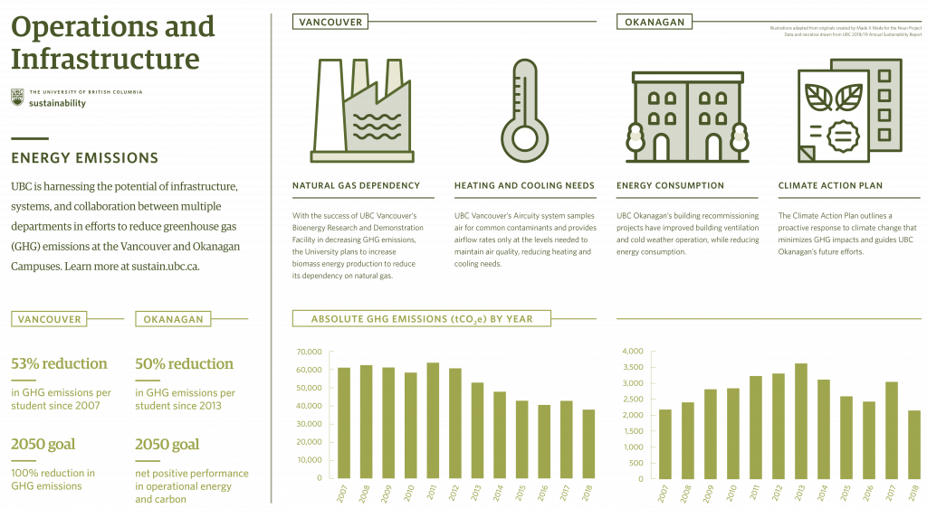
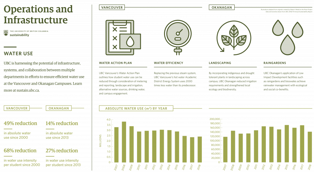
FIGURE 5: WATER USE INFOGRAPHIC
REFERENCES
Adomßent, M. (2013). Exploring universities’ transformative potential for sustainability-bound learning in changing landscapes of knowledge communication. Journal of Cleaner Production, 49, 11–24. https://doi.org/10.1016/j.jclepro.2012.08.021
Biermann, F. (2004). Knowledge for the sustainability transition. The challenge for social science. In F. Biermann, S. Campe, & K. Jacob (Eds.), Proceedings of the 2002 Berlin Conference on the Human Dimensions of Global Environmental Change: Knowledge for the Sustainability Transition, The Challenge for Social Science (pp. 1-11). Amsterdam (www:glogov.org): The Global Governance Project.