Our dashboard can be found here.
Our infographics can be found here.
Introduction
In this project, we designed an interactive dashboard that enables the audience to explore the relationship between the characteristics of a medical insurance beneficiary, such as age, Body Mass Index (BMI), smoking status, and the insurance costs incurred in the United States. By visualizing the Medical Cost Personal Dataset, we try to answer questions such as does an increasing BMI increase the medical costs? How about age? Number of children? Smoking status? Furthermore, we designed infographics to demonstrate our findings in the correlation between personal factors and medical costs.
Our intended audience is the public that is interested in medical expenses. The US is well-known for its lack of universal healthcare and perplexing health insurances. We hope our design could help the audience make informed decisions with regard to healthier lifestyles, no matter if they have the privilege to visit hospitals.
Data
For this project, we are using the Medical Cost Personal Dataset. This dataset is used in the book Machine Learning with R by Brett Lantz and extracted from Kaggle by Github user @meperezcuello. The data is in the public domain. (meperezcuello, 2019) Originally, the dataset was used to train a machine learning model to predict the insurance cost. We are aware that it is only a small sample of medical insurance costs in the US of people aging from 18 – 64. There’s no detailed demographic information such as race and county. And it cannot reflect the health condition of people who don’t have insurance.
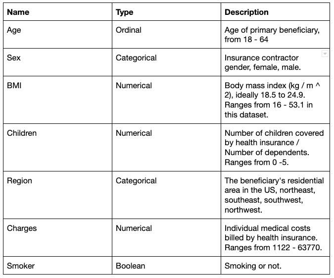
It has 7 attributes and 1338 records. The attributes are as follows:
Tools
For the interactive dashboard, we use the Tableau Desktop. Tableau is very easy to use when doing visual analytics. Compared with Shiny or Plotly, Tableau requires minimal technology shrewdness to build a dashboard. It also provides a variety of native visualization idioms and color palettes that are sufficient for our project. Another reason we choose Tableau is that it provides a free platform where we can easily publish our work. For the infographics, we used infogram. It was a great tool to use because it had lots of templates which are easy to modify. And it’s also user friendly.
Analysis
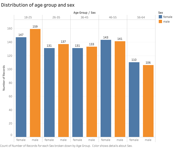
We first made some static visualizations to get familiar with the data and understand the distribution. The dataset has most samples in the 18 – 25 age group. The largest difference of numbers of beneficiaries from both sexes is also in this age group.
The distribution of insurance charges is right skewed. More than half of the charges are lower than 12,000. A few records are higher than 50,000.

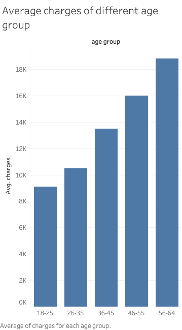
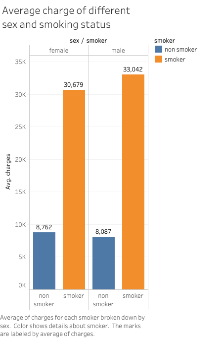
On average, male beneficiaries are charged more than female ones. The difference is more drastic across different age groups and smoking status.
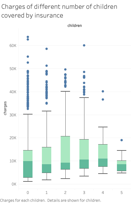
We once thought the number of children covered by insurance may also be a factor that affects the charges. But the following box plot shows that the medians of charges across different numbers of children are quite close to each other. The distribution of charges of beneficiaries having no minor dependents is wider than other beneficiary groups. The most expensive charges also show up in this group. The minimum of charges grows steadily when there are more children covered by insurance. But there’s no clear pattern of the maximum. One possible explanation is that people who have no minor dependents may be older and have independent grown-up kids. Therefore they may have more medical costs due to their age.
We used two scatter plots to discover the relationship between quantitative variables, namely age vs. charges, and BMI vs. charges.
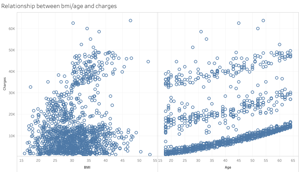
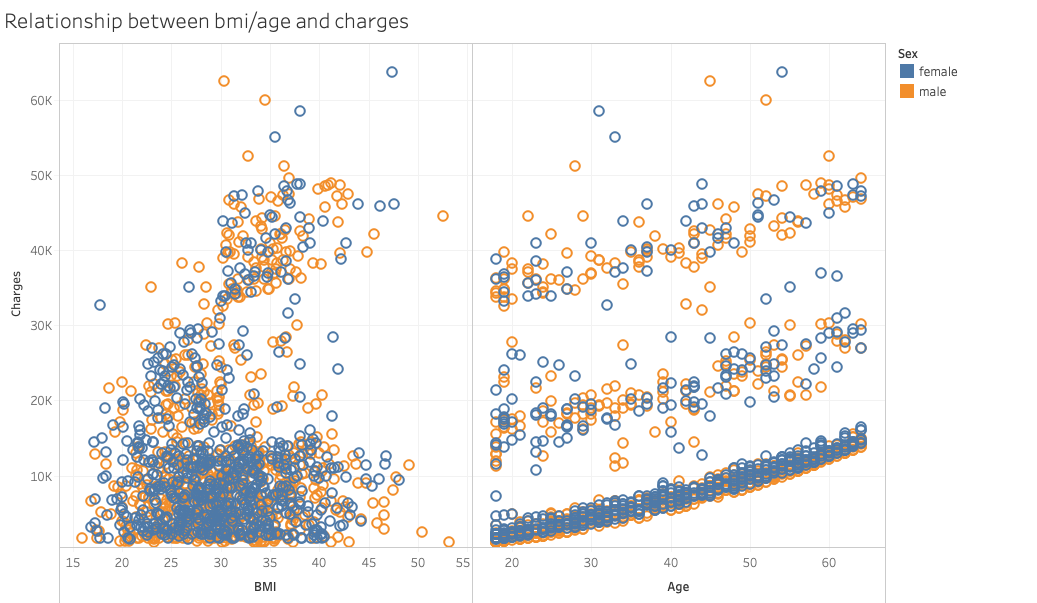
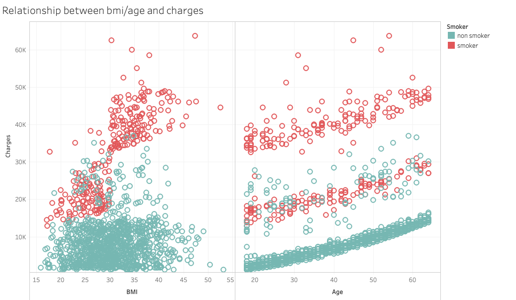
The scatter plot on the left hand side indicates the relationship between BMI and medical charges. There’s no clear pattern in the graph. The plot on the right hand side shows the relationship between age and charges. There are three clusters with similar slopes, growing as the age increases. When we take sex and smoking status into concern, it shows that there’s no clear difference in distribution between sexes, while the smoking status tells us more interesting information.
The BMI-vs-charges graph implies a positive correlation between BMI and medical charges within smokers. The age-vs-chages graph shows that smokers dominate the highest cluster, non smokers the lowest. These two graphs are later used in the interactive dashboard.
Design Approach
We developed our design approach by analyzing our target audience’s tasks. We aim to allow users to play with the data and find out the relationship between medical costs and factors of their choice, such as age, gender, and region. Using Munzner’s framework of task abstraction, we identify our audience’s goal at the highest level is to discover the relationship between medical costs and other factors. At the lower level, our design should allow users to compare between different groups, such as age, sex, and region. Due to the simplicity of our data (only 7 attributes and 1338 records) and the lack of granularity, our design doesn’t emphasize the mid-level tasks such as looking up and locating.
To support discovery of the relationship between quantitative variables, we designed a scatter plot where users can choose the x-axis. The y-axis is fixed and indicates the medical costs. Furthermore, to support the visual queries of comparing groups of data, such as male vs. female, and smoker vs. non-smoker, we used a pre-attentive visual primitive, namely colors (Ware, p.29). When choosing “breakdown by sex” or “breakdown by smoking status”, the spots will be divided into two colors. When breaking down by sex, it is difficult to separate the two colors, which indicate male and female, from each other. On the other hand, when breaking down by smoking status, the red spots indicating smokers pop up and show a clear trend different from the green spots, which indicates non-smokers.
The principle of soundness/utility/attractiveness were used in the design. The infographics gives a detailed overview of the factors that affect medical cost in the Northwest, Northeast, Southwest and Southeast region of the United States. It shows the Sex and number of records for each age group. It also shows how age and lifestyle (smoking) plays a factor in medical cost. All information in the infographics are truthful and honest. The data representation and credible analysis was gotten from Medical Cost Personal Dataset. Simple illustrations were used which complements the data conveyed in the infographic. Being a medical related topic, white was used as the background colour as it is associated with medicine/hospital. For the age factor, bold colours were used for the younger age range as it signifies strength and agility that comes with young age while warm colours were used for the older age range as it signifies security. Furthermore, two font sizes were used, one for heading and subheading while the other for body. All texts were aligned evenly. Overall, infogram was a great tool to use expect for one or two challenges we had- we found it difficult to customise the pictogram template to our desired choice.
Reference
Meperezcuello. (2019). Medical Cost Personal Dataset. Retrieved from https://gist.github.com/meperezcuello/82a9f1c1c473d6585e750ad2e3c05a41#file-readme-md.
Munzner, T. (2014). Visualization analysis and design. Boca Raton: CRC Press.
Ware, C. (2008). Visual thinking for design. Burlington, MA: Morgan Kaufmann.