Using design to appeal to the masses
Laura Chow
Since entering a position that requires me to engage with individuals who have focused their education in social sciences and arts, I have come to appreciate that health professionals struggle to:
- Describe complex information that is simple, easy to understand, and accurate,
- Ensure that simplified messages are easily interpretable without any assistance
- Make message delivery look good
While points one and two are often navigated (though with issues as illustrated through other course modules), it seems that health professionals often believe that “having the message is what’s important.” I believe this is fundamentally wrong.
This week’s module emphasizes the visual end product media that can be used to communicate scientific information. Over the years, there have been attempts to include more graphics and design elements through colour in handouts and presentations; but they are often poorly designed, which can ultimately be very distracting and result in poor message delivery (Cater, 2013).
Matt Carter states:
“Although content certainly matters, design and delivery of your presentation are what will ultimately make it a success.”
In my own experience, I have even had someone once tell me, “if it looks good, it hardly matters what you put on the page.” Obviously, there is a fine balance to meet in order to ensure that the desired scientific rigour is present and displayed in the presentation; however, sometimes, we must remember that this requires simplification of our process and methodology. The important question to ask is whether or not someone will still understand the gist of the message, or if they will give up all together if it becomes too complex.
It doesn’t take a rocket scientist to recognize the role of flash and pizzaz in successful marketing, so why should it be any different in communicating scientific evidence? Interestingly, this gap has been recognized as a limitation of scientists, with calls to improve visual communication and incorporating graphic design theory and practice (see Khoury et al., 2019; Estrada and Davis, 2014; Cheng and Rolandi, 2015) among many others). The results are evident with recent health campaigns.
This said, however, many slide decks, handouts, and posters (especially when made in-house) still often contain too much text and are written at a level that would respond to people who mirror the person presenting (i.e. someone with a scientific background). Obviously, this makes sense, as few health professionals have graphic design skills. Generally, strong results have been seen when scientists work alongside a graphic designer; this makes sense to combine the strengths of each profession to help make a strong and coherent message that is more accessible to others. While we may feel that we are diluting the message, ensuring that the essence of the takeaway is present is key.
_____
References and Background:
Carter, M. (2013). Designing science presentations: a visual guide to figures, papers, slides, posters, and more. Amsterdam: Elsevier Academic Press.
Bylinskii, Z., Kim, N. W., Odonovan, P., Alsheikh, S., Madan, S., Pfister, H., … Hertzmann, A. (2017). Learning Visual Importance for Graphic Designs and Data Visualizations. Proceedings of the 30th Annual ACM Symposium on User Interface Software and Technology – UIST 17. doi: 10.1145/3126594.3126653
Cheng, K., & Rolandi, M. (2015). Graphic design for scientists. Nature Nanotechnology, 10(12), 1084–1084. doi: 10.1038/nnano.2015.290
Cornish, K., Goodman-Deane, J., Ruggeri, K., & Clarkson, P. J. (2015). Visual accessibility in graphic design: A client–designer communication failure. Design Studies, 40, 176–195. doi: 10.1016/j.destud.2015.07.003
Estrada, F. C. R., & Davis, L. S. (2014). Improving Visual Communication of Science Through the Incorporation of Graphic Design Theories and Practices Into Science Communication. Science Communication, 37(1), 140–148. doi: 10.1177/1075547014562914
Khoury, C. K., Kisel, Y., Kantar, M., Barber, E., Ricciardi, V., Klirs, C., … Novy, A. (2019). Science–graphic art partnerships to increase research impact. Communications Biology, 2(1). doi: 10.1038/s42003-019-0516-1
____________________________________________________________________________
Module 9 Blog Post: Risk and Crisis Communication on Social Media for Pandemics |Gabby Hadly
Objective / Central Message:
My goal in this blog post is to dive into what effective risk/crisis communication looks like on social media for a pandemic threat.
Background:
When developing written risk communication materials we know to explicitly state the purpose of the message at the beginning of the material, write at an 8th grade reading level, use the correct lingo for our audience, and to keep acronyms and abbreviations to a minimum.
Given that risk communication materials and messages should be tailored to each medium and each social media platform, should the messages also be tailored each context? For example, if I am communicating on social media about a terrorist attack or an environmental disaster- do my message guidelines change? What about for pandemic events?
With 50-70% of individuals around the world receiving their news from social media platforms, I wanted to explore the best approaches to communicating risk during a pandemic on social media.
Social media + Pandemic:
It can be difficult to accurately communicate the risk of a pandemic event on social media. The social media attention span tends to be short, yet pandemics are long-wave events that sometimes last weeks, months, or years. Pandemic messages on social media are often short, (especially micro-blogging sites such as Twitter), whereas accurate advice and news-reporting- may require more detail. Accurate information is required to prevent illness and death or mitigate fear, whereas social media is rife with mis- and dis- information. Yet at the same time, social media can offer risk and crisis communicators advantages due to their greater immediacy over more traditional forms of communication, and because of their potential for more tailored responses to audience members.
Tip for pandemic risk communicators on social media:
- Listen to what social media users are saying and provide them with access to relevant information.
- Provide constative forms rather than expressive forms (i.e. factual straightforward statements are best), engage local health care-workers in messaging whenever possible.
- Have a strong and continuous presence on social media during a crisis. Engage in direct dialogue.
- When developing a caption or making a video posting- consider incorporating the following messaging tips from the CDC around outbreaks-
- Some experts also believe that messaging that arouses a healthy dose of fear might just be what we need during a pandemic. Such messaging combined with useful information that helps people protect themselves or diagnose symptoms, can become a powerful and actionable health message, and result in wide sharing and engagement across populations.
Final thoughts:
Risk communication via social media in the days of a pandemic are now upon us. Just as we tailor our risk communication messages to various mediums, we must also do the same for various forms of risk. Pandemic risk communication in the medium of social media requires listening to your audience, providing reliable and relevant sources, posting and engaging regularly, and using careful message wording.
References:
https://www.emerald.com/insight/content/doi/10.1108/978-1-78756-269-120181016/full/html
https://www.cdc.gov/eis/field-epi-manual/chapters/Communicating-Investigation.html
https://time.com/5802802/social-media-coronavirus/
https://www.who.int/emergencies/diseases/novel-coronavirus-2019/technical-guidance/risk-communication-and-community-engagement
Week 9 Blog Poster: How can we improve academic posters?
Sean Sinden
I decided to write my blog post about some recent attempts to improve the way academic posters are designed and implemented.
As noted in the text, posters are designed to draw in an audience’s attention and highlight a few key messages. However, traditional posters are often packed with too much information, complexity, and jargon to make it a useful medium for communicating the core ideas of the research project.
A traditional poster format
Despite the obvious love and attention to detail that went in to constructing this poster, from the Society for Conservation Biology, you’re not going to get much information from it unless you have 10 minutes to read through the plethora of details. Unfortunately, this is the format that the vast majority of posters at academic conferences follow: introduction, methods, discussion, conclusion. Given how many great research projects are accepted for the poster sessions, this is a wasted opportunity to get across some strong, actionable, and interesting content.
A better way to poster?
A few years ago, Mike Morrison, a PhD student in industrial and organizational psychology, introduced what he called the Better Scientific Poster. In his view, an academic poster should do three things: 1) maximize insight, 2) keep the good stuff (leave time for conversation), and 3) be easy to make. His design is based off of starting with a minimalist design, and adding only the things that are necessary for the poster to be effective; focus on what people need to know and only include what is nice to know if it makes sense to include. So, include the main takeaway in plain language in the centre. He also suggests that we use colour, which could be part of a brand or used to denote what kind of study you are displaying. On one side of the poster, he includes an “ammo bar” which contains the figures, tables, and methods the presenter may need. On the other side, you include a short-form overview of the study, including intro, methods, results, and discussion that can be read in 1-4 minutes. Finally, he adds a QR code that will link to a copy of the poster and the academic poster on which it is based. So, session attendees get to choose how much information they want to take away. They can read the takeaway on move on, they can browse the study overview, interact with the presenter with the help of the ammo bar, or pull out their phone to save the full article for later. This YouTube video is a greater overview of how and why he proposes we should design poster.
The Better Scientific Poster
Is this our best option?
Morrison’s design is just one approach to making a better poster and other design specialists have criticized his design choices. But the point is that we shouldn’t just repeat the same stodgy poster style used for the last century because that’s what academics have always done. We should strive to look for new ways, inspirations, and schools of thought to inform visual aids for effective research communication.
The Whitewashed Podcast
Nilou Tafreshi
Compared to many of my peers, I was pretty late to the Podcast world. My first introduction to this amazing world of auditory entertainment was S-Town – an investigative podcasts by the same producers for Serial and This American Life. https://stownpodcast.org/
Since then I listen to a variety of topics ranging from comedy, politics, to true crime. One of my favourite true crime podcasts is called Canadian True Crime. https://canadiantruecrime.ca/ This is a great example of how little equipment is really needed to start a podcast. The key word being START, because although the host started small, she now has one of the most popular crime podcasts. She started out recording in her closet!

I’m wondering if I have what it takes to start my own Podcast. 🙂 I moved to Canada at the age of 10 and by the time I was a teenager, I found myself in this in-between stage culturally – I wonder if others feel the same way.
- My goal for this podcast would be to provide a space where those with similar experiences can find themselves represented.
- My audience would likely be those 25-44 given it represents 50% of podcast listeners anyway; but I am wondering if my audience would be slightly younger given the topics I would be discussing would likely be of interest to those around my age. I think if I had to really narrow down my ideal target audience, it would be those who immigrated at an age that allows them to fully comprehend both cultures. For example, when I was younger, I felt I was not Persian enough to hang out with my peers who were from Iran (I was often called white-washed) but I was also visibly different than my other Canadian peers with whom I had more in common. Obviously these are things you figure out as you get older but I think when I was in the thick of it, I would have loved to know that it’s an actual phenomenon.
- The format of this podcast would likely incorporate humour and not have a professional approach; that being said, I think it will be important to be mindful of language and potentially controversial issues that might offend some listeners given the wide range of cultures that may tune in.
- Although I love the concept of having the podcast be 20 minutes so that people can listen to it on their commute, I do wonder if this duration would be too short to really dive into topics – especially if I were to have guests on the show.
- One thing that wasn’t mentioned in the text (or maybe it was and I missed it) is the name of the podcast. I think it is also really important. Right now I’m thinking “The Whitewashed Podcast”
In summary, podcasting is a great way to reach busy people and if you take into consideration your format, audience, length, and goals, you will be more likely to succeed.
Poems are communication too
Alison Knill
I was really interested in the idea of including poetry in risk communication this week because that concept had never crossed my mind before. I’m so used to the traditional forms of risk communication (i.e. pamphlets, infographics, social media posts) that I’d really be drawn into a communication style that used art or poetry. Something so different would be eye catching that I’d be more likely to fully read through it (I might be pretty bad for mindless scrolling).
One of the most common styles of risk communication that I see is the colour-blocked infographic (like the earthquake preparedness infographic).
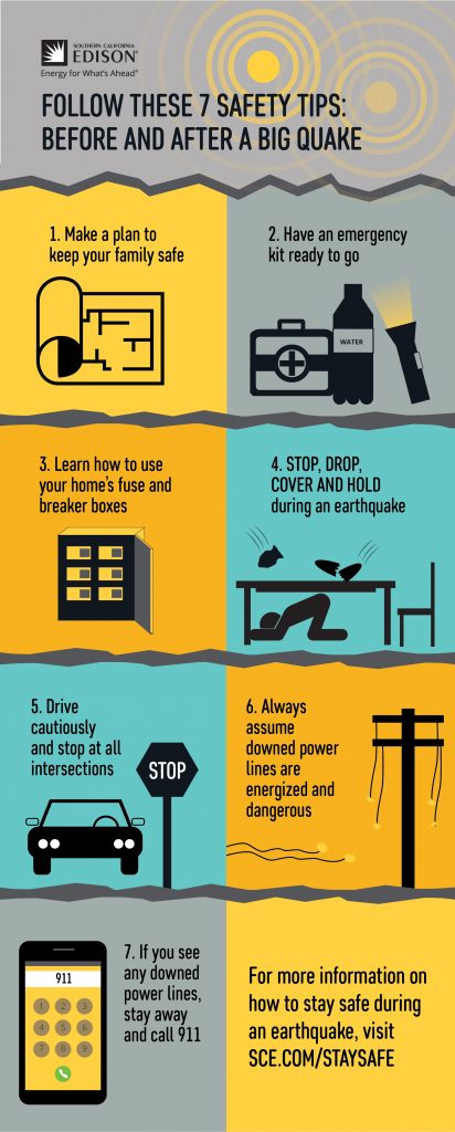
It’s eye-catching with the colour blocking, which also helps to differentiate between the different points. The style is used often because it works – it gets people to look at them and keeps the information clear and simple to read. But using the same format can also be a drawback because the information can be changed, but the overall look doesn’t change. How to do you make sure people know its new information with the same looking infographic? That’s one of the major challenges that I’ve been getting stuck on – how can I design my communication plan to look unique, but still work and still get people thinking about the topic?
That’s why I find poetry so interesting as a risk communication plan. It’s meant to get people to think and question their perceptions. A poem can challenge, appease, muse, be witty, or serious depending on the style and language chosen. But its strength is also its weakness. Poetry is thought provoking, but it can also have many different interpretations. A risk communication plan needs to be clear, concise and make sure a main point is conveyed. It can’t be left to interpretation. That puts the pressure on the creator to make sure there’s only one message people can take away from it.
An example of poetry done well that I’ve come across lately is with hand washing. The image shows someone washing their hands in the sink with a poem overlaid that has the function of making sure the person washes their hands for the proper amount of time.
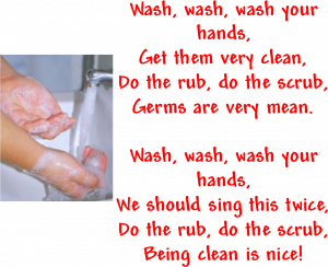
A poem really works well in this context because it helps people keep track of time for proper handwashing, while making the process a bit more enjoyable or fun. Given the right context and the right audience poems can provide the needed distinct appearance to stand out.