
Lab 1 was about Spatial Stats using a model builder exercise
Through Lab 1, I obtained data from the CDC, solved issues whereby numbers are treated as text, and carried out spatial analyses to try understanding spatial relations among cancer rates in Southeastern United States. The lab exercise also reviewed how to use Unique IDs and how to create them. Finally, I created a model, with multiple outputs, in order to produce an animated map showing different rates and spatial relations between rates and counties across several years in the southeastern US.
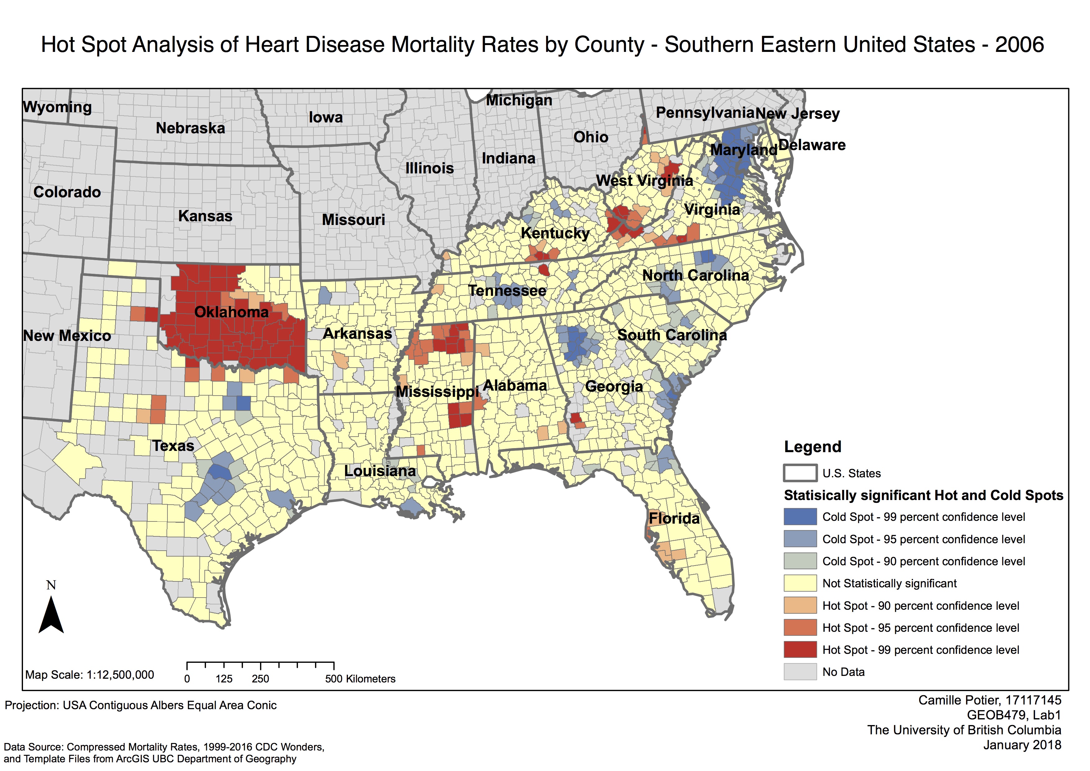
Hot Spot Analysis of Heart Disease Mortality Rates by County – Southern eastern United States – 2006
A map of yearly hot spots and cold spots of heart disease mortality rates was created by data obtained from CDC Wonders. This map represents the hot spots and cold spots of heart disease mortality rates for the year of 2006.
It is possible to observe on the map that, for the year of 2006, there is the highest concentration and clustering of hot spots in Oklahoma. This that there is a high spatial cluster of heart disease mortality rate in the countries in that area in 2006. Other hot spots can be found in Northern Mississippi as well as at the border of the Kentucky, West Virginia and Virginia states.
Cold spots are clustered in central Texas, Tennessee, North California Georgia as well as along the eastern coast of the United States. The concentration of cold spots is the highest in the state of Maryland. Interestingly the cold spots in Tennessee and Georgia are correlated with the location of big cities such as Nashville and Atlanta. Similarly, in the state of Texas the cold spots in blue are similar to the location of main cities such as Austin, Houston and Dallas. In Florida, cold spots surround Jacksonville in the North, and Miami in the South, while hot spots are closely correlated to the location of Tampa. The zones in yellow represent areas with no apparent spatial clustering.
The hot spot analysis’s aim was to assess whether high (hotspot) or low values (cold spots) of heart disease rates cluster spatially. The map created identifies statistically significant hot spots and cold spots using the Getis – Ord Gi* statistic. The output of this analysis resulted in a new output feature class with a z-score, p- value and confidence level. The final map reflects these different confidence level ranging from 90% to 99% confidence levels to no statistically significant areas. The largeamount of hot spots of heart disease mortality identified in Oklahoma have a 99% confidence level for the most part. The cold spots identified in Maryland also have a 99% confidence level.
Full lab: GEOB479_Lab1