This graph provides a visualization to show a network of interconnected and metadata to establish connections between the participants’ music choices, creating communities of individuals with similar music choices. What am I hoping to discover what choice of music was identical to those in my community? What data is assumed? Can I make sense of the visualization to conclude the reason for my music choices, and maybe why did you not choose other music selections?
After engaging in several methods of uncovering the network of the SPARQL endpoint program, initially, looking at all of the data from the class in Palladio, it seemed like it would be difficult to see any relationships. This is because I am more used to working with spreadsheets and pivot tables and working with information. However, once I started creating order within the network by moving around the nodes, I found this an advantageous way to visualize the data and find connections differently.
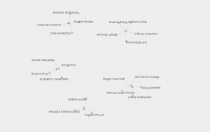
After engaging in several methods of uncovering the network of the SPARQL endpoint program, I found that there were different patterns and visual limitations from the data presented. I actually enjoyed the process of trying to build other graphs but was overwhelmed initially with the multitude of data linking it demonstrated. However, I was able to gain confidence in understanding the patterns of the choices as I was able to navigate through the requesting of data from my peers’ selections.
Community three is where I found myself in the data collection with Alexandra, Johanna, and Michael. I was eager to find out what similarities I had in the tracks I chose and their selection. I am a visual learner, but clusters close together are too busy for my eyes, so I decided to gather information for the table. I entered Curator and Tracks; this allowed me to specifically see what my peers in my community chose and then make the comparisons.
Once going over our selections, what stood out for me was that we were placed together in a community based on two sections we had in common in our track selections. For example, Alexandra and I had similar choices, such as Johnny B Goode and Panpipes (Solomon Islands). Johanna and I were identical with these two tracks Panpipes (Solomon Islands) and Melancholy Blues. Michael and I both chose Johnny B. Goode and Fifth Symphony (First Movement). However, many of our track selections were different. What occurred to me in analyzing these similarities is to see cultural influences seeing that many of the tracks had a substantial Western culture selection of music tracks. Even though they tried to incorporate non-Western music, there was an overwhelmingly Western influence on our track selection.
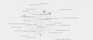 After analyzing the tracks in my group, I wanted to discover from the larger groups that the popular songs that stood out were Flowing streams and Fifth Symphony (First Movement). I believe that the Fifth symphony could have been a popular choice because of its popularity in commercials and movies.
With this task, we must make assumptions about why our peers made the selections that they did. It made me think of the data collection we do in post-secondary and blueprinting assessments. Are the objectives and questions aligning with the course objectives? This type of visual graphing provides a valuable review, such as the level of difficulty of the assessment. However, this task demonstrates how the web collects digital texts, search engine data and social networking to group data. For example, based on my friends or groups on social media, I can see how I may receive advertisements and news stories. Therefore, I think it is important to note that this type of networking can have implications for us presently and in the future because we may be placed in communities based on tracking systems.