Blog Update #7a: Final conclusions and recommendations
Conclusions:
Overall, although we did not manage to see statistically significant results, both qualitative and quantitative data from our study suggests that community-related elements are important motivators for participants when deciding to donate to a charity. Donation events with segmented progress bars and community-related elements displayed a higher mean level of engagement and trust. Many participants stated that seeing their friends who have also donated was an important requirement for their own donation, and also played an impact on the amount they decided to donate. This hints that our design was able to meet its primary goal of creating an engaging donation experience to motivate donor behaviour.
However, due to time and experimental limitations, we were only able to evaluate a subset of the functionalities in our design; we were not able to assess the impact of establishing clear goals and subsequent feedback in encouraging increased user engagement and donations. We can only conclude that the trends from our data showed that the segmented progress bar and community-related elements may be useful to motivate donation behaviour. Interestingly, we also found that both elements may cause a feeling of competition or social comparison to arise, and that the colors of the segmented progress bar are distracting. These areas can potentially be explored further.
Recommendations:
We believe that our logical next step would be to perform several much-needed minor adjustments, but that our overall design approach was also validated. Adjustments to the progress bar and improvements of aspects such as anonymity are needed, but the community-related elements of our interface to improve donation motivation was validated through our prototype.
However, there are mixed findings on the emphasis on individual contribution as well as social comparison. Regarding these findings, future studies should investigate the effectiveness of segmented progress bar with more aesthetically pleasing colors, such as single colored segments, or low saturated colors, to reduce visual fatigue. Another issue that is worth studying is the scalability of segmented progress bar. Larger scale donation events would likely have unrecognizable individual contributions and overly crowded segments, which might lead to confusing donation experience. Moreover, a major concern for many users has to do with the social comparison arising from the segmented progress bar and community elements. Some users liked it, whereas others reacted negatively to it. More investigation should be done on ways to mitigate the negative aspects of competition, while continuing to cultivate increased intrinsic motivation to donate.
Blog Update #7b: Reflection on your design and evaluation process
Beginning our project with a field study was a great way to start. We were able to get insight about the current practices used by charities to motivate donors, and the causes that drive a potential donor to contribute, which then directed our design. From the field study, we learned that participants trust a charity more when family and friends have also donated, and the sense of community is also a motivating factor as the impact made by a community will be much bigger. By conducting interviews with users, we were able to uncover these motivators, which would not have been reflected in our design without the field study.
Starting our design with low-fidelity prototyping before moving to medium-fidelity prototyping worked well. We were able to find confusion points early on that could have been potential confounds in the evaluation of our interface designs later. However, when moving on to our medium-fidelity prototype, we made certain visual and interface decisions that we found ended up surprisingly influencing our evaluation (e.g. the colorful segmented progress bar). In our paper prototype, the segmented progress bar had less saturated and a more toned down color palette, meaning that any issues were missed from piloting. However, when we moved on to the medium-fidelity prototype, we changed the colors to become more saturated and more colorful – leading some users to feel distracted and confused by the array of colors presented. From this experience, we realized the importance of such seemingly small decisions – even on the visual aspects of our interface. More careful and systematic piloting would have helped to avoid these issues again in the future.
Regarding our evaluation of participants’ motivation to donate, we thought that theapproach we had taken was, in general, the right direction, but certain details could have been changed to improve the validity of the study. Creating a scenario for participants where they were given money to allocate to different donation events worked well, as participants were able to definitively decide which interfaces they liked better, and donate more to those. Although the task was limited in that the given budget was not real money, and that people were forced to donate some amount of money, we still found that this allowed us to better focus on just the effect of the interface factors we were interested in. We could have, however, been more careful with the content of the donation events we used – although there was no statistically significant effect from the content, we found that people were more motivated to donate towards natural disasters such as earthquakes (something we also found in our field study). As a result, we should have, in hindsight, briefly piloted the content of each donation event as well, and remove events where there might be a potential confound.
Blog update #6 – Experiment Abstract and materials
1.Pilot test
The pilot test showed that participants can finish the experiment tasks within 30 minutes. However, there were some issues:
The think-aloud instruction was missing. Changes were made to the task description to include it.
Participants focused on the content of the donation event when they decide on the amount to donate. Therefore, we made remarks to ourselves that we need to remind participants throughout the whole experiment.
After participants looked at another interface, it is natural for them to change the amount to donate to the previous event. Changes were made to the task description that they can change their decision at any point.
The total number of people donated to an event was missing. Changes were made to the interfaces to include it.
One participant did not know that he can read more detailed information by clicking the “NEXT” button on the event list page. Therefore, we changed the button to “More Details”.
One participant almost missed the friends element. Therefore, we included the color version of the friends’ profile pictures in the task scenario given to the participant, and if the participants still fail to notice the key interface element, we will walk them through each of them.
2. Experiment Abstract
Motivating potential donors to donate is a huge challenge for charities. We introduce the use of segmented progress bar and community element in donation interfaces. A segmented progress bar is divided into segments proportional to the amount each individual has contributed. The community element is shown by highlighting users’ contacts on social media. To test the effects of these elements on promoting donation behaviour, we conducted an experiment with a total of 8 users. Our results show that (1) the community element is an important motivator for participants before they decided to donate to a charity (2) the segments of segmented progress bar can help participants to determine the appropriate amount to donate, and (3) events with segmented progress bar and community element has a higher mean level of engagement and trust for an organization. Overall, segmented progress bar and community element may be useful to motivate donation behaviour.
3.Revised supplementary experiment materials (no limit)
No changes was made to the consent form.
Some changes were made to the study instrument:
An instruction to ask participants to think-aloud during the experiment was added. This is to ensure that we can get insight into what the participant is thinking.
An instruction to allow participants to change the donation amount to an event at any point of the experiment was added. This allows flexibility to our experiment and we can better trace the rationale of the decision of participants.
Instructions to remind the interviewer to walk the participants through the interfaces if they seem to be confused or fail to notice the key interface element was added. This is to ensure that participants will decide on the donation amount according to the key interface elements.
A question “What about the interface caused you to donate this amount of money?” was added to the coding sheet. By adding this additional question, we can better probe the participant.
Four donation events were added to replace the placeholder names.
A color version of the friends’ profile pictures was added to the task scenario given to the participant. This is to ensure that participants can better relate the task scenario to the interfaces.
An instruction that remind participants there is no payment process in the experiment is added. This is to avoid participants misunderstand that they need to make actual payments.
Some changes were made to the interfaces:
Four realistic donation events were added to replace the placeholder events.
Notifications that a feature has not been completed were added to functionalities that were implemented horizontally in the interfaces.
Different number of goals are added to each event to make the events more realistic.
The payment page is removed to avoid participants misunderstand that they need to make actual payments.
The total number of people donated to an event was added because this is a standard information that should be shown in a donation event.
The “NEXT” button on the event list page was replaced with the “More Details” button. This is to ensure that participants know that they can read more detailed information by clicking this button.
Blog Update #5a: Rationale of Medium Fidelity Prototype Approach
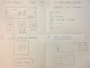
Our prototype will be a website, built using HTML/CSS. Our experiment only requires one prototype that can be toggled to simulate all 4 conditions.
Horizontally, we decided to cover the following features:
Users already have their profiles created and linked to social media accounts
Filter function
Search function
We decided to Wizard-of-Oz’d users’ profiles to avoid the tedious creation process, and to Wizard-of-Oz’d the filter and search function because our experimental goals don’t emphasize on that. Since it is impossible for us to link participants’ social media accounts to our website, friends of participants will be Wizard-of-Oz’d.
Vertically, we decided to focus on two areas – the community-related elements and a segmented progress bar that highlights individual contributions:
A list of donation events that users can view by clicking the “next” button
A segmented progress bar in which a segment represents the donation by a donor
When user hover over a segment of the progress bar, a pop-up shows up, with a thank you note to the donor
Friends of user will be shown under the progress bar and when the user hover over his friend’s profile, a pop-up shows up, with a thank you note to his friend
A draggable bar that user can adjust the amount of money to donate
An input box for user to input the donation amount
When user click the “Donate Now” button, he is directed to the payment page
After the donation process is completed, a pop-up shows a thank you letter to the user
The progress bar on the detailed event page is grown to show the contribution of the user after the donation process is completed
We decided to implement the whole donation process because we want the user to experience the donation process with community-related elements and segmented progress bar to test whether these elements will motivate the user to donate more money.
Event details and donors’ contributions will be fake data. The payment process will be Wizard-of-Oz’d and payment information will be filled out in advance to avoid the tedious form-filling process. We included these elements because we want to make the donation process as realistic as possible.
The overall appearance is not a first priority in our prototype as long as the layout is clear and doesn’t distract participants. However, the appearance of the progress bar is argued to be important. Key to the progress bar is the clear and intuitive visualization that informs the impact and recognition to each individual contribution.
We decided to build the website using HTML/CSS because of our group skills and since our prototype requires many interactions on the interface, it is faster to build the prototype by using HTML/CSS.
To narrow down the scope of our experiment, we decided to only focus on goals 1 and 3 from Blog Update #3. We felt like these goals were ones that were not only simple to execute, but also had the most potential to produce interesting results. Aside from that, only minor wording changes were made for clarity and brevity.
To test the effects of community-related elements (e.g. Facebook friends who have also donated) on promoting donation behavior.
To test the effects of a segmented progress bar, or one that highlights individual user contributions, on promoting donation behavior.
Blog Update #4b: Experiment Method
Participants
10 participants will be recruited through convenience sampling. As a result, it is anticipated that our participants will be university students ranging from the ages of 19 to 25. This sample of participants is not completely representative of the entire target population (adults of varying socioeconomic statuses), given that most students are of the same socioeconomic status.
Conditions
In this study, we will investigate four different interfaces. Each of the interfaces have the same underlying structure, but with various features of interest toggled on or off to investigate their effect on donation behavior.
Regular Progress Bar + No Community Elements
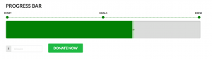
This interface represents a standard donation interface which uses a regular progress bar as a measure of progress towards reaching some target monetary goal.
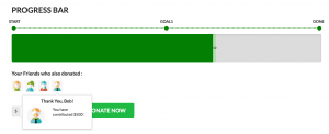
Regular Progress Bar + Community Elements
This interface retains the same standard progress bar as the first interface, but adds on community-related elements. Under the progress bar, there is a list of Facebook friends who have also donated to the same cause. More information such as brief description of friends and amount of money contributed appears when mouse is hovering over the profile pictures.
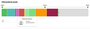
Segmented Progress Bar + No Community Elements
Instead of a regular progress bar, this interface features a “segmented” progress bar, where each segment in the progress bar represents an amount of money donated by a donor. The length of the segment is proportional to the progress made in terms of monetary amount towards the target goal. Users can hover over each segment to see the name of the donor and the amount donated. However, there are no community elements present in this interface.
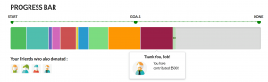
Segmented Progress Bar + Community Elements
This interface contains a segmented progress bar, as well as the community-related elements as described above. When participants hover over the icon of their friends below the progress bars, it reveals a popup box indicating which segment of the progress bar their friend contributed to, and the amount of money they donated.
Tasks
Participants will be asked to evaluate and interact with four different donation interfaces (corresponding to the conditions above). They will be given a budget of $200 to specifically give to various causes or charities (see Section 4c for detailed task descriptions). After going through the four donation interfaces, they will be asked to allocate this money to each of the donation events, however they like. They can give as little or as much as they want (within $200) to each of the donation events.Each participant goes through the donation events in the same order, but the pairing of interface conditions to each donation event is counterbalanced with Latin squares to mitigate order effects and the potential confound of a particular donation event’s content.
Design
2 x 2 within-subjects factorial design, with 2 levels of community elements (inclusion of Facebook friends or no inclusion) x 2 types of progress bars (segmented or regular).
Procedure
Here we detail the basic template of our experiment procedure:
Participants will be introduced to our study and asked to read and sign the consent form.
Experimenter will set up experiment equipment with permission of participants, including: audio recording device, screen recording, and noting participant id.
Experimenter will walk participants through a donation task description, which gives participants a situation to donate using a allocated amount of money. (More details in attached instruments)
Participants will be presented with the experiment interface, which consists of 4 donation events each with different interface setups based on experiment conditions: each of the interfaces has the same underlying structure, but with various features of interest toggled on or off to investigate their effect on donation behavior.
After finishing exploring each interface, participant will be asked to donate some portion of money in the budget and answer a short interview question about their impression of the interface.
After looking through all interfaces, participants can decide if they want to change the amount of money that they allocated for donation to each of the 4 charities.
A follow-up questionnaire will be provided to collect information about participants’ demographic information, preferences, engagement and trust levels on each donation events.
A short interview will be given to collect more qualitative data based on feedback of participants’ questionnaire.
Apparatus
For convenience, the location of our experiment will take place in study rooms in the Computer Science building. The participant will be presented with a laptop computer that contains our interface prototype, as well as a piece of paper detailing the task description for easy reference. The laptop screen will be recorded to capture users’ interaction with the prototype. No location or hardware constraints were imposed for this experiment, as the key interaction will occur in the computer’s web browser.
Independent and Dependent Variables
Independent Variables:
All independent variables are within-subjects factors.
Community-related elements (inclusion of Facebook friends or no inclusion)
Progress bar type (segmented or regular)
Dependent Variables:
Amount of money allocated to a donation event (quantitative)
Decided by participant after evaluating and interacting with each donation event’s interface.
Motivation to donate
Measured by user rankings of donation events in terms of preference (qualitative).
Measured through 5-point Likert scales about engagement and trust (quantitative).
Hypotheses
H1: Participants will donate more money to interfaces with segmented progress bars compared to regular ones. H2: Participants will feel more motivated to donate to interfaces with segmented progress bars compared to regular ones. H3: Participants will donate more money to interfaces that include community-related elements compared to those without them, except for when there is no segmented progress bar. H4: Participants will feel more motivated to donate to interfaces that include community-related elements compared to those without them, except for when there is no segmented progress bar.
Planned Statistical Analyses
We plan to conduct an Analysis of Variance (ANOVA) to test the difference in means of donation amounts across our interface conditions. For our Likert scales, we plan to simply present descriptive statistics, as they are meant to be supplementary to results from the ANOVA and the rest of our qualitative data. Presentation order of interfaces, as well as donation event content will be considered as potential confounding factors.
Expected Limitations
Due to the limited time and resources available to complete the project, our proposed study has several expected limitations. First, the experimental task lacks external validity, as it is somewhat unrealistic, given that the budget assigned to users is simply a number, and not their own real money. In addition, because we intend to prompt users to donate some amount to each of these donation events, motivation to donate is, at a base level, forced in the experiment. This was a decision made to help us more directly investigate the effects of our interface factors.
Second, a potential limitation is in exploring donor motivation, as it is difficult to measure objectively. Given the scope of the experiment, we rely on the amount users decide to donate and their self-report on various Likert scale measures to do so. However, we suggest looking at literature on donor motivation to find more established methods of evaluating motivation to donate.
Third, another limitation could be the potential confound of the content associated with a particular donation event. The content or cause associated with a donation event could be a major factor in affecting how much money a user might want to donate. Although we have made efforts to try to mitigate this, it still remains as a limitation of our study. We felt that using the same content across interfaces sacrifices too much external validity for our experiment.
Blog Update #4c: Supplemental Experiment Materials
No major changes, except for small wording and clarity edits.
Removed note about how Raymond knows about these charitable organizations, as it isn’t particularly relevant to our interface design.
Raymond continues to represent an individual who simply wants more regular, personalized feedback about the impact of his donations, as that would help him feel more connected to the cause and the organization as a whole.
Bella:
Small wording and clarity edits.
Changed Bella to be the 35-year-old accountant, as money is not a big concern for her compared to being able to trust the organization she donates to.
Bob:
Revamped Bob as a task example overall to be representative of some of the people we interviewed in our field study.
A younger, 20-year-old college student, where money can be tight.
However, he wants to help out, especially when it’s for a cause that’s personal or relevant to him. (e.g. natural disasters in his area, for funding education for children in need).
He feels like it’s hard for his donation to make an impact, as he can only give a little. This is something that we would add to our requirements: the importance of having a community who donates along with you – realizing that if everyone gives a little, then it’ll have a big impact.
Task Example #1: Raymond
Raymond is a 27-year-old university graduate. He has worked as an engineer for 3 years. Raymond deeply cares about others and intends to donate a portion of his income to help those in need. However, he’s concerned about where his money goes to and the impact of his donations. He is a frequent donor and is especially motivated when he sees stories of donees and how hard their living situations are. However, most charitable organizations are really busy, and often struggle to have the resources to personally inform donors (even regular ones) about the impact of their donations. Thus, Raymond sometimes feels a bit isolated and disconnected from these organizations, reducing his motivation to donate more money. He wants to establish a long-term donor-to-donee relationship with these organizations and wishes that there was some way that he could keep up to date with how he can help, and how his contributions have made a difference to those in need.
Task Example #2: Bella
Bella is a 35-year-old accountant. She was taught by her family that “helping others is a virtue”. She was raised to become a very charitable person that shows concern about people who need help. In the past, she would always be willing to donate money to any charitable organization that she meets, such as those with charity workers who are fundraising on the streets. However, many news reports have showed that some of the organizations who are fundraising are merely scams. She felt conflicted as her contributions were surprisingly not her original intention, and thus destroyed her trustworthiness in these organizations. This has changed the way she donates money – now, she only wants to donate to trusted charitable organizations, such as those recommended or donated to by her friends and family.
Task Example #3: Bob
Bob is a 20-year-old college student who is currently studying overseas. As a result, money is tight – but he recognizes that being able to attend university is already a privilege in itself, and thus tries to donate money to those who need it more whenever he can. He is especially motivated to donate whenever he hears about causes that are personal to him, such as when an earthquake occurred in the area near his hometown. Because money is tight, he can only spare small amounts of money to donate. He feels like it’s hard for his donation by itself to make an impact, and sometimes wonders if he should even bother donating. He wishes that there was some way for him to realize he’s not alone in donating money, and that he’s actually making an impact, even if he only gives a little.
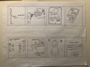
Blog Update #3b – Low-Fidelity Prototype(s) Demonstration:
After initial iterations of storyboard and wire-framing (see figure 1), we came up with a paper prototype that captures main steps of donation process with a focus on providing effective, motivating feedback to donors. We approach this objective by using the following features:
A segmented progress bar for a donation event that visually presents contribution of each donator
The ability to see friends’ donation to an event on the segmented progress bar
Notification to update donors on the progress of the donation objective
Clear and real time feedback to show the impacts of donation
The video clip demonstrates how our prototype supports Raymond to donate more confidently:
Figure 1: Storyboard for a community centered design
Blog Update #3c – Additional Information about Prototype(s):
We chose to support all three task examples, including:
Raymond, who wishes to be more connected to the donation events and to be more clear on where his donations go
Bella, who has doubt on trustworthiness of donation events and would like to have reference from friends or family
Bob, who has limited financial resources but wishes to make impacts with a community
During the field study, we noticed that most participants are motivated to donate by causes related to intrinsic motivation such as emotional connection, relatedness, and donation sustainability. We therefore decided to focus on motivating donation by clearly showing what the donation is for, how it is processed and where it goes, as well as involving elements of community.
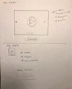
The scope of our prototype is both horizontal and vertical. To better illustrate a full image of donation process and give the context of the key tasks, we have simple setups for a donation events list, the checkout process and donation complete popups. The focus of our prototype is on the donation page and notification features to provide effective feedbacks to users.
Having a clear donating goal and breakdown of donation were found to be very effective in motivating donation behaviour. We decided to capture these two design focuses with an interactive progress bar. The interactive progress bar has a clearly stated donating objective, such as building a house for children. We set several milestones on the bar to present the impacts and breakdowns of donation. Noticing that responsibility tends to be weakened as individual stay within a social group (bystander effect), we intend to motivate individual contribution by having each donator’s donation visualized on the progress bar as sections proportional to the amount they donated. Including users in donation events’ profile, we hope to build connection and relatedness between donors and donees.
Majority of our field study participants donate with reference from their family or friends, as these donations were described as more trustworthy and relevant. We incorporate this in our design by highlighting users’ contacts on social media on the progress bar. We envision that making impacts with a group of friends or family members would buffer the happiness of donation.
To keep donors engaged with the donated event, the prototype would notify donors when a milestone got reached. The notification provides donors with the most updated information on the progress of donation objectives. We hope to build a long term connection between donors and donees with accurate and real time feedback to build trust, empathy and relevance.
Blog Update #3d – Walkthrough Report:
We carried out a cognitive walkthrough with two of our group members, one for each of Raymond and Bella. The task was to donate money to help fund the construction of a house for children, one of the donation events on our interface.
Overall, the walkthrough went smoothly – however, we learned that parts of our interface weren’t immediately clear or obvious to the user. On the first page, with a list of various donation events, users were hesitant, as they weren’t sure if they were going to be directed to immediately donate money, or if it was just to find out more details about the event.
On the main event page, users felt overwhelmed – there were a lot of different elements on the page. Although the progress bar was what caught the user’s eye (as was intended), the user was not clear about what the segments on the bar represented at first. It was only after they pressed on a segment, that a pop-up saying “thank-you” to the person who donated, that it “clicked”, and they understood that each segment of the bar was a donation by an individual, with the length of the segment proportional to the amount donated. To solve these problems, we plan to streamline the donation event page, reducing unnecessary details and paying more attention to the grouping and alignment of interface elements. Help labels or definitions of our terminology (e.g. donation events, tags, goals) could also be provided.
Users easily understood how to use the donation slider to specify the amount of money to donate. However, upon donating and revisiting the event page, they felt like the presence of a goal update (which provided feedback about the impact of their donations) was not visible enough. To address this, we could provide a more prominent visual indicator of a new update, or perhaps automatically show the most recent update to users by default.
The walkthrough covered the task example for Raymond by clearly giving feedback in the forms of various media when a goal is reached because of his donations. In addition, because donated money is all going towards funding a specific donation event, Raymond knows exactly how it will be used. Goals also help breakdown costs and needs of the organization, allowing him to see exactly how he can help. Personalized thank you notes and notifications make Raymond feel more connected to these organizations and their causes.
We also cover the task example for Bella, who is concerned about trust. Donation goals clearly outline where money goes, increasing transparency. In addition, by seeing Facebook friends who have also donated underneath the progress bar, she develops a greater sense of trust towards a particular charity.
Blog Update #3e – Proposed goals of experiment:
To test if the inclusion of community-related elements (e.g. Facebook friends who have also donated) would increase user trust in a given charity.
To assess the impact of establishing clear goals, and subsequent feedback, in encouraging increased user engagement and donations.
To test if a segmented progress bar, or one that highlights individual user contributions, would encourage users to donate more money.
Based on findings from our field study, we settled with the above 3 goals for our experiment. Although a significant finding from previous milestones was on the significance of generating emotion through visuals to motivate donations, we felt like it was difficult to adequately investigate emotion within the scope of 444. In addition, it did not seem to have as many interesting design decisions that we could look at, as it seemed to revolve more around data than design.
Our first goal looks at the impact of friends and family. In our field study, we found that users were more likely to trust and donate to a charity when their friends or family had previously donated to it. We hope to measure the impact of including Facebook friends by asking participants to self-report on their sense of trust in the organization.
Our second goal examines goals. Including specific goals makes it clear to potential donors how their money is used and what kind of needs a charity might have. We measure this by potentially manipulating the presence or absence of such goals, and observe if an impact is made on the amount of money a user might donate.
Lastly, we look at our segmented progress bar. This might augment a user’s sense of community, as they are able to see their own and everyone else’s contributions. We measure this in a similar manner to our second goal.
The next steps of the development will be generating low-fi/medium-fi prototypes and determine a proper experimental design to explore our findings further. Given the limited time and resources, we will focus on some of the key findings from our study. According to our interviews, all participants cited that internal factors such as empathy are the most important factors of motivating them to donate. External factors are relatively trivial and some external factors such as people who are pushy or intrusive may even hinder them from donating. Most participants tend to donate to causes that really touch them such as the difficulties of people in need. Therefore, we will be focusing on spurring people to donate by appealing to arousing their emotions. Additionally, there is a tendency for people to donate for causes they care about or mostly related to their personal experience. Our system will also focus on matching people’s interests with opportunities for donations.
We found that the lack of trustworthiness is a barrier that hinder people from donating. And most participant evaluate the trustworthiness of an charitable organization according to their familiarity and transparency of information. Additionally, one thing in current practices our users complained the most is that organizations do not always feedback, and we found providing feedback would promote long-term donations. Therefore, Our system will aim to motivate donations by improving the exposure of the donation information and providing feedback.
Moving forward we plan to explore different approaches/design alternatives to help us to address findings from our field study. We will explore different ways of arousing emotions of users and different formats to provide information and feedback to users. Hopefully we will help to address motivating long-term donations.
Blog Update #2b: Revised Task Examples
Summary of Changes: Raymond:
– We changed the background of Raymond to be a more realistic person that is willing to do donations since we didn’t have a chance to interview any rich entrepreneurs that are also interested in donations.
– We pointed out the importance of feedback and the progress from charity after donors’ donations which will increase donor’s motivation. Bella:
– We changed to point out the reason of Bella’s personality of caring others.
– Focused on the trustworthiness between individual and charitable organization. Bob:
– Since we want to focus on increasing the motivation of donation behavior, we have changed this task example from a charity to a donor.
– We pointed out the fact that some donors are only motivated to donate to people who are related to them, and they need charity to remind them of the donation events that they are interested to donate.
Task Example 1: Raymond
Raymond is a university graduate, he is 27 years old and has worked as an Engineer for 3 years. Raymond cares about people and he intends to donate some portion of his income to help those who are in need. However, he is concerned about where his money goes to and the impact of his donation. He is a frequent donor and is especially motivated when he sees the stories of the donees and how hard their situation are. Most of Raymond’s donations go towards organizations he just so happened to stumble upon – for example, from street posters, or from social media content on the Internet. However, some of these organizations are really busy, and often don’t have enough feedback on the progress afterward or personal touch to their donors, so Raymond feels a bit more isolated and less connected that reduces his motivation to donate. He wants to establish a long-term donor-to-donee relationship with these organizations and wishes that there was some way that he could keep up to date with how he can help, and how his contributions have made a difference to those in need.
Task Example 2: Bella
Bella is a 20-year-old college student. She has an awareness about “helping others is a virtue” which is influenced by her family. This let her becomes a very charitable person that has much concern about people who need help. In the past, if she saw any organization was doing fundraising on the street and those charity workers came to her for donation, she was always willing to donate money to them. However, many news showed that some organization doing fundraising was just a fraudulent trick. She felt conflicted as the way she contributed was surprisingly not her original intention, and these destroyed her trustworthiness on those organizations. This changed her way to do donation. She only wants to donate to the charitable organizations recommended by her friends and family.
Task Example 3: Bob
Bob is a 35-year-old accountant and has moved to another country due to his job assignment. He is a person who only cares about the things or people who are related to him. Everytime he sees a charitable organization doing fundraising and asks him if he can donate some money for people in need, it does not motivate him to donate since he does not know who the donees are and he feels that it is not part of his business. In fact, sometimes he feels annoyed at those charity workers, as they are sometimes pushy and get in his way. Last month, he saw a news report about a natural disaster that happened in his hometown and there was an organization doing fundraising for helping those people in need. This disaster is related to his hometown, so it caused him to have a motivation to do the donation. He decided to do the donation after he get home from work. However, he totally forgot to do the donation when he got home, and
Blog Update #2c: Prioritized list of requirements
a) Absolutely must include
These requirements represent the major factors that can motivate donors to donate and are the most common concerns of donors after they make a donation. In addition, these requirements require more user testing and refinement than other requests.
– System includes ways that can appeal to the emotion of donors during the whole donation process.
– System includes a way to categorize different kinds of donation based on people’s interests.
– System includes a way for donors to know where their money goes to and the result of their donation.
– System includes an easy to use and clear flow when going through the process of donating.
b) Should include
This requirement is also very important to donors according to our field study but are slightly less important because they require a longer time for user testing to observe the effect.
– System includes a way for donors to establish a long-term donor-to-donee relationship with charity.
– System includes an easy way to remind the donation event that the donors are interested in.
c) Could include
This requirement is less important because donors tend to donate to charities that has established for a long time and/or are recommended by their family or friends, which does not require much user testing.
– System includes a way to show their trustworthiness to donors.
d) Could exclude
This requirement is a great addition to our system but is currently out of scope.
– Algorithms that can suggest categories of donation that are potentially interested by the donor.
Users: Must include
– Individuals who are (at least, somewhat) interested in donating to charities
– Individuals with enough knowledge to navigate a web interface
– Individuals who are able to pay by the payment methods provided
Users: Exclude
– Technologically illiterate people
– Illiterate people
– Individuals who are not interested at all in donations
Blog Update #2d: Design Alternatives
Design Alternative I: Donation Events
Description:
We envision a system that revolves around different types of “donation events”. These donation events are essentially fundraising campaigns organized by various charities with the goal to raise a certain amount of money for a specific cause. On the main interface of a donation event, there’s a large video which is used to introduce the donation event and arouse user emotion. We might also envision having some kind of progress bar to indicate the amount of money donated thus far.
Users have the option to create an account and set up a personal profile. Their profile stores information about categories of donation events that they are interested in, so that these can then be recommended to a specific user, personalizing the process.
Pros:
– Video is likely to be a stronger form of communication to arouse people’s sympathy
– Donation events give users a goal to reach and spur excitement around a cause.
Cons:
– Usefulness of system is dependent on number and diversity of events.
– Requires charities to host events and to include videos and relevant information.
Design Alternative II: Donation Gallery
Description:
In the main page of our system, we will show posters about the stories of donees who are in need, similar to that of a poster/photo gallery. Users can swipe to see more posters and click the “Details” button which direct them to the videos of donees if they are interested to know more about it. At the bottom of the posters, we will also show videos of donees to attract the attention of users.
If the user does not have a user account, he can create one and choose the categories of donation that he is interested. The latest posters and videos shown on the main page will be personalized by the categories chosen by the donees. When users click the video, he will be redirected to another page that has a huge “Donate Now” button to encourage one to donate. It makes it easy for the user to know the next step to do if he want to donate. After a user has donated, he can check his message box to know about the update of his donation. News feed with photos and/or videos will be shown to tell the donor about the result and impact of his donation.
Pros:
– Catch user’s attention by using pictures and videos of donees on the main page
– Use of videos to appeal to user’s emotion
– Provide feedback to donors about the result and impact of their donation
Cons:
– Users can only choose a category to donate according to the posters/videos posted
– Require charity to film video only
– Nowhere to see detail information about the charity.
The original project direction focuses on increasing donor engagement with donation centres in need; we broaden the focus of this project from engagement to the motivation of donor behaviour, hoping to build a more equal community through interaction design. Although engagement is certainly a part of donor motivation, we thought that there was more aspects to motivation than simply engagement that we wanted to explore in our project.
Design Direction:
We will keep the overarching design direction from the original proposal: to create a personalized and engaging donation experience to motivate donor behaviour. We will focus our design efforts specifically on these two parts of the interface:
Donors’ Personal Profile
We intend to explore ways to visualize and keep records of user donations, a method used a lot in helping form habitual behaviours. This could take the form of badges, leveling systems, etc.
To encourage prosocial behaviour, we might incorporate records on common social media platforms, such as LinkedIn or Facebook – bringing direct, extrinsic rewards to donors for their donations.
Charity Profile
Allow charities to specify donation goals for specific items (e.g. $100 towards purchasing 5 chickens for a village in Sudan).
Provide updates on the impact of users’ donations (e.g. photos, graphs or statistics showing positive impact, etc.) to encourage long-term donation sustainability and donor engagement.
For the two functionalities above, ensure that they are easy to use and efficient, enabling charitable organizations to add goals and provide updates in a timely manner.
In this project, we hope to evaluate this proposed system in terms of its effectiveness in motivating donor behaviour. These design directions are flexible and likely to change after conducting our field study, but in general the system will take on the form of a website or web application, as the platform is not critical to our objectives in this project.
Task Examples:
Task Example 1: Raymond
Raymond is an affluent board member of a real estate company. He generates considerable income every year. Feeling grateful and generous, he intends to donate some portion of his income to those that need it more. Most of Raymond’s donations go towards organizations he just so happened to stumble upon – for example, from street posters, or from social media content on the Internet. He finds it difficult to establish a long-term donor-to-donee relationship with these organizations, to see the results of his donations and the impact that it had. Occasionally, he visits the people he sponsors. However, as a busy man, Raymond doesn’t always have time to visit. He wishes that there was some way that he could keep up to date with how he can help, and how his contributions have made a difference to those in need.
Task Example 2: Bella
Bella is a 20-year-old college student. She is a very charitable person that has much concern about people who need help. The appreciation from people she helped also motivated her to help more of the others. She used to spare change to homeless people to help them get food. However, many news and studies showed that most homeless end up spending the money on narcotics and drugs. She felt conflicted as the way she contributed was surprisingly not her original intention. In this case, she changed her way of helping others; instead of sparing change to the homeless, she decided to donate money to charitable organizations. However, just like with her situation with the homeless, she struggles with who the money she donates to these organizations actually goes to, and whether or not it actually leads to a positive impact. As a result, Bella feels discouraged from donating money anymore.
Task Example 3: Steve
Steve has worked as a Donor Relations Coordinator for a charity for 3 years. His job is to be the main point of contact for most mainstream fundraising involving members of the public, to develop relationships with donors and to encourage them to donate. Recently, a news report showed that a number of charities were found to spend more than 80% of donations to the organization’s operating expenses. This has negatively affected the public’s motivation to donate. However, the charity that Steve is working for is a trustable organization. Since there has been a drastic decrease in donations for the charity, Steve’s manager asked him to think of solutions to increase donors’ confidence to the charity and encourage them to donate. Steve realizes that it would help if donations were made more transparent, and donors could see exactly how their money is being used to make an impact (instead of unrealistic amounts going towards operating expenses). He wishes that there was a system in place that would help improve transparency with the least amount of additional overload on their organizational practices, as their charity is already very overworked and busy.