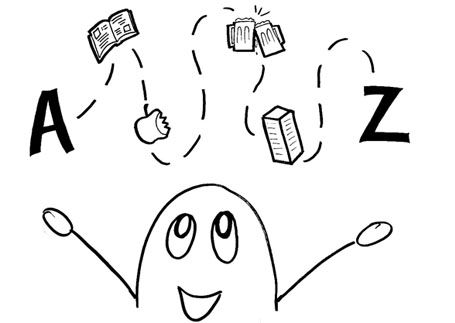
It was flattering to hear how well the visuals for our presentation went over with the guest panel. And they were designers!
While they may have looked “stupid” it really took a lot of time to narrow down what the key ideas were, and how to visually represent those without any excess noise. I Sharpie’d through many sheets of paper before I was able to come up with sketches that clearly represented the main point we were trying to get across.
The process also helped inform the content of the presentation. As I began sketching we only had discussed a rough outline for our presentation. Given that guideline I was able to experiment with many different ways to communicate our ideas, each opening up new avenues for exploration. Each different visual representation also had a slightly different verbal representation, so it was really a matter of selecting the combination that would be most effective especially given the tight time constraints.
In the end I think it was right to cut out all of the unnecessary details out of our initial presentation in order to make it more understandable for everyone. Given that everyone had a strong handle on our proposal right away, we had lots of time to discuss the finer details during the discussion session which followed.
To use Don’s analogy, we tried to throw one ping pong ball at a time.
Whats your signal to noise ratio?
Exit Bike Kitchen, enter assignment 5. From the limited information Ron and Moura disclosed today, it looks exciting.

One reply on “Stupid simple drawings”
[…] This is an age old saying that people love to throw around, but oh my it is so true. So many projects falter when they have too many concepts in either the content or the delivery. Daniel and Nestor did an incredible job at this in their presentation. […]